this just in, every member of the fandom brings something new and irreplaceable with them regardless of whether they are a content creator or not. the conversations you have with your fellow fans and the positivity you bring just by sharing the same space is beautiful, and so are you. thank you for existing
“Are you hurt?” The girl asked, most likely looking for some reason that Jamie should be acting like she was.
“No.” Jamie shook her head. “No, I’m fine. You’re fine. I’m just- I’m gonna,” She nodded toward the store and then turned around and pushed her cart forward.
She had never been one to forget how to speak in front of anyone, but damn, she had come here looking for sunshine and warmth and spring, that that girl was a ball of sunshine and springtime. And Jamie had just mumbled under her breath and stumbled away like she was a prepubescent boy who had never seen a girl before.
She looked back over her shoulder, absolutely mortified to find the other girl was looking at her.
She felt her entire face warm and then she looked back in front of her and tried to focus on the flowers.
She took a large drink of her coffee and then shook her head.
“idc about shipping im an adult” i love that and i hope youre having fun but im gonna go gorge myself on every silly little interaction these fake people have and live like a king
I managed to dig up all four of the WIP pixel art files for the Chemistry Sampler, with the oldest dating back to Dec 2018– three years ago, now!– and with them, loads and loads of old sketches, rejected ideas, and half-finished panels. So if you’d like to come with on a lengthy– lengthy!– dive into the process of making a 16-part sampler, click below!
(I’m not kidding, though! This got long as hell!)
I’m going to go through the sampler panel-by-panel, in the order they were first conceived, but that is not at all how the actual design process went. One doesn’t work on a single panel, finish it, and then move on to the next– instead, it’s all working on every panel all at once, jumping from here to there, trying to make each piece look good on its own and also look good as part of a whole. I also started and stopped working on the sampler at least three different times over the years, which meant even more changes as my style and abilities altered over time. But for ease of organization, I’ll be taking things one panel at a time. So, from the top-!
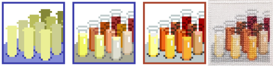
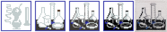
The Test Tubes were the first panel sketched, with no specific color in mind, and the original composition didn’t change a pixel all the way to the end! The colors, however, changed constantly: I remember for a while they were mostly neutrals, but once I knew I wanted to have a yellow pencil, orange bottle, and some brown cookies in the other panels the colors of the test tubes changed to match.
When I went to stitch the sampler, this was the panel I started with: since it uses thread from every single color family in the sampler (except for the two blues), I figured if I could find threads that worked well together here, they’d look good everywhere else, too.
The Microscope was the second panel sketched, and it didn’t change too much, either. The very first sketch was wicked flat, and imho flat = boring, so I rotated it around to put it at an angle and give it some more depth. I later decided to put a little molecule model (ethanol– looks like a cute little puppy) next to it to help fill out the space. There is also a full-panel picture of another molecule model elsewhere in the sampler, but by the time I decided to include that panel this one was both already completely designed *and* completely stitched, so it was a little late to change the molecule to something else. And anyway, I like the little guy! So I’m glad he stuck around. :)
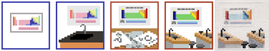
The Periodic Table was the no. 1 absolute must-have for a chemistry sampler, but it also posed a unique challenge in that it was the only part where the size was out of my control: if I made each element 2x2 squares they wouldn’t all fit in the panel, so they had to be 1x1– but that left a huge amount of empty space around them. My solution: placing the table inside a classroom, as a poster.
The first classroom draft doesn’t read well (is that a kitchen sink??) and the second one was even worse. I liked the idea of including larger squares for the elements, but drawing them that small and at odd angles made them hard to identify even as pixel art, and as a general rule of thumb fine details are always *less* distinct in the stitched version than in the digital pattern. Version three is much better: you can see multiple workstations and stools, making it clear that it’s a classroom space, and the repeated diagonal lines give it a nice sense of dimension. That’s always a good thing.
(Confession: on its own, I like the rainbow color palette better than the final one, but aside from a tiny bit in the volcano panel this was the only part that had any green at all. Next to all the blue and orange panels the green looked out of place, so for the sake of the larger, cohesive whole it had to change.)
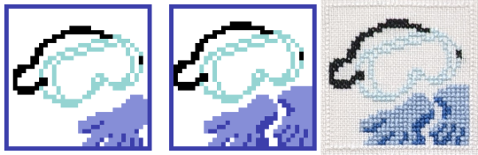
The PPE was the reason this sampler ended up so blue! I liked the first sketch, and the first colors, so I started using the same two sorts of blues to sketch out other panels. Made a few small changes to this one later– added another glove– but nothing major.
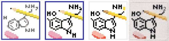
The Molecule Sketch also didn’t change much, except that it started off *really* messy and was constantly tweaked to be a little cleaner each time I came back to the sampler after a break. Turns out it’s hard to draw a pentagon on a square grid! In the first sketch younger me tried to use antialiasing to smooth out the corners– see the pale grey parts along all the diagonals– but nowadays I would consider that extremely bad pattern design. Yeah, it’d make the lines look better when stitched on white fabric, but on dark fabric the pale parts would stick out like a lightbulb and the whole effect would be ruined.
I also eventually added a little backstitching detail, since somewhere between 2018 and 2020ish I finally got over my irrational fear of designing with backstitch. Baby steps!
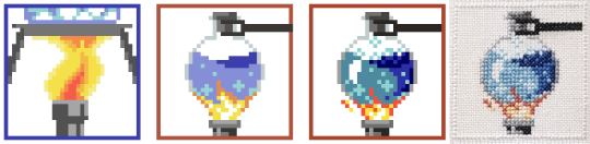
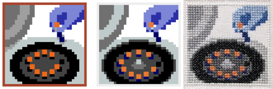
The Boiling Flask started life as a closeup shot of a bunsen burner flame + some tiny bubbles, but after a little while I figured that the water was more interesting than the flame. Plus the silhouette is clearer!
We’ve already seen where all the blues came from, which means it’s time to bring in the oranges!
Jupiter in a Bottle is, along with the PPE, one of the two panels that set the tone for all the others. There were about three seconds where I thought I’d try for a pale, crystalline effect for it, but I quickly switched to something brighter and rounder. At that point the chem sampler looked roughly like this:
…so, ah, not very promising, but I remember thinking ‘well, if nothing else, at least I’d have fun stitching the goggles and the orange one”. So since I was sure I wanted to keep those two, all of the other squares ended up being designed around them and borrowed a lot of their colors.. In the end I decided to go all-in on the oranges and blues, and, well, I think it worked out nicely! :)
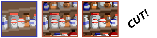
This little bastard was The Reagent Cabinet, and it’s one of the panels that eventually got cut! It was a very early introduction, and stuck around almost all the way to the finish. I didn’t ever like it, though: it’s not very interesting, not very beautiful, and if I had stitched it it would have been the *only* full-coverage panel in the entire sampler, and so would have looked very out-of-place and heavy compared to the rest of the design.
Still, it technically fit the color scheme, and technically the theme, too, so I didn’t actually have the guts to chop it until I went to export the image and start stitching. At that point, dreading the idea of laboring over an entire full-coverage panel of a design I hated, I finally deleted it and started stitching everything else anyway, just with a giant empty hole in the corner of the pattern. I figured “well, I may be burnt out on designing for now… but once I’ve been stitching a while I’m sure the spark will come back, and I’ll think of something to fill the space”. And so it did, eventually!
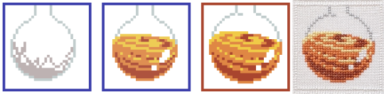
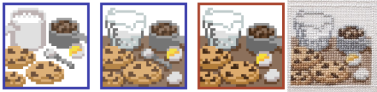
The Cookies, however, are a panel that I’ve loved from the beginning I wanted to include a nod to ‘everyday chemistry’ alongside the more ‘serious’ designs; a carryover from the math sampler, in a sense, with its bees and shells.
These particular cookies are based off of my Mom’s chocolate chip cookies, which are kind of sort of like this recipe, but better somehow, and made out of old Y2K surplus that she bought off a disenchanted ex-prepper. Somehow the 20-year-old powdered peanut butter just hits different…
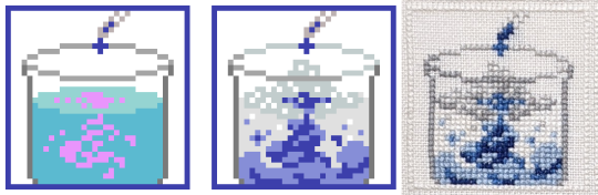
The Billowing Liquid was a effect that was, at least at the beginning, too far above my pay grade: I knew I wanted ‘some kinda sick-looking swooshy liquid effect, like in VFX reels or something?’, but that’s, uh, not a very concrete concept. I ended up realizing I was thinking of an ink-in-water effect, so from that I was able to look up reference vids and start sketching out some actual shapes. I added a little fizz on top, too, for extra effect– and I think it did end up looking the way I originally envisioned it, even if I didn’t have the words or the skills to capture it back then!
Another cut panel! This one’s the Alchemical Equipment: the idea was that hey, the modern science of chemistry is descended from the mystical practice of alchemy, so wouldn’t be cool to put a nod to alchemy into the sampler? Also alchemical symbolism is wicked cool. ⁽ᴬˡˢᵒ ᵃˡˢᵒ ᵐʸ ᶠʳᶦᵉⁿᵈ ʰᵃᵈ ʲᵘˢᵗ ᵍᵒᵗᵗᵉⁿ ᵐᵉ ᵗᵒ ᵖˡᵃʸ ᴺᵃⁿᶜʸ ᴰʳᵉʷ: ᶜᵘʳˢᵉ ᵒᶠ ᴮˡᵃᶜᵏᵐᵒᵒʳ ᴹᵃⁿᵒʳ ᵃⁿᵈ ᶦᵗ ʷᵃˢ ʳᵉᵃˡˡʸ ᵍᵒᵒᵈ⁾
I tried a couple different takes on this panel, and I still like both of the last two a lot, but in the end they didn’t fit at all with the rest of the sampler, so! For the good of the whole ✂
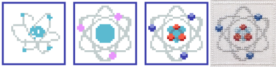
The Atom is one of the few where I still had my very, very first sketch saved! Normally I don’t save these– I’ll either start cleaning up the sketch on that same layer, or will delete the sketch once I’ve got a first draft started– but not for this one, or for the next two with it!
After the jump from sketch to first draft, this panel didn’t change much: I just added in the nucleus and made some of the curves less jerky and more smooth.
The Glassware Collection was sketched at the same time as the atom, so you can see its original iteration too! The biggest challenge here was to figure out how I wanted to handle the transparency of the glass: all the other glassware in the sampler was filled with something or other, and I debated whether or not to fill in these beakers and bottles too, with either plain white stitches, or grey, or both. In the end I stitched a bit of white shine on each bottle as a highlight, and left the rest of the space empty. Straight up, on my fabric it’s hardly visible at all, but I made some mockups and found that if someone were to stitch this same panel on black or dark fabric, then this version would look way better than one with the bottles filled completely with stitching. So it may not make my version look any better, but hey, for somebody else someday it will. :)
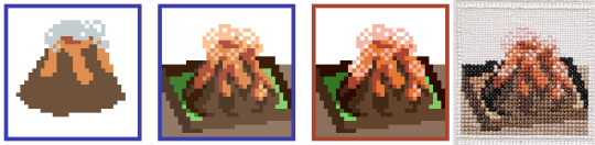
The Volcano is a kid’s chemistry classic! I toyed briefly with the idea of doing one of the other classic childhood experiments: red cabbage pH tests, or the rubber egg, but none of them are as instantly recognizable as the vinegar-and-baking-soda volcano, I think.
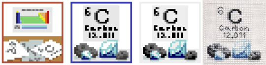
The Element of Carbon is a spinoff from that one rejected periodic table idea! This panel was one I made right after returning to the project after a long, long break. To get back into the swing of things I went through a bunch of my old discarded prototypes, and discovered that there were some good ideas hidden in there: they just needed to be fleshed out more, and given their own space to breathe.
Also, in the time since I started this design I finally learned how to do a french knot! At long last, I’m a real cross-stitcher
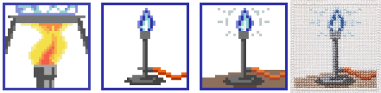
The Bunsen Burner was made right before I started stitching the sampler: at that point I had the color scheme just about figured out, and most of the panels most of the way done, and there were only two or three spaces left with no design or a soon-to-be-cut filler design. At that point I reached out to a friend of mine who had studied chemistry in college and asked them for some feedback, and they helped me tighten up the design a lot! This is when the alchemy panel finally got the chop, and in its place the bunsen burner came back: now zoomed all the way out, for easy visibility, and with a pretty new shine effect up top.
The Centrifuge was the other panel my friend recommended– and Evan, if you’re reading this, thanks a million! This one was an easy breezy design to make: pleasant shapes, an interesting subject, and lots of ovals. I do love a good oval.
This panel and the one before it came together *fast*: I was trying very hard to lock down final designs so I could lock in final colors so I could lock in a final arrangement so I could finally, finally,start stitching. I figured if I could get the sampler to the stitching phase then the ball would at last be rolling fast enough that I wouldn’t be in danger of abandoning the project again– a pretty bold hope, given that I was more than two years and several abandonments in, but hey, I was still hoping!
One problem: this is the point when I finally cut the reagent cabinet, so, while I *had* finally gotten to the stitching phase, I was still only stitching 15/16ths of a pattern. Enter:
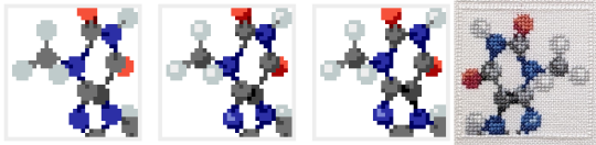
The Molecule Model
The final panel! I had hoped to come up with a suitable final idea in the process of stitching the sampler, and it took a hell of a long time to get there: I believe I had all the panels started, and a few of them finished, even, by the time the idea for this one rolled around. I was working, then, with a fixed position for the panel, along with a fixed color palette, but if anything those constraints made designing it easier. I just picked an interestingly-shaped molecule (theobromine, found in chocolate and tea), built it in MolView, spun it around until I got a cool angle, sketched it, and bam! Final panel complete!
…minus a mountain of tweaking, of course. All the other panels had had months to get their rough edges ironed out, but for this one I just kept the file open as I stitched, fixing problems as I found them. I would not recommend it– you have to unpick a lot of stitches anytime you decide ‘actually, it looks better one square to the left’!
~~~~~~~~~~~~
So, did it work? Did it all come together in the end? God, I hope so!
But you know, I think it did. :)
Thanks for reading! ✌
-Geri
P.S. it’s not about any specific panel, but you see how the early drafts have colored borders, while the final version has white ones? At one point I was using a draft of the sampler to mess around with GIMP’s content aware fill, trying to make some glitch art, y’know? And the results were pretty cool, but also overwhelmingly line-y:
…and I was hoping to try and make glitched-out versions of the individual panels, instead. So I took the version I was experimenting with and deleted the borders from it, and from that discovered two things:
One, that it was a huge improvement to the composition and should absolutely be carried over to the official version of the file, and
Two, that it did not make the content aware fill work any better, and in fact made the results look worse.
This postscript has a happy ending though: turns out if you take any individual panel and use it to tile a plane then you can select a chunk of it, use the content-aware fill, and then pick out the best bits to make your own glitchy sampler :)