#this is tomorrow
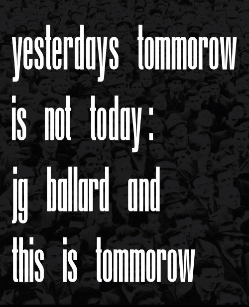
Last week I published a new essay exploring the links between the 1956 Whitechapel Gallery exhibition ‘This is Tomorrow’, Pop Art, Brutalism and the specualtive fiction of J.G Ballard. You can read all 3000 odd words of it here:
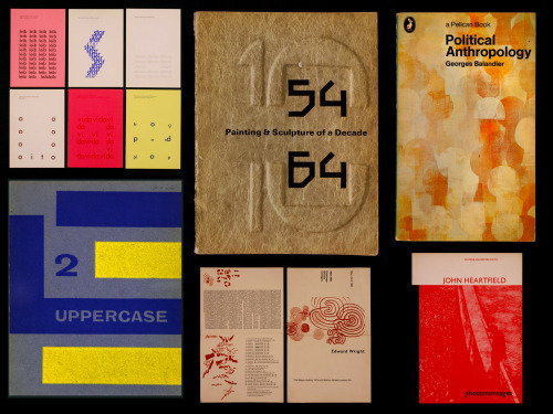
There is also a design aspect to this project, including typography inspired by Edward Wright, used on some book covers for Ballard. But more on that soon.
My past blog posts on ‘This is Tomorrow’ can be found here:http://theoinglis.tumblr.com/tagged/this%20is%20tomorrow
Post link
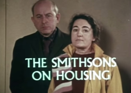
B.S Johnson’s 1970 BBC2 documentary ‘The Smithsons on Housing’.
This documentary gives a great insight into the Smithsons views on architecture and the process and logic behind one of their only major realised buildings, the sadly soon to be demolished (I believe so anyway?) Robin Hood Gardens in Poplar, East London.
The Smithsons were one of the driving forces in British Brutalism, and were very involved in the Independent Group from the start. They worked with Paolozzi and Henderson in ‘This is Tomorrow’ calling their collaborative piece 'Patio & Pavillion’, it definitely sat within the overall concept of Brutalism, well away from the retrospective idea we have of Pop Art. It also had a profound effect on a 26 year old future dystopian writer J.G Ballard who would later write about this specific part of the exhibition in his 2008 autobiography.
In the work of the Smithsons and Brutalism in general there is a clear conflict between the utopian ideals of Modernism and the realities of modern life which 'This is Tomorrow’ so radically explored. This dichotomy really comes through in the documentary, Sukhdev Sandhu in 2009, wrote of it thusly:
“They drone in self-pitying fashion about vandals and local naysayers to such an extent that any traces of visionary utopianism are extinguished.” (via)
Post link
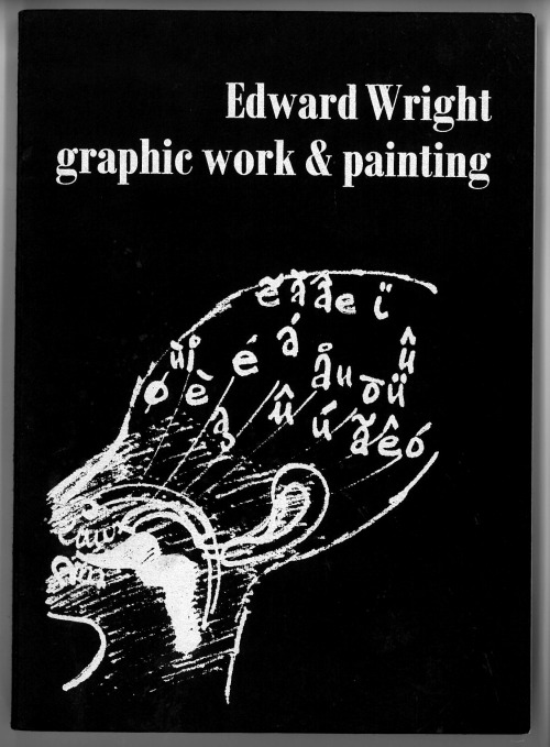
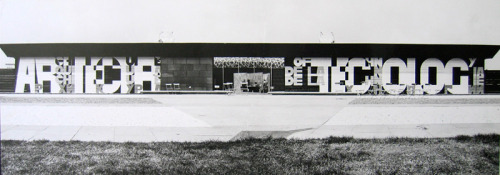
Edward Wright graphic work & painting. Published by the Arts Council in 1985.
“The heart of the 20th century myth is the knowledge that each science, each activity is a part of all others” Edward Wright, 1960. This quote stood out to me in relation to the cross disciplinary set up of ‘This is Tomorrow’ and the various groundbreaking topics that it explored.
There is also a really interesting recollection by designer Trilokesh Mukherjee (who later worked for Ken Garland) about the lengths he had to go through to even get an interview for a place on Edward Wrights graphic design course at Chelsea School of Art in 1963:
“After going through a test for life-drawing, two tests for the History of Art (three hour written, and an hour of slide-test) and a day-long test for graphic design, I was called for the interview.”
Post link
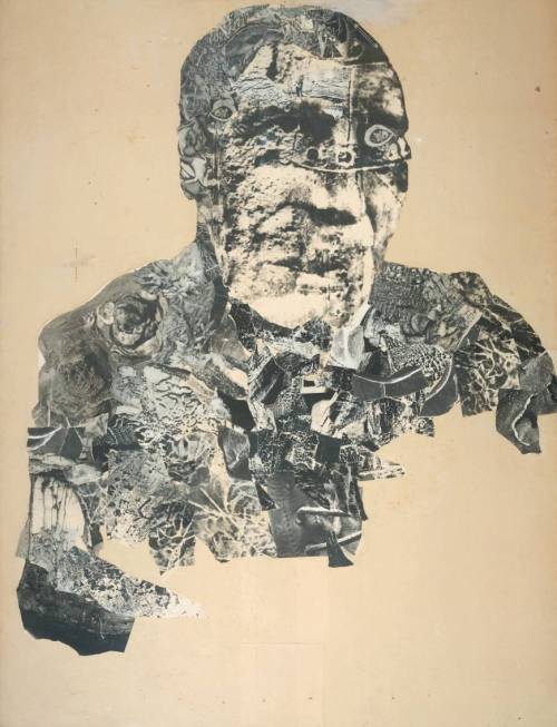
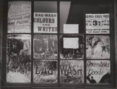
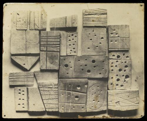
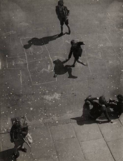
Various photographs and collages by Nigel Henderson (1917–1985) from the Tate galleries online collection.
“Henderson is best known as a member of the radical Independent Group of the 1950s, a gathering of artists and others committed to the discussion and dissemination of new ideas on art practice. The Independent Group was involved in two principal areas: the use and analysis of the ephemera of popular culture, inflected primarily by America (which can be connected to the emergence of Pop Art), and the discussion of the Brutalist aesthetic, which was more oriented towards European models and the influence of Surrealism.”
Henderson was a close friend of Eduardo Paolozzi, and as mentioned previously, was part of Group 6 in the exhibition ‘This is Tomorrow’. His street photography deals with the raw textures and realities of post-war urban life. He was fascinated by distressed surfaces, graffiti, signage, surreal juxtapositions and the interesting and mysterious fragments of the city.
If there is any traction to the idea of a 'Brutalist aesthetic’ Henderson certainly captures it through his images and experiments.
All images © Tate. My other 'This is Tomorrow’ posts can be found here: http://theoinglis.tumblr.com/tagged/this%20is%20tomorrow
Post link
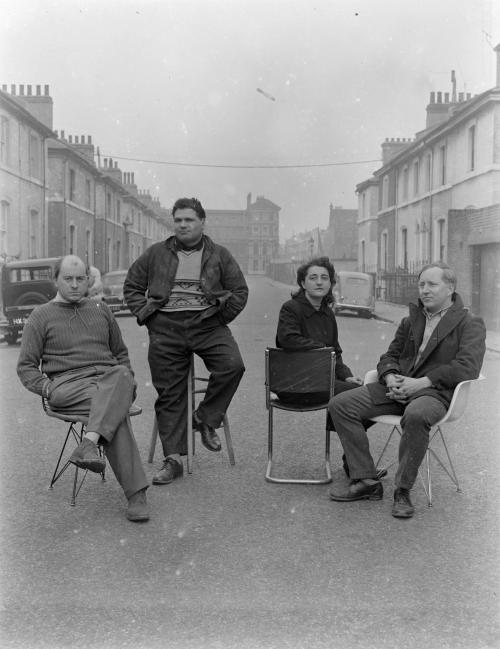
“Photograph showing Nigel Henderson, Eduardo Paolozzi, Alice and Peter Smithson, seated in an unidentified street.”
This image shows Group 6, from the 1956 exhibition ‘This is Tomorrow’. You may recognise it from one of the posters featured in my previous post. All four members have links to Edward Wright (the designer mentioned previously) who taught at the Central School of Art at the same time as both Paolozzi and Henderson, and was hired by the Smithsons to design the lettering for their 1956 House of the Future. Which was their vision for the homes of tomorrow, exhibited at the Daily Mail Ideal Home Exhibition.
All four members of Group 6 were also involved in the emerging genre of 'New Brutalism' (after béton brut — raw concrete) which was a term coined by critic and writer Reyner Banham in an Architectural Review article written the year before 'This is Tomorrow’. The similarities in both ideas and aesthetic between the architecture of the Smithsons, the paintings and sculptures of Paolozzi and the photography and collages of Henderson prove that there is more to Brutalism than just concrete buildings! As well as more to 'This is Tomorrow’ than just Pop Art…
Top image © Tate. The Image below is an outtake from said photoshoot (via).

Post link
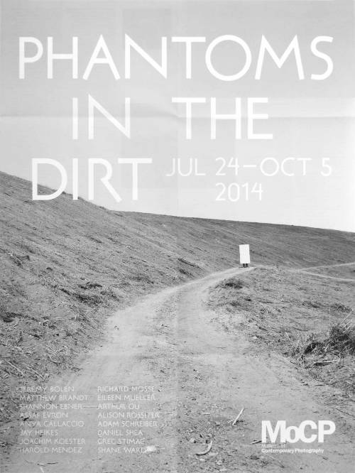
As a follow up to my last post about designer/artist Edward Wright here is one of his typefaces being used by a contemporary designer:
This poster from July 2014 was designed by James Goggin for an exhibition in Chicago.
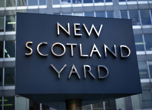
‘James Goggin’s poster employs a newly digitised cut of British designer Edward Wright’s Flaxman typeface… famously known for its rotating role on the New Scotland Yard sign outside London’s Metropolitan Police headquarters’.
It’s really good to see one of his typefaces digitised and in use! Looks great on this poster. Eagle-eyed readers may have noticed I’ve been using type inspired by Wright, but more on that soon…
Post link
Edward Wright - Designer, typographer, artist, writer, architect, teacher (1912–88)
Since the book I’ve ordered about Wright (published in 1985) hasn’t turned up yet, i’ll have to make to do with posting Hyphen Press’ bio. They published a book about him in 2007 which I sadly haven’t been able to track down.
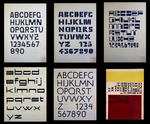
“Edward Wright (1912–88) was an artist and designer. Born in Liverpool, where his father was Ecuadorian vice-consul (his mother was Chilean), he trained and worked briefly as an architect before concentrating on painting, drawing, print-making, and also ‘commercial art’ (as it was then still called). From 1942 through to his retirement he lived in London, with periods of work in book publishing and advertising, and teaching graphic design (very broadly conceived) – most notably at the Central School (his evening classes in typography, 1952–6, became legendary) and at Chelsea School of Art. Wright was among those who fostered the modern spirit in Britain, working alongside architects, and refusing any simple split between art and design. He was always much concerned with text and language. Among his exceptional work is the lettering that he made for modern buildings, often managing both a specific design and an alphabet that could be applied more generally.”
The best online source for info about Edward Wright is ‘The optimism of modernity’ which was a 2007 project from the Reading University typography department about modern British typography. One of their pages includes some great quotes about Wright from those who knew him, as both students and/or friends, including this one from Richard Hollis which is very revealing and touches on the ‘This Is Tomorrow’ work from my previous two posts.
“He was a great dancer, in a Latin American way. He and his improbable wife Kitty gave great parties. And generally, Edward was very un-English and exotic in a time of drabness – around 1960. He had all-over short hair, very unusual. His cultural references were almost entirely to things outside this country and his work was unlike what others were doing. He wasn’t really a designer – design was just one of his interests, just one of the skills he practised. His ‘This is tomorrow’ catalogue had no precedent and no direct influence. But it is one of the most memorable pieces of design made here.” - Richard Hollis
There is something very intriguing about his work, it is almost unsettling at times and can be hard to place. This definitely comes from his position as a relative outsider, which goes in part to explain why he is not better known (despite many friends and ex-students who are still big names). In the face of his unfortunate obscurity I’m really glad to have come across him and his work through an interest in 'This is Tomorrow’.
It just so happens there is a lecture about his lettering work in London next month: http://www.letterexchange.org/events/lx-lecture-david-pearson-designer-teacher/ hopefully I’ll make it there to find out more.
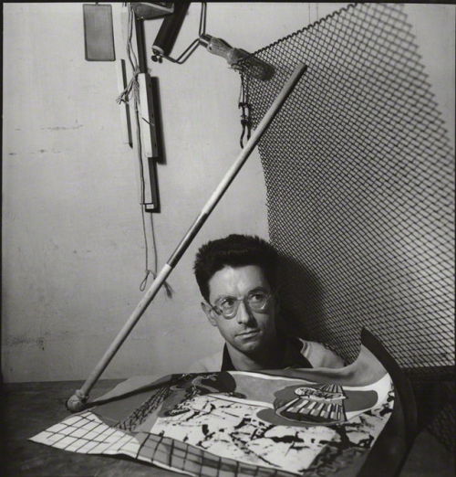
Portrait of Edward Wright via NPG all other images from Optimism-Modernity
Post link
‘This is Tomorrow’ - The posters
A selection of the promotional posters designed by the individual groups involved in the 1956 Whitechapel Art Gallery exhibition 'This is Tomorrow’, all using Edward Wright’s typographic identity (to use the term loosely) which I introduced in my previous post.
The variety of approaches seen in the posters sets the tone for the exhibition on the whole, which was an eclectic series of installations by 12 teams, or 'groups’, comprised of practitioners from different creative fields. Such as art, music, sculpture, architecture and graphic design as well as theorists and critics. Most were members or associates of the 'Independent Group’, who formed in 1952 and held meetings at the ICA. It is notable that Richard Hamilton’s collage 'Just what is it that makes today’s homes so different, so appealing?’ was originally created to be used on his groups poster, but went on to be the most important piece to come out of the exhibition. It is probably the most iconic image of early British Pop Art.
All the images of the posters are from the V&A’s online archive.
Post link
Here begins the first of a few posts leading up to something more lengthy that I have been working on lately:
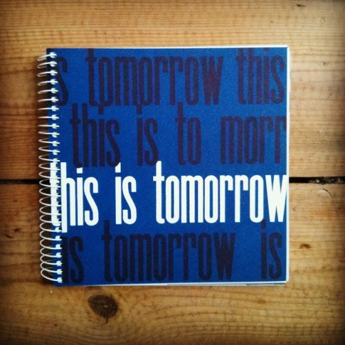
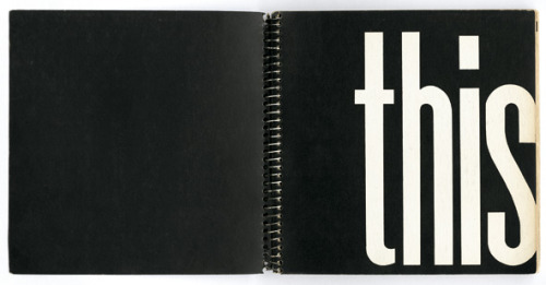
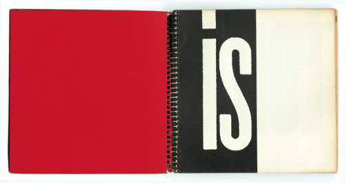
I first came across a significant mention of the 1956 Whitechapel gallery exhibition ‘This is Tomorrow’ through something I was researching outside of my usual sphere of graphic design. I suspect I had heard of it at some point previously in my arts education (perhaps not though) being as it is a seminal moment in British art. After a bit more digging what struck me most was the exhibitions catalogues design. I would have been hard pressed to place it as coming out of fifties Britain had I not known its context when seeing it for the first time. It gets a very fleeting mention in Richard Hollis’ 'Graphic Design: A Concise History’ sandwiched between mentions of Twen magazine and a little bit about First Things First -
“Images in magazines, which had been the raw material of Dadaist collages and 'mass communications’ in general, were attracting the attention of artists during this period. This interest was vividly expressed in the exhibition 'This is Tomorrow’ at the Whitechapel Art Gallery in London in 1956. The catalogue was designed by Edward Wright, who had been adept in the advertising manner of Elfer at Crawfords. The catalogue cover carried very condensed poster type printed by silkscreen, and its spiral-bound pages were among the first to use cheap offset lithography and type reproduced from typewriting. It looked forward to the do-it-yourself improvisations of the 'alternative’ magazines of the 1960s and represented the beginnings of Pop Art in the collages by Richard Hamilton” (p165)
Edward Wright was a new name to me, one I’d never seen mentioned in any books (as far as I remember), except for the aforementioned Hollis’. Biographical details and further examples of his work have proven fairly sparse online, beyond a few sources and articles. He is a surprisingly and unjustifiably obscure designer considering his typographic evening classes at the Central School were attended by future Pentagram co-founders Alan Fletcher, Colin Forbes and Theo Crosby, along with many other prominent names in graphic design history such as Ken Garland, Germano Facetti and Derek Birdsall. Quite a legacy… But I will say more about Wright and his work another time.
A facsimile reprint of the 'This is Tomorrow’ catalogue (worked up by one of my favorite contemporary designers - Fraser Muggeridge) is available from the Whitechapel Gallery, or if you are feeling rich you can get the original for a whopping £1,500 http://www.peterharrington.co.uk/rare-books/architectural/this-is-tomorrow/. Just another thing to naively and optimistically look out for in used bookshops I suppose…
(Spread images via Optimism Modernity)
Post link

