#tomorrowfeatured

LIVE
Especially at heavyweights the counter spaces in the characters form a visual counterpart to the steEspecially at heavyweights the counter spaces in the characters form a visual counterpart to the steEspecially at heavyweights the counter spaces in the characters form a visual counterpart to the ste

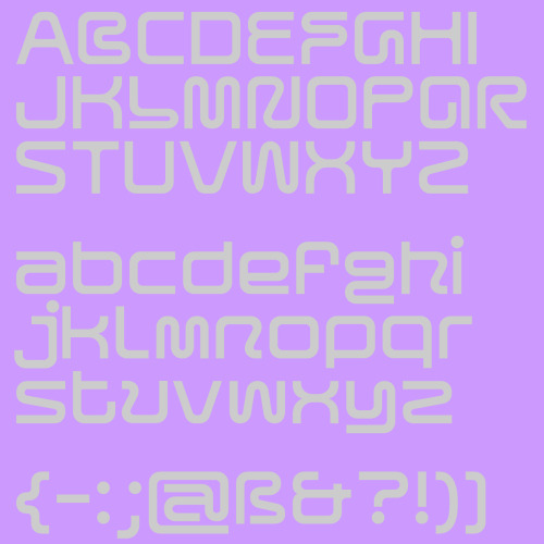
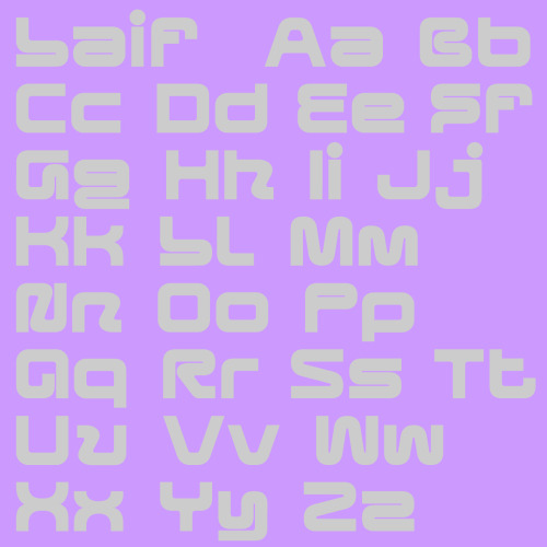
Especially at heavyweights the counter spaces in the characters form a visual counterpart to the stems and develop a high contrast appearance. Specific parts are exaggerated and pushed to their limits with their undulating movement, for example, the uppercase B, F, L and lowercase g and y.

www.new-letters.de


Post link
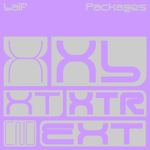
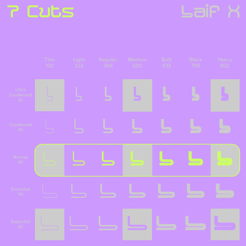
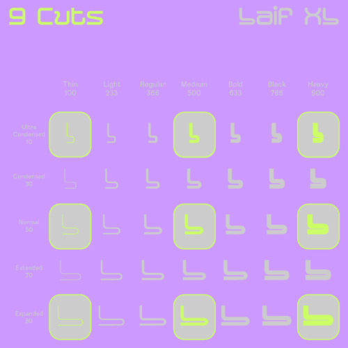
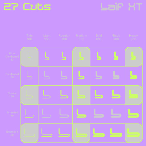
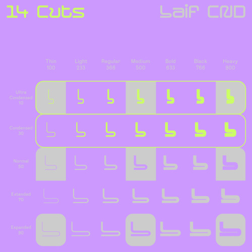
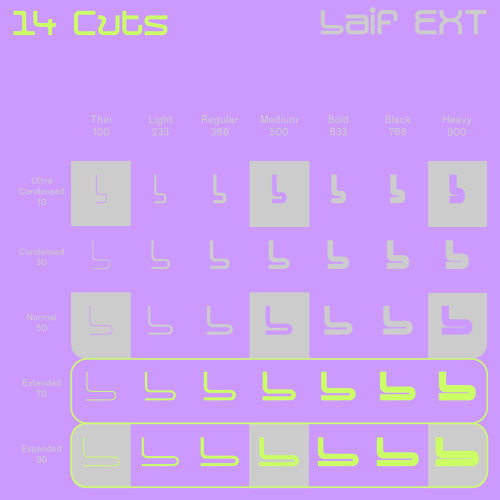
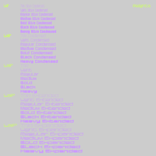
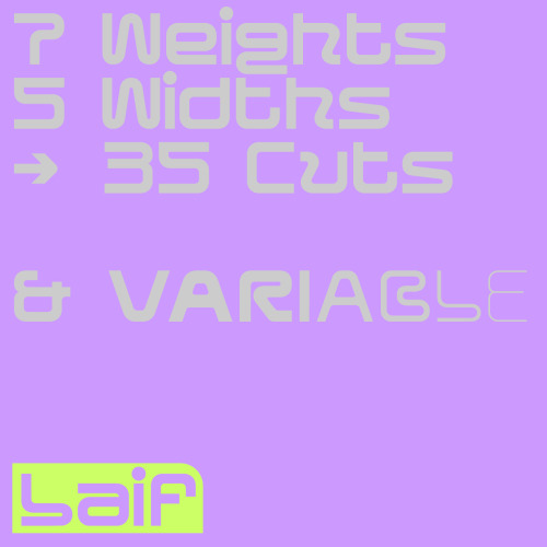
Laif was built as a variable typeface, including 2 axes - a width and weight axe. With 35 cuts, it is our most extended typeface, so far. 

www.new-letters.de

#typeface    #geometric    #modular    #release    #variable    #display    #typography    #typefoundry    #newletters    #tomorrowfeatured    #type01    #lavendrtype    #typedepartment    #typegoodness    #typespire    #designfeed    #thedod    #typetype    #365typefaces    #aigadesign    #eyeondesign    #itsnicethat    #designeverywhere    
Laif was built as a variable typeface, including 2 axes - a width and weight axe. With 35 cuts, it iLaif was built as a variable typeface, including 2 axes - a width and weight axe. With 35 cuts, it iLaif was built as a variable typeface, including 2 axes - a width and weight axe. With 35 cuts, it iLaif was built as a variable typeface, including 2 axes - a width and weight axe. With 35 cuts, it iLaif was built as a variable typeface, including 2 axes - a width and weight axe. With 35 cuts, it iLaif was built as a variable typeface, including 2 axes - a width and weight axe. With 35 cuts, it iLaif was built as a variable typeface, including 2 axes - a width and weight axe. With 35 cuts, it i

Laif was built as a variable typeface, including 2 axes - a width and weight axe. With 35 cuts, it is our most extended typeface, so far. 

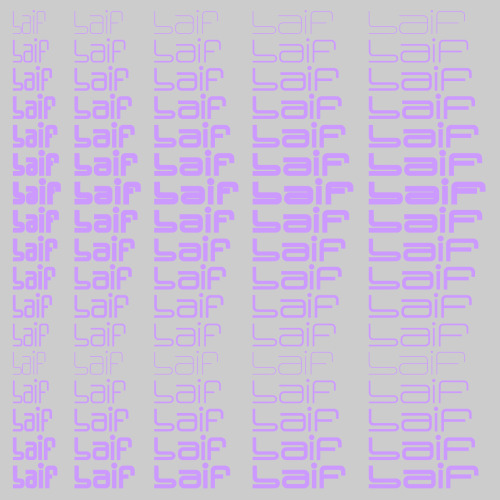
Referring to its architecture and appearance, Laif is intended as a display font. With its extensive set of glyphs, it is multilingual and contains a large number of accents, punctuation, symbols and special characters.

www.new-letters.de


Post link
Laif was built as a variable typeface, including 2 axes - a width and weight axe. With 35 cuts, it iLaif was built as a variable typeface, including 2 axes - a width and weight axe. With 35 cuts, it i

Laif was built as a variable typeface, including 2 axes - a width and weight axe. With 35 cuts, it is our most extended typeface, so far. 

www.new-letters.de


Post link
Laif was built as a variable typeface, including 2 axes - a width and weight axe. With 35 cuts, it iLaif was built as a variable typeface, including 2 axes - a width and weight axe. With 35 cuts, it iLaif was built as a variable typeface, including 2 axes - a width and weight axe. With 35 cuts, it i

Laif was built as a variable typeface, including 2 axes - a width and weight axe. With 35 cuts, it is our most extended typeface, so far. Out now!

www.new-letters.de


Post link
Review Hanje typeface… *****Hanje is an ultra heavy display typeface. Its very dense and massive appReview Hanje typeface… *****Hanje is an ultra heavy display typeface. Its very dense and massive appReview Hanje typeface… *****Hanje is an ultra heavy display typeface. Its very dense and massive appReview Hanje typeface… *****Hanje is an ultra heavy display typeface. Its very dense and massive app

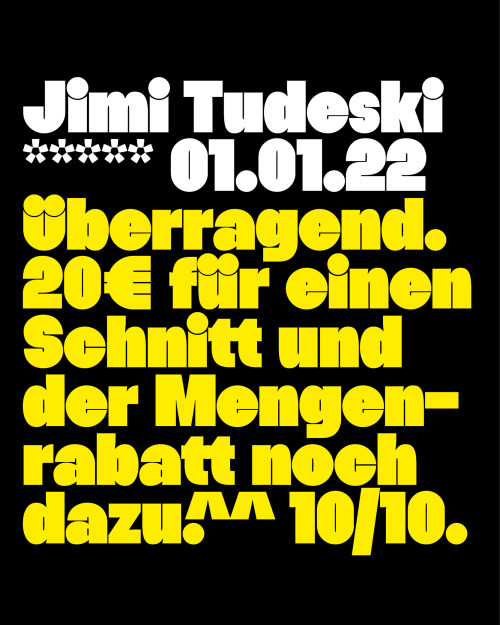
Review Hanje typeface… 
*****
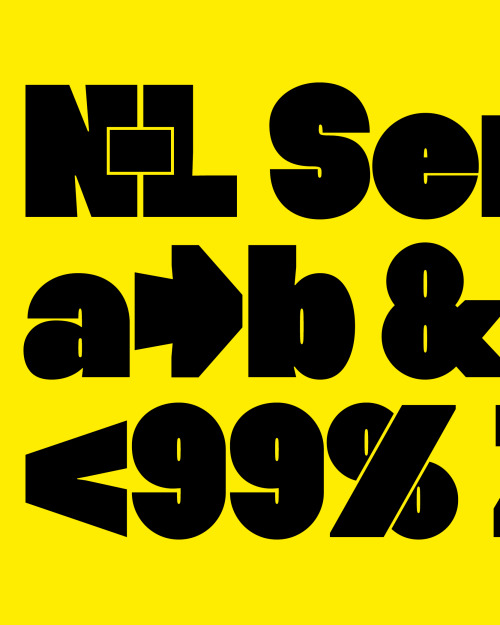
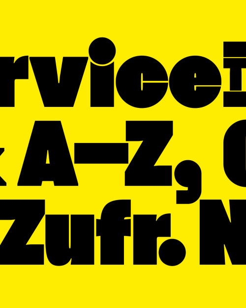
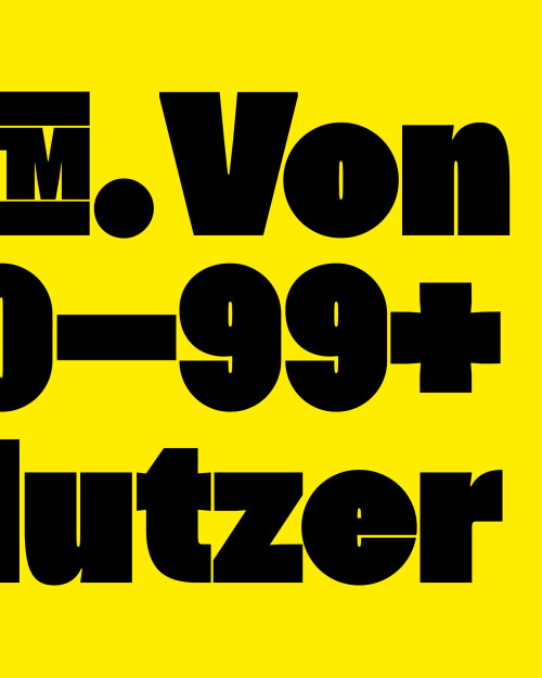
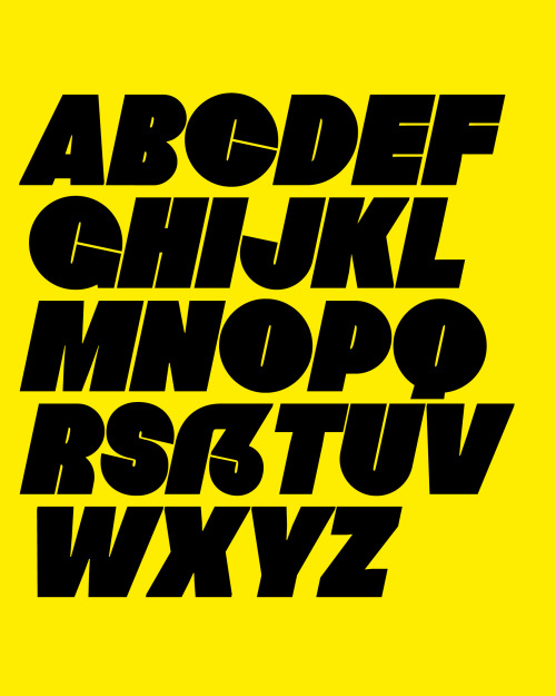
Hanje is an ultra heavy display typeface. Its very dense and massive appearance is contrasted by a geometric construction, making it almost appear warm and modest despite its heavy weight. 

www.new-letters.de


Post link
One main realization during the developing process was the fact that diacritics would often collide One main realization during the developing process was the fact that diacritics would often collide One main realization during the developing process was the fact that diacritics would often collide

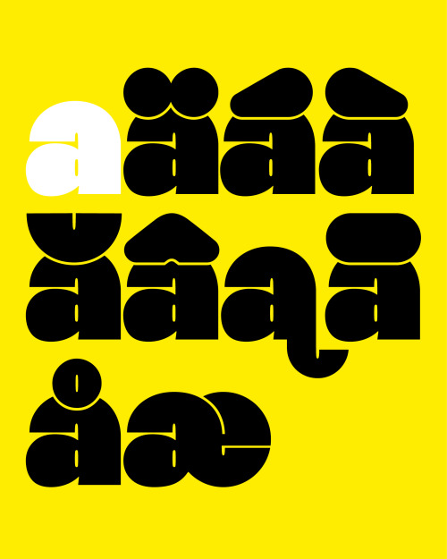
One main realization during the developing process was the fact that diacritics would often collide with the actual letters, leaving an unpleasant overlap.

Hanje solves this issue by scraping out a gap between letter and punctuation, which as a side effect serves as one of the typeface’s distinctive features.

All characters including diacritics are individually and precisely cut out, resulting in a typeface containing over 420 characters. Therefore the typeface is suitable for many languages.

The very dense and massive appearance is contrasted by a geometric construction, making it almost appear warm and modest despite its heavy weight.

www.new-letters.de


Post link
One of Hanje’s distinctive features is its massive diacritics. Instead of just sitting on top of theOne of Hanje’s distinctive features is its massive diacritics. Instead of just sitting on top of the

One of Hanje’s distinctive features is its massive diacritics. Instead of just sitting on top of the letters, a gap between letter and diacritic is manually carved out. The fact that the diacritics don’t sit on top, a small line height is possible without letters colliding. This helps the typeface remain its dense and heavy construction as well as tight letter spacing.

While in some typefaces diacritics appear as more of an indulgence, they are where Hanje’s strength and part of its personality lie. Therefore the typeface is very strong in languages where many diacritics occur.

www.new-letters.de


Post link

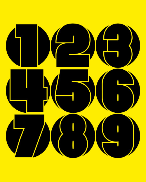
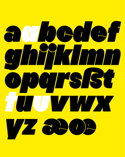
Hanje’s strengths emerge in larger sizes above at least 50 pt. The very dense and massive appearance is contrasted by a geometric construction, making it almost appear warm and modest despite its heavy weight.

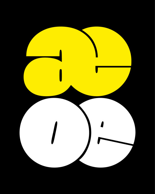
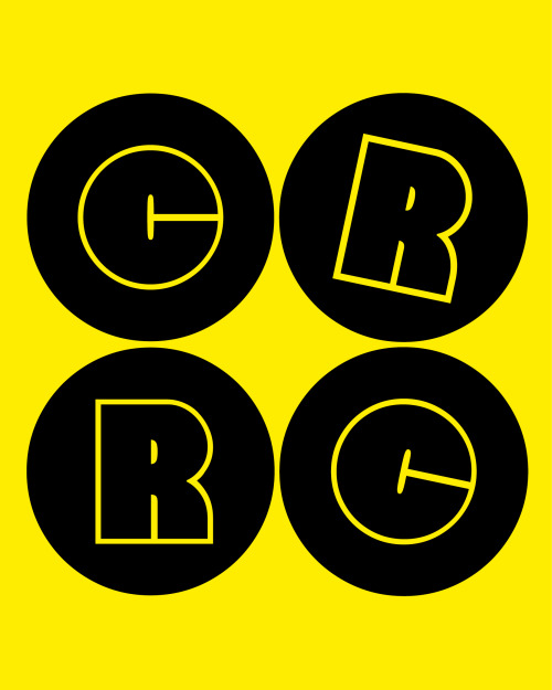
The principle of geometry and its extreme heaviness is especially evident in the typeface’s round letters. Letters such as »e« are perfectly circular with a counter so narrow that under some circumstances it can almost appear to be a straight line.

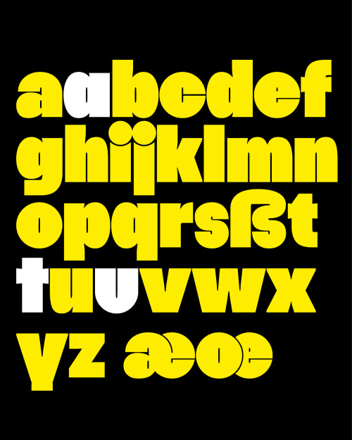
Stylistic alternatives such as »u«, »t« and a single storey »a« accentuate and strengthen the typefaces geometry and relation to geometric sans serifs.

www.new-letters.de

#typeface    #release    #ultraheavy    #thomasjohn    #typography    #typefoundry    #newletters    #tomorrowfeatured    #type01    #lavendrtype    #typedepartment    #typegoodness    #typespire    #designfeed    #thedod    #typetype    #365typefaces    #aigadesign    #eyeondesign    #itsnicethat    #designeverywhere    
Hanje’s strengths emerge in larger sizes above at least 50 pt. The very dense and massive appearanceHanje’s strengths emerge in larger sizes above at least 50 pt. The very dense and massive appearanceHanje’s strengths emerge in larger sizes above at least 50 pt. The very dense and massive appearanceHanje’s strengths emerge in larger sizes above at least 50 pt. The very dense and massive appearance

Hanje’s strengths emerge in larger sizes above at least 50 pt. The very dense and massive appearance is contrasted by a geometric construction, making it almost appear warm and modest despite its heavy weight. 

The principle of geometry and its extreme heaviness is especially evident in the typeface’s round letters. Letters such as »e« are perfectly circular with a counter so narrow that under some circumstances it can almost appear to be a straight line.

Stylistic alternatives such as »u«, »t« and a single storey »a« accentuate and strengthen the typefaces geometry and relation to geometric sans serifs.

www.new-letters.de


Post link
Hanje started as an experiment which explored the questions whether a typeface could have a maximum Hanje started as an experiment which explored the questions whether a typeface could have a maximum Hanje started as an experiment which explored the questions whether a typeface could have a maximum Hanje started as an experiment which explored the questions whether a typeface could have a maximum

Hanje started as an experiment which explored the questions whether a typeface could have a maximum weight and what limitations this extreme condition would entail. The outcome are two styles, Ultra Heavy and its corresponding italics.

www.new-letters.de


Post link
loading