#variable

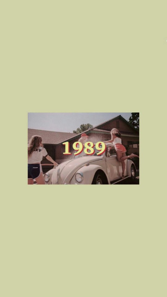

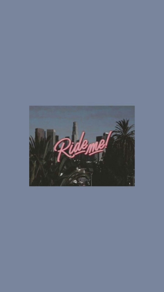


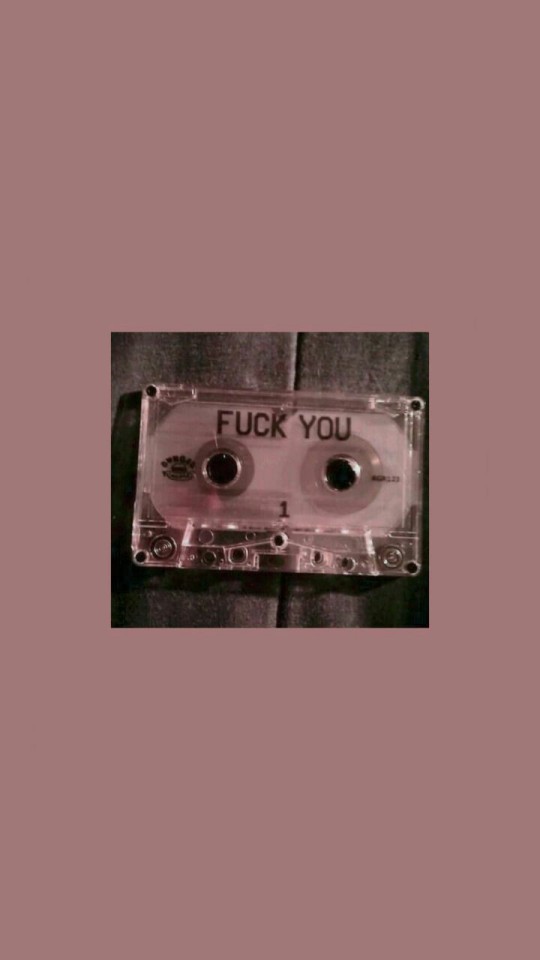

WALLPAPERS VARIADOS | DÊ LIKE!


Okay, that Sadamoto bike racing stuff got me digging back through my Hobby Japan stash and I finally tracked down these old gems that have always mystified me (from issue 259, Dec. 1990). Obviously the theme is some sort of Immortal Grand Prix-style robo-racing competition, but I haven’t been able to find any further information about it. I suspect it started as a modelling contest with something like stylized Diaclone builds, but that’s pure speculation. It says Round 3 in the heading so I’m assuming there were two installments prior to this, but I’m missing those issues, GRAAAHHH!
Post link


Especially at heavyweights the counter spaces in the characters form a visual counterpart to the stems and develop a high contrast appearance. Specific parts are exaggerated and pushed to their limits with their undulating movement, for example, the uppercase B, F, L and lowercase g and y.
Post link
Laif was built as a variable typeface, including 2 axes - a width and weight axe. With 35 cuts, it is our most extended typeface, so far.


Laif was built as a variable typeface, including 2 axes - a width and weight axe. With 35 cuts, it is our most extended typeface, so far.
Referring to its architecture and appearance, Laif is intended as a display font. With its extensive set of glyphs, it is multilingual and contains a large number of accents, punctuation, symbols and special characters.
Post link


Laif was built as a variable typeface, including 2 axes - a width and weight axe. With 35 cuts, it is our most extended typeface, so far.
Post link


Laif was built as a variable typeface, including 2 axes - a width and weight axe. With 35 cuts, it is our most extended typeface, so far. Out now!
Post link