#typefoundry

LIVE
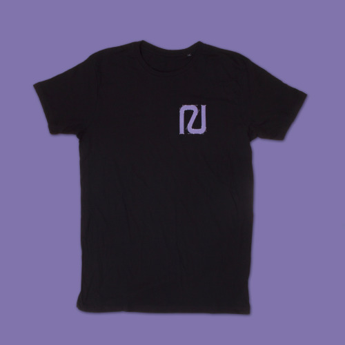
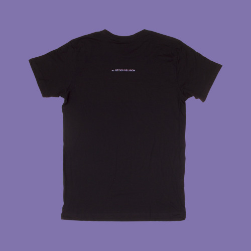
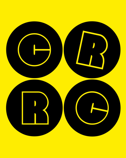
Out now, bézier religion t-shirt.N or L motif on the front (randomly chosen), N-L BÉZIER RELIGION onOut now, bézier religion t-shirt.N or L motif on the front (randomly chosen), N-L BÉZIER RELIGION on

Out now, bézier religion t-shirt.
N or L motif on the front (randomly chosen), N-L BÉZIER RELIGION on the back. Available in our shop.

www.new-letters.de


Post link
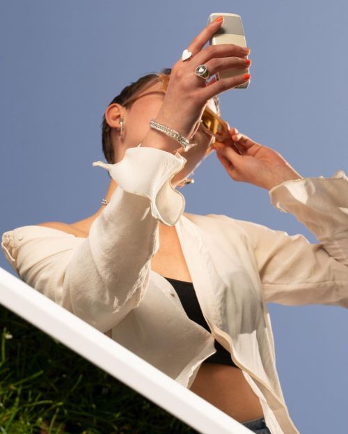
BLING BREAK spring campaign. Art direction and photography Pascal Botlik with Ena Grzywa for Bling KBLING BREAK spring campaign. Art direction and photography Pascal Botlik with Ena Grzywa for Bling KBLING BREAK spring campaign. Art direction and photography Pascal Botlik with Ena Grzywa for Bling KBLING BREAK spring campaign. Art direction and photography Pascal Botlik with Ena Grzywa for Bling K

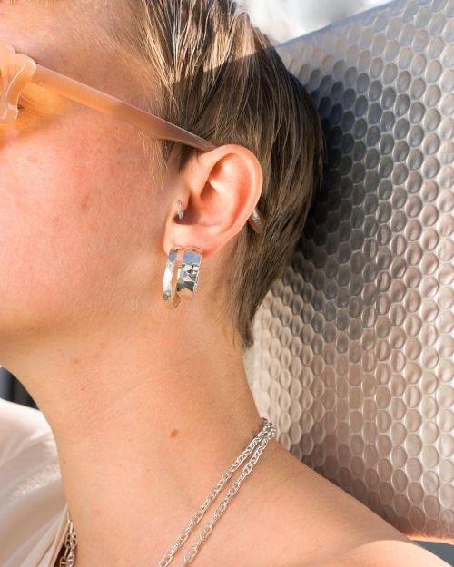
BLING BREAK spring campaign. 
Art direction and photography Pascal Botlik with Ena Grzywa for Bling Konstanz

Model: Paula Jäger
Rasmus typeface in use 

www.new-letters.de


Post link
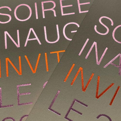
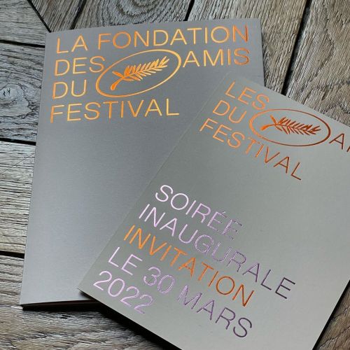
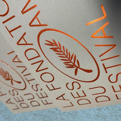
Identity for Cannes Festival 22 by Philippe Savoir, using Anaïs typeface.www.new-letters.deIdentity for Cannes Festival 22 by Philippe Savoir, using Anaïs typeface.www.new-letters.deIdentity for Cannes Festival 22 by Philippe Savoir, using Anaïs typeface.www.new-letters.deIdentity for Cannes Festival 22 by Philippe Savoir, using Anaïs typeface.www.new-letters.de

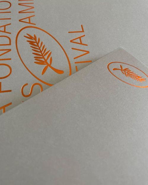
Identity for Cannes Festival 22 by Philippe Savoir, using Anaïs typeface.

www.new-letters.de


Post link
BLING BREAK spring campaign. Art direction and photography by Pascal Botlik with Ena Grzywa for BlinBLING BREAK spring campaign. Art direction and photography by Pascal Botlik with Ena Grzywa for BlinBLING BREAK spring campaign. Art direction and photography by Pascal Botlik with Ena Grzywa for Blin

BLING BREAK spring campaign. 
Art direction and photography by Pascal Botlik with Ena Grzywa for Bling Konstanz
Model: Paula Jäger
Rasmus typeface in use

www.bling-konstanz.de
www.new-letters.de


Post link
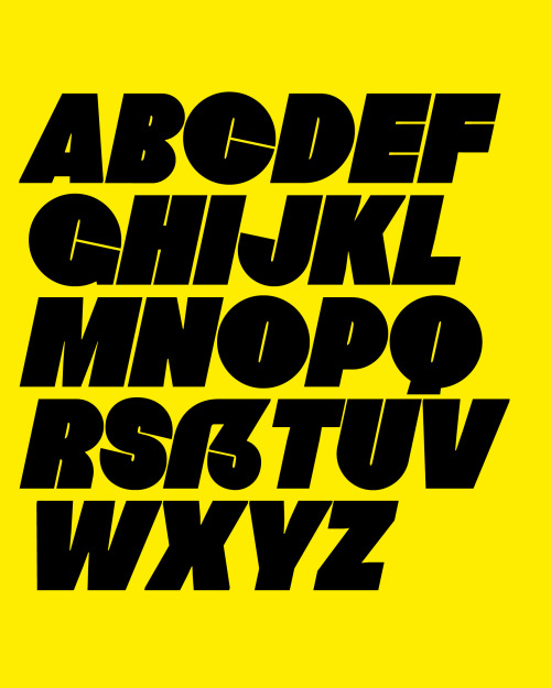
Especially at heavyweights the counter spaces in the characters form a visual counterpart to the steEspecially at heavyweights the counter spaces in the characters form a visual counterpart to the steEspecially at heavyweights the counter spaces in the characters form a visual counterpart to the ste

Especially at heavyweights the counter spaces in the characters form a visual counterpart to the stems and develop a high contrast appearance. Specific parts are exaggerated and pushed to their limits with their undulating movement, for example, the uppercase B, F, L and lowercase g and y.

www.new-letters.de


Post link
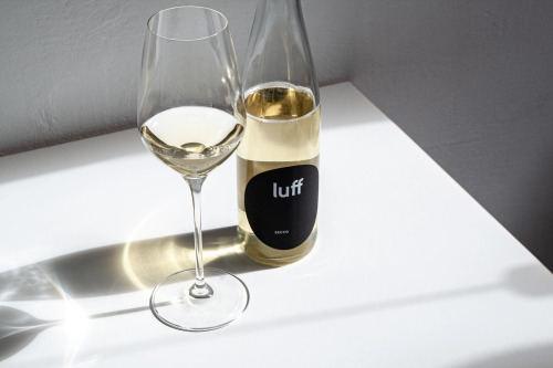
We love the branding of Weingut Luff and that they chose Tilde typeface. Cheers. Design: Almahttp://

We love the branding of Weingut Luff and that they chose Tilde typeface. Cheers. 

Design:Alma
http://luffwein.de


Post link

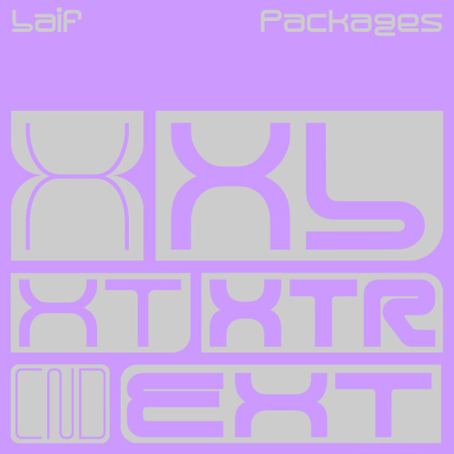
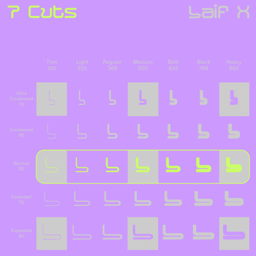
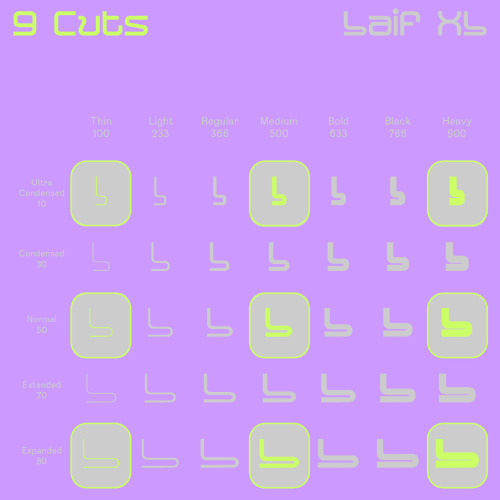
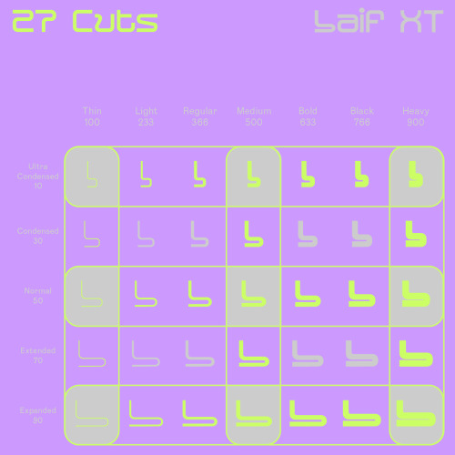
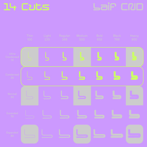
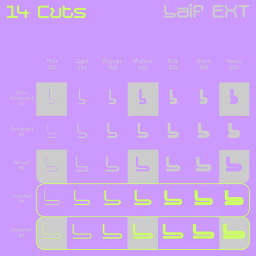
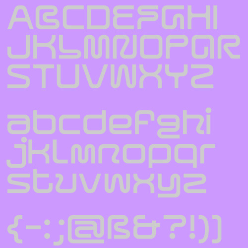
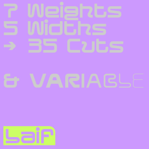
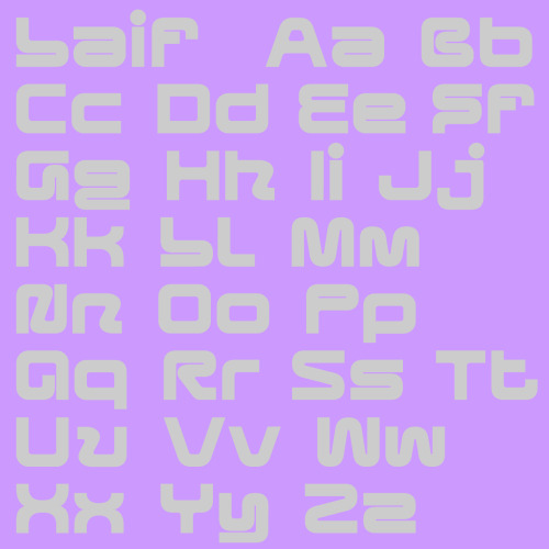
Laif was built as a variable typeface, including 2 axes - a width and weight axe. With 35 cuts, it is our most extended typeface, so far. 

www.new-letters.de

#typeface    #geometric    #modular    #release    #variable    #display    #typography    #typefoundry    #newletters    #tomorrowfeatured    #type01    #lavendrtype    #typedepartment    #typegoodness    #typespire    #designfeed    #thedod    #typetype    #365typefaces    #aigadesign    #eyeondesign    #itsnicethat    #designeverywhere    
Laif was built as a variable typeface, including 2 axes - a width and weight axe. With 35 cuts, it iLaif was built as a variable typeface, including 2 axes - a width and weight axe. With 35 cuts, it iLaif was built as a variable typeface, including 2 axes - a width and weight axe. With 35 cuts, it iLaif was built as a variable typeface, including 2 axes - a width and weight axe. With 35 cuts, it iLaif was built as a variable typeface, including 2 axes - a width and weight axe. With 35 cuts, it iLaif was built as a variable typeface, including 2 axes - a width and weight axe. With 35 cuts, it iLaif was built as a variable typeface, including 2 axes - a width and weight axe. With 35 cuts, it i

Laif was built as a variable typeface, including 2 axes - a width and weight axe. With 35 cuts, it is our most extended typeface, so far. 

Referring to its architecture and appearance, Laif is intended as a display font. With its extensive set of glyphs, it is multilingual and contains a large number of accents, punctuation, symbols and special characters.

www.new-letters.de


Post link
Laif was built as a variable typeface, including 2 axes - a width and weight axe. With 35 cuts, it iLaif was built as a variable typeface, including 2 axes - a width and weight axe. With 35 cuts, it iLaif was built as a variable typeface, including 2 axes - a width and weight axe. With 35 cuts, it i

Laif was built as a variable typeface, including 2 axes - a width and weight axe. With 35 cuts, it is our most extended typeface, so far. Out now!

www.new-letters.de


Post link
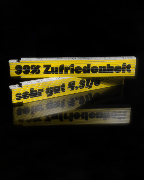
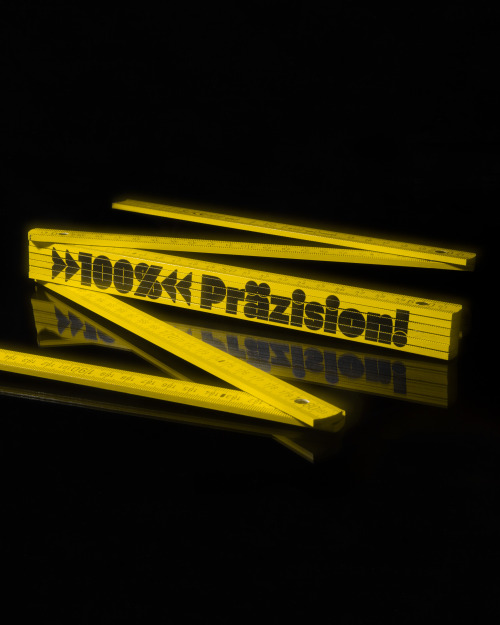
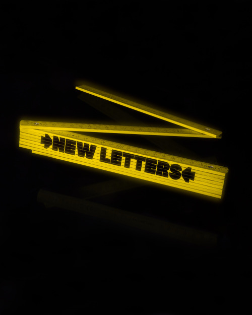
Branded pocket rule - with Hanje typeface print. Available in our shop (Motive: NEW LETTERS - 100% PBranded pocket rule - with Hanje typeface print. Available in our shop (Motive: NEW LETTERS - 100% P

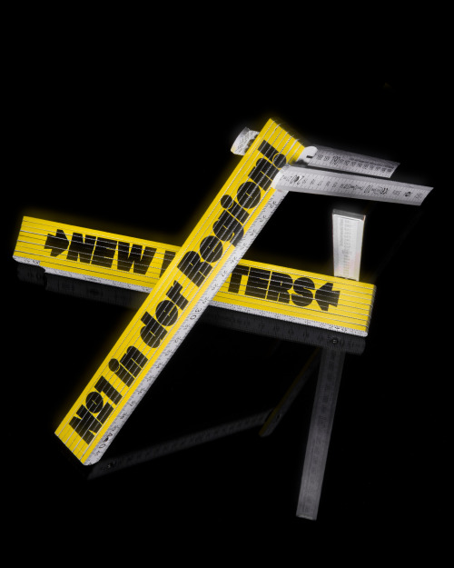
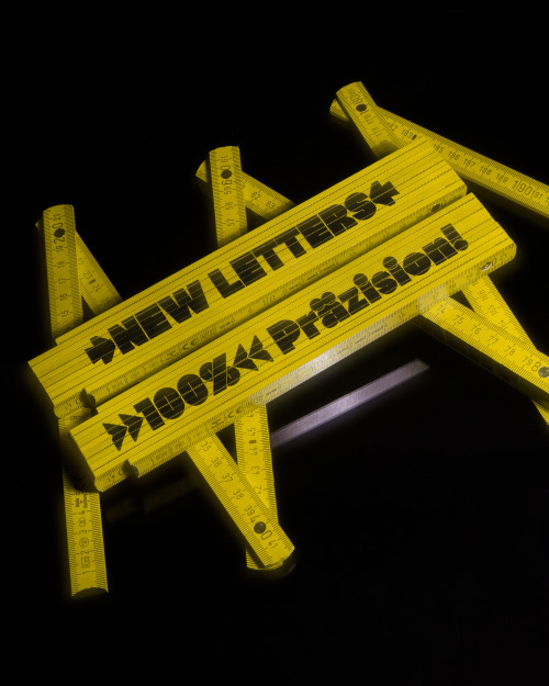
Branded pocket rule - with Hanje typeface print. 
Available in our shop (Motive: NEW LETTERS - 100% Präzision!) 

Length: 200cm
Material: Wood

www.new-letters.de


Post link
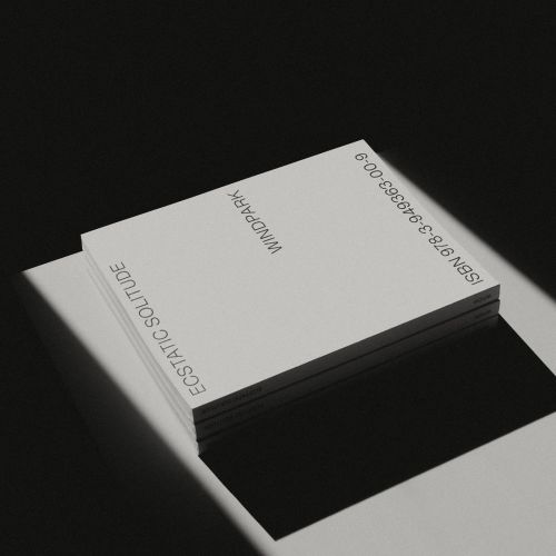
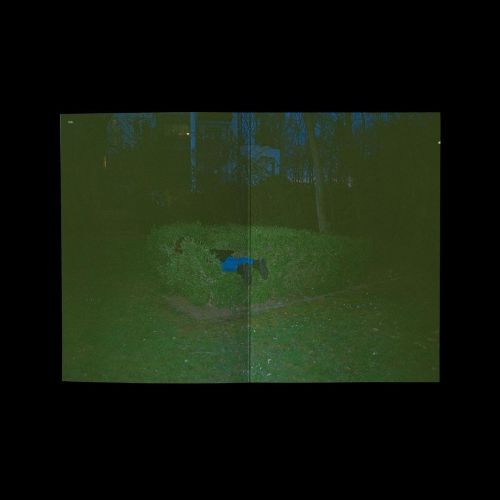
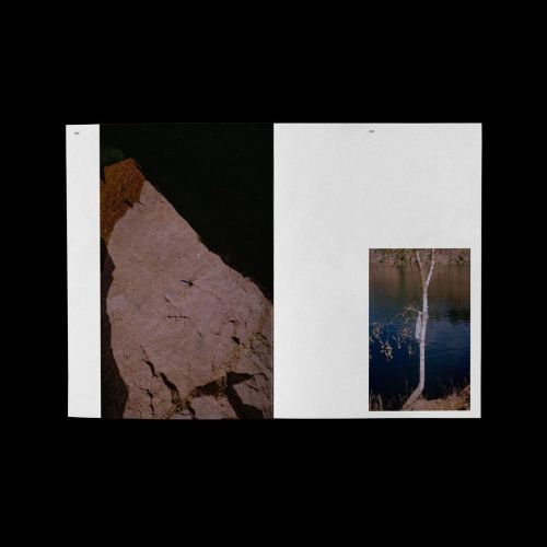
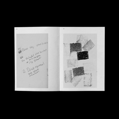
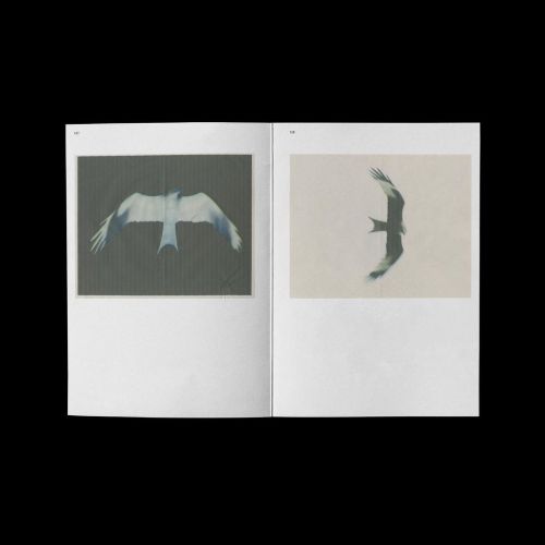
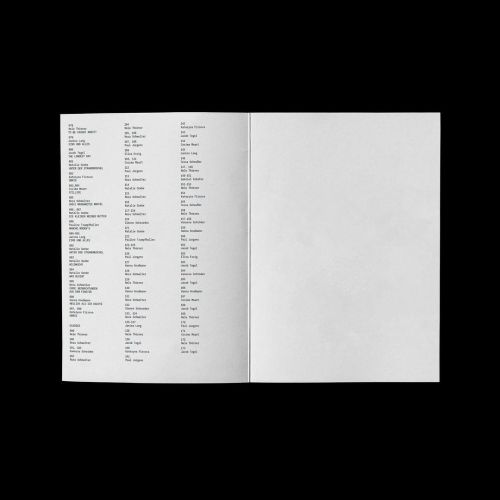
Almost a year ago.. ECSTATIC SOLITUDEPublished by Windpark books limited to 100 240 pages, 23 × 30Almost a year ago.. ECSTATIC SOLITUDEPublished by Windpark books limited to 100 240 pages, 23 × 30Almost a year ago.. ECSTATIC SOLITUDEPublished by Windpark books limited to 100 240 pages, 23 × 30Almost a year ago.. ECSTATIC SOLITUDEPublished by Windpark books limited to 100 240 pages, 23 × 30Almost a year ago.. ECSTATIC SOLITUDEPublished by Windpark books limited to 100 240 pages, 23 × 30Almost a year ago.. ECSTATIC SOLITUDEPublished by Windpark books limited to 100 240 pages, 23 × 30Almost a year ago.. ECSTATIC SOLITUDEPublished by Windpark books limited to 100 240 pages, 23 × 30Almost a year ago.. ECSTATIC SOLITUDEPublished by Windpark books limited to 100 240 pages, 23 × 30

Almost a year ago.. 

ECSTATIC SOLITUDE
Published by Windpark books 

limited to 100
240 pages, 23 × 30 cm
quality printing on a hp indigo
softcover with thread stitching
16 stickers included

w/ Paul Jürgens, Peter Oliver Wolff, Nora Schmelter, Jacob Tegel
: Peter Oliver Wolff
Typeface: Anaïs 

www.new-letters.de


Post link
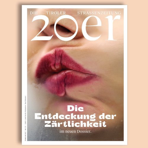
February issue of 20er Zeitung - Die Tiroler Straßenzeitung, design by Super Studio using Kjell type

February issue of 20er Zeitung - Die Tiroler Straßenzeitung, design by Super Studio using Kjell typeface. Cover: Delia Baum. 

www.new-letters.de


Post link
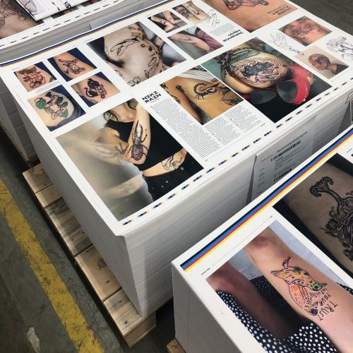
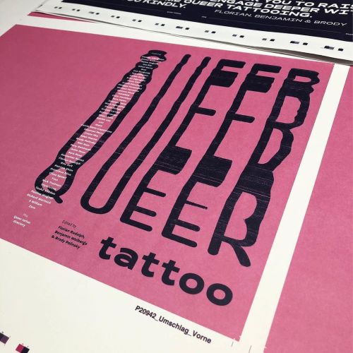
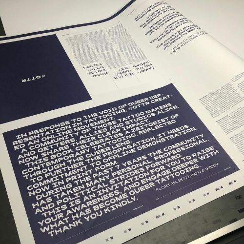
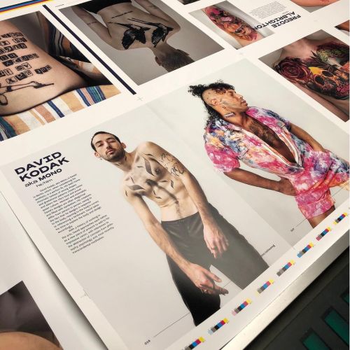
We are looking forward to the new book QUEER TATTOO by Benjamin Wolbergs, Florian Rudolph & BrodWe are looking forward to the new book QUEER TATTOO by Benjamin Wolbergs, Florian Rudolph & BrodWe are looking forward to the new book QUEER TATTOO by Benjamin Wolbergs, Florian Rudolph & BrodWe are looking forward to the new book QUEER TATTOO by Benjamin Wolbergs, Florian Rudolph & Brod

We are looking forward to the new book QUEER TATTOO by Benjamin Wolbergs, Florian Rudolph & Brody Polinsky - published by Verlag Kettler.
Rois typeface in use. 

You can pre-order the book at www.verlag-kettler.de
www.new-letters.de


Post link
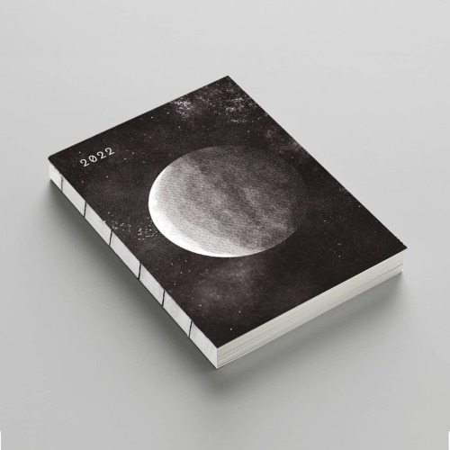
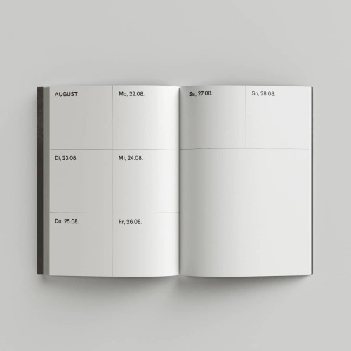
For all adventures to come. Agenda by Anna Bitzer using Mériva typeface.Illustration: Silvan ZurbrigFor all adventures to come. Agenda by Anna Bitzer using Mériva typeface.Illustration: Silvan ZurbrigFor all adventures to come. Agenda by Anna Bitzer using Mériva typeface.Illustration: Silvan Zurbrig

For all adventures to come. Agenda by Anna Bitzer using Mériva typeface.
Illustration: Silvan Zurbriggen 

www.new-letters.de


Post link
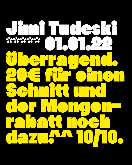
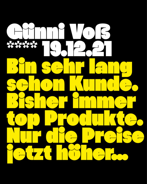
Review Hanje typeface… *****Hanje is an ultra heavy display typeface. Its very dense and massive appReview Hanje typeface… *****Hanje is an ultra heavy display typeface. Its very dense and massive appReview Hanje typeface… *****Hanje is an ultra heavy display typeface. Its very dense and massive appReview Hanje typeface… *****Hanje is an ultra heavy display typeface. Its very dense and massive app

Review Hanje typeface… 
*****
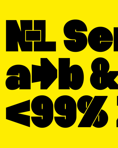
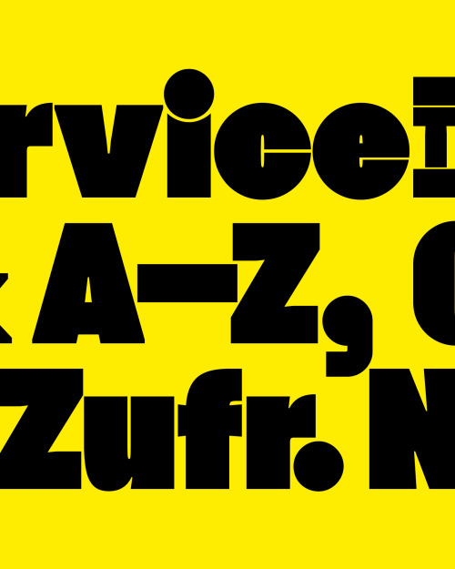
Hanje is an ultra heavy display typeface. Its very dense and massive appearance is contrasted by a geometric construction, making it almost appear warm and modest despite its heavy weight. 

www.new-letters.de


Post link
Bézier Religion T-ShirtUnisex fit100% organic cottonRuns small to size. We recommend to take one sizBézier Religion T-ShirtUnisex fit100% organic cottonRuns small to size. We recommend to take one sizBézier Religion T-ShirtUnisex fit100% organic cottonRuns small to size. We recommend to take one sizBézier Religion T-ShirtUnisex fit100% organic cottonRuns small to size. We recommend to take one siz

Bézier Religion T-Shirt

Unisex fit
100% organic cotton
Runs small to size. We recommend to take one size larger than usual. 

www.new-letters.de


Post link
One main realization during the developing process was the fact that diacritics would often collide One main realization during the developing process was the fact that diacritics would often collide One main realization during the developing process was the fact that diacritics would often collide

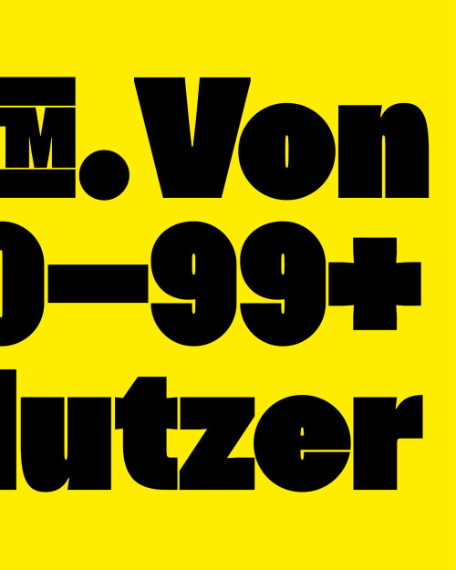
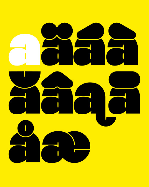
One main realization during the developing process was the fact that diacritics would often collide with the actual letters, leaving an unpleasant overlap.

Hanje solves this issue by scraping out a gap between letter and punctuation, which as a side effect serves as one of the typeface’s distinctive features.

All characters including diacritics are individually and precisely cut out, resulting in a typeface containing over 420 characters. Therefore the typeface is suitable for many languages.

The very dense and massive appearance is contrasted by a geometric construction, making it almost appear warm and modest despite its heavy weight.

www.new-letters.de


Post link
Yellow branded pocket rule - with Hanje typeface print. Available in our shop. Length: 200cmMaterial

Yellow branded pocket rule - with Hanje typeface print. Available in our shop.

Length: 200cm
Material: Wood

www.new-letters.de


Post link
Yellow branded pocket rule - with Hanje typeface print. Available in our shop. Length: 200cmMaterial

Yellow branded pocket rule - with Hanje typeface print. Available in our shop.

Length: 200cm
Material: Wood

www.new-letters.de


Post link
Yellow branded pocket rule - with Hanje typeface print. Available in our shop. Length: 200cmMaterial

Yellow branded pocket rule - with Hanje typeface print. Available in our shop. 

Length: 200cm
Material: Wood

www.new-letters.de


Post link

Stella von Senger now selling limited edition calendars of her poster series she did during the last winter lockdown.

„We all see a sky“ - A0 tear-off calendar of zoomed in phone pics, edition of 50.

Graphic design and production (hand assembled in Berlin with love) by  Jan Motyka using Rois typeface.

50 percent of the profit will be donated to @visionsforchildren

One is 222 euros including taxes and shipping. 

Dm Stella von Senger for purchase. Share the love / it’s Christmas.

www.instagram.com/stella_vonsenger
www.new-letters.de

#stellavonsenger    #calendar    #weallseeasky    #janmotyka    #graphicdesign    #typeface    #newletters    #typography    #typefoundry    #photography    
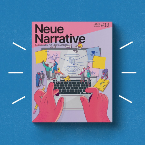
Issue #13 of Neue Narrative magazine is out! We are happy that this time Mériva typeface is in it. C

Issue #13 of Neue Narrative magazine is out!
We are happy that this time Mériva typeface is in it.

Cover-Illustration: Soner Aktas

www.neuenarrative.de
www.new-letters.de


Post link
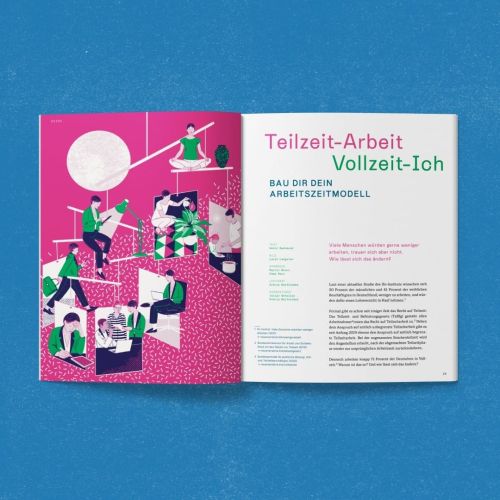
Issue #13 of Neue Narrative magazine is out! We are happy that this time Mériva typeface is in it. w

Issue #13 of Neue Narrative magazine is out! 
We are happy that this time Mériva typeface is in it. 

www.neuenarrative.de
www.new-letters.de


Post link
One of Hanje’s distinctive features is its massive diacritics. Instead of just sitting on top of theOne of Hanje’s distinctive features is its massive diacritics. Instead of just sitting on top of the

One of Hanje’s distinctive features is its massive diacritics. Instead of just sitting on top of the letters, a gap between letter and diacritic is manually carved out. The fact that the diacritics don’t sit on top, a small line height is possible without letters colliding. This helps the typeface remain its dense and heavy construction as well as tight letter spacing.

While in some typefaces diacritics appear as more of an indulgence, they are where Hanje’s strength and part of its personality lie. Therefore the typeface is very strong in languages where many diacritics occur.

www.new-letters.de


Post link

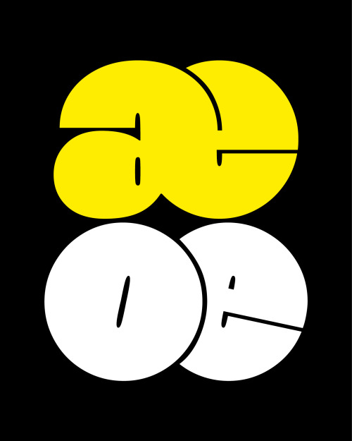
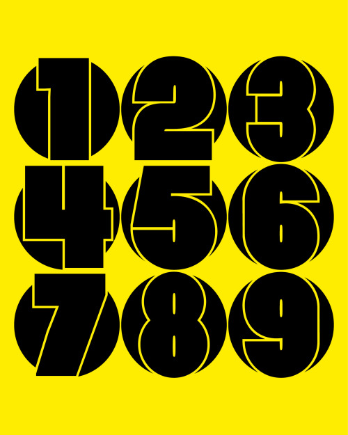
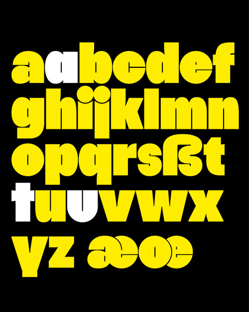
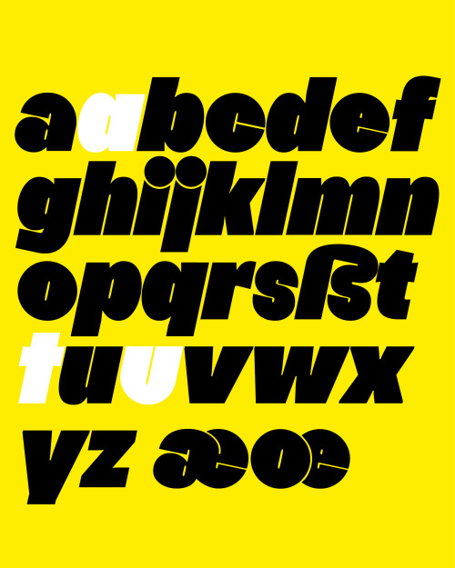
Hanje’s strengths emerge in larger sizes above at least 50 pt. The very dense and massive appearance is contrasted by a geometric construction, making it almost appear warm and modest despite its heavy weight.

The principle of geometry and its extreme heaviness is especially evident in the typeface’s round letters. Letters such as »e« are perfectly circular with a counter so narrow that under some circumstances it can almost appear to be a straight line.

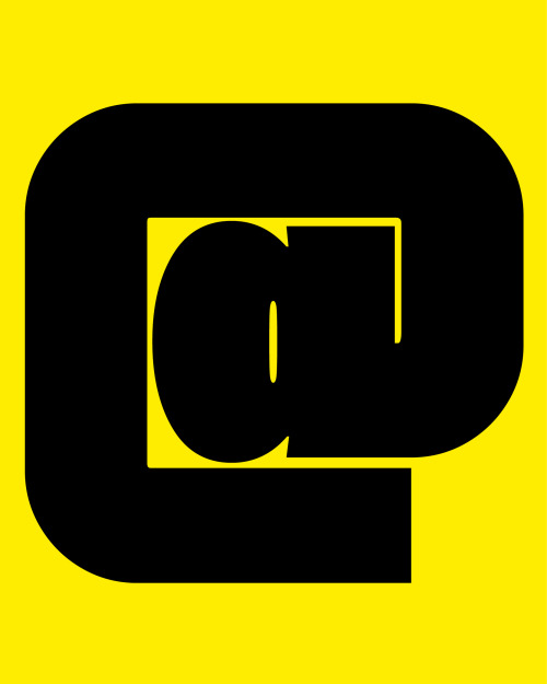
Stylistic alternatives such as »u«, »t« and a single storey »a« accentuate and strengthen the typefaces geometry and relation to geometric sans serifs.

www.new-letters.de

#typeface    #release    #ultraheavy    #thomasjohn    #typography    #typefoundry    #newletters    #tomorrowfeatured    #type01    #lavendrtype    #typedepartment    #typegoodness    #typespire    #designfeed    #thedod    #typetype    #365typefaces    #aigadesign    #eyeondesign    #itsnicethat    #designeverywhere    
Hanje’s strengths emerge in larger sizes above at least 50 pt. The very dense and massive appearanceHanje’s strengths emerge in larger sizes above at least 50 pt. The very dense and massive appearanceHanje’s strengths emerge in larger sizes above at least 50 pt. The very dense and massive appearanceHanje’s strengths emerge in larger sizes above at least 50 pt. The very dense and massive appearance

Hanje’s strengths emerge in larger sizes above at least 50 pt. The very dense and massive appearance is contrasted by a geometric construction, making it almost appear warm and modest despite its heavy weight. 

The principle of geometry and its extreme heaviness is especially evident in the typeface’s round letters. Letters such as »e« are perfectly circular with a counter so narrow that under some circumstances it can almost appear to be a straight line.

Stylistic alternatives such as »u«, »t« and a single storey »a« accentuate and strengthen the typefaces geometry and relation to geometric sans serifs.

www.new-letters.de


Post link
Hanje started as an experiment which explored the questions whether a typeface could have a maximum Hanje started as an experiment which explored the questions whether a typeface could have a maximum Hanje started as an experiment which explored the questions whether a typeface could have a maximum Hanje started as an experiment which explored the questions whether a typeface could have a maximum

Hanje started as an experiment which explored the questions whether a typeface could have a maximum weight and what limitations this extreme condition would entail. The outcome are two styles, Ultra Heavy and its corresponding italics.

www.new-letters.de


Post link
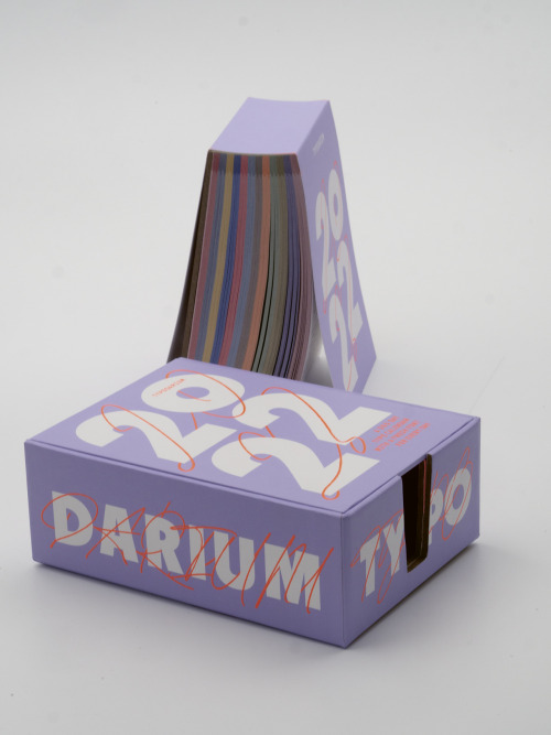
The new Typodarium 2022 is out, thank you Slanted. We are looking forward to November and Kjells day

The new Typodarium 2022 is out, thank you Slanted. 
We are looking forward to November and Kjells day.

www.slanted.de/product/typodarium-2022/
www.new-letters.de


Post link
loading