#yourbaroness

@yourbaroness and @revolvermagazine are extremely excited to announce “FULL SPECTRUM - The Art of Gold & Grey,” an album-release-night exhibition of original Baroness artwork, created by John Dyer Baizley & Marald van Haasteren at Revolver Gallery, 67 West Street, Unit 107, Brooklyn, NY immediately following the bands performance at Rough Trade. All Baroness album covers will be on display, accompanied by over 30 original drawings from Marald van Haasteren, the band’s long-time friend and frequent collaborator, who has travelled from his home in the Netherlands to join the event. Both artists will have original artwork on display and for sale, as well as prints, LPs, and other special items. The event is open to the public, and there’s no admission fee. We hope to see you all there; this will be unique one-night-only event


Tour admat for Baroness for their North American co-headline tour with Deafheaven, with Zeal & Ardor joining them, in March/April 2019.
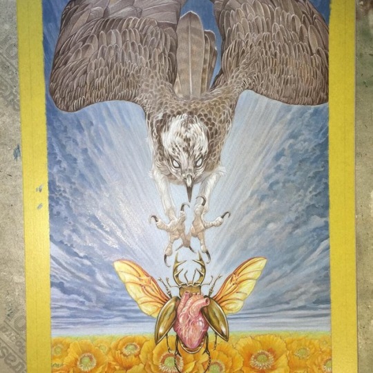
Always a pleasure & honor to work with John, although this one was produced under a bit of time pressure, even more than usual with an aperfectmonster collab ( I’m not complaining, mind you.) because of that, I didn’t take my usual time to sort out models, etc but straight away went to my archive of photos: the osprey is based on a great shot by @joinus12345 & the heart/beetle is based on an earlier design of mine (go down my feed to find that one.) That being said, limited time can sometimes lead to good things: it forces me to make bolder decisions, “downside” might be that I had to do a bit more digital work. I made this in 5 days from scratch. Swipe to see the art in different stages. Layout by John Dyer Baizly.
Thank you again John for your trust!
❤️

Never posted the full image of this one. This was the second piece I made of the series of 15 for the Purple album of Baroness. I provided John with a deluge of pieces to pick from & this one didn’t make the cut. The alligator skull was used again in what would become the centerpiece of the series: Desperation Burns. Here’s a sort explanation about some of the components: I used the alligator as a metaphor for the accident, the primal nightmare from the deep.
To stay within the element of water I opted for the lotus flower as the counterpart: the lotus symbol of enlightenment, transformation, also coming from the deep, murky water. The lotus pad was placed like a shield, trying to protect but also conceal, hide.
The shells represents homes, shelter & the female sex.
Post link