#supracolor


Another poster that made its debut at @fullbleedexhibition :
High On Fire- “Drowning Dog”.
18x24”
9(?) color screenprint on French whitewash paper
Edition of 50 Artist Proofs
Printed by Ben LaFond
This is 1 of 2 posters I made for @highonfireband US-tour, that unfortunately had to be canceled twice due to Matt’s medical problems.
Hope that Grammy they’ve won has some healing power & HOF will be back killing it at every show around the globe.
This poster was based on the song Drowning Dog:
THE WORSHIP OF INFERAE TOMBS
A COMMUNION OF SYCOPHANTS
HOW LONG IS THE LINE TO OUR DOOM
DECEIVERS AND LYING CHANTS
CHORUS;
AND GOD DAMN YOU
YOU’RE THE SHADOWS OF MAN
AND GOD DAMN YOU
FOR IT’S KILL OR BE KILLED IN THE END
THE NUMBERS CROSSED LINES IN THE SAND
THE POOLS OF HUMAN RATS
THEIR TAILS ARE TWISTED AND TIED
EAT OF THY POISON DIVINE
CHORUS;
THE TORTURER SLOWLY BROUGHT DOOM
IRREVERANT THE INGRATE LAUGHED
MENDACIOUS AND FULL OF BLACK RANTS
DARK GRINS AND KNIVES IN BACKS
CHORUS;
END CHORUS;
TAKE WHAT IS GIVEN TO YOU—DEATH SURROUNDS YOU
STUCK LOW WITH SOULS FOR THE MOON-DEATH SURROUNDS YOU
BLACK GARBS THE HOSTING OF TWO—DEATH SURROUNDS YOU!
Having recently lost my own dog, I wanted to somehow work that wound in the art. Initially i wanted to stay away from a literal approach & asked Des if there was a deeper meaning behind the lyrics. This was his response:
“Drowning dog was actually one of my stories. An old roommate of mine had a friend who had a dog. The dog bit someone and he knew it had to be put down. So instead of taking it to the vet and having them give it a shot he decided to take the dog to the beach, walk out into the water and drown the dog. He felt the dogs life should be taken by his own hands. Pretty trippy huh? He said he wrapped his arm around the dogs neck and submerged his head watching him squirm. Once he stopped squirming he looked him in the eyes and waited for his soul to leave his body”
So that threw all my plans of using metaphors right out of the window & I just went for a full on literal approach.


And another poster that made its debut at @fullbleedexhibition :
High on Fire
12x27”
5(?) color screen print on French Black Licorice paper
50 AP’s
Screen printed by Ben LaFond.
Before High On Fire show at the Patronaat in Haarlem during their 20 sunless years tour, the band & I were brainstorming about posters. I showed them the WOLFBRIGADE poster I did for Roadburn 2018 to display what Burlesque of North America is capable of. The band freaked out & made it clear that they would love to use the exact design. I became excited about this idea & proposed to mirror the image and redraw the whole design to give it just that bit of difference. We both agreed to talk to the Wolfbrigade guys first & see if they were into this. At first WB was not into it but when I said I would change the wolf into a hyena (an animal Des & me both love), they gave the green light. So here it is: 2 of my favorite bands, facing each other & making what was already a bold design, that much stronger.
The art is a nod to the legendary band Discharge, who’s “Never Again” 12” depicted a photo by John Heartfield showing a dove impaled on a bayonet (photo entitled: “The Meaning of Geneva, Where Capital Lives, There Can Be No Peace”.)
When I finished the art I realized it also could be seen as a nod to the now famous Metallica shirt design “ Metal up your arse”

“Amanita”, color pencil & acrylics on matting board, 29-03-2019.

“Marrow-3”, color pencil & acrylics on matting board, 27-03-2019.
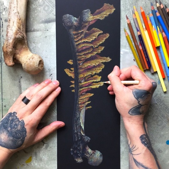
Second piece of “Marrow”, the name I gave to the bone/fungus series, in progress. More pieces to come!

Work in progress: one of a series revolving around bones/fungus. At this stage I’m pushing in the colors & fighting the black, where the highlights & color saturation has to be emphasized.

“Unfolding” - color pencils & acrylics on matting board, 18-03-2019

Small study of one of the gnarliest human skulls I have in my collection. I struggled with this one, got lost in the details & was on the brink of overworking it & eventual tearing it up & throwing it in the bin. Right now I think I somehow balanced it out & start to like it but am still not 100% convinced.
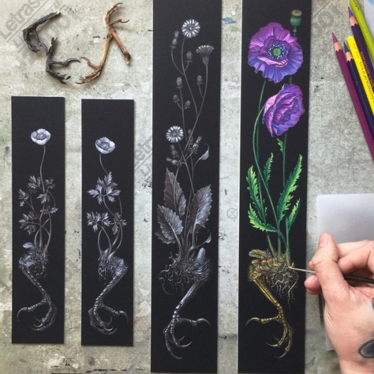
“Clawing Earth” part 1-4, color pencil & acrylic on matting board. All part of a langer series entitled “Fleeting Earth”. Expect to see more pieces in the near future, my mind is still racing about all the possibilities. Enjoy!

“Clawing Earth” part 3, color pencil & acrylic on matting board 10-02-2019 & part 4 in a very early stage. Part 4 will be a return to full color, can’t wait to make those colors pop.
On the left you see the first composition sketch & transfer.

“Clawing Earth” color pencil & acrylic on matting board in progress. 2 new pieces of the “Fleeting Earth” series, inspired by my last homage to Albrecht Dürer. More pieces to come!

“Fleeting Earth” color pencil & acrylic on matting board 05-02-2019. The start of a new series, inspired by my last homage to Albrecht Dürer. I’m really fired up about this new series: my mind is racing about all the possibilities, so expect to see a lot more pieces, both in full color & tonal like this one.


“Hommage à Albrecht Dürer” Part 2, white color pencil on matting board. Again combining 2 of my favorite pieces from AD: “Wing of a European Roller” & “The Great Piece of Turf”. I’m really pleased with the flow of the composition & hesitated a moment to add color to it but decided to stick with the initial plan of full color & do another variant in black & white. Model of the European Roller provided by the talented @daniellefrenken_taxidermy_art, making the execution of this idea, that much easier.


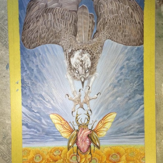


Tour admat for Baroness for their North American co-headline tour with Deafheaven, with Zeal & Ardor joining them, in March/April 2019.
Always a pleasure & honor to work with John, although this one was produced under a bit of time pressure, even more than usual with an aperfectmonster collab ( I’m not complaining, mind you.) because of that, I didn’t take my usual time to sort out models, etc but straight away went to my archive of photos: the osprey is based on a great shot by @joinus12345 & the heart/beetle is based on an earlier design of mine (go down my feed to find that one.) That being said, limited time can sometimes lead to good things: it forces me to make bolder decisions, “downside” might be that I had to do a bit more digital work. I made this in 5 days from scratch. Swipe to see the art in different stages. Layout by John Dyer Baizly.
Thank you again John for your trust!
❤️

Almost done with the digital phase of this piece. Only some smaller pieces left to do for this ambitious project & then it’s a wrap. I can’t wait to reveal the whole thing but I guess we all have to patient.

Nearing the end of the color pencil stage of this ambitious project, consisting of multiple pieces interacting with each other. Next up boosting certain areas with acrylics: deepen colors, shadows & accenting the highlights. After that scanning & digital touch ups.

Detail of the finished first layer of what is going to be a full color piece of an ambitious project involving multiple pieces interacting with each other. This stage is done in personal favorite pencils, brown/yellow ochres @fabercastellglobal & white @caran_dache. This provides a solid base, that keeps the whole piece from falling apart when I go wild with colors.

“Analog” stage of the poster/shirt design I made for Pertubator for their Euro tour this past March.
I’m still trying to catch up with posts over here, a lot of work to show, so enjoy!

Haven’t posted here in awhile, somehow slipped through the cracks. I will try to make up for that & post all the art I made since, starting with this commission for Michael Faith: “Grammia Miniacea”.

Progress of the Thomas Hooper collaboration piece: the color pencil stage is almost finished. It’s time to put in the darkest shadows & the highlights & then boost certain areas with acrylics. I will scan in the result of my part of the collab, so I can let Thomas start burying my work with my mind at ease, ha!
Stoked about this first piece of what hopefully will turn into a continuous project.

Available NOW: my new screenprint “March To The Sea”. A part of this was used for the poster of last Euro tour of Baroness, now available in full through the wonderful people of Burlesque of North America
MAIN EDITION:
18 x 24"
10 color screenprint on French Whitewash paper
signed, numbered, and embossed edition of 65 prints
$65 + shipping
VARIANT EDITION I:
18 x 24"
10 color screenprint on French Starch Rain paper
signed, numbered, and embossed edition of 26 prints
$75 + shipping
VARIANT EDITION II:
18 x 24"
11 color screenprint on French Brown Wrap Kraft Paper
signed, numbered, and embossed edition of 16 prints
$75 + shipping
Screenprinted by Ben LaFond

“Flycatchers” are finished, I will bring these among other OG’s with me to the art show @theconventphilly on August the 24th: epic event with long time friends John Dyer Baizley & Jeremy Hush & Burlesque of North America (more news on this coming soon!)
Post link

Rounding this one up: had to balance things out & do some personal work, before diving into more “Metal”-projects. No title yet, feel free to put your 2 cents in, thanks!
Post link


Lucifuge album cover art & shirt design. Such a blast to maker huis for my old punk buddy Juanmi, thanks again for all the trust & artistic freedom!
Post link

Finishing the shirt design for Mortuous. This was based on Clint’s ideas:
Chrysalis of Sorrow Concept:
A person cocooned (the Chrysalis of Sorrow) in their own misery & suffering, isolated from the world around them and surrounded by ghosts & memories.
I’d like the cocoon symbolize the protective nature of the mind - to secure itself from reality. In this case as a metamorphisis into the spirit of oneself transcending into a realm beyond.
I’m imagining to connect the artwork to the LP artwork, the Crysalis can be hanging off of a branch, or even shrouded by the branches similar to the kind of tree drawn on the album.
Darker colors come to mind, like purple/blues, greens, browns, etc.,
Lyrical focus on the concept:
Slipping through anguish,
Pain, and defeat,
Sorrow of loss,
Control out of reach,
Misery consuming,
No signs of relief
Behold the depression, swallowed in grief
I basically stayed with the concept but had to ditch the “surrounded by ghosts & memories” part, I added the geometric maze from the album cover in the background; a structured, constructed labyrinth, forces you to follow a path to no where, e.g. society.
The color scheme is based on these lyrics: “orange is for anguish, blue for insanity”.
I planned to use that color scheme for the album cover but had to forfeit that plan, when the art made different demands: look down my feed for the album cover in different stages/colors. I’m glad I finally got to pull of these colors in a convincing way. Make sure you check out @mortuous : record release show tomorrow, preorder up on Carbonized Records Tankcrimes Dawnbreed records & catch them live on their August West Coast tour!
Post link


Proud to reveal the art I did for REVOLVER Magazine: the new issue revolves around Ghost and their new album Prequelle, with 5(!) different covers, my version exclusively available in the box set, that collects the all. On newsstand June 19, for a look inside the magazine: link in the bio of @revolvermag. Thank you so much @jimmyhubbard @revolvermag for this opportunity & all the artistic freedom, trust; I think it has paid off!
Post link

Finishing the “handwork” stage of the cover art for Lucifuge debut album. Glad to work with my old punk buddy Juanmi on a project again, up the metalpunx!
Post link


2 other small pieces that I recently finished. I love the beauty, fragility & frozen tragedy of dead birds, with these composition I wanted to give them the “crammed” feel of Holbein’s painting of the dead body of Christ. “Robin” & “Bluethroat” 9,4 x 21cm. They could be displayed as a diptych (pretty much every variant: lying, standing, etc works) but can also be displayed solitary.
Post link