#carandache


SO LIKE this is probably my favorite illustration from all semester but i needed to figure out a way to crop this that didn’t just toss tiddy at everyone who saw this. i don’t know if it worked. but here is ‘truth coming out of her well to shame ableists,’ a spoof of Jean-Leon Gerome’s La Verite. #truthcomingoutofherwelltoshamemankind #jeanleongerome #carandache #photoshop #digitalart
https://www.instagram.com/p/CPHp7FsjYI6/?utm_medium=tumblr
Post link

working on a revamp of my #girlwithapearlcochlear, she’s looking pretty snazzy if i do say so myself #girlwithapearlearring #vermeer #disabledbodiesarebeautiful #disabledbodiesareart #disabledartist #carandache #neocolor2
https://www.instagram.com/p/CM4-VtRDGLU/?igshid=1e7cztni5c59m
Post link

“I love drawing food! The challenge is fun!”
I’m an idiot. Work in progress of French Hot Mess II.
.
.
.
#art #wip #workinprogress #monicarennart #littlebluerenn #frenchhotmess #prismacolor #watercolour #winsorandnewton #food #carandache #arches #eckersleysmacarthur #eckersleys #imadeathing
Post link
The first thing that I want to make clear is that I’m still using a lot of the equipment that is listed on my website for my various projects. It’s just that my approach to writing and drawing utensils changed a lot during the past few months and I wanted to talk a bit about my current choices and reasons behind them.
As you know I have been in Japan almost 10 years already and because I’m a huge fan of art supplies it was almost impossible for me not to buy a lot of different stuff just to try them out. Some of these I used a lot (like my watercolors, pencils, brush pens or fineliners) but a lot of my purchases just ended up in my “art stuff” drawers.
Recently I discovered that some of the mechanical pencils and pens that I used during my university time and later swapped for different models were no longer usable. The plastic was discolored, rubber parts turned to a sticky mush and the ink dried-up. I started systematically clearing up my art supplies getting rid of all the things that just got old or that I know I’m not going to use. It pains me every time I have to throw things away but I knew that it’s my fault they ended up in those drawers in the first place.
I decided to change my ways.
When buying art supplies I was more concerned with the new functionality than anything else but now I decided to put more question on my “do I really need this” list, like:
- Is this pen or pencil re-usable? Can I replace the ink or cartridge so I can use it again and again?
- Is it long lasting? Will some parts just deteriorate over time?
- Can it be repaired if I break it?
- If I need to throw it out can it be recycled?
According to these rules, I changed my “everyday” set of tools I almost always have with me, even if I’m not planning to draw anything:

1: For writing: LAMY AL-star with EF nib.
- It’s almost all made of aluminum so is really hardwearing but light and easy to write with.
- I’m using a converter so I don’t have to throw away plastic cartridges and can use any fountain pen ink I want.
- The nib is really easy to buy and replace so I can fix the pen instead of buying a new one (I already had to do it once after I dropped it accidentally)
- Comes with 2-year maker warranty. You can also buy spare parts if needed.
- One downside: there are some plastic parts, unfortunately.
This is a fountain pen I already had - Kana bought it for me some time ago - it even has my name on it. With this fountain pen, I signed a lot of “Tokyo Storefronts” books already and use it often for writing my memos and journal entries when I’m outside. It’s also good for some sketching on good, smooth paper.

2: For writing on stuff: Kaweco Special Ballpoint pen, black
- As far as I can tell entirely made of metal - durable and recyclable.
- Can use any ISO standard, Parker G2 type of cartridge which is produced by many makers in various colors and ink types. This should allow me to use the pen without relying on the whims of one company.
- With a good cartridge, it’s easy to use and doesn’t require so much pressure to write like some ballpoint pens.
- Comes with a maker warranty.
I have this in my “basic set” to write the things which are hard to do with a fountain pen: a quick sign, address on an envelope, some fast notes. I was surprised that I actually like to write with it (I dislike ballpoint pens in general) the cartridge I bought for it in Itoya is excellent!

3: For sketching: Caran d’Ache 844 mechanical pencil0.7mm
- The body of this pencil is made of light aluminum and other components are also made of metal.
- It uses the standard 0.7mm pencil leads that are made by many companies making it easy to refill. I’m currently using softer, 2B leads made by Mitsubishi.
- It’s light and easy to use.
- Comes with maker warranty.
I use this pencil for sketching my ideas when I’m outside but because it’s so nice to use I’m drawing with it at my desk a lot too! It’s light and not to thick. It does not have a fancy rubber grip but that’s all right, the mat paint finish is just great. I have a simple eraser in my pen case to accompany it.
These three writing and drawing instruments are currently in my pen case. I might insert a wooden pencil there if I know I’ll be doing a more serious drawing, but that’s mostly it. I hope these three will work for me for a long time!

Burning blue ⛓ #drawing #art #freehand #traditionalart #watercolor #carandache #witch #darkart #pentelbrushpen #ink #blue #indigo #markmaking #mentalhealth #stake #magdalenaszymaniec #magdalenadraws #eyes #artistsoninstagram
https://www.instagram.com/p/CTUxKcfj3lX/?utm_medium=tumblr
Post link

")
")


Another poster that made its debut at @fullbleedexhibition :
High On Fire- “Drowning Dog”.
18x24”
9(?) color screenprint on French whitewash paper
Edition of 50 Artist Proofs
Printed by Ben LaFond
This is 1 of 2 posters I made for @highonfireband US-tour, that unfortunately had to be canceled twice due to Matt’s medical problems.
Hope that Grammy they’ve won has some healing power & HOF will be back killing it at every show around the globe.
This poster was based on the song Drowning Dog:
THE WORSHIP OF INFERAE TOMBS
A COMMUNION OF SYCOPHANTS
HOW LONG IS THE LINE TO OUR DOOM
DECEIVERS AND LYING CHANTS
CHORUS;
AND GOD DAMN YOU
YOU’RE THE SHADOWS OF MAN
AND GOD DAMN YOU
FOR IT’S KILL OR BE KILLED IN THE END
THE NUMBERS CROSSED LINES IN THE SAND
THE POOLS OF HUMAN RATS
THEIR TAILS ARE TWISTED AND TIED
EAT OF THY POISON DIVINE
CHORUS;
THE TORTURER SLOWLY BROUGHT DOOM
IRREVERANT THE INGRATE LAUGHED
MENDACIOUS AND FULL OF BLACK RANTS
DARK GRINS AND KNIVES IN BACKS
CHORUS;
END CHORUS;
TAKE WHAT IS GIVEN TO YOU—DEATH SURROUNDS YOU
STUCK LOW WITH SOULS FOR THE MOON-DEATH SURROUNDS YOU
BLACK GARBS THE HOSTING OF TWO—DEATH SURROUNDS YOU!
Having recently lost my own dog, I wanted to somehow work that wound in the art. Initially i wanted to stay away from a literal approach & asked Des if there was a deeper meaning behind the lyrics. This was his response:
“Drowning dog was actually one of my stories. An old roommate of mine had a friend who had a dog. The dog bit someone and he knew it had to be put down. So instead of taking it to the vet and having them give it a shot he decided to take the dog to the beach, walk out into the water and drown the dog. He felt the dogs life should be taken by his own hands. Pretty trippy huh? He said he wrapped his arm around the dogs neck and submerged his head watching him squirm. Once he stopped squirming he looked him in the eyes and waited for his soul to leave his body”
So that threw all my plans of using metaphors right out of the window & I just went for a full on literal approach.


And another poster that made its debut at @fullbleedexhibition :
High on Fire
12x27”
5(?) color screen print on French Black Licorice paper
50 AP’s
Screen printed by Ben LaFond.
Before High On Fire show at the Patronaat in Haarlem during their 20 sunless years tour, the band & I were brainstorming about posters. I showed them the WOLFBRIGADE poster I did for Roadburn 2018 to display what Burlesque of North America is capable of. The band freaked out & made it clear that they would love to use the exact design. I became excited about this idea & proposed to mirror the image and redraw the whole design to give it just that bit of difference. We both agreed to talk to the Wolfbrigade guys first & see if they were into this. At first WB was not into it but when I said I would change the wolf into a hyena (an animal Des & me both love), they gave the green light. So here it is: 2 of my favorite bands, facing each other & making what was already a bold design, that much stronger.
The art is a nod to the legendary band Discharge, who’s “Never Again” 12” depicted a photo by John Heartfield showing a dove impaled on a bayonet (photo entitled: “The Meaning of Geneva, Where Capital Lives, There Can Be No Peace”.)
When I finished the art I realized it also could be seen as a nod to the now famous Metallica shirt design “ Metal up your arse”

“Amanita”, color pencil & acrylics on matting board, 29-03-2019.

“Marrow-3”, color pencil & acrylics on matting board, 27-03-2019.
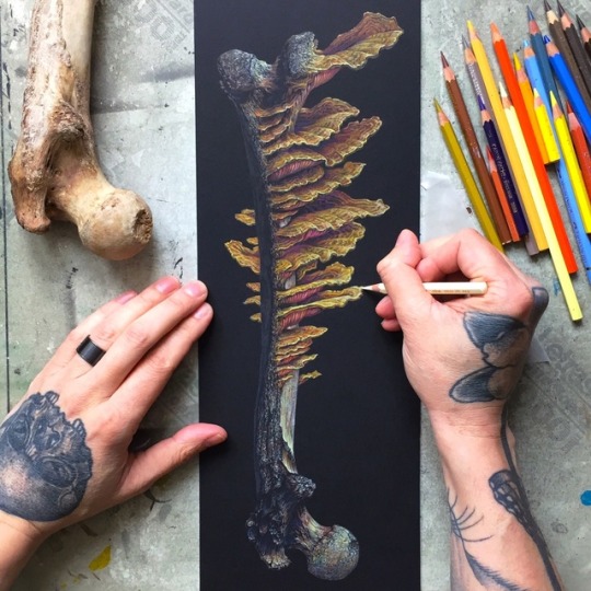
Second piece of “Marrow”, the name I gave to the bone/fungus series, in progress. More pieces to come!

Work in progress: one of a series revolving around bones/fungus. At this stage I’m pushing in the colors & fighting the black, where the highlights & color saturation has to be emphasized.

“Unfolding” - color pencils & acrylics on matting board, 18-03-2019

Small study of one of the gnarliest human skulls I have in my collection. I struggled with this one, got lost in the details & was on the brink of overworking it & eventual tearing it up & throwing it in the bin. Right now I think I somehow balanced it out & start to like it but am still not 100% convinced.
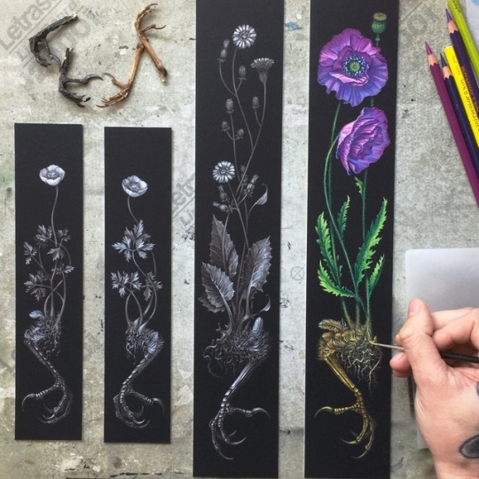
“Clawing Earth” part 1-4, color pencil & acrylic on matting board. All part of a langer series entitled “Fleeting Earth”. Expect to see more pieces in the near future, my mind is still racing about all the possibilities. Enjoy!

“Clawing Earth” part 3, color pencil & acrylic on matting board 10-02-2019 & part 4 in a very early stage. Part 4 will be a return to full color, can’t wait to make those colors pop.
On the left you see the first composition sketch & transfer.

“Clawing Earth” color pencil & acrylic on matting board in progress. 2 new pieces of the “Fleeting Earth” series, inspired by my last homage to Albrecht Dürer. More pieces to come!

“Fleeting Earth” color pencil & acrylic on matting board 05-02-2019. The start of a new series, inspired by my last homage to Albrecht Dürer. I’m really fired up about this new series: my mind is racing about all the possibilities, so expect to see a lot more pieces, both in full color & tonal like this one.


“Hommage à Albrecht Dürer” Part 2, white color pencil on matting board. Again combining 2 of my favorite pieces from AD: “Wing of a European Roller” & “The Great Piece of Turf”. I’m really pleased with the flow of the composition & hesitated a moment to add color to it but decided to stick with the initial plan of full color & do another variant in black & white. Model of the European Roller provided by the talented @daniellefrenken_taxidermy_art, making the execution of this idea, that much easier.


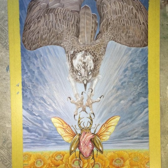


Tour admat for Baroness for their North American co-headline tour with Deafheaven, with Zeal & Ardor joining them, in March/April 2019.
Always a pleasure & honor to work with John, although this one was produced under a bit of time pressure, even more than usual with an aperfectmonster collab ( I’m not complaining, mind you.) because of that, I didn’t take my usual time to sort out models, etc but straight away went to my archive of photos: the osprey is based on a great shot by @joinus12345 & the heart/beetle is based on an earlier design of mine (go down my feed to find that one.) That being said, limited time can sometimes lead to good things: it forces me to make bolder decisions, “downside” might be that I had to do a bit more digital work. I made this in 5 days from scratch. Swipe to see the art in different stages. Layout by John Dyer Baizly.
Thank you again John for your trust!
❤️

Almost done with the digital phase of this piece. Only some smaller pieces left to do for this ambitious project & then it’s a wrap. I can’t wait to reveal the whole thing but I guess we all have to patient.

Nearing the end of the color pencil stage of this ambitious project, consisting of multiple pieces interacting with each other. Next up boosting certain areas with acrylics: deepen colors, shadows & accenting the highlights. After that scanning & digital touch ups.

Detail of the finished first layer of what is going to be a full color piece of an ambitious project involving multiple pieces interacting with each other. This stage is done in personal favorite pencils, brown/yellow ochres @fabercastellglobal & white @caran_dache. This provides a solid base, that keeps the whole piece from falling apart when I go wild with colors.
, charcoal on paper, commissioned work - - - - - - - #drawing #fineart #charcoal")
Musk Ox (22” x 30”), charcoal on paper, commissioned work
-
-
-
-
-
-
-
#drawing #fineart #charcoal #carandache #chalkpastel #graphite #fionatangart #arts_help #artist_features #wildlife #wwfcanada #wildlifeart #mural #trompeloeil #artnet #animal #artcollective #art_conquest #fionatang #saatchiart #Saatchigallery #opusartsupplies #wildlifeartist #blickartmaterials #emilycarrunista #wacfeature #Connect2Earth #muskox #bull #canada (at 100 Braid St Studios)
https://www.instagram.com/p/CGkVZnahiHZ/?igshid=aehrupi3d3rg
Post link