#art process
K is for..
Timelapse of my Link portrait
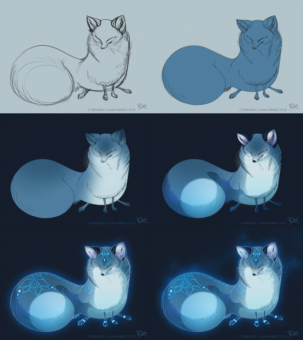
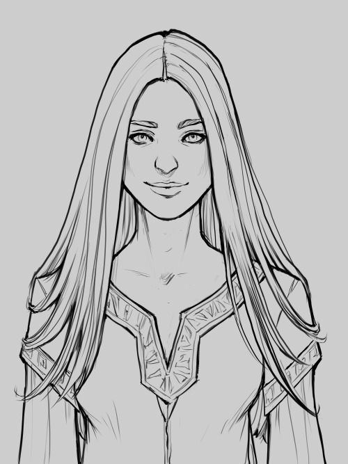
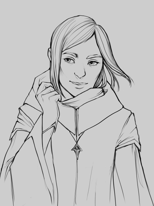
Drawing, inking and tone timelapse
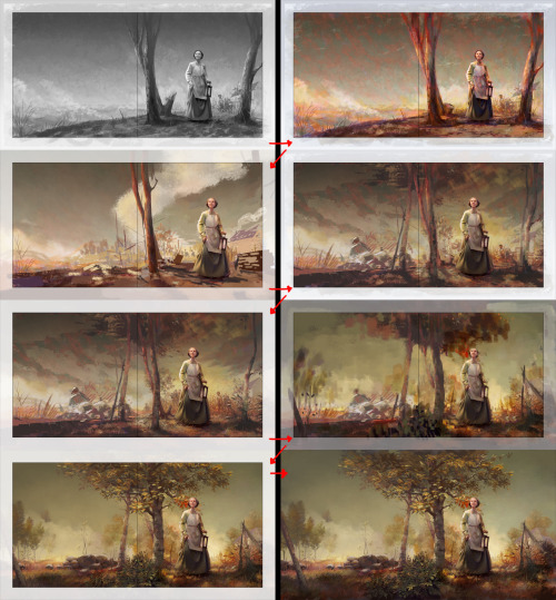
Painting update
I turned in art for my first picture book yesterday (ahhh!!!), and I’m still feeling spaced out, coming off that disoriented post-exam feeling of anxiety and anticipating the months ahead before being able to see how it all turned out.
Post link


The Serpent & The Rays
I painted this as a demo for students at a Zoom event recently and since I get a lot of questions about how I paint shallow water, here’s a step by step! It’s honestly a really fun subject to paint and pretty accessible even for people who are newer to painting environments.
If you like this type of content, I have an artbook on Kickstarter right now with tutorials just like this!
I made a process video for my recent zine Kpop In the Time of Covid. You can read the full zine here on tumblr, and purchase copies here on etsy.
hope this is readable and understandable
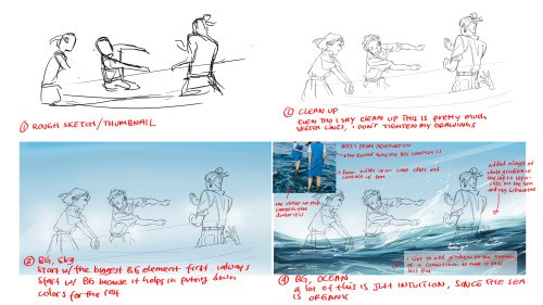
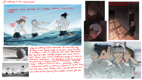
my process is pretty straightforward and i like to keep things simple (hence why everything is loose, loose lines and loose coloring)
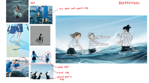
also, i use photo for pose ref as often as possible, i want the gesture to feel natural.
if anyone has any questions, feel free to ask! ill reply them with my main account (aaronboreasu) bc this account cant reply to comments… LOL (or with messages is cool too)
Post link

I was making striped paintings for awhile in my 20s, but stopped after I found the work of Agnes Martin. I felt like she had already achieved what I was looking for, and I felt content with that.
Several years later I revisited stripes because they were the most accurate way to communicate my intentions at the time. These new intentions for the work created the layered process you can see above—and, consequently, an interesting aesthetic that felt unique enough to be worth exploring.
Later, I was finally able to see some of Agnes’ work in person. Despite their similarities from afar, our paintings are quite different up close. While the screenprints that reignited her art practice—On a Clear Day, 1973—are almost unbelievably perfect, her paintings later could be considered quite flawed—full of flecks of dried gesso, misaligned pencil marks, and other imperfections. But that was an integral part of her message. The work wasn’t perfect in the worldly sense, but was about the choice to create a perfect state of being regardless—while both creating or observing art, or anything else.
I see this as a form of great compassion, of enlightened being, and a very beautiful thing to express.
Pictured above is my painting, Alignment, from 2017. It has three violet stripes on a gold background, covered in many layers of translucent white paint, creating a soft and ethereal quality that is impossible to capture. It speaks to my experience of the same inner perfection Agnes Martin painted and spoke of. It is about the idea of creating and observing from this perfection rather than from a perspective informed by the physical world. This is why you are seeing the painting through a veil of white paint, rather than directly onto the brightly-coloured surface below.
Is Raining process, (part 2)
Let’s start the fun stuff.
So to recap from part 1, we have the background painted in.

Mountains are a big nexus for clouds and precipitation cause of the rain shadow effect.
Since it’s gonna be raining in the piece, I want to make sure the entire environment is on board. For the mountains, I thought it would look cool to add some misty clouds.
Moving closer,there’s usually a bit of blur where the rain hits the ground, so I added mist there too. For this I use a soft airbrush and gently erase the shapes till I’m satisfied with the result.

Now the rain. Lots of spatters and dots, and then I use the ‘motion blur’ effect to make it looks like rain.

I do several layers of rain. The more layers of rain, the harder the downpour. I try to do a layer of ‘foreground rain’ where the drops are a bit more defined. Then I just fiddle with the opacity till I like it.

My favorite bit. Shiny rain drops on the plants. If I can make anything sparkle in a piece, I will haha.

Character time!

I make sure they blend into the environment. So following the same light source for light and shading. Also since it’s raining, they’ll have little bits of raindrops on them.

Last but not least, I throw a soft light filter to unify the pallet and help set the mood.

And tada. There’s the finished piece.
Hope y’all enjoyed
Is Raining art process. (part 1)
Here’s another process thingy. For fun.
First, I block in the big shapes. I want to set up the environment and sure the colors work.
Since it’s gonna be raining in this piece (eventually), the colors overall are going to be somewhat dull, maybe with a greyish tint.

Next up, pick a light source.
For rocky features like mountains, this where the lighter shapes will be. For this one I opted to have the light coming from the upper left corner.
Again, I want to keep the colors pretty muted and not too saturated.

Time to start adding more details. I like to work from back to front.
For the mountains I can add more cool shadows to suggest more rock shapes, and just add more colors. The eraser took is excellent for carving out rock features
For grass I try to add more texture and shadows to break up shapes. I want this to look like a wild grassy meadow.

A forest at the base of the mountain helps add to the sense of depth.

More shapes and details in the grass. Paint out small clumps. Add some weeds. Little hi lights and shadows to keep breaking up shapes.

Last thing I add is the flowers; they are very fun so I save them for close to the end.

And finally the plants at the front. Since these dudes are closer, they are darker in color and more defined. I love using the really dark greens for plants.

And thats the base!
I’ll talk about the rain and the final touches in part 2
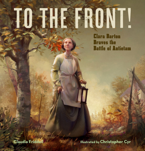
To the Front! comes out in four weeks on March 1, and I’m getting so excited!
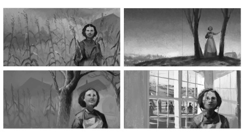
I had some requests to show process, and I thought this would be a great chance to sneak you all into the studio with me. Up first are my early cover concepts. Corn! Window! Trees! Thumbnails like these are just so I can pass an idea to the publisher.
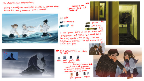
Once we settle on something, I lay out values then push color in slowly at first, building up all those fun complicated color relationships while also bringing in details and refining the composition.
Ask me questions! I’d be happy to tell you more about my process.
Post link
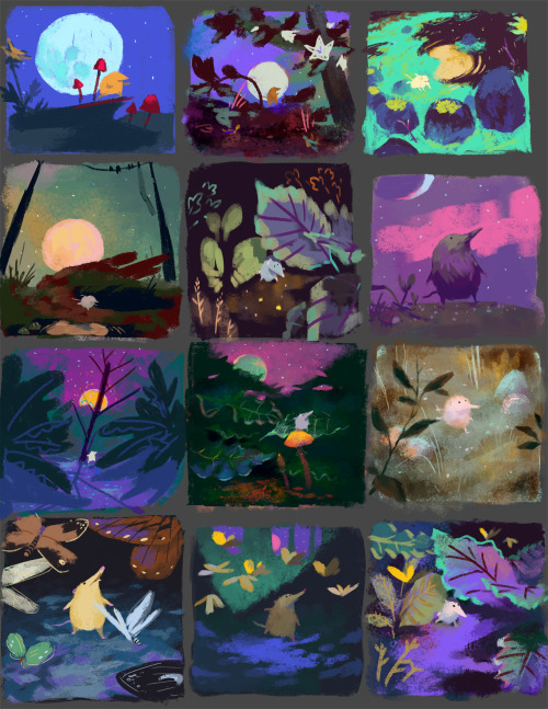
When I start designing, I thumbnail. These little sketches help me work out my ideas quickly. Color relationships and compositions begin to come together.
What’s your favorite? What colors make you fall in love?
Post link


