#creative process

If you haven’t read my last few posts - that’s okay! That’s fine! I *totally* get it. But if you’d like to do that, I *just* made them and they might lend context this post.
For a long time - since its creation, really - this blog has been dedicated to one book series.
Mind you, it’s a great book series. I love it. But like…it’s over. You know?
It’s great. But there’s nothing new that’s coming from it. It’s a complete story. There’s no new content.
I’ve been thinking about this for a while. I don’t want to just leave you guys high and dry. We’ve been through it together! …And by it I mean the fictional ups and downs of the Lunar Chronicles cast. =D =D =D …ah jeez…I am so self conscious… =D =D =D

Would you guys be interested if I made this a straight up bookish tumblr? I could bring up -other- books I mean?
Like maybe books I really like?
Or maybe I could rant about books I don’t like??
Whichever? Both?
I already have a book in mind I’d love to share with you guys.
Maybe I could talk about my book? If you guys would be cool with that I mean. I’d love to share my creative process with y’all.
Anyway I *SUPER* hope I’ll get some answers to this because I want to take all of you into consideration about this!

AS ALWAYS, I SUPER LOVE *ALL* OF YOU.
THANK YOU *SO FUCKING MUCH*, HONESTLY, FOR STILL BEING WITH ME EVEN THOUGH I WAS INACTIVE.
THAT MEANS MORE TO ME THAN WORDS CAN EXPRESS.
~ ♥ ♡ ♥ ♡ ♥ ♡ ♥ ♡ ♥ ♡ ♥ ♡ ~

I was making striped paintings for awhile in my 20s, but stopped after I found the work of Agnes Martin. I felt like she had already achieved what I was looking for, and I felt content with that.
Several years later I revisited stripes because they were the most accurate way to communicate my intentions at the time. These new intentions for the work created the layered process you can see above—and, consequently, an interesting aesthetic that felt unique enough to be worth exploring.
Later, I was finally able to see some of Agnes’ work in person. Despite their similarities from afar, our paintings are quite different up close. While the screenprints that reignited her art practice—On a Clear Day, 1973—are almost unbelievably perfect, her paintings later could be considered quite flawed—full of flecks of dried gesso, misaligned pencil marks, and other imperfections. But that was an integral part of her message. The work wasn’t perfect in the worldly sense, but was about the choice to create a perfect state of being regardless—while both creating or observing art, or anything else.
I see this as a form of great compassion, of enlightened being, and a very beautiful thing to express.
Pictured above is my painting, Alignment, from 2017. It has three violet stripes on a gold background, covered in many layers of translucent white paint, creating a soft and ethereal quality that is impossible to capture. It speaks to my experience of the same inner perfection Agnes Martin painted and spoke of. It is about the idea of creating and observing from this perfection rather than from a perspective informed by the physical world. This is why you are seeing the painting through a veil of white paint, rather than directly onto the brightly-coloured surface below.
Hi All,
I’m a Canadian artist, author, and creativity consultant. I’ve been called an “artist whisperer” but my work is more about life than art, and I can work with anyone.
My philosophy is about building holistic abundance outside of “the system” through compassion-based creativity, for the purpose of maximum joy and freedom for all. I believe that creativity is our natural state, and it should be used for all aspects of life, all jobs, all educational systems, all businesses, everything. We are not meant to conform. We are not meant to work ourselves into illness or depression just to keep the old economic and power structures going.
I always knew I was an artist, but spent too much of my life overwhelmed by negativity and trauma to access the inspiration or confidence needed. I operated on anxiety, just trying to survive.
It was my very cliché journey out of that dark place that informs my work now. I have an intimate understanding of the intense pain and depression of disconnectedness, but also of the fact that there are ways out into a life of profound inspiration and bliss. I also know how impossible and trite that can sound.
I learned my biggest lessons the hard way after a very severe health crash in my 20s that still affects me now. I was forced to give up my work and money-focused lifestyle, and I eventually surrendered to my real loves: deeper truth, higher creativity, and inspired service.
I rested and learned to prioritize my needs and inspiration, and that led to accidentally writing my first book (my second book was on purpose). These books are powerful, but they ask a lot. A complete creative awakening can mean disrupting your whole life.
My partner @jameswyper is a full-time working artist, who supported me through all my health flareups solely with his art, even while living on a small island in a big, dreamy oceanfront house, which also probably sounds impossible to some. We are just stubborn and use an effective philosophy.
My health is now quite a bit better, we love our lives and our work more than ever, and we recently bought a new home in the mountains, where we live with our dog (who is the best).
I always so badly want to give the relief and joy I find to everyone else who needs it too, but I know it doesn’t really work like that. I had to hit rock bottom to change direction, and I know most others do as well. I hope I can at least help a few people to find their bounce.
If you have any questions feel free to ask below!

We are settled enough into our new place that I’ve been thinking about starting another beaded painting soon. This prototype is only 6x6” yet took over 100 hrs, so it’s a bit of a commitment. I love spending that much time with a work of art though, slowly watching the vision come alive. When it’s done that experience is over.
Plus I do find the effect of several thousand beads pretty astounding. Each one of these was individually hand-stitched and meticulously adjusted so the thread isn’t visible. I did buy a luneville hook, which could speed things up, but I don’t yet know how to use it. I also love how the stitches on the back of the prototype look, so I’m not totally sure I even want to change techniques.
Untitled Prototype. 2019. Hand-stitched glass beads on oil on canvas. 6x6 inches.


This is what a naked first draft looks like. Ready for the read through? #megabuzz #rave #raver #raving #creativeprocess
Post link


Brand Development for Pathway Church of Charlotte. Several iterations of design were proposed. The final emphasized a “path” within the logo mark in the shape of a P. Several mockups of marketing and stationery pieces were also proposed in the final style guide.
Post link


Storyboards showing various features for a proposed new app to benefit the public transportation system. The app would have an online pay option, a way to check exact bus locations remotely and a real-time trip planner. All these features would help ease anxiety for commuters as well as create ease of use for casual riders.
Post link


The tees I designed to benefit a sweet family’s adoption. The chalk was the initial sketch, followed by a quick manipulation in photoshop. The marker was another itiration of the sketch. When it was time to finalize, I outlined in illustrator in order to create the vector image the printer would later use.
Post link

Work in progress, detail…
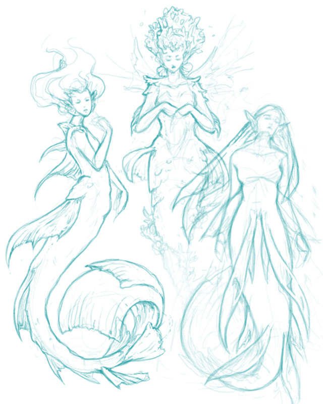
Time for some mermaid sketches.


I rarely post #art I do for work, but this “Frazzled Dad” was fun. These are unused #frames I did for a #storyboard#animatic.
Post link


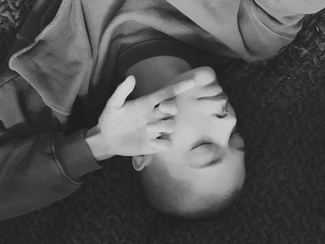
The desperate desire to create vs the oh so constant sleepiness plaguing my every action
Empire Wreckers “How Bad Movies Are Made Featuring ‘The Rise of Skywalker’” (2021)
Video essay detailing the process of writing and filming the movie “Star Wars: The Rise of Skywalker”.


Part 3/3


Part 2/3