I have like no butt. Butt needs more attention. Sculpt sculpt sculpt! Meanwhile still on the carb restrictions… But enjoying lots of fresh spinach ᕦ(ò_óˇ)ᕤ Major setback yesterday at my sisters place, we made nachos…. WHY.
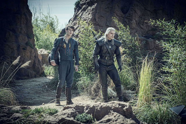
Joey Batey is really approximately the same size and shape as Henry Cavill, and there are a number of clever techniques in pretty much all Jaskier’s costumes to hide this fact and make him look about three or four inches narrower than he actually is. The costumers work really really hard to make him look that twinky, often with cleverly cut shoulder decorations that pretend he’s trying to look bigger than he is and have the actual effect of making him look a lot lighter.
On a Doylistic level this makes sense, because it’s hard to make Geralt look Huge and Imposing next to your non-combatant harmless sidekick if said sidekick is a jacked six foot burly man.
On a Watsonian level, however, the notion of Jaskier as this big meaty dude aggressively arguing with all his tailors to ensure that he looks as non threatening and foppish and entertaining as possible while also looking as sexy as he can (for a Jaskier definition of sexy, at least) is generating considerable entertainment for me this fine morning.
“No! My shoulders must look slender!”
“But, sir, you could look ripped!”
“Absolutely not! I must look slim and gentle and unassuming!”
“As you wish, sir… So do you wish it to be cut with much excess fabric, so that you look small and also very wealthy to afford so much?”
[howling] “No! I must look slender and gentle and also above else very attractive!”
Geralt doesn’t notice any of this until they try to share a tiny hostel bed on the road and Jaskier cuddles up to him and abruptly there is no more room in that bed
I need a full picture costume run down of this by someone in the fashion field stat
Ask and ye shall receive! I may not work in the fashion field but I do work in the costume production industry for theatre/film so this is totally my area. Using clothes to change someone’s appearance is super common, and Tim Aslam’s costume design for The Witcher is actually a really good example of this, so buckle up because this is a long ride!
Creating an illusion like this has two main components:shape(the style lines created by the clothes), and fit (the way the clothes hang on the person’s body), and is the result of close collaboration between the designer and the production team.
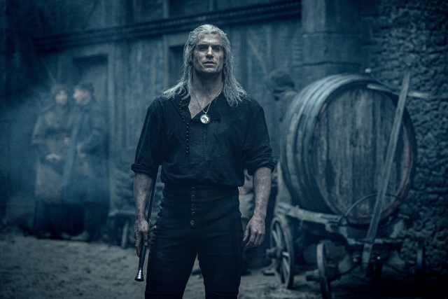
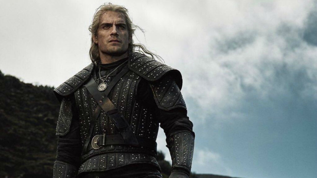
We’re going to talk about season one, because that’s where the difference is the most obvious. Take a look at Geralt:
First, let’s talk about shape. The goal here is to make Geralt look strong and imposing, and the best way to do that is to exaggerate the triangle of his upper torso. See how much broader his shoulders look than his waist in both images? A loose shirt over tight pants is a classic way to establish this, because the shirt blousing at the waist (note that the pants sit high up at the natural waist) makes the hips looks narrower in comparison. Note also that his shirt has an asymmetrical closure - a centered vertical line down the shirt would make him looks slimmer, while the off-center one adds width.
His armor does this by giving him those massive shoulder pieces, which both lengthen and raise his shoulder line. I would estimate that they raise Henry Cavill’s shoulder line by a good two inches just from the bulk of the leather alone. His torso armor also does a really clever thing by having a very subtle V shape to the vertical lines, making his waist look smaller. If you count the number of stripes above and below his belt (again, sitting high at the natural waist), you’ll notice that the narrow stripe at the front edge of the armscye disappears, which allows the side stripes to make that V shape.
Now let’s talk about fit. The fit of Geralt’s shirt looks simple but is actually super specific. It’s very easy for an actor to get lost in a shirt that is too loose - if there’s too much extra fabric then it will just make the actor look smaller by drawing attention to how baggy it is. This shirt fits just right: the sleeves are full enough to allow for movement but still relatively fitted (and rolling up the sleeves actually also helps add breadth to Geralt’s torso by continuing the horizontal line at his waist). The body of the shirt fits smoothly across the shoulders and chest, and has just enough fullness to drape at the waist without feeling baggy.
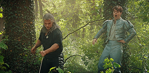
Now let’s look at Jaskier.
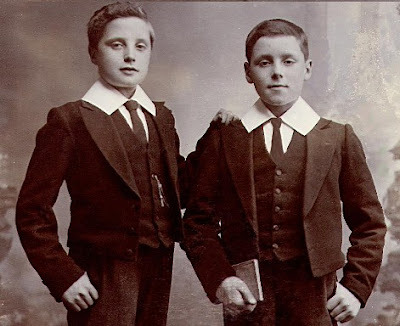
We’ll start with this look. Shape and fit are very interconnected here so it’s just gonna be a jumble. First thing I notice: the jacket. Unlike your traditional fantasy/historical doublet, all of Jaskier’s jackets end at the waist, rather than continuing into a peplum/skirt like Geralt’s armor does. This cropped jacket is evocative of childhood/immaturity, an association that is generally considered to have its roots in schoolboy uniforms of the 19th and early 20th century (see the image of schoolboys wearing “Eton Jackets” below)
Jaskier also tends to wear his jackets open. This creates a vertical line down his torso, which is generally slimming, but it also totally obscures the shape of his torso. The brain is going to take the line of his hip, which we can see, and the armscye of his jacket, (which actually looks to be cut ever so slightly artificially narrow but it’s hard to tell) and fill in a line between them, which is likely going to end up being slightly narrower than his actual ribcage. He does have poofs at the top of his sleeves, which can be a technique used to add width, but if they’re cut and fit carefully you can actually hide some of the breadth of the shoulders inside the poof and make it look like the fullness comes from the poof and not the body.
Note: the “armscye” is the technical name for the armhole, but specifically the torso part. The corresponding sleeve part is the “sleevehead.”
Again, we have another open jacket, this one with strong vertical lines. See how the line of Jaskier’s hip flows up through the edge of the doublet all the way up through the armscye? This makes his torso look narrower despite the jacket’s shoulder tabs. In contrast, this line is always broken on Geralt’s outfits, whether at the waist with his shirt or with the giant shoulder pieces with his armor. Jaskier’s pants also tend to fit more loosely, which de-emphasizes the triangle of his shoulders to waist.
Okay this is my favorite image to illustrate everything we have going on here. Look at Jaskier’s jacket. What’s the first thing you notice? The bright yellow inset slashes in his chest. The high contrast in color draws the eye inwards and distracts from the breadth of his shoulders, where we have another cleverly cut poof. His jacket is again cropped, with strong vertical lines, over the baggiest pants he wears in the season.
Now look at Jaskier and Geralt together. Jaskier is all about long vertical lines, while Geralt’s predominate lines are either horizontal or diagonal. Additionally, Jaskier’s hips look even to his shoulders, even if they’re not, and Geralt’s shoulders are exaggerated. The two characters have a very different presence, even if the actors underneath are similar.
I hope you’ve enjoyed this introduction to costume design! Creating the illusory effects like this is one of my favorite things and I am excited to share!!
“But NORMAL People’s Bodies Didn’t Look Like That!” …right?
Some of you may have seen my post about Baroque artists and their realistic depictions of human bodies as having skin and fat.
I’ve had a lot of negative and frankly fatphobic comments on that post, calling the people in the paintings “fat” and “obese,” mostly along the lines of this:
“It’s because the artists are depicting rich people, who were fat and lazy. Normal people didn’t look like that!”
The idea, of course, is that these artists wouldn’t have ever drawn bodies that looked like those in the Baroque paintings, if they weren’t painting super-rich people that stuffed themselves with food all day.
Supposedly. We’ll see how well that holds up.
Today I was in the library looking at a collection of drawings by Albrecht Dürer, and learned that in the early 1500’s, Dürer tried to put together essentially a “how-to-draw” book, showing how to draw people. His work was controversial, because of his technique of “constructing” figures using rules about proportions. (A quick and easy method of inventing realistically proportioned bodies out of thin air? Cheating!!)
However, in his “constructed” drawings, Dürer had to figure out how to handle the range of variety in bodies, and ended up breaking down how to create a variety of body types in correct proportions.
I’m showing the women, to contrast with the post on Baroque paintings. Here are some of his drawings that I thought y'all should take a look at.
These are a couple of his more “average” women—the one on the left is from his drawing book, and the one on the right is one of his drawings.
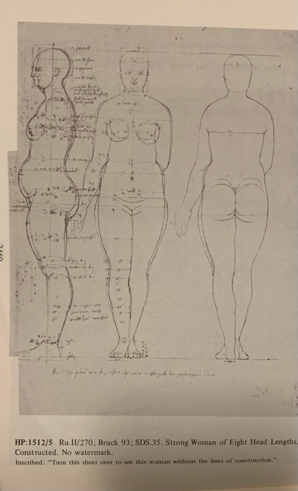
Here’s a “strong woman” and “A very strong, stout woman”
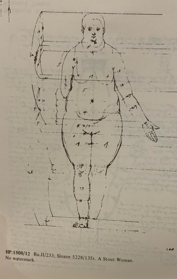
This is what he refers to as a “stout woman.”
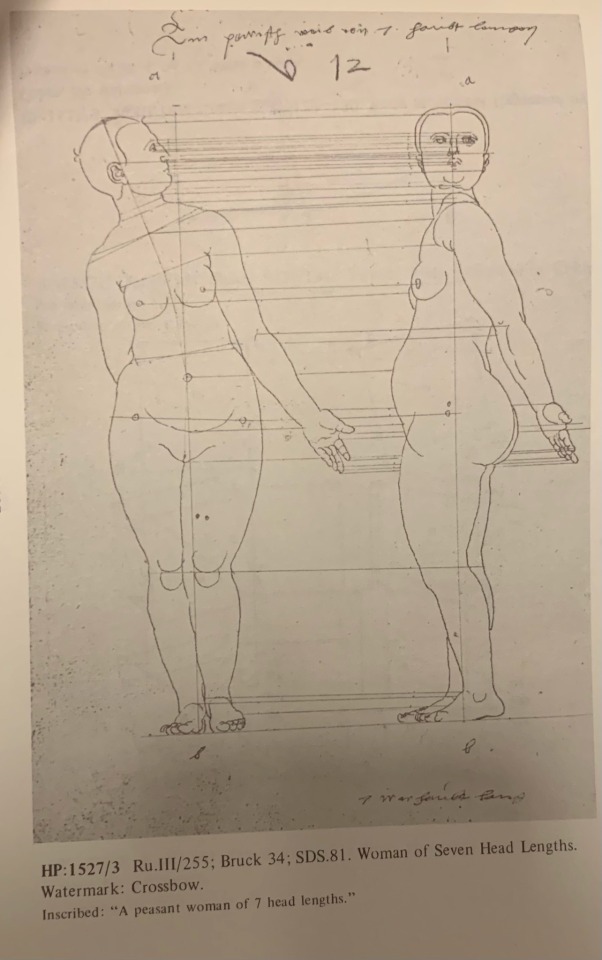
Here’s where it gets interesting: this is what Albrecht Dürer refers to as a “peasant-type” woman
^That. That’s what a “peasant” body type looks like.
He labeled this one “A peasant woman of 7 head lengths”
in case you missed it: this figure drawing by a guy in the 1500’s is literally labeled as being of a peasant woman! this is what a “peasant woman” body type looks like!
He did draw similar amounts of thinner figures, but they’re not particularly emphasized over the “Strong” and “Stout” figures. Nor is there exactly a “default” figure. He’s just…going over the range of variations that there are?
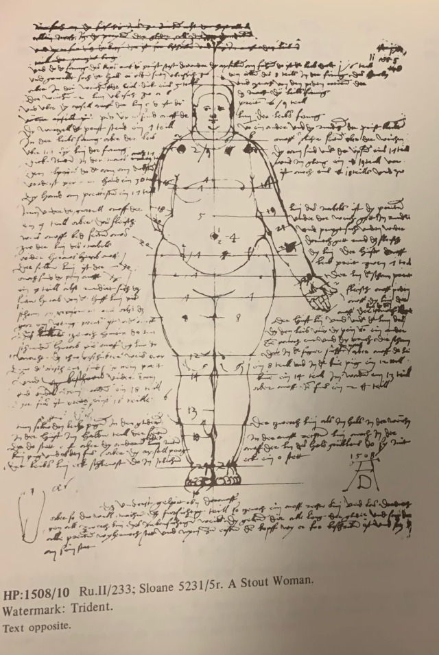
Here’s another “stout woman,” covered in notes on how to draw the proportions:
now that’s too technical for me to make any sense of but
this was in the 16th century!! This body type was apparently not incredibly rare in the 16th century. This body type was important enough for you to be able to draw, as an artist, in the 16th century to be handled in detail in a 16th century artist’s drawing advice
In conclusion: yes this is just what people look like, yes it’s important to know how to draw fat bodies, even this dude from the early 1500’s is telling you so, Die Mad About It
all of this is from “The complete drawings of Albrecht Dürer” by Walter L. Strauss