#design experience


Writers of the past warned us about letting Big Brother and alike in our lives, either with or without consent for a generous and obvious amount of reasons. Today we have compromised quite a bit with the triangulation of privacy between us, government, corporations, and where the value should be placed at; however, there’s also a great deal in politics that comes with it.
This week Amazon publicly bloomed another interesting idea in terms of delivery and privacy polarization which involved the users receiving his/her goods, with theAmazon Keyservice where the delivery person has access to your home via a kit costing $249.99. This service requires Amazon Prime and the bundle includes a smart lock and a cloud cam to monitor the delivery personnel to your home, which basically translates into Amazondropping your package entering your doors.

Paying to have strangers in your home?
I’ve heard different complains up until now about couriers dropping packages to the front door and eventually getting stolen by someone else. We are talking about packages which cannot fit in the common mail box and are delivered the homeowner aren’t in. Here we have a common problem where there’s data missing in the form of service between the user and the business. But delivering a package without anyone stealing it is more an issue of drop-off timing and setups.
Ever since the internet became widely and commercially available we stepped backwards in terms of privacy rights and user rights. There’s an ongoing battle to protect not only the neutrality of the internet but also the privacy of the user. This is not a confrontation to safeguard what we go online for, it’s a struggle to keep sensible data away from those who might use it against us. Social Security numbers, credit cards information, shopping habits, health status, and so on; the struggle gets more and more intense every time

The extension of 3rd party body into our privacy is now a reality…
In terms of privacy users aren’t helping the cause as they are voluntarily giving up personal information at no cost to online social platforms. Facebook knows a great deal of every user and it crosses such data with other apps like Instagram to provide exact persona and behavior; great amount of data sold to corporations for business purposes comes from platforms like Twitter, Tinder, Snapchat, Youtube .
By using Amazon Key we remove the last boundary of security we hold by letting strangers in our homes despite being monitored; however, how secure will these locks be? If modern cars can get hacked, how long do you think it’ll take to remotely open a door? But ultimately, how much are you willing to give just to have your package inside your door. Is this all worth it?

I always advocated approaching the urban design issue in city with improving public spaces and pedestrian areas. There’s a lot that can be achieved just by focusing on few important elements such as the people who flood our streets.
In the past years we sadly witnessed the death of innocent people by the hand of radical Islamic terrorists who used vehicles to fulfill their nefarious plans. Public security is at its highest alert since the events of September 11 2001 in the United States, and perhaps we can now help cities both ways in terms of security and decor.
Governments can continue to spend millions on local security among hot-spots some cities might be vulnerable; police and army personnel are siding to keep communities safe across Europe during this wave of radical terror. However, we can make cities safe when we decide to use simpler approaches to limit traffic and potential threats in specific areas.

Common cement road barriers downtown Milan resemble Checkpoint Charlie in post-WW2 Berlin.
We don’t need to turn roads and intersections into Cold War security checkpoints, we just need to use urban landscaping tools and reshape them into spots that can blend within blocks and avoid any uncomfortable and insecure atmosphere among people. It’s important to create smart urban solutions that don’t trigger the population into believing there’s any threat.
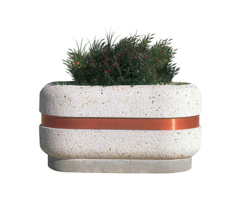
A heavy cement flower pot is the best way to combine decor and security feature in one object.
Cities can safely implements large gardening objects like flowerpots made of cements to be placed where sensible gateways needs to be protected. The decor element of nature will play the advantage point while enhancing the security methods where needed.
These important and hefty pots are already everywhere used as decorative elements in many cities across Europe, some even have horizontal planks functioning as bench-element for pedestrian to use. This system is both eye-friendly and it doesn’t stand out as something alienating for the user to experience.
Any of these objects comes with a considerable weight that can improve the security of those city spots in need of safety; they act as dead weight to stop any moving vehicle by acting as physical barriers defending people. The plus side is they can be arranged to fit the decor and theme any city sports by changing pot size, weight, flora, pattern.
A selection of these pots placed according to the city’s strategic need has the full potential to stop any commonly driven vehicles to create disaster. People will be protected without knowing enforced barriers have been placed.
Your parents had a car when you were growing up that stayed with you enough time to give you fond memories. Going to school, weekend groceries, trip to the lake, and then eventually that car eventually became your very first experience after getting the driving license. From there other beautiful memories of emancipation, freedom, and love, characterized your relationship with the four wheels.
That car belonged to your family for something like ten years, because it represented that kind of important purchase right after buying a house. From the financial point of view it always made sense into finding the right finance opportunity and get a good car. If you treated it well you would keep that car until its final days where it couldn’t move anymore.
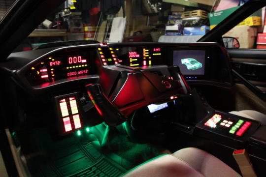
The 80s gave a glimpse of the clustering today’s cars would be facing.
From the invention of the car, driving meant the physical extension of the human body and mind onto the road with a straightforward interaction. The simpler mechanical processes of the car allowed drivers to focus more on their ability to conduct the vehicle, technology was passive and was only introduced to avoid the arm of those inside.
However in the last ten years the realm of electronics drastically changed our relationship with the road. Cars have become much more expensive and loaded with features we don’t have time to use nor to get acquainted in order to take fully advantage of, and they have became more sophisticated systems to buy and to maintain. If yesterday you begun driving on a car that fully relied on gears and levers, today you are immersed into a realm of digital enchantment and electronics that are there to distract you from the road.

The Opel Astra dashboard is an example of bad layout that doesn’t aid the driver at all.
Every five or so years cars get implemented with the latest gadgets in terms of safety and entertainment, increasing the UX/UI workload for the driver to catch up. Dashboards and steering wheels become more and more clustered with extra features and buttons, the driver at the same time is asked to split his visual and body tasks more and more focusing away from what’s in front of him/her.
Buttons to press on the dash create a momentary distraction for the driver to prioritize. Even if it’s just a second or two it still removes the attention from the surrounding traffic. Using only the hand to activate the dash features without looking at them isn’t always easy because of they way buttons are designed, but also the position they take might interfere with the shifting stick or other obstacles.

The Lamborghini Urus dashboard is a Christmas tree on wheels.
Expensive cars tend to have the most of features and UI increasing the UX workload for the driver and passengers, resulting in more distractions while driving; also expensive cars tend to be those with the highest horsepower and speed, thus increasing the risk factor furthermore.
Car makers don’t always keep in mind best practices in terms of interior design and tend to patch their mistakes adding expensive safety features. Collision avoidance, radar, breaking assistance, biometric evaluation, are part of extra packages that spike up your final estimate when you go visit the dealership for a quote.
Some might ask if you are putting a price on the safety of your family and yours, but the gimmick is old and redundant. But the issue is not difficult at all to fix. What is needed is a simple layout of the UI in order to simplify the UX of the driver and passengers, reducinig critical tasks to the minimum of danger and distraction.

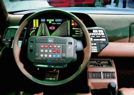
Audi A4 dash presents 7 focus points the driver has to pay attention before fully getting used to. In the past 2 to 3 focus points were the standard.
There’s no need to design all the dash buttons the same shape and colour, nor to place them too close where the hand cannot naturally interact with them (aka too close to the shift lever). The distance the eyes have to travel also poses a significant element of distraction pattern: the more the focus points on the dash the more the eye has to constantly jump from one to the other and away from the traffic ahead.

Tesla model 3 has a clean dashboard with only one focus point, removing unwanted distractions from the eyes.
How much technology is enough and is it really needed?- Modern cars are removing the experience away from the driver and placing it in the hands of on-board technology. This process has disconnected the individual from fully understanding how the physics of driving work, and the obligations involved being on the road. Drivers and passengers will continue to trust the car’s technology to the point they will surrender even their legal responsibilities in case of any accident.
This has already happened with self-driving technology with some intoxicated Tesla owners blaming the car for creating an accident, or Uber’s vehicle collision radar not working when in March 2018 a pedestrian was struck and killed in Arizona. So here we have an issue of balancing the driving experience so we can still enjoy the tech featured in side a vehicle, without removing our duty towards driving according to the laws and common sense.

For those who are seasoned sailors of the web, especially if you come from the 90s, you have probably browsed thousands of web pages form around the world and managed to find all kinds of content across several languages.
Ever since the beginning of the Internet 2.0 web design started to become more conformed around certain standards, especially since globalization widened communication channels, with users preferring certain standards than others. Shapes, colours, formats, images, sounds, and much more, evolved in various entities becoming common praxis or iconic styling.
While browsing logo brands across countries I found a very interesting layout in the Japanese web design that immediately struck me. Intercontinental names like KFC,McDonald’s,Uniqlo, presented distinct layouts in their web pages.

Layout necessity or Japanese simplicity? [kfc.co.jp]
KFC came across with their Japanese homepage that relied less on images and more on information compared to its US counterpart. Large pictures and minimalism are the convey method to present products in North America; it’s a faster way to appeal to visitors and customers with an engagement relying on pixels rather than text.
Stories and ethnicity have become a big part of corporate strategies. [kfc.com]
In the case of KFC I immediately noticed the vertical Japanese layout versus the horizontal American one. Different scrolling directions for websites that might change the user experience and information output; however, there are questions we can ask:
- Is this about Japan being famous for maximizing their physical space by ‘verticalyzing’ everything?
- Is this layout a much better solution because the Japanese user base heavily relies on mobile and tablet technology and their vertical displays?
- Do Japanese value information through text more than pictures?
Upon asking myself these questions I searched a bit more on the topic and found a very interesting article from Moravia.com about Japanese web design. There are elements the Asian user does not share with the Western one, and surprisingly text is and remains an essential portion of the information on websites and publicly displayed data, including billboards and flyers.
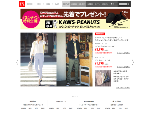
A preference for written information is what Japan likes. [uniqlo.co.jp]
Uniqlo shows on its homepage a different ratio of images/text compared to the US website. Somehow the Japanese choice of web structure seems outdated compared to the West, nonetheless its function if what the users in that country want. Product details appears to be the most relevant information for Japan customers; they value technical data more than product pictures.
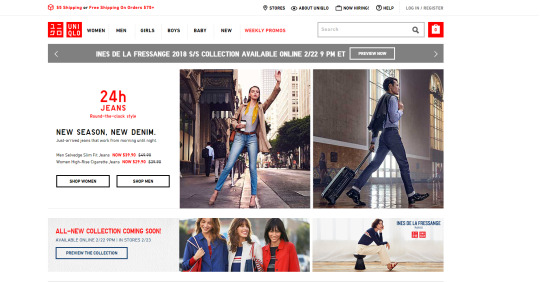
Western web design aims to increase the image percentage in order to become a catalog for users to check from any device. Pictures convey more data to customers since they are easier and faster to browse. The attention span people carry shortens as time goes by and companies don’t want customers to become bored reading too much of just one product. It can hurt sales. The User Interface design changes to fit the task the user wishes.

MdDonald’s Japan has a striking visual design proposing original alternatives. [mcdonalds.co.jp]
Beside serving different items, McDonald’s website in Japan shows the different approach on the graphic appeal to the point the logo fades in the background. Odd products are renown to be featured among the Japanese marketing machine for their ability to strike the user. However, American customers are spoiled by the perfect symmetry and repetitive look of the goods they buy, often relying on the same old reference picture as guidance to their spending habits.
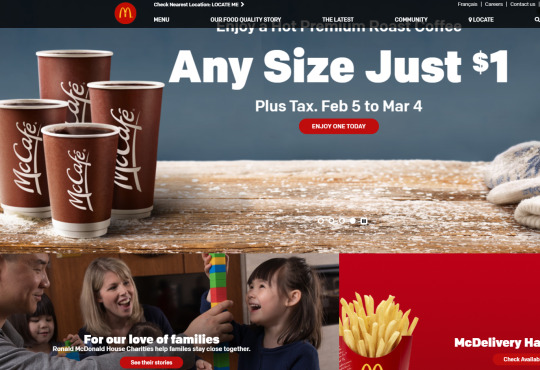
The US websites works more as a central information hub [mcdonalds.com]
McDonald’s US websites proposes a seasonal engagement to promote their offers in the form of coffee, along with their information on how their relationship with customers evolves in terms of new services or outreaches to the community. North American markets have to account for the diversity in ethnicity and cultural elements Japan does not have; this translates into a different set of rules web design and user experience will undergo.
Beside the cultural difference between Japan the North America, Japanese have a genuine curiosity on details we often miss. Their ability to collect information via text is superior to other countries; this gives them the edge to craft exhaustive experiences often dwelling into perfectionism. It’s more about quality than anything else.