#user interaction

5 UI UX trends to follow for 2020

For those who are seasoned sailors of the web, especially if you come from the 90s, you have probably browsed thousands of web pages form around the world and managed to find all kinds of content across several languages.
Ever since the beginning of the Internet 2.0 web design started to become more conformed around certain standards, especially since globalization widened communication channels, with users preferring certain standards than others. Shapes, colours, formats, images, sounds, and much more, evolved in various entities becoming common praxis or iconic styling.
While browsing logo brands across countries I found a very interesting layout in the Japanese web design that immediately struck me. Intercontinental names like KFC,McDonald’s,Uniqlo, presented distinct layouts in their web pages.

Layout necessity or Japanese simplicity? [kfc.co.jp]
KFC came across with their Japanese homepage that relied less on images and more on information compared to its US counterpart. Large pictures and minimalism are the convey method to present products in North America; it’s a faster way to appeal to visitors and customers with an engagement relying on pixels rather than text.
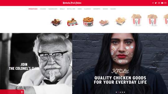
Stories and ethnicity have become a big part of corporate strategies. [kfc.com]
In the case of KFC I immediately noticed the vertical Japanese layout versus the horizontal American one. Different scrolling directions for websites that might change the user experience and information output; however, there are questions we can ask:
- Is this about Japan being famous for maximizing their physical space by ‘verticalyzing’ everything?
- Is this layout a much better solution because the Japanese user base heavily relies on mobile and tablet technology and their vertical displays?
- Do Japanese value information through text more than pictures?
Upon asking myself these questions I searched a bit more on the topic and found a very interesting article from Moravia.com about Japanese web design. There are elements the Asian user does not share with the Western one, and surprisingly text is and remains an essential portion of the information on websites and publicly displayed data, including billboards and flyers.
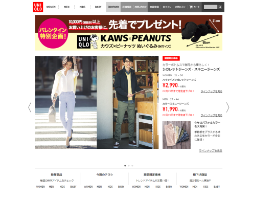
A preference for written information is what Japan likes. [uniqlo.co.jp]
Uniqlo shows on its homepage a different ratio of images/text compared to the US website. Somehow the Japanese choice of web structure seems outdated compared to the West, nonetheless its function if what the users in that country want. Product details appears to be the most relevant information for Japan customers; they value technical data more than product pictures.
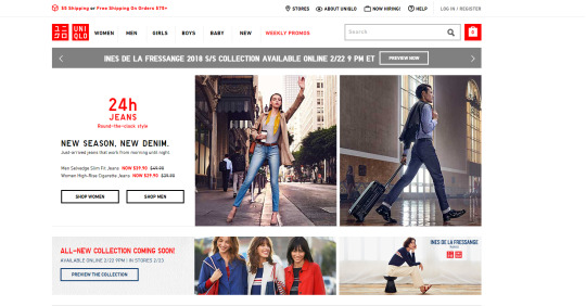
Western web design aims to increase the image percentage in order to become a catalog for users to check from any device. Pictures convey more data to customers since they are easier and faster to browse. The attention span people carry shortens as time goes by and companies don’t want customers to become bored reading too much of just one product. It can hurt sales. The User Interface design changes to fit the task the user wishes.

MdDonald’s Japan has a striking visual design proposing original alternatives. [mcdonalds.co.jp]
Beside serving different items, McDonald’s website in Japan shows the different approach on the graphic appeal to the point the logo fades in the background. Odd products are renown to be featured among the Japanese marketing machine for their ability to strike the user. However, American customers are spoiled by the perfect symmetry and repetitive look of the goods they buy, often relying on the same old reference picture as guidance to their spending habits.
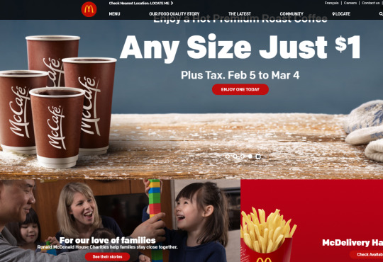
The US websites works more as a central information hub [mcdonalds.com]
McDonald’s US websites proposes a seasonal engagement to promote their offers in the form of coffee, along with their information on how their relationship with customers evolves in terms of new services or outreaches to the community. North American markets have to account for the diversity in ethnicity and cultural elements Japan does not have; this translates into a different set of rules web design and user experience will undergo.
Beside the cultural difference between Japan the North America, Japanese have a genuine curiosity on details we often miss. Their ability to collect information via text is superior to other countries; this gives them the edge to craft exhaustive experiences often dwelling into perfectionism. It’s more about quality than anything else.