#katsura


New Type - May 2022
Translation of the interview section in New Type Magazine with Character Designer/ Hero Designer, Katsura Masakazu.
What you naturally faced concerning the new season that has been released.
-This is the release of the long awaited new content, but how does Katsura-sensei feel?
Actually, the conversation about “TIGER & BUNNY 2” had come up immediately after the earlier release. In the end it turned into 2 movies but even when the series was paused, I had the thought that “someday it’ll happen”. At least when we started, I naturally took in the emotions of “it’ll come”.
-Any changes to how you approach designing?
It has to be that I started participating in the script writing meeting. This is something that continued from “DOUBLE DECKER! Doug & Krill”. I participated in all of the episodic, plot developments so I have the opportunity to understand the characters better and make suggestions if I think up an idea, so there isn’t anything bad for me or the series.
-Three new heroes were introduced this season, but what type of request did you receive for Thomas and Subaru?
For the new characters, Sengoku Subaru was requested to be “hot headed”. What I thought up was the image of a protagonist for a hot headed manga. A hot headed protagonist you could imagine seeing anywhere rather than an un-extraordinary personality that is often found in anime. In the end I think he became a character that you don’t see in “Taibani”’s world. Thomas is the type that rejects people, like the past Barnaby. I misunderstood this in the beginning and he originally was the complete opposite by having a smug expression (laughs). After reorganizing my direction, I thought that, “if he is rejecting people then I should make him always wear a hood”. The reason for the hood is because it consistently gives the impression of, “I am trying to block my interactions with people, please do not come near me”. The cross mark is my own concept, meant to be an x mark. To mean, “don’t come near me!” (laughs)
-What are your thoughts about Subaru and Thomas’ hero suits?
Mr. Black’s hero suit color concept is black. The combination of hot headed red on a black base. He is Thomas has a base of white with some cool blue accents. And so, even if it has nothing to do with the story, in terms of motifs, I designed them in the direction of black symbolizing demons and white symbolizing angels. I have drawn about 10 heroes within “Taibani”, and it has become clear that thinking up new ideas has become a little difficult. In the end I utilized everything I had within me and thought, “let’s make them heroes that could come out of my manga”. My specialty design for a hero has to be a no face, no eye, no mouth, abstract “full-face” design. Because these types of heroes have never existed in “Taibani”, I believe that they hold their place against the existing heroes.
-I think Lara is a hero who has a unique charm different from the existing heroes.
The request was for a magical girl. What I like the most is the brown coloring. I don’t recall of seeing any magical girl that uses brown, right? I was pulling inspiration from European sweets such as chocolates or macarons.
-I guess the reason why the colors don’t seem out of place, despite it being an odd color combination, is because you were using the motif of sweets.
That is right. I also wanted to give her a large head piece so I drafted the cat ears to the staff and was told to continue in this direction. It was definitely after that when she was given the name, Magical Cat. Because the cat ears look like an “M”, I also made an “M” mark for “magical” and gave her the cat charm when illustrating the final design.
-There is an impression that you give lots of deep thoughts towards character backgrounds.
Well, I think that rarely gets shown in the visuals of a story (laughs). I just think it’s fun to develop a character’s background on top of the visuals when designing an anime character. When I let my imagination swell, the direction to go when designing said character becomes even more clear.
I think that your stance of “stuffing the insides with information” even when it is not visible, is a trait that exists because you are a mangaka.
That is true. Mangakas cannot birth a design if we cannot develop the life of the character. Even if it is a design-only job, even if it will never come up in the product, drama can be born from the design when one starts thinking, “I think this character wears these types of clothes for this type of reason”.
The origin you aimed to return to
-On one hand, out of the previous heroes, Kotetsu and Barnaby give the image that their normal clothes have returned to look like their original design.
Over 10 years have passed since season 1 of “Taibani” was released. I aimed to return to the original look because I want people to think, “‘Taibani’ is going to start again!” when they glance at the art now. Barnaby hasn’t changed much but Kotetsu has quite a set up. Following his past image, I had put him in a jacket rather than a gilet. I thought that it would definitely be cold for him because this season is taking place from the fall to winter. But, wouldn’t Kotetsu fans who have always been there, want to see him in a gilet as well? So that is how he got the design of retaining his old gilet-like outfit when he removes his coat.
-The hero suits also have the impression of returning to their original look.
This is the same reason as how I designed their daily clothes. I went in the direction of, “you won’t notice unless you are a fan” when designing them. I was aiming for people to know that it’s Wild Tiger and Barnaby when glancing briefly, but for fans to also think, “it’s completely different!” when they look. A point of focus is that I made their heads larger. Their heads in season 1 were just a bit too small. It was obvious that a person’s head would not fit in that size. The heads were made to be quite small even in S.H.Figuarts’s physical recreation. It is, of course, difficult to recreate balance like that of a real human suit, but I adjusted it so the idea of there being a person in there doesn’t seem weird.
-There was an increase in the details for the movie ‘TIGER & BUNNY The Rising”, but season 2’s look gives off the impression that the design has matured.
The goal was to have people think, “the two have returned!” But I had quite a trial and error with the intention of “changing everything from the foundation”. However, I thought that it was impossible to beat the original design and designed their look by just adding details.
-You considered changing their design to something completely new?
Yes, for there is something exceptionally refreshing about having new suits. I thought that it would be fine if their looks changed so much like how “Ultraman” turned into “Ultraseven”. However, I contemplated for half a year before completing the original Wild Tiger design. I think it’s difficult to surpass that.
-Not only with Tiger and Barnaby, but the other heroes also have their own personality and place in the world. It’s like each person is the protagonist of their own story.
Because the companies are competing against each other, I believe the suit concepts have to be completely different. I wasn’t requested to do this from the production or the script writing side but when I changed the concepts, I think people were naturally able to separate and come to their own conclusion that these heroes are from different companies.
-Is there any visual point that you’d like us to focus on, as it is almost time for the release of the series?
It is the “storage bangle”, the bracelets that Kotetsu and Barnaby wear. In a way, I designed this for my own selfish reasons (laughs). It wasn’t a request from a scenario point-of-view, but in the end it became a part of the script. BANDAI SPIRITS were unaware of it’s use but for some reason became attached to it and made it into a product. It is an item that becomes virtual during a situation in the season, so please focus on it.
[Translation by TLF]
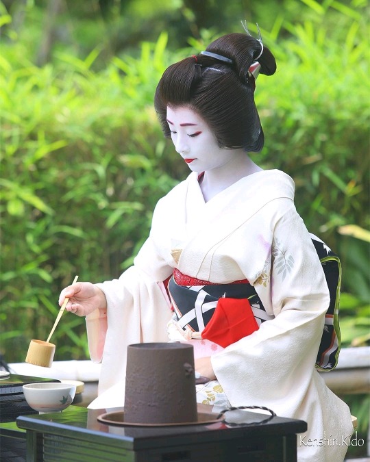
May 2019: Famous Geiko Marika (Tsurui Okiya) of Gion Kobu hosting a tea ceremony.
Source:Masanobu Kido on Instagram


