[image ID: screenshot of a spreadsheet used to schedule time on various pieces of equipment. For the current day, the big Chandler & Price press was claimed from 10 am to 5 pm, to print a sequence of 4 colors. end id.]
;ALKSDJF HUBRIS HUBRIS HUBRIS
anyway. i got two colors done today and it took uuuuh 3 extra hours about.
[image ID: a photo of in-process combination hand-inked and letterpress printed illustrations. the illustration of a person will be done in pen, and the colorful pattern of the suit they’re wearing is being printed letterpress from decorative pieces, like border design materials. a digital mockup of the drawing is used to establish position in the press so that the printing can be done first, and then inks will be applied after on a light table, tracing from the mockup. in this stage of the process, the blue and green elements of the fabric pattern have been printed.]
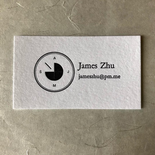
[image description: 3 photos of a business card letterpress-printed from handset type, and the forme of lead type used to print it. The contact info is set in Garamond; beside it is a simplified graphic of a piece of machinery for decryption. It’s circular, with the implication of all 26 letters spread around the outside circle by placing the A, J, M, and S at its cardinal points. Inside that ring is three-quarters of a circle, and a diagonal pointer from the center instead of the last quadrant. In the forme, each letter and space is an individual piece of lead, assembled into the custom shape. The circle is a single ring of brass, and all the rectangular pieces of type and spacing around it have to be assembled to accommodate the curves and touch its edges at several points, so that gentle pressure at the sides of the forme will hold all the pieces together and lift upright into the press bed, with nothing supporting its feet. End description.]
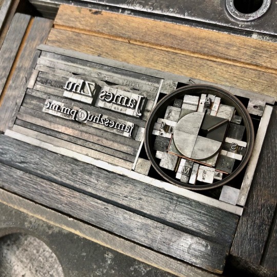
i had no idea what this little device was until yesterday, but it was VERY fun to build out of some simple colorets.
it’s one of the individual drums for a bombe, a cryptography device—whole banks of these things, crunching possibilities!! the backsides look like a whole rotating maw of shark teeth, but it’s all delicate wire brush contacts for input & output signals. and there it is, we’ve exhausted my understanding of both cryptography and early computing, that’s all I’ve got.
[video description: recording of lifting upright a chase of handset relief type for letterpress printing. The chase is a rectangular cast iron frame that holds any printing material for printing in a clamshell-action press. Formes of type or relief printing blocks lay inside it, and are held in position inside it by gentle pressure from quoins, metal wedge-devices that expand between the forme and the chase. Once under this pressure the chase can be lifted upright without any individual piece of type falling out, and carried to the press, held vertically in its bed, and pressed into the sheet in the clamshell-closing motion that brings type and paper together. End description.]
I probably would have to tighten up this forme a bit more to put it in the motorized C&P, doing speed & a thousand impressions, but for a hundred on the baby treadle I could trust it!
[image description: 3 photos of a letterpress-printed business card, and the forme of handset type used to print it. The job description is in Computational Imaging; beside it is a graphic which the customer explained to me and—I didn’t totally understand what it means, I’m sorry. A long-legged bird, stork or ibis type thing, stands at one point of a triangle. The other points are labeled P1 and P2. The lines from the bird are solid and the line between Ps is dotted. In the forme of type, the triangular shape has to be approximately filled with clusters of rectangular spacing material so that pressure can be applied evenly to its legs and keeps it standing stable in the upright bed of the press. End description.]
Apparently an armadillo, rabbit, or fish would’ve done also, but the bird won. For OBvious reasons I hope.
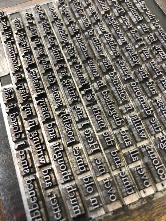
[image description: 3 photos of a small broadside of an excerpt from Dracula, letterpress printed from handset type, set in Garamond. full text under cut. Text in black, with a floral decoration on one side in pale green. The third photo is of the forme of lead type used to print the text, each letter and space an individual piece arranged by hand. end description.]
I have not read Dracula before and you know what. Adaptations have all lied to me, making Harker such a tasteless saltine cracker of a guy. He’s got some uuuh weird opinions of course but the text, and the way it’s being delivered in bits as letters to ME, and the big book club party happening here on the hellsite—it really brings me a whole lot of sympathy for him. This castle business has been wild but buddy, I get it, I too find great relief in the spaces worn down and the tasks done & re-done by the people before us. Reading this old book together with our contemporaries & otherwise.
also it’s been way too long since I got to set a little bit of TYPE-type, I missed it :) wanted to do a quick thing to shake some words out of my fingers.
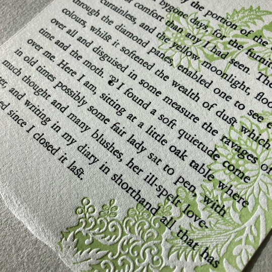
“This was evidently the portion of the castle occupied by the ladies in bygone days, for the furniture had more air of comfort than any I had seen. The windows were curtainless, and the yellow moonlight, flooding in through the diamond panes, enabled one to see even colours, whilst it softened the wealth of dust which lay over all and disguised in some measure the ravages of time and the moth. … I found a soft quietude come over me. Here I am, sitting at a little oak table where in old times possibly some fair lady sat to pen, with much thought and many blushes, her ill-spelt love-letter, and writing in my diary in shorthand all that has happened since I closed it last.”
[video description: a compilation of recordings for a small letterpress-printed broadside, excerpt from Bram Stoker’s Dracula, with a pale green floral illustration. 1 - handsetting the text of the excerpt from lead type, by individual letter. 2 - mixing the pale green ink and hand-inking the magnesium floral illustration plate with a small brayer. 3 - locking up the forme of type for printing, where all the individual pieces of type are wedged inside a cast iron frame (chase), so it can be carried and held vertically in the press without any pieces falling out. 4 - inking the type in black, with the small brayer. 5 - hooking the chase in the upright half of a clamshell-style press, and pressing the relief type onto the sheet when a hinge action closes the press. 6 - the finished broadside, green floral pattern with black type, set in Garamond. end description.]
[video description: recording of handsetting lead type for letterpress printing. Each letter of a line of text is set one at a time, taken from a cabinet of the font, divided into compartments for each letter and figure. End description.]
[image description: 2 photos of a combination letterpress-printed and pen-inked illustration of a person on their phone, wearing a heavy jacket. the jacket is selectively letterpress printed with a two-color pattern: rows of yellow chevrons, printed over and in between each with rows of tiny pink arrows. at certain boundaries like seams and folds of the jacket, the pattern jogs at a different angle so it’s not an entirely flat rendering of the fabric pattern. the second photo is a closeup, showing the impression of the letterpress materials into the toothy paper. end description.]
finally I have drawn an aspirational piece of clothing that I do not crave to own in vain, because I kind of already have this one!! Very approximately. It’s denim and not these colors exactly but it fits me about like this and is patched with some busy beige & yellow & pink & green upholstery fabric to cover the paint job of the previous owner.
Bulky denim jackets are an icon of comfort & safety to me. I steal my mother’s flannel-lined one all the time. I remember as a kid, sleeping in the back of the car with my dad’s 80s Chubby & Tubby black denim coat for a blanket. Love is stored in the oversized pockets
Anyway! the pattern for this one came more from houndstooth, herringbone, etc. Fabrics where the texture communicates the weaving process. I got very very stubborn about using the bold 30 pt. Guillemets, despite how many passes it took to cover the whole area with them hahaaaaa. We have a very reasonable number of them for use as quotation marks! It took. So many more than that to cover this jacket. But they’re JUST the right texture so I committed.
[video description: compilation of process recordings of making a 5x7 inch combination letterpress & hand-inked print. 1 - timelapse recording of a digital drawing with thin lineart. 2 - layering two proofs of letterpress-printed patterns on tissue paper to check the alignment of rows of chevrons, on top of rows of arrows. 3 - copying over the shape of selected parts of the drawing to prepare for typesetting. 4 - with the reference copy, setting a handset forme of letterpress type that will print rows of chevrons approximately across the selected areas. 5 - locking up the printing forme in a frame, to lock it in position and carry it to the upright bed of the clamshell-action press. 6 - printing a pass of yellow chevrons through a hand-cut mask, so that when the press closes on a hinge the form only contacts in an irregular area. 7 - after several passes, an irregular shape has been printed tightly with rows of yellow chevrons, and rows of pink arrows. 8 - timelapse recording of hand-inking the linart back onto the print, on a light table, with the original digital drawing as reference. 9 - the finished print, an illustration of a person on theiir phone, in a heavy jacket printed with the pattern. at some seams and fold line boundaries, the pattern changes angle to distinguish parts of the jacket. end description.]
was not sure i would love inking the toothy Copperplate paper but it is fine & the printing texture is worth it :))
[image description: 4 photos of proof cards of various sizes and fonts in the Garamond family, printed from handset type for letterpress printing, and the formes of type used to print them. Each proof card shows all the letters, figures, and symbols available in the case of lead type, and what sizes of the font are available to typeset. Each type forme is assembled from individual letters and figures, which are redistributed back into the case after printing so they can be set again in a completely different forme. End description.]
14.5 cabinets down 9 to go
Garamond was a bit tough to clean—it’s in use quite a bit which helped some things but tended to leave the spacing extra messy. I did it in a bunch of little bursts, which feels pretty unsatisfying. AND this is the point where I have to admit, I simply cannot barrel through the type cabinets exclusively and ignore the galleys until that’s done. There isn’t enough cabinet space to lay out all the good book stuff accessibly; some larger Garamond & single sizes of titling and such have to go in galleys so that the still-wrapped Century Schoolbook italics can come out of the stone; etc. I feel more disorganized by doing little bits of different cleaning jobs all over, but it’ll all come together into a better typesetting space & catalog eventually. I think.
[video description: a compilation of recordings for letterpress-printed thank you cards. 1 - pinning a relief magnesium plate to a base that raises it to the standard height for the press. 2 - testing with a gauge that the ink rollers on a clamshell-action press are level and the correct height to just touch the relief plate, distributing ink across it cleanly. 3 - feeding the press, where every time the press opens on a hinge a printed card is removed and a blank one is placed in the registration pins. 4 - locking up a forme of handset type for printing, where all the individual pieces of type are wedged inside a cast iron frame, so it can be carried and held vertically in the press without any pieces falling out. 5 - mixing a bright blue color of ink on a glass plate. 6 - feeding the press for the blue pass in a similar clamshell press. 7 - feeding the cards into a press to score the fold into them; scores are punched into the front of the card to pre-stretch the paper fibers and keep them from breaking around the fold line. 8 - the finished cards have a delicate line drawing of sunflowers printed in light brown across the fold line, and the text THANK YOU printed in cyan. with cyan envelope. end description.]
i am cheating, i am a hack and Hermann Zapf is carrying me (Optima)
[video description: recording of taking fresh lead type for letterpress printing out of its packaging and distributing all the individual letters in a type case. The type case is divided into separate compartments for each letter, symbol, and figure. When taken out of the package, several individual pieces might be stuck together, and to safely separate them without damaging the printing face of the type, you tap the feet of the type against the wood of the type case. End description.]
[image description: 3 photos of a small combination letterpress & hand-inked print, and a photo of the relief letterpress materials used to print it. The 3x4 inch print is an illustration of a person stretching their arms over their head, topless and wearing a three-tiered skirt patterned with pink, blue, and grey flowers. The floral print is selectively letterpress printed, and in three passes, so that the three tiers of skirt are successively fainter towards the hem. The print isn’t framed with glass, just mounted and matted, and the inner edge of the matboard opening is bordered with a soft grey piece of handmade paper. The letterpress printing formes are assembled from many individual relief flowers cast in lead, one forme for the pink flowers and one for the blue. there are flowers in each forme that perfectly overlap, making the grey flowers by repeatedly printing in both pink and blue. end description.]
okay the Pilot is veryfun. easy cleanup. relatively fast for very small scale things. BUT i did clearly learn something about that scale aspect this time around f;lskdjf
the printing surface is so small, and then i made it smaller every time i tore packing away from the lower tiers of the skirt to get the feathering. so the differential between the ~5 pt. mylar mask and the 10 pt. tympan paper packing wasn’t enough in the upper tiers, and the impression came all the way through the mylar sometimes. still! there’s something really satisfying about these minis, and they also give me the freedom to use more varieties of decorative stuff since i don’t have to have so much of it to cover the area. i’ll keep thinking about small ones and work on controlling the pressure better.
anyway sometimes i draw a shirtless woman because im gay and sometimes i draw a shirtless woman because i thought of a Cute Skirt but not a Cute Shirt that goes with it. actually hold up. i don’t wear skirts much but i would wear the fuck out of a sheer shirt in a fabric like this. fuck. i want it for me. uGH—
[video description: compilation of process recordings of making a small combination letterpress & hand-inked print. 1 - timelapse recording of assembling two handset formes of lead-cast floral pieces for letterpress printing. Each forme is a scattering of many different flower designs; one forme will print blue and the other pink and some of the flowers repeat in each forme so they’ll print both colors on top of each other. 2 - putting pink ink onto the circular ink distribution plate of a tabletop clamshell-action printing press. 3 - inking up the press, where each time it’s hand-cranked the rollers pass over the ink plate, and then the plate rotates a few degrees to refresh the ink distribution. 4 - pulling an impression in the press, where the press closes on a hinge and presses the relief lead pieces into the paper. 5 - changing out the pink forme for the blue forme inside the chase, the iron frame that holds each printing forme upright in the press. 6 - tearing away parts of the backer for a masked printing process, which allows the letterpress floral pattern to print in an irregular, selective area of the print. hand-tearing parts of the backer between impressions feathers the edges of the pattern, because it decreases pressure and ink transfer at the torn edges. 7 - pulling further impressions of the letterpress, which is gradually printing a three-color floral pattern on a skirt that fades away at the bottom edge. 8 - applying hand-inked lineart to the prints on a light table. a mockup on a separate sheet behind the print functions as a sketch. 9 - the finished print, illustrating a woman wearing the pink and blue three-tiered skirt. The print is mounted with a mat board laid on top, with a grey lining around the inside edge of the mat board opening. end description.]
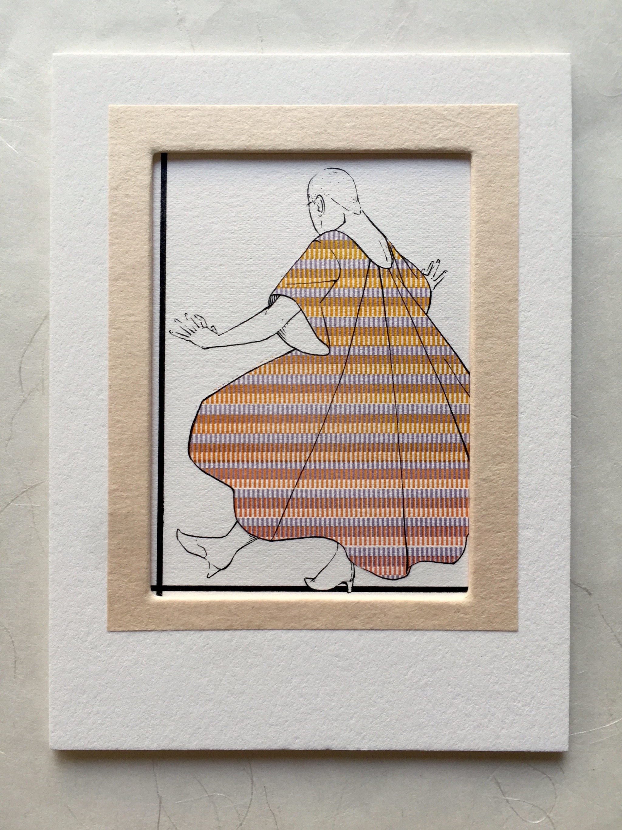
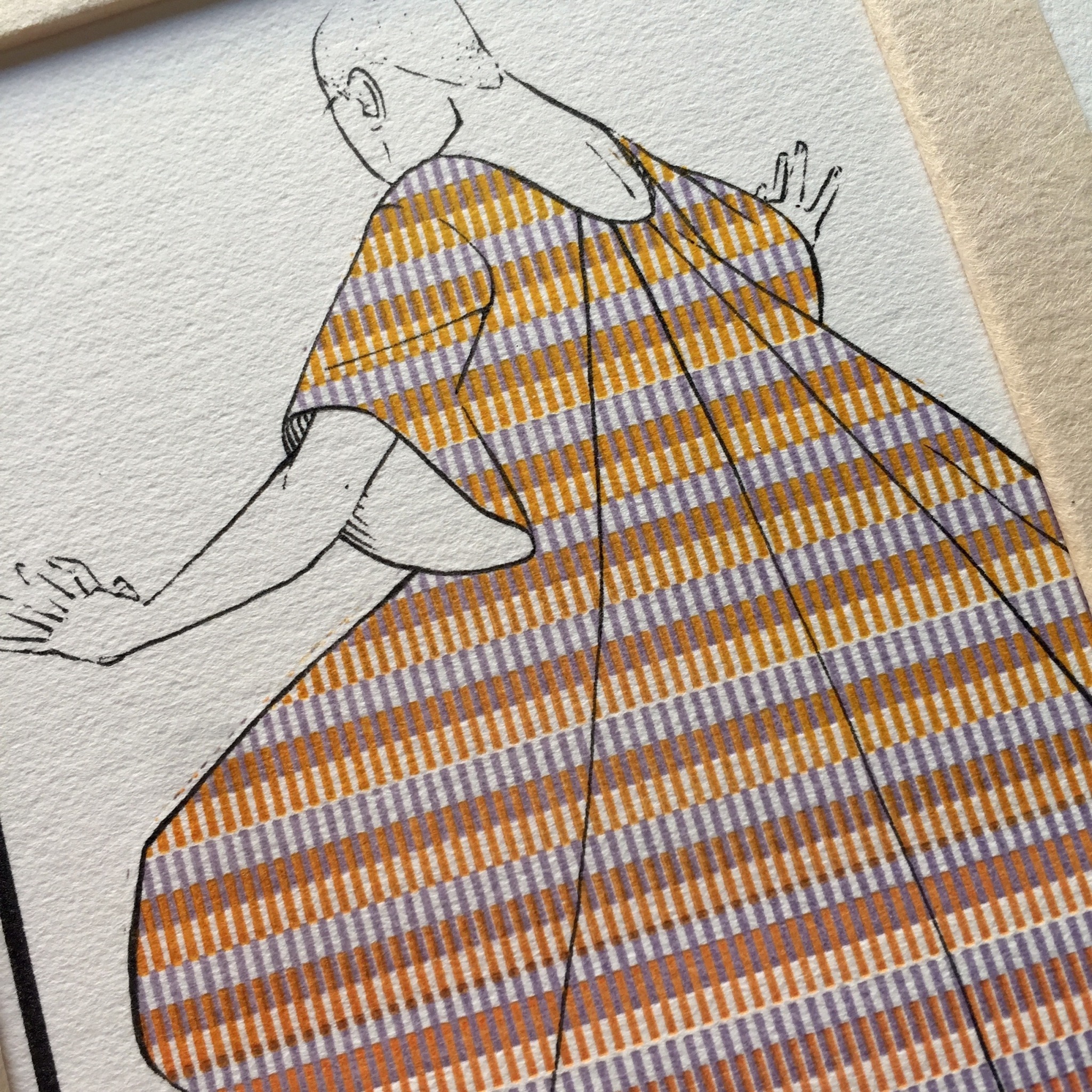
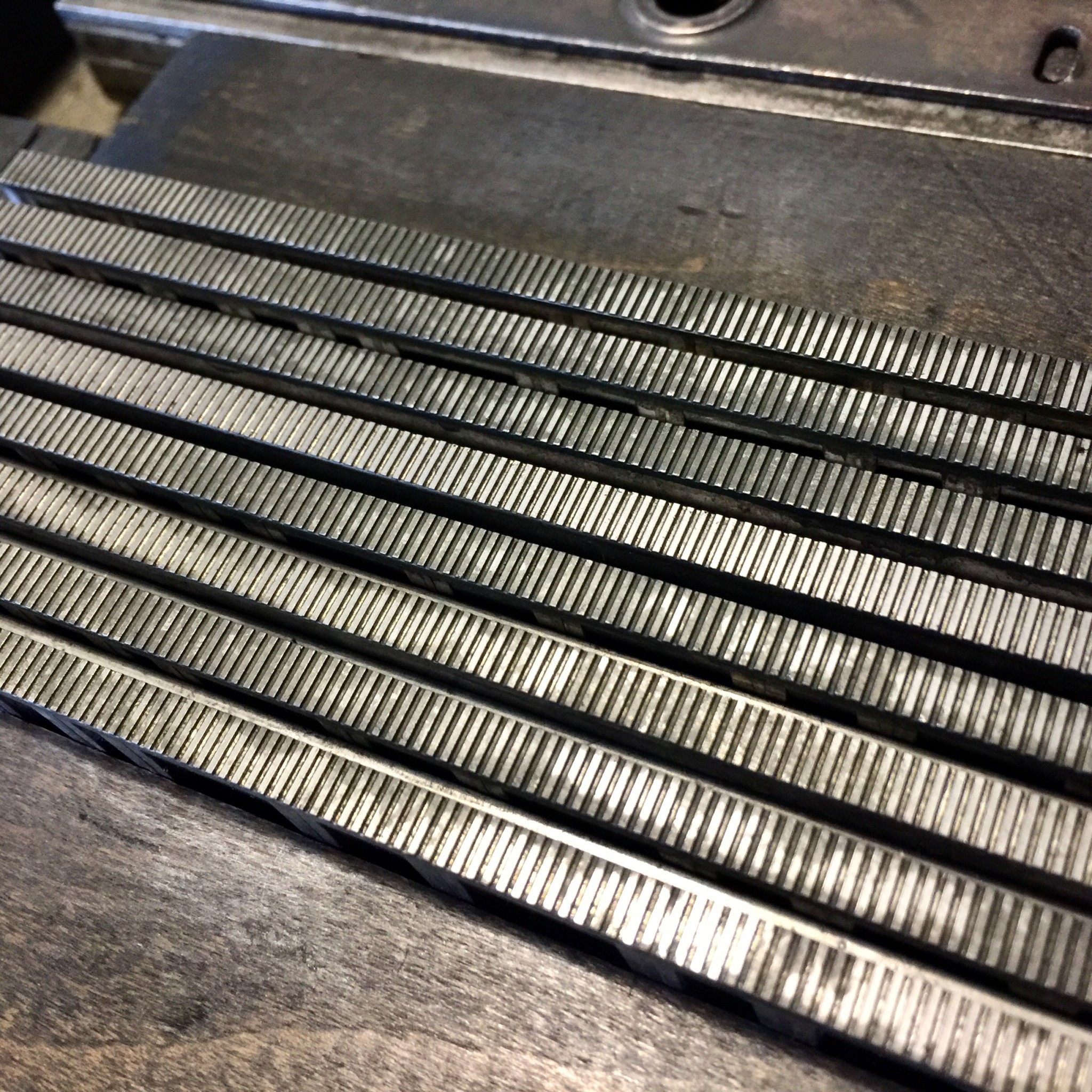
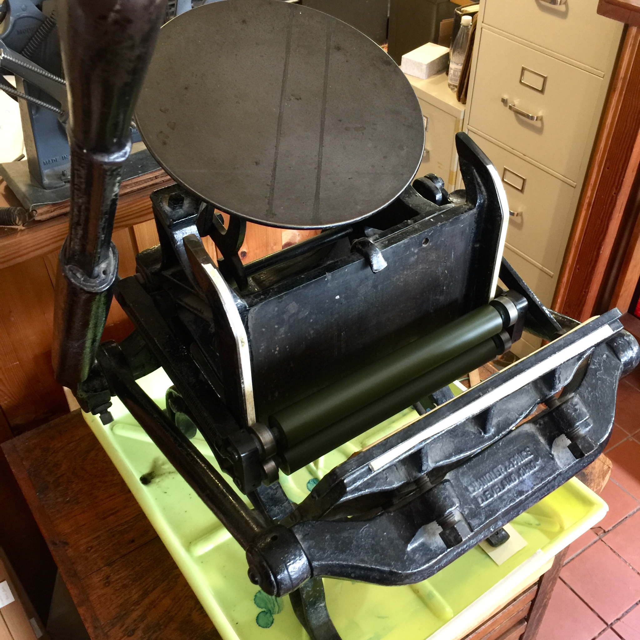
[image description: 2 photos of a small combination letterpress and hand-inked print, a photo of the relief letterpress materials, and the Chandler & Price Pilot press used to print it. The 3x4 inch print is an illustration of a person from behind, head shaved and hands out, wearing a bell-sleeved tent dress, skirt flared out wide. The fabric in the print is selectively letterpress printed with tightly barred rows of alternating colors: half the rows transition from yellow-orange to red from the shoulders to the bottom of the skirt, and the rows in-between are a consistent light purple. The print isn’t framed with glass, just mounted and matted, and the inner edge of the matboard opening is bordered with a soft beige piece of handmade paper. The letterpress printing forme is made from rows of barred lead slugs intended for printing borders; the Pilot press is a clamshell-action press, small enough to sit on a table, each impression applied by hand with a large lever on the side. end description.]
revived the Pilot for this one!* I wanted to see if it’s useful especially for these small-run, several-color kinds of things. Makeready is usually weirdly easy on the pattern-printing projects since position is determined by the masking system more than the sheet’s registration, so it’s not so disproportionately loss-y to only do an edition of 5, but it isstill very annoying to clean the bigger presses of several colors for just 5 hits each :// but i felt pretty free to mess around with colors on the Pilot, with washup being so much faster. Did a little hand-brayered roll from yellow to red on the ink plate. I’ll have to work on that to get used to how tight the scale of the press is! It’s SO small. I was trying for a more saturated yellow and red at the ends, but it all got a bit over-mixed trying to hit the right part of the chase with even inking.
*revived is a strong word. the only thing that was ever wrong with it was the spring-back on the hold-downs got broken, so they would get snagged underneath the rollers when the press opened. i just took the whole rig off and now there’s no hold-downs, but it’s perfectly usable again!
[video description: compilation of process recordings of inking and mounting a small, combination letterpress & hand-inked print. First the letterpress elements are printed on a blank sheet, and then inks are drawn on top on a light table with a separate sketch underneath for reference. The print is mounted and assembled with a mat board laid on top, and there’s a soft beige lining around the inside edge of the mat board opening. The lining as well as the hinge between mat board and backer is made from a single rectangular piece of handmade paper. First it’s glued to the front of the mat board across the opening in the center, pasting down the exposed liner on the outside; then the paper is cut into four pieces from the inside, and folded and glued around the underside of the mat board to secure it. The extra parts of the center piece of paper flip up to the top of the mat, fold over, and are the hinge between front and back of the mat sandwich. The small print is set in place behind the mat opening with linen tape. end description.]
i have as usual made this more complicated than it needed to be
[image description: 9 photos of an 8x11 inch letterpress printed broadside with an illustrated border, the handset formes of type, and the relief plate used to print it. The wide border is densely decorated with leaves and flowers, birds, ugly angel babies, weird beak-y fish-things; the text inside is set justified to occupy an even rectangle just inside the border. Set in several fonts, all-caps: “Well I will say pretty fucking clever of em to figure out that the fastest way to make any given uncomfy situation not at all their fault is to call some other party a liar about it! Credit where it’s due, that sure is the express lane to a guilt-free life. But I do have to ask, are they road-legal, lead-footing the pedal with those extra large clown shoes on? Do they feel safe in there, making their shitty steel torpedo of a defense mechanism somebody else’s manslaughter problem? Honk honk goof troop, concrete shoes don’t make up for having the spinal integrity of the average cooked tube of rigatoni. On the upside: one, at this point they are surely uninterested in changing course, and two: eventually, they are going to run out of land.” border and text in black, with a drop cap & small extra decorations around the type printed in safety green. photos of the type forme show how each letter of type is individually spaced to spread across even line lengths, and the plates are, at least on the surface, copper. end description.]
Belligerent Affirmations all originate as text messages i’ve sent a particular friend when they needed some—shout-y validation. (with permission) i like to make physical copies of a few of them, the ones that might be useful to someone else without prescriptive context. i’m not totally sure this one is? useful to anyone else, i mean. But I’ve been surprised before by how open to interpretation they can be, and by how common the experiences are, so there’s a few copies available!
unfortunately i do not know a lot about the original use of this border; i know our plates came to us via Frank McCaffrey, who got electroplated copies of several borders like this from George W. Jones’ collection in England in 1931. I can date the design of another border in the group to the 1550s, but i don’t know about this specific one. They’ve been ripped off their mounting and the insides are hacksawed out, i guess so that you can set type inside them which—okay?? i wouldn’t recommend it seeing as they’re hacksawed and unmounted. It took a lot of work with the SP15 rollers to get it to print relatively clean & even, with the way it’s torqued, and it would not be fun to also have good type in there.
the secret sauce on the green color is a 30 year old can of fluorescent yellow :)) absolute nightmare trying to get anything workable out from under the skin, but stick it in front of the space heater for a sec and it’s good as new.*
*it is not actually, it’s fumey when it’s hot and it’s got hickeys in it but it SURE is still fluorescent
fonts: Eden bold, Alternate Gothics 51 & 77, Bernhard Gothic Medium, & Devinne.
Had some technical issues with both of them that were fun to solve; masked off the triangle because I didn’t like the triangular form I’d made, and I had to die-cut the pi with a brilliant gold paper backer because gold ink wasn’t speaking on the red stripe, even with an underprinter.
finally had a minute to photograph & write up the etsy listing for the card deck!
The Big Type for Bad Eyes card deck is an edition of 71 letterpress-printed playing card decks, done entirely from handset type on a Vandercook Universal. It is designed especially for the vision-impaired, with standard card dimensions but large-type and minimal distraction. The ranks are printed in the corners in 48-point Nicholas Cochin Bold, and in the center from various large wood types, characters between 1 ¼ and 3 inches tall. The backs feature our favorite German-cast 2-color birds from the early 1900s, surrounded by a tiling of random letters from Nicholas Cochin Bold, Bernhard Gothic Medium, and Motto, sizes 18-48 point.
Each deck comes in a recyclable clear box tied closed with ribbon, with a title card, a colophon, and two jokers. The jokers read: “My mother says she had to find a favorite thing about her eyesight. Hers is Misread Headlines.” My mother, who has macular degeneration, has generously and with good humor chosen six real examples of newspaper or advertisement headlines she has misread, making new phrases from some delightfully surreal alternate reality.
Of the six headlines, please choose your favorite pair to go with your card deck and include your choice with your order! The various joker headlines are: • the Utility Fishstick • Savage Nuns • Won Leadership of the Gambling Party • Menace Promotions • 100% Off!!! • a Rewarding Year of Bilking Regardless of what pair you choose, one joker will be red and one will be black.
Lastly, there are two available designs of bird for the back of the deck—matching but identifiably distinct, for the purposes of two-deck card games. If you would like 2 decks that differ, choose one deck of variation A and one of variation B.