So about three years ago I did this fanart of Auri for a contest (on the left), and I felt like it was time to give it another go! Three years later and a college education and here we are~
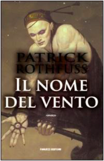
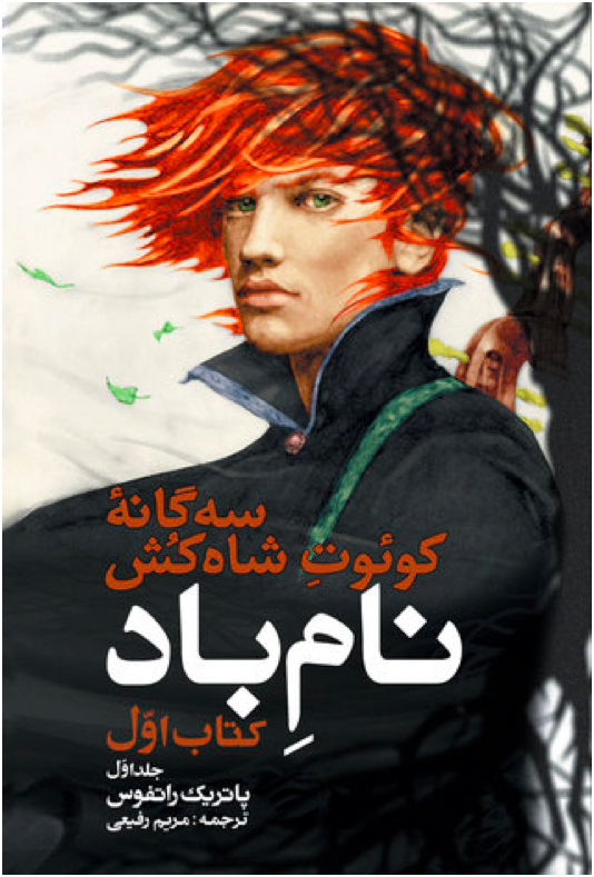
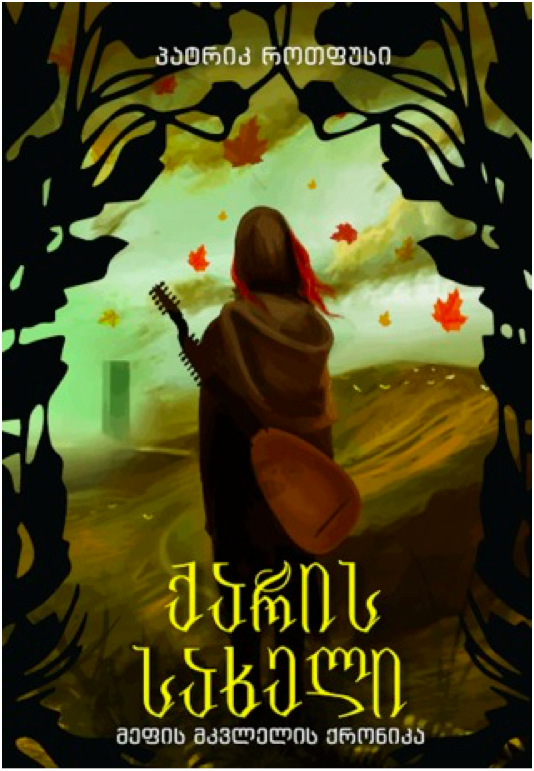
So a long while back, I had a illustration project to re-imagine the covers of three of my favorite books. Naturally I went with Patrick Rothfuss’ literary wonders of the Kingkiller Chronicles and a Slow Regard. I finally decided to touch them up, add some type, and put them up here today!
Cross posting this from my Artstation, I feel like I can communicate better here…I think I am finally done with this part of the project, I had to add some color and work more on the characters, changed up some minor things on the last 2 pages but all in all I am really happy with the result.
I am happy I was able to work on aspects I had not done before like working on scenes, even city design ( which was a nightmare hahaha) also working on painting facial expressions and the worst of all, feet. Feet have always been a challenge of mine and I feel like I need way more practice I don’t enjoy drawing them tho..
Why? Because I can. I am not a graphic designer, just a person with opinions.
Criteria for consideration: Must be a cover in a published edition of The Name of the Wind by Patrick Rothfuss. Hardcover, paperback, and ebook are all fair game, as are foreign language editions. Some editions reuse the same cover art, in which case I only rate one cover. Some editions modify cover art from another edition. If the differences are substantial, I’ll rate both.
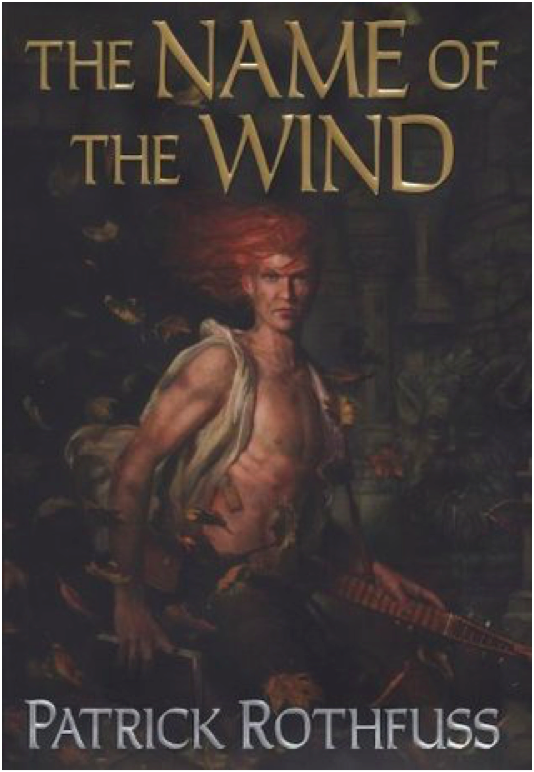
Kindle March 2007 Edition
Ah, the famous shirtless redhead cover. This cover is a bit infamous in the fandom for being both bad and cringey. This is not good art. It’s cheesy. The shirtless aspect is silly, and the windswept hair is so windswept, you’d think Kvothe was in a tornado. Nice balance with the title and author text, although it looks like the title and author text are slightly off center.
3/10
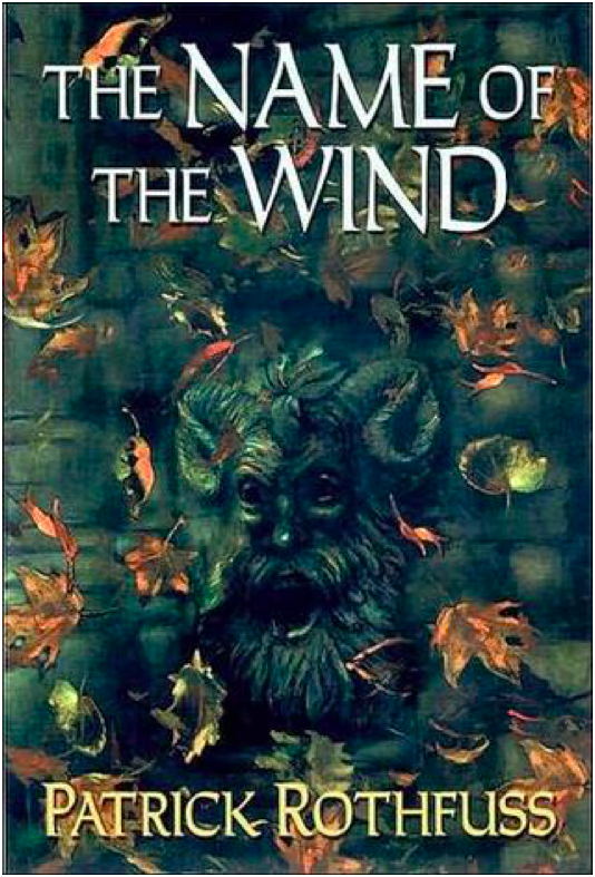
Hardcover April 2007 Edition This is just a zoomed in crop of the above cover, which is a little lazy. It does make for a better cover image, except the creepy goat man bust has nothing to do with the plot of Name of the Wind. So I suppose they cancel out.
3/10
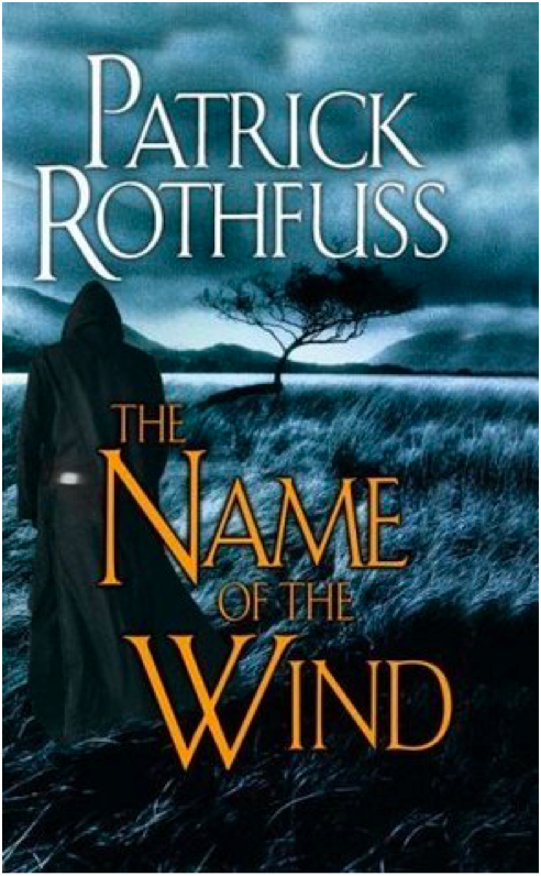
Mass Market Paperback April 2009 Edition
I despise this cover. It’s a lazy design, and the photo manipulation is terrible. Points I guess for good title text placement. But the photo manipulation is so! So! Bad! This is also the start of the trend of a hooded, cloaked figure with his back to the viewer staring out into the void. It is a bad trend.
2/10
Paperback UK June 2008 Edition
We’re still with the hooded, cloaked figure, but at least he’s facing front this time. I like the embellishment on the ‘W’ in the title text, although it gets a little pumpkin viney. Overall, it’s an ok cover. It doesn’t make me cringe, but it doesn’t grab the viewer’s interest, either.
4/10
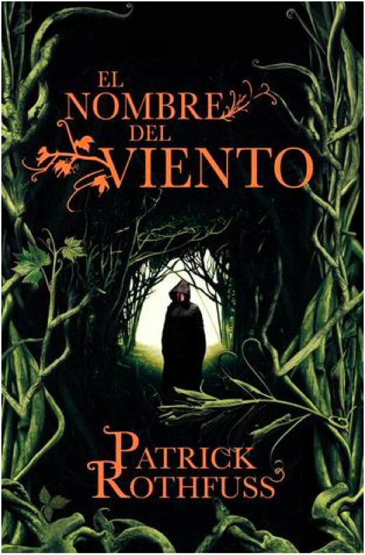
Paperback Spanish May 2009 Edition
Same image as the previous cover, but this one is uncropped and has a different plant border. I’m not sure how successful the changes are. On the one hand, shrinking the image of the figure makes the figure look more mysterious, which is good. But on the other hand, this is a bad plant border. I thought there was some corn on the right side for a minute.
4/10
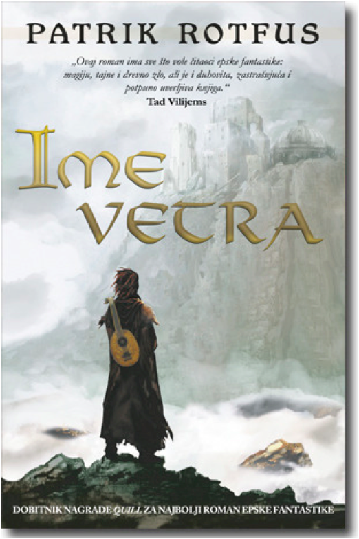
Hardcover 10th Anniversary October 2017 Edition
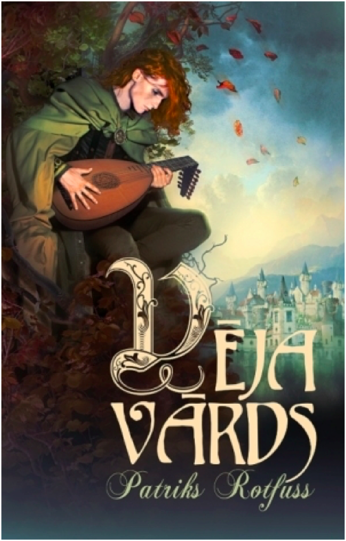
10th Anniversary edition got fancy, and it shows. I love the ruin influence in the title text, which is a great callback to the use of ruins in the novel and also a more creative and unexpected choice than making the title text leafy. That being said, the “of the” in the title text is very oddly formatted and doesn’t fit the style. The cover illustration is pretty great, with lots of symbolism for old fans while still maintaining visual interest for new readers who are browsing and happen to pick the book up. The Cinder statue is delightfully creepy and much more relevant to the novel than the dumb pan statue from the earlier cover.
9/10
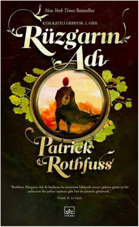
Paperback Turkish March 2007 Edition
Another trend starting here: Cloaked figure staring out at a city in the distance. I like the painting, at least what I can see of it. I find the choice to crop out most of the painting really bizarre. Is this supposed to be a telescope we’re looking through? And the leaves look like lily pads. The title and author text leaf embellishments are quite nice here, but I don’t know why there’s a metallic color shift. Overall, a poor use of space.
4/10
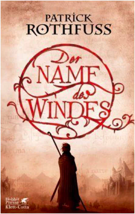
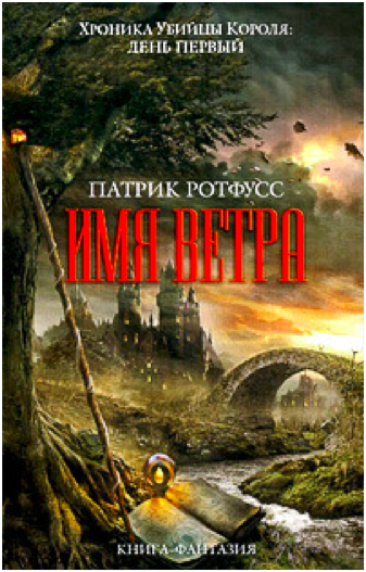
Hardcover German March 2007 Edition
Oh look! A cloaked figure staring at a city. What a surprise. I rather like the title text design, which is pretty creative and a good way to make the title visually appealing. I wish the city in the painting weren’t so damn faded and distant – I think it’s a mistake to keep the visual focus on the figure exclusively and only hint at the city beyond.
6/10
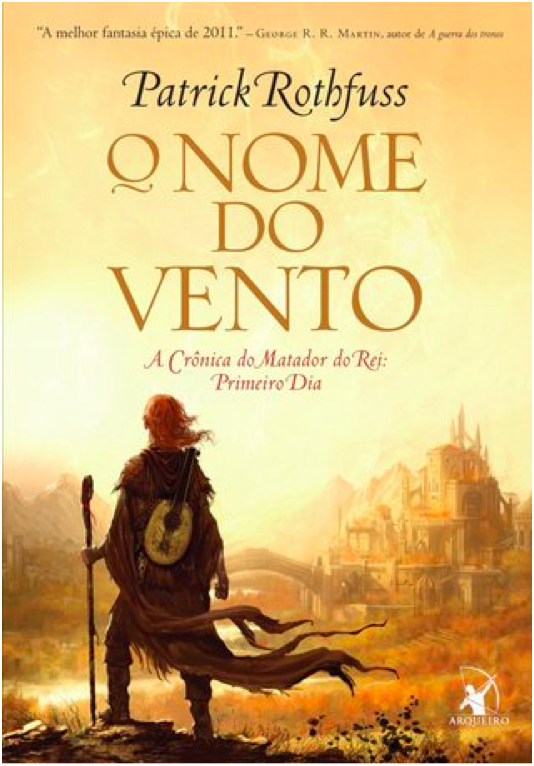
Paperback Portuguese September 2009 Edition
This cover is terrible. I would say the worst, but there’s more still to come. Anyways, this is incredibly bad. We’re once again with the hooded, cloaked figure with his back to the viewer, which is a lazy and uninteresting pose. The image is badly photoshopped and looks like an alternate movie poster for The Blair Witch Project. There’s nothing interesting about the image, nothing that interests the viewer. The title font isn’t boring, I guess. That’s the only good thing I have to say about this. 1/10
Paperback Portuguese July 2009 Edition
Still another cloaked figure staring off at a distant city, but this is one my favorite versions of this trope. The city is far enough in the middle distance that the figure is the main focus, but we can still see enough of the city to see that it’s cool looking. I’m glad to see the bridge from the books, which is a nice detail. The title text does a good job of filling in the empty space of the painting without crowding the other elements.
9/10
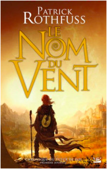
Paperback French November 2009 Edition
This is the same cover image as before, but it’s been cropped so that the figure is centered. I don’t like the change – the balance is better when the figure is off center. Also, the title text is way too big and dominates, which is unfortunate because the Spanish cover had such a lovely balance throughout. 7/10
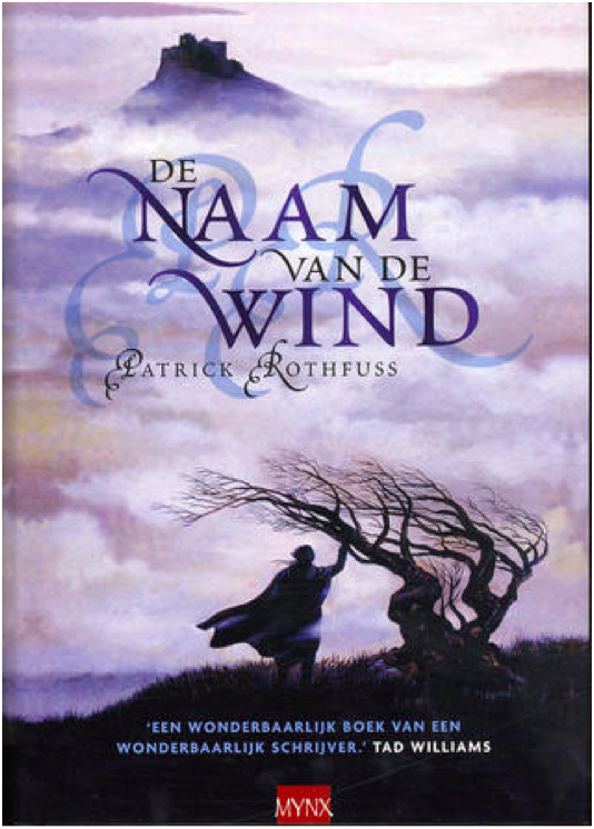
Hardcover Dutch July 2007 Edition
Yet. Another. Hooded figure. Staring. At a city. Wow. This one has a tree, at least. The image is… fine? I might be kinder to it if I hadn’t seen several better iterations of this right before. Because so much of the image is shrouded in fog, there’s very little to go on in terms of visual interest. And while I don’t mind the shadowed, muted color scheme, it also means that there’s very little to distinguish the cloaked figure and make him intriguing. The shadow initials behind the title text is horrific and obscures the title somewhat, so docking a couple of points for that. 5/10
Hardcover UK January 2017 Edition
Ahahahaha. This looks like the My Neighbor Totoro edition of Name of the Wind. It’s very silly and lighthearted, but wholly inappropriate for a book whose reading level is above first grade. If this was a kid’s book, I’d give it full marks. But Name of the Wind is very much for adults, and this cover is way too young and childish.
1/10
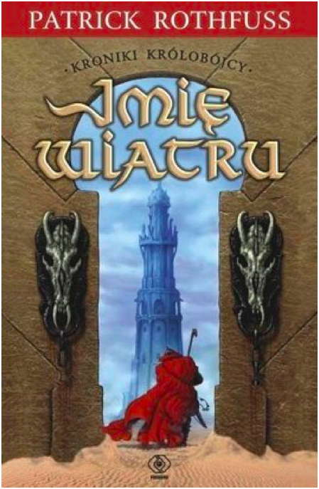
Paperback Polish August 2008
YIKES. I cannot figure out which scene or location from the book this image is trying to evoke, which makes me think the cover artist did not have the book or a text excerpt to work from. What the hell are those weird horse skulls? Why is this taking place in a desert? Why is the texture so bad? So many questions. And the effect on the title text is bad.
0/10 YES WE CAN GO LOWER THAN 1
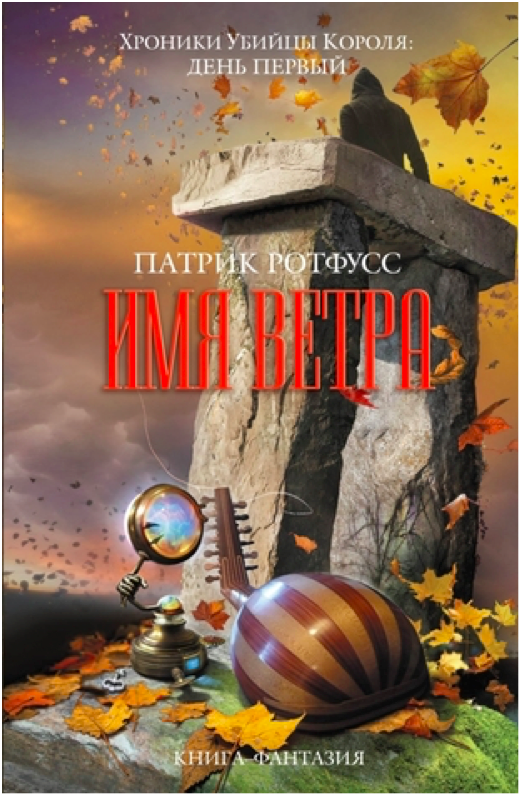
Hardcover Russian 2010 Edition
This looks like the cover to a Dungeons and Dragons manual. I suppose that’s supposed to be from the Dracchus scene with Denna, but the image doesn’t look quite right for Name of the Wind. It’s just so generic fantasy. I also don’t like how the image is cropped top and bottom to make way for a very generic marble background. Still, the image is colorful and exciting, even if it could be the cover for any fantasy novel ever.
5/10
Paperback UK 2011 Edition
What the FUCK happened here? Who let this shit happen?
-10/10
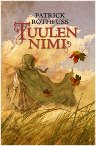
Hardcover Finnish August 2010 Edition
Ooooh, more Miyazaki fanart! This is actually quite lovely, and it fits the tone of the books much better than the kids book cover from before. I love how soft and gentle the painting is. Notice the color balance. I don’t know if this cover really ‘grabs’ you or draws interest, but it’s one of my favorites of the bunch.
10/10
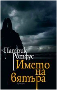
Paperback Bulgarian October 2010 Edition
I reserve the right to change my opinion later, but this may be the worst contender in the cloaked and hooded figure from behind category. I actually had to double check that this wasn’t a reused image from the mass market paperback edition, but nope! This is a brand new cover image, and it’s absolute shit. The lighting is so dark it’s impossible to make out details, the balance is way off, and the cover and title text are placed over the figure (aka the only object of interest) instead of the boring, generic storm clouds.
0/10
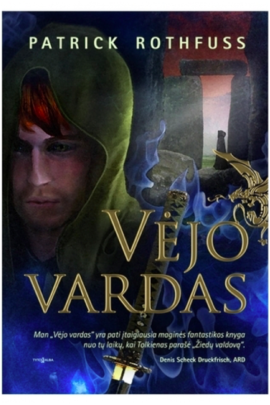
Hardcover Lithuanian 2011 Edition
YIKES times two. This cover art is truly awful in ways I didn’t know could still happen. Kvothe’s face looks ‘off’ because the facial proportions are all wrong. The blue mystical katana is bizarre because there’s no magical sword, much less a katana, in the story. And is that a photo of Stonehenge in the background? With yet another hooded figure?! I do like the gold foil of the title and the golden dragon embellishment, but the rest of this is such shit.
0/10
Paperback Serbian February 2011
And we’re back in the safe territory of a cloaked figure staring off at a distant city! All these covers are starting to run together, but this is a new cover art. It just looks like all the others. Once again, it’s fine. The city is a little too distant and greyed out to hold interest, and the figure is kind of generic.
5/10
Paperback Italian 2008 Edition
I do not know what happened here. Who is this figure supposed to be? I cannot for the life of me figure out which character this is. It’s a shame, because it’s well-done art with a cool character and costume design. The title and author text obscure the image, though, and the shadow on the text is so extreme it’s hilarious.
0/10
Hardcover Hungarian 2009 Edition
This is just boring. There’s no information conveyed here, nothing interesting or arresting to attract the viewer’s attention. The translucent overlay on the title is an odd choice.
2/10
Paperback Persian 2016 Edition
I believe this was originally a fanart of Kvothe (correct me if I’m wrong please), but it’s a good one. The tree shadow in the back is distracting and obscures the handle of the lute on his back, though. I wish there was more here – it feels very spare in an unintentional way.
6/10
Hardcover Georgian 2016 Edition
Cloaked and hooded figure staring off into the distance, check. I’m not crazy about this one – the art is very soft in a blurred kind of way, and it reads as a little humdrum. The tower in the distance is quite dull – it looks like a modern office building.
4/10
Hardcover Italian October 2016 Edition
The title text is a little too high – I don’t like how it covers the figure’s chin. It’s not a bad idea to make Kvothe’s green eyes a focal point, and it’s certainly more of an original idea than most of these covers have shown. But the muted color pallete drags the whole mood down. It’s not evocative, just kind of damp.
5/10
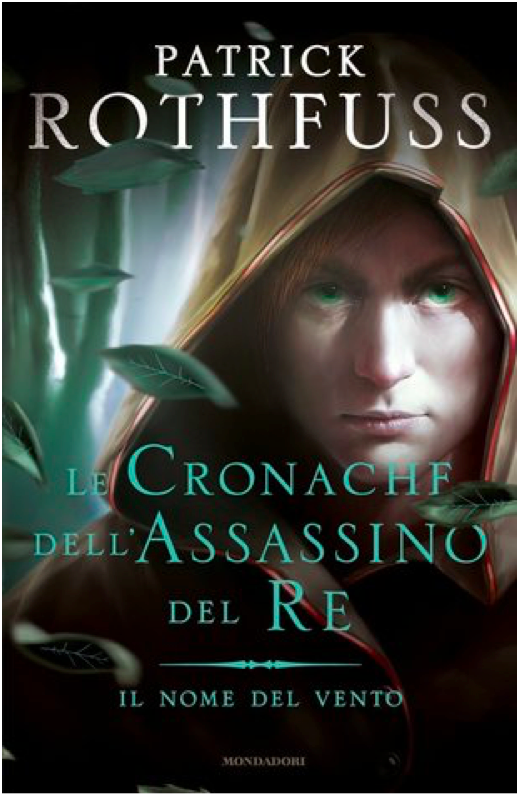
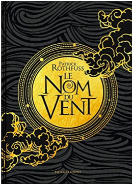
Hardcover 10th Anniversary French November 2019
I LOVE this cover. It’s gorgeous. I love the gold foil, love the text, love the clouds. It’s stunning and timeless. Amazing.
10/10
Hardcover Latvian October 2013 Edition
It’s a cloaked figure with a city in the distance, but he’s NOT looking at the city! What!! I’m rather surprised at how few covers feature Kvothe actually playing the lute – this may be the only one, actually. I don’t like the bottom fade, and I think the design is a little generic fantasy. But it’s a nice balance, and the title text is fancy and eye-catching.
7/10
Paperback Polish 2017 Edition
This cover artist also clearly wasn’t working off an excerpt from the book. The character design is so off and unlike Kvothe, except for the cloak. Wall texture looks like a photo manipulation, which is cheap. This whole thing is bad.
0/10
Hardcover Russian 2015 Edition
What is with the Stonehenge imagery? And why is that guy floating off of Stonehenge in a modern hoodie? Why is that one leaf in the top right so huge? Why is the title text red and difficult to read? At least there’s a broken lute, I guess.
1/10
Paperback Chinese May 2012 Edition
This is incredibly lazy and the photoshop job is terrible and generic. Zero effort was put into this cover.
0/10
Hardcover Russian 2011 Edition
I’ve been pretty harsh on Russia, mostly because the Russian covers have been terrible. This is ok-ish. It’s very generic fantasy, and the castle looks like Hogwarts. But it has visual interest, even if the title text color is garish.
2/10
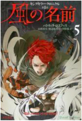
Japanese 2017 Edition
I quite love that they turned Kvothe into an anime character. And he’s doing stuff, too, and not just staring out into the middle distance. There’s so much imagery of the broken lute in these covers, so it’s refreshing to see the other part of this scene – when Kvothe loses his shit and finally calls the name of the wind. Fun cover, good artwork. The red title text works here because it matches Kvothe’s hair.
In case it wasn’t clear, I am solidly in the “Denna is great,” and “Denna is just female Kvothe” camps. @ me. . Photography: the bard-artist @catmonkeyphotography
“If a storm blows down your house, or breaks a tree, you don’t say the storm was mean. It was cruel. It acted according to its nature and something unfortunately was hurt. The same is true of Denna.” -Patrick Rothfuss, Name of the Wind
Photo: Whose photos say 7 words @catmonkeyphotography
“One of the POV characters is a woman and she’s really kick ass. Plus there’s war, magic, rebellion, spies, lots of really awesome characters and a mule that thinks he’s a duck.”
Uprooted by Naomi Novik
“It’s FANTASTIC.”
The Ranger’s Apprentice by John Flanagan
“The main characters are men, but the women are kickass and actually have important functioning roles in the plot!”
We recommend:
Literally Anything by Brandon Mull (Fablehaven or the Beyonders especially)
You might feel weird picking up a 600-page-each-book series written for 5-8th graders but believe me when I say that these books are so damn phenomenal, you’ll be glad you did. Really imaginative stories. Good characters. Patton Burgess.
The Name of the Wind (of The Kingkiller Chronicle series) by Patrick Rothfuss
A more adult fantasy novel that is so unbelievably good I can’t even put it into words. Just do it.
Sabriel by Garth Nix
A classic. No explanation needed.
An Ember in the Ashes by Sabaa Tahir
We love a good two-perspective story. Bonus points for supporting an author who is a WOC!
The Young Elites by Marie Lu
This story is not without its weak moments, but A+ for a non-Medieval England setting and main characters with physical deformities. Also revenge is good.
A Court of Thorns and Roses by Sarah J Maas
Beauty and the Beast retelling. Curses, trials, fairies. If for nothing else, read for the scene where the protag gets mad at the two male characters and paints portraits of their faces on pigs’ bodies for hours.
I want to add more book recommendations, so if you have any good ones, send them our way!!!


")
, and I felt like it w")
, and I felt like it w")


![eyes on you [x x x x x x x]](https://64.media.tumblr.com/df1b0b2769a35cd1c00d1ded01f9e38f/tumblr_pm23auhqCW1un1x6fo1_1280.png "eyes on you [x x x x x x x]")
![eyes on you [x x x x x x x]](https://64.media.tumblr.com/b20167653a741f04c37ba3deafebefc5/tumblr_pm23auhqCW1un1x6fo2_1280.png "eyes on you [x x x x x x x]")
![eyes on you [x x x x x x x]](https://64.media.tumblr.com/cdf30cb9540cea041e089e3fc33a7005/tumblr_pm23auhqCW1un1x6fo3_1280.png "eyes on you [x x x x x x x]")
![eyes on you [x x x x x x x]](https://64.media.tumblr.com/b83ca480f755b8c3ad401622d133df3a/tumblr_pm23auhqCW1un1x6fo4_1280.png "eyes on you [x x x x x x x]")
![eyes on you [x x x x x x x]](https://64.media.tumblr.com/558437c2ccd9fef2dbd71dfae6374d1c/tumblr_pm23auhqCW1un1x6fo5_1280.png "eyes on you [x x x x x x x]")
![eyes on you [x x x x x x x]](https://64.media.tumblr.com/d55e7d435df614a9a57a8749b6d0df57/tumblr_pm23auhqCW1un1x6fo6_640.png "eyes on you [x x x x x x x]")
![eyes on you [x x x x x x x]](https://64.media.tumblr.com/44a28df7bd8197f68800108996812f91/tumblr_pm23auhqCW1un1x6fo7_1280.png "eyes on you [x x x x x x x]")