process notes for “stagnation” – wanted to document my art process for this since it’s my most detailed painting yet, which involved trying a few new methods for the first time ! this is mostly for my own record, but i thought some of you might be interested. artist statement + detailed explanation under the cut !
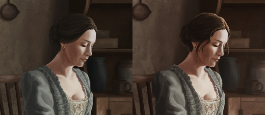
the concept behind “stagnation” centres around miranda’s isolation inland - detached from both flint’s pirate world and civilised society, existing in a limbo state between worlds after having been uprooted from her past life. not looking out but looking downwards, she is surrounded by an empty, lifeless house that is not a home.
“ this place, this life that we’ve been living here, it doesn’t feel like living anymore ” — black sails 1.04
the composition sits within a static one-point perspective view to convey a sense of stillness in space. miranda is intentionally placed just off the vertical third to create a tension between figure and environment, again suggesting she does not quite fit in this space.
process :
i knew from the beginning that undertaking this painting would be beyond anything i’ve ever done before so i dedicated a lot more time towards the early research & development stages. i’m not practiced in painting environments so i took this as an opportunity to learn and challenge myself ! the whole process from start to finish took about 4.5 months!!!
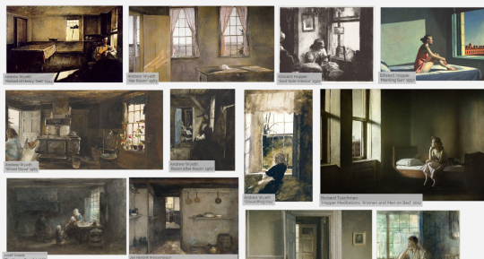
the initial concept was originally inspired by the works of 20th century american artists edward hopper & andrew wyeth, however further visual inspiration was also found in several hague school and dutch golden age artists.
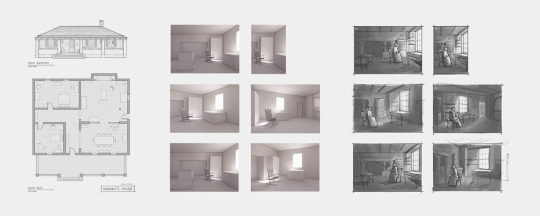
i already had a vague idea of what i wanted the overall composition to be ( miranda sitting alone in her house ), but needed to do further studies to nail something down. so begins the ( likely unnecessary ) exercise in analysing miranda’s house from various screenshots and reconstructing the floor plan ( fun fact: i used a shot of billy standing in the doorway as a visual ruler/reference, since he’s just about 2m tall ! ). this was used to roughly model and create basic 3d views, which i then used as a base for thumbnail studies. i explored a couple different angles, but ended up settling on a front-on views as opposed to more dynamic angles since it better suited the mood i wanted to convey.
once a thumbnail composition was settled on, i created a rough sketch at full size. typically for fully-rendered pieces, i’d work from a cleaned up version of the sketch, but since this piece involved a level of detail i’ve never attempted before, i opted to do clean lineart to save me from having to refine forms too much down the line ( especially while working to the zine schedule ).
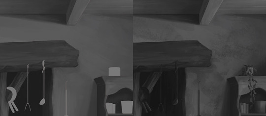
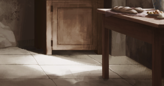
to make sure i got my values right from the beginning, i tried the greyscale to colour method (based on traditional flemish method), rendering the full painting in b/w first. i started with the base background ( house and furniture ) so i would have environmental context to accurately light everything else. the objects & figure shapes were blocked in for clipping masks, then rendered. a smooth brush was used to lay down initial values, then texture was built up with a few rougher brushes. the texture on the plaster walls was done by broadly/lightly applying texture, then haphazardly drawing random shapes with the lasso tool & painting/erasing within the selection to add more variation zones ( you can see evidence of this in the more defined edges of certain patches on the wall ).
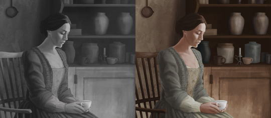
colour overlays were applied in a similar order to the greyscale, background first then objects & figure. i used a mix of gradient maps and layers set to colour/overlay blending modes to start off with, then adjusted the curves of the base grey layers since the contrast was actually quite flat. when i was mostly happy with the colour, i flattened a few layers and started painting over, adding more definition and texture. i also used brushes set to colour/overlay blending modes. the background and object groups were still kept on separate layers to allow for further colour adjustments. some objects were changed/omitted since i thought the painting was feeling a bit too busy ( also couldn’t be bothered painting a woven basket lmao ).
most cast shadows were kept on a separate multiply layer, as i wasn’t super confident with them ( you can see the shadow direction changing a few times in the gif - tbh still not sure i did them correctly ). while i did have some crude 3d views to reference from, the rendering software i used didn’t give me accurate lighting conditions ( more ambient than anything ). i also had a screenshot of the kitchen at a similar angle but different time of day to help inform my decisions, most of it ended up being educated guesses. i had to think about how light works on different finishes ( eg metals vs ceramics ) and how they behave in relation to surrounding surfaces ( eg reflected light from the floor to the display cabinet, light from the chimney ). i suppose this is where working in the architectural industry came in handy ! the light streaming in from the window was done with a textured brush set to low opacity - i did this before the colour stage, but i kept it turned off during the colouring process as i wanted to make sure the lighting/colour behind the light rays was accurate first.
for final touches, i added small details like a rim light on miranda’s head to distinguish her dark hair from the shadowed wall, and the stray strands of hair. a few adjustment layers ( curves, gradient maps, general colour overlay, hue/saturation ) were used to tweak the overall appearance. then of course, a noise texture layer + my signature slapped on top !
reflection :
the greyscale render > colour method i found to be a lot more efficient than my usual process of blocking in colours then shading from there ( since i usually have to keep fixing tonal values while i’m colouring with the latter method due to relative colour perception ). i still had to adjust value depth in the colour stage ( more emphasising instead of repainting ), but to a much lesser degree than i would have otherwise. i’ve never really bothered to do composition thumbnails before ,since most of my drawings to date have been simple figure/ground instead of full illustrations. but having done it for this, i found it was really helpful having a visual gameplan from the beginning to guide me. definitely going to start thumbnailing for more illustrations going forward. the rough 3d views were also super handy to create compositions i’d probably not come up with otherwise !! they were created with autodesk revit + enscape since that’s what i’m familiar with. but i’m hoping to teach myself blender at some point since the lighting controls are a lil more versatile !
i really enjoyed rendering the timber/wood + the slight imperfections of the stone tiles. i also liked doing the embroidery on her stomacher. i think i struggled most with rendering the folds of the dress - just couldn’t find the right reference, so i kept having to repaint it quite a few times ! definitely need to do some clothing/fabric studies at some point. i didn’t use any perspective guidelines either - i went off the base 3d view ( which i didn’t even follow too closely ) and then eyeballed the rest. probably could have benefited from setting up some guidelines but i felt i’ve had enough experience drawing architectural perspectives that i could wing it lol.
there were also a couple things i’ll probably do differently in the future. for most of the rendering & colouring process, i kept many elements on clipping mask - these clipping masks bases fm the beginning had very sharp edges so i ended up having to go in with a textured brush after to soften the edges. i could probably stand to be a bit looser with these bases, but i think it was mostly a product of following refined lineart as opposed to something sketchier. i probably also didn’t need to use as many layers as i did. as a general rule, i try to keep layer count to a minimum, but since this particular piece was working on a set schedule, i wanted to make sure i was making allowances for quick/easy adjustments. otherwise i would have merged layers for overpaint much earlier in the process.
overall, the outcome was much better than i originally imagined - it certainly taught me quite a lot ! and thank you for reading all my silly ramblings, hope you found this as interesting as i did <3
I did a “draw this again” from 2008! People have always told me how much they like the original concept so I thought it deserved a makeover. I included a process gif too (sorry for the poor quality!)
Arsenic and Old Lace; a 1920’s horror-themed D&D campaign featuring three pcs that have a total of 2 brain cells between them and a DM with the patience of a saint