#stanley morison
Typography Tuesday
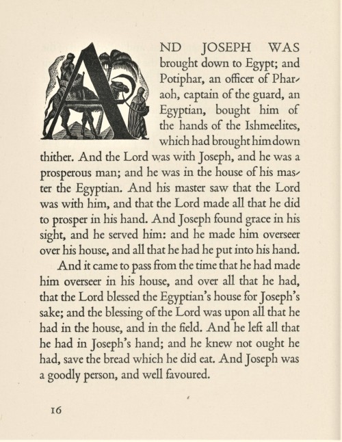
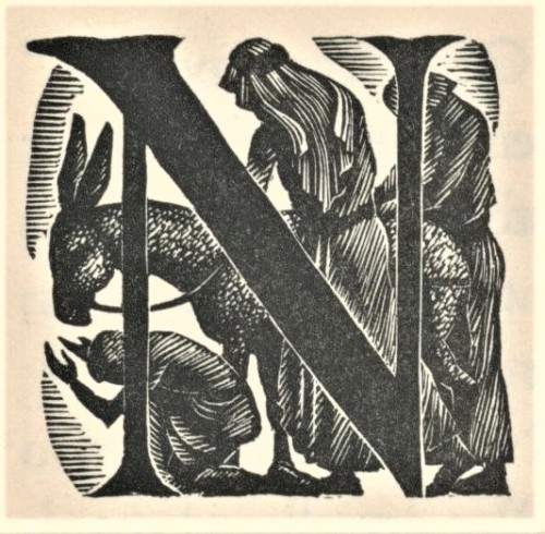
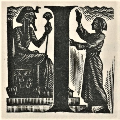
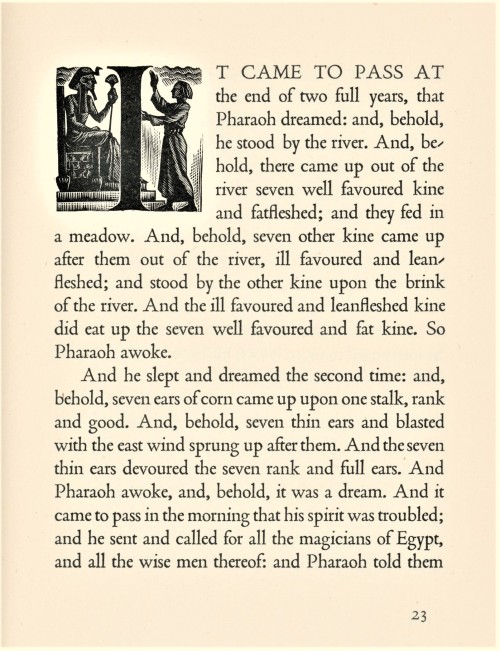
Last week we presented wood engravings by the English-American artist Nora S. Unwin (1907-1982) from Joseph; the King James Version of a Well-loved Tale, arranged with an introduction by her friend and frequent collaborator Elizabeth Yates, and printed and bound by the Plimpton Press in 1947 for Alfred A. Knopf in America and the Ryerson Press in Canada.
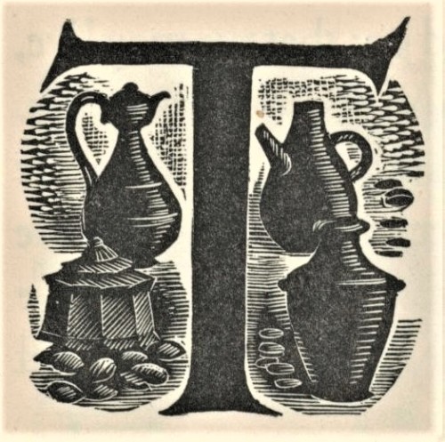
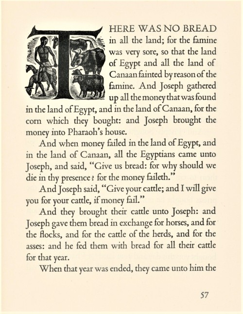
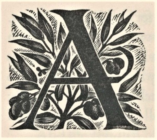
Today we present Unwin’s fine wood-engraved historiated initials for the chapter openings of the book. The initials mesh well with the solid stateliness and deep color of Stanley Morison’s Poliphilus typeface (released by Monotype in 1923), and integrates uniformly with Unwin’s engraved illustrations, creating a harmonious and holistic presentation to the entire production. This copy is another gift from our friend and benefactor Jerry Buff.
View more posts with historiated initials.
Viewmore Typography Tuesday posts.
View more posts with women wood engravers.
Viewmore posts with wood engravings!
Post link
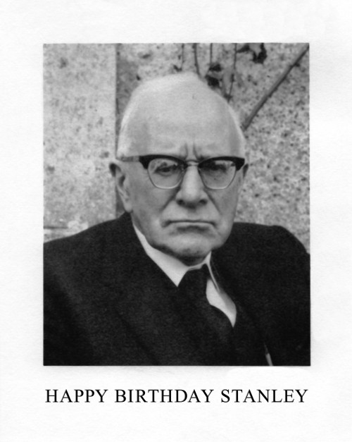
stanley morison, most eminent typographical scholar of the twentieth century, was born 6 May 1889: happy 133rd stanley! post hoc ergo proper hoc: 6 may is also the feast of st john ante portam latinam—st john is patron saint of printers & engravers.
image is frontispiece (tweaked a bit) from Stanley Morison | 1889—1967 | A Radio Portrait [w.s. cowell, ipswich, 1969; photo by janet stone]. caption set in times new roman, the face designed by morison for his 1932 redesign of The Times—for more typeface info vide‹chiasmus›.
Post link
eric gill on typography
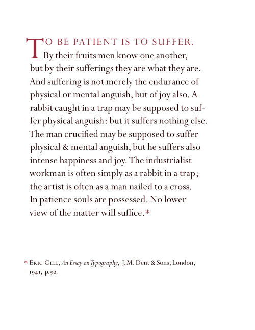
gill’s philosophy of art & craft from his seminal An Essay on Typography, here set in digital reissue of monotype perpetua . perpetua was completed by eric gill august 1928 [uk monotype 239]; & first shown in a private printing of The Passion of Perpetua and Felicity — english translation by walter shewring of the latin hagiography Passio sanctarum Perpetuae et Felicitatis, «a journal recounting her [vibia perpetua’s] trial and imprisonment that was continued by a contemporary who described Perpetua’s death in the arena» [www.britannica.com]. «the roman was named ‘perpetua’, the italic cut later ‘felicity’» [stanley morison, A Tally of Types, cambridge university press, 1973, p101]. morison’s ultimate analysis: «They are creations. There never was anything of that kind before he [gill] did this, and never been anything since. And these things were not ad hoc designs, they were designs that he had been cutting on stone for a generation before it was ever proposed that he should design a type: with the result they are both very successful in terms of unselfconscious design. The capitals that he did, I think, will be immortal. They’ll be used as long as Roman alphabet is ever used anywhere. And probably those Perpetua capitals—the titling, so called—I suppose are the finest capitals ever done since Sixtus V—1589. They’re far better than the classic Trajan and Augustus pattern—far better.» [Stanley Morison | 1889—1967 | A Radio Portrait, w.s. cowell, ipswich, 1969, p24]. first commercial showing of perpetua was gill’s Art Nonsense [cassell & co, london, 1929]—vide‹belle sauvage›.
An Essay on Typography [first edition: sheed & ward, london, 1931] was the first showing of gill’s joanna typeface, printed at hague & gill, printing office of gill & son-in-law rené hague. for more on the joanna face vide‹life drawing›.
the illustration atop is Eye and Hand, wood engraving, gill’s device c.1906.
Post link
pointed runic
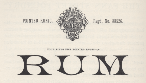
generally, i take the term runic to denote a fount of sorts requisite for setting the inscriptions of pagan, northern-germanic tribes in the letters they called runes [cf. isaac taylor, The Aphabet, vol.2, kegan paul, trench, & co., london, 1883, p210]. but in Plain Printing Types theodore low de vinne gives a taxonomy of types he assigns to the category «antique», & one is called runic: «Runic is the name given to another style of antique of light face, of condensed form, with pointed serifs, and often without lower case characters.» [the century co., nyc, 1902, p326]. perhaps here we get closer to the face illustrated, but not quite, i think.
stanley morison in his slim biography of Talbot Baines Reed [privately printed at the university press, cambridge, 1960] gives account of reed’s proprietorship of the type foundry he took over at his father’s death in 1881, the fann street foundry (vide footnote to ‹clarendon›); & morison shows several specimens from a fann street foundry catalogue [Specimens of Printing Types, Ornaments, &c, sir charles reed and sons, london, 1887], of which the illustration is one [op cit., p38]—morison must have found it striking. if runic is a species of antique, i do not see it in this face; or perhaps it was felt to resemble the ancient runes: there must be some logic in the name [✓].
Post link
quick path to enlightenment
dust jacket [spine, front+flap], title-page, preface, & opening from stanley morison’s seminal First Principles of Typography [macmillan, new york, 1936]. «First authorised separate edition.» also first US edition. [98b in The Writings of Stanley Morison, tony appleton, brighton, 1976, p24.] the first draft had appeared in The Fleuron, no.vii, 1930.
morison’s distillation : tenets of good [book] typography. printed at the printing-office of the yale university press; monotype composition in bembo throughout; but—surprise—dust jacket, also presumably machined at the yale office, set in weiss types from the bauer foundry—interesting choice (for more info vide‹sweet vignette›). bruce rogers’ quotation on the dust jacket is apt—had rogers a further involvement? beyond the quotation appleton makes no further mention of rogers; he does, however, tell us that the copy described is ex libris brooke crutchley, & crutchley made pencil annotations—«These marks were made with a view to a possible revised edition.», notably augmenting the title by quantifying typography, i.e. First Principles of Book Typography [ibid.]. morison’s prefatorial intimation, «attempt at a rationale of book-typography», i believe, confirms he was of a like mind with crutchley.
Post link




![quick path to enlightenmentdust jacket [spine, front+flap], title-page, preface, & opening from quick path to enlightenmentdust jacket [spine, front+flap], title-page, preface, & opening from](https://64.media.tumblr.com/972612c413387ae880862746710ddfdc/f36253c48bcf96f2-64/s500x750/8ef5e6b15b341085f5e3aee7ce95ad56ac116460.png)
![quick path to enlightenmentdust jacket [spine, front+flap], title-page, preface, & opening from quick path to enlightenmentdust jacket [spine, front+flap], title-page, preface, & opening from](https://64.media.tumblr.com/10f75f470bcd4fabe0f46202776ed2a3/f36253c48bcf96f2-84/s500x750/95f5c08c2a75824d4f22ab689b7a6c8ee82c43f9.png)
![quick path to enlightenmentdust jacket [spine, front+flap], title-page, preface, & opening from quick path to enlightenmentdust jacket [spine, front+flap], title-page, preface, & opening from](https://64.media.tumblr.com/e18c2a6b141669c4a90fec8bf6daa559/f36253c48bcf96f2-6c/s500x750/0e2d484a44aee7e8634a83107fbbb37b8b37c948.png)
![quick path to enlightenmentdust jacket [spine, front+flap], title-page, preface, & opening from quick path to enlightenmentdust jacket [spine, front+flap], title-page, preface, & opening from](https://64.media.tumblr.com/dbddb6c8b3dbcf541890cf70ebe7b81b/f36253c48bcf96f2-b0/s500x750/9618d6b9438cf92f6614c99fdc2792ef2d42c8eb.png)