#typography tuesday
Typography Tuesday
ANNA SIMONS
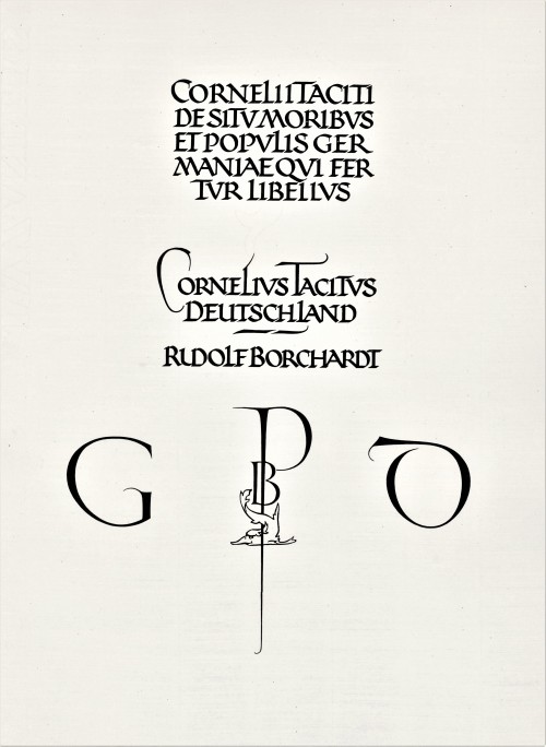
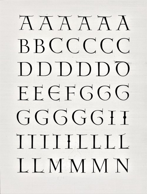
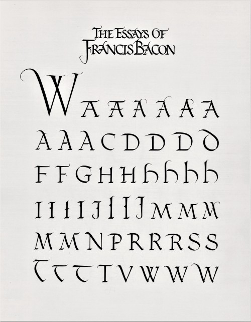
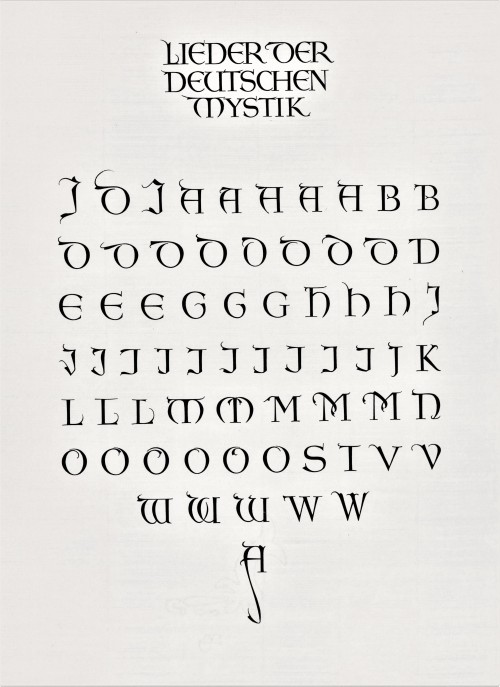
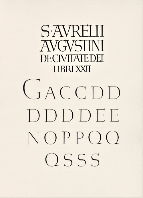
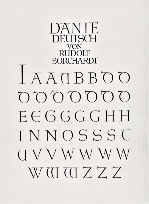
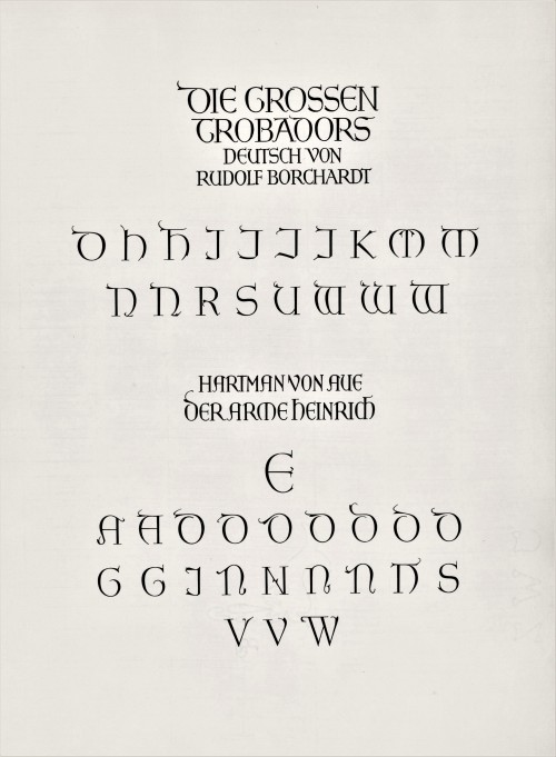
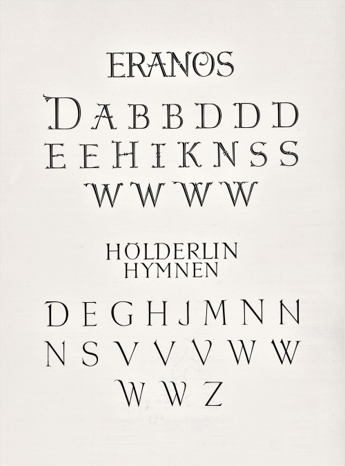
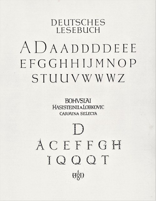
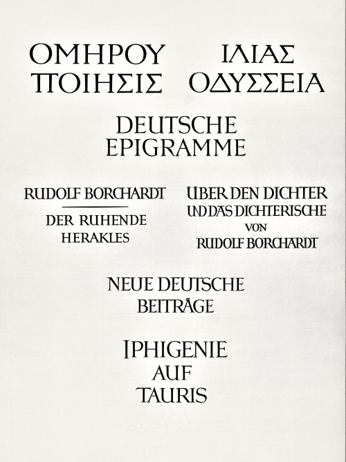
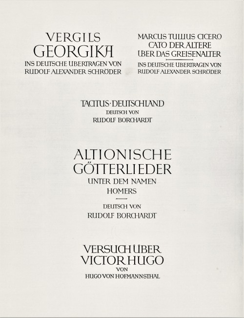
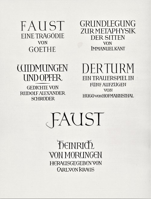
Today we present a few pages from a new acquisition, Titel und Initialen für die Bremer Presse, a specimen book of the titling and initials produced by the German calligrapher and type designer Anna Simons (1871–1951) for Willy Wiegand’sBremer Presse, printed letterpress in Munich at the Bremer Presse in an edition of 220 copies in 1926. A student of the renowned British calligrapher and type designer Edward Johnston, Simons taught Johnstonian design concepts at the Kunstgewerbeschule in Dusseldorf and later at Munich under the direction of German architect and type designer Peter Behrens. She began doing design work for the Bremer Presse beginning in 1918, and along with her assistant Franziska Kobell, Simons designed some 1400 titles and initials for the Presse. Simons continued to teach and work in Germany through the Nazi regime and died at 80 in Prien, Germany.
View more posts with designs by Anna Simons.
View posts on other Women Type Designers.
Viewmore Typography Tuesday posts.
Post link
Typography Tuesday
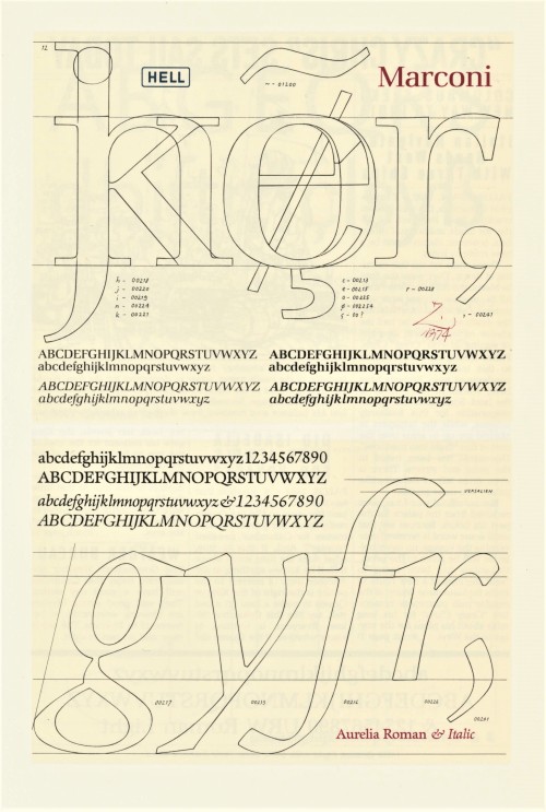
This week we present a selection of designs by our favorite type designer and calligrapherHermann Zapf (1918-2015) from the 1987 publication Hermann Zapf and His Design Philosophy published in Chicago by the Society of Typographic Arts (STA) in memory of the great Scottish-American type designer and long-time design director for the Ludlow Typograph Company Robert Hunter Middleton (1898-1985), who provided the original idea for the book. Since 1948, Hermann Zapf designed over 175 alphabets for hand-composition, for the Linotype typesetting machine, and for photocomposition and digital laser systems. The book brings together selected articles and lectures on calligraphy and contemporary developments in type design by Zapf, with illustrations, some presented for the first time, bibliographical notes and a complete list of Zapf’s typefaces.
Although Zapf spent the majority of his career in Germany, he was an honorary member of STA and was a professor of typographic computer programming, the first such position of its kind in the world, at Rochester Institute of Technology (RIT) from 1977-1987. Click on the images for details on the designs.
View more posts that include the work of Hermann Zapf.
Viewmore Typography Tuesday posts.
Post link
Typography Tuesday
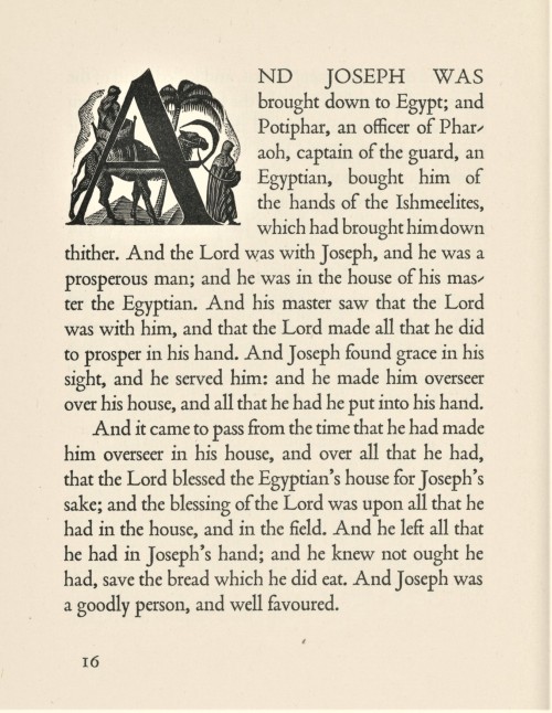
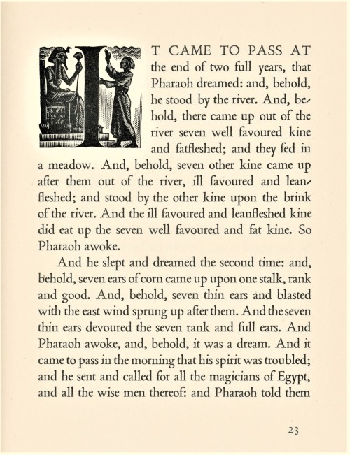
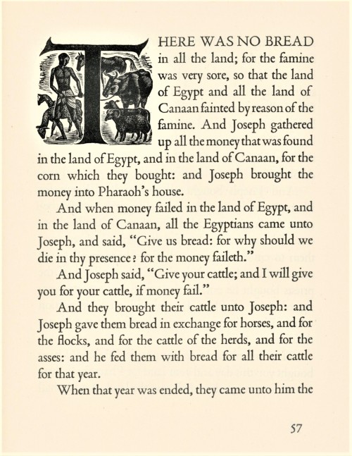
Last week we presented wood engravings by the English-American artist Nora S. Unwin (1907-1982) from Joseph; the King James Version of a Well-loved Tale, arranged with an introduction by her friend and frequent collaborator Elizabeth Yates, and printed and bound by the Plimpton Press in 1947 for Alfred A. Knopf in America and the Ryerson Press in Canada.
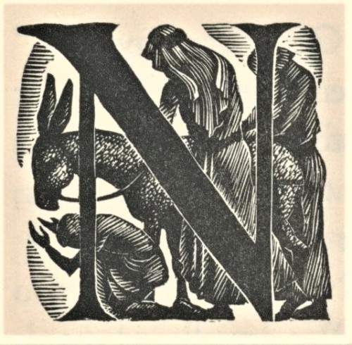
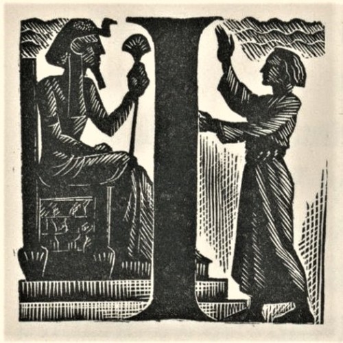
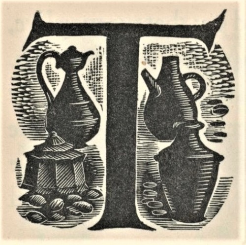
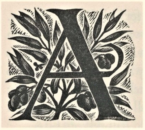
Today we present Unwin’s fine wood-engraved historiated initials for the chapter openings of the book. The initials mesh well with the solid stateliness and deep color of Stanley Morison’s Poliphilus typeface (released by Monotype in 1923), and integrates uniformly with Unwin’s engraved illustrations, creating a harmonious and holistic presentation to the entire production. This copy is another gift from our friend and benefactor Jerry Buff.
View more posts with historiated initials.
Viewmore Typography Tuesday posts.
View more posts with women wood engravers.
Viewmore posts with wood engravings!
Post link
Typography Tuesday
ANNA SIMONS, PART 2
This week we present the next ten of the twenty numbered plates in Titel und Initialen für die Bremer Presse, a specimen book of the titling and initials by the German calligrapher and type designer Anna Simons (1871–1951) for Willy Wiegand’sBremer Presse, printed letterpress in Munich at the Bremer Presse in an edition of 220 copies in 1926. We highlighted the first ten plates a couple of weeks ago.
For 15 years, Simons’s Arts & Crafts-inspired designs were important elements in the aesthetics of the Bremer Presse, and Weigand celebrated her contributions in this portfolio set of specimens during the middle of their collaboration. The press closed in 1934 and its assets were liquidated the following year. The studio building was destroyed in bombings during WWII. Simons, however, continued to teach and work in Germany through the war before her death in 1951.
View more posts with designs by Anna Simons.
View posts on other Women Type Designers.
View more Typography Tuesday posts.
Post link
Philosophical Sweets
The delightful ornamentation around the page numbers in this 1795 tract is a contrast to the dense German philosophy of the text. We think it looks like each page number has been placed in a candy wrapper.
Post link
Typography Tuesday
Ken Briggs
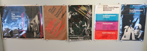
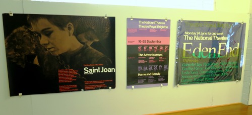
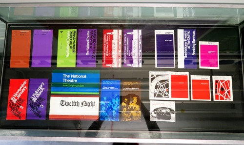
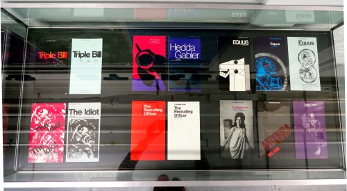
Posters and programmes for the National Theatre, London
Ken Briggs (1931–2013) became well known for the posters and programmes he created for the National Theatre, London, in the 1960s. His strongly coloured designs draw on elements of Swiss typography and the intelligent use of overprinting inks. The work became a key feature of the National Theatre’s visual identity.
These items will remain on display until the end of the month.
For any enquiries relating to the collections at Typography and Graphic Communication or if you would like to arrange a visit please contact Laura Weill ([email protected]),Collections Administration Assistant.
Post link
Typography Tuesday
Hans Schmoller: 100 years
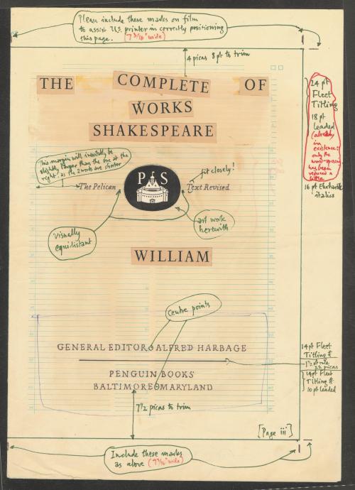
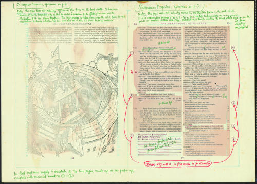
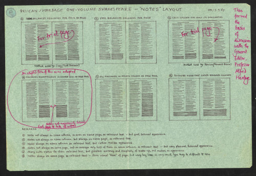
The Complete Pelican Shakespeare, 1968.
This April marked 100 years since the birth of Hans Schmoller. Schmoller is best known for succeeding Jan Tschichold as Typographer at Penguin Books in 1949, progressing to Head of Production in 1956 and Director from 1960. Much like his predecessor, Schmoller had a dogmatic approach to typography. His work on The Complete Pelican Shakespeare is fine example of his constant pursuit of perfection.
Schmoller was invited to speak at the Department of Typography & Graphic Communication in Spring term 1979. During these sessions he discussed the process of designing The Complete Pelican Shakespeare as well as answering student questions on technique, house style and future developments. As a result of his visit Schmoller was kind enough to donate the design archive of The Complete Pelican Shakespeare, including hand drawn and annotated specifications, layouts and paste-ups.
This archive is a perfect example of pre-digital typography as well as Schmoller’s meticulous attention to detail and typographic talents.
For any enquiries relating to the collections at Typography and Graphic Communication or if you would like to arrange a visit please contact Laura Weill ([email protected]),Collections Administration Assistant.
Post link
Typography Tuesday
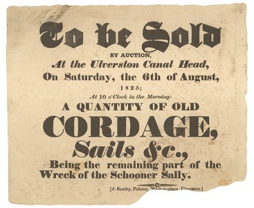
The Soulby Collection: a 19th century printer’s archive.
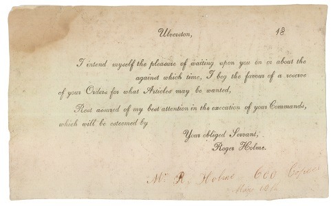
The John Soulby Collection comprises approximately 500 items of provincial jobbing printing produced in Ulverston, Cumbria, by John Soulby jr. between 1821 and 1827, including posters, notices, handbills, trade cards, billheads, receipts and a variety of other jobbing work. Many items in the collection are proof items, with letters missing, wrong fonts, manuscript corrections to copy, or smudges from testing if the ink was dry, providing an insight into the working processes of the jobbing printer. Many items have a manuscript note stating the name of the client and size of the print run. The collection showcases a variety of display typefaces including fat face, Egyptian, Italian and shaded letter. The items also demonstrate the use of variegated type for notices, signs and posters.
The items had originally been pasted into a blue paper guard book along with some twenty items by other north country printers; perhaps by John Soulby as a record of his own work. The collection was acquired from Roger Warner of Burford by the Museum of English Rural Life at The University of Reading in 1965, for £30. It had originally been obtained in Ulverston from descendants of the Soulby family. The collection is now permanently housed in the Department of Typography & Graphic Communication.
For any enquiries relating to the collections at Typography and Graphic Communication or if you would like to arrange a visit please contact Laura Weill ([email protected]),Collections Administration Assistant.
Post link
Typography Tuesday
A handwritten letter from the Centre for Ephemera Studies.
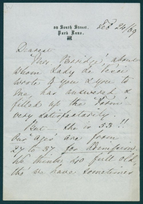
The Centre for Ephemera Studies holds a collection which continues to expand; volunteers can often be found sifting and sorting through piles of donated material. Items are generally kept as a typical example, saved to be decided upon at a later date or kept as an exceptional rarity- and this hand written letter is one of those exceptional rarities. Hidden amongst a few bits of printed material, the letter appeared unassuming at first, but then you see the signature of the author: F. Nightingale.
Not only is it written by Florence Nightingale, the topic of the letter is absolutely charming. She discusses the credentials of a prospective student nurse who…
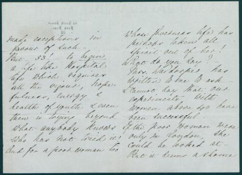
“…filled up the form very satisfactorily. But- she is 53!!! Our ‘ages’ are from 27 to 37 for admission we think 40 full old tho’ we have sometimes made exceptions in favour of luck. But- 53!- to begin a life like Hospital life which requires all the vigour, hopefulness, energy and health of youth and even then in trying beyond what anybody knows who has not tried it!”
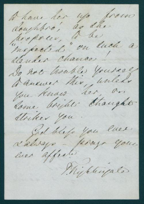
“And for a poor woman too… it seems a shame to have her from Loughbro’ as she prepares to be “inspected” on such a slender chance!”
This letter is such a fantastic insight to nursing in the 19th century and Nightingale’s character.
For any enquiries relating to the collections at Typography and Graphic Communication or if you would like to arrange a visit please contact Laura Weill ([email protected]),Collections Administration Assistant.
Post link
Typography Tuesday
3D lettering collection
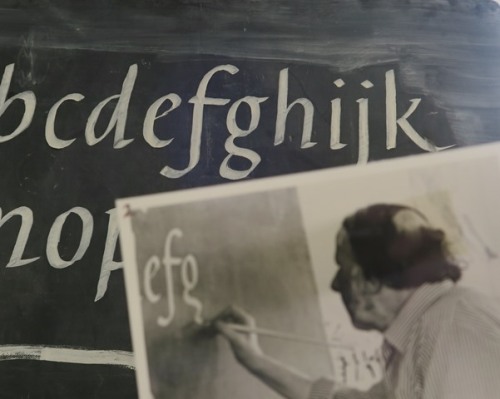
If you have been following us on instagram you may have seen our @52museums takeover which was organised around our #instaphabet. The alphabet itself featured quite a few letters from our 3D lettering collection.
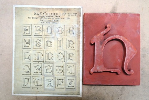
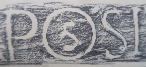
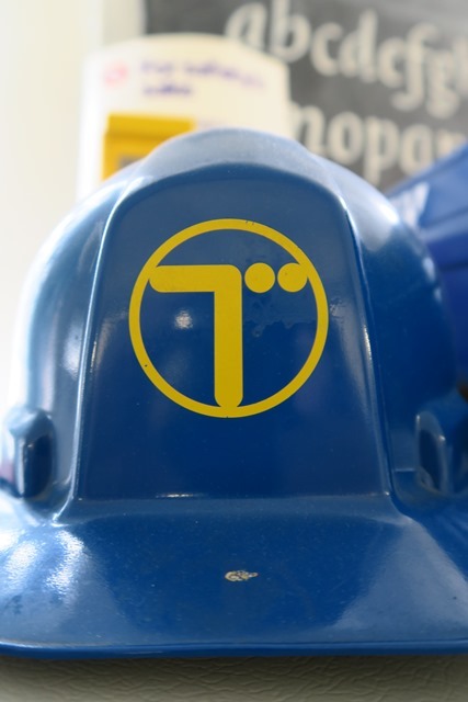
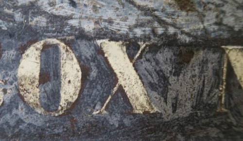
This collection comprises letterforms showcasing a variety of materials and lettering techniques; wood, stone, slate, terracotta, metal and plastic that have been stamped, routed, cut, pressed, embossed, cast, moulded, fired and hand drawn.
Many of the items have been saved from demolition sites across south-east England. The collection gives a rich overview of lettering styles and provides enjoyment through the variety of materials, scale, colour and finishes.
For any enquiries relating to the collections at Typography and Graphic Communication or if you would like to arrange a visit please contact Laura Weill ([email protected]), Collections Administration Assistant.
Post link

