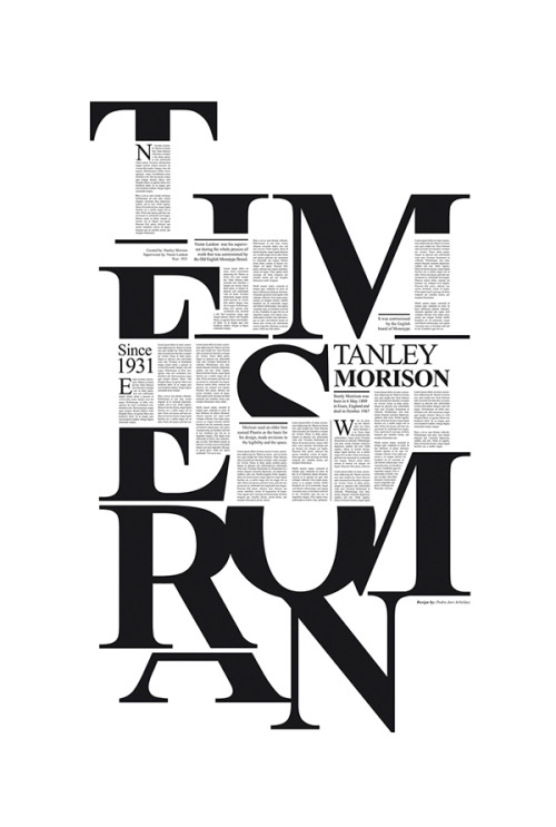
#times new roman
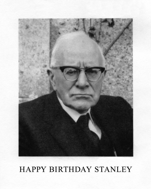
stanley morison, most eminent typographical scholar of the twentieth century, was born 6 May 1889: happy 133rd stanley! post hoc ergo proper hoc: 6 may is also the feast of st john ante portam latinam—st john is patron saint of printers & engravers.
image is frontispiece (tweaked a bit) from Stanley Morison | 1889—1967 | A Radio Portrait [w.s. cowell, ipswich, 1969; photo by janet stone]. caption set in times new roman, the face designed by morison for his 1932 redesign of The Times—for more typeface info vide‹chiasmus›.
Post link
angelica’s unusual laputa
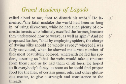
i stumbled across a sweet edition of part three from jonathan swift’s 1726 Gulliver’s Travels, designed & illustrated by warren chappell: the angelica press edition of Gulliver’s Travels : A Voyage to Laputa [ nyc, 1976]. the book includes preface & afterword on swift, both by house proprietor dennis j. grastorf; in his introduction, grastorf describes chappell’s creation method for the illustrations—clever combination of letterpress, pen & ink, photography (1st illustration frontispiece & 2nd illustration): grastorf dubs this two-color chiaroscuro. i presume grastorf may also have been editor, & author of the colophon (3rd illustration).
perceiving the text set comfortably large i felt immediately attracted to a read; but was mystified to learn from the colophon that the text is set 12pt times new roman: upon analysis i make it 13/14, but it feels larger. admittedly, the 1970’s were the height of mini-computer driven film composition for offset litho: either the photo-typesetter manufacturer’s version of times was, somehow, large on the body or chappell’s 12pt specification was subjected to scaling by the compositor. in any event, i applaud the admixture of times & perpetua. i am, however, amazed that uppercase display is not letterspaced (aesthetically balanced)—absence of this in chappell’s work i have never noticed. perhaps the compositor had yet to unravel all the mysteries of his machine.
during the read i grew increasingly aware of anomalies of punctuation, first noticing quotation of statements, i.e. within inverted commas (e.g. 4th illustration); but these are reported statements, not direct speech—the editor not so daring as to recast the clauses. i also found colon & semicolon where simple comma is expected; checking several instances against a bona fide text my observations were confirmed: the editor embarked upon a bold new logic for punctuating swift, &, perhaps, overwhelmed by swift’s descriptions of the academicians of Lagado felt an urge to up his game, be more adventurous.
Post link
[1/5] favorite characters meme () → hollyhock manhiem-mannheim-guerrero-robinson-zilberschlag-hsung-fonzerelli-mcquack
↳ “if i’mshitty, that’s just because i’m shitty. and you’re allowed to be mad at me. you just need to know that whatever i do-it’s not your fault.”
“i know - i mean.. i know, but i don’t always know, you know.”
Post link


![[1/5] favorite characters meme () → hollyhock manhiem-mannheim-guerrero-robinson-zilberschlag-hsung- [1/5] favorite characters meme () → hollyhock manhiem-mannheim-guerrero-robinson-zilberschlag-hsung-](https://64.media.tumblr.com/da07a26f0f2d10f6c6f735cb6ffc5b87/tumblr_pbmwfgI05y1w4auizo1_500.png)
![[1/5] favorite characters meme () → hollyhock manhiem-mannheim-guerrero-robinson-zilberschlag-hsung- [1/5] favorite characters meme () → hollyhock manhiem-mannheim-guerrero-robinson-zilberschlag-hsung-](https://64.media.tumblr.com/ef127eb1d4945d8920a014b3dee4362e/tumblr_pbmwfgI05y1w4auizo2_500.png)
![[1/5] favorite characters meme () → hollyhock manhiem-mannheim-guerrero-robinson-zilberschlag-hsung- [1/5] favorite characters meme () → hollyhock manhiem-mannheim-guerrero-robinson-zilberschlag-hsung-](https://64.media.tumblr.com/dbdd8f980ce5053d8421fdcb9f8bd6b4/tumblr_pbmwfgI05y1w4auizo5_r1_500.png)
![[1/5] favorite characters meme () → hollyhock manhiem-mannheim-guerrero-robinson-zilberschlag-hsung- [1/5] favorite characters meme () → hollyhock manhiem-mannheim-guerrero-robinson-zilberschlag-hsung-](https://64.media.tumblr.com/9d1e96778b1fc13579ac8df282c2c81b/tumblr_pbmwfgI05y1w4auizo4_r1_500.png)
