#laputa
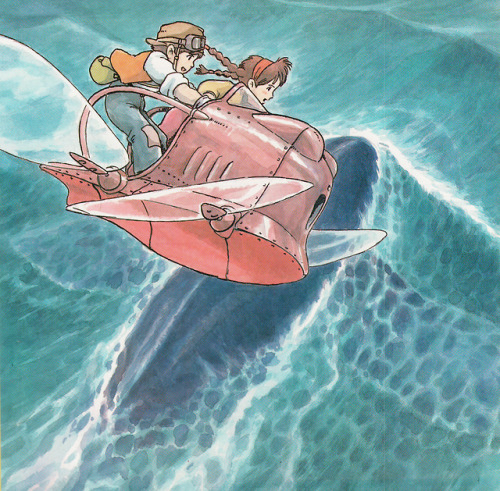
Studio Ghibli: the name of our movie would be “Laputa: Castle in the sky”
People who don’t speak Spanish: OH that’s amazing
People who speak Spanish: *choke on saliva* La QUE?!


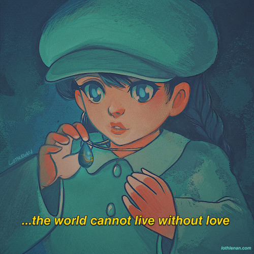
My card designs for a Ghibli zine ! I quite like how they turned out ✨
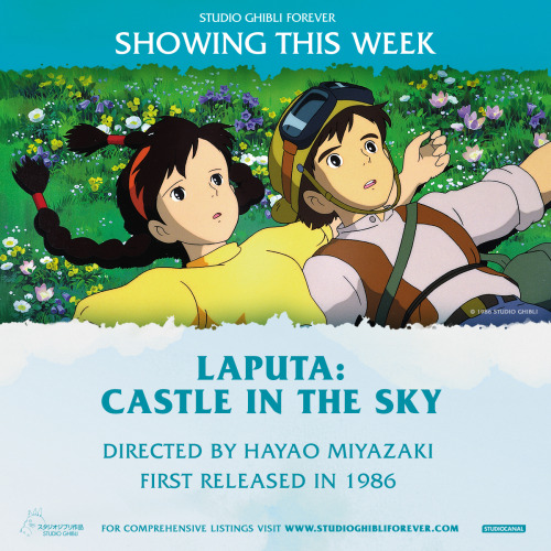
Catch Hayao Miyazaki’s animated adventure Laputa: Castle in the Sky in cinemas May 6 - 12. http://po.st/ghibliuk#StudioGhibliForever
Post link


Ghibli redraw of myself and my boyfriend
(That background was so daunting lmao)
It’s DRAWCEMBER, babes! HECKIN YEAH. That means 2020 is almost over and 2021 is nigh upon us. So unless 2021 ends up being the 2012 everyone feared and the Mayans were just dyslexic…(2021… 2012… 2021…) that’s something to celebrate!!!!
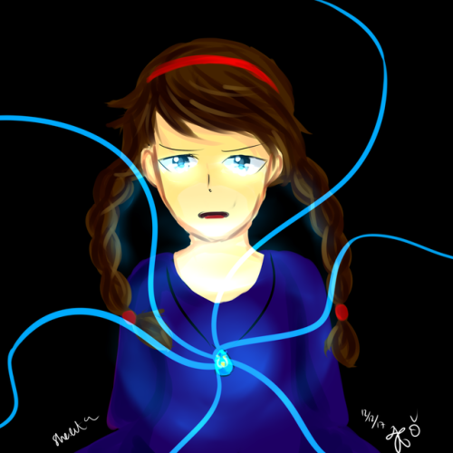
To offer 2020 a sacrifice and hope for a great 2021, I am participating in the Drawcember challenge by doing my own Girls Redrawing Girls challenge! Referencing series, games and films I have seen in 2020, I am drawing a lady and featuring a new one every day! I call it #GirlsRedrawingGirls
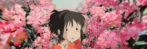
Today was Laputa: Castle in the Sky, featuring Sheeta! I watch this at least once a year, so of course I watched it in 2020! I hope you like it <3
Also psssst, doing some giveaways for all my Drawcember pieces – only people on my newsletter list will be eligible to win (because obviously I have their email haha). If you want a piece of that action, go to my webpage and sign up for the newsletter at the bottom <3
Not giving a list for my Drawcember challenge cause I want it to be a SURPRISE! Every day is a surprise. The present is a gift. Something something yada yada. <3
Post link
Illustration personal project based on Studio Ghibli Heroines. Watermark & color fade cause this shit is important. #studioghibli #hayaomiyazaki #ghibli #miyazaki #howlsmovingcastle #spiritedaway #princessmononoke #illustration #design #personalproject #typography #print #printdesign #anime #film #art #yeg #edmonton #designschool #university #designer #illustrator #vector #vectorart
Some Ghibli illustration work I had been working on and hope to sell in my etsy store soon. Would you buy it? :)
Feel free to add me to Instagram for more of my design work and person junk.
IG: hylians
Post link
~ Hisaishi / Ghibli medley ~
.
.
See how many themes/motifs you can spot
.
#studioghibli #joehisaishi #pno #ponyo #mononoke #spiritedaway #nausicaa #howlsmovingcastle #porcorosso #laputa #thewindrises #totoro #hayaomiyazaki #miyazaki
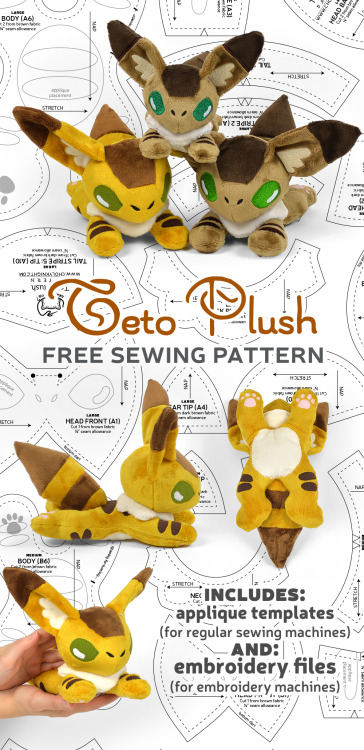
Hello everyone! As promised I have a new addition to my Ghibli pattern collection today! ♥
https://cholyknight.com/2020/07/10/teto-plush/
It’s the cute fox-squirrel, Teto, from some of the older Ghibli movies: Nausicaa of the Valley of the Wind, and Laputa Castle in the Sky
I opted to do this one with a flat, beanie-like body to include all of the tiny body markings. With that in mind, it was perfect for machine embroidery. So I created a large version for 6" x 10" hoops, and a small version for 5" x 7" or 4" x 4" hoops. Of course there are applique templates for regular sewing machines as well. The larger size is definitely easier to applique, but at least you get some variety this way!
Like all of my other free patterns, this one is available to everyone for all time! You’re also welcome to sell items you’ve sewn with the pattern – though a credit back to me is much appreciated ^_^ I hope you all like it!
P.S. If you downloaded the file super early, there was an error with the pattern and it’s missing the templates :( But thanks to you guys catching it it’s all fixed :) So go ahead and give it another try (it should say #2 in the file name) ♥
Post link
angelica’s unusual laputa
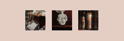
i stumbled across a sweet edition of part three from jonathan swift’s 1726 Gulliver’s Travels, designed & illustrated by warren chappell: the angelica press edition of Gulliver’s Travels : A Voyage to Laputa [ nyc, 1976]. the book includes preface & afterword on swift, both by house proprietor dennis j. grastorf; in his introduction, grastorf describes chappell’s creation method for the illustrations—clever combination of letterpress, pen & ink, photography (1st illustration frontispiece & 2nd illustration): grastorf dubs this two-color chiaroscuro. i presume grastorf may also have been editor, & author of the colophon (3rd illustration).
perceiving the text set comfortably large i felt immediately attracted to a read; but was mystified to learn from the colophon that the text is set 12pt times new roman: upon analysis i make it 13/14, but it feels larger. admittedly, the 1970’s were the height of mini-computer driven film composition for offset litho: either the photo-typesetter manufacturer’s version of times was, somehow, large on the body or chappell’s 12pt specification was subjected to scaling by the compositor. in any event, i applaud the admixture of times & perpetua. i am, however, amazed that uppercase display is not letterspaced (aesthetically balanced)—absence of this in chappell’s work i have never noticed. perhaps the compositor had yet to unravel all the mysteries of his machine.
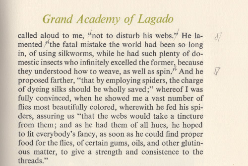
during the read i grew increasingly aware of anomalies of punctuation, first noticing quotation of statements, i.e. within inverted commas (e.g. 4th illustration); but these are reported statements, not direct speech—the editor not so daring as to recast the clauses. i also found colon & semicolon where simple comma is expected; checking several instances against a bona fide text my observations were confirmed: the editor embarked upon a bold new logic for punctuating swift, &, perhaps, overwhelmed by swift’s descriptions of the academicians of Lagado felt an urge to up his game, be more adventurous.
Post link


