#coloroftheyear

Color plays a critical role in brand identity design. It plays a vital part in providing a visual cue for brand strategy communication.
Color consistency across all marketing materials, from brochures to billboards, is a must when reproducing the brand color scheme. Being consistent helps you build a reliable brand with which your customers can connect!
In 1963, Pantone developed the color matching process called PMS (Pantone Matching System). This system allows designers to match specific colors through the production stage, regardless of the equipment used to produce the material.
Every year, Pantone selects color/s to represent and reflect the upcoming year’s mood, character, and impression. Today, Pantone has unveiled Very Peri as the 2022 Color of the Year!
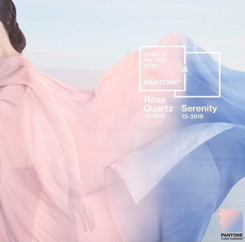
Pantone acababa de sacar los nuevos colores para el nuevo año 2016!!!
A que no adivináis que propusimos nosotros para 2016 en nuestra última colección?
En breve os desvelaremos detalles de la colección de Verano 2016…
#Pantone#ColoroftheYear#Serenity#RoseQuartz
#Balance#Calming#Tranquility#Wellness
Post link
2018 || For the love, of inspiration! All the best wishes for 2018, thanks for following and liking and see you all in the new year…
#2018 #bestwishes #happynewyear #newyear #health #creativity #love #friendship #inspiration #heart #pencil #artwork #drawing #sketch #resolution #jump #fun #pantone #ultraviolet #coloroftheyear #design #graphicdesign
Post link


