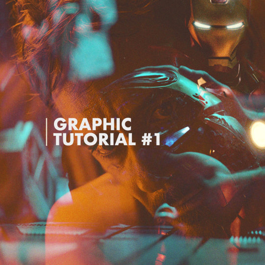
hey ! i’ve been seeing template #2 pop up a bit with middle text portion edited but usually without the same black overlay text effect so this is a tutorial of how to do it with just about any other word . it’s all about the masks for this one . long post , photo heavy under cut .
i guess this is a “ how to make a overlapping shadow text edit for posts / p.romos / what have you ” tutorial .
Hi guys! I’ve had a lot of fun making these magazine covers (and inside features) so I thought it would be cool to do a lil tutorial on the whole process. I will be going into detail for all the steps to create both the covers and the inside features, as well as giving helpful tips and ideas such as font suggestions.
Difficulty: Easy/Medium (depends on complexity)
Likes/Reblogs appreciated if you found this helpful!
Last week I received an ask requesting a tutorial on this graphic so here she be! I’ve never done a tutorial on graphic-making before so forgive me if this isn’t the most in-depth tutorial/best example.
Tutorial below the cut.
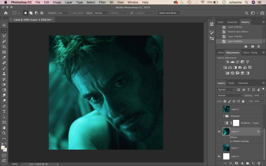
1. Start by opening your base image on Photoshop – crop to your liking. I usually size my square edits 1100 x 1100 pixels to maximise quality!
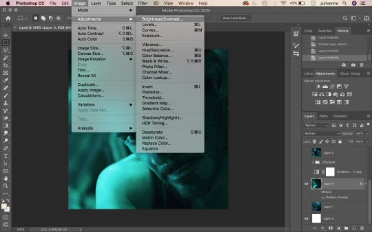
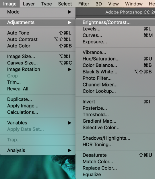
2. Up above where all your tabs are, click on Image and hover over the Adjustments section.
3. From here, you will find settings such as Brightness/Contrast, Vibrance, Hue/Saturation, and Shadows/Highlights. When making graphics, these are the settings I frequently mess around with. Using the aforementioned settings, adjust the sliders accordingly to fix the brightness and overall look of your base image to your liking.
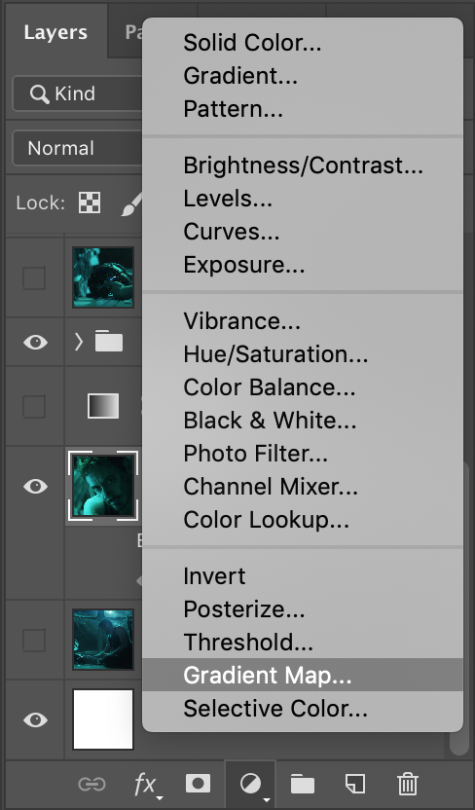
4. After adjusting your base image’s look, head over to the bottom right of your screen, where the layers panel is. At the very bottom, you will see a circle that is half empty and half filled. Click this, and find Gradient Map.
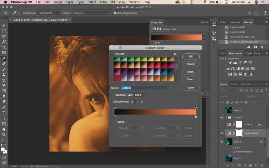
5. Click on the gradient bar and this window should open up. The gradients you see on my screenshot have been pre-installed. You can find these same gradients (and more) on DeviantArt and install them to your own computer! Pick a gradient duo you like (in this scenario, black and a warm, vibrant tone works best). I ended up using #151311 and #CD5517 as my two colours for the gradient.
6. Press enter and minimise your gradient adjustment window. After this, find your second image which will be your “overlay image”. Paste it on top of your base image layer (drag upwards if it is underneath your base image layer) and adjust its position to your liking like so.
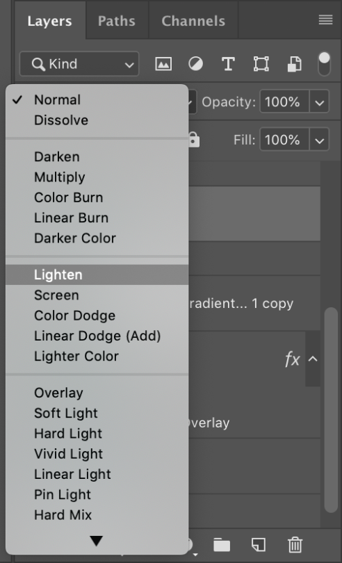
7. Make sure your “overlay image” layer is selected. Under your layers panel, there is a search bar that says “Kind” with a magnifying glass next to it. Click the drop-down button that says “Normal” on it. Here you will find different blending settings for your overlay image. Choose “Lighten”.
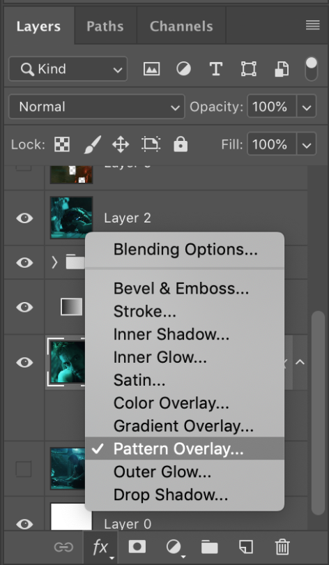
8. To add a little more styling to your edit, click back and make sure that your base image layer is selected. On the bottom-most selection of buttons (bottom right corner), click on the “FX” button and then “Pattern Overlay”.
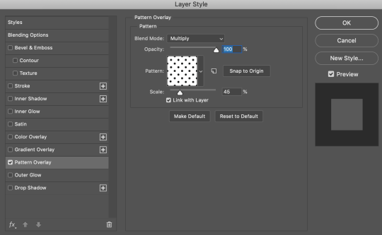
9. You will see the Pattern Overlay adjustment window on your screen. Ensure the blend mode is set to multiply, opacity at 100%, and that your pattern is the polka-dot-looking option. Scale your pattern to 45% (or not – adjust to your liking!)
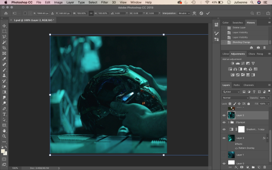
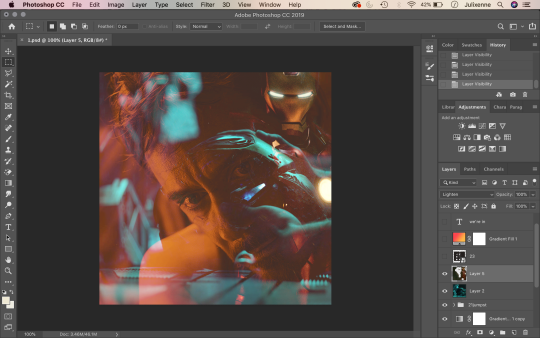
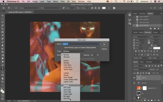
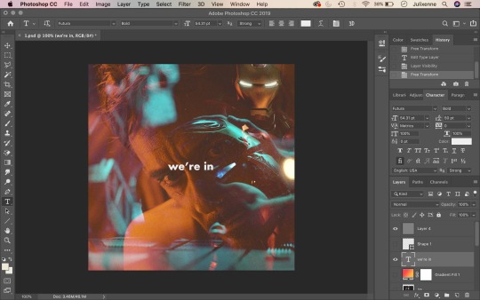
10. Your edit should start to look like this now! (Except I added a third image of Iron Man on the top right corner so disregard that – I was just trying to make things a little more fun hehe – you can add as many images you want on top of your base image. Making edits is all about trial and error and going nuts.)
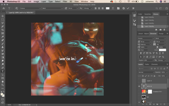
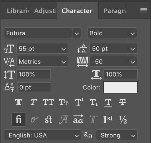
11. Assuming that you are on the “Essentials” mode of Photoshop, the text tool should be on the left-hand side of your screen as it is on mine. Click the gigantic “T” and drag a text box on your image like so. Type whatever text you wish. (In this tutorial, I used the font Futura and centred my text to the image.)
12. Bonus! If anyone wants the full settings of my text for this edit, here they are! Follow if you wish.
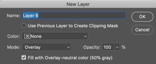
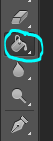
13. In classic Julie graphic-making tradition, we have to add a layer of noise to top things off. From the bottom right corner of your screen, next to the folder, there is a page button. Click this while holding down option (mac, windows: alt) and a “new layer” window should open. Under mode, select overlay.
14. After selecting overlay as your blending mode, tick the box that says “Fill with Overlay-neutral colour (50% grey)”.
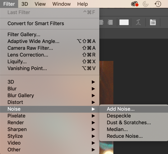
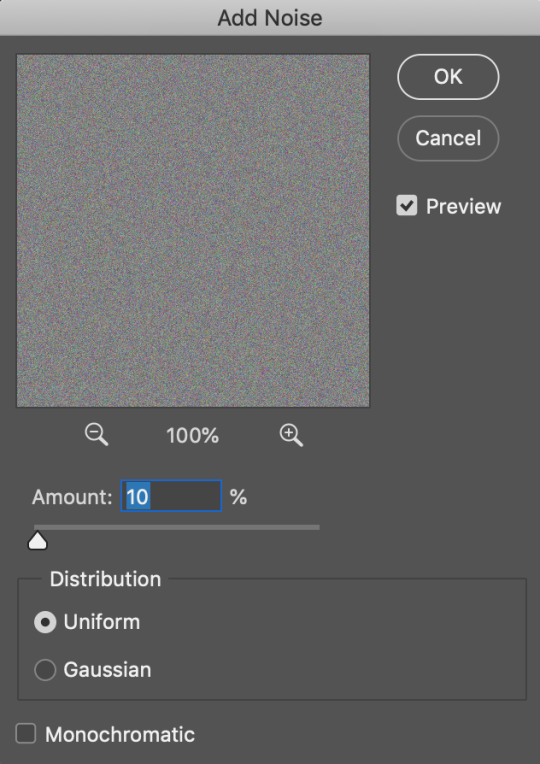
15. Above where all the main Photoshop tabs are, click on “Filter”. Hover your cursor all the way down to “Noise” and select “Add Noise”.
16. Change the amount to 10 (or something else that will suit your taste), set distribution to uniform and click OK!
17. And there you have it, folks! Save as a JPEG and you’ve got yourself an edit. ✨
Step 1: Open up 7 pictures. 6 for the background and 1 for the centre. I get all the pictures above from here.
Step 2: Crop and resize your six pictures to 245px and height 150px. After that you can sharpen/topaz the pictures and add coloring/psd or even textures.
Step 3: Go to layer>new. width 500px and height 475px. Background contents: transparent.
Step 4: On your six pictures, one by one, at the top of photoshop go to select>all then edit>copy merged. Go to the layer in step 3 and click edit>paste. Repeat the step until you obtain this result. After that, go to layer>merge visible.
Step 5: For the picture at the centre, I use this picture. Cut the background using whatever tool you’re comfortable with. Make the background transparent like this:
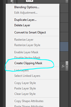
Step 6: Go to layer>new adjustment layer>gradient map. Choose black and white. then on the gradient map layer, right click and click create clipping mask. your layer should look like this:
Step 7: At the top of photoshop go to layer>merge visible. Create new layer, layer>new>layer.
Step 8: At my picture, i want to highlight her lips and dress. So on the color picker, i choose red. I zoom in the picture and paint her lips with red. After you’re done, change the blending mood from normal to color. Everytime you want to highlight something, the first step is make a new layer and then paint it with whatever color you want.
Step 9: After you’re done in step 8, go to layer>merge visible. then go to select>all then edit>copy merged. Go to your layer where you put the six pictures and put it at the centre. or doesn’t have to be at the centre. its up to you. (make sure you already resize the picture before pasting it into other document, of course you don’t want the picture to be too small or too big)
Step 10: For the final touch, i add up film texture by going to filter>texture>grain. choose film and here and my setting:
Step 11: Then i go right click at the centre picture and go to blending option. mess around and adjust the setting. I choose outer glow, here are my setting:
Step 12: Save your picture. I recommend to save it as .png format. :)
I hope you like it, it seems a bit complicated but hmm… it’s a bit easy! So if you’ve any difficulties send me a message and i’ll try to answer as soon as possible! Good luck!!! xx
。・ tutorial five, graphic tutorial three by graphictutorials ゜+.*
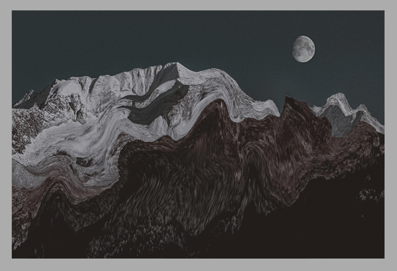
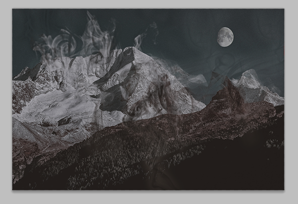
-`. Hello everyone! In this tutorial, I’ll teach you how do make an edit/graphic with smoke distortion, like this: .’-
Important note: You will need smoke brushes.
If you don’t already have brushes, here are some recommendations: 1 (I think this is the one I have), 2, or 3.
Download some smoke brushes and open them in Photoshop to install them.
Once you’ve done that, we can begin.
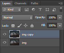
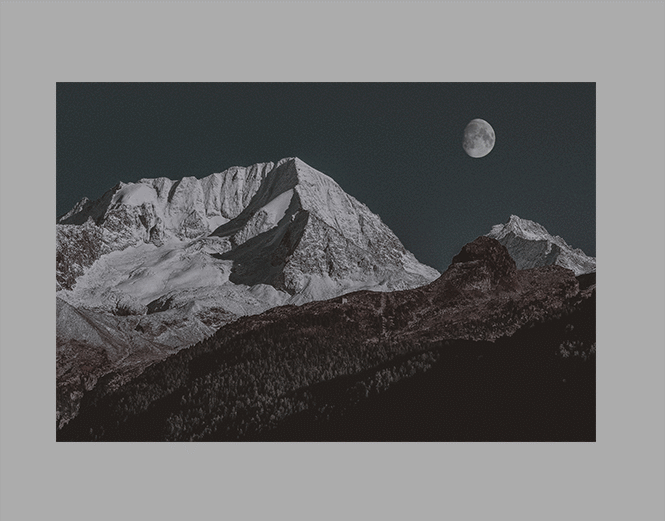
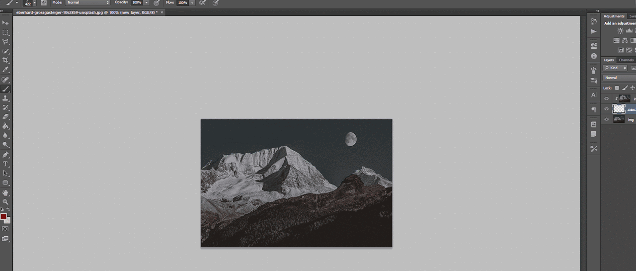
1. Open your image in Photoshop and duplicate the layer.
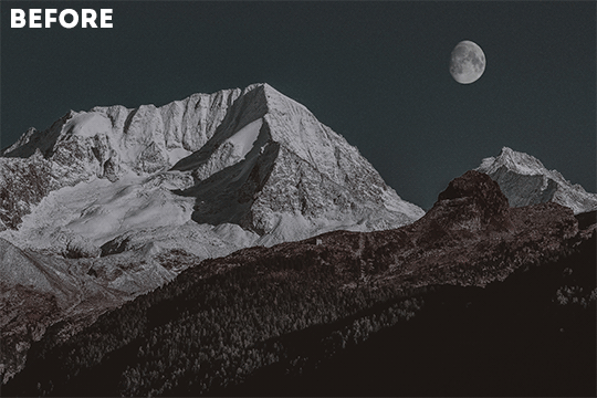
For example, this is my image:
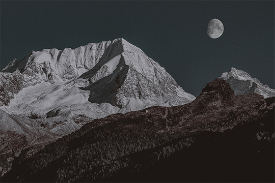
And here you can see I made a copy:
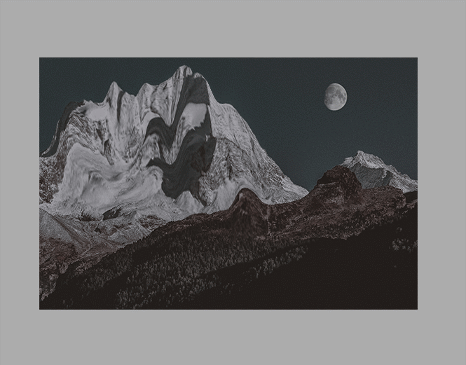
2. On the duplicate layer, go to Filter>Liquify (or hold shift+ctrl+x).
3. Change the tool options to what you feel is best.
If the brush is too big, make it smaller. You don’t want it to be too big, you want it to be small so you can liquify only a few parts of the image. If the brush is too big, it will liquify the entire image, and you do not want that.
You can change the density and pressure, as well, depending on how you want your brush to be.
Here are my settings:
(Keep in mind, my image is 540x360, you might want to make your settings bigger if your image is bigger.)
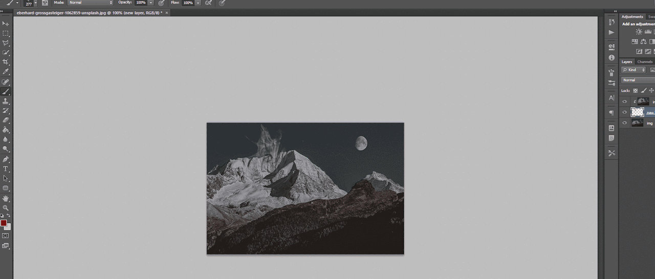
4. In the liquify section, you’re going to click and drag portions of your image in a certain direction.
For example, for my mountains, I’m going to drag the mountains upwards.
You can make swirls, zigzags, or just straight strokes.
You can switch between brush sizes to create smaller or bigger strokes, too.
Click OK when you’re done.
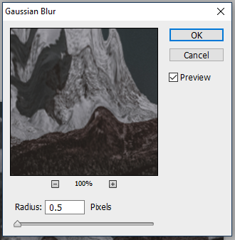
5. Go to Filter>Blur>Gaussian Blur and apply a small blur.
For example, I put 0.5 radius.
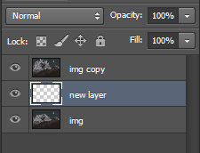
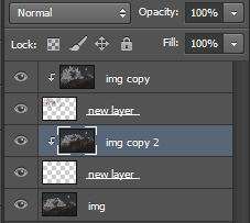
6. Create a new layer (ctrl+j) and place it under the liquified duplicate image.
7. Select the duplicated image layer again, right-click, and select “Create clipping mask.”
The duplicate/liquified image will disappear from the workspace but don’t worry, it’s supposed to do that.
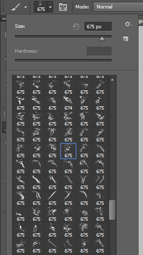
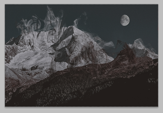
8. Select the new layer again, and go to the brushes. Choose a smoke brush you want. I recommend choosing one that goes in the direction of your strokes.
For example, if your strokes go upward, choose a smoke brush that goes upward.
9. Adjust the brush size if you need to, and go back to the workspace, choose where you want the brush to be, and click once.
That portion will now be filled with your liquified image.
10. Apply some more smoke brushes for more of the liquified image to appear.
11. You can go back to the original, unedited image, and duplicate it, liquify again, and repeat the steps for more distortion and smoke.
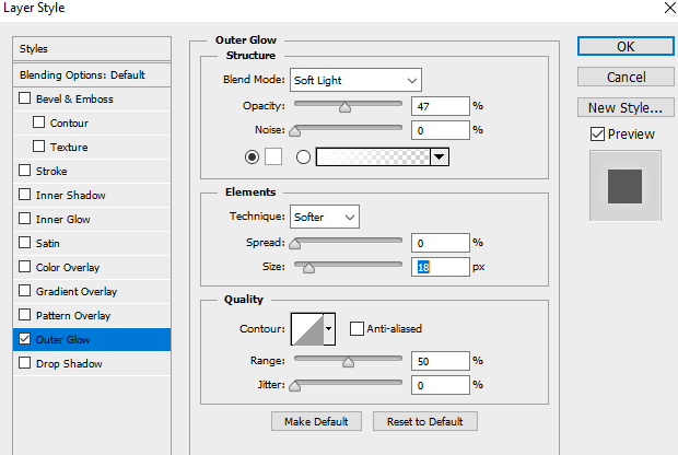
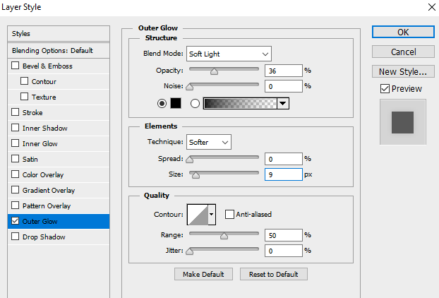
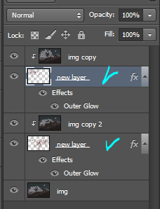
12. Once you’re done with the smoke, go to each brush layer, double-click, and apply an outer glow of either white or black, depending on the image, in Overlay mode and lower the opacity a bit.
For example, here are mine:
Make sure you only do it to the brush layers, not the liquefied layers!
This will make each smoke layer stand out from the original image and from the other smoke layers.
If you plan on making more portions of your image smoked (?), then repeat the steps until you’re done.
That’s all there is to it!
I hope you found this helpful and plan on using it. If you need any further help, just send me a message!
。・ tutorial four, graphic tutorial two by graphictutorials ゜+.*
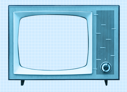
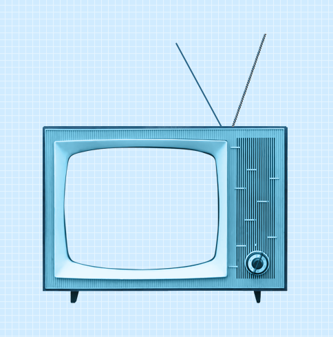
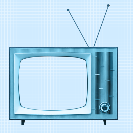
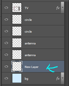
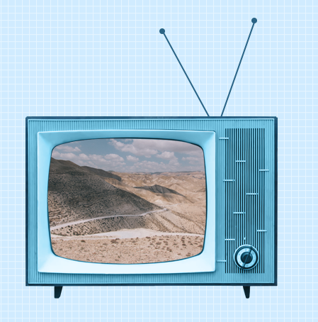
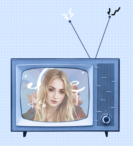
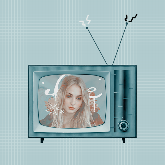
-`. Hello everyone! In this tutorial, I’ll teach you how do make an edit/graphic with a TV and electricity doodles, like this: .’-
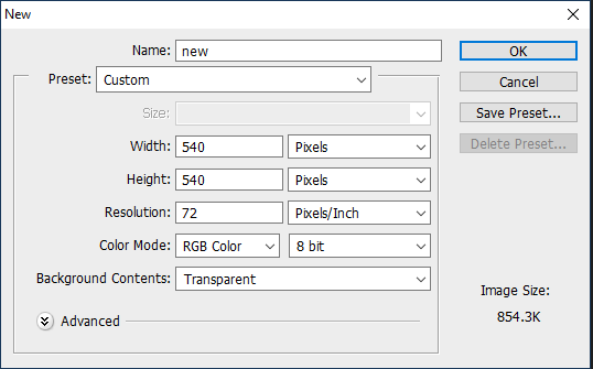
1. Open photoshop and create a new document with the size you want.
For this tutorial, I’ll be doing 540x540px.
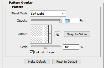
2. Add your background. You can make it a solid color, use a pattern, gradient, texture, etc.
For example, I used the paint bucket tool to fill the background with a solid color (#d1ecff, to be exact), and I applied a pattern overlay (using the last one here) in soft light mode.
So my background looks like this:
A/N: I’m making the example pastel-ish, but you don’t have to!
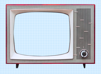
3. Now make a png of a vintage-esque TV, or you can use one of these: 1,2,3,4.
I’ll be using the 2nd png in the 1st pack.
A/N: You’re going to want the screen portion erased if it isn’t already, because that is where you’re going to put an image.
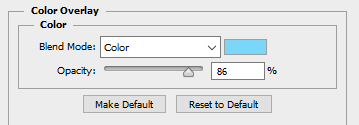
4. This is optional, but if you don’t like the color of the TV, you can change it by:
Double-clicking on the TV layer, and go to the “Color Overlay” tab, clicked the colored rectangle, choose the color you want, click OK, and change the mode to one of the following: Overlay, Soft Light, Color, Hue, or Multiply. Choose which one looks best with your color and you can adjust the opacity if you want.
For example, here’s what I did:
5. If you chose a TV that already has antennae, skip this step. If your TV does not have antennae, like mine, I will show you how to quickly make some.
Create a new layer, choose a foreground color to a color that matches your TV color, select the line shape tool, make the line 2px weight with no stroke, and click and drag a couple lines from the top of the TV to make antennae.
A/N: You might want to rasterize those shapes (to do so, right-click on each layer and click “rasterize layer”) or put those shape layers under the TV layer.
Now create another new layer, use the ellipse shape tool, click and drag a small circle to fit on top of one of the antennae (hold shift as you do so to get an even circle). Duplicate that and drag it over to the other antenna.
6. Now for the screen image.
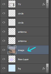
Create a new layer and drag it under all of the TV/antennae layers.
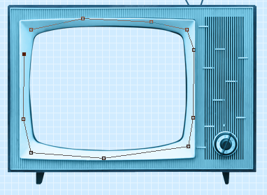
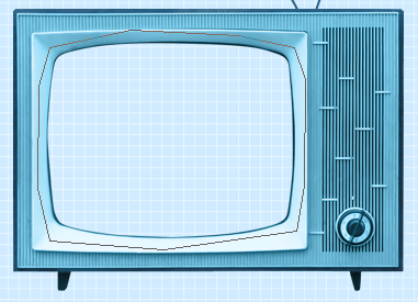
Select the pen tool. You’re going to make some points around the screen portion and connect them.
Once you connect them, It’ll make a line like this:
Go to the top bar and click the “Selection…” button. It will make the outline into a selection and that’s what you want.
A/N: There will be a dialogue box pop up, but just click OK.
Now it is a selection.
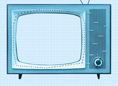
Click the fill bucket tool and click inside the selection to fill it. It doesn’t matter what color it is.
Click CTRL+D to deselect it.
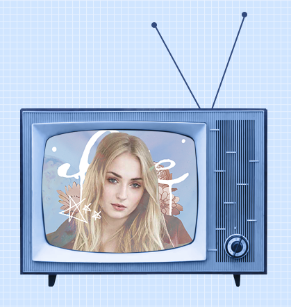
7. Now we will put an image/edit inside.
If you just want to put an image, open the image, drag it to the TV edit document, make sure it’s right above the screen fill layer, right-click on the image layer, and select “Create Clipping Mask.” It will be inside the screen portion and you can resize.
If you want to put an edit inside, I’d suggest making the edit in a new document, merge all of the layers of the edit document when you’re done, drag it over to the TV edit document, make sure it’s right above the screen fill layer, right-click on the image layer, and select “Create Clipping Mask.” It will be inside the screen portion and you can resize.
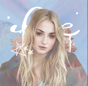
For example, I quickly made this edit in a new document and merged all the layers:
Then I followed the steps above and put it inside the screen.
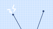
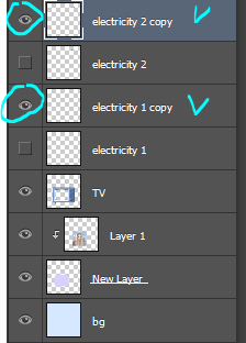
8. Creating the “electricity”.
Create a new layer and use the brush tool with a simple hard round brush in a small size and draw a couple little zig-zags coming from one of the antennae.
Create another new layer and make a couple more for the other antenna.
Now you could stop here, or if you want, you can make them into a little gif with the next step:
9.Duplicate one of the electricity layers, choose the select tool, right click on the document, and click “Free Transform”. Go to the top bar, and in the rotation box, enter -10. Hit the Enter key when you’re done.
It rotated the duplicate slightly to the left.
A/N: If it’s blurry around the edges, apply a Surface Blur with 5 Radius and 10 Threshold.
Duplicate the other electricity layer, Free Transform it, and apply a Rotation of 10. (Do the same number but polarize it. i.e., if you previously put -10, put +10 for this one. If you previously put +10, now put -10.)
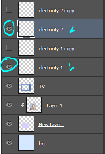
10.Open the frame animation timeline.
For the first frame, hide the duplicated electricity layers. Only the original ones should be visible.
Create a new frame and in this one, hide the original electricity layers and un-hide the duplicates.
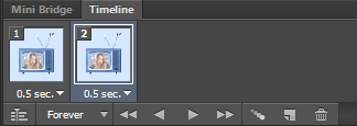
Set the speed of the gif to 0.5, or something around there. You don’t want it too fast because it’ll hurt people’s eyes!
Make sure the loop is on “Forever” as well!
11.Go to File>Save for Web.., and save the gif.
And you’re done!
Here is my edit, image version:
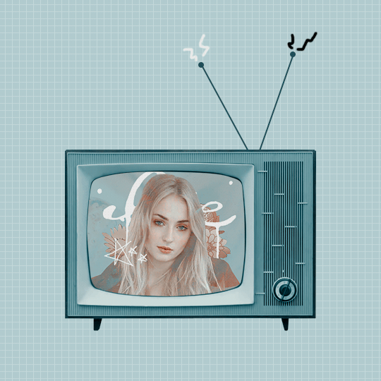
And here it is as a gif:
Other Suggestions:
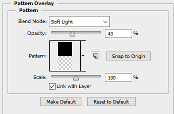
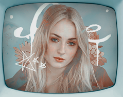
> For the full effect, you can go to the screen fill layer (not the image/edit inside of it) and select it, double-click, and apply a pattern overlay with a horizontal stripe and put the mode on Soft Light and lower the opacity to create that line effect.
Result:
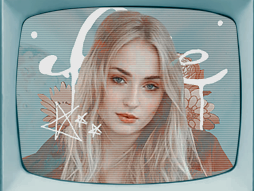
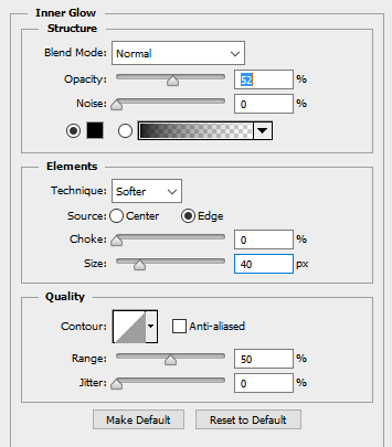
> You can also apply an Inner Glow to the screen layer and create a shadow.
Result:
Anyways, I hope this tutorial/guide was helpful. If you need any help or have any questions, feel free to ask!
3. Create a new guide halfway through your new document.
To do so,
3a. Go to View>New Guide
3b. Select “Vertical” under the Orientation options
3c. Enter the position, which would be half the size of the width of your new document.
For example, if the width was 540px, you would enter 270 px. If the width was 500px, you would enter 250 px.
Since I used 800px width, I would put in 400 px.
Just figure out half of the size width you put. (Width/2=Position)
3d. Click OK when you’re done.
It should now have a line that goes through half-way, like so:
4. Select the image layer, click the rectangular select tool, click and drag the select tool until half of the document is selected. You would do it to the smart guide you previously created.
5.Once half of the image is selected, go to Edit>Cut. It should remove that half. Don’t worry, that is what it is supposed to do.
6. Now go to Edit>Paste Special>Paste into Place. The half should now be put back into place, in a new layer separate from the other.
Now you can remove the smart guide if you want. If you do, simply go to View>Clear Guides.
I’ll be doing it, too. It’ll look back to normal, like so:
7. Hide the half layer for now and click the text tool.
8. Choose the font, text size, color, etc., then click on the document and enter the text you want on the side where the half would be.
9. Unhide the half-image layer, and place that half layer above the text layer.
For example, it’ll go from this:
To this:
10. Right-click on the half layer, and click “Create Clipping Mask."
The layers should look like this:
And the image should now be inside the text, like this:
That’s basically all there is to it. You can customize as much as you want.
You can enter a quote, like so:
You can make a birthday edit, like so:
Add a psd, like so:
Change the background color, and add a text style, like so:
Or, instead of having the text on one side, you can center it all together and it’ll look like this:
Just change the text color and background color, and it should match.
Anyways, I hope this tutorial/guide was helpful. If you need any help or have any questions, feel free to ask!


