#photoshop tutorials

NEW VIDEO TUTORIAL: a two-in-one tutorial on how to make a gif using a layout & multiple gifs + typography (as requested)
this is what I’ll be teaching you in part one:
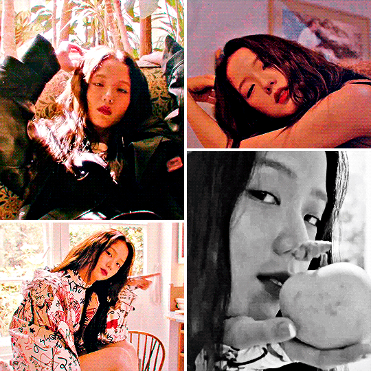
and this is what i’ll be teaching you in part two:

What you’ll need for this:
- Basic understanding on how to make gifs. (Here’s my complete giffing tutorial)
- Understanding of how to make a gif with multiple gifs in one canvas. (Here’s my tutorial on it.)
- Photoshop CC.
- Patience <3
- The layout I used in this tutorial I got from here.
If you have any remaining questions about anything, my DM is always open! Either here or on @lizzies, just let me know what I can help you with and I’ll try my best!
- as some of you may know, all of my resources and content are made for free, and i work with commissions. but if you feel like supporting a content creator, this is my ko-fi. all of my income comes from supporters so this is always extremely helpful. <3 let me know if this tutorial helped you, and if there’s any specific video tutorial you’d like to get from me, just let me know and i’ll try my best to deliver!

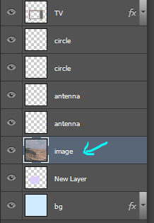
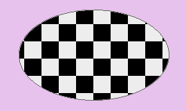
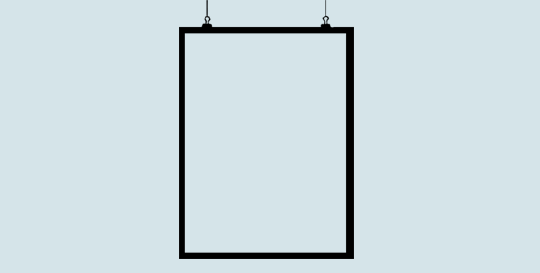
first, make your gif. you can add your psd here if you want, but i waited until the end. after you do that, make a circle over the part you want to be your gif. to get a perfect circle, hold down the shift key while making it.

the next thing you need to do is group all your layers so you can make a layer mask on them.

now click on the shape layer and select the circle.

now make a layer mask on your group. it’ll look like this:


now just delete the shape and you’re done!
unfortunately, the sharp edges are something you can’t really fix.

first, make your gif and add your psd. then select all the frames and all the layers, and click this button:

it’ll change the animation frames into a timeline

then, with all the layers still selected, go to filters > convert for smart filters. it’ll change all the frames into this:

now make a copy of that:

now go to filter > sketch > halftone pattern. enter the settings you want, and apply this to the top copy. your gif will look like this (depending on the colors you chose)
just change the opacity and you’re done! if you want to sharpen it, sharpen the bottom layer.
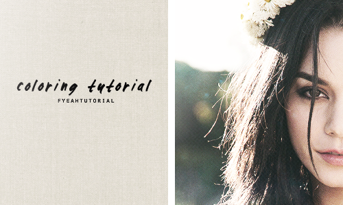
coloring tutorial requested by anonymous
Note!! - This coloring obviously doesn’t work on all pictures. ofc you need to adjust them. This coloring will involves many textures to be play around with. other example: http://oi50.tinypic.com/1zgumie.jpg
Step 1: Open up your picture. I’m using thisone.
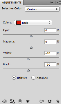
Step 2: Go to layer>new adjustment layer>selective color
Colors: Reds
0, 0, -10, -10
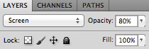
Step 3:Openthis texture on photoshop, drag the layer to your picture. set the blending mood to screen, opacity 80% and fill 100%
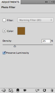
Step 4: Go to layer>new adjustment layer>photo filter
Choose color and enter #855b20
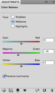
Step 5: layer>new adjustment layer>color balance
tone: Midtones
0, -16, 0
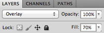
Step 6: Go to layer>new adjustment layer>gradient map
choose black and white gradient map
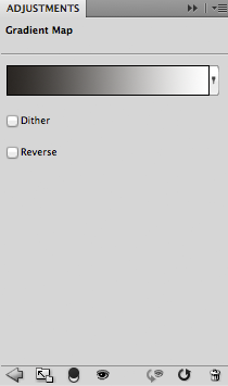
set it as overlay, opacity 100% and fill 70%
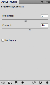
Step 7: Go to layer>new adjustment layer>brightness/contrast
2, 20
Step 8: Openthis texture on photoshop, drag the layer to your picture. set the blending mood to screen, opacity and fill 100%
Step 9: I add up glow texture which you can do that by using brush tool. create a new layer(layer>new>layer), choose white on the color picker and just brush off around the left corner. change the blending mood to screen. decrease the opacity to around 70%
Step 10: remember you can always adjust the setting above!! when you’re satisfied with the results, flatten the image (layer>flatten image).
- you’re done! any questions just ask me :)
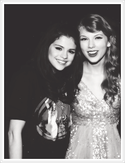
Step 1: Open up your photoshop as well as your picture (file>open). In this tutorial I’m going to use thispicture.
Step 2: Then i crop/resize the picture to 245x320 pixels
Step 3: Duplicate the layer(layer>duplicate layer). Then Filter>Sharpen>Smart sharpen. Amount: 500 and Radius: 0.3
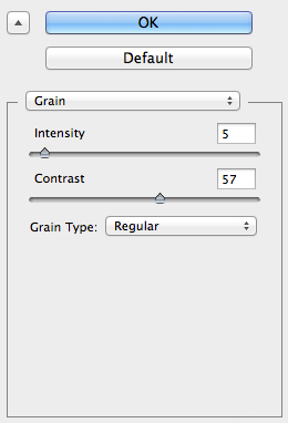
Step 4: Go to Filter>Texture>Grain. This is my setting
Step 5: Add psd/coloring to the pictures. This takes a lot of time for me to color. you can find some great psd here,here and many more at my resources page.
Step 6: I use this texture and set it to screen, opacity at 70% and fill 100%
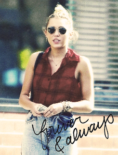
Step 7: I use handwritten texture which you can find here. how to use it? set it to darken and after that i use sharpen the texture(filter>sharpen).
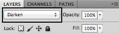
tips: use the move tool to adjust the position and you can also rotate the texture!
Step 8: Flatten the image if you’re satisfied with the result(layer>flatten image). Save it and done!
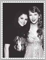
Step 1: Open up your picture.
Step 2: Crop and resize the picture, mine is 245x320. you can add coloring, sharpen etc.
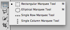
Step 3: Go to layer>new and select rectangular marquee tool on the tools bar.
Step 4: Make a selection on the layer.
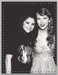
Step 5: right click on the picture and click select inverse

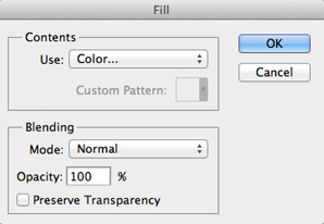
Step 6: right click again and choose fill. follow this setting (and for the color choose white #ffffff)
Step 7: After that go to click>deselect. Make a selection again in between the border.
Step 8: Right click on the picture and select stroke. For color option choose black. I usually keep up the opacity between 20%-40%
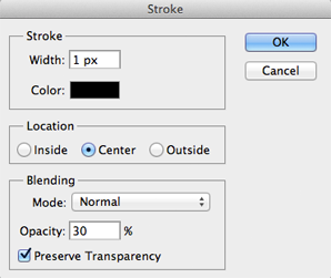
Step 9: If you want to make the line(stroke), use the same step as step 8. After you’re done go to layer>flatten image. Save it and you’re done!

okay..so lets get started
Step 1: Open up 7 pictures. 6 for the background and 1 for the centre. I get all the pictures above from here.
Step 2: Crop and resize your six pictures to 245px and height 150px. After that you can sharpen/topaz the pictures and add coloring/psd or even textures.
Step 3: Go to layer>new. width 500px and height 475px. Background contents: transparent.
Step 4: On your six pictures, one by one, at the top of photoshop go to select>all then edit>copy merged. Go to the layer in step 3 and click edit>paste. Repeat the step until you obtain this result. After that, go to layer>merge visible.
Step 5: For the picture at the centre, I use this picture. Cut the background using whatever tool you’re comfortable with. Make the background transparent like this:

Step 6: Go to layer>new adjustment layer>gradient map. Choose black and white. then on the gradient map layer, right click and click create clipping mask. your layer should look like this:

Step 7: At the top of photoshop go to layer>merge visible. Create new layer, layer>new>layer.
Step 8: At my picture, i want to highlight her lips and dress. So on the color picker, i choose red. I zoom in the picture and paint her lips with red. After you’re done, change the blending mood from normal to color. Everytime you want to highlight something, the first step is make a new layer and then paint it with whatever color you want.

Step 9: After you’re done in step 8, go to layer>merge visible. then go to select>all then edit>copy merged. Go to your layer where you put the six pictures and put it at the centre. or doesn’t have to be at the centre. its up to you. (make sure you already resize the picture before pasting it into other document, of course you don’t want the picture to be too small or too big)
Step 10: For the final touch, i add up film texture by going to filter>texture>grain. choose film and here and my setting:

Step 11: Then i go right click at the centre picture and go to blending option. mess around and adjust the setting. I choose outer glow, here are my setting:

Step 12: Save your picture. I recommend to save it as .png format. :)
I hope you like it, it seems a bit complicated but hmm… it’s a bit easy! So if you’ve any difficulties send me a message and i’ll try to answer as soon as possible! Good luck!!! xx


I’m going to be active again in Patreon! Keep an eye on new stuff from now on <3
http://www.patreon.com/serafleur
Pledge now before the month of March ends to receive these rewards on April 7th, 2018
More rewards by pledging on my Patreon:
• Hi-Res images (.PNG)
• Step-by-step Images
• Layered PSD File
• Brushes used
• More artworks exclusive for patrons
• Tutorials and more!
Some previous rewards available on my Gumroad: gumroad.com/serafleur
Post link

。・ tutorial five, graphic tutorial three by graphictutorials ゜+.*
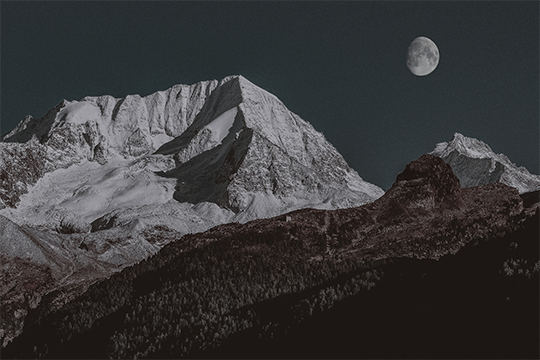
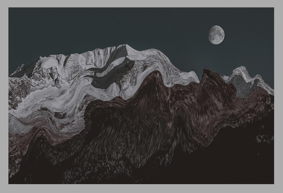
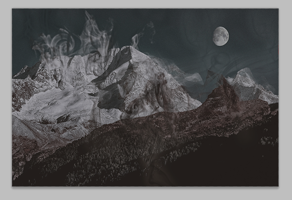
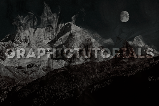
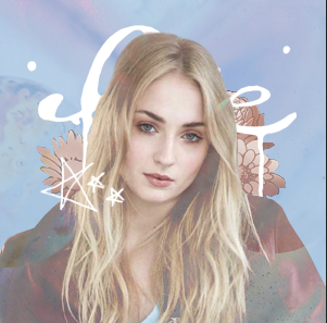
-`. Hello everyone! In this tutorial, I’ll teach you how do make an edit/graphic with smoke distortion, like this: .’-
Important note: You will need smoke brushes.
If you don’t already have brushes, here are some recommendations: 1 (I think this is the one I have), 2, or 3.
Download some smoke brushes and open them in Photoshop to install them.
Once you’ve done that, we can begin.
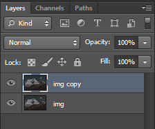
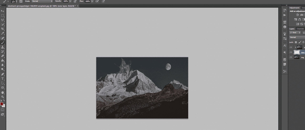
1. Open your image in Photoshop and duplicate the layer.
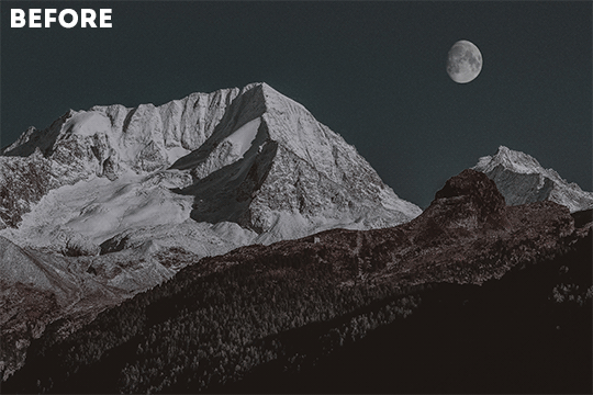
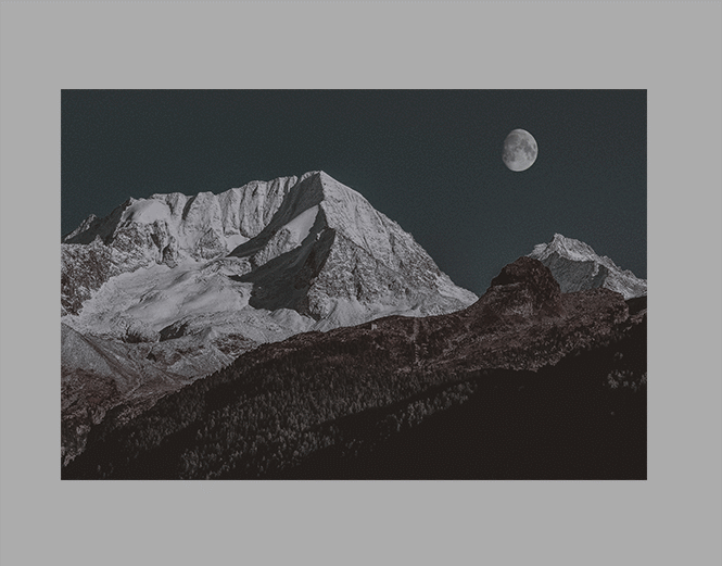
For example, this is my image:
And here you can see I made a copy:
2. On the duplicate layer, go to Filter>Liquify (or hold shift+ctrl+x).
3. Change the tool options to what you feel is best.
If the brush is too big, make it smaller. You don’t want it to be too big, you want it to be small so you can liquify only a few parts of the image. If the brush is too big, it will liquify the entire image, and you do not want that.
You can change the density and pressure, as well, depending on how you want your brush to be.
Here are my settings:

(Keep in mind, my image is 540x360, you might want to make your settings bigger if your image is bigger.)
4. In the liquify section, you’re going to click and drag portions of your image in a certain direction.
For example, for my mountains, I’m going to drag the mountains upwards.
You can make swirls, zigzags, or just straight strokes.
You can switch between brush sizes to create smaller or bigger strokes, too.
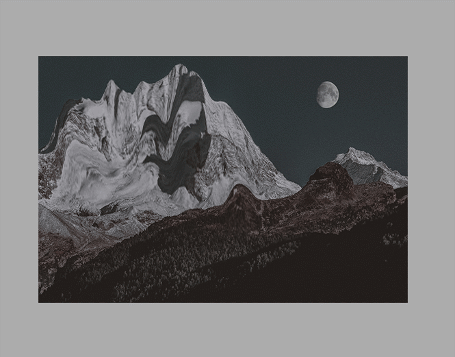
Click OK when you’re done.
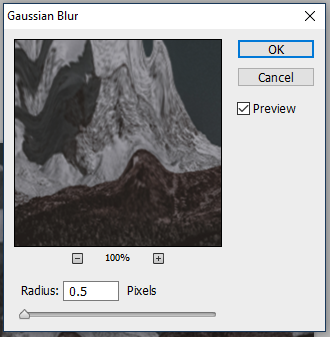
5. Go to Filter>Blur>Gaussian Blur and apply a small blur.
For example, I put 0.5 radius.
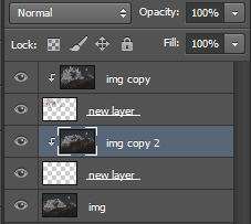
6. Create a new layer (ctrl+j) and place it under the liquified duplicate image.
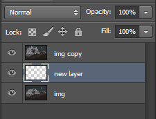
7. Select the duplicated image layer again, right-click, and select “Create clipping mask.”

The duplicate/liquified image will disappear from the workspace but don’t worry, it’s supposed to do that.
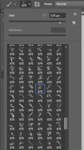
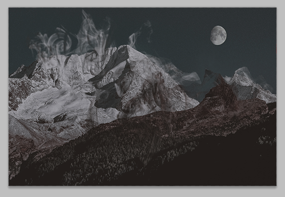
8. Select the new layer again, and go to the brushes. Choose a smoke brush you want. I recommend choosing one that goes in the direction of your strokes.
For example, if your strokes go upward, choose a smoke brush that goes upward.
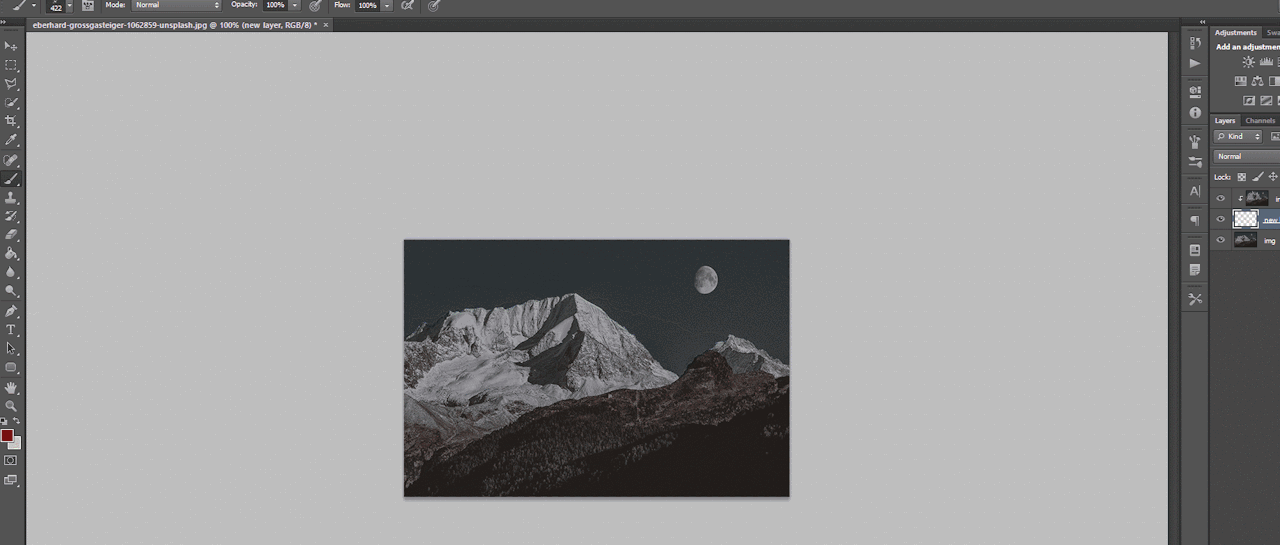
9. Adjust the brush size if you need to, and go back to the workspace, choose where you want the brush to be, and click once.
That portion will now be filled with your liquified image.
10. Apply some more smoke brushes for more of the liquified image to appear.
11. You can go back to the original, unedited image, and duplicate it, liquify again, and repeat the steps for more distortion and smoke.

12. Once you’re done with the smoke, go to each brush layer, double-click, and apply an outer glow of either white or black, depending on the image, in Overlay mode and lower the opacity a bit.
For example, here are mine:
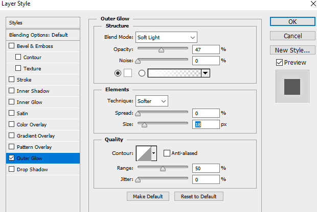
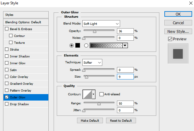
Make sure you only do it to the brush layers, not the liquefied layers!
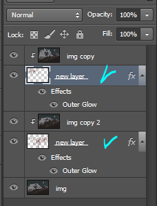
This will make each smoke layer stand out from the original image and from the other smoke layers.
If you plan on making more portions of your image smoked (?), then repeat the steps until you’re done.
That’s all there is to it!
I hope you found this helpful and plan on using it. If you need any further help, just send me a message!
Post link

。・ tutorial four, graphic tutorial two by graphictutorials ゜+.*
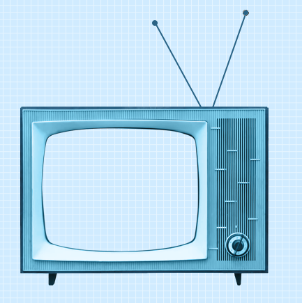
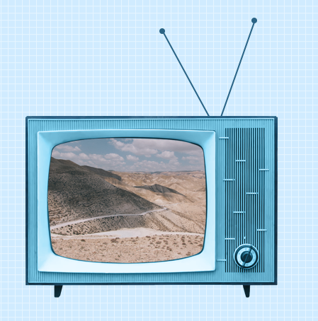
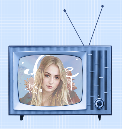
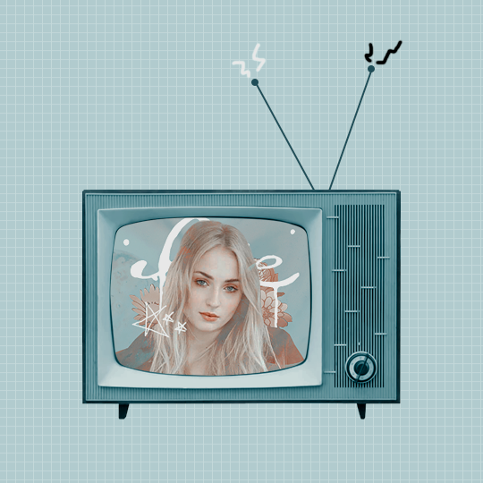
-`. Hello everyone! In this tutorial, I’ll teach you how do make an edit/graphic with a TV and electricity doodles, like this: .’-

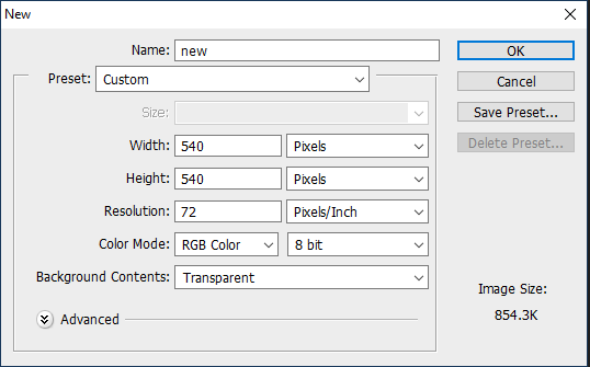
1. Open photoshop and create a new document with the size you want.
For this tutorial, I’ll be doing 540x540px.
2. Add your background. You can make it a solid color, use a pattern, gradient, texture, etc.
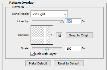
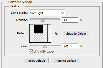
For example, I used the paint bucket tool to fill the background with a solid color (#d1ecff, to be exact), and I applied a pattern overlay (using the last one here) in soft light mode.
So my background looks like this:

A/N: I’m making the example pastel-ish, but you don’t have to!
3. Now make a png of a vintage-esque TV, or you can use one of these: 1,2,3,4.
I’ll be using the 2nd png in the 1st pack.
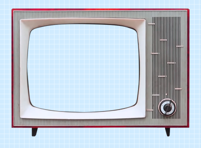
A/N: You’re going to want the screen portion erased if it isn’t already, because that is where you’re going to put an image.
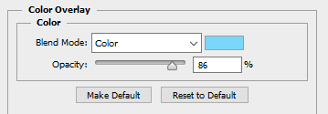
4. This is optional, but if you don’t like the color of the TV, you can change it by:
Double-clicking on the TV layer, and go to the “Color Overlay” tab, clicked the colored rectangle, choose the color you want, click OK, and change the mode to one of the following: Overlay, Soft Light, Color, Hue, or Multiply. Choose which one looks best with your color and you can adjust the opacity if you want.
For example, here’s what I did:
5. If you chose a TV that already has antennae, skip this step. If your TV does not have antennae, like mine, I will show you how to quickly make some.
Create a new layer, choose a foreground color to a color that matches your TV color, select the line shape tool, make the line 2px weight with no stroke, and click and drag a couple lines from the top of the TV to make antennae.

A/N: You might want to rasterize those shapes (to do so, right-click on each layer and click “rasterize layer”) or put those shape layers under the TV layer.
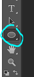
Now create another new layer, use the ellipse shape tool, click and drag a small circle to fit on top of one of the antennae (hold shift as you do so to get an even circle). Duplicate that and drag it over to the other antenna.
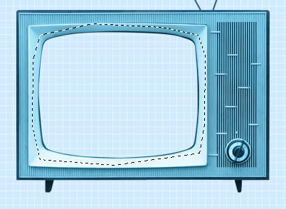
6. Now for the screen image.
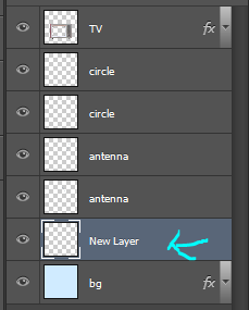
Create a new layer and drag it under all of the TV/antennae layers.
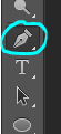
Select the pen tool. You’re going to make some points around the screen portion and connect them.
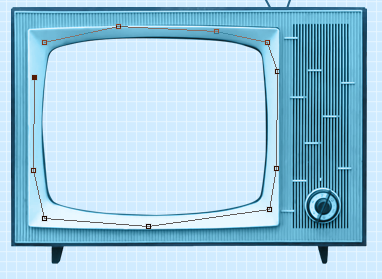
Once you connect them, It’ll make a line like this:
Go to the top bar and click the “Selection…” button. It will make the outline into a selection and that’s what you want.

A/N: There will be a dialogue box pop up, but just click OK.
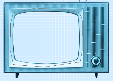
Now it is a selection.
Click the fill bucket tool and click inside the selection to fill it. It doesn’t matter what color it is.

Click CTRL+D to deselect it.
7. Now we will put an image/edit inside.
If you just want to put an image, open the image, drag it to the TV edit document, make sure it’s right above the screen fill layer, right-click on the image layer, and select “Create Clipping Mask.” It will be inside the screen portion and you can resize.
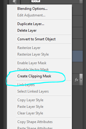
If you want to put an edit inside, I’d suggest making the edit in a new document, merge all of the layers of the edit document when you’re done, drag it over to the TV edit document, make sure it’s right above the screen fill layer, right-click on the image layer, and select “Create Clipping Mask.” It will be inside the screen portion and you can resize.
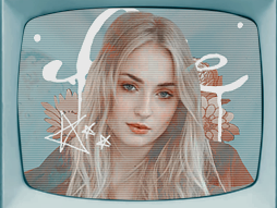
For example, I quickly made this edit in a new document and merged all the layers:
Then I followed the steps above and put it inside the screen.
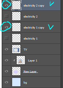
8. Creating the “electricity”.
Create a new layer and use the brush tool with a simple hard round brush in a small size and draw a couple little zig-zags coming from one of the antennae.
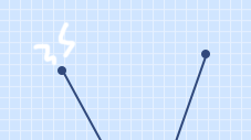
Create another new layer and make a couple more for the other antenna.

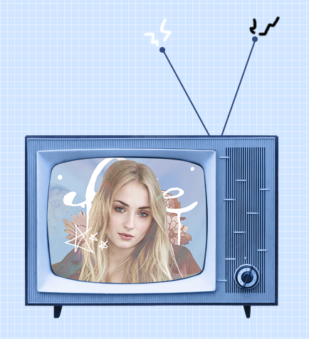
Now you could stop here, or if you want, you can make them into a little gif with the next step:
9.Duplicate one of the electricity layers, choose the select tool, right click on the document, and click “Free Transform”. Go to the top bar, and in the rotation box, enter -10. Hit the Enter key when you’re done.

It rotated the duplicate slightly to the left.


A/N: If it’s blurry around the edges, apply a Surface Blur with 5 Radius and 10 Threshold.
Duplicate the other electricity layer, Free Transform it, and apply a Rotation of 10. (Do the same number but polarize it. i.e., if you previously put -10, put +10 for this one. If you previously put +10, now put -10.)


10.Open the frame animation timeline.
For the first frame, hide the duplicated electricity layers. Only the original ones should be visible.
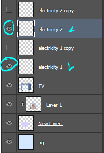
Create a new frame and in this one, hide the original electricity layers and un-hide the duplicates.
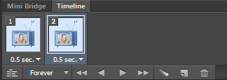
Set the speed of the gif to 0.5, or something around there. You don’t want it too fast because it’ll hurt people’s eyes!
Make sure the loop is on “Forever” as well!
11.Go to File>Save for Web.., and save the gif.
And you’re done!
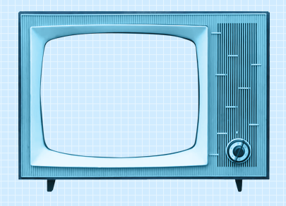
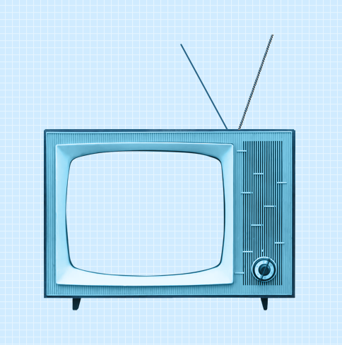
Here is my edit, image version:
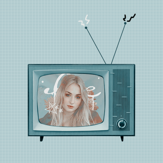
And here it is as a gif:
Other Suggestions:
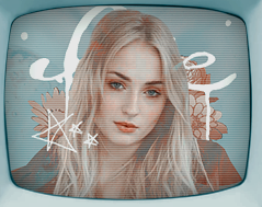
> For the full effect, you can go to the screen fill layer (not the image/edit inside of it) and select it, double-click, and apply a pattern overlay with a horizontal stripe and put the mode on Soft Light and lower the opacity to create that line effect.
Result:
> You can also apply an Inner Glow to the screen layer and create a shadow.
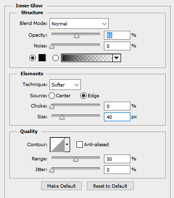
Result:
Anyways, I hope this tutorial/guide was helpful. If you need any help or have any questions, feel free to ask!
Post link

。・ tutorial three, graphic tutorial one by graphictutorials ゜+.*
-`. Hello everyone! In this tutorial, I’ll teach you how do make a simple edit like the one below .’-

1. Open Photoshop and create a new document, using the proportions you want.
For this tutorial, I’ll be doing 800x500.
1a.Using the paint bucket tool, fill the document with a solid color.
I’ll be using white.
2. Open the image you want and drag it over to the new document, and resize it if you need to.
For this tutorial, I’ll be using this image.

3. Create a new guide halfway through your new document.
To do so,
3a. Go to View>New Guide
3b. Select “Vertical” under the Orientation options
3c. Enter the position, which would be half the size of the width of your new document.
For example, if the width was 540px, you would enter 270 px. If the width was 500px, you would enter 250 px.
Since I used 800px width, I would put in 400 px.
Just figure out half of the size width you put. (Width/2=Position)

3d. Click OK when you’re done.
It should now have a line that goes through half-way, like so:

4. Select the image layer, click the rectangular select tool, click and drag the select tool until half of the document is selected. You would do it to the smart guide you previously created.

5.Once half of the image is selected, go to Edit>Cut. It should remove that half. Don’t worry, that is what it is supposed to do.

6. Now go to Edit>Paste Special>Paste into Place. The half should now be put back into place, in a new layer separate from the other.


Now you can remove the smart guide if you want. If you do, simply go to View>Clear Guides.
I’ll be doing it, too. It’ll look back to normal, like so:

7. Hide the half layer for now and click the text tool.

8. Choose the font, text size, color, etc., then click on the document and enter the text you want on the side where the half would be.

9. Unhide the half-image layer, and place that half layer above the text layer.
For example, it’ll go from this:

To this:

10. Right-click on the half layer, and click “Create Clipping Mask."

The layers should look like this:

And the image should now be inside the text, like this:

That’s basically all there is to it. You can customize as much as you want.
You can enter a quote, like so:

You can make a birthday edit, like so:

Add a psd, like so:

Change the background color, and add a text style, like so:

Or, instead of having the text on one side, you can center it all together and it’ll look like this:

Just change the text color and background color, and it should match.

Anyways, I hope this tutorial/guide was helpful. If you need any help or have any questions, feel free to ask!
Post link

。・ tutorial two by graphictutorials ゜+.*
-`. Hello everyone! In this tutorial, I’ll teach you what shapes are, what the default shapes are, how to use them, how to style them, and how to make your own custom shapes. .’-
Here’s the navigation:(find the portion you want and the corresponding letter, then scroll down till you see the letter.)
a - explaining the shapes
b - showing the default shapes
c - explaining how to use the shapes
d - explaining how to style the shapes
e - making custom shapes tutorial
f - explaining how to get more shapes
A. What are the shapes?
Photoshop shapes are pretty self-explanatory. Much like the shape tools in Microsoft Word, you can use them to create edits/graphs/etc.
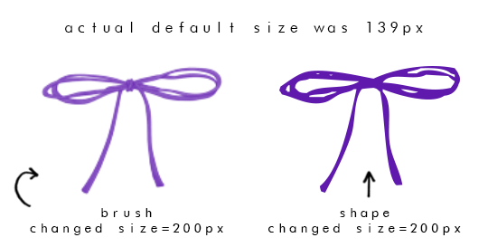
They are similar to brushes, but unlike brushes, they don’t have the textures as some do. Shapes are solid.
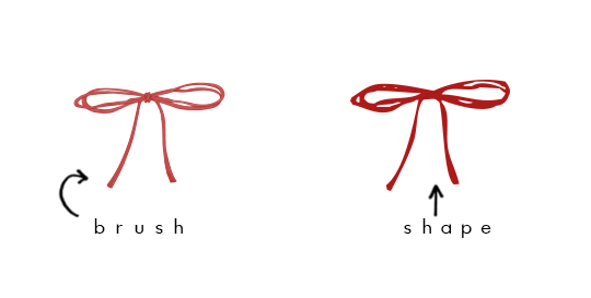
Another notable difference is that if you make your brush size bigger than what it was, it will be blurry. If you make your shape size bigger than what it was, it will not be blurry.
B. Default Shapes
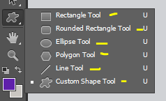
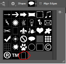
The default shapes are the rectangle, rounded rectangle, ellipse, polygon, line, and custom shape.
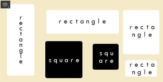
With the rectangle shape, you can make rectangles. You can also make squares if you hold shift while you drag and create the shape.

With the rounded rectangle, you can make rectangles with rounded corners. You can also make squares if you hold shift while you drag and create the shape.
With the ellipse shape, you can make ovals and you can make circles if you hold shift, as well.
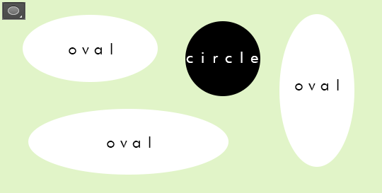
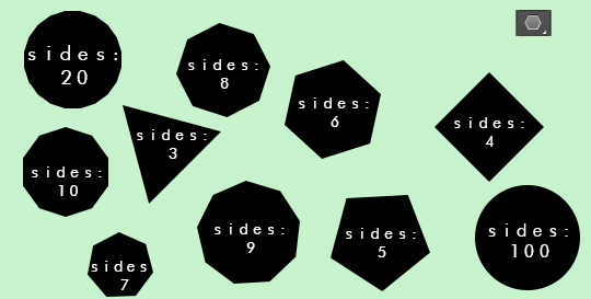
With the polygon shape, you can create shapes with more than 2 sides. You have to enter the number of sides you want, from 3-100. You can make a triangle shape with 3 sides, a square with 4 sides, a pentagon with 5 sides, a hexagon with 6 sides, a heptagon with 7 sides, an octagon with 8 sides, a nonagon with 9 sides, a decagon with 10 sides, and so on until you reach 100 sides, which will then be a circle.
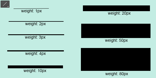
With the line shape, you can create lines/dividers. You can change the weight to be bigger or thinner, too.
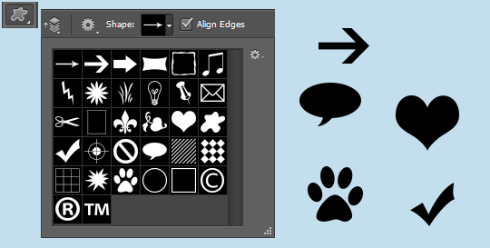
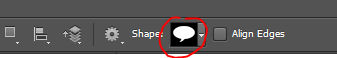
And then there are the custom shapes. That is where the other shapes are and if you download shapes from online, they will appear here. The preset custom shapes are random things like a heart, arrow, frame, etc.
C. How do you use shapes?
1. Select the shape you want.
2. Go to the document.
3. Click and drag until the shape is the size you want.
4. If you want your shape to keep its proportions, hold the SHIFT key while you click and drag.
D. How do you edit the shapes?
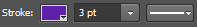
You can change the color of your shape by going to the “Fill:” section and change the color.


You can also change the fill to a pattern, gradient, or no fill at all.
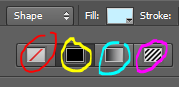
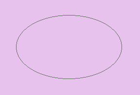
The setting circled in red is the option to have no fill. If you click that, the shape will be invisible, like this:
The setting circled in yellow is the color fill.
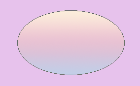
The setting circled in aqua is the gradient fill. If you choose that, you can select a gradient. It’ll look somewhat like this:
The setting circled in pink is the pattern fill. If you choose that, you can select a pattern. It’ll look somewhat like this, depending on what patterns you have:
You can resize your shape by using the select tool, right-click on the shape, click “free transform path,” and resize it.
You can have a border by enabling the “Stroke:” portion. You can have the stoke to be a color, pattern, or gradient. Then you can change the size of the border next to it. And you can change the style of the border to be solid, dashed, or dotted.
E. How do you make your own custom shapes?
1. Open the image you want.
2. If it’s not already a png, you have to make it to a png. Otherwise, the shape will not turn out.
3. This step is optional, but I like to set the color overlay to black to see what the shape will look like. (ctrl+u, lightness: -100)
4. Use the select tool to select the entire document.
5. Click the move tool. (Make sure the document is still selected)
6. Move the shape a little. For example, click the backward key once and put it back by clicking the forward key once.
7. The png should now be the only part selected.
8. Go back to the select tool. (Make sure the png is still selected)
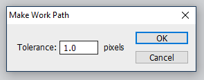
9. Right-click on the png and select “Make Work Path”.
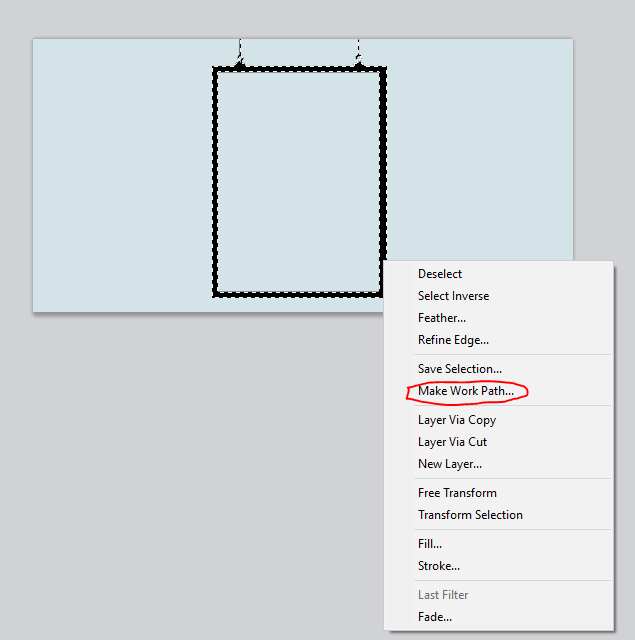
10. Enter a tolerance level. I recommend 0.5-2.0. It depends on the png, really. It might look better with lower tolerance, or it might look better with higher tolerance.
11. Click the pen tool and right-click on the png.
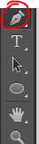
12. Click “Define Custom Shape.”

13. Name the shape and click OK.
14. Click the delete key and delete the png layer.
15. Create a new layer.
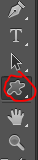
16. Click the custom shape tool.
17. In the custom shapes navigation, scroll down until you see the shape you created. Click it.
18. Click and drag the shape until it’s the size/portions you want.

19. Change any details you want (fill, stroke, etc.), and you’re done!

What to keep in mind:
- The shape is not going to be perfect. The work path tries to detect as close as it can, but it will not get every detail.
F. How do I get more shapes?
Shapes4Free has a wide selection of shapes to choose from. Just choose the one you like, scroll down until you see the green “download” button, and click it. Then open it in photoshop. The shapes will appear in the custom shapes section.
Deviantart has tons of shapes available, too. Just search “photoshop shapes”, “custom shapes”, etc.
I hope this tutorial/guide was helpful. If you need any help or have any questions, feel free to ask!
Post link

。・ tutorial one by graphictutorials ゜+.*
-`. Hello everyone! In this tutorial, I’ll teach you how to center objects/text in photoshop, as well as explain how the Smart Guides and custom Guides work. .’-
A. How to Center Text
1. Type the text you want.

2. Select the center text-align option from the text toolbar settings.

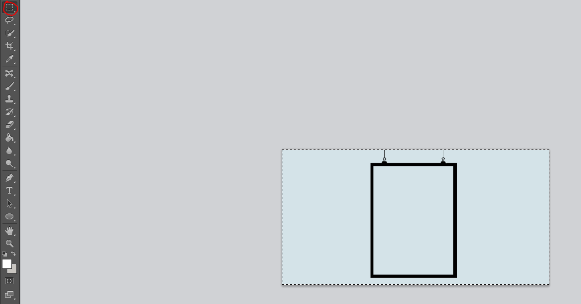
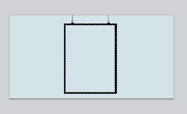
3. Use the rectangular select tool to select the entire document.

4. Click the move tool and select the “Align verticals centers” and “Align horizontal centers” icons.

The text should now be centered perfectly.

Before moving on, let’s go over the other alignment options just so you know what they are.
“Top Edges” (the first icon) aligns the text to the top.
“Bottom Edges” (the third icon) aligns the text to the bottom.
“Left Edges” (the fourth icon) aligns the text to the left.
“Right Edges” (the sixth icon) aligns the text to the right.
B. How to Center an Object
It’s the same steps as before:
1. Open/create the object and place it on the editing workspace.

2. Use the rectangular select tool to select the entire document.

3. Click the move tool and select the “Align verticals centers” and “Align horizontal centers” icons.

It should now be centered perfectly.

A few things to keep in mind:
- It centers according to the image. If you have a png but there are some portions on the outside that are not fully erased, it still detects it as part of the image you want to be centered and will place the png in an odd place.
- To get the best result, make sure there are no “crumbs” around the image/png you want to use.
- If you can, select the portion of the image/png you want and click CTRL+J. That will create a new layer and remove any outer edges.
C. Smart Guides
Attempting to center multiple objects will send all objects in the same position and will override each other.
Thus, I recommend turning on your Smart Guides. (To do so, go to View > Show > Smart Guides)
The smart guides are bright, pink lines that appear when you place something over or near another object. It helps with aligning objects, specifically objects with the same dimensions to make them parallel.
For example, here is a gif showing you how the pink smart guides help you align an object (in this case the “&”) with another object:

It tries to help you align an object with the ends/center of another.
As another example, here is a white, centered square. The smart guides help align two black boxes to be even to the white box.

Using smart guides is a good advantage I recommend using.
D. Custom Guides
Adding custom guidelines in certain areas also makes it easier to align objects.
To add guides,
1. Go to View > New Guide.
2. Select the orientation you want: horizontal or vertical.
3. Enter the position you want the guide to be.
For example, if your document is 540px wide and you want to enter a guide in the middle, you would put “270 px”.

As you can see, it adds a cyan line in the center. That will help you see where the center is to put an object there.

You can follow the steps again to put more guidelines.
For example, say you want the 540px wide document to be cut into fourths, you would put one guide with 135 px, one with 270 px, and one with 405 px. (540/4=135. 135+135=270. 270+135=405. 405+135=540.)

The guidelines you enter help you see where to put things perfectly.

And don’t worry. When you save your image, the lines will not save with it. But if you want, you can remove them by going to View > Clear Guides.
That is it for this tutorial. I hope you found this helpful and your editing process. If you have any further questions, don’t hesitate to send a message!
Post link