#leatherbinding


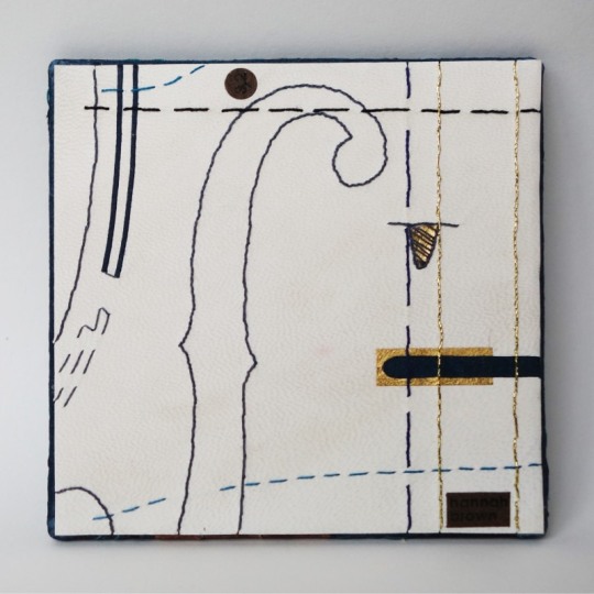
“Music” Miniature Board
Commissioned as part of a series on the same theme by Neale Albert, New York, USA.
Measuring 3 inches square
Made in 2020
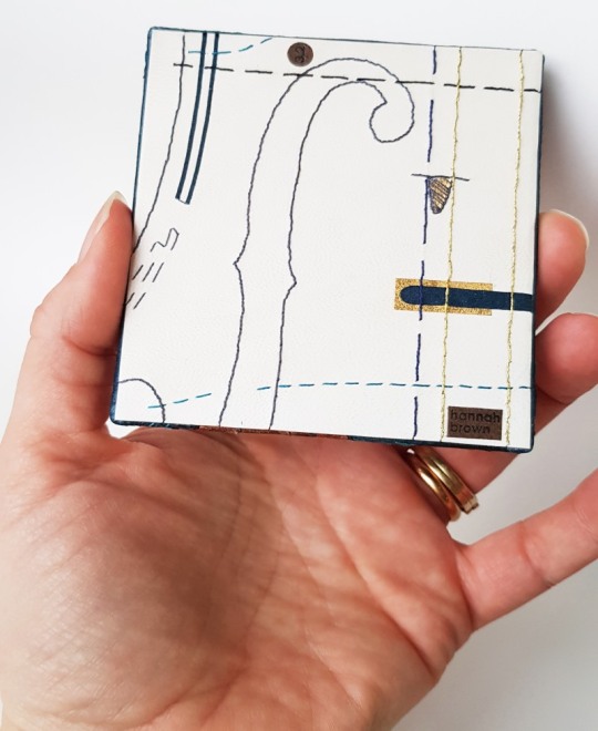
This series of boards was inspired by a collection of full size boards which Neale Albert was shown during a trip to George Bayntuns in Bath in 2018. The boards he saw had all been made by members of Designer Bookbinders for a separate project on the theme of Architecture. This project gave Neale the idea for a new project: a series of miniature designer bound boards on the theme of music, three inches (7.62 centimetres) square in size. In early 2019 myself and a number of other binders were asked to participate in this project. Each binder was given total control of the design of their piece (as usual for Neale’s commissions) the only common ground between them was to be the size and the musical theme.
Neale started collecting dolls house miniatures in the mid-1980’s, which then progressed to commissioning miniature reproductions of his favourite things leading eventually to having entire miniature rooms made for him. But of course miniature rooms need miniature things to go into them, and naturally when Neale’s second room project was going to be the library at Cliveden House in the UK he needed miniature books for the shelves! Initially these were blank books purchased at doll house shows until he discovered the world of real miniature books with real type and real illustrations.
I believe that this was the start of Neale’s passion for collecting miniature bindings, commissioning bookbinders from around the world to create miniature books for him. Over 250 of Neale’s bindings are illustrated in the 2008 publication, “The Neale M. Albert Collection of Miniature Designer Bindings: A Catalogue of an Exhibition Held at the John Rylands Library 4 June – 18 October 2008”, and he has commissioned many more since then too.

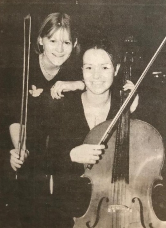
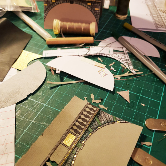
When I considered the theme my thoughts naturally turned to cellos as I played the cello up until the age of 20. I made it all the way up to Grade 8 (which seems unbelievable to me now as I can barely remember how to read music anymore!) and was a member of both the orchestra at my secondary school as well as a local music centre. I started learning the cello when I was at primary school - here I am on the far right!

I was also part of a record breaking attempt in 1998 and made it into the local paper (below on the right!). Nearly 4000 young musicians got together at the National Indoor Arena in Birmingham along with the City of Birmingham Symphony Orchestra and the conductor Sir Simon Rattle to perform Sir Malcolm Arnold’s Suite No.2, along with school children from all over the country - we successfully broke the previous record of 2212 musicians!
Sadly leaving home to go to university was the end of my cello playing as I decided I didn’t want to take such a large instrument away with me. It sat in the cupboard at my parents house for many years however I am pleased to say that it has finally gone to a new owner and is being played again.
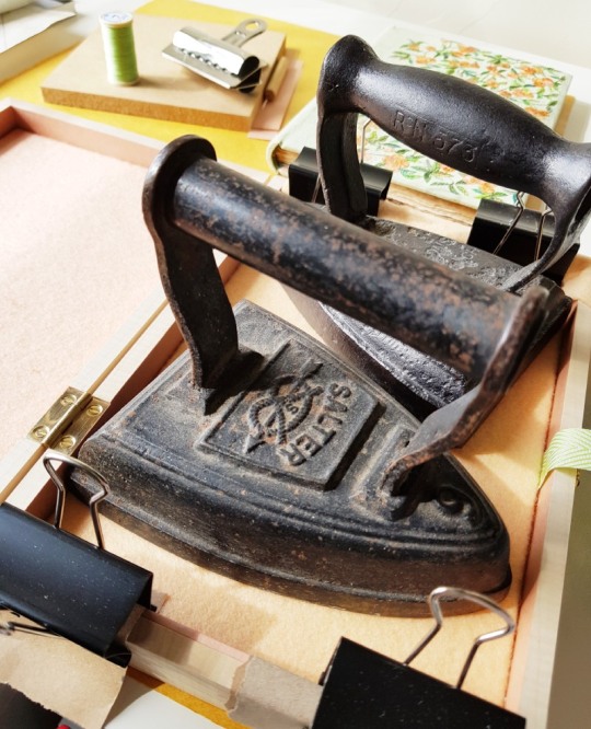
As luck would have it a neighbour of mine is a luthier, based in Somerset and specialising in cellos. Kai-Thomas Roth was born in Germany. From the age of eight he knew he wanted to become a violinmaker and made his first instrument at the age of thirteen. After training as a cabinetmaker in Switzerland he came to England to study at the Newark School of Violin Making. Following work experience in the trade he established with his wife Caroline Crowley their business as makers of fine instruments of the violin family in 1990.
Below: Head of Baroque cello, No 103, after Guadagnini (Photo Credit: Kai-Thomas Roth Instgram account @kaithomasrothcellos)
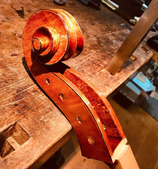
Specialising exclusively in making bowed stringed instruments all experience and expertise gained since 1986 are concentrated on the manufacture of these intricate complex artefacts. For that reason Kai-Thomas neither has a shop nor employees and he does not deal in old instruments or undertake repairs. This puts him amongst the few makers who immerse themselves completely in creating instruments but amazingly he’s never played the instrument he so lovingly creates!
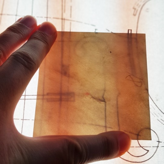
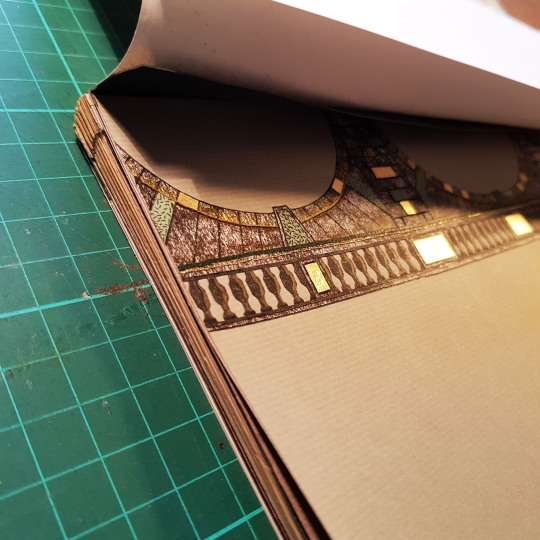
I approached Kai to ask whether he had any technical drawings of cellos that I might borrow to base the design of my board on. What he lent me was a drawing of a “Violoncello Piccolo” made by Johann Christian Hoffmann in Leipzig in 1732. This instrument belongs to the Museum of Musical Instruments of Leipzig University and the maker was in Leipzig at the same time as Johann Sebastian Bach. This violoncello is a small cello that would be played braced against the shoulder rather than between the legs. This instrument is also a five-string version of the instrument, standard cellos have just four strings.

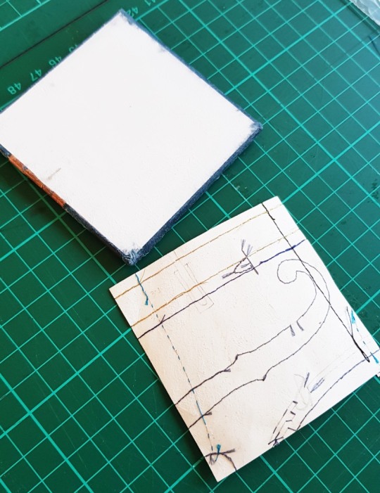
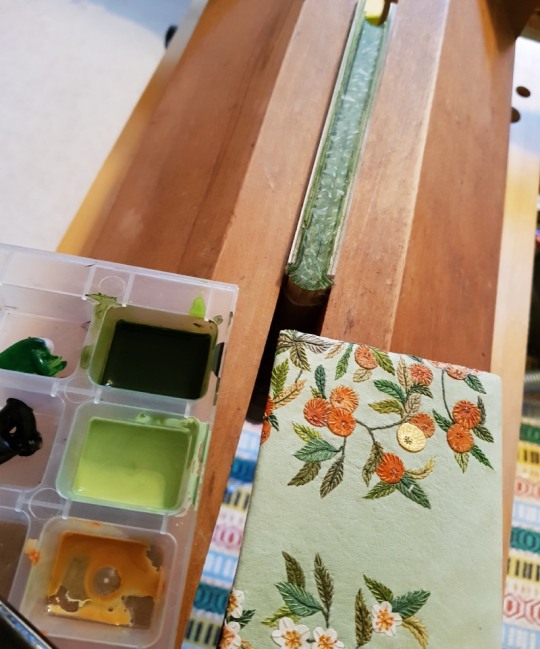
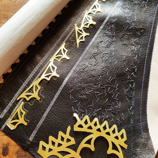
The inner board was made up as I would make up the board for a binding. Two 1mm think squares of Gemini board were glued together, with a piece of kraft paper glued on the inner side of the board and two layers of 145gsm water colour paper to the outside. Once dry the outside face of the board was bevelled using sandpaper.
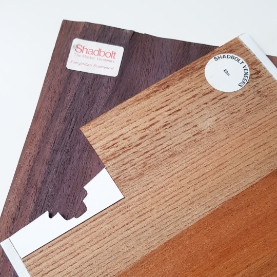
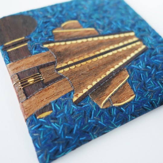
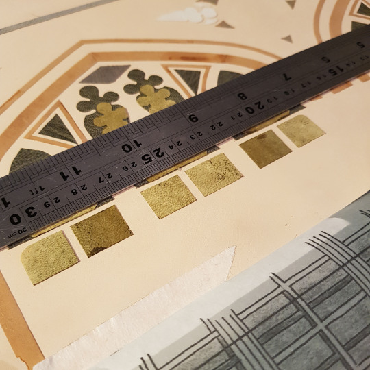
The front of the board is covered in “Colvert” coloured bull skin from the Remy Carriat Tannerie in France, this was edge pared for the turn-ins using my Brockman paring machine and then further pared with a rounded scalpel blade. The bull skin is very stretchy and difficult to pare with a conventional paring knife so I have found through experimenting that I get the best result using a scalpel with a size 23 Swan Morton blade in it.
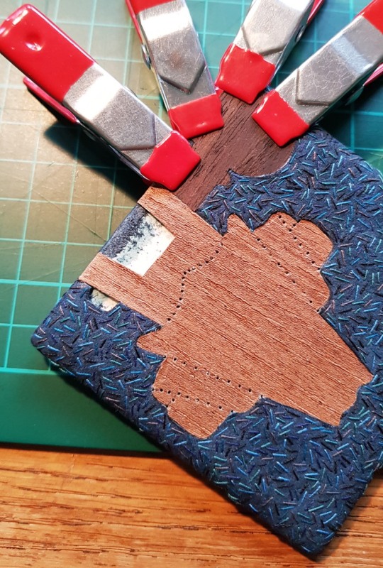
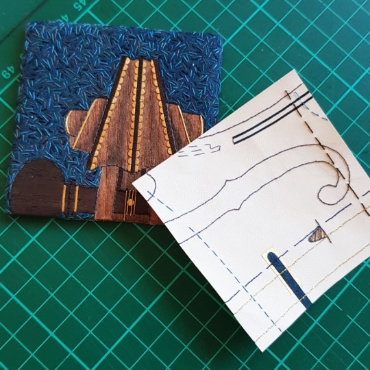
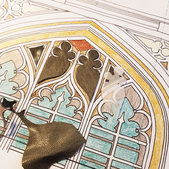
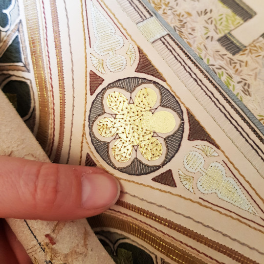
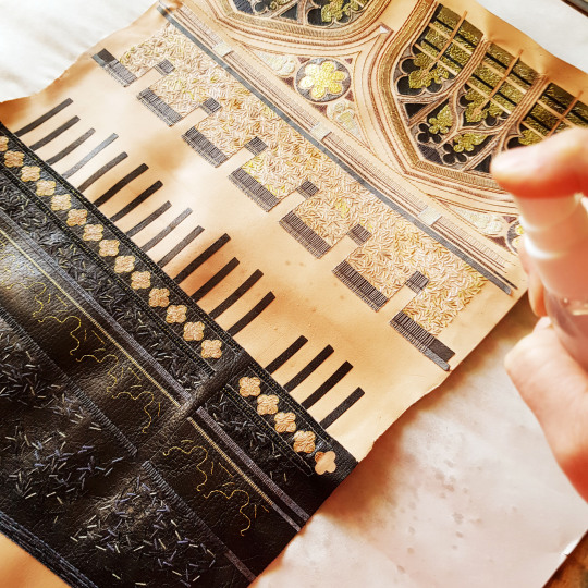
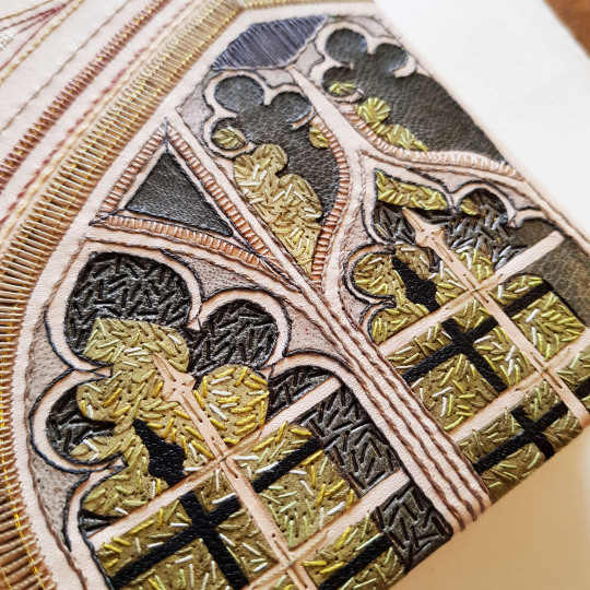
I traced the scroll section of the cello, including the top peg, onto some paper and transferred this onto the back of the leather I chose to use for the board. I then embroidered a series of individual short lines in a variety of colours of cotton thread to break up the uniform blue of the leather. These stitches were done around the outline of where the scroll was going to sit on the board.
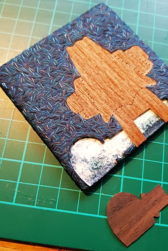
The leather was then pasted to the board, turned in and left to dry. I then cut out the outline of the cello scroll (within the line of stitches) and peeled this away to leave a void. I used two varieties of veneer (Rosewood and Elm), which I backed onto card to give extra thickness and strength, cutting them out very carefully with a sharp scalpel so that they exactly matched the void that they needed to fill.
They were glued in place using PVA glue and held with small clips whilst the glue dried to ensure that they dried flat. Where the veneer met the edge of the board I bevelled the veneer to match the profile of the leather as it thinned towards the edges.
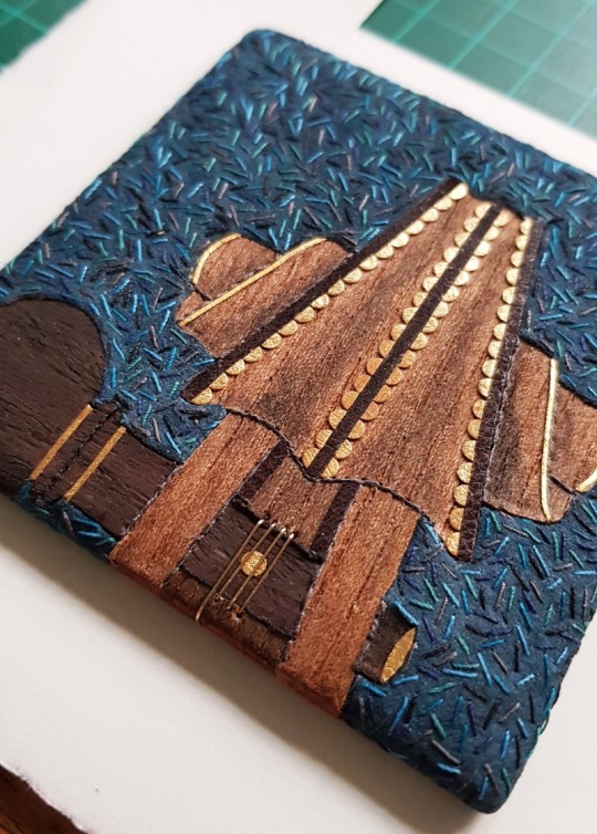
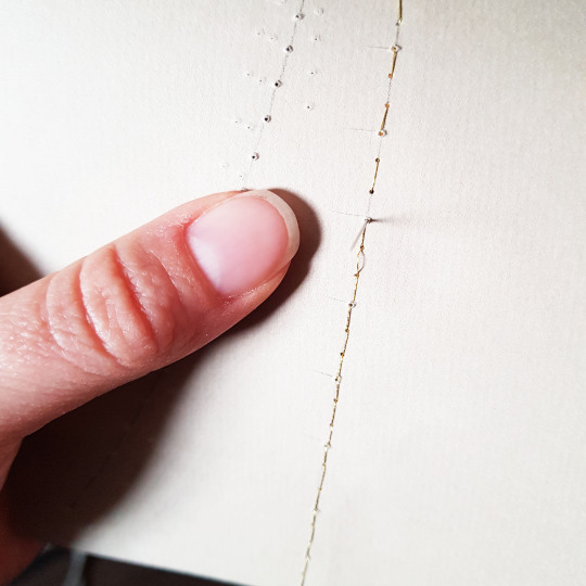
I forgot to take too many photos of how I built up the detail on the veneered sections of the board (I was enjoying this part too much and forgot!), but I drilled small holes right through the board using a fine drill bit in my Dremel and added outlines using thread sewn through these holes. I also added a thin wash of acrylic paint to some areas of the veneer to add an appearance of shading and depth to the surface, plus I also included some detail in gold leaf to jolly up the design!
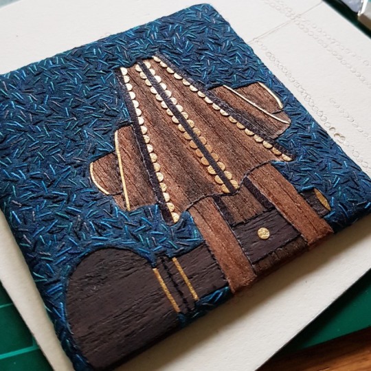
Finally, I used thin gold wire that was also passed through more small holes drilled in the board to depict the cello string wound round the topmost peg. The wire was passed through the board and embedded into the reverse before being covered with the infill on the back of the board.
Once the back of the board had been infilled and built up it was time to work on the design for the back of the board. I cut a small piece of vellum to 3 inches square and traced another part of the cello technical drawing onto the reverse of it using a light box. This section included part of the F hole and the bridge that supports the strings.
I was then able to use these lines as a guide for embroidering the design using the same colours of thread as used on the front of the board.

I also used some gold leaf and small elements of the “Colvert” bull skin to match what I had used on the front of the board.
The back of the board was built up with a couple of layers of Zerkall paper and sanded flat. Once the vellum was complete I stuck it down to the back of the board and left it to dry, making sure I rubbed it down all over to ensure it stuck down properly.
And so we had a completed board! All that was left to do was to add my signature and a small number annotation to the vellum back of the board then it was photographed and posted over to join the other boards in New York. This was a very pleasurable little project to work in in amongst other commissions and I was pleased to reminisce back to my more musical days!

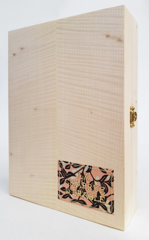
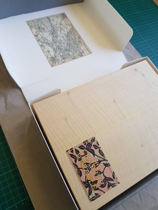
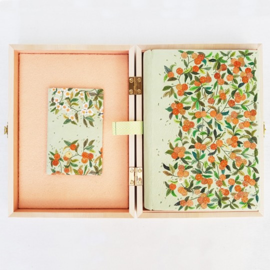
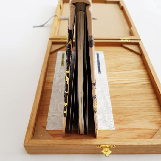
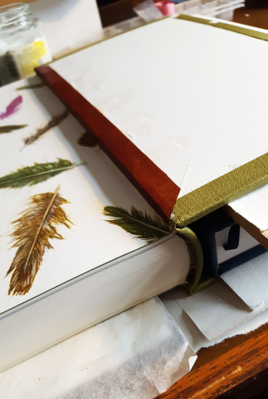
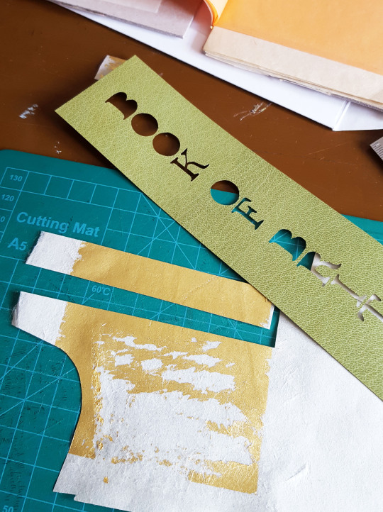
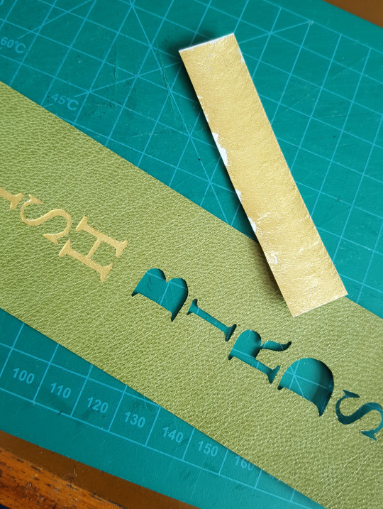
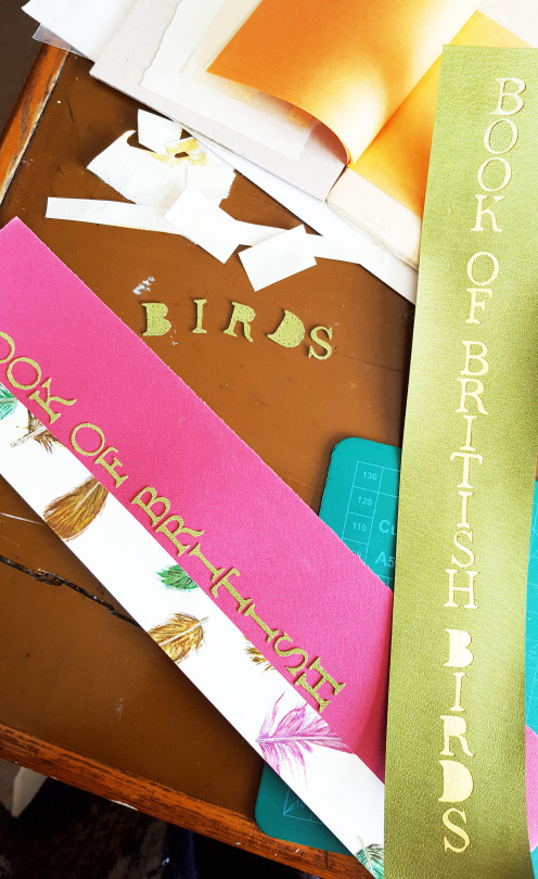
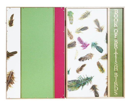
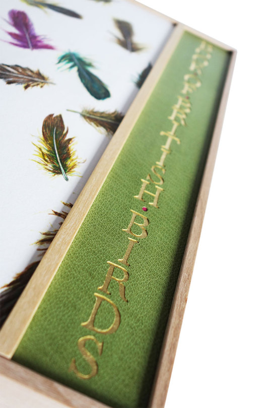
And so the binding was complete! I used a spare piece of the endpapers to create a title for the box. The words were pierced out using a scalpel and backed with gold leaf. The title was then sewn to the lid of the box through small holes drilled around the outside of the label.

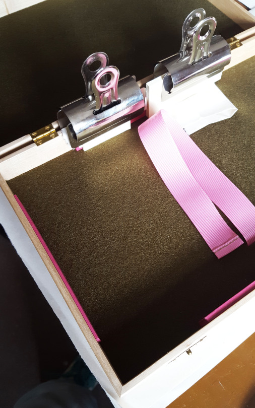
I knew early on that wanted the container to be made from Maple wood to tie in with the book title and I was pleased to be able to source some. The inside of the box was lined with felt, with a ribbon lifter attached to help to get the book out of the box.
THE COMPLETED BOX
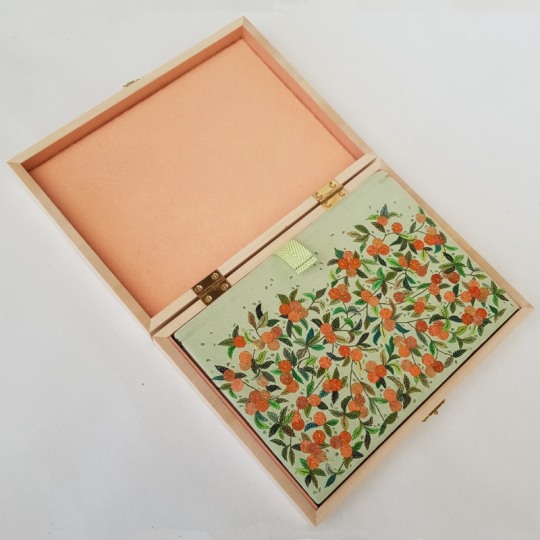
THE BOOK IN THE OPEN BOX
THE BOOK ON THE OPEN BOX

THE BOOK NEXT TO THE BOX
THE EDGE DECORATION
THE FULL COVER

THE PASTE-DOWNS

BACK COVER DETAIL

FRONT COVER DETAIL
THE ENDPAPERS

I was finally able to order the outer conservation box from The Bodleian Library a few weeks ago.
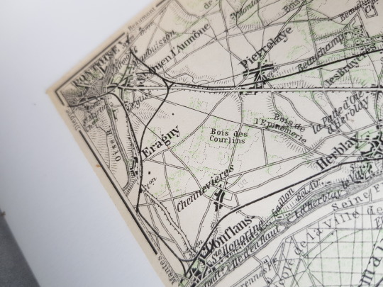
As well as adding a title to the spine, I glued into the inner lid of the box a map dating from 1910, showing the area of “St. Denis-Pontoise” in France, including the town of “Eragny”.
The press was named after the Pissarro family’s home village in Normandy, I will have to try and visit it someday!

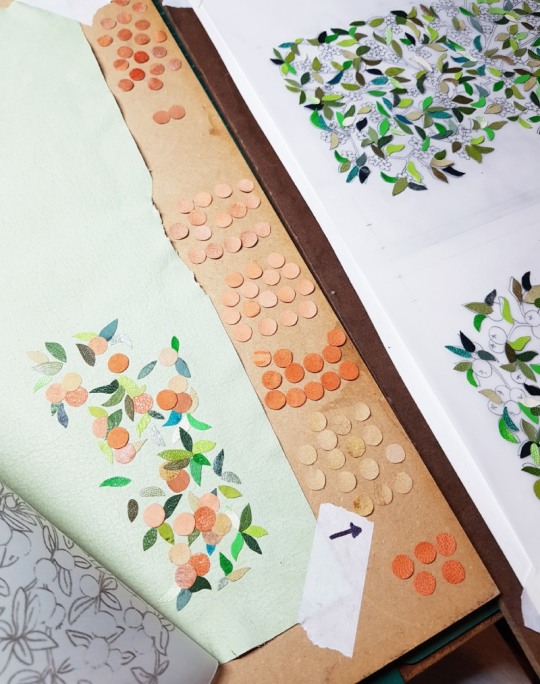
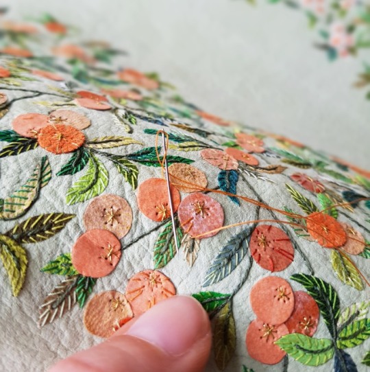
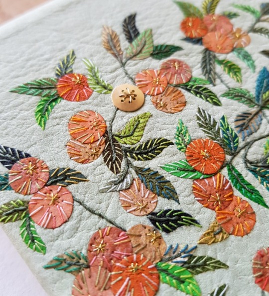
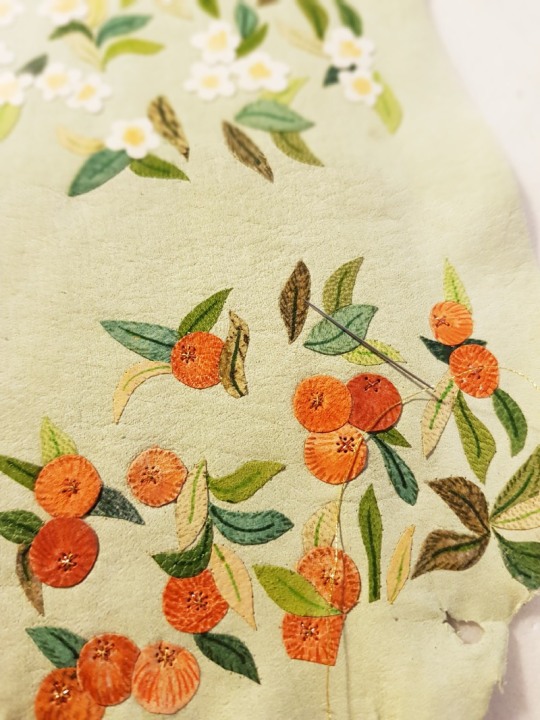
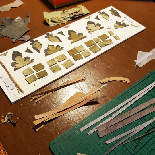
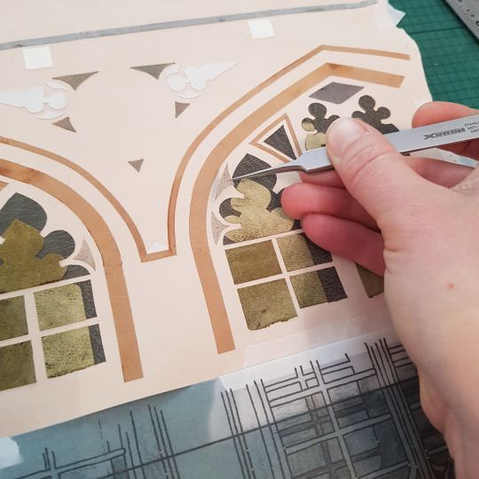
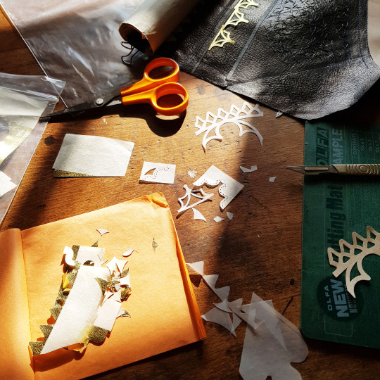
Finally the time had come for me to do the bit that I like the most - decorating the covering leather! The first step in the process was to cut out all of the leather onlays I needed to complete the design, including lots of lots of little leaves. On a couple of occasions I brushed past these loose leaves sitting on one of my benches and dislodged a few and it was a rather frustrating game trying to find their correct positions again!
When it came to the apples, I cut out a multitude of discs in different tones of leather and tried to spread the colours out as evenly as possible over the front cover.
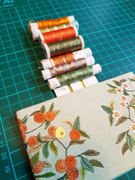
Once all of the onlays were down, I went through my box of threads and pulled out a selection of greens, reds and oranges with which to start sewing the detail onto the cover.

Firstly I concentrated on sewing all of the ‘branches’ using a dark green thread. This also helped to secure each of the leaves onto the leather. Each leaf in turn was then further embroidered with little stitches all the way up in a contrasting green to the colour of the onlay. As the leaves on the front and back covers were mirror images of each other, I made sure to sew the corresponding leaves in the same coloured thread.

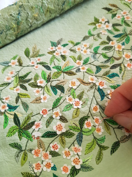
The apple blossom was attached to the leather using a double criss-cross stitch to look like the stamens of the flowers. I pricked the holes first with a needle pricker as the vellum inlays were tough to push a needle through.

Onto the end of each of the criss-cross stitched (eight in total for each flower) I tied a small French knot. These were done in a variety of different coloured threads to add variety.
The apples on the front cover were also embellished with a variety of coloured threads, enhancing the colour whilst also securing the onlays down.
The back of the leather looked like this once the embroidery was complete - a random scattering of coloured threads!

So, the time had come to cover the book, always a daunting task after spending so much time embroidering the leather beforehand. I laid a few layers of newsprint down onto my bench and got together all the tools I needed for the process: sharp scissors, teflon folder, scalpel, fine metal tools for forming the head caps and some cord, also for forming the head caps.

The front of the leather was spritzed with some water to prevent marks from forming on the front of the leather once it dried. The back was pasted out three times using flour paste, with time left in between each application to allow for it to absorb into the leather.

The covering of the binding requires all the hands and nerves I have so I often don’t get many photos of this part of the process! The leather went down well and the book was left to dry under weights between blotting paper for 24 hours, with the blotters changed regularly. The following day, I dampened the joints with a water pen and carefully opened up the boards. The leather joints were stuck down into position with PVA whilst both of the book boards were open.
I bought some 18 carat yellow gold sheet in order to add one gold apple to the front cover. This was pierced into shape using a jeweller’s piercing saw and holes drilled through it. One of the criss-crosses was sewn with metallic gold thread, the other had gold wire passed across it to physically attach the gold apple to the book board through small holes that had been drilled using my Dremel..
Small channels were cut out of the reverse of the board and the ends of the gold wire were bent into these to permanently fix the gold apple in its place. The insides of both the front and back boards were then infilled and sanded. The first layer was some watercolour paper, which was the same thickness as the turn-ins and the leather joint. The second layer was a piece or Zerkall, cut a few millimetres smaller than the size of the boards. This was then sanded completely flush to get rid of any lumps and bumps.
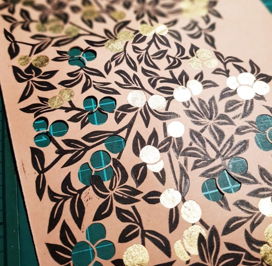
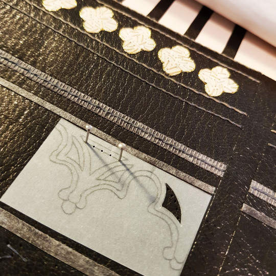
It was then time to stick the paper doublure down to the front and back boards. All of the pierced shapes had been filled with gold leaf backed onto Japanese tissue.

Once stuck down, I wanted to add extra detail to the endpapers and doublures. For the apples inside the front board, I cut out tiny criss-crosses from black paper.

These were then stuck down onto the gold using PVA glue.

For the blossom inside the back board, I used black acrylic paint on the end of a needle pricker and applied paint to each of the flower centres.

Finally, I wanted to add a little of the cover leather to the endpapers and doublures. I cut out small shapes from thinly pared cover leather and stuck them randomly amongst the branches.
The next, and final, blog post in this series shows images of the completed binding and wooden box that was made for the binding.
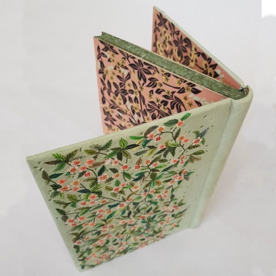
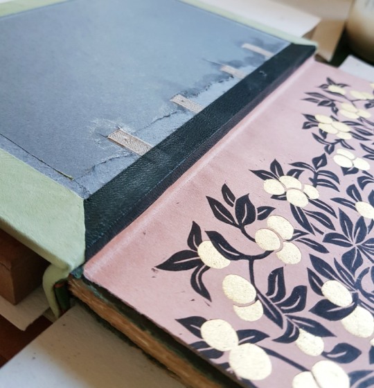
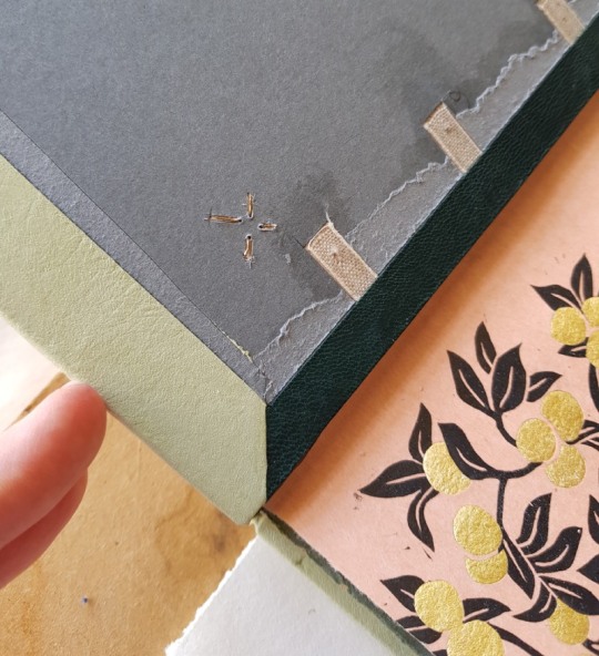
The client wished to retain the gilt calf paste-downs if possible to include them within the new binding. To do so it meant removing them from the existing limp cover so I could mount them to new sheets of paper.

The leather of the limp calf cover had started to degrade, so I removed it by peeling it back carefully from the reverse of the paste-down. I was then able to sand the surface using a fine sandpaper.
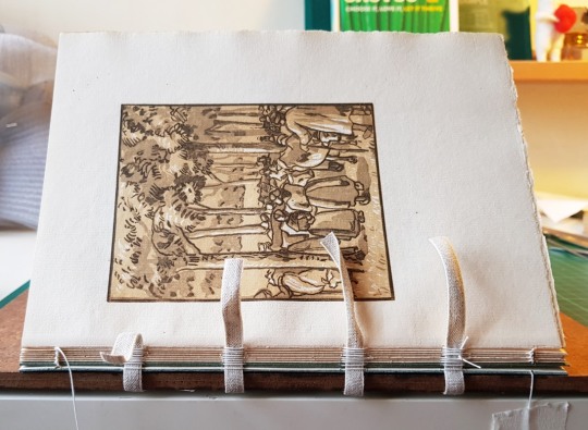
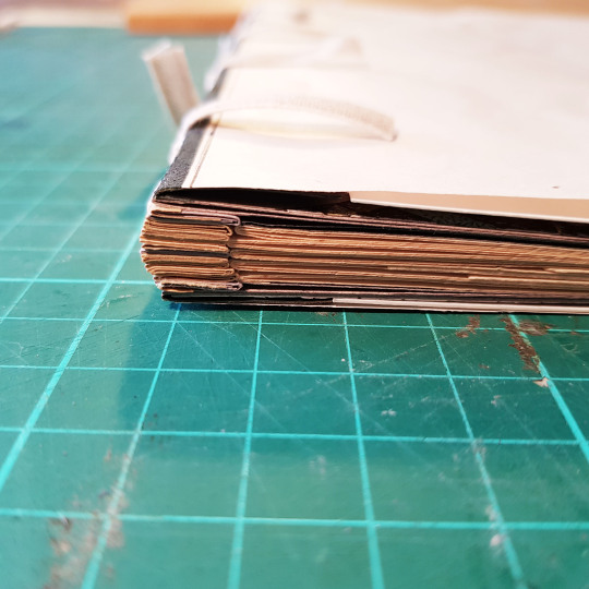
Once sanded the paste-downs were mounted to a bi-folded sheet of paper and sewn to the textblock as an additional section on the front and the back. I wrapped a bi-folded strip of paper to this new section as a guard, the other side of which (as visible in the below photograph) was then tipped onto the endpaper section once that had been sewn to the textblock.

The sections were all then sewn together onto four tapes.
Once all the sections were sewn together, with the endpapers added on at either end, the spine of the book was glued up in-between the tapes with PVA glue and left to dry.

I then rounded and backed the book, and lined the spine attaching a one-on, two-off hollow and then sanded the top edge flush. I wanted to add some edge decoration and did so using watered down acrylic paints. I first applied a thin layer of dark green to match the paper I had used to mount the new paste-downs onto. I further built up the colour by dabbing on small amounts of white, peach and green paints on top to create an abstract pattern in colours to match the binding.
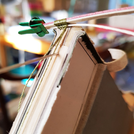
The foredge and bottom edge were left deckled so I did not need to apply edge decoration to them. The next stage was then to sew the endbands. I selected colours that I thought would work well on the binding.
I then created double core endbands using a mixture of these coloured endband threads. The larger core was made from a lamination of leather and a thin strip of vellum. The vellum side was paced pointing towards the top edge of the binding to try and keep a crisp edge where the endband silks wrapped over it. The smaller core was made by stiffening some linen sewing thread with PVA glue and letting it dry out.

The boards were then laced on and bevelled. The covering leather was pared in preparation for the next stage of the binding process.

The next post details how the leather onlays and embroiderd elements were added to the covering leather to build up the design.

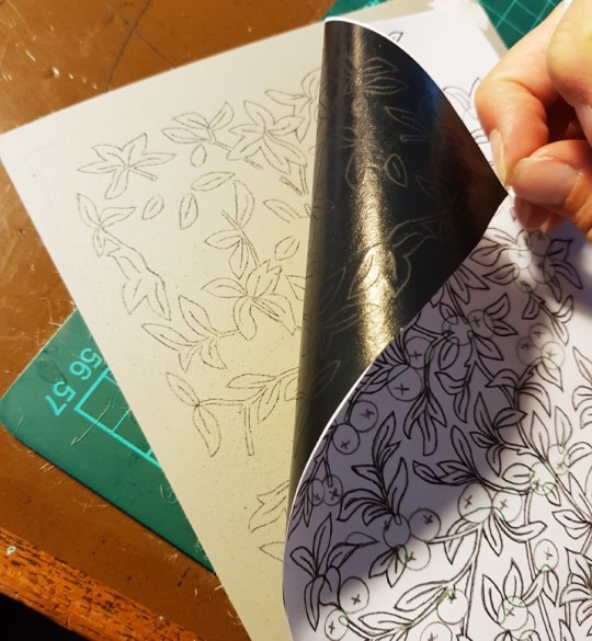
Throughout the book there were numerous wood cut prints so I decided to try out some lino printing to tie in with this. In order to transfer the design onto the lino for cutting I placed a sheet of carbon paper on top of the lino. On top of that I laid a line drawing of the design and then I traced the lines with a biro in order to leave a mark through the carbon paper on the surface of the lino.
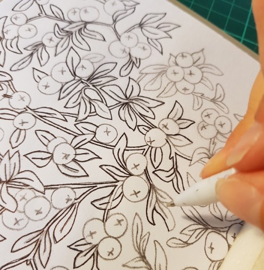
I only wanted to print the leaves using the lino plate, so only marked these areas through the carbon paper. It was very clear to see what I needed to cut once I was done marking the lines.
I invested in some rather lovely new “Pfeil” lino cutting tools in a variety of cutting shapes. Each tool is made from chrome vanadium steel with ergonomically shaped hardwood handles – they made slicing the lino a breeze!
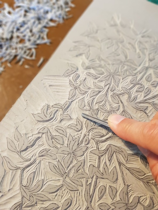
The sample board was done in the same manner, just cut on a smaller scale.

The cut lino was inked up with black intaglio ink using a roller.

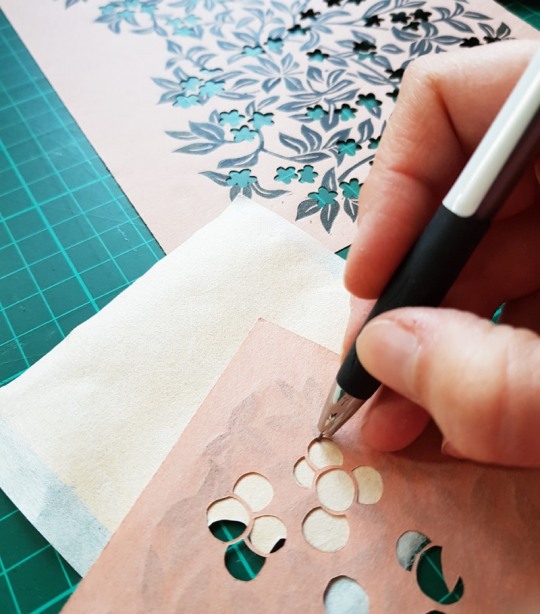
The apricot Satogami paper was then laid on top of the lino plate and put into a press. Once printed they were pegged up and left to dry for a few days, I did extra copies so I could select the best ones for the final binding.

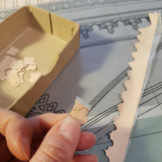
I chose to split the cover design so there were apples on the front and apple blossom on the back of the book. I wanted this difference to carry through onto the endpapers and doublures. To add another level of complexity to the design I decided to make it so that each of the flowers and apples on the endpapers and doublures would have gold leaf behind them to catch the light when the book boards were opened which meant cutting out each shape using a scalpel.
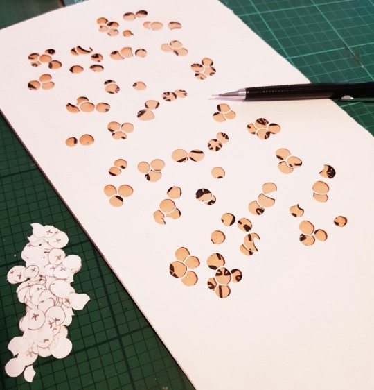
I glued some squares of gold leaf to Japanese paper in preparation using PVA glue and left them to dry.

I flipped both the paper-backed gold leaf and the pierced endpapers over and drew around the shape of the flower and apple clusters that I needed to back onto the reverse side of the gold leaf.
I then made a slightly oversized cut around the pencil outline so that there was enough extra to glue it onto the reverse of the printed paper to span the pierced void.
The next post covers the forwarding of the book!
I was shocked to look back at my last blog post to see that it was back in August of 2019, nearly one whole year ago, where did all that time go? I have found it is all too easy to get out of the habit of writing, unless I do so as soon as I have finished a binding or project it seems like a real effort to look back retrospectively and write a post. I have five outstanding things to write about, all of which with photos to edit which seems a bit of a mammoth task!
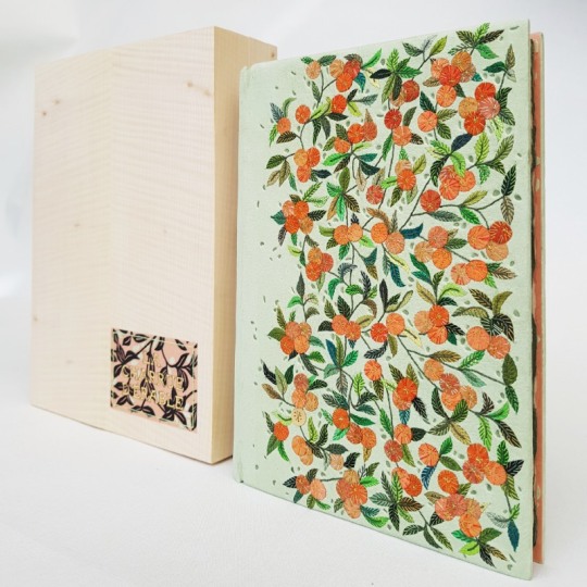
So, to kick start my blog again I am starting with a binding that I have literally just shipped off to France to a client, I hope it reaches him safely and is well received. In fact the binding itself was finished a couple of months ago but due to the global pandemic I was unable to order an outer conservation box for it, I get these from the University of Oxford, so the binding sat safely in its wooden container in my plan chest until I was able to place an order for a box of the correct size.
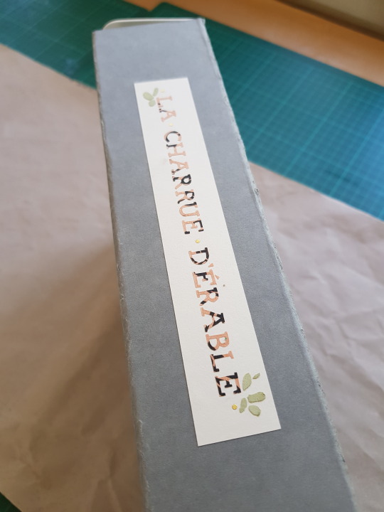
The binding is a copy of, “La Charrue D’Érable” (The Maplewood Plough), one of 116 copies printed in 1912 at the Eragny Press in France. The Eragny Press was founded by Lucien Pissarro (1863-1944), the son of the Impressionist, pointillist painter Camille Pissarro. The press was named after the Pissarro family’s home village in Normandy. The Eragny Press specialised in small hand-made books in limited print runs featuring superior coloured wood engravings. The press was active between 1896 and 1914 and produced 32 titles in total, La Charrue D'Érable was the penultimate publication from the press. This is not only the most important book of the Eragny Press, but is also Camille Pissarro’s only substantial illustrated book.
The book is illustrated with twelve full-page, colour wood-engravings drawn by Camille Pissarro and engraved by Lucien Pissarro, primarily printed in shades of peach, green, and/or blue from multiple blocks. In addition, there are numerous wood engraved vignettes, initials, and the title-page border by Lucien Pissarro.

Taken from Via Libri: The World’s Largest Search Engine for Old, Rare and Out-of-Print Books;
“Camille Pissarro exhibited in the first Impressionist show in 1874 and continued his association with the Impressionists for the next dozen years. He then adopted the style of Pointillism briefly, before reverting to an Impressionistic style of landscape painting. It was during this last period of his life that he made the drawings that would eventually result in La Charrue d'Érable. Although the book was not published until 1912, most of the blocks were cut and proofed by Camille before his death in 1903. Lucien Pissarro was trained as a painter by his father, exhibited with the Impressionists, and eventually became interested in book making. After settling in London, he and his wife Esther learned the arts of printing and book design from Charles Ricketts. The early books from Pissarro’s Eragny Press were printed with type supplied by Ricketts. This book is printed in a typeface designed by Lucien Pissarro.”
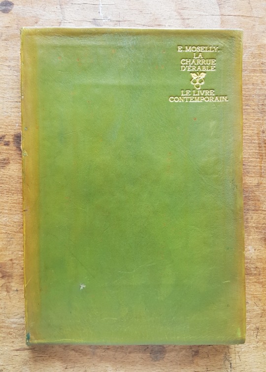
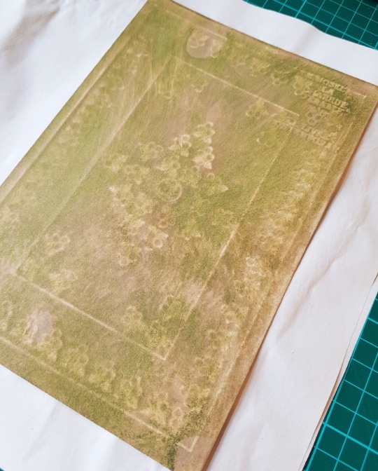
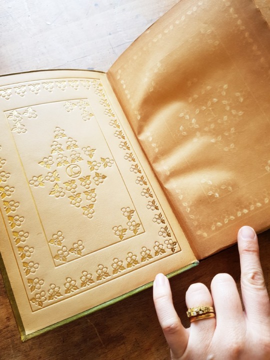
The original book was bound in full limp green calf with gilt titling on the upper cover. The leather had begun to degrade on the copy I was due to rebind, especially on the spine section. There were calf paste-downs inside the limp cover, stamped in gold with apple patterns and a central “Livre Contemporain” monogram. The client was keen to keep these paste-downs in the new binding so I had to think of ways to achieve this. I did also enquire whether he wanted me to try and retain the paper endpapers opposite these leather doublures, they had a sort of ‘halo’ of the leather doublure pattern on them due to the acid from the leather affecting the paper. In the end I though that they were too brittle and damaged to transfer to the new binding.
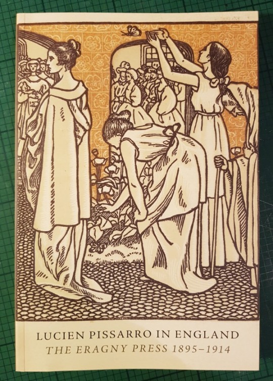
In early 2011 the Ashmolean Museum in Oxford ran an exhibition entitled, “Lucien Pissarro in England: The Eragny Press 1895-1914”, I was able to buy a copy of the catalogue they published online with the same title in order to read up more about the Eragny Press. Lucien was sent to England by his parents where he fell in with a group of artists who were followers of William Morris and the Arts and Crafts Movement. In the 1890s, William Morris founded the Kelmscott Press to produce exquisite, hand-made books. Lucien and his friends wanted to do something similar, and so for the next 20 years he laboured over the spasmodic production of 32 hand-crafted books with his wife, Esther.
I found it interesting to read that Lucien Pissarro had to wait a long while for the text to be written, it was delayed due to illness and other reasons. He therefore ended up making the initials before the text was written so the writer then had to begin his chapters with words which began with the letters that had been cut!
Although inspired by the Kelmscott Press, the woodcuts are very different to those done by William Morris. There were no floral borders in this text block, although the title page had some floral elements like apples on a tree with one of the chapters actually being called, “Sous Les Pommiers”, or “Under the Apple Tree”. I really liked the way that these branches looked so began to think of ways of incorporating these into the design for the cover.
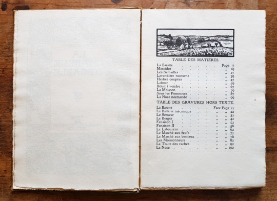
The book is a quaint representation of rural French farming life. I lived in France for 18 months a few years back although unfortunately I didn’t become a fluent French speaker so I required some help deciphering the, ‘Table des Matières’. I asked a French friend to help me translate the chapter titles which she did, although she was unsure about a couple of them as they were written in old French. Fortunately these gaps were filled by my French-speaking client. Alongside egg and cattle markets (Marché aux œufs/au bétail) and harvesters (Les Moissoneurs) the more interesting descriptions were:
Messidor: During the French revolution, the name of the months were changed. Messidor was the tenth month (from mid June to mid July).
Lavandière Nocturne: A ghostly spirit in the form of a washerwoman doing laundry in the river or pond seen at night. This is a bad omen, usually a herald of death. This is a widespread southern French folk-legend.
La Batterie Mécanique: In this context it is a mechanical thresher for grain.
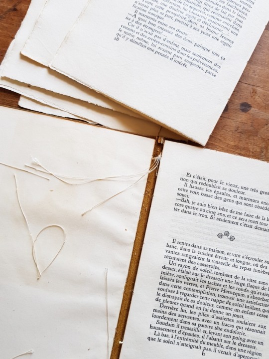
The book was very easy to pull as the covering leather on the spine had degraded and the sewing threads were loose. The central sections therefore pulled away from the leather spine well and I carried out a couple of small repairs on tears using Japanese tissue and wheat starch paste.
Some of the sections within the text block were unopened, so the top edge of the sections had never been cut meaning that some of the 'hidden’ pages in the original binding would have been hard, if not impossible, to read without tearing the paper.
Many books were sold with unopened pages, this may have been to save the publishers labour and money or to make the sections easier to sew as the pages wouldn’t move around like modern single folio gatherings if left uncut. The reason they were sold like this was that the purchaser/collector was supposed to take the book to a bookbinder of their choice (usually local) who would bind the book according to their personal taste, often the same leather and finishing for each book so that their library looked the same. This was the way books were brought on the market until well into the nineteenth century, until industrial bound books came into being, with their edges cut flush.
The original binding was simple limp calf, perhaps meant as a 'temporary’ binding. Had the edges of the pages been cut, the bookbinder would likely cut them again when rebinding, each time taking more off the text block decreasing it’s size. I made the decision to cut the top edges of the sections in order to make the binding function properly, but left the foredge and bottom edge deckled.
In researching the reason why books were left unopened I was directed to an interesting article entitled, “Uncut, unopened, untrimmed, uh-oh” from The Folger Library about the terminology behind it, having initially referred to the pages of my text block as ‘uncut’ I realise that they should have actually been described as ‘unopened’:
unopened:a book sold with the bolts uncut, to be hand-slit by the purchaser with a paper-knife. It is then said to be opened. Cf. uncut.
uncut:a book is said to be uncut if the edges of the paper have not been cut with the plough or guillotine. Cf. unopened.
The difference between “unopened” and “uncut” is significant for the history of reading: unopened leaves are a pretty good indication that a book wasn’t read when it was new. Uncut leaves, on the other hand, only show that the text block was not neatened up by having the edges trimmed to the same size.

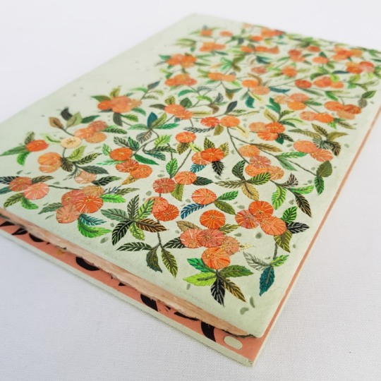
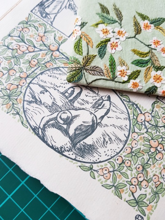
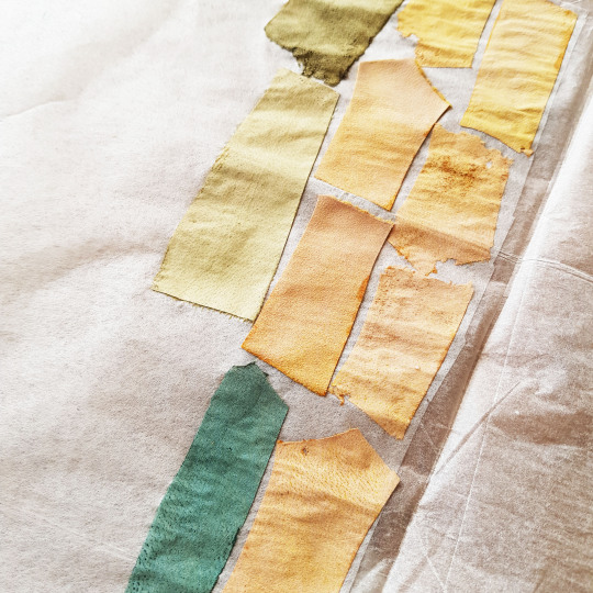
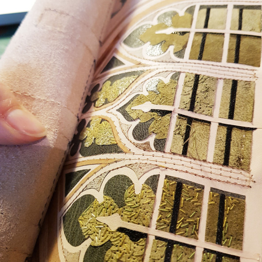
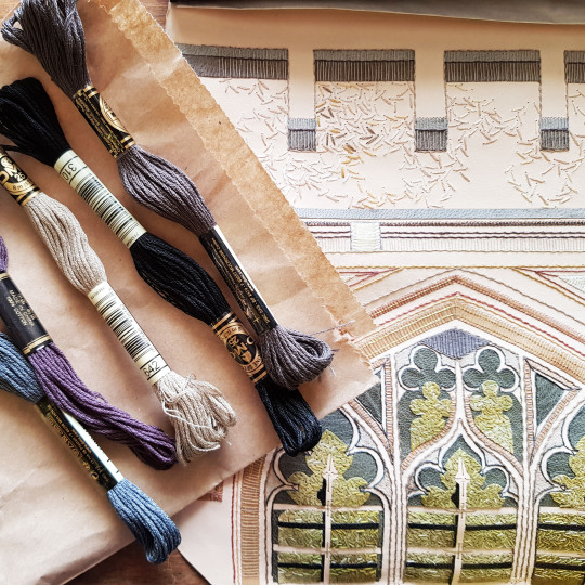
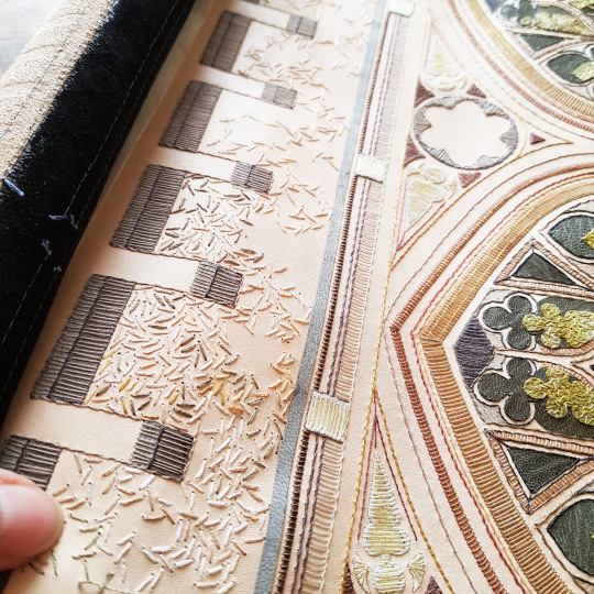
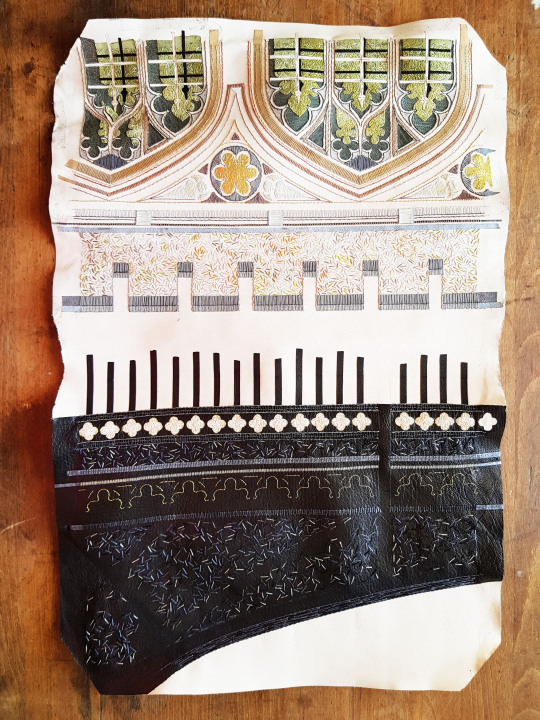
I was inspired by the earthy pastel colours of the woodblock prints. I found a really interesting supplier of Bull skins in a wonderful array of colours, appropriately this was from a French supplier called Remy Carriat. The colour I opted for was a pale green called ‘Pistache’ which was the perfect match for the green on the title page and throughout the binding.
I paired it up with some 80gsm Japanese machine made paper called ‘Satogami’ in the colour Apricot which made the perfect colour palette.
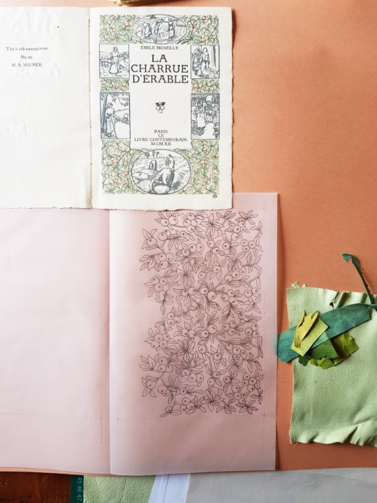
The design was based on a repeat pattern inspired by the apple branches on the title page of the text block.
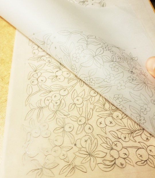
Rather than having apples on the branches over the whole book, I decided to divide the design in two and have apples on the branches one side and apple blossom on the other. I traced the leaf shapes through onto a piece of tracing paper, changing the placement of the apples for flowers for the other half of the binding.
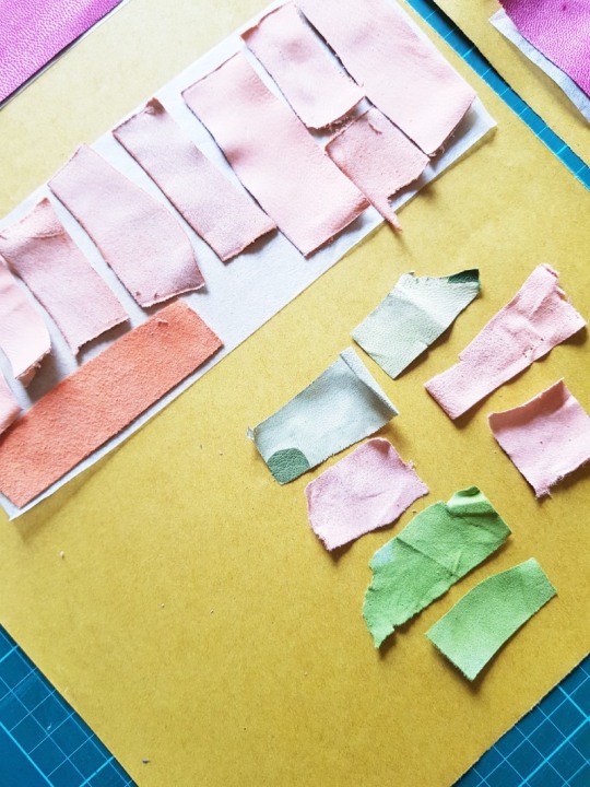
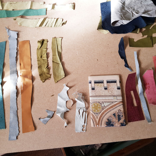
With the colour palette chosen I searched through my bag of leather off-cuts and parings for a variety of pieces to use for the onlays. I chose a selection of greens, oranges and peaches in both leather and suede in order to have a nice selection of different tones on the cover. The suede pieces were backed onto lens tissue to keep them stable.
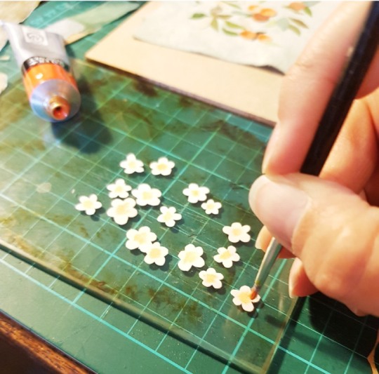
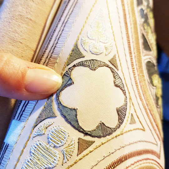
I chose to use thin vellum for the apple blossom, cutting out multiple flower shapes. I then stippled some acrylic paint onto the centres to add some colour.
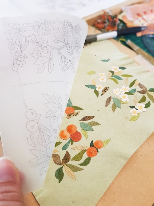
I first worked on a small piece of leather to make a sample board to test out the design. I make a sample board ahead of each of my fine bindings to test out colour combinations, this one is number 55 in my collection.
A piece of tracing paper with the design on was stuck on top of the pared leather at one side so it could be lifted up and down. The onlays were picked up with fine tweezers, PVA glue applied to the reverse and then they were stuck down in place using the tracing paper template as a guide for placement.
The sample board was then backpared on the reverse before being embroidered.
The completed sample board was an excellent match for the title page so I was very pleased.

Jumping ahead, but still on the subject of the sample board, the above picture shows the reverse of the board illustrating the endpapers and the doublures alongside the title page and the paste downs. Please read the next blog post for how the endpapers and doublures were created!
Not only do you have to be a bookbinder when you are a bookbinder, but also a graphic designer, craftsperson, leatherworker, printmaker, carpenter, jeweller, photographer and of course a miracle-maker!! My latest commission is finished and one more book has left the studio and is now happily with its new owner. Fortunately I didn’t have to trust the postal service for this one and was able to hand deliver it.
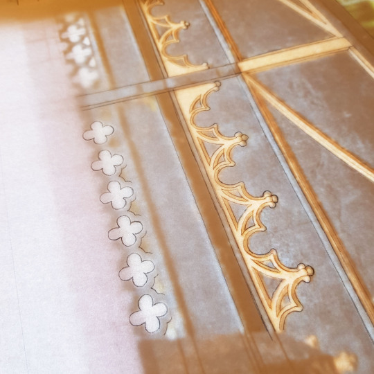
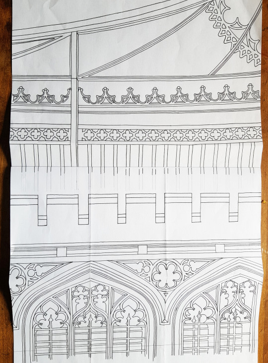
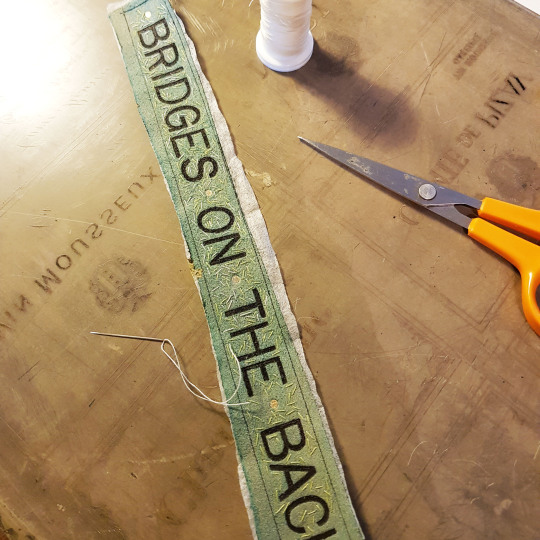
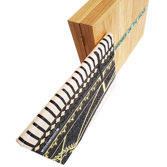
“Bridges on the Backs” was completed at the end of March. The book was printed in 1961 and formed part of a series of more than 34 books that were published by Brooke Crutchley at The University of Cambridge in between 1930 and 1958 as part of “A Printer’s Christmas Books” - the printing of these was the University Printer’s continued custom of giving a book to friends of the press at Christmas. The series was started by Walter Lewis and Stanley Morison in 1930. Brooke Crutchley was the University printer at Cambridge and oversaw the production of the Christmas Book series from its inception 1930 until its discontinuation in 1973. He gave a talk at St. Bride Printing Library in December 1975 at the opening of an exhibition of the Christmas books which ran from 10 December 1975 to 30 January 1976.
The book is a first edition, one of 500 copies printed in Monotype Times Wide on Spicer’s cartridge paper. Illustrated with 9 drawings, touched with colour, by David Gentleman, with another on the front endpaper and title-page. The original binding was a green canvas portfolio binding, lettered in gilt.
In the words of Brooke Crutchley, `”Bridges on the Backs is unique - it opens like a lady’s handbag; unique in other ways too and, I think, my favourite of the larger books, perhaps of them all. David Gentleman’s drawings are delightfully reminiscent of youthful Cambridge in summertime. Peter Eden in his text and captions carries his erudition with consummate grace, and the overlapping illustrations, a la Humphrey Repton, never fail to surprise.”
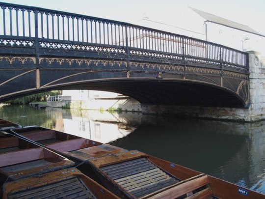
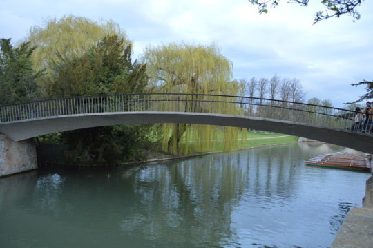
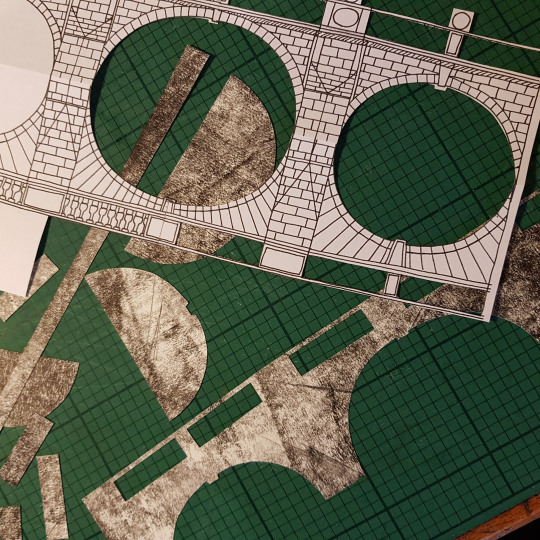
The nine illustrated drawings depict all the nine Bridges on The Backs, a picturesque area to the east of Queen’s Road in the city of Cambridge, England where several colleges of the University of Cambridge back onto the River Cam. The name “The Backs” refers to the backs of the colleges. Historically, much of the land was used by the colleges for grazing livestock or growing fruit. Cattle can still be found grazing behind King’s College. The river was also an important commercial thoroughfare to the mill at Silver Street.
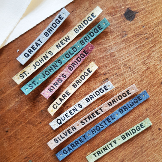
I wanted all of the bridges to appear in the binding and box in some way. I began by looking at images of each of the bridges online (unfortunately time didn’t permit me to visit Cambridge in person as I would have liked to do). The bridges are as follows:
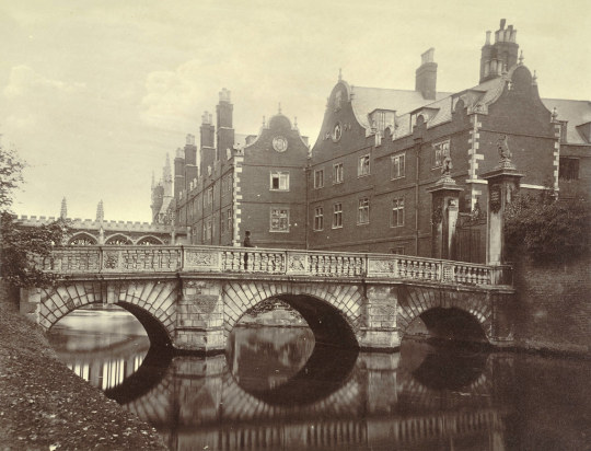
Great Bridge (now known as “Magdalene Bridge”)
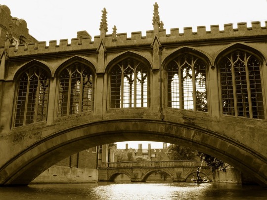
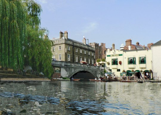
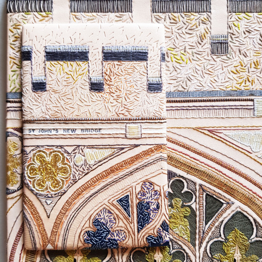
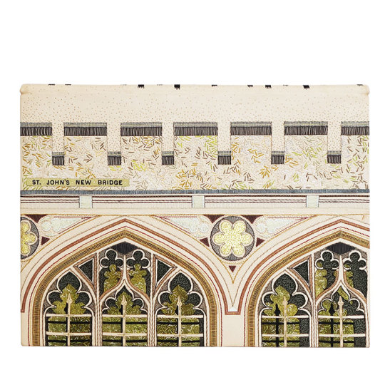
St Johns New Bridge (otherwise known as The Bridge of Sighs)
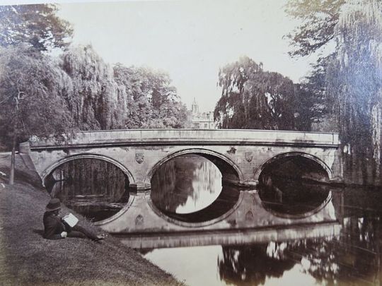
The beautiful bridge which crosses the River Cam at Trinity College dates from 1764 and was built by James Essex, a builder and architect who worked at many of the Cambridge colleges. It replaced a stone bridge built in 1651.
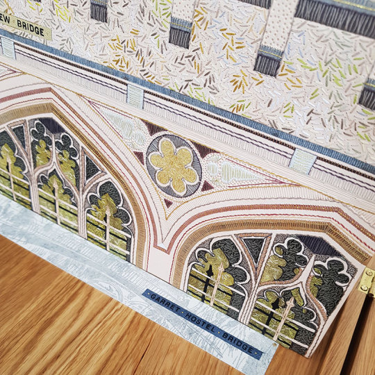
Garret Hostel Bridge
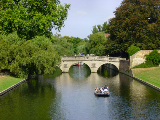

Queens Bridge (otherwise known at the “Mathematical Bridge)

Silver Street Bridge
The Silver Street bridge, designed by Sir Edwin Lutyens in 1932 built in 1958-9, it is an arch bridge that carries both vehicular and pedestrian traffic across the River Cam in Cambridge. It is a site of bridges dating back to the 14th century.
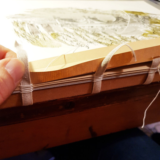
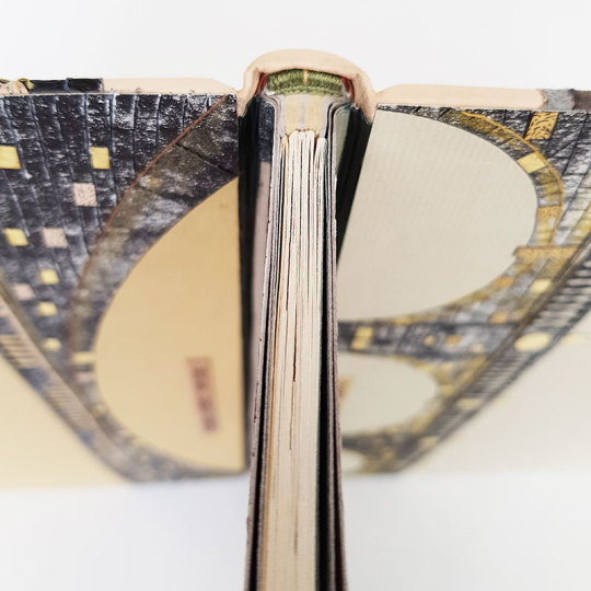
I had never bound a book in this format before, with the spine edge at the top of the text block - this led to some interesting design challenges. Because the book was an unusual structure, and the illustrated pages had additional flaps revealing how the bridges looked in previous incarnations behind each one, I wanted to make sure that the pages would open well to facilitate the opening of these flaps. I therefore chose to bind this as a stub binding.
I chose papers to match the colours and tones of the illustrated drawings: grey and mustard yellow. As there was more bulk at the front edge of the book due to the tipped in flaps I had to compensate for this at the spine. I folded up stubs for each of the sections but also had extras in between these to make up for the difference in thickness. Initially the stubs were sewn to their relevant sections using linen thread.
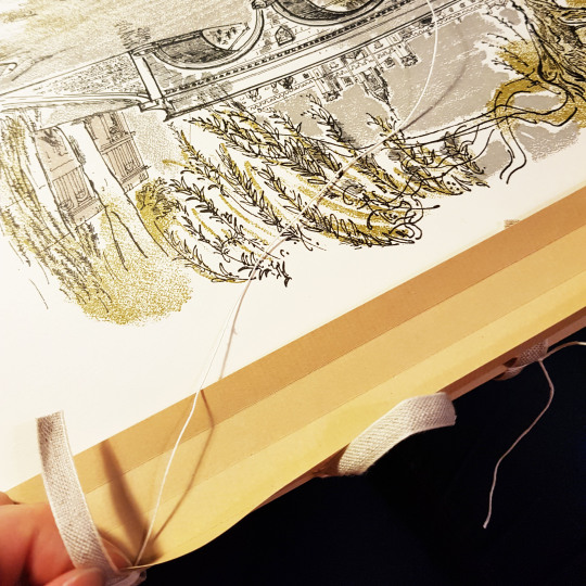
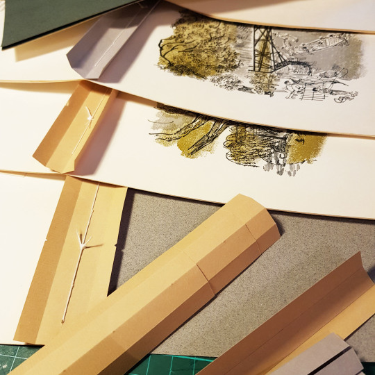
These stubs were then sewn together onto four tapes to create the text block.
Once the text block was sewn up I started to work on my ideas for the cover design, endpapers and doublures. For each of my bindings I make a small sample board to test out ideas ahead of making the actual binding.
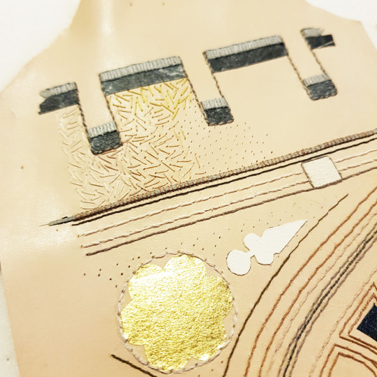
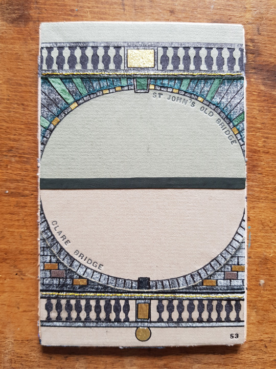
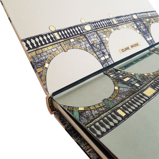
I looked at images of all the bridges, for the endpapers and doublures I wanted to “mirror” two bridges on each, so I paired up the bridges that best matched each other - for example Clare Bridge and St John’s Old Bridge each had three arches, and Silver Street Bridge and Kings College Bridge had one each so they were natural choices to go with one another.
I drew line drawings of these bridges and then cut the silhouette of each out of paper that I had textured using a roller with black ink on top of a textured surface.
Further detail was added to these papers through the application of suede onlays, black paper cut-outs (for the pillars) and gold leaf that had been adhered to Japanese paper. In the below picture you see part of the doublure for the sample board being made.
Lines were also embroidered through the paper. These holes were pre-pricked with a needle pricker through the front and then carefully embroidered using a running stitch. Care must always be taken when embroidering paper as it is prone to tearing. The thread was then whipped around with an additional thread on the front face of the doublure.
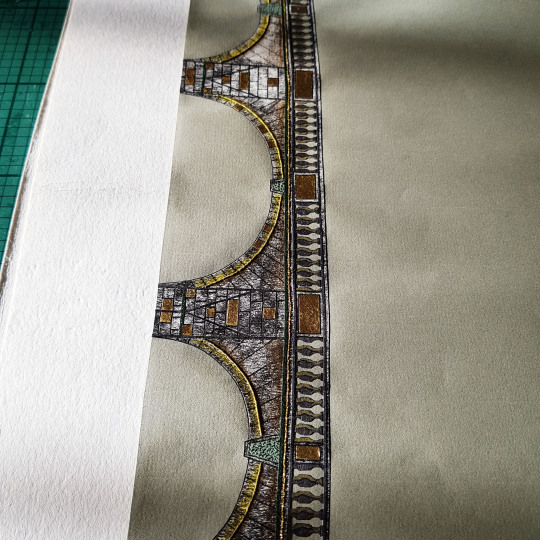
Once I had worked out which bridges to put on the endpapers and doublures I was able to choose which to have on the front and back covers of the binding. This was a binding of two halves, more so than any other I have ever done. The different format of this text block meant that the front and the back cover played different parts in the design, therefore I chose the two most contrasting bridges for on the front and back covers: St John’s New Bridge (The Bridge of Sighs) and The Great Bridge.
I thought that the Great Brdge would work well with the gold on black against the more ornate look The Bridge of Sighs. I started by using my light box to help draw the outline of the bridges.
I then pieced these together into a full cover design. At the time of drawing this design I wasn’t sure if I might want to join up the front and back covers across the spine in some way. With this in mind I scaled up the front and back images so that the lines of each, if carried across the spine, would meet with each other.
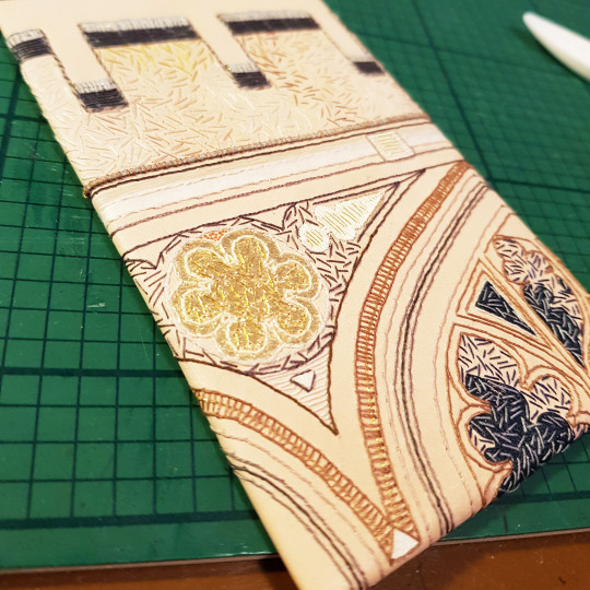
For the sample board I chose to trial the Bridge of Sighs part of the design. This particular bridge was built in 1831 and it named after the Bridge of Sighs in Venice. The design was built up using a variety of leather onlays, machine embroidery, hand embroidery and also onlays made by sticking gold leaf to Japanese paper.
This sample board is number 52 in my series.
Back to the text block, the endpapers were made up by laminating the illustrated bridge paper sheet to a plain bi-folded sheet, capturing a long, thinly pared, piece of leather (0.4mm) between the sheets at the edge - this would later get stuck down and become the leather joint.
A waste sheet and compensation guard were also added this endpaper unit to protect the endpapers during the rest of the forwarding and covering process. This endpaper could then be sewn to the text block.
The book block was then rounded with a backing hammer. I drew the thickness of the boards onto the outer waste sheet, plus a little extra (as seen below indicated by the thin black pen line). I then placed the book block into my backing boards to this line in order to make sure the shoulders were made at the correct place to allow the boards to sit perfectly within them.
The top and bottom text block edges were then sanded flat, and the foredge sanded into a round by wrapping some sandpaper around a piece of dowel of the correct diameter. Double-core end bands were sewn, the boards attached and bevelled at the edges. I was then ready to proceed with the leather work!
Given my choice of using two contrasting bridges on the cover design, this meant that I needed to scarf-joint two contrasting leathers together: black goat skin for The Great Bridge and fair calf for The Bridge of Sighs.
Onlays, and plenty of them! I don’t like to throw anything away so even the edge parings that come off the back of the leather after running it through my Brockman paring machine get kept. I back them into lens tissue and use them as onlays - it gives a whole new colour palette in addition to conventional onlays.
This book mainly used greens and greys, I adapted the colours I had used on the sample board (one reason i do the sample boards - to test colours out in advance!). I cut all of the shapes out using a scalpel and fine scissors.
The onlays were glued down in place using PVA through a tracing paper template, using a ruler for extra accuracy.
I find my fine-pointed tweezers one of the most useful pieces of kit I own, perfect for picking up small pieces and getting then stuck down exactly where you need them to go!
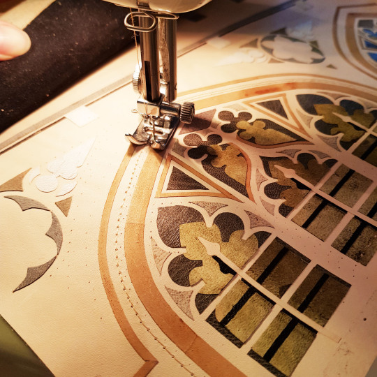
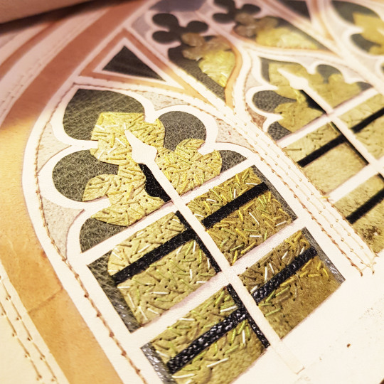
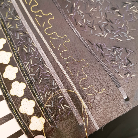
After the onlays and backparing came the embroidery, the bit I enjoy the most! For this binding I machine-stitched the multiple linear border lines to speed up the process and then whipped over the top of them with cotton threads.
Tiny flecks of different green threads were hand-sewn to break up the colour of the green onlays beneath.
When embroidering a large piece of leather, it is not possible to use an embroidery hoop as the leather is too thick so I coil up the leather and hold it in place with bulldog clips at the top and bottom. This makes it much easier to handle.
As well as using cotton threads I also used slightly thicker skeins for the larger patches of detail.
Plus you can’t beat a bit of metallic thread! This was embroidered over the onlays that were made from gold leaf stuck to Japanese paper.
I always love to capture what the back of the leather looks like post-embroidery, after all this won’t be seen ever again!
The same process applied to the Great Bridge side of the cover. The onlays were stuck down, back-pared and embroidered. I used a tracing paper template to prick where I needed to sew the metallic thread lines that would lie alongside the gold onlays - I was going to wait to glue these down once the book was covered (I will cover the reason for this later).
The actual Great Bridge has gold elements on a painted black behind so I naturally chose to depict these gold elements using gold leaf. The gold leaf was stuck to Japanese paper squares using PVA glue. I then cut out the required onlays and put them to one side until the book had been covered.
Because it is necessary to dampen the leather when covering the book, I decided to stick on the gold onlays after the book had been covered, to avoid damaging the gold.
So, with all of the embroidery complete it was time for covering!
The text block had been bevelled and back-cornered in preparation. The text block was capped up with paper and cling film to avoid moisture getting to the text block during the covering process.
The leather was dampened with a water atomiser ahead of pasting the back out with home made paste. The dampening was done to prevent any marks on the front of the leather due to the paste being drawn through unevenly.
The book was left to dry between blotters overnight, changing the blotters regularly to draw out the moisture. The following day I was able to open the book up and lay down the leather joints. Once these were down the back of the boards was infilled with watercolour paper, then a layer of Zerkall paper. This was then sanded flush. The surface was then ready to have the decorated paper doublures stuck down onto it.
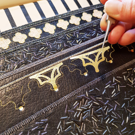
I then added some blind tooling detail in between the sewn lines using a hand-made finishing tools.
Plus I also added more detail using carbon tooling within the window spaces of The Bridge of Sighs.
Once the binding was dry it was also time to add the gold detail onto the Great Bridge section of the book. I first gold-tooled some circles directly onto the leather. The decorative gold onlays were then stuck down within the metallic thread lines I had sewn previously before the book was covered.
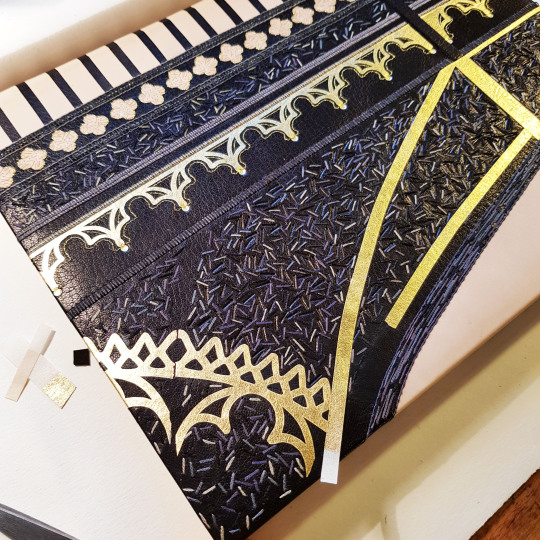
Here shows the sample board on top of the covered book - the differences in the colour of the leather onlays and sewing threads are apparent.
The final part of the tooling process was to tool each of the bridges names on a coloured leather to correspond with the appropriate part of the book or box.
A title was also carbon tooled to go onto the lid of the oak box the book was to be housed in. This was then embroidered with small flecks of different green threads, like on the book cover.
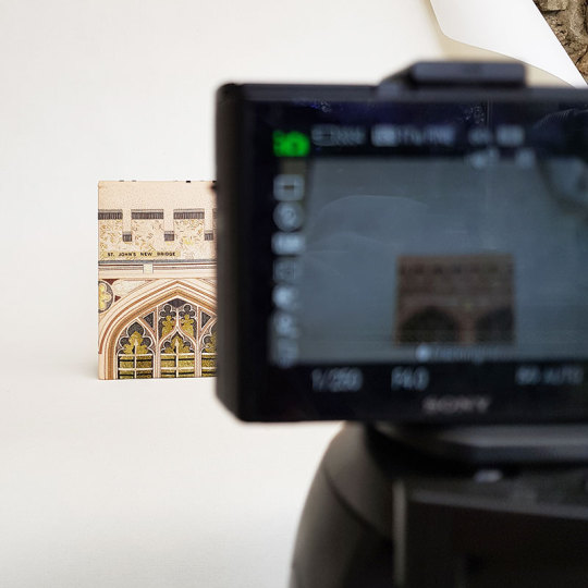
It was then time for photography! I take all of my own photos now in the conservatory of our house as the light is by far the best there than anywhere else in the house.
With a “standard” binding I would take a photo of the book with both covers open, however it doesn’t really work for this book as the orientation is wrong!
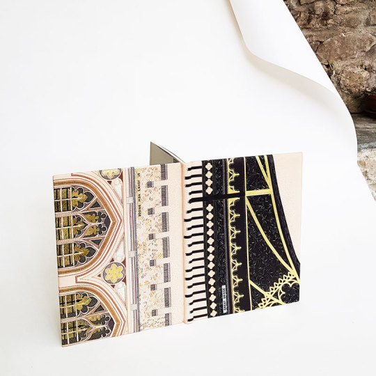
FRONT OF BOOK: St John’s New Bridge
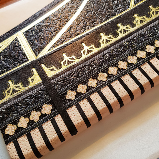
BACK OF BOOK ALONGSIDE OAK BOX: The railings of the Great Bridge were carried over onto the spine of the book, with the ends feathered out using little carbon-tooled lines. the box was made from oak with the title strip stuck to the front.
THE HEADBANDS:
THE BOX: The box was made so that the book could sit open for display within grooves in the box lid. There are six of the nine bridges illustrated on the binding. Images of the three bridges I couldn’t fit in sit in the box creating the grooves for the book to stand upright in!
DETAIL OF THE FRONT ENDPAPERS AND DOUBURES: With rather unexpected luck, this commission was being gifted as a wedding present. The couple met at Cambridge University and so happened to be at Clare College and St John’s College respectively - the two bridges I had mirrored inside the front cover!!
To see these photos and more please visit my website here.
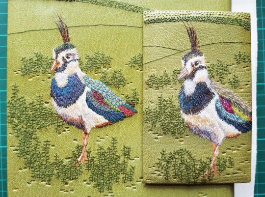
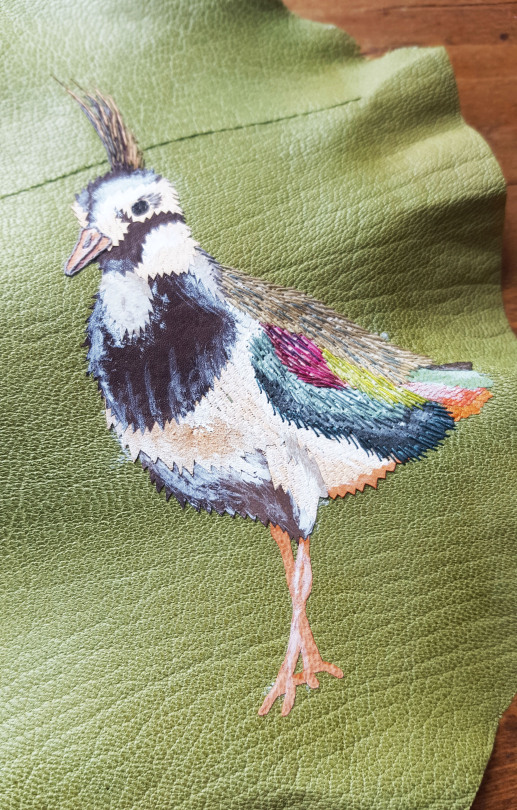
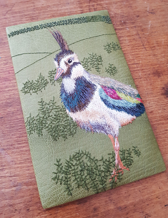
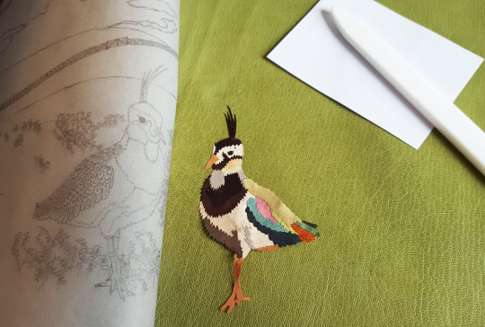
Spot the difference in the above! As explained in the previous post, the reason for me doing my sample boards is they are a test run ahead of working on the actual binding. In this case, I finessed the lapwing on the book by using a wider colour palette overall and also added feather outlines to the back of the bird which I felt made a huge improvement.
So, onto the covering stage of the binding process. I spritzed the front of the leather using a water spray in order to prevent stains appearing as a result of the pasting out of the reverse after covering.
The back of the leather was pasted out three times and left for the paste to soak in each time.

Thankfully the leather went on to the book well and I was able to turn in the edges and form the headcaps before leaving the book to dry for 24 hours. I regularly changed the blotting papers in order to draw out the moisture over this time.

Once completely dry I was able to open up the book boards and work on sticking the leather joints down. The leather joints had been glued into the endpaper before the book was forwarded so I took off the waste sheets that had been protecting the text block to free them.
I laid the book down on my bench with both boards open. I then cut bevels at the corners of the turns-ins and the leather joints so they would lie flush when the leather joints were glued down. I applied PVA glue to the leather joint and rubbed it down using my fingers before closing the board and letting it dry. Once dry the same was done to the other board, then the boards were infilled, sanded and the printed paper doublures were glued down.
Once the book was complete it was time to work on the wooden container I had planned to house it in. I wanted the title to appear on the lid of the box so carefully cut the letters out of the same colour leather.
Once they were cut out I backed the voids with gold leaf that I had stuck to Japanese paper (the same as I had done for the ‘highlight’ leaves on the paper doublures).
It was important to cut the letters out especially carefully as I wanted to use them to make a label for an outer conservation box I had ordered for the wooden box to live in.
The box itself was machined from tulipwood with a routed channel in the lid and base in which a decorated panel was fixed. It was lined with felt and spacers added on all four sides.
Finally, I will end with some pictures of the end result! More pictures of this binding and box can also be found on my website.
FRONT OF BOOK AND BOX:

DOUBLURES AND ENDPAPERS:

OPEN BOX, LID AND BASE:
BOX TITLE DETAIL:
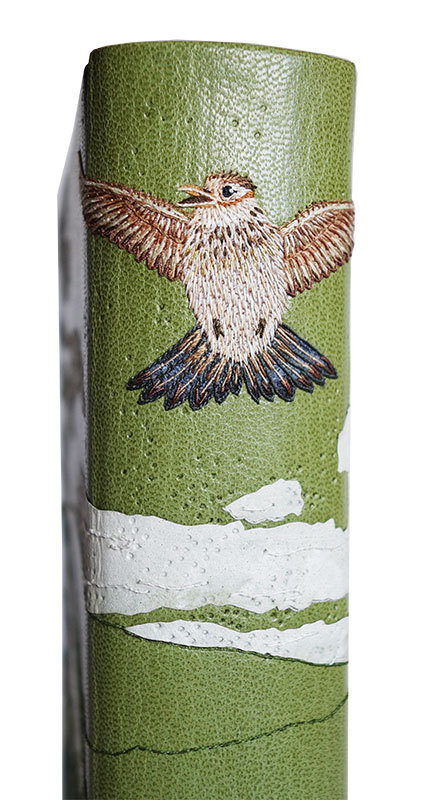
SKYLARK DETAIL:
ENDBAND DETAIL:
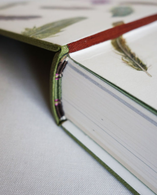
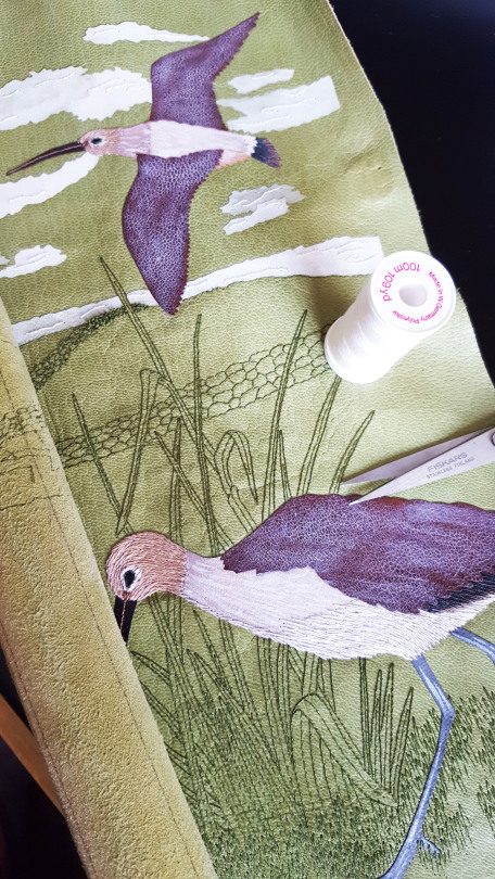
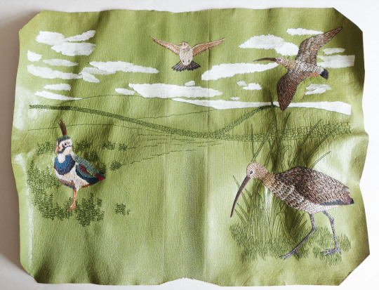
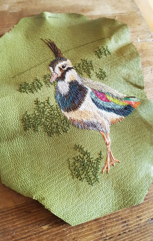
Part three of this blog post details the embroidery I did on the British Birds binding, the bit I always enjoy the most! As described in the pervious installment, I chose to keep the background detail behind the birds to simple lines embroidered in green to match the covering leather. This was to stay in keeping with the illustrations within the book.
The drystone wall ran across the design, changing in size for perspective. The larger part of the wall was detailed with outlines of individual stones and as the wall went into the distance this changed and each stone was represented by a small French knot.
Behind the lapwing, as shown in the previous post through the work I did on the sample board, I added sprigs of heather.
And behind the curlew I depicted the bird walking amongst some long grasses.
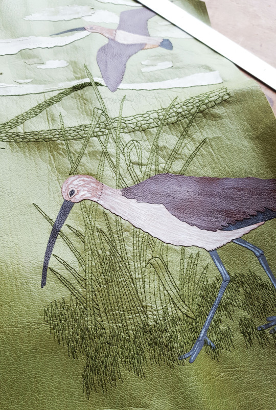
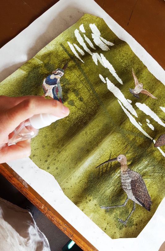
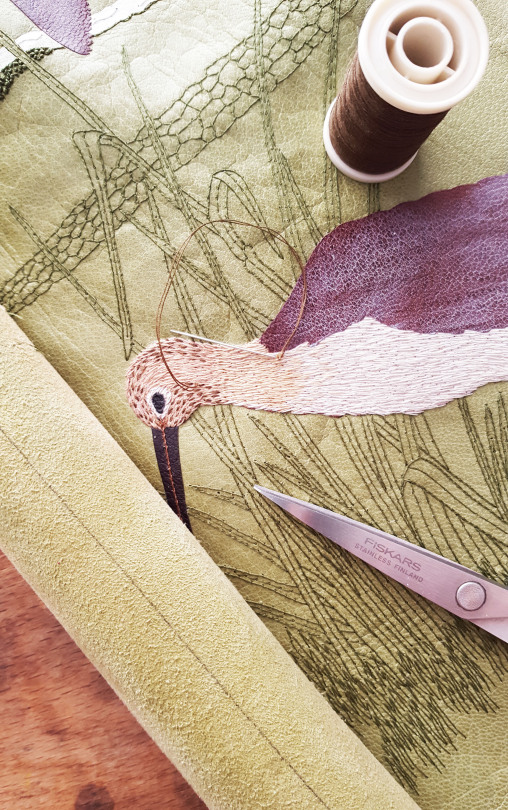
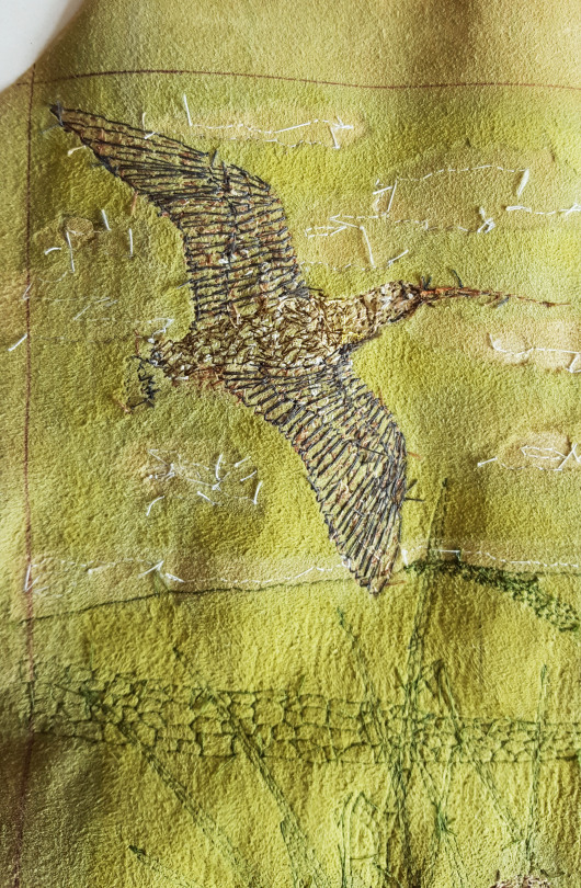
Once the background detail was complete it was time to work on the birds. Firstly, the large standing curlew got the embroidery treatment. I started by building up the colour with some small stem stitches with threads in colours to match the onlay behind.
Once these patches were blocked out with small stitches, I added some speckled detail on the head of the bird using a double length of machine cotton.
Once all of the colour block was done on the main body of the bird, I added feather outlines using a darker thread.
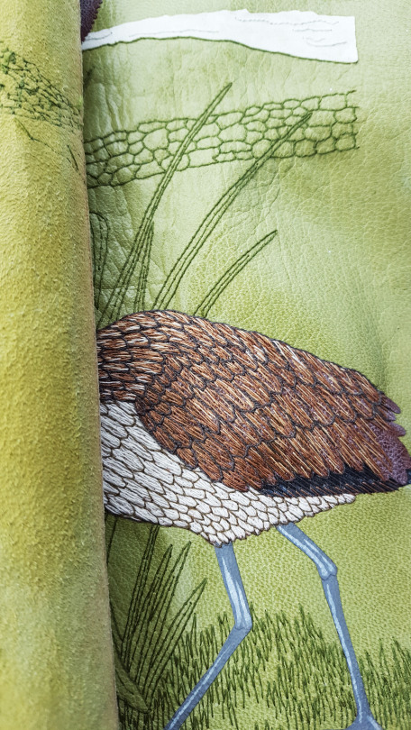
Within each of these outlined feathers I added further detail in the centre of each using a lazy daisy stitch.
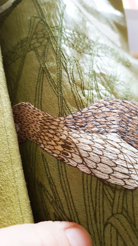
More detail was added to the beak and legs, plus a small white French knot was sewn into the black of the bird’s eye to bring it to life!

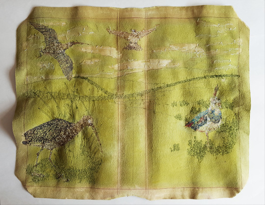
The back of the leather showed the number of stitches that went into creating his feathery look.
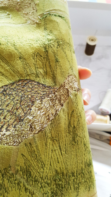
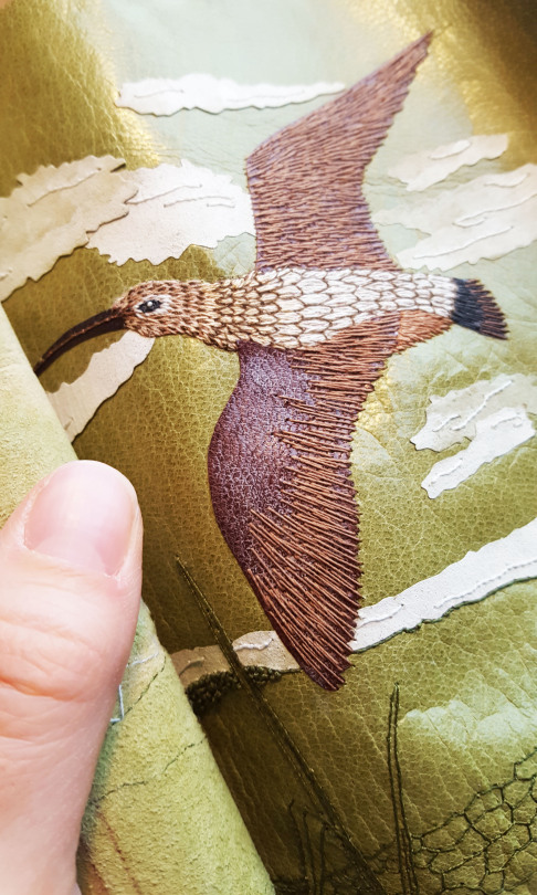
The same method was applied to the flying curlew, using smaller stitches on the base and building up detail on top.
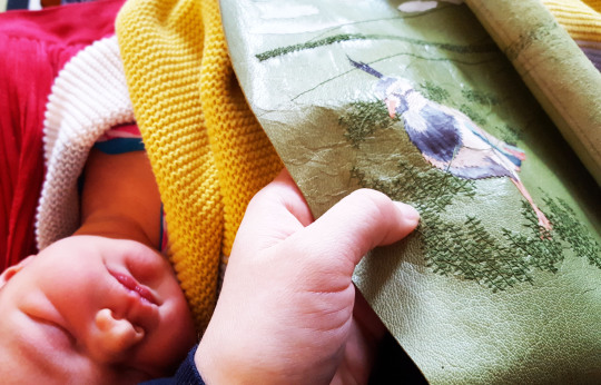
I had company in the form of a newborn baby throughout this process - thankfully at her early age she slept a lot and embroidering the leather was a pleasant task to do with a dozy baby on my lap!
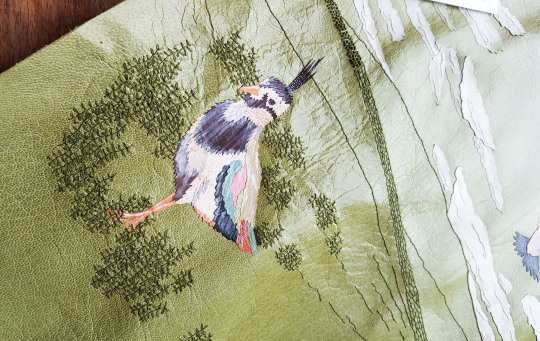
As with the curlews, the lapwing had his feathers built up in the same way. Having worked on a lapwing for the sample board, and therefore having had a “test-run”, I thought of improvements to the way I should embroider the second one. I was able to add finer detail and adapt the way I used the threads a bit on the actual book leather. For example, I used a larger variety of colours and added outlines for some of the feathers on the lapwing’s back.
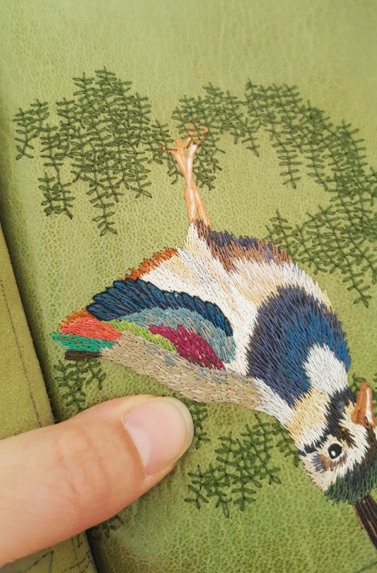
Metallic threads were also woven into each of the birds before completion to add a little sparkle to their feathers!
A little white thread was also added to the clouds to add a bit of textural detail to them too. And with this done the embroidery stage was complete!
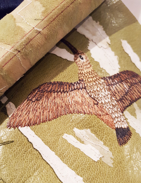
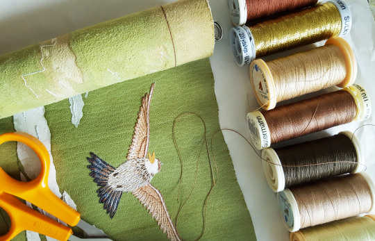
COMPLETED FRONT OF LEATHER:
COMPLETED BACK OF LEATHER:
The next, and final, installment sees the leather going onto the book and the end result…

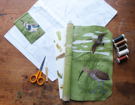
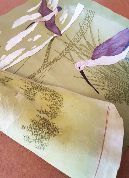
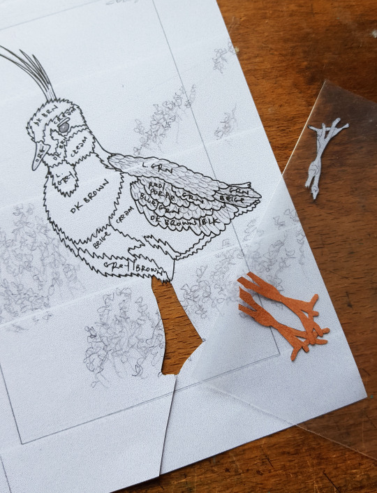
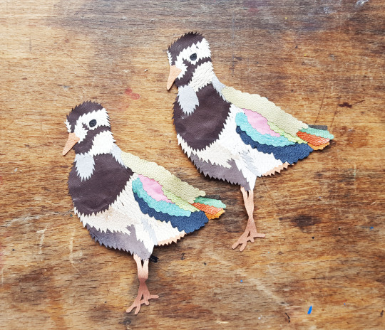
The curlews, skylark and lapwing were each broken down into block colours in order to plan out their onlays. I chose a lovely shade of green to have as the covering leather to compliment the birds and to achieve a background colour I was happy with.
For the sample board I chose to illustrate just the lapwing, so worked on two lapwing onlays simultaneously (one of the sample board and one for the book). The onlays were each cut out with a scalpel, giving each one a slight border so that it could be stuck to the next in a patchwork off the book.
The small onlays were stuck together off of the book using a tracing paper template as a guide.
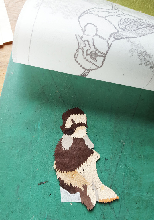
Finally producing two lapwings!
One of the birds was stuck down onto the sample board leather using PVA glue. The colours were then muted down using a very thin wash of white acrylic paint. Once this had been done I was able to back-pare and then embroider the leather.
I first worked on the background detail, in a green thread to match the colour of the leather. In the book all the full-colour illustrations of the birds were shown against a muted grey, line-drawn background so I wanted to compliment this on the cover design.
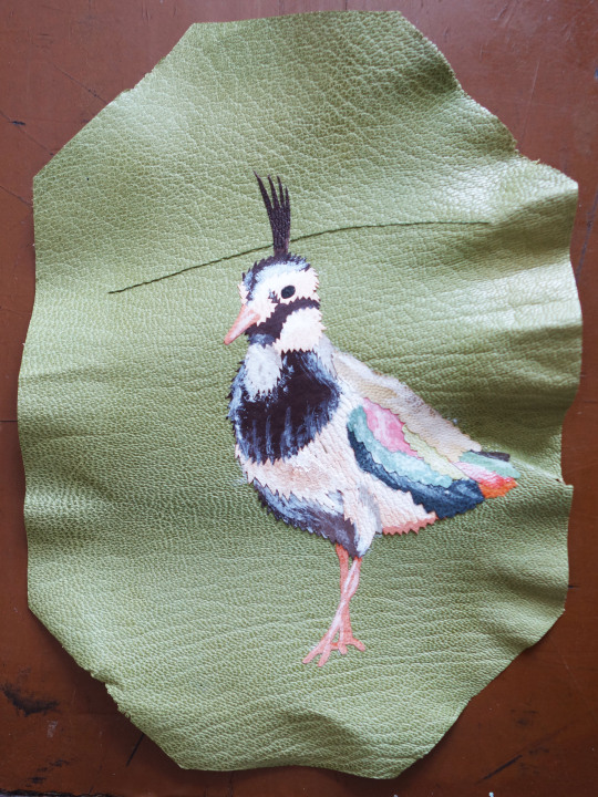
Stitches were gradually built up over the whole surface of the sample board leather including coloured stitches all over the bird to give it a more feathery look and feel.
‘Heather’ detail was also added around the lapwing.
A drystone wall was included in the design drawing (including a four-bar gate) using French knots to give the impressions of the stones. Once the embroidery was complete the leather was stuck onto the sample board with paste and the edges turned in.
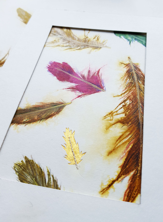
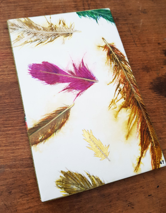
A section of the printed feather paper was selected to use on the sample board. In addition to the printed feathers, a single feather made from gold leaf was also added as a highlight. This was done by cutting out the feather shape from the endpaper and then backing the void with some gold leaf that had been adhered to Japanese paper. The shaft of the feather was embroidered with thread.
Once stuck down this board became number 47 in my sample board series!
And so once I was happy with the sample board I was able to move onto working on the book itself. In the way I had laid down the lapwing onto the sample board using my tracing paper guide, I did the same for on the covering leather, rubbing it down with a Teflon folder to ensure even adhesion.
The two curlews and the skylark were also glued down in the correct positions.
I painted some strips of suede with white acrylic paint in a mottled pattern to use for clouds. These were also cut out and laid down in place.

The whole of the leather was then back-pared on the reverse in preparation for the next stage, the embroidery. This is detailed in the next blog post, part three.