#say it with me now

I was involved with a project team that was recognized by the execs at Wizards of the Coast last year, and this customized Chandra card was created as our reward! There are very few of these in existence (I think, like, 5). THE (GREMLIN-COUNTING) POWER OF TEAMWORK.


This goes right into my Nalaar family Commander deck! …Which in turn goes right into a security vault, probably. Thank you, Wizards!
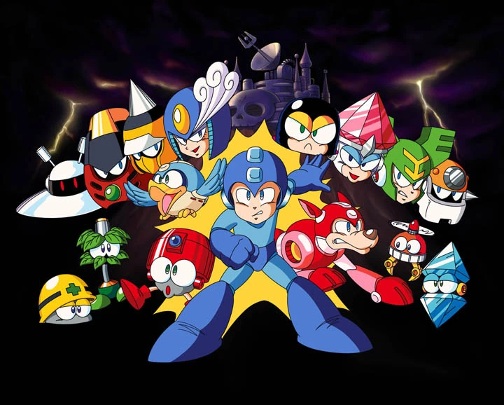
One of the things that I love the most about the Classic Mega Man series is its artstyle. It’s very anime-esque with a slight twinge of toon, and there’s a surprising amount of detail that goes into each art piece drawn by Mega Man illustrator Keiji Inafune (Such as how robot masters and characters like Mega Man and Roll have different pupil types and the infamous ‘Capcom hand’).
Naturally, ever since 2015, I’ve been trying my hand in seeing how accurately I can replicate the Mega Man artstyle, and considering I mentioned planning to make a full Famicom styled box art piece for Mega Man Ultimate, I decided it was about time to dive back in to researching Mega Man’s artstyle to make said art piece as 1:1 to official artwork as I can!
And where better to start with the centerpiece, Mega Man himself? Back in December of 2020, I drew a Classic styled Mega Man in honor of his 33rd anniversary, and while it was decent enough in its own right given my skillset at the time, this time I wanted to go all out in drawing a full-body Mega Man while keeping a lot of Inafune’s art choices in check…

… which resulted in the best Mega Man I’ve ever drawn!
Looking at a character like Mega Man, you’d think he wouldn’t be too difficult to draw, and design wise, he’s not. The simplicity of his armor and few colors actually make him— in theory— pretty easy to draw.
But when you’re attempting to match the actiony grandeur that is the key artwork for more recent Mega Man games on top of keeping an eye on proportions, shading styles, and shaping everything just right… then it becomes a tad hard.
So, when I sat down to draw Mega Man, I made the decision to start with arguably the most important part… the head.

To me, if you’re going after a stylistically accurate Mega Man, his head is detrimental in getting just right. This is easier said than done, because his helmet isn’t just a circle; it’s more ovular and widens toward the top, leaving the base of the helmet to be a bit slimmer.
Above, you can see two preliminary sketches I whipped up in preparation for the digital outline phase. While they look fairly similar, each one has a focus: the leftmost sketch was primarily focused on getting the head to look nice (Which took about forty-five minutes by itself!), as well as drawing a good buster.
The righthand sketch was more focused on Mega Man’s pose, explaining the placeholder head and buster. I was originally going to jump right into taking the left sketch and digitalizing it, but when I felt like the hand and legs could be drawn better, I made an additional sketch to merge with the first.

Woah! Here’s something new: just like how I’ve begun showing the spriting process for some of my sprite works, here’s the process I went about when digitalizing my Mega Man sketch after I had finished reshaping everything in my drawing software: from outline to flat color to the end result!
Interestingly, when I first got done drawing Mega Man, I thought it looked great… but I wasn’t a fan of how he looked proportionally, as I thought his arms and legs looked a little short. When I had been searching for reference images to base my sketches on, I noticed that Mega Man’s legs especially are a bit lengthy, so I redrew 45% of my then-final result with these changes in mind, which resulted in the version shown in this post.
I’m really impressed with myself on how great I got this piece of Mega Man to look, since shading and posing aren’t my forte— it feels nice to have one of the tougher aspects of MMU’s eventual box art drawn, and I hope you’ve enjoyed both the art and reading the process behind it!