No, I don’t mean just eat better foods. After all, disinformation aside, at this point I feel reasonably confident that “eat food. not too much. mostly plants” works just fine for my body type, metabolism, and tax bracket. Granted, I don’t always take that advice. But I mean eat in better ways. Don’t choke down breakfast; chew, savor, appreciate, think of the all the days I woke up sad and punished my system with a Bustelo-only diet.
And on the flip side of this, no more gorging - whether stoned, in a hurry, or having just come off cardio. No matter what basal command urges an ever-ramped chew/swallow/repeat, slow down. Create a reasonable portion. Dip over the boundary of that portion only when appropriate, not just when available. Quit eating with a scarcity mentality.
Binge good TV, use bad TV as emotional caulking
I was piercingly depressed this week and I watched the 2nd half of THE LEFTOVERS first season, which for all its shaky starts turns out to be the truly bleakest and most perfectly depressing show on the current roster. This is good TV. HOMELAND, for all its stupidity, can be binged in two days for an experience akin to classic 24 with better casting and half the episodes.
Bad TV is used to muffle the buzz of boredom when nothing more healthy will do. It is a way of sitting in one place, alone, dislocated. When you must exist in empty space. But it should seal narrow cracks, not shingle your roof.
Stop softpedaling language
Professional interactions in publishing (and I’m sure it’s not alone) so often subsists on a mat of insincerity and complicity in that insincerity. We say that sounds great but we mean that sounds like words. We say we’ll do it but we mean we’ll do it when you prompt us the 2nd time. We say it’ll be good when we mean we have no fucking clue how it’ll be. We say we’re excited when we mean we don’t want to say we feel nothing. We say she’s nice when we mean she’s boring. We say that’s unfortunate when what we mean is that we’re happy they’re failing. We say all good when we mean some good. We say we really enjoyed it when we mean that we burst into fractured sobs upon turning the final page because somewhere in this mound of edited text was a sharp edge that rent a hole in our heart’s exoskeleton and we don’t like that such a thing can happen because it hurts and pain is bad.
Stop being so negative to seem cool
Negativity and irony in media and publishing is easy and comforting. By saying something is terrible or the worst thing ever or the worst or pretentious or flawed or just awful or stupid or that it’s your most hated example of another thing you don’t like, you’re very quickly and efficiently saying I’m Not Like That. Compulsive othering is a human feature but it’s not a good thing. Especially when it’s used to silence benign positivity; “I was happy because of this thing, it made me feel good” “you must be naive and stupid and if you really think that you’re not one of the cool kids” it’s fucking sickening and it drives so many ad-revenue engines and while I recognize nobody can always exist in a perfectly warm bath of good vibes about any and all things unless that person is literally a god, it is tiresome and boring to read and listen to people who can never be expressly and messily vulnerable about the many things that make them feel comforted and beautiful and perfect in the moment and strip away every ounce of self-consciousness like a cleansing fire, because they are afraid of sounding happy. Criticism and lazy outrage are not easy unless that’s all you do. A heart that beats with emotional flab is not one I wish to sync with.
Defend Kid Rock
Kid Rock writes great songs, he’s very talented, he gives a lot to charity, he likes a lot of the same music as me, and I’ve been listening to him for years. He has a new album out. I’m gonna probably like it just fine and continue to argue that anyone who doesn’t listen to him because a mean kid in fifth grade used to yell the lyrics to Bawitaba during recess (or equivalent) is being needlessly self-limiting.
Be skeptical and call out when appropriate the people who use texts to validate their opinions poorly
Smart people have nuanced ideas of how “the world works” and “how humans think” and yet I see some cling to the idea that one book like sof (or similar) has unlocked the secret molecule of Truth about all humans and therefore they can make sweeping statements on how neuroscience works is gonna be getting a frowny face from yours truly. I’m drawn to these people, but I prefer smart people who remember they’re tiny and stupid and insignificant sometimes.
Visit every NYC bookstore new and used
Every Barnes and Noble, every tiny stack of used books on the streetcorner table or in the cramped floor-through apartment, every place that sells books in every corner of this ridiculous city. Staten Island, Gravesend, Bronx, I’m coming, I swear.
Panic better
Every time I panic now I set my phone timer for 45 minutes, to trick my brain (panic part) using another more powerful part of my brain (procrastinating part). I can panic in 45 minutes. It’s working.
Read white guy novels with healthy and skeptical abandon
I like Knausgaard, Richard Ford, John Updike, and DFW. Don’t need to defend that because nobody is threatening this. Nothing wrong with enjoying books by or about members of your tribe - just as long as you don’t get hung up on it. (This includes books only set in the last decade.) There’s a lot of good- and bad-natured criticism of white dudes who write books, and none of it should stop you from reading their books if you want to. Just read non-white non-guy books with abandon too. This is part of the “like what you like” thing.
Re-embrace uncertainty
I have a Career now, but I still don’t know how my 401k works, the difference between “then/than” every time, or when my parents will die. I have a new nephew but I don’t know what his life is gonna be like (though it’ll be filled with love and good food because my sister’s a bomb-ass cook and nurturer). But in order to not get riveted by the Now and spiral into a pit of depression, I must remember that I cannot understand the ramifications of every single action I do or do not take. Sometimes shit is just going to happen and no amount of control-freakiness can change that, so I might as well quit worrying so much.
Trust the right doctors
Before I switched jobs I got a physical where the doctor found a suspicious mole. I then visited a dermatologist (my first - I don’t have the world’s best skin but it’s always been a'ight) and got a biopsy that said nothing cancerous but the doctor still urged that I should get the whole thing removed.
Then I got a new job and switched insurance and suddenly I had to start the process again - find a new dermatologist and find a surgeon that wouldn’t ask for two week’s pay up front. Months went by. And every month, that first dermatologist emailed and called to check if I’d gotten the mole removed. Without any possibility of financial compensation, she urged me over and over to address the mole, get it cut off, do it quickly, wherever, whatever it took. I resented this. Not everyone is a rich doctor, right? Not everyone can afford to get surgery for a benign cluster of cells at any point in the pay month.
So I finally slipped in an appointment with a new doctor before Christmas, who biopsied the rest of the mole to be absolutely sure what the follow-up treatment would be. Turns out I have a stage zero melanoma. Which is exactly as unconcerning as skin cancer can possibly be - you basically just get it snipped off and that’s it - but I wouldn’t have known if it wasn’t for the first doctor, who gave so much of a shit that she hectored me like a good doctor should. When I emailed to thank her, she just said “I just wish we had national health care. I’m glad you did this.”
Find good doctors, stick by them, keep yourself alive.
Say I was wrong
Admitting you fucked up when you fucked up will make your life a lot easier. Just don’t admit it all the time and for no good reason.
Don’t smoke things you find on the street, it never ends well
Street weed gave me a headache and street Newports gave me the hangover equivalent of Ragnarok so, yeah.
Read more poetry
The more good and blood-drawing poetry I read the cleaner and stronger I get. It’s expensive to buy. It’s worth it.
And finally…
Read what scares you and makes you angry
Patricia Lockwood scares me. She’s so good and writes such terrifying things. Kiese Laymon scares me. He describes anger and paralysis and fear and systemic injustice so perfectly and so VITALLY. People who are either so talented or are so good at describing terrifying realities or fictions that they make you question the entire cocoon of ways you make yourself Feel Okay are the people you should read. People who disagree with you and who say things that offend you and frustrate you are always hard to read and you can burn yourself out but if you approach them out of a sincere desire to understand who they are, why they do and say what they do and say, and what big tectonic forces and filters have shaped their perceptions to make them so different from yours, are the people who will save a significant part of the intelligent person’s life, every time.
Happy thirty-fourth anniversary to Mega Man, who will personally see Dr. Wily’s world-ruling schemes through to their ends as he fights for everlasting peace! … or, uh, was it fighting to save the world?
I REALLY wanted to make something far more extravagant for Mega Man’s anniversary this year, but given what I had made last year paired with how busy the first half of December’s been, I decided to opt for something a little simpler.
It isn’t quite a wallpaper (It can be if you crop it to your liking), though here is a sprite piece I whipped up of the crew from the original Mega Man on the NES (Guest starring Mega Man? from Mega Man Powered Up) in one big epic battle!
Of course, we all know who will prevail, don’t we? Here’s to another year of fighting for… well, take your pick!
Hello everyone! It’s December 12th, and today just so happens to be a very special day… it’s my birthday!
One year ago today, I made what may just be my absolute shortest post announcing to the few followers that I had at the time that it was my birthday. It wasn’t anything special, and the only reason I had uploaded it at all was because I was proud to share that the twelfth of December is a date I look forward to all year.
This year, however, I wanted to try a little something different. Instead of settling for a three word post (I still can’t get over how short that post is.), a few months ago I had an idea of what I could talk about when 12/12 rolled around.
I’ve mentioned this briefly once before in the answer to an ask that had been sent in, but there’s a very good reason that my blog name is ‘StarDestroyer81'— it’s a combination of the subtitle and release year to one of my all-time favorite arcade games, Bosconian!
Unfortunately, Bosconian isn’t all that well-known of a title, especially when pitted against some of Namco’s other smash hits, such as Pac-Man and Dig Dug. So, for my birthday and just in time for Bosconian’s 40th anniversary..
Let’s talk about Bosconian: Star Destroyer!
Bosconian was released by Namco in… well, 1981! The game began to show up in arcades in Japan on November 7th of that year, whereas its was released worldwide (By Midway Games) the next month.
I’ve spent such a long time digging around to try and find an exact date as to when in December the worldwide release happened (How cool would it be if it was on my birthday?), though I did find the date of December 5th, though don’t take this as the definite date.
Whenever I talk to my friends about Bosconian, a majority of them have never heard of it (Appropriately so), and so I describe it to them 'The Star Way'— it’s like Galaga, but a million times cooler. Bosconian is a multi-directional space shooter type of arcade game, and unlike Galaga, not only can you move wherever you’d like instead of being limited to the x-axis, but you can move and shoot in eight different directions!
Bosconian puts you as the player in the esteemed Starfighter, a spacecraft which has but one goal: to seek and destroy the base stars (Also known as 'Orbitals’), which are large, green enemy bases. It’s no easy task, however, as the entire time you’re being chased by oncoming fleets of enemy ships on top of steering clear of asteroids and Cosmo Mines, which can be destroyed for additional points.
Each level of Bosconian gives you a set number of base stars to vanquish, whose destinations are conveniently identified on a map on the right side of the screen (A blinking red dot signifying where you’re at). Blast all the base stars and you’re off to the next parsec!
The base stars have six circular cannons which can open fire should you get too close, though its projectiles are relatively easy to avoid should they not be too clustered. To defeat the base stars, you have two options: the standard way, or the patented “Star Method”.
Regularly, you would shoot work your way around each base star and shoot out all of its cannons. Once all six are destroyed, the entire base star blows up. Conversely, if you go about the ever-cool “Star Method”, if you line up your shot just right, you can shoot between the bottom or top two cannons to shoot directly at the core of the base star, which blows it up immediately. It’s SO satisfying!
Sometimes, the game alerts you to go into 'battle stations’, which means a select base star has sent out a fleet of five enemy ships in a certain formation that will hone in on your location. By being reckless, it can be easy to not see where they’re coming from and run right into them, but with quick handiwork, they can all be blasted for a nifty point bonus provided none have left the screen.
You might also notice that on the right side of the screen, there’s a section reading your ship’s “condition”. Having a Condition Green means that everything is relatively lax, and there’s not much action afoot. A Condition Yellow means that things are looking a bit dangerous, and is the usual condition for a majority of the game.
And then there’s Condition Red…
Before I get into specifics about Condition Red, I should also mention the importance of one of Bosconian’s most vicious foes: the dreaded Spy Ship. Easily spotted by its bright yellow color, the Spy Ship appears from a random corner of the screen, and will glide around the player at a distance before vanishing off screen. If you see the Spy Ship, stop everything and destroy it before it leaves. If you don’t,or if you take too long in a level…
Condition Red happens. Heart-pounding music sets in as an enormous amount of enemy ships will fly in from all directions directly toward your ship. If you don’t act fast and blast the remaining base stars, you’re as good as space junk.
Something that sets Bosconian apart from a lot of other space shooters at its time was the fact that it— in a forty year old game, mind you— included voice acting. Throughout your cosmic escapades, various voice lines will play, and right here is a list I’ve made of all of them and when they occur!
“Blast off!” - Played when starting a stage. “Alert! Alert!” - Played when an enemy ship draws near. “Battle stations!” - Played when a fleet of five ships leaves a base star, in search of your ship. “Spy Ship sighted!” - Played when a Spy Ship appears. This is an excellent audio clue to know when to start looking for it. “Condition Red!” - Played when… uh, take a wild guess.
While it’s neat that Bosconian has these voice samples, I personally didn’t hear them in action until long after I played it for the first time on the first Jakks Pacific Namco Plug-and-Play, which lacked the samples. And, additionally… some of these voice samples don’t even sound like what is actually being said.
For example, for a while, these are what I heard instead:
’Spy Ship sighted!’ may just be the clearest sample of them all, but ’Condition Red!’, on the other hand… when I was little, I had no clue what was being said, and didn’t use contextual clues to look to the right of the screen.
Speaking of taking visual cues… what does all of this even look like? If you’d like to check out the original, 1981 arcade version, here’s a longplay of it where you can check out my long descriptions of in-game goings-on in action!
Alternatively, check out the Jakks Pacific port, which was the version of Bosconian that not only I grew up with, but also set my all-time personal best score of 505,750on!
I think that’s about everything that I’ve wanted to dive into regarding Bosconian, and I hope that with my explanations that anyone reading this has a better understanding of what Bosconian is. It’s such a cool game that deserves a whole lot of recognition! I hope you’ve enjoyed everything this post has had to offer, as I’ve waited quite a bit to write about this game!
It’s December 10th, and any of my followers who are as big on Shovel Knight as I am knows what that means— it’s Shovel Knight: King of Cards’ second anniversary! My post for the campaign’s first anniversary just last year featured a triad of wallpapers perfectly suited to King Knight’s grandeur, but looking back at them I noticed something…
For the anniversaries of the previousthreecampaigns, I made wallpapers featuring a checkerboard-styled pattern featuring select sprites of each respective campaign’s protagonist, as well as campaign-exclusive characters overlayed onto two colors I feel best fit each adventure.
Though, for some reason, I didn’t end up making one for King Knight’s campaign last year, even though I had gone and made one for Plague Knight’s a few months prior. I think it was simply because I already had three detail-intensive wallpapers, plus I could experiment with it more once Specter of Torment’s anniversary rolled around.
Though, with King of Cards’ anniversary upon us…
The gilded goon now has a checkerboard wallpaper of his own! It was admittedly a little tough settling on a pair of colors that not only I liked, but also looked good (A nice shade of yellow was always in the cards)… but I quite like the end result and showcases a lot of my favorite frames of King Knight’s animations!
Hi everyone! I’m back yet again with another lengthy design deep-dive post, this time having to do with Override! It’s been a short while since I’ve discussed anything Override related, and since I’ve been wanting to talk about it and its cast of characters again for quite some time, I settled on the perfect topic: how its main character designs have evolved over the course of two years!
Since I first unveiled Override as a concept to my tumblr (Which you can find linked in the paragraph above), a good few touch-ups have been made to all four protagonists— including a complete redesign of Casey! Check it out!
I find that the differences in design are most prevalent with Casey, though effectively, the remaining three have also had pixel-perfect alterations made to their sprites. I’m also just now realizing that this is the first time my followers are getting to see their default sprites, something I’m very much acquainted to by this point.
Below, you will find not only explanations as to what’s changed for each character’s design, but also their full design timelines (And developmental names!) which includes sprites I made for Casey and Lauren back in 2019! Without further adieu, let’s get into it, because we’re in for a long ride!
As I’ve mentioned in Override’s two year anniversary post, Override was once a completely different concept entirely compared to what it is today, and given this, each member of the chosen four have had quite a rollercoaster ride in just about every aspect of their design, be it their looks, name, or personality.
And who better to start with than Casey?
Casey was originally going to be named either ‘Weston’ or 'Colton’ early on in back when the project was called MOTHER: Into the Unknown, but 'Casey’ was settled to be his final name once I drew him for the first time.
As you can see above, the tried and true Earthbound 'striped shirt and shorts protagonist’ combo in Casey’s design was used to its fullest since day one. At first, I wanted him to have a red shirt with orange stripes, but after noticing this made him look too similar to Lucas, it was changed to a blue shirt with cyan stripes.
Fun fact: Casey’s dull brown hair color and the color scheme of his shirt for a while were in direct reference to one of Lucas’ Smash Bros. alternate palettes, which was where I got the inspiration from (Plus, blue is my favorite color)! He was going to have red shorts as well, but that was much too on the nose.
Casey’s scarf also went through a few color changes! I think the reason it was white in the first design was just for placeholder reasons, though I recall it being red for a little while before I switched into yellow for two reasons: one, the color yellow is associated with both optimism and cowardice (Both being big personality traits of Casey’s), and two… well… this guy.
Lastly, let’s touch on Casey’s most recent design. Because Override is now its own entity separate from the Earthbound continuity, I wanted to opt for a design that was… more of my own, if that makes sense. I ended up giving him a long sleeved light cyan shirt with blue sleeves, referencing his previous design, as well as completely redrawing his hair so that it wouldn’t be too spherical.
Now, how would you react if I told you that Casey’s design timeline has the least number of sprites?
Enter Lauren, who I’ve given the distinction of having the second most changed design since her first version! My original vision of Lauren was to have her be more of a 'girly girl’ type (Look where that ended up lol), and while she had several preliminary names, the only ones I distinctly remember are 'Madison’ and 'Hannah’.
Because I didn’t bring it up in Casey’s section, you might notice that Lauren’s sprite style changes drastically by the third design, opting for a bigger sprite with room for more detail. Early on in, this visual style lined up with Oddity’s quite a bit, and became its own thing soon enough (Plus, Override’s character sprites have four pixel tall eyes. Big difference.).
For like a very brief while, Lauren’s color of choice was a mint green, though that was swapped out for a shade of orange quite fast. I also wanted Lauren to have a bow, kind of like what Paula wears in Earthbound, and I also wanted her to wear a dress… before long, I realized I had just designed another Paula.
So, the dress aspect of the design had to be changed, but I first wanted to see if I could hammer out a good hairstyle for her, which doesn’t come into full effect until the third-to-last sprite. Lauren eventually began to sport her trademark ruby red color, and instantaneously after that change, she switched out the dress for something marginally less lady-like; a t-shirt and overall combo.
By now, Lauren’s 'nine-year-old tyrant’ personality was beginning to take shape, and while her overall design was her final design for a while, I then remembered that Override takes place early on in the year, so it might make a little more sense to have her dress in something warmer (Like how Casey gained a sweater)!
Thus, Lauren was given her standard jacket, as well as keeping the pink shirt aspect of the previous design! I find that Lauren had the smallest amount of changes between the Override reveal post and this one, as all I did were give her the little hood pullies and a hood for her jacket.
And that’s a wrap for Lauren! You know how I said that Lauren had the second most changes to her design since her initial concept? Well, do you want to know who couldn’t keep a consistent design for the live of him for the longest time?
Bradley.
With a whopping eleven different design sprites, it took me an extremely long time to settle on how I wanted Bradley to look, as well as who Bradley is as a character. Named 'Oliver’ originally, his design didn’t start making the rounds until I had started to round out the designs for Casey and Lauren.
Initially, I envisioned Bradley as more of a 'social outcast’ type (Much more so than his present version, funnily), though I also wanted him to be kind of a nerd type who plays video games a lot and does well in class, but I also wanted him to be a 'cool guy’ character who would skateboard everywhere… oh, boy, this wasn’t going to be easy.
Bradley, for a while, wore glasses, as a subtle nod to the glasses Jeff wears in Earthbound: the only difference being that you could actually see Bradley’s eyes. Jeff was a big inspiration for Bradley’s character, too, seeing as both were blonde (At one point), had glasses (At one point, again), wore green (At some point) and didn’t use magic.
It was when I did away with his glasses that his current design began to form. I briefly brought back the hoodie his first design has before giving him a red dress shirt with a black overshirt jacket (Though the hoodie was repurposed for his best friend’s design, who ended up looking a lot more like how I first wanted Bradley to).
I then tested out a different palette for his new outfit by making the overshirt jacket green and trying out a long-sleeved black shirt underneath, and since that design change, Bradley was pretty much finished, save for small changes from then on (Such as his military dog tag necklace).
His current design changes two things from his previous design: one, I finally got his hair how I wanted it to look— noticed best by his bangs and the addition of a cowlick— and two, he now sports an undershirt like this, which I find has a particular 'late 90s/early 2000s’ feel to it.
As for Bradley’s character, it was eventually decided he would be a mix of the personalities I wanted to give him: he’s mostly known as an unassuming and awkward teenager, but also likes skateboarding and playing video games. With perhaps the most design-intensive character out of the way, let’s move on to our last but certainly not least team member…
MacKenzie! Oddly enough, I’m pretty sure MacKenzie was like the second character I began to think of ideas for. In the Into the Unknown days, my basic idea was for her to be the standard 'early 2000s gothic girl’ without going too overboard in terms of the usual dark and complex clothing.
She was named 'Destiny’ at the start, but I then changed her name to 'Kenzie’, as it better fit the era Override takes place in… but then I felt like Kenzie was too feminine of a name for the type of character I was aiming for, so she was promptly renamed to MacKenzie thereafter.
MacKenzie is noteworthy for having her first design line up pretty closely to her current design, though plenty of changes were made in-between. She started out with an extremely basic, placeholder look: a jean jacket, deep red shirt, black pants… boom. MacKenzie. However, for a while, MacKenzie had two things the current MacKenzie does not: a hair bow, which has a crescent moon in the middle, and bright pink wrist sleeve braces.
Most of her early sprites were focused primarily of detailing her first sprite, while experimenting some with color choices. Somewhere down the line, though, a humorous idea came to mind— what if she carried an entire stop sign for a weapon? I had wanted MacKenzie to be more of a masculine type of girl, similar to MOTHER 3’s Kumatora, so it was a perfect addition to her design!
For a little while, the sprite where she first has the stop sign was her current design, before I tried out giving her the black jeans I had initially drawn her with. I liked the design, though I felt that it was a little lacking, like it was missing something… maybe if I gave her different headwear?
Her crescent moon bow was replaced with a black snapback with a purple brim (That’s why MacKenzie is always represented with a purple color, by the way!), and I saturated her jean jacket a bit so it wouldn’t be so flat. She also now wears a black wrist sleeve brace (Though it could also be a Psiometer… up to interpretation!) on one of her arms, as a nice callback to her starting design.
Thus, MacKenzie’s design was complete! … or, so I thought. It was when my good friend @minxxikuo took a huge liking to MacKenzie and began to draw her that I found that I really like how he portrayed her. Knives’ portrayal of MacKenzie featured a shorter hairstyle that juts out to the side a bit, as well as giving her all kind of earrings.
We ended up agreeing that this interpretation was now canon, and the only other addition I made that you can find in her latest sprite— which is an extremely easily missed detail, mind you— is the addition of two little pins to the front of her jean jacket. Oh, also, her stop sign has a dent in it now, implying… previous melee use.
Well, I think that’s about everything! This post ended up being much longer than I expected it to be, but knowing a good few of my followers do like when I get lengthier insights to whatever I make, I’m not sweating it too much! I hope that you’ve enjoyed this deep dive of the Override cast’s designs— these four have come a long way!
(And there’s quite a tale behind its creation, too, of which you can find a deep dive and additional insight for underneath the cut— concept art included!)
Since Reigh and I began talking about creating a Deltarune about a month or so back, we knew that at one point we wanted a version of the one piece of Deltarune art featuring Kris, Susie and Ralsei beholding a behemoth of a billowing, blue dark fountain (Unintentional alliteration + 100).
The only difference being, naturally, that in place of the usual three heroes of the Delta Rune legend, it would instead feature the DarkLight trio: Reigh,Micah, and— a character that a lot of the Deltarune fandom could argue deserves much more lore relevance— Rouxls Kaard.
I mean, how hard could it be, right? Said artwork is entirely sprited, and if you know me, I’ve quite a history in pushing my spriting expertise to the limit… though, let’s take a closer look at the original’s sprites.
Upon closer inspection, the silhouettes of Deltarune’s trio are not only shaded a very specific way, but also have parts of their outfits flowing valiantly in the wind. The more I began to look at it up close, the more I wasn’t sure if I had the skill to make something of this caliber for DarkLight— I even would have to sprite the trio from the back!
Though, I didn’t want to conclude that it couldn’t be done, not without at least giving it an attempt. Really, all I needed to do was sprite DarkLight’s trio of the legend, as I already had a good, pixel-perfect asset of the fountain itself. So, I took to MS Paint and hastily drew out what the end result would look like.
Key word: Hastily.
As it turns out, it was easier than I thought it would be whipping up silhouettes of the cast by mouse, though I knew for certain that I would have to add a lot more details and accurate shading if I were to attempt a final version.
It was at this point that I discovered a sneaky trick that would, effectively, give me silhouettes that would actually look good, and from then on, all I’d need to do is shade them. The trick in question? Just upscale their overworld sprites, redraw them as solid black silhouettes, and flip them horizontally!
It worked out a lot better than I thought it would, too, and all that was left to do was heavily reference the shading style of the original. I noticed that, in the original art piece, the upper halves of Susie and Ralsei are at a very slight angle— it’s easier to see with Susie, as you’ll notice her jacket is flowing mostly to the left, so I’d have to account for that for Micah and Rouxls.
So, I got to work in shading. It was during this process that I made the realization that I would have to draw in some details so that the silhouettes would look better, most notably, having Rouxls holding his hands behind his back (Which, as any artist who’s drawn said pose from the front, is nowhere near as easy from the back).
Here’s what the fruits of my labor yielded! Eagle-eyed observers may notice that Rouxls’ coat flaps are drawn differently than the original silhouettes so that they look a bit more flowy (Rouxls Kaard fanatics may also notice that his whole design looks a bit different, and the reason behind that is… well… Reigh fixed it!).
This was quite a fun little project to work on, and it won’t be the last time you’ll see this art in action, either, though more on that in due course… in the meantime, I hope you’ve found my sprite process for this piece to be fascinating because I’m REALLY proud of it!!
This past weekend, a small teaser video I made was uploaded by my good friend @itsactuallyreigh for a Deltarune AU they and I have been working on called DarkLight: Parallel Worlds, and let me tell you, the entire process of batting ideas back and forth so far has been nothing short of a thrill!
We knew early on in that we wanted DarkLight’s protagonists to feature self-inserts of ourselves (You can check out Reigh’s right here!), and I found that to be the perfect opportunity to use my fursona as my respective Deltarune self-insert as well as getting to design a Dark World variation for him, too! And after working meticulously to sprite my fursona in Deltarune’s spriting style…
I can finally show him off!!
I had Micah’s Light World design (Pictured on the left) designed long before I had even played Deltarune (Because… well, he is just my fursona), so having his base design ready when going in to sprite him in Deltarune’s style made the process very easy.
However, what I didn’t have was a clear idea on what I wanted his Dark World design to look like. There isn’t necessarily a consistent theming in terms of the Lightner’s Dark World designs; sure, I supposeKris’ armored statureandRalsei’s wizard-esque outfit kinda leans more toward a fantasy approach… but then we have Berdly, who is clearly just Falco Lombardi.
After some thinking, I had an idea— what if I were to combine design aspects of select video game characters into Micah’s Dark World design? It was an idea that seemed sound enough to work, so I began to look toward some of my favorite video game characters for influences.
Perhaps the most obvious design aspect I I took inspiration from is Micah’s shoulder cape, which some of my followers may recognize as being near-identical to Clairen’s. I can’t help the fact that the panther wife has such a cool cape, and I wanted Dark World Micah to have one, too!
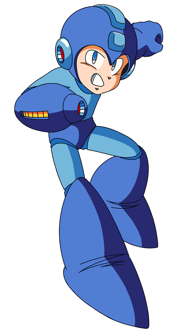
Micah’s Dark World design also features a chestplate and arm gauntlets that are heavily inspired by the armor of Shovel Knight, and while it’s not exactly prevalent in sprite form, I based his boots off of the boots you see in the Mega Man franchise, namely that of Mega Man’s own!
Lastly, you might notice a very specific coloring throughout the design. If you look specifically at the scarf, chestplate and boots… his color scheme draws inspiration from the Bi flag! This was an idea that I had when beginning to outline the sprite, and I’m STILL surprised I managed to get it to look good!
And, as per most of my recent sprite posts, here is the design process I went about when spriting Micah’s Light World variant! You can see a lot of the early steps involve outlining the head, and then once the torso comes in, you can see the exact moment when I shrank everything to be appropriately sized. I was able to get him to be two pixels smaller than Susie’s sprite!
At some point later this month, I’m hoping to draw out his Dark World design so you can get a better idea of what the smaller details look like, but for now, I hope that you’ve enjoyed the spritework and insight on the design process!
Did you know that Rivals of Aether has unique holiday alternate palettes for all twelve Rivals? I don’t quite remember which holidays are represented, but I do know that earlier this year, I got to see what the Valentine’s and Summer alternate palettes looked like, and I just HAD to show off a few of the Halloween alts because of how great the costumes are!
Here’s a good portion of the roster in their respective Halloween alts! Up until the moment you move, the Rivals have little costumes on, but the instant you start brawling, they dissipate into thin air (I would imagine because it would be rather tumultuous to animate each one), though whomever you play as will still keep their spooky alternate palette!
I think one of my favorites out of the eight you see above might be Absa in her witch costume— the colors are really nice and she just looks so darling! Zetterburn’s vampire costume is also quite cool and I’m sure you can imagine how loudly I laughed when I saw that Kragg’s costume is just a giant pumpkin.
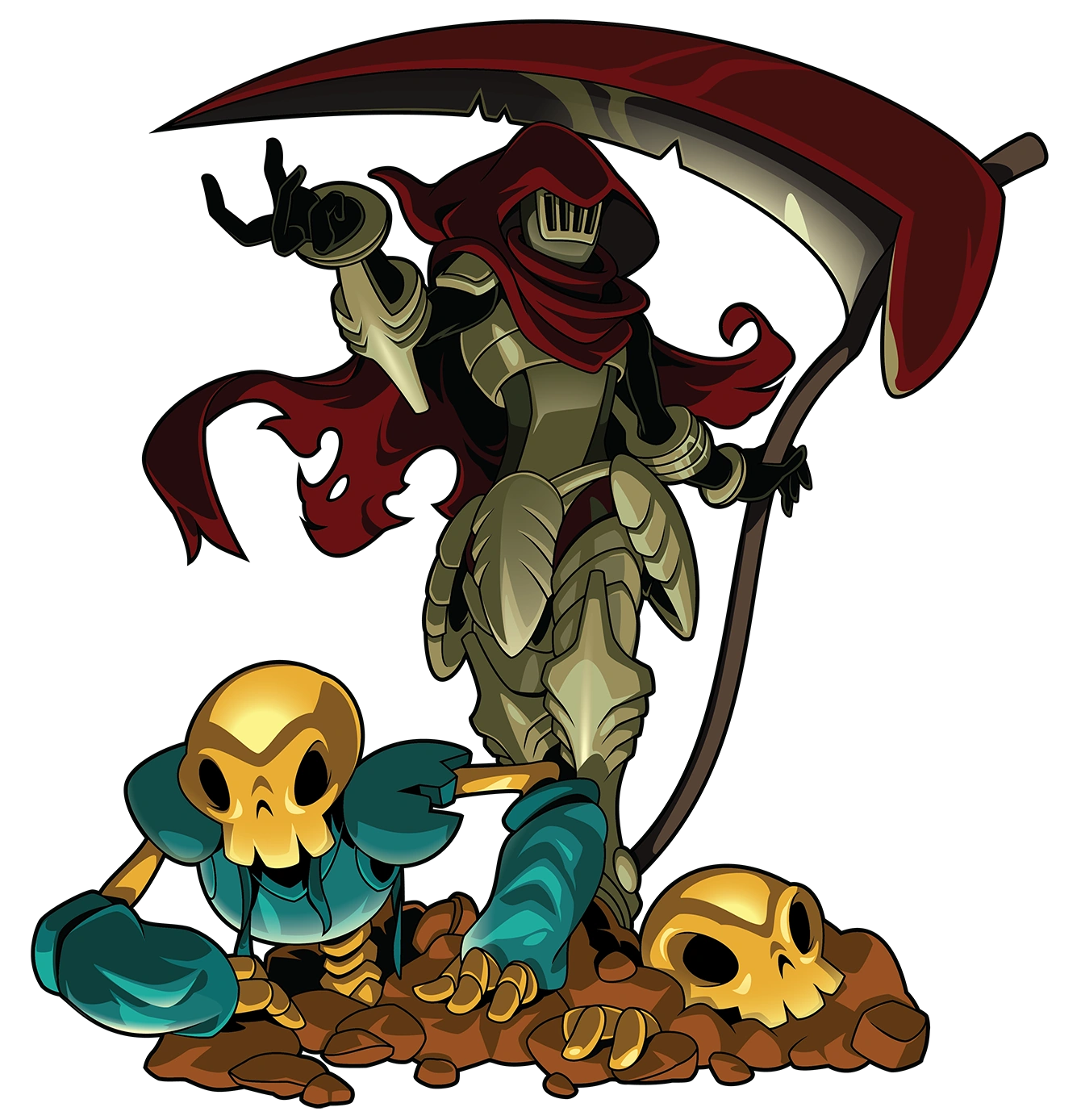
Even Shovel Knight gets in on the action! This one is also one of my favorites because he is very clearly dressed as a certain scythe-swinging specter… he’s got the scythe down-pat, though it half-looks like he just threw a sliver of fabric over his helmet and called it a day. I would imagine going for the real deal might lead to some… unruly consequences from Specter Knight.
Though perhaps the real show-stealing costume belongs to Wrastor. Sure, Kragg going as an oversized pumpkin or Orcane in the typical ‘bedsheet ghost’ garb might be iconic, but then you have Wrastor, who’s dressed as…
QUINN?!
I vividly remember actually shouting “WHAT?!” when I got around to seeing Wrastor in a plague doctor mask and hat combo— I seriously was not expecting to see some plague doctor representation in Rivals of Aether, but to say that it was a pleasant surprise would be vastly underselling it. This is AWESOME.
Now, we wait until Christmas (Or Thanksgiving, I dunno if the latter has any unique alternate palettes) to see the next set of festive color schemes! And, because I haven’t said it yet…
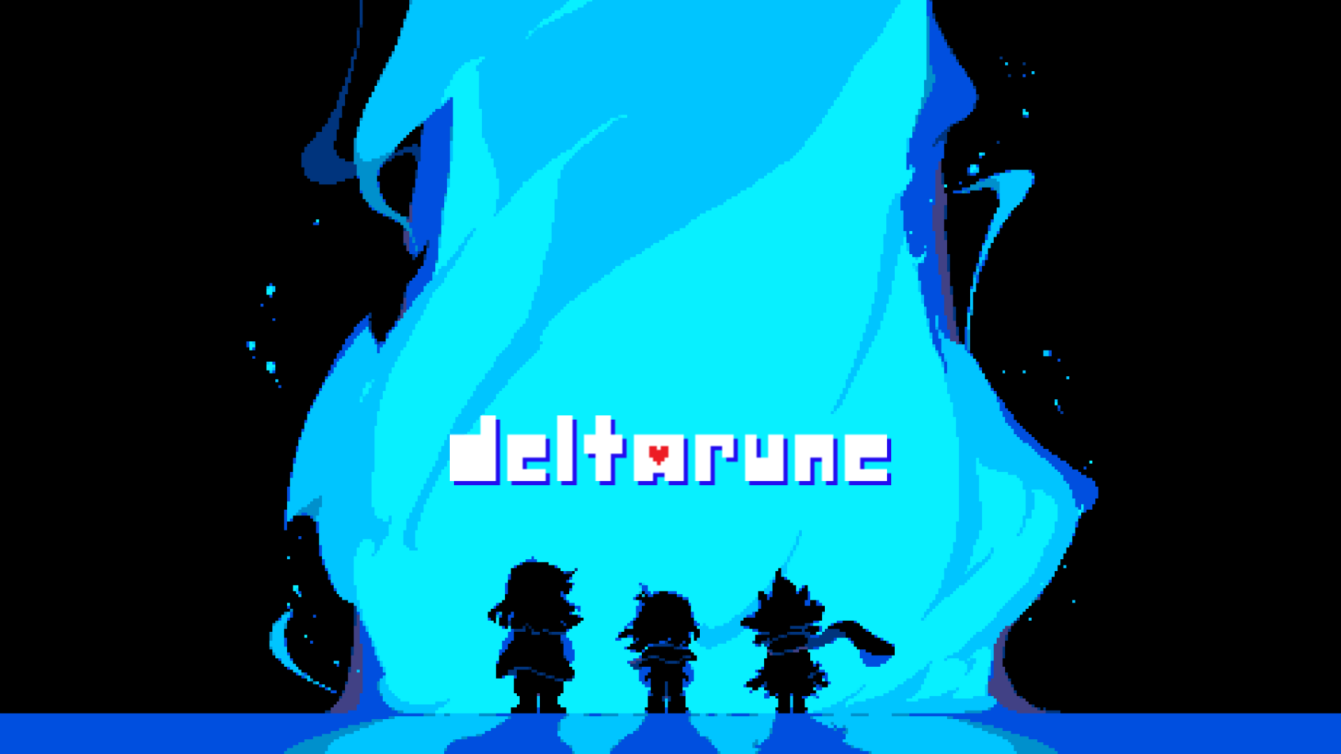
Happy third anniversary to Deltarune, the successor to Undertale! About a month or so ago, I decided to both give Deltarune a big shot as well as replaying through Undertale since it had been a good few years since I’d played the latter, and it was a decision I absolutely do not regret!
Deltarune is every bit as amazing as you may have heard; it takes all the good qualities of Undertale and takes them up to eleven— the writing is hilarious, the spritework is WILDLY inspirational and the soundtrack, as per usual, is without flaw!
I wasn’t aware that the anniversary of Deltarune was so soon, and again found myself in the position of working SUPER fast to have something for the occasion… and of course, if you know anything about my anniversary posts, this means that I’ve got a few wallpapers I’ve designed!
My initial plan was to make a set of five wallpapers, the remaining two being wallpapers for Noelle and Berdly, but the three wallpapers I ended up making took a bit longer than I had expected them to, and for what it’s worth, I find that a pack of wallpapers of just the Deltarune trio is more than enough!
May the coming years bring us the highly anticipated next installments of this iconic tale of light and darkness!
They say that only a team of three may seal the Dark Fountains: a HUMAN, a MONSTER, and a PRINCE FROM THE DARK. It is only with their combined efforts that the balance of LIGHT and DARK may one day be equalized.
…but every tale has two sides.
Check out this teaser video I made for a Deltarune AU @itsactuallyreigh and I have been working on: DarkLight: Parallel Worlds!
On March 13th of this year, @stephysalcidosentan ask in regarding some details on the ever-skittish plague doctor in-training Quinn, and amidst the selection of facts provided was one that would wind up being relevant in due time…
Today’s the day, fellow doctors.
While not the day that I first designed Quinn— which was September 4th, for those keeping track— today is Quinn’s in-universe birthday, and I just HAD to draw something commemorating one of my favorite OCs!
Though, it was a little difficult for me to settle on what exactly I wanted to draw at first. My initial plan was to do a simple bust shot of Quinn in a party hat (Rather, with a party hat on his beak… it’s still a cute idea I may one day bring to fruition), though I had just drawn Quinn in his entirety a month back, and wasn’t really keen on drawing something too identical to it.
But then I remembered that last year on the first of this month, I had drawn a Quinn icon, and while I don’t think I ended up using it here on tumblr (Because @breakbeat-solitare had already designed me an icon for October), it was the perfectopportunity to remake it to better fit Quinn’s current design iteration while also giving me a chance to use it!
It’s the boy! Drawing Quinn is just SO much fun— even if it’s a bit challenging to get his beak to look just right (The specific curvature is key), I find that he’s one of my more visually appealing OCs and I’m just so excited to finally have him as my icon this October!
Happy third anniversary to Mega Man 11, the blue bomber’s triumphant return since Mega Man 10, which released eight years prior! I’ve mentioned in a previous ask that Mega Man 11 is not only tied with its predecessor as my favorite Mega Man game, but it’s also a contender in a three-way tie for my favorite video game ever— and for good reason!
Mega Man 11 is noteworthy for a variety of reasons, but for me, I feel like its strongest point is staying true to the classic Mega Man formula while trying enough new things to form its own identity. More or less, it’s like a modernized NES Mega Man, with the addition of a game-changing mechanic, a solid team of voice actors, and perhaps the most expressive robot master line since Mega Man 8!
Speaking of the eleventh line of robot masters, back in March I began making posts that showcased the eight robot masters of Mega Man 11 sprited into an NES-esque style. The posts were certainly way more well-received than I thought they would be, and they were a whole lot of fun to make!
Anyone who’s been keeping track of said posts, however, knows that there’s still two robot masters left to be seen sprited, those robot masters being Blast Man and Impact Man. Really, the biggest reason I haven’t gotten around to making posts for them yet is because of both bosses’ backgrounds (Especially Blast Man’s) have a lot of detail in them, and it’s been really hard trying to get them to look right.
But with the anniversary of Mega Man 11 finally upon us, I didn’t want to keep any of my followers waiting for any longer for the last two bots of the lineup, so I figured what way to show them off…
… than showing the entire line all together!
While I still feel a little bad about not having sprited demakes for the boss rooms of Blast Man and Impact Man yet, the arrival of Mega Man 11’s release date made for the perfect opportunity to get around to showing their respective sprites since I have had both done for quite a while! With that, let’s start with the robot master who was originally going to be next in line to be showed off… Blast Man!
Blast Man is unique in a way that he bears a more simplistic design (In a similar vein to Fuse Man and Block Man) while still having just a touch of the modern design influences that the rest of the lineup has. However, he still has a lot of cool features that aren’t really explored a whole lot, such as his tri-button torso piece and his segmented boots, which I find to be really neat!
To make up for the lack of backgrounds for both Blast and Impact, I’ve made gifs showcasing the process I took in making their sprites as I’ve been doing for my more recent sprite posts! The biggest challenge in spriting Blast Man for me was accounting for the smaller details on his armor, as well as nailing his red headpiece, which I found was detrimental if I wanted his overall sprite to look good.
Another small detail I wanted to account for was Blast Man’s skin tone— there are a lot of Blast Man sprites out there that portray him with the same skin tone as most of the other vaguely humanoid robot masters, which I always found to be off-puttingly inaccurate. I made absolutely certain that this was something I would correct with my 8-Bit interpretation!
And with the ins-and-outs of Blast Man’s sprite design process done and out of the way, now we can move onto the last robot master of the pack, who I regard as being my favorite of the eight…
BEHOOOOOOOLD!!! IMPACT MAN!!!
The overall design of Impact Man is an interesting one; I remember when I first saw him that I thought his yellow/orange color scheme was just how he was shaded, but as it turns out, that’s actually a component of his design. I also didn’t really understand the spike on his head until we got around to seeing his full-body… though now knowing that he’s made up of the Impact Brothers, it’s a really cool design approach!
Perfectly striking a balance between the two was an astronomical feat, too. The biggest thing I wanted to make sure my sprite of Impact Man had were those classic ‘robot master eyes’, and from there I would sprite the rest of him as accurately sized as I could manage, all while still having him be smaller than Bounce Man.
Color choice was also very important, too! My original Impact Man sprite from 2018 used seven colors, and my version from 2019 had six colors like the present version above, though the color I swapped out for the latest version was a shade of grey so I wouldn’t have to color every dark section of him a solid black.
It feels so wonderful to finally get to show off all eight of my sprite demakes of the robot masters from Mega Man 11, and I hope that you’ve enjoyed them and the processes in making them that I detailed! I do intend on spriting out backgrounds for Blast Man and Impact Man when I get some more practice, but for now, here’s to another year of the Double Gear!
All Kris had to do was follow Susie to the supply closet to retrieve some chalk, yet moments later, they’re a mere twenty-four hours away from the worldwide reveal of Charles Feldman’s Y2K plan.
(Context and a better look at the sprites under the cut!)
I initially didn’t plan on making an entire post for this, but given the effort that went into it (Even if it looks identical to the source material at first glance), I figured it was worthy of showing on my main blog!
As of a few days ago (As a result of my good friend @minxxikuo being a big fan of it and with the veryrecent release of Chapter Two), I decided to give Deltarune a go, and man am I glad that I did. It may have been a good five years since I’ve even touched anything having to do with Undertale, yet Deltarune does enough differently from its predecessor that it’s a whole new experience entirely!
Though, my experience with Deltarune so far isn’t necessarily the point of this post (Though you can find similar insight in the tags). Rather, once I discovered that there was a meme where Kris and Susie find themselves in varying media that isn’tDeltarune (Much to Susie’s frustration), I just had to make a contribution to it.
And what better way to do that than by putting the human and monster duo in the world of Override— specifically, this scene? I went into the creation of it knowing only Knives and whoever else I decided to show it to would understand it to its fullest, though it ended up looking so good that I decided I ought to post it!
The original Deltarune sprites are featured on the left, whereas my Override-styled interpretations are on the right side! Kris was particularly easy to draw a sprite for, the only thing that was challenging for them was trying to match their body type to their original sprite, as well as stylizing their hair.
I was anticipating spriting Susie would be a muchmore daunting task (Because of her overall design coupled with the fact that I had to redraw a veryspecific frame of her), though resizing the sprite just a notch and adding some finer details (Like the pocket on her jacket, the belt loops on her pants and a whole ton of shading) made the process much easier.
Then, there was the fact that I had to recreate the general scene where Lauren’s out investigating the SGN-DRN crash— really, I still had all of the sprites, the toughest thing about the recreation was getting the lighting (Which I didn’t have on-hand) to look as identical as possible to the original. Suffice to say, I think I got pretty close!
For a joke I only intended on showing a couple of people, I’m still really proud of it, and am happy to have put my spriting smarts to good use for such a creative meme!
Around the end of November last year, I unveiled a full set of robot masters that I had designed for my very own faux Mega Man game, Mega Man Ultimate! At first, I was a little nervous in showing off my fanmade robot masters, but to my surprise, they were a big hit— I was not expecting the Synergon Legion bots to be so well-received!
In the first post I’ve linked, I mentioned that I’ve been designing robot master OCs since mid-2013, though ended up becoming super reclusive with them since a lot of them were subject to extreme ridicule, despite the fact that none of them were meant to be on the same level as official ones.
However, there was one particular bot in the very first lineup of robot masters that I designed which stood out the most, in that he actually looked like he belonged in a Mega Man game. Granted, his design was still particularly lacking, but I held him in a high regard.
And after designing a full set of robot masters that all look official in one way or another, I figured that it was high time that I revisit said favorite robot master OC of mine and give him a big redesign with my newfound robot master design smarts. Enter…
SDN-001:Stellar Man
Height: 5'11" Special Weapon: Crescent Boomerang Good Point: Confident Bad Point: Tends to overwork himself
Stellar Man is the rank of general of the Space Surveillance Network. As the head of the astral agency, he works tirelessly to ensure that the space station he mans is always within perfect working order. He specializes in the design of numerous spacecrafts and space stations, and has a major soft spot for all things astrology, spending most of his free time studying star patterns and galaxies.
When he’s doing battle with a threat from beyond the SSN’s parsec (Namely a certain Mega Man), Stellar Man utilizes his zero gravity mobility and his signature weapon: the Crescent Boomerang, a cross between the Metal Blade and the Rolling Cutter. With an iconic weapon, a well-regarded reputation and an absolutely out of this world look overall, he’s a real star, man!
(Design and sprite process below the cut!)
At last, Stellar Man makes his debut on my blog! I’ve actually had Stellar Man’s general design around since before I even had any of the Mega Man Ultimate robot masters up on tumblr, so this appearance was a long time coming!
When I set out to design him, one of the biggest things I wanted out of his design was to have him look a lot like the Stardroids from Mega Man V. The Stardroids have some of the coolest design elements in Classic Mega Man’s history; even now, there’s nothing quite like them, in my eyes, and that was something I wanted to incorporate into Stellar Man’s design.
I also knew that I wanted him to have a unique helmet shape, but after combing through all of the robot masters and Stardroids, I couldn’t think of something that’d stand out. It was when I looked to the character designs of the X Series, however, that I found a few design aspects that I liked, and suddenly his design was blasting off!
Here is the step-by-step process I made when drawing Stellar Man’s sprite! Really, the toughest thing about taking the design and shrinking it down to sprite form was the helmet, as the jagged edges and the glass dome proved to be a challenge in sizing perfectly, but I’m really happy with how he ended up looking!
Also, can we talk about the stage select portrait I drew for him?! I’m fairly certain that it’s one of my absolute best portraits I’ve sprited, right up there with Strafe Man and Glitch Man! It originally started as a test to see how far I could go in spriting a robot master portrait without any preliminary sketching… and before I knew it, I had a full icon made. Talk about motivation!
I am REALLY proud of the sprites on display here and the overall design of Stellar Man, and I couldn’t wait to show them to my followers! I really hope you’ve enjoyed everything this post has to offer, and you can certainly expect to see more fanmade robot masters of mine in the future!
In said post, I make a passing mention about how it took me anywhere between two to three hours to finally nail a damageless run against Plague Knight, to the point where I had memorized his attack patterns and what phase of the fight came when. And, to its credit, it’s still a pretty solid performance!
But anyone who knows me knows that my perfectionism knows no bounds. Now that I knew that I was capable of perfect running one of the most unpredictable bosses in the game, I began to wonder: could I beat Plague Knight without taking damage faster than my original time of thirty-five seconds?
Well, if the above video is any indication, than yes! It took oodles of practice to get a run a swift as this one and have the whole run fit into the Nintendo Switch’s thirty second limit video capture— at one point I had a pretty good fifteen second run completed, but with the way I recorded it, it was missing a few frames in-battle and wouldn’t have looked good edited together.
This didn’t deter me, however, and it was with recently-acquired skill and a pinch of luck that I was able to pull this off. I am S U P E R proud of this and hope that it amazes you as much as it amazed me!


")


from Rune Factory 3: A Fantasy Harvest Moon Hold up.")


:quality(80)/f/93161/2772x3555/3833041bd5/shovelknight007.png)

