Hi everyone! Today, I have a bit of a smaller post seeing as yesterday I showcased a drawing I’m quite proud of with a particularly lengthy design process to go with it, though what I have for thispost is something I’ve been wanting to show off for a short while now!
A few days back, when looking at Mega Man Ultimate’s stage select (The most recent version from 2020, in particular), I decided that it was high time that certain aspects of it got a revision— most specifically, the bulky stage select icon borders.
While the portraits of the eight robot masters have been constantly reworked and improved upon since each one’s conception, the stage select icon borders have remained untouched since I first started making Mega Man Ultimate content back in 2018. Given I’ve had four whole years of sprite practice under my belt since then, it was time for a redraw!
When drawing a new stage select icon border, I took inspiration from the ones used in Mega Man 2 andMega Man 4, the former of which being my main reference. The initial 2018 borders have always felt a bit clunky to me, and there’s a lot going on on all sides of it (Figuratively and literally).
Upon setting out to make a slimmer, more compact redesign, I wanted the border itself to be a lot more simplistic than the version from four years ago. Really, all I needed were some cool blue gradients and the classic blinking corner lights, and it didn’t actually take me that long to whip something up with those design choices in check!
And that’s not all— if you look really closely between both portraits of Amazon Man, you may be able to make out a few small changes so that his portrait looks the best it can be! I redrew the leftmost side of his helmet and eyes a slight bit, fixed the shading on his head so that it looks a bit more vibrant, and extended his right pupil up a pixel. While small, these changes make his portrait look leaguesbetter than before!
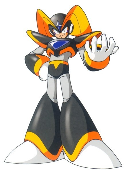
While we’re on the topic of SLN-004, it was when I had been making these changes that I wanted to try something in pertains to Amazon Man’s design that I had not once ever considered before… what would he look like withouthis usual mouthpiece?
The answer is a little something like this! While not a permanent change to his design, the minute ‘mouthpiece-less Amazon Man’ crossed my mind, I just hadto attempt spriting out what he would look like without it!
I’ve always envisioned Amazon Man to have a slightly darker, more tan skin tone than the usual lighter tone that most humanoid robot masters tend to have, similar to Blast Man. In addition, I felt that it would be appropriate to continue to stray from the norm by giving him a broader chin, which hasn’t been seen in a robot master since Dive Man.
The full, reworked version of Mega Man Ultimate’s stage select should be up very soon— since all that’s left for me to do is figure out one last portrait— but for the time being, enjoy this sneak preview of what to expect for it!
The artstyle of the Classic Mega Man series, which only began to find its footing just after the third installment, is iconic. I have a majorsoft spot for Keiji Inafune’s artwork for the NES-era Mega Man titles, as well as Ryuji Higurashi’s illustrative work for Mega Man 9. I’ve even spent a good while trying my hand at the style, of which you can check out here!
Though, every artstyle has to start somewhere, and even though the later NES Mega Man titles had some excellent looking artwork, the illustrations for the first couple of games were… interesting. The characters of the original Mega Man and its sequel were drawn in a much more rounded artstyle, looking more chibi like than the anime-esque style it would evolve into, and after the first few Mega Man games, it was quickly improved upon.
When you really take some time to sample Mega Man 1 and 2’s artwork, however, you’ll find that it’s not thatbad of an artstyle. Sure, the infamous ‘Capcom hand’ looked odd from having the middle two fingers fused together, but outside of that, I find that it’s an artstyle that doesn’t get a lot of representation in Mega Man fanart and is one I’ve grown to appreciate in these past few weeks.
And from having drawn a near-identical Inafune-styled Mega Man a month ago, yet another challenge for my artstyle replicating smarts arose… could I do it again, but take more after the style of Mega Man 2’s artwork?
See for yourself!
I’ve been playing a whole lot of the first Mega Man Legacy Collection for the past few weeks, and in that time I’ve beaten all six games (Some even twice or thrice like Mega Man 5), read all of the database entries, and have been sampling the game’s enormous backlog of illustrations from Mega Man 1 through 6!
In doing so, I found myself developing a fondness for the artstyle of the first two titles in the series— while I do prefer the artstyle of the later NES games, the humble beginnings of Keiji Inafune’s illustrations for Mega Man appealed to me, and it was a style that I definitely wanted to see if I could come close to replicating.
And so, it was shortly decided that I would be drawing Mega Man in the Mega Man 2 artstyle! … but what pose would I draw him in? I thought it would be neat to have a MM2-styled version of Mega Man from his appearance on Mega Man 10’s box art, and the instant I thought of that pose, I got straight to work!
Compared to its modern counterpart, the style of the earlier Mega Man games has some pretty key differences: most glaring are the pupils of the eyes, which are much more wide than the slimmer pupil shapes seen in later titles. The eye shape itself is also a lot more circular, too, and certain aspects of robot master facial features (Such as their mouth or chin) are much larger.
The hands and boots of both Mega Man and robot masters are also greatly simplified, too. The 'feet’ section of the boot is much more round, and also lack the 'Z’ crease shape you would normally see on non-segmented boots. Instead, the boots (And often other parts of the body, such as the legs or buster) have minor crosshatch shading, though nothing too major.
These were design elements I made sure to account for in my initial sketch, and much like when I last drew Mega Man, the most important part was getting his head to look as 1:1 to the original that I could. You might notice the 'Capcom hand’ looks a bit wonky, and this is because I was using my Switch for references and it was tough to draw a good looking one pointed left instead of right— it wasn’t a huge deal. I could always fix it when I digitalized it!
After I got the sketch fully lined to my liking, it was time to figure out another crucial aspect to staying true to the look of Mega Man 2’s visual style: the colors. The colors I used here were directly picked from Mega Man himself on Mega Man 2’s box art, but when I wasn’t liking how dark the colors came out, I brightened and desaturated them a slight bit to give it that vintage feel.
The shading was particularly easy, as I referenced the shading from my main reference of Mega Man in 10’s main artwork, though I intentionally left some areas unshaded (Such as the buster meter and inner earpiece) seeing as Inafune tended to do the same every now and then.
An extremely small detail that I’m glad I acknowledged was how you can only see Mega Man’s right (Or hisleft) earpiece as opposed to both. In artwork from the first two games, whenever Mega Man is at a ¾ths angle, only one earpiece is present, whereas both can be seen at the same angle in later games.
I’ll be honest, it was actually a whole lot of fun drawing in 2’s artstyle, since it’s a lot more simplistic compared to the perfection 9 and 10’s style demands when replicating it— I may even attempt modern robot masters in the same style to see what they may have looked like in earlier Mega Man titles… or perhaps even draw faux official artwork for the obscure Bond Man!
That said, I hope you’ve enjoyed my dive into analyzing the artstyle of the earlier Mega Man games, and what my research yielded in perhaps one of my favorite drawings I’ve done this year!
One of the things that I love the most about the Classic Mega Man series is its artstyle. It’s very anime-esque with a slight twinge of toon, and there’s a surprising amount of detail that goes into each art piece drawn by Mega Man illustrator Keiji Inafune (Such as how robot masters and characters like Mega Man and Roll have different pupil types and the infamous ‘Capcom hand’).
Naturally, ever since 2015, I’ve been trying my hand in seeing how accurately I can replicate the Mega Man artstyle, and considering I mentioned planning to make a full Famicom styled box art piece for Mega Man Ultimate, I decided it was about time to dive back in to researching Mega Man’s artstyle to make said art piece as 1:1 to official artwork as I can!
And where better to start with the centerpiece, Mega Man himself? Back in December of 2020, I drew a Classic styled Mega Man in honor of his 33rd anniversary, and while it was decent enough in its own right given my skillset at the time, this time I wanted to go all out in drawing a full-body Mega Man while keeping a lot of Inafune’s art choices in check…
… which resulted in the best Mega Man I’ve ever drawn!
Looking at a character like Mega Man, you’d think he wouldn’t be too difficult to draw, and design wise, he’s not. The simplicity of his armor and few colors actually make him— in theory— pretty easy to draw.
But when you’re attempting to match the actiony grandeur that is the key artwork for more recent Mega Man games on top of keeping an eye on proportions, shading styles, and shaping everything just right… then it becomes a tad hard.
So, when I sat down to draw Mega Man, I made the decision to start with arguably the most important part… the head.
To me, if you’re going after a stylistically accurate Mega Man, his head is detrimental in getting just right. This is easier said than done, because his helmet isn’t just a circle; it’s more ovular and widens toward the top, leaving the base of the helmet to be a bit slimmer.
Above, you can see two preliminary sketches I whipped up in preparation for the digital outline phase. While they look fairly similar, each one has a focus: the leftmost sketch was primarily focused on getting the head to look nice (Which took about forty-five minutes by itself!), as well as drawing a good buster.
The righthand sketch was more focused on Mega Man’s pose, explaining the placeholder head and buster. I was originally going to jump right into taking the left sketch and digitalizing it, but when I felt like the hand and legs could be drawn better, I made an additional sketch to merge with the first.
Woah! Here’s something new: just like how I’ve begun showing the spriting process for some of my sprite works, here’s the process I went about when digitalizing my Mega Man sketch after I had finished reshaping everything in my drawing software: from outline to flat color to the end result!
Interestingly, when I first got done drawing Mega Man, I thought it looked great… but I wasn’t a fan of how he looked proportionally, as I thought his arms and legs looked a little short. When I had been searching for reference images to base my sketches on, I noticed that Mega Man’s legs especially are a bit lengthy, so I redrew 45% of my then-final result with these changes in mind, which resulted in the version shown in this post.
I’m really impressed with myself on how great I got this piece of Mega Man to look, since shading and posing aren’t my forte— it feels nice to have one of the tougher aspects of MMU’s eventual box art drawn, and I hope you’ve enjoyed both the art and reading the process behind it!


