subtitle regulations really need to catch up to modern day productions on youtube
when you have big professional companies like bon appetit, or geek & sundry, or microjig, or americas test kitchen, and theyre producing content to put on youtube and other sites, they shouldnt be allowed to rely on auto captioning, or fans captioning it for them
closed captioning regulations had to be implemented for tv and film because otherwise, we just…. didnt get any
and now that they can get away with not doing it on the internet, theyve gone right back to not captioning anything because nobody is making them
those regulations really need to catch up
tl;dr im hard of hearing and im pissed that closed captioning isnt required on videos on the internet
If this video helps even one person, it was worth it.
So, I’ve got a ton of ingredients that my body reacts to: corn, citric acid, gluten, chocolate, bananas, peanut oil–I’m all over the place.
It was so hard to read ingredient labels and just find food that I could eat. Grocery trips were unbearable, they took like two or three hours usually.
But I always had this idea on how to make it easier. So I quit my job and helped build an app over the past few years. And that app’s called Fig.
[A phone screen showing the app interface, which Tyler scrolls through. Top text reads: “First up: Do you follow any of these diets? Dietary restrictions are complex - it’s ok to select more than one!” Underneath is a checklist of ingredients and dietary restriction, including categories with suboptions.]
What makes fig unique is we’re trying to help pretty much everybody that has to avoid certain ingredients.
That means we’ve got a ton of things that you can select from–even really specific ingredients.
[Camera briefly returns to Tyler’s face again.]
And like I had dreamed of for so many years, checking ingredients is as quick as this.
[A phone camera scans the barcode on a bottle of spices. Details about the product appear, including an ingredients list and allergen statement. The ingredient “citric acid” appears in red all-caps. There is also an accompanying message that says “This product does not match your Fig.”]
And finding food you can eat is as simple as this.
[The app displays a scrollable list of food items, similar to a storefront. Each item has a save toggle and is accompanied by a photo, the product brand/name, and its size. There is a search bar labeled “search for a product.” There are also menus for narrowing the search; one is set to “allowed,” one is set to “Whole Foods,” and another unaltered menu is titled “Category.”]
[The camera returns to Tyler.]
So if you know anybody with food allergies, stomach issues, other dietary restrictions, I’d really appreciate it if you shared it with them.
[The appstore listing for Fig: Food Scanner & Discovery.]
It’s called Fig, it’s completely free, and you can get it on iOS and Android in the US.
LARP is a hobby that can often be inaccessible in a number of ways. This is a simple and definitely incomplete list of questions organisers and game runners can ask themselves and consider, related to disability specifically.
As always, a disclaimer before I launch into a million and one ideas and questions. I’m pretty sure it’s technically impossible to achieve all of these in one game, but aiming for as many as possible isn’t going to do anyone any harm. Let’s get into it.
Last note: I’m going to make a rough attempt to organise these into sections for ease of reading, but it’s important to remember there are crossovers and intersections. I cannot cover every consideration unfortunately.
MOBILITY: Are your venues doorways wide enough for wheelchair and crutch users? How even are the grounds? Are major game areas only accessible by stairs? Is the outside covered in mud or ice? Are there access ramps? Is there a reservation system for bottom bunks? Is there downstairs sleeping? Is there any plot accessible only in hard to reach areas?
PROCESSING AND SENSORY: Is there accommodation for those who need interpreters? Doe interpreters accompanying a player pay full price? Does any plot rely solely on one sense, for example sight or sound? Does your game contain loud sounds or flashing lights? Do your fictional words have sign language to go with them?
MENTAL HEALTH: Is there a safeword to call scenes to a close? Is there both an OC and IC quiet place to go? Is there a qualified mental health first aider at the game? Is your complaints policy and acceptable themes clearly laid out? Do you list potentially sensitive themes that will be included in advance? How much game relies on social skills? Is there a veto on players policy?
GENERAL: Is there a quiet place to sleep? Is there separated OC and IC areas? What is your alcohol policy? Is there noncom plot? Is there down periods where people can nap? Do you have a concessions scheme? How close are train stations, parking or buses? Is there access to electricity? Can refs remind players of medication timings? Will you list your menus and ingredients in advance? What’s the temperature like? Is there any expensive required costume? Is there running water? How accessible is the place for ambulances? Do you have a first aider?
An Exploration of Her Visual Aides and Accommodations while in University
Welcome to Part One of my Helen Keller mini-series. In Spring 2022 I took a Disability in Literature class as part of my degree. The focus was on Helen Keller, her writing, her activism, and her complicated legacy.
While studying Keller’s writings I became fascinated with the occasional mentions of historical visual aids Keller relied on. It was through her autobiography I first learned that there used to be multiple Braille alphabets for the English language, or that raised text was still an incredibly popular printing choice. If you read older posts from my blog, especially Writing a Blind Character in Victorian Era Historical FictionandI found a lost piece of blindness history you’ll know that historical accommodations have been an interest of mine for a long time.
It was also through this class that I first became aware of the 2020 TikTok #helenkellerwasfake controversy. In 2020 handful of TikTok creators claimed that it was absolutely impossible for a Deaf-blind woman to accomplish everything Keller had done. Among the accusations were that her handwriting was too perfect, she could not have possibly written multiple books, or graduated college.
I believe that the skepticism people have towards Keller’s achievements stems from them not knowing what tools she had to accommodate her disabilities and how she used them. So in this post I’m going to describe all the tools Keller used throughout her life and how they contributed to her education and career.
This is a very informative and interesting series of posts. The amount of detail is incredible! I am continually impressed by the amount of work Mimzy puts into posts such as these and I hope they get spread so that people who are curious about Helen or even confused about how she existed can learn.
Educating people about accessibility allows them to expand their ideas of what disabled people can do.
A few things I have extra appreciation for:
-Asking how she wrote print so well is the older version of accusing blind people of faking when they use the internet or print keyboard.
-Sighted-guide as an important accommodation not just for navigation, but also for conversation and description of the world.
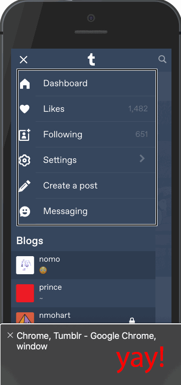
If you’re an avid user of Tumblr on mobile web, then you might’ve noticed some improvements we made. Bigger font sizes and higher contrast text? Your screen reader actually reads what you hope it would? You’ve guessed it, we’re making Tumblr ✨accessible✨.
Why?
Since we’re rewriting the web, we wanted to make sure we did so with accessibility in mind. I could give you a long description why, but plenty of articles explain better than I can. Put simply: the web should be made useable for everyone.
We began with using the accessibility auditing tool in Google Lighthouse to check the improvements that could be made. Initially, our score wasn’t that great: 62. If you factored in areas that need to be manually checked then our score would have been abysmal. However, we’ve made great strides since then and are on our way to achieving that coveted
We had inaccessible menus and poorly described elements, among other things. Using a tool like VoiceOverorTalkBalk you can see what experiencing Tumblr on mobile web with a screen reader was like. Here’s a gif showing what the mobile web experience on Tumblr was like prior to the changes.
What we did
Some of the more noticeable improvements we made were introducing design changes to increase readability and making improvements following WAI-ARIA guidelines. We’ll walk through a few other changes we made using React.
Visual order on the page follows DOM order
One of the larger changes we made was to revamp modals and popovers (e.g., the post activity screen). Originally we used React Portals but it isn’t always the most friendly for accessibility. Ideally you want to have elements appear in logical DOM order and Portals provides a way to circumvent that. So, no more Portals!
The user’s focus is directed to new content added to the page
Next step was to provide a way to manage focus. We want to a) direct focus to the modal when it’s opened and b) return focus to the element that opened the fullscreen modal. Using React’s lifecycle methods and refs, this is simple enough to implement. In your modal component:
publictargetEl:HTMLElement;// The element used to open the modal publicbuttonEl:HTMLElement;
publiccomponentDidMount() { // We add an event listener to get the element that opened the modal document.addEventListener(‘focus’,this.setOriginalTargetEl,true); // We set focus to some element inside your modal this.buttonEl.focus(); }
publiccomponentWillUnmount() { // Return focus to the element that opened the modal if(this.targetEl) { this.targetEl.focus(); } }
publicsetOriginalTargetEl=event=>{ // Only set it once to get the initial target if(!this.targetEl) { this.targetEl = event.relatedTarget; document.removeEventListener('focus’,this.setOriginalTargetEl,true); } };
Of course, we’re still fine-tuning different elements of the site since accessibility is more than just a number. A lot of these changes will be even more noticeable when the new Tumblr dashboard comes to your desktop. There’s still more to come, so keep your eyes open!
Think there’s a way to make Tumblr more accessible? Hit us up at tumblr.com/jobs and come work with us!
First comic panel shows the main character holding a pencil larger than themself and using it to draw a line. The caption says “ADHD Bri’s How To.” The sub caption says “writing alt text”. A disclaimer at the bottom states “this is an example of how I write my alt text and is not perfect nor the only way to write it.”
The second comic panel shows an example comic. The caption states “1. List how many and types of images.” The sub caption says “This lets tour audience know what to expect. Example: “Two panel comic.”
The third comic panel shows the same example comic focusing on the first panel. The caption states: “2. Clarify which image you are describing.” The sub caption says “example: “comic panel one.”
The fourth comic panel shows the example comic. The caption says “3. explain the visual elements of your image.” The sub caption says “example: comic panel one shows the main character leaning back in their chair with their foot on the table in front of them.”
The fifth comic panel’s caption says “Tips”. The sub caption says “use only tangible descriptors. If there are multiple characters, make sure to label which one you’re referring to. Don’t go overboard describing everything. Pick and choose which best tells your story.”
The sixth comic panel’s caption shows the same comic example. The caption says “4. Write the caption or spoken text in image.” The sub caption says “example: the main character asks “how tough am I? Let’s just say I’m not afraid of anything.””
The seventh comic panel’s caption says “Tips”. The sub caption says “the punctuation and symbols are not always screen reader friendly. Be mindful how you use any. If you intentionally misspell or use alternative spelling of something in the image, write it so it can be readable in the alt caption and specify it was written originally in a particular fashion or tone.”
The eighth comic panel shows the same example comic. The caption says “5.) Repeat steps 2-4 for any other image.”
The ninth comic panel shows the example comic. The caption says “The results.” The sub caption says “Two Panel Comic. Comic Panel one shows the main character leaning back in their chair with their foot on the table in front of them. The main character asks “How tough am I? Let’s just say I’m not afraid of anything.” Comic panel two shows a large figure looming over the main character with “making phone calls” written on its chest. The figure asks “you were saying?””
did the preliminary research, it does not appear to be a scam, the parent organization SciAccess grew out of conversations at scientific conferences about equity and inclusion in STEM. Both ZERO-G social media pages have confirmed the partnership
“The goal of this mission is to bring together the largest and most diverse group of disabled crew members in a weightless environment, with the hopes to learn how to adapt and make accessible outer-space travel for disabled space explorers, scientists, and researchers. The Mission: AstroAccess parabolic flight is scheduled to take place on October 17, 2021, launching from Long Beach, California.
“Our mission is to change outer space and change the world. If you are a disabled person who is confident, enthusiastic, playful, and literally willing to float upside down to change the future, we are looking for you!” says Dr. Sheri Wells-Jensen, Associate Professor of Linguistics at Bowling Green State University.”
There is an impressive team behind AstroAccess, you can find the full list on their site here.
Here’s a couple of those bios.
“Anna Voelker is the founder and Executive Director of the SciAccess Initiative, an international program dedicated to advancing disability inclusion in STEM. Through SciAccess, they lead numerous science inclusion initiatives, including an annual conference launched by their receipt of the 2018 Ohio State University President’s Prize. Anna specializes in accessible space science outreach for diverse learners and has worked extensively with blind and low vision students using 3D printing and data sonification. In June of 2021, Anna joined the Aspen Science Center as its new Executive Director. Anna is a 2018 Brooke Owens Fellow and previously worked at NASA Kennedy, NASA Goddard, the Space Telescope Science Institute, the International Astronomical Union’s Office of Astronomy for Development, and the Aerospace Corporation.”
“Eric Ingram is the Founder and CEO of SCOUT Inc., a company de-risking space operations with sensor suites that enable spacecraft to see and understand the area around them. He also currently serves on the Board of Directors for the Space Frontier Foundation. He was previously an Aerospace Engineer for the Licensing and Evaluation Division of the FAA’s Office of Commercial Space Transportation, where he gained expertise in the regulatory environment. Prior to this, Eric was an engineer for Deep Space Industries, where he designed cubesat subsystems for testbed missions. Outside of the space industry, Eric previously served as the President of the United States Wheelchair Rugby Association, leading the USWRA to its largest budget surplus in its 30+ year history. Eric has competed in the sport of wheelchair rugby for 15+ years, competing domestically for several club teams, and internationally with the US Developmental team. Eric holds a Bachelor of Science in Physics from Old Dominion University, most of a Master of Science in Electrical Engineering from the University of Houston, a sport pilot certificate, and is working towards SCUBA certification.”
“Dr. Sheri Wells-Jensen is an associate professor of linguistics at Bowling Green State University in Bowling Green, Ohio. Along with various aspects of astrobiology, her research interests include social aspects of human colonization, disability, the relationship between language, embodiment and thought, language evolution and ways in which alternative sensory inputs could influence the evolution of scientific thought. She is on the board of SOCIA (Social and Conceptual Issues in Astrobiology and METI (Messaging Extraterrestrial Intelligence) International.”
“Dr Jamie L. Molaro is the Executive Director of Disabled for Accessibility in Space (DIAS). Dr. Molaro is a planetary scientist at the Planetary Science Institute and located geographically with host institution the Caltech/Jet Propulsion Laboratory. Her research focuses on understanding the way that rocky and icy materials fracture and break down, driving landscape evolution on asteroids, comets, and moons. She is also a team member on NASA’s OSIRIS-REx mission to retrieve a sample of rock from an asteroid surface. Service is an integral part of Molaro’s career, including organizing and running exhibitions and workshops on science and data-driven art, and leading DAIS (Disabled for Accessibility in Space). DAIS is a peer networking, support, and advocacy group for disabled and chronically ill people in space science and related fields and professions, and proud collaborator in Mission: AstroAccess.”
[Bildbeschreibung: Screenshot von Link-Text “Bundesanzeiger: Bekanntmachung der Begründung zur Änderung der Barrierefreie-Informationstechnik-Verordnung (PDF, derzeit nicht barrierefrei).”]
Watched a great talk today about web/technology accessibility, and the speaker pointed out that yes, accessibility is important for people with permanent disabilities, and we should definitely care about that. But also accessibility helps EVERYBODY, because everybody will, at some point in their lives, find themselves in situations that accessible technology can help with. Here are permanent, temporary, and situational disabilities that accessible technology can help with:
Remember that whether something is disabling or not depends on the situation, the environment, the technology, etc. We’re ALL disabled at some point. It is important to support permanently disabled people, but it is also important to remember that accessibility helps us all!
I’ll just mention the irony quickly and do this:
[ID: A table of types of disability. Columns are labeled Permanent, Temporary, and Situational, in that order. Each example has an abstract human figure to represent the disability.
Touch: One Arm, Arm Injury, New Parent (holding a child in their arm)
See: Blind, Cataracts, Distracted Driver
Hear: Deaf, Ear Infection, Bartender (surrounded by noise)
Speak: Non-verbal, Laryngitis, Heavy Accent (wielding a sword, shield, and viking helmet)
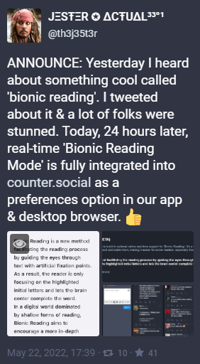
whenever i click the cc button on a youtube video that clearly has a high budget and is made by a fucking studio and i see “english - auto generated” i spit daggers from my eyes and mouth at whoever decided to not pay someone to make actual captions
because jester found out about it *yesterday* and stayed up all night and now it’s implemented into counter.social. Like as an option, for those who want/can be helped by it.
Is this on your radar at all? People there are loving it. It’s helping them read faster, and more accurately.
Image 1 screenshot from Counter.social post from JΞSŦΞR ✪ ΔCŦUΔL³³°¹ @th3j35t3r ANNOUNCE: Yesterday I heard about something cool called ‘bionic reading’. I tweeted about it & a lot of folks were stunned. Today, 24 hours later, real-time 'Bionic Reading Mode’ is fully integrated into https://counter.social as a preferences option in our app & desktop browser.
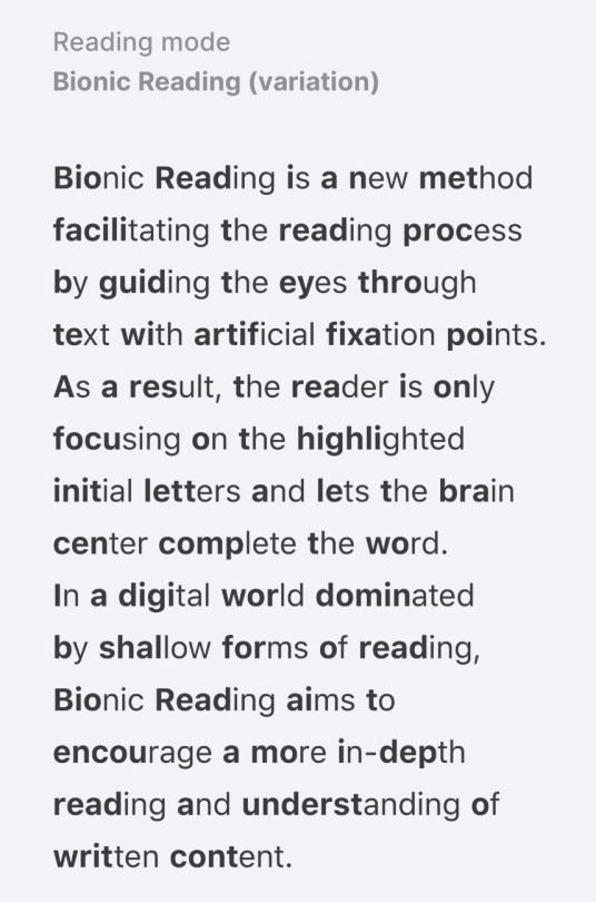
Image 2 text reading
Bionic Reading is a new method facilitating the reading process by guiding the eyes through text with artificial fixation points. As a result, the reader is only focusing on the highlighted initial letters and lets the brain center complete the word. In a digital world dominated by shallow forms of reading, Bionic Reading aims to encourage a more in-depth reading and understanding of written content.
(and nah this isn’t me schilling for CoSo. I’m well aware it’s not the site for everyone. dude just has great response and turnaround)
okay but seriously why are the formatting buttons in the new post modal still obnoxiously vivid when i SPECIFICALLY changed all the tumblr color styles using stylus to make them less saturated and stop them from giving me a fucking migraine. they are fucking painful. people using the LOW CONTRAST theme probably don’t want to see BRIGHT VIVID NEON COLORS anywhere on our dashboards, TUMBLR
MOTHERFUCKER
THEY HARD-CODED THE FUCKING SVG COLOR HEX CODES DESPITE ALREADY SETTING THEM TO USE A MODIFIABLE COLOR VARIABLE.
in case y'all wanted to see the colors i want to be seeing vs the ones i amseeing…
bad, migraine fodder:
good, i can look at these (these are the colors i set using stylus and they use the same variables so they shouldbe the same):
@wiphi!don’t hard-code hex value colors. leave them variable. not only is it then easier for y'all to push changes if you ever need to, but it allows people who need additional accessibility tweaks to use stylus and other custom css addons in order to, y'know, NOT BE MADE COMPLETELY MISERABLE BY YOUR PAINFUL COLOR CHOICES.
once again: i use the LOW CONTRAST theme. this is because i need tumblr to be LOW CONTRAST. that includes ALL OF THE FUCKING BUTTONS
okay but seriously why are the formatting buttons in the new post modal still obnoxiously vivid when i SPECIFICALLY changed all the tumblr color styles using stylus to make them less saturated and stop them from giving me a fucking migraine. they are fucking painful. people using the LOW CONTRAST theme probably don’t want to see BRIGHT VIVID NEON COLORS anywhere on our dashboards, TUMBLR
MOTHERFUCKER
THEY HARD-CODED THE FUCKING SVG COLOR HEX CODES DESPITE ALREADY SETTING THEM TO USE A MODIFIABLE COLOR VARIABLE.
in case y'all wanted to see the colors i want to be seeing vs the ones i amseeing…
bad, migraine fodder:
good, i can look at these (these are the colors i set using stylus and they use the same variables so they shouldbe the same):
okay but seriously why are the formatting buttons in the new post modal still obnoxiously vivid when i SPECIFICALLY changed all the tumblr color styles using stylus to make them less saturated and stop them from giving me a fucking migraine. they are fucking painful. people using the LOW CONTRAST theme probably don’t want to see BRIGHT VIVID NEON COLORS anywhere on our dashboards, TUMBLR
Having an emotional breakdown while having having a seizure for the first time in over 6 months cuz of the fucking unremovable effects with the Android 12 update my phone involuntarily installed
And there’s no way for me to uninstall the update.
Trying to navigate between tabs? Dramatic flash to pull up the viewer.
Unlock phone? Rippling flash upon unlocking.
Typing? Rippling circle bubbles for every single fucking letter i type. IM LITERALLY HAVING TO VOICE TYPE THIS RN.
I am physically incapable of using my phone now. Plus the whole fact i had a seizure (atonic seizure) cuz of something like this is fucking BULLSHIT.
So yeah if you’re photosensitive for ANY kind of reason, don’t let Android system 12 install !!!
Fuck.
I don’t think you can do anything about the flash effects when unlocking the phone, but for keyboard issues, you can download other keyboards and disable the one that came with Android. I’m using the Microsoft Swiftkey keyboard and it has options to disable key popups.
As for the tabs, if you mean browser tabs, you can try another browser.
What the actual fuck. I haven’t installed android 12 yet and now I’m weary.
I recommend setting the default browser to something like ecosia, opera or Firefox if you can.
Also agree with the keyboard installation suggestion.
The problem is if one doesn’t update the software apps will stop working properly after a while. Like I’ve had this with netflix, WhatsApp, messenger and YouTube where they’d start bugging because I hadn’t updated in a while.
This needs to be fixed by android Devs!
Update:
I’ve started messaging developers. I’ve contacted Samsung Germany and Google Pixel Support.
Support has told me they will forward the Information to their developer team asap
I have also suggested Google placing a prominent warning in front of the installation menu until the issue has been fixed.
I have also suggested to remove the visual effects as a standard setting feature and to have them be optional. So that users have to actively activate them
I have suggested development do a check on all visual effects while being at it.
Support said, if you can and own a Google device, you can report the issue using the settings under tips and feedback.
Since OP can’t use their phone I doubt they can do this but everyone who owns a Google phone with android 11 or 12 or phone using android 12 can do this!
Make the Devs aware. Stay polite. But firm that this is an issue that needs fixing.
I don’t know if this will help everything, but you can disable animations if you go to Settings-> Accessibility -> Visibility enhancements -> Remove animations. That will at least remove SOME of the animations.
Reblogging to save a life. Thank you for the advice!
If you own a Google Phone please take the time to send feedback to the devs via settings as well. The more tickets the developers the receive the more we can communicate the urgency on the matter !
Just tried the ‘turning off animations’ option and frick, it actually made the flash intensity worse. Before it be kind of a smooth fading transition where the flash was a second or two longer
But if you remove the animation, it makes the intensity of the flash so so so much worse.
Just a heads up to others, wanting everyone to stay safe//:
When we say make Pride more accessible we mean make sure disabled folks can actually enter the gay bar. (We see your doors with a lip on them.)
When we say make Pride more accessible we mean don’t pack people in and make it hard to move in mobility aids.
When we say make Pride more accessible we mean stop having Pride events that only happen on grass.
When we say make Pride more accessible we mean make sure all bathrooms are easily found and usable.
When we say make Pride more accessible we mean make sure we actually can sit somewhere if we need to. If all the seats are bar stools that is not helping or helpful.
When we say make Pride more accessible we mean don’t expect everyone can dance physically.
Stop using ‘that’s just how it’s always been’ as an excuse. Intersectionality in the community needs to be a thing.
An Exploration of Her Visual Aides and Accommodations while in University
Welcome to Part One of my Helen Keller mini-series. In Spring 2022 I took a Disability in Literature class as part of my degree. The focus was on Helen Keller, her writing, her activism, and her complicated legacy.
While studying Keller’s writings I became fascinated with the occasional mentions of historical visual aids Keller relied on. It was through her autobiography I first learned that there used to be multiple Braille alphabets for the English language, or that raised text was still an incredibly popular printing choice. If you read older posts from my blog, especially Writing a Blind Character in Victorian Era Historical FictionandI found a lost piece of blindness history you’ll know that historical accommodations have been an interest of mine for a long time.
It was also through this class that I first became aware of the 2020 TikTok #helenkellerwasfake controversy. In 2020 handful of TikTok creators claimed that it was absolutely impossible for a Deaf-blind woman to accomplish everything Keller had done. Among the accusations were that her handwriting was too perfect, she could not have possibly written multiple books, or graduated college.
I believe that the skepticism people have towards Keller’s achievements stems from them not knowing what tools she had to accommodate her disabilities and how she used them. So in this post I’m going to describe all the tools Keller used throughout her life and how they contributed to her education and career.
In this post I’m going to explore:
The Manual Alphabet
Braille and Raised Print
How Accessible was Keller’s College Experience
How did Keller Write by Hand
Writing with a Typewriter
Sighted Guides
I also include several quotes from Keller’s own writings and I will link those sources here:
Note: The link I’m providing is to a free copy through The Project Gutenberg, but it isn’t exactly the most pleasant reading experience. If you would prefer a print version or an ebook copy of The Story of My Life, you’ll probably be able to buy a copy online for cheap.
Note: This book is incredibly hard to come by, with printed copies costing 80$ (US) or more, and I cannot find a convenient ebook of it. So I’m providing a link to archive.org which provides different formats for you to download the book in.
The Manual Alphabet
This is the concept that I think is hardest for anyone to conceptualize. The basics of the manual alphabet are that someone finger-spells every word they say with their signing hand held to the listener’s hand.
If you know how to finger-spell, I strongly recommend holding your signing hand to the palm of your other hand–we’ll call it the receiving hand. Try finger spelling through the alphabet and focusing on what your receiving hand feels. I use the American Sign Language alphabet, and I will describe how those letters feel to me.
A. I feel four flat, smooth surfaces, about an inch long, maybe a quarter inch wide. Those are my middle phalanges. I can also feel the tip of my thumb sticking up, but that’s a curved surface instead of flat.
B. I feel four cold fingertips touching my hand, but I can’t touch my hands palm to palm because my thumb is in the way, held at a diagonal angle
C. Five slightly-sharp pricks. Those are my fingernails, they’ve grown out recently. There are four pricks on top in a crescent shape and one at the bottom.
D. I feel the cold smoothness of my nails again, but instead of the tips it’s the entire nailbed. There are three on top, one at the bottom.There’s a cold fingertip pressed against my index finger. That is the index finger of the signing hand, making the letter D.
E. Four cool nail beds against my palm and the side of a thumb pressed between hands.
F. Three cold finger tips match up to my pinky, ring, and middle finger. Those are the fingers that stay up for the letter F. The nail bed of a thumb and index finger held together touch the dip where my palm creases are, almost scratchy.
G. The back of an index finger held horizontally along my palm. The fingers of my receiving hand curl over the one finger.
H. This sign is very similar to G, but it’s two fingers instead of one.
I. It feels a lot like A, but the pinky finger extends and touches the tip of my pinky finger.
J. The hand makes the sign for I, and then rotates against my hand, three knuckles grazing my palm, the end of a finger tracing down the side of my hand, along the inside of my wrist, and to my thumb.
K. The index and middle finger press against mine. The side of the thumb touches the shallow valley between my second and third metacarpals. The pinky and ring finger of the signing hand are folded down, pressing against my palm and leaving the last two fingers of my receiving hand the chance to fold down.
L. An index finger pushes against mine while the thumb sits almost horizontally. The knuckles of three fingers are pressed against my palm. The middle, ring, and pinky finger of my receiving hand could fold down around the signing hand.
M. This one is tricky. It feels very similar to A, and it’s only my wrapping receiving thumb over the signing hand that I find the person has folded their thumb into their fist. Folding my entire hand over theirs, I find the nail of the thumb poking between the ring and pinky finger.
N is almost exactly like M, but I find the nail of the thumb sitting between the ring and middle finger.
O feels similar to C, but with C there was an inch or so gap between the nails, and now they’re clustered tightly together
P. The tips of two fingers touch my palm. By closing my palm around theirs I realize that it’s the middle and index finger poking me, and that the thumb is touching the index finger. The ring and pinky finger are curled inwards.
Q is similar to P, but the middle finger has been folded into a fist with the ring and pinky finger.
R. Two finger tips press against one of my fingers, one tip underneath the other in a vertical line. Curling my receiving fingers around the hand, I find that it’s two fingers crossed over each other, the middle finger crossing over the index finger. The pinky and ring finger are curled in, allowing my receiving fingers to fold over their knuckles.
S. A folded fist presses to my palm, but instead of the thumb sitting to the side of it, it’s pressed between the knuckles of those fingers and my hand.
T. This one feels a lot like M and N, but the thumb pokes up between the index and middle fingers
U. Two long fingers press against my index and middle fingers, held tightly together while the remaining fingers and thumb fold into a fist.
V one is like U, but the fingers spread to have a gap between them, literally in a V shape.
W is three fingers press against my hand, a gap between each one. It’s like V in that way, but doubled.
X feels a lot like C, but instead it’s just a thumb and an index finger nail poking into my palm.
Y is the backs of three fingers press against my palm while the thumb and pinky finger of the signing hand press against the thumb and pinky of my receiving hand.
For Z, a cold index finger draws a Z onto my palm.
All these signs are a distinct sensation experience, and with practice Keller began to recognize the differences in the way sighted people recognize the visual differences in their printed alphabets. And like the process of visually reading, where we string together letters in recognizable groups to form words, Keller adapted to stringing touch-letters together into words. Within a few months this method of hand-reading, of sign recognition, became second nature to her. Her vocabulary began to expand and her speed at signing and receiving increased.
Reading Braille and Raised Print
After Keller learned the manual alphabet, Sullivan began using it to read to her. Just as parents read aloud to their hearing children, Sullivan signed every letter into Keller’s palm. In one of her letters to a friend back at the Perkins Institute, Sullivan wrote that she was inspired by how one of Keller’s baby cousins was learning language by listening to her mom, and thought that continuous exposure to language through her hands would give Helen the chance to learn language as fluidly as hearing children. Because Keller was learning words through spelling instead of sound, it wasn’t long before she was reading on her own through both raised print and braille.
Sullivan started teaching Keller to read raised print first because the alphabet resembled printed letters and would allow her to write on her own. She had observed Helen attempting to write letters in an imitation of what Sullivan did in her free time.
Raised print was a prototype to Braille, which was invented by Louis Braille in 1824 while he was a student at Institut National des Jeunes Aveugles, the first ever school for the blind, located in France. Imagine a page of large font and instead of being printed in black ink, the letters are raised. You can trace your fingers over the edges to feel the shape of each letter. But raised print had some weaknesses–
1. The letters had to be printed in a very large font in order for someone to trace each letter with their fingers. This meant each page could only contain a handful of letters and words and every book needed far more paper to be printed in full.
2. Eventually the letters would fade and wear out. Braille letters wear out too, but at a much slower rate. These books did not have much longevity.
Braille had its own weakness in that there was no standardized Braille alphabet for all English speakers until 1932. In The Story of My Life Keller mentions being able to read in multiple varieties of Braille: English; American; and New York Point.
The Accessibility of University in 1900
Helen Keller was determined to go to college, and she wanted to go to Harvard specifically. There were a few problems to this goal: 1. Harvard did not admit female students, but they had a sister school, a women’s college, on the same campus called Radcliffe College. 2. Radcliffe was incredibly competitive, and unlikely to want to accommodate a disabled student. Years later in Midstream, Keller reflects on a dinner party where both Mark Twain (referred to as Mr. Clemens rather than his pen name) and Woodrow Wilson (before his presidency) were in attendance.
“He [Wilson] asked me why I had chosen Radcliffe College rather than Wellesley, Smith, or Bryn Mawr. I said, ‘Because they didn’t want me at Radcliffe, and as I was stubborn by nature, I chose to override their objections.’" (Midstream, Chapter Seven, Wanderings, pp. 104)
Keller was only a teenager at the time but she was by then very used to everyone doubting she’d accomplish anything and doing everything in her power to surpass their expectations.
In Chapter 18 of The Story of My Life, Keller describes the experience of preparing for Radcliffe College by attending the Cambridge School for Young Ladies (1896-1899). While there she had a massive struggle obtaining accessible reading materials. The textbooks her teachers assigned had never been printed in raised print or braille before, and though Keller had friends who volunteered to transcribe her reading material, there was never enough time to transcribe all of it. When Keller could not rely on accessible reading material, Anne Sullivan would step in and read to her through the manual alphabet. Sullivan was also present for all of Keller’s lectures to translate what the professors were saying. Keller would listen to Sullivan’s hand and try to remember everything she could, and at night when her classmates were sleeping she would be up transcribing what she remembered into notes she could read.
Only a few of Keller’s teachers over the years learned the manual alphabet to communicate with her directly. In one passage recalling her first year at Cambridge, Keller describes her experience learning German.
“At the Cambridge School the plan was to have Miss Sullivan attend the classes with me and interpret to me the instruction given.-Of course my instructors had had no experience in teaching any but normal pupils, and my only means of conversing with them was reading their lips. My studies for the first year were English history, English literature, German, Latin, arithmetic, Latin composition and occasional themes. Until then I had never taken a course of study with the idea of preparing for college; but I had been well drilled in English by Miss Sullivan, and it soon became evident to my teachers that I needed no special instruction in this subject beyond a critical study of the books prescribed by the college. I had had, moreover, a good start in French, and received six months’ instruction in Latin; but German was the subject with which I was most familiar. In spite, however, of these advantages, there were serious drawbacks to my progress. Miss Sullivan could not spell out in my hand all that the books required, and it was very difficult to have textbooks embossed in time to be of use to me, although my friends in London and Philadelphia were willing to hasten the work. For a while, indeed, I had to copy my Latin in braille, so that I could recite with the other girls. My instructors soon became sufficiently familiar with my imperfect speech to answer my questions readily and correct mistakes. I could not make notes in class or write exercises; but I wrote all my compositions and translations at home on my typewriter.-Each day Miss Sullivan went to the classes with me and spelled into my hand with infinite patience all that the teachers said. In study hours she had to look up new words for me and read and reread notes and books I did not have in raised print. The tedium of that work is hard to conceive. Frau Grote, my German teacher, and Mr. Gilman, the principal, were the only teachers in the school who learned the finger alphabet to give me instruction. No one realized more fully than dear Frau Grote how slow and inadequate her spelling was. Nevertheless, in the goodness of her heart she laboriously spelled out her instructions to me in special lessons twice a week, to give Miss Sullivan a little rest. But, though everybody was kind and ready to help us, there was only one hand that could turn drudgery into pleasure. That year I finished arithmetic, reviewed my Latin grammar, and read three chapters of Caesar’s “Gallic War.” In German I read, partly with my fingers and partly with Miss Sullivan’s assistance, Schiller’s “Lied von der Glocke” and “Taucher,” Heine’s “Harzreise,” Freytag’s “Aus dem Staat Friedrichs des Grossen,” Riehl’s “Fluch Der Schonheit,” Lessing’s “Minna von Barnhelm,” and Goethe’s “Aus meinem Leben.” I took the greatest delight in these German books, especially Schiller’s wonderful lyrics, the history of Frederick the Great’s magnificent achievements and the account of Goethe’s life. I was sorry to finish “Die Harzreise,” so full of happy witticisms and charming descriptions of vine-clad hills, streams that sing and ripple in the sunshine, and wild regions, sacred to tradition and legend, the gray sisters of a long-vanished, imaginative age—descriptions such as can be given only by those to whom nature is “a feeling, a love and an appetite.” (The Story of My Life, Chapter 18)
I think it’s worth noting that Keller both enjoyed and excelled in German because her teacher was willing to learn the manual alphabet to accommodate her. The direct communication nurtured her interest and streamlined Keller’s learning experience, even if the teacher was not the most fluent signer. When Keller took her exams later that year, German was one of her most successful subjects.
“I took my preliminary examinations for Radcliffe from the 29th of June to the 3rd of July in 1897. The subjects I offered were Elementary and Advanced German, French, Latin, English, and Greek and Roman history, making nine hours in all. I passed in everything, and received “honours” in German and English.”
I recommend reading The Story of My Life if you want to learn more about her experience at college, the struggles she experienced, the memories she made, what she read, what she enjoyed or disliked about college. The Story of My Life was written during her sophomore year of college, so those accounts of her struggles were fresh in her memory and ongoing. If you yourself are a student, I think you will relate to some of what she writes.
Writing by Hand
In one of her letters, Anne Sullivan describes the process of teaching Helen to write with a pencil on paper:
“I put one of the writing boards used by the blind between the folds of the paper on the table, and allowed her to examine an alphabet of the square letters, such as she was to make.”
Unfortunately I couldn’t find a photo, drawing or description of the writing board, so I will have to make some speculation based off my past research into historical accessibility tools. I believe the board was designed to sit underneath the page and that it had grooves carved into it. These grooves were a little less than an inch tall and stretched horizontally from one edge of the board to the other. The grooves resembled the blank space between lines we see on lined paper today. The separating lines remained raised, creating boundaries for the pencil to stop so that a person could write in a straight line.
When we teach blind students to write by hand today, we teach them a style of penmanship where the tip of a pencil never leaves the page. The letters are very blocky and have a line at the bottom that connects one letter to the next.
Here is a photo of Helen Keller’s handwriting when she was a child:
[Image Description: a yellowed page with pencil writing that fills the entire page and reads: “South Boston Mass. Nov. 7, 1889. Mon cher Monsieur Anagnos. Today is your birthday and how I wish I could put my two arms around your neck and give you many sweet kisses, but I cannot do that because you are far away, so I will write you a nice long letter, and when you come home I will give you the kisses. Now I am going to tell you something which will surprise you very much. I came to Boston three weeks ago to study with my dear teacher. I was delighted to see all of my friends again and they were glad to see me. I miss you and I hope you will come back soon.” End Image Description]
If you’re familiar with the 2020 TikTok controversy where several TikTok creators claimed Helen Keller wasn’t real, you might know that someone specifically pointed out her handwriting and said it was too perfect to have come from a deaf-blind woman. And this handwriting is perfect. Every letter is written super carefully, hesitantly. The lines of penmanship on this are also unnaturally straight on a page with no visible lines. Sighted people cannot write that straight, they veer off and write slightly diagonally and have uneven space between their words because there is nothing on the page to set a clear boundary.
A blind writer who positions a writing board underneath their papers will have built in lines they can feel as they write but we cannot see. Note where her lowercase letters have
And if you observe her lowercase Y’s, P’s and G’s you might notice that some have an odd indent on the line, like something disrupted Keller’s otherwise smooth handwriting. That’s the slightly raised line on the board behind her page. “Delighted” “surprised” and “glad” are excellent examples of where that disruption is most noticeable.
It’s also worth noting that Helen Keller’s handwriting style remained unchanged throughout her entire life. Here is a sample from when she was older:
[Image Description: On a slanted writing surface is a piece of write paper where Helen Keller has written: “Faith is the strength by which a shattered world shall emerge into the light. Helen Keller.” Both her hands are pictured in the photo. Her left hand is holding the page steady while her right hand finishes writing her signature. Her hands are wrinkled with age. End Image Description]
The photo is dated from the year 1930, so Keller would be fifty years old in this photo. Her hand writing is nearly identical to the older sample. She favors sharp corners for her M’s, N’s, and H’s instead of soft curves. Her T’s and L’s have little tails at the bottom pointing to the right, like her pencil was drawing the line downward, hit a bump and moved to the right to prepare for the next word.
Now there are no visible lines on the surface the photo is held to, but this photo is not a candid. Many photos of Keller are posed with the photographer and her translator telling her how to position her body and face. The page was probably written with a writing board ahead of time and then posed on a writing desk that would photograph well.
But handwriting doesn’t stagnate for forty years like that. Sighted girls change up their style all the time for aesthetic purposes. Keller’s handwriting is purely functional. The little tails at the beginning and end of letters look decorative but they function to prepare her pencil to write the next letter as smoothly as possible. Muscle memory is guiding where and how her hand moves.
Writing by Typewriter
When it came to her writing, Helen Keller favored her typewriter. It was faster than brailling everything by hand and accessible to sighted readers, which was what mattered when it came to her goals to become a professional writer. She became a proficient typist with practice, much like sighted people today with their laptop keyboards, typing away with their eyes on the screen instead of roaming across the keyboard.
You might ask how she learned how to use a typewriter without ever being able to see the keys. I have not yet found any record of Keller describing how she learned to use a typewriter, but I will speculate. The most likely answer is that Anne Sullivan held Helen’s finger to every key and used the manual alphabet to tell her which letter that key produced. It was slow work and a lot of memorization.
I did find an interesting detail about how Keller uses her typewriter from the perspective of her sighted editor, John Macy:
“Although she has used the typewriter since she was eleven years old, she is rather careful than rapid. She writes with fair speed and absolute sureness. Her manuscripts seldom contain typographical errors when she hands them to Miss Sullivan to read. Her typewriter has no special attachments. She keeps the relative position of the keys by an occasional touch of the little finger on the outer edge of the board.” (The Story of My Life, A Supplementary Account, Chapter 2: Personality)
There is also a mention from Keller about what typewriter she liked best while writing The Story of My Life:
“I use the Hammond typewriter. I have tried many machines, and I find the Hammond is the best adapted to the peculiar needs of my work. With this machine movable type shuttles can be used, and one can have several shuttles, each with a different set of characters—Greek, French, or mathematical, according to the kind of writing one wishes to do on the typewriter. Without it, I doubt if I could go to college.” (Chapter 20 of The Story of My Life)
[Image Description: Helen Keller from her Radcliffe years, seated at a narrow wooden table with a Hammond typewriter set on top. One hand is poised on the keys, the other hand is hidden behind the typewriter. Helen’s hair is pulled back in a low bun or braid and her chin is tipped down. She is wearing a dark blouse with poofy sleeves and a shiny satin ribbon tie. Behind her is a bookshelf and floral curtains. End Image Description]
Helen Keller never used a white cane for the blind. White canes were not popularized until after World War 1, which ended when Keller was almost forty years old and already comfortable with how she navigated the world. She also never had a guide dog despite being a dog lover, despite being so famous that a guide dog school would happily assign her a dog if she applied for one.
Instead Keller relied on sighted guides for her entire life because they offered an advantage that a cane or dog never could–they could use the manual alphabet to translate conversation and describe their surroundings. A cane could never do that, but a hearing-blind person would not need someone to manually describe their surroundings by hand because they could hear nearby conversations and ambient noise like birds chirping and nearby traffic. Sighted guides accommodate her deafness as well as her blindness.
Helen Keller attended every event and location with a sighted guide and translator. For most of her life that guide and translator was Anne Sullivan, but after Sullivan’s death the role was filled by Polly Thompson for many years. After Thompson’s death, the American Foundation for the Blind that employed Keller to help fundraise for their foundation provided trained volunteers who could fill the role.
ExtraReading Material
Along with the two books I’ve referenced, I think one of the best Helen Keller readings you can pick up is The World I Live In (1908), where Keller describes the sensory experience of how she navigates through her life. It also includes discussions of what her dreams were like.
Hello, I’m Mimzy. I run a writing advice blog and my most popular subject is teaching writers how to better write blind characters. This includes helping them build interesting blind characters, determine the limits and skills of their characters, brainstorm accommodations for them (especially in fantasy and sci-fi stories) and avoid ableist tropes and phrasing. I am a visually impaired writer and currently I’m in university studying English literature and Disability Studies.