Every review on fanfiction.net has an associated timestamp telling us exactly when it was posted, or so we thought. When trying to find the hours of peak review activity across different fanfiction.net fandoms, I saw some fandoms with very uneven review count distributions (shown below).
What made this even more confusing was that some of the fandoms had much more pronounced spikes at 7 and 8 UTC. I compared the fandoms with large spikes to those without. I noticed that ones with spikes tended to be fandoms with many reviews in the early 2000s. I wanted to look at how the distribution of review time changed over each year. I chose to make a heat map of the average daily distribution by year. I did some data wrangling so that I could put year on the Y axis and hour of review on the X- axis. Below is the result.
First Exploratory Visualization:
The resulting visualization made the situation much clearer. Every year should look like the ones between 2012 and 2017, where reviews are relatively evenly spread across the day with small variations at peak hours. Before 2012 we see very different behavior. Around 60% of reviews have a time stamp of 7 UTC, and the other 40% have a timestamp with 8 UTC. We see absolutely no reviews with timestamps for other hours. 2011 is a unique case where we have almost all reviews posted during the 7-8 UTC with less than 1% posted at other hours. To get a closer look at 2011, I filtered the data to just 2011 and used months instead of years on the Y-axis.
Second Exploratory Visualization:
This graph reveals two important clues as to what is wrong with the dataset. The first is what the split between 7 and 8 values is from. 7 and 8 values each have a specific time of year where they are the only review time, switching in March and November. I realized that something else important happens with dates in March and November, daylight-savings time. I looked up the daylight-saving times for 2011 and it was from March 14th to November 6th we see those dates reflected exactly in the data. We even see that March is evenly split because the 14th is close to the middle of the month. In November the 6th is close to the beginning so we see an uneven split. The other thing that this graph shows us is that at some point in December the dates started to match the expected values. To get the most accurate value of the date that this happened I had to switch to looking at the day instead of month, and found that on December 27th all dates are 0 UTC and then after that they seem to be accurate to the minute.
Now that I had the issue clearly defined, I had to figure out why this was an issue in our data in the first place, and hopefully fix it. Instead of exploring our collected data, I saved a lot of time by going right to the source. I went on fanfiction.net, found some old reviews, inspected the webpage to find the UTC time stamp, and converted the timestamps into datetimes. I found that all the old reviews on the site were either 7 or 8 pm. I wasn’t able to find an exact reason that the site is inaccurate, but I believe that when the ff.net backend was built in 2000 they decided to save some hard drive space by only saving dates by the day.
Here is 2015, a typical year, showing what the review distribution should look like. We can see people reviewing later in the day during summer and winter break. 8 UTC is midnight Pacific and 3 am Eastern, we see the lowest usage during the three following hours when many of the US reviewers are sleeping.
While creating these visualisations I learned:
1. Visualise both before and after processing data. Before calculating the month from the date, the visualisations didn’t discover the inaccuracies. After splitting date into the year and hour of the day variables, the visualisations showed the problems with the dates.
2. Look deeper if something seems weird. When I first saw the problem by accident I almost dismissed it. Going off on a tangent ended up making a discovery that will be helpful for future research with this dataset.
3. Creating a presentation can help with findings. When creating a presentation to the group I built an interactive version of the graph (linked below). The interactive version showed that the data was missing a lot of reviews from when we were scraping the site in late 2016 to early 2017, another important thing to know when using this dataset.
Hello! We are researchers at the University of Washington Human-Centered Data Science Lab investigating people’s participation in online fan communities like Fanfiction.net to better understand how people form communities in online environments. We’d love to have you participate in our new survey.
We’re looking for Fanfiction.net users aged 13 and above. We’re interested in hearing from anyone who has used Fanfiction.net to read, review, or post fanfiction stories. You don’t need to be a current user of Fanfiction.net - we’re also interested in hearing from people who used the site in the past. The survey contains 14 questions and you are not required to answer every question.
All parts of this survey were approved by the University of Washington Human Subjects Division Institutional Review Board (IRB) to ensure the protection of your rights and welfare as you take this survey. Your responses will be kept confidential, although we may publish aggregated results. You may exit the survey at any time.
For questions about our research, contact Niamh Froelich at [email protected].
Thank you for your participation!
We have over 300 responses already!! Thank you so much everyone. This survey is still open if you haven’t had a chance to answer!
A study on fanfiction stories’ update frequency and number of reviews received
As a grad student, I often find myself debating over finishing tasks all at once or spacing them out over a reasonable time period. In the fanfiction community, we have seen stories where multiple chapters are posted on the same day, while others are updated every few months or even years. As authors, if our goal is to attract readers and reviews, how long should we wait between chapters? Is it better off to satisfy our readers with content all at once, or to keep them hooked by posting a bit at a time?
Our Approach
To answer these questions, we defined the “frequency” of updates in a story as the average number of days between chapters posted, and looked at stories with more than one chapter and at least one review from fanfiction.net during the period of 1997 to 2017. In this particular study, we are considering the first story posted by each author to avoid miscalculating the accumulated review count for their subsequent stories. Note that the original chapter publish date/time was not available in the dataset so researchers estimated it from either the story publish time or time of the first review. As a result, this dataset is representative of stories with more reviews.
What We Found
In this graph, each data point is a story mapped to the total number of reviews received (y-axis) and average days between chapters posted (x-axis). The x-axis is then divided into 14 bins, to represent “buckets” of stories where chapters were posted every 1, 2, 3… 14 days on average. While there are quite a few stories with up to hundreds of reviews, the median line plotted for each bin indicates that the data is skewed to the right.
My initial guess was that stories with chapters posted 3-4 days between each other might receive the most reviews, as readers are likely to revisit the same story for updates every few days. This graph seems to be consistent with this speculation and shows that the first peak is at five days. This means that half of the stories with chapters published five days between each other are observed to have 9 reviews. Other peaks are observed at ten and thirteen days.
Your Thoughts?
How often do YOU update a story? What factors do you consider when planning to post a new chapter? As a reader, would you prefer coming back every few days to read the new chapter and review, or reading them all at once? We look forward to seeing your comments and learning more on this topic!
As a creative writer myself, I’ve always been anxious about getting reviews on the content I put out there. As I’m sure others who publish any form of writing can attest to, reviews form an integral part of our development as writers. However, I also find myself paying attention to not just what a review says, but also how it is said. Specifically, the emotions expressed in a review often shape my interpretation of it.
With that in mind, we at the University of Washington Human-Centered Data Science Lab (UW-HDSL) are interested in researching the emotions present in the multitude of reviews by the fanfiction community. By investigating a correlation between the lengths of reviews and the emotions expressed in them, we aim to understand the growth of relationships between members of the community as they share likes and dislikes.
Introduction
Our previous research with the fanfiction community has found widespread encouragement for budding relationships in its distributed-mentoring setting. The members of the community, mostly young adults from all over the world, are incredibly expressive in their words and often eager to support each other in the writing process. Most of the reviews we have seen in the community are rife with emotion, with the words jumping off the page with their expressiveness. This collectively supportive environment not only seeks to bring out the best in each individual but also to form meaningful relationships that extend beyond that of anonymous writers and readers of fanfiction.
Methods and Findings
For this exploration, we examined 1000 reviews of various fanfiction stories published on the site. We decided to classify them as exhibiting one of 11 emotions: Like, Joy/Happiness, Anticipation/Hope, Dislike, Discomfort/Disgust, Anger/Frustration, Sadness, Surprise, Confused, Unknown, and No Emotion. Figure 1 shows an example of a review coded in this way using TextPrizm, a web tool developed by members of the UW-HDSL.
Figure 1: An example of a review being coded for emotions
By coding these reviews for emotions, we are trying to gain a better understanding of the trends in emotions expressed by reviewers across the community. By identifying such trends, we hope to learn how relationships are formed between users sharing common interests and having similar reactions to certain content.
Figures 2 and 3 display our preliminary results so far. Figure 2 represents the number of reviews being classified as having each emotion, while Figure 3 shows the average lengths of reviews in the dataset expressing each emotion.
Figure 2: A bar graph showing the no. of reviews each emotion was assigned to.
Figure 3: A bar graph showing the average no. of words in a review expressing each emotion.
The high number of reviews expressing Joy / Happiness and Like is an encouraging indication of the fact that most users took adequate time to express their positivity and support towards the writers. Another emerging trend can be seen in the reviews marked as No Emotion. This small number of reviews averaging at about 80 words per review was found to contain thoughtful discussions on global issues like religious tensions and sexual violence. While the previously discussed reviews highlight the positivity inherent in the community, these reviews remind us of the incredible maturity and depth of thought that the members also possess, a fact even more inspiring given that the community is mostly comprised of young adults.
Conclusion and Future Work
This initial examination of a small set of reviews offers some insight into the correlations between emotions and review length. An exploration of a larger set of reviews may offer some basis for providing statistically significant findings along the lines of the currently observed trends and can provide further insight into the ways in which reviews are integral in the process of users on relationship building on Fanfiction.net.
We would love to hear from you, members of the fanfiction community, about what you think of our work and how you view the emotions expressed in reviews of your writing. At the same time, we would also be interested in knowing if you express certain emotions in your reviews more extensively than others! If you have any questions or concerns about our data, feel free to respond to this post or send up an ask, and we would be happy to get back to you. And, as always, stay tuned for our future work with your wonderful fanfiction community!
Acknowledgments
We are incredibly grateful to Dr. Cecilia Aragon and undergraduate researcher Niamh Froelich at the UW Human-Centered Data Science Lab for the initial ideas behind the project, their insightful feedback, and constant support throughout the process. We are also grateful for the fantastic Fanfiction.net community, which continues to prosper each day and exist as a positively supportive environment for budding and seasoned writers alike.
A time-shifted serial correlation analysis of reviewing and being reviewed.
Acknowledgements: Investigation by Arthur Liu with thanks to Dr. Cecilia Aragon and Jenna Frens for feedback and editing and also to team lead Niamh Froelich.
Is it true that giving someone a review will make that person more likely to write reviews as well? Conversely, is it true instead that writing more reviews yourself will help you get more reviews from others?
In this post, we explore one avenue of reciprocity by analyzing the time series of reviews given vs. reviews received.
Of course, you have to be careful with this technique. The inspiration of the analysis we utilized comes partly from Tyler Vigen’s Spurious Correlations site (http://www.tylervigen.com/spurious-correlations) where he shows interesting correlations between clearly unrelated events. With a humorous perspective, he reminds us that correlation is not evidence of causation (since sociology doctorates and rocket launches are totally coincidental), but the analysis techniques here are an interesting technique to investigate potential relationships between two different time series.
Back to our topic of reciprocity, we wanted to investigate the relationship between reviews given and reviews received. We had two hypotheses that we were interested in testing: first, we were curious if users who received more reviews would be more inclined to give reviews themselves. Second, we were curious if giving reviews would help increase the number of reviews you personally received.
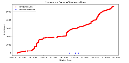
To get into specifics, here is an example plot of a real user’s review activity.
Let’s break it down. This plot follows the activity of a single user over the course of several years. It plots the total amount of reviews that they gave (in red) and also the total number of reviews that they had received on their fan fictions (in blue). What this chart shows us is that this is a user who has had a very consistent amount of activity in terms of giving out reviews. It also captures spikes in the number of reviews received (blue) which may correspond to having released a new chapter.
If there was a strong link between reviews given and reviews received in either direction, we would expect to see that increases in one is followed by increases in the other. Here is an example where we witness such a relationship:
Since it is harder to analyze the change in activity level from these cumulative plots, we then looked at the total number of reviews given each month. Here’s what that looks like for the same person:
This time, it is more apparent that there is a similar pattern in the activity behavior for the reviews given and reviews received. For this example, that similarity is a similar spiking pattern.
From Vigen’s website, we could naively apply a correlation calculation here, but there is a glaring flaw: one of the time series is clearly ahead of the other. So, what if we just shifted one of the time series so they overlapped and then computed the correlation? This is the basic intuition of serial correlation: we apply a range of possible shifts and then compute the correlation between these shifted graphs. The one with the highest correlation would be the one with the best match.
The results for different shifts:
The best shift of “11 frames”:
In other words, for this person, giving a lot of reviews correlates well with receiving a lot of reviews roughly 11 months later. Of course, this doesn’t prove any sort of causation, but we can speculate that the increased amount of reviews this user gave helped boost the amount of reviews they got later!
From this analysis of an individual person, we were curious how this extended to the larger community to see if these same trends existed! The short answer, “eh, not really,” but it is interesting to see why this cool pattern might not generalize adequately.
1. Not all individuals get reviews and give reviews at the same scale
Some users just like to give reviews and some users just like to write reviews!
For instance, here is someone who gives a lot of reviews and didn’t get many themselves.
Here is someone who gave some reviews, but then focused on writing stories and received a lot more reviews instead!
For graphs like these, it is hard to apply the analysis we did earlier because the relationship is likely a lot weaker or there might just not be enough data points to capture it anyway.
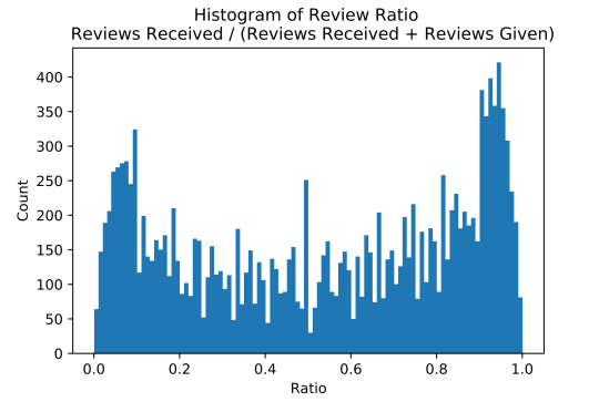
We can summarize these examples for the overall population by looking at the ratio between reviews given to reviews received.
For this sample of 10k users, we see that those who primarily receive reviews will have a larger ratio (right), and users who primarily give reviews will have a smaller ratio (left). In more detail, a ratio of 1.0 means that they only received reviews. For example: 10 reviews received / (10 reviews received + 0 reviews given) = 1. For a ratio of 0.0, it means they received no reviews. For each ratio, the graph shows the total count of the 10k users who had that ratio.
To address issue (1), we reduced the scope down to users who had a relatively equal ratio of reviews given vs. reviews received.
Additionally, we pruned for users who had received at least 10 reviews. This way, we would have enough data points to use for our analysis. In fact, this is also why there is a large spike in the 0.5 ratio which consisted of a lot of users who had written one or two reviews and received an equal amount.
With this cleaned up, we also computed the lags on a finer scale–weeks–instead of months since we noticed that months were not granular enough. We computed the most common lags, and here is a plot of the results. This lag is the shift applied to received reviews, and the correlation is how well the two series correlated with each other after the shift. A correlation of 1 means that as one increased, the other increased as well, a correlation of -1 means that as one decreased, the other increased, and smaller values such as 0.8 mean that the correlation was positive, but less strong.
So the result here is both a little messier and structured than we had hoped from our hypothesis, but that’s part of the research process!
To elaborate, in the X dimension, the lag, there isn’t a particular range that was significantly denser than the rest. In fact, if we looked at the histogram, we see something like this:
So we lied a little, it looks like that last lag of +20 weeks looks really popular, but this is actually an artifact caused by the serial correlation process. If you recall this graph:
The red line is the chosen lag at the peak. In this case, the shifting actually peaked, but if we had truncated the graph at 5, it would have simply picked that highest shift.
Not convinced? Here’s the same analytics, but now we calculated up to a lag of 40.
Looks like the 20 bucket wasn’t particularly special after all.
So ignoring this last bucket (and the first bucket for a similar reason), we notice that our histogram matches this noisiness that we observed for the lags.
What does this mean? It suggests that there is no general pattern that can succinctly summarize the larger population, and that we are unable to conclude that there is a common average positive or negative lag relationship between the number of reviews someone has given and the number of reviews that they have received. Some authors sent more reviews after receiving more reviews (positive lags), some authors received more reviews after getting reviews (negative lags), and some authors did not exhibit much of a relationship either way (the first and last buckets which didn’t find a reasonable shift). Although these relationships do exist, the timing was not consistent overall so we can’t say anything about fanfiction.net authors in general.
So…
2. Looking across users, we do not see consistent behavior in a time-shifted relationship between a person’s received and given review count
Even when we look at the lags with the highest correlation (r > 0.7), we see that this even distribution of lags still holds.
In summary, this isn’t the dead end! (With research, it rarely is!) But it helps paint a better picture of the users in the community and why this approach may not be well suited to encapsulate it well. We see that the relationship between reviews received and given doesn’t follow a necessarily time-shifted relationship and that in fact, this shift can go either direction. Try taking a look at your own reviewing trends, and see where you would be located within these graphs! Are you someone who has a positive shift or a negative time shift… or no strong correlation at all?
In the meanwhile, we’re still exploring some other interesting approaches in reciprocity! Stay tuned :)
One of the questions we occasionally get from authors is: “What kinds of submissions get the most reviews?” We think this is a really interesting question and we’ve started doing some exploratory analyses related to the quantity of reviews that authors receive based on a variety of factors. One of the factors that we decided to check out was the number of words in a chapter. We were curious: Would shorter chapters get more reviews because they might take less time to read? Or longer chapters because there is more for reviewers to dig into? Or maybe there’s a sweet spot somewhere in between?
Methods
To look into this we took a random subset of 10,000 authors from FanFiction.net with chapter publications over a 20 year period from 1997 to 2017. We then created a scatterplot with each point being one of these 10,000 authors, the x-axis showing the median number of words across their published chapters, and the y-axis showing the median number of reviews received on those chapters. The points are segmented into six groups based on percentile of the total number of reviews received on all chapters they have ever published. We then put trendlines in for each of these segments, so we can more easily observe if there are any relationships between chapter length and reviews received across each of these groups. We also performed this analysis at the chapter with similar findings. The results are preliminary and warrant further exploration, but we’ll share what we’ve found so far.
Results
It turns out that the small number of most highly reviewed authors in the top 1% saw an increase in reviews received up until chapters of almost 5,000 words in length, at which point their chapters began to receive fewer reviews on average.
For those authors whose works are in the top 25% of reviews received (excluding the top 1%), as chapter length increases, the number of reviews received on those chapters does as well. Interestingly, there does not appear to be the same drop off in reviews received for longer stories for these authors as there was for the authors in the top 1% of reviews received.
On the other hand, the remaining authors whose chapters are less highly reviewed saw little change in the length of chapter published with the number of reviews received.
Conclusion
These preliminary results point to some interesting potential implications on how an author might be able to get the most reviews. For the most highly reviewed authors, shooting for a chapter of around 5,000 words in length is most likely to result in the highest levels of engagement. However, for the vast majority of authors, writing longer chapters is not likely to have a negative impact on engagement from reviewers, and may even result in more reviews.
How about you?
What are your experiences with receiving or providing reviews based on chapter length? We’d love to hear whether this is a factor that motivates you or something that you consider when writing or reviewing!
The fanfiction community is huge and growing. It’s an intricate network of authors, reviewers, and readers contributing to the creation of some form of contemporary culture.
At the University of Washington, we are a group of researchers studying the fanfiction community and exploring the informal learning taking place there.
We were particularly interested in authors who are user-favorites on Fanfiction.Net. When a user favorites an author, there are certain characteristics of the author that the user finds intriguing. It could be that the story is very interesting or the style of writing of the author fascinates the reader. We aim to find which authors have been favorited the most and what factors correlate with a user favoriting an author.
This blog post explores the connection between users (in a particular fandom) and the authors that they have favorited on FanFiction.net. We us a metric to measure this relationship and try to find out how it correlates to other factors such as:
Number of stories and chapters published by the authors
Number of reviews received for the published stories
Total number of words written by the author
Number of favorites received
In our analysis below, we have used the PageRank algorithm on authors in the “Game of Thrones” fandom on Fanfiction.net. Each author has at least one favorite author, and we have exploited this detail for our analysis.
Motivation
Both of us are huge Game of Thrones fans. The exciting season 8 finale and the massive popularity of GoT on social media motivated us to explore this fandom. Our current goal is to analyze authors that have been favorited by users, and which features might have earned them favorites in the GoT fandom on Fanfiction.net. This analysis can pave the way for building a recommendation engine for users on Fanfiction.net.
Dataset
Our dataset has been scraped from Fanfiction.net. For the analysis, we used two primary tables - Story and Author_favorites. The ‘Story’ table contains data about the stories - including but not limited to a unique story identifier, user id, fandom id, number of reviews, number of followers, and so on. The ‘Author_favorites’ table contains data about the users and their favorited authors. Because the data in these tables were humongous, we limited our scope to the Game of Thrones fandom. We used a cluster of the data by only retrieving the data that consisted of stories written in the “Game of Thrones” fandom.
The dataset we used was formed by combining the User Favorite table, Fandom table, and Stories table. This gave us a table consisting of User IDs and their Favorited Author IDs, both belonging to the Game of Thrones fandom on Fanfiction.net.
Method and Process
PageRank is a billion-dollar algorithm which made Google what it is. Whilst the most popular application of PageRank is web search, it can be exploited in other areas as well. The web is a gigantic graph interconnected by the web links. And PageRank assigns a score of importance by calculating the ‘inlinks’ to a website. In our case, we have considered the dataset of users and their favorited authors as a form of a graph: Many users favorite authors and these users could be authors themselves who have been favorited by other users. Hence, every author will have none, one or more users who favorite them. And thus we can assign a score of ‘connectedness’ to the authors by using PageRank.
A visual representation of the graph is shown below. The blue dot at the center represents a user and the yellow dots represent the favorited users as well as the favorited users who have favorited other favorited users! When there are no out-links, the graph stops traversing.
Fig 1. Network of a user (of highest pagerank) and his/her favorite authors. Blue dot represents the user with highest PageRank and yellow dots are favorited authors
This graph shows the ‘connectedness’ amongst fanfiction authors. Now we attempt to determine which characteristics (features) have a good correlation with the PageRank score that we obtained. In simple words, we try to find out how closely related the PageRank score is with characteristics such as ‘number of reviews’, ‘total words written by the author’ and so on. How can this be done?
A simple way to do this is through Linear Regression. In linear regression, we plot the features against a single response and try to explain the relationship through a straight line. We are conducting our regression analysis by using metrics which depict an author’s output (quantity):
Total words written by authors
Number of stories and chapters published by the author
And those depicting the recognition received (quality) by the author in the form of:
Number of reviews received
Number of times the author’s stories have been favorited
The intuition behind our analysis is to discern if there is any correlation between the PageRank scores which is obtained through network analysis and the above-mentioned metrics.
Findings and Results
PageRank Distribution
The histogram below shows the distribution of PageRank scores. As expected the histogram follows the Power Law which means a small number of items are having high page rank scores while the majority of items is concentrated towards minimum scores.
Due to the nature of our distribution, we decided to strip off all the authors having a score above 0.5, as clearly they are outliers and may not represent how the majority of the community behaves. In fact, there is a possibility of authors with high page rank scores skewing our results.
Regression Analysis
The graph below shows a plot of PageRank score against total words and the line denotes the amount of correlation between the two. A positive slope indicates a positive correlation. Please note that even a slight increase in the PageRank makes a big difference. We can safely discern that as the authors increase their output, their score improves.
The second metric we used to measure an author’s output is Story-Chapter product which is the number of stories multiplied by the number of chapters. The reasoning behind multiplying both is that author adopt different styles for structuring their content. One author may have a story with multiple chapters, another one may write multiple stories with one chapter each. The plot below depicts positive correlation yet again.
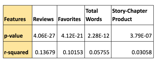
Running regression over other variables yields the following output:
Our initial assumptions were correct and the features we selected are all indicators of a good PageRank score. However, which one of these is the best predictor?
Enter p-value. P-value helps to determine the level of significance of our results. In statistics, a p-value <0.05 typically indicates the trend is statistically significant. P-value only helps to infer significance which means all the variables we included in our study are important predictors for the page rank score. What p-value does tell us is how important these variables. To know which feature is better predictor, we use another metric called r-square. R-square helps to know the degree of correlation between two expected output and the actual output. It is conceived in terms of percentage.
The p-values obtained for the above features are as follows:
Based on our analysis, it’s safe to conclude the number of reviews received by the author indicates a higher probability of that author being favorited often.
Conclusion
In our analysis, we used four features, two of which Total Words and Story-Chapter product indicate the output (quantity) of an author while the other two; the number of reviews received and number of times the author’s works have been favorited indicate the quality of an author’s work. These features have been plotted against the page rank score which indicates the degree of an author’s presence in the community. Through data science and statistical analysis, we were able to discern that the quality of works and feedback received by an author is a better indicator than the output.
Future Work
Our analysis can help pave the way for a recommendation engine for new users. This recommendation engine would leverage the PageRank algorithm to recommend authors to a user which he/she would most likely favorite. Just like Google and Amazon recommend products to users, our recommendation engine would suggest authors for users depending on the fandom they like. To build a recommendation engine as effective as Google or Amazon would require tons of optimization and fine-tuning, hence we have kept this as future work for this project.
As for fanfiction enthusiasts ourselves, we want to connect with the community so that they can help us in our analysis. Inputs from the community are always encouraged as this would help us make a better recommendation engine. So please comment on your views on the following questions:
What would you like to see recommended? We aim to recommend the Authors, but are open to suggestions!
What parameters do you think would affect the action of a user favoriting an author? Do you think it’s just the story or could it be the number of reviews, genre or style of writing? Comment below! Our analysis indicates the number of reviews, however, it will be interesting to see if our analysis is aligning with what the community thinks.
Hi! I’m Ruby, and I’m part of a group of researchers studying fanfiction communities through the University of Washington’s Human Centered Data Science Lab.
In November of 2017, we sent out a survey to all of you to learn a bit more about what motivates folks to participate in fanfiction communities, what kinds of activities you all participate in, and where your communities are. It’s been a hot minute, but I finally have some results to share!
We were absolutely blown away by your enthusiasm filling out our survey. We got a total of 1,888 responses from all over the world, which was way more than we ever could have imagined. Thank you all so much!
In this blog post, I’ll give a quick overview of participant demographicsand fan experience data. Then I’ll finish off with a preview of a few more blog posts to come!
Demographics
Survey participants’ demographic information matched well with previous fanfiction community censuses. (1,2,3,4) If you’re familiar with fandom spaces, this section shouldn’t be too much of a surprise.
Gender
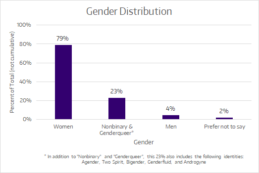
The following chart represents the gender distribution of our participants. These percentages are not cumulative! Participants could check as many identities as applied to them.
Gender identities that fall under the nonbinary and genderqueer umbrellas were aggregated for the purpose of this chart, but a comprehensive distribution will be shared in a more robust demographics post later on. Stay tuned!
Age
The age distribution of participant was pretty typical of fanfiction communities. This chart expresses the distribution as percentages. Children under 13 were excluded from filling out the survey.
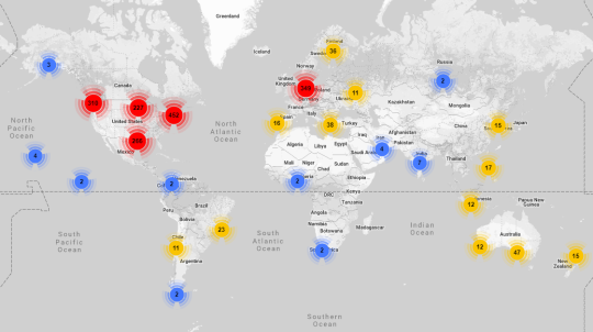
Location
We collected some general location data and found that most of our participants were from the United States and Europe. That said, participants answered our survey from all over the globe. Here’s a map of where our participants were from.
This map was created by aggregating coordinate data into different “buckets” based off of how close those locations were to one another. Each of the colored circles on the map represents one of these “buckets”. Any coordinate within a certain distance from the epicenter of each circle is included in the total displayed at the center of that circle.
To put that in context, the red circle over Germany doesn’t mean that there are 349 participants from Germany—it means that there are 349 participants from various locations around Europe, with the center of that bucket being located in Germany.
Blue circles represent buckets of 10 or fewer participants, yellow circles represent buckets of 100 or fewer participants, and red circles represent buckets of more than 100 participants.
Fandoms
Participants represented a great spread of different fandoms. Keep in mind that these results are from November 2017 through January 2018, so the fandoms represented in this word cloud are the ones that were popular among participants a year ago.
This word cloud only includes fandoms that were listed by ten or more participants. Although we did combine synonyms of fandom names (e.g. BNHA, My Hero Academia, MHA, etc. are synonyms of Boku no Hero Academia) we did not do any “meta-categorizing” (e.g. making Boku no Hero Academia a synonym of “Anime”). Therefore, the only fandoms included here are ones that were listed explicitly.
Fan Experiences
The biggest part of our survey delved into the activities that people in fanfiction communities participate in. We’ll give some more in-depth analysis of this data later, but for now, here’s a taste.
Personal History
First off, let’s talk about experience in terms of time. The following chart shows how long participants have been involved with online fanfiction communities.
Please keep in mind that each of these brackets are different sizes. The first bracket, “1 - 2 years”, represents only a 2-year span, while the fourth spans 10 years.
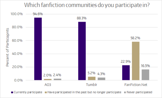
Which Fanfiction Communities?
Fans who filled out our survey were mainly based on tumblr and AO3, and most had used FanFiction.Net in the past. This is good to keep in mind, because the results from fans who favor other communities—say, Wattpad—might look very different. There is no one monolithic “fanfiction community”.
Activities
A significant portion of our survey questions asked participants to indicate how often they do various fanfiction-related activities. Although the complete list of activities was a lot longer, for this first overview post we’re just going to focus on three: reading fanfiction, writing fanfiction, and commenting on fanfiction.
Unsurprisingly,reading fanfiction was the most popular activity among our participants. About two-thirds of participants read fanfiction every day. Only 5 participants (0.3%) indicated that they’d never read fanfiction.
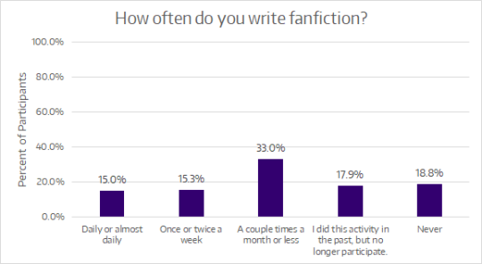
As for writing fanfiction, the distribution is much more even across the five frequency options. About a third of participants write fic at least once or twice a week, while another third write fic more infrequently (a couple times a month or less). The final third had not written fic or were no longer writing fic at the time of the survey.
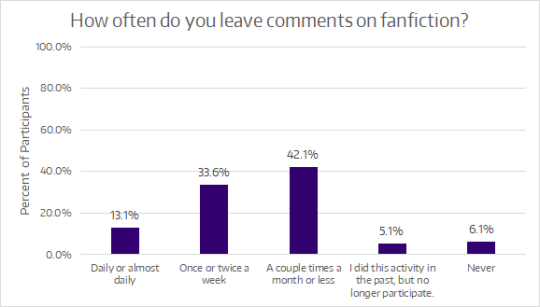
Leaving comments or reviews on fanfiction was a fairly ubiquitous activity. Nearly all participants (88.8%) reported that they do at least occasionally leave comments or reviews. Almost half of participants (46.7%) left comments at least once or twice a week.
What’s Next?
Now that I’ve shown you all a sample of the results from the survey, what else is there to see?
In the coming months, my research team and I will continue to post about additional findings from the survey results. Some of these posts may cover topics such as:
Demographics and activity information by fandom
Comparing age and different activities in fanfiction communities
Expanded demographic information, especially for gender
In addition, we have a significant amount of data from long responses to our survey question, “What motivates you to participate in fanfiction communities?” Participant responses were incredibly rich and detailed, and there’s a lot of fantastic information to draw from them.
For now, that’s a wrap! Thanks for taking a look at our results. If you have any questions or want clarification on any of the data shared here, please don’t hesitate to reply to this post, reblog with a comment, or send an ask. I’ll be happy to clear up any confusion, if I can.
May the force be with you all,
Ruby Davis Human-Centered Data Science Lab University of Washington
Hello! We are researchers at the University of Washington Human Centered Data Science Lab, where we study fandom and fanfiction communities in order to better understand how people interact and engage with others in online environments. We’ve built a survey, and we’d love you all to participate!
All parts of this survey were approved by the University of Washington Human Subjects Division Institutional Review Board (IRB) to ensure the protection of your rights and welfare as you take this survey.
Anyone 13 years old or above can participate. You may stop participating in the survey at any time. Your responses will be kept confidential, although we will publish aggregated results. Also, we’ll ask if you are interested in a follow-up interview.
This survey will ask you about your participation in fanfiction communities. You will also be asked some basic demographic questions at the end of the survey. The survey contains 11 to 13 questions in total depending on your answers. You are not required to answer every question.
For questions about our research, send us an ask or contact Ruby Davis at [email protected].
Sometimes you look at a chart and it just makes sense, and for me it was this wonderful visualisation of the Sherlock fandomby@fffinnagain that came across my dash the other day. Full disclaimer - I didn’t even read their full post, but I think this is one way of looking at the data that speaks multitudes for itself.
Take a look here and tell me what you see!
I’ve divided the “waves” here into a few categories - “On Air”, when ATLA was airing for the first time, “Pre-LOK”, the time between ATLA and LOK, the “LOK era” which is self-explanatory, and then every year individually after that. A creator is assigned into a wave based on the date of their earliest fandom work (due to the way AO3 works, this isn’t always the date they published their first work, but rather the date this work was last updated).
Once the creators are assigned to their groups, the colors are used to track any additional works they produce in the fandom. Such works are counted up per month, which explains the small local variations in these waves. I’ve marked a few key dates on the graph as well - one or two of which might explain the 2020 boom ;)
The ATLA Renaisance of 2020 brought almost 10x the amount of new creators to the fandom as any other year! How many of these fanwork creators will be around in a couple years? Well, judging from previous waves, it does seem that contributions from creators who entered a fandom die off to a trickle come the next year. The bunch that entered during the LOK era seem to still be contributing consistently however, and there’s a definite resurgence of the OG fans coming back to the fandom, as you can see from the little blue-purple bump in the year 2020.
We’ll have to wait and see if the new fans are here to stay - but for now we can enjoy the wonderful content they produce!
Let’s take a look at the next-gen Avatar fandom, too. Overall there are far less works in the Legend of Korra tag, although its release on USA Netflix has given it a popularity boost as well - one that’s even bigger than the one it got from the landmark series finale.
I’m interested in eventually examining the crossover of creators between these two fandoms, to answer questions such as: how many creators participate in both fandoms, and of those, what’s the fandom of origin and the lag between the crossover?
Anyway, for now, tag urself I’m a 2019 ATLA baby, and I still can’t believe I’ve never written a stand-alone for LOK (side-eyes my fanfic drafts folder).
Want to zoom in yourself? I’m hosting the interactive charts here on GitHub Pages, but I’m pretty sure I’ll surpass the storage limits soon, so be sure to take a look before they get replaced by new ones!
Nice to see another implementation of the creator waves analysis! That blow up with the US Netflix release of ATLA is increadible! Also love the interactive graphs, should those up myself!
btw: I usually report the number of creators active per interval rather than the works by them to lessen then bumps related to drabble challenges and the like. (And this is probably the post you saw with creators waves, not the older post linked.)
Sherlock fans, new and old, click below to read a long list of graphs and comments about our communities fanworks over the last 10 years. I scraped AO3 again and demonstrate that:
More creators are writing longer works in 2020
Readers engaged more as the fandom changed after S4
Top ten new tags per year for the last 10 years
And a lot more.
PS the code to gather this data and analyse it can be found way over here.
Activity over 10 years
The last 10 years in the BBC Sherlock fandom have been tumultuous, but this community persists, with engagement from new fans and continued creative output. To commemorate over a decade of squee, I’ve done another scrape of the fandom’s imprint on the Archive of Our Own and will share some insights from the numbers in these plots. A very late update on my post S4 snapshot from 2018.
Note: This analysis is of completed public fanworks only, about 101000 of the 122000 Sherlock (TV) works available at present. This is to remove the late WIP effect, which adds a bulge to the last few months, and out of respect to creators who wish to have their material reserved for other registered AO3 users.
The works are still coming
Counting the number of works posted per day, we can see the peaks associated with each series airing (in UK and US). After that, the number of works continues fairly evenly, 20-30 per day, plus seasonal peaks. This rate is continuing on without a hint of new canon in sight. So who is posting all this work?
Creator-waves, monthly output
Years ago I started plotting creator waves, basically I group fanwork producers by the year they first posted to the fandom and then count how many of this group are active in later time intervals. This lets us get a sense of how long people are contributing and whether new fans are getting the urge to create.
This plot of the Sherlock (TV) fanworks on AO3 shows the standard shape of plump participation in the first year of any given set of creators, followed by a slowly thinning tail as they because less active over time. Turnover is natural in fandoms, with most only posting a work or two within a fairly limited amount of time, while a precious few persist for years. The surprise for me here is that the ratio of new creators is higher in 2020 than it was in 2019. Maybe the excuse of lockdown encouraged more folks to take a turn at creating content.
Another way to look at the output of fan creators on AO3 is to see the total amount of words being shared across all fanworks. The total has been pretty close to 300-400k words per month since 2018! To get a sense of what that means per work, I also plotted the median number of words per fanwork in these monthly sets. The median in higher in the last year than it had been staying for a while.
Reader behaviour: Hits & Kudos & Comments
Fan creators are only part of the story. Stats on engagement are a bit trick to interpret, I’ve got some plots here that tell us something about how works have been engaged with over time.
The obvious first to consider is Hits. Above is the total number of Hits given to works published each month. This is the current totals, not a historical snapshot, so we have a very strong bias towards early works, what we might call the Classics Effect. Works that have been around longer have had the chance to be seen by more people, and in particular those works that become must-read classics in a fandom, extending their exposure through prominence in top ranked works and recommendations.
To cut down on the advantage of the classics, we can also consider median hits per work for each month. As most works get a lot attention when they are first posted and then fade out of sight, the median number of hits reflects instead the ratio of readers to creators, basically how many eyeballs are around to look at the latest work, regardless of status. The median plot shows how the hyper-visibility of the few work available before 2012, and then a more steady curve once the fandom had gotten established on the platform after Series 2. Amazingly, the hit rate for the median work was steady through the big bumps in activity with later series, a 1000 hits for median works between 2013 and 2018, followed by a slow decline. I’d expect the 2020 works to continue gaining for a few months yet, but the median is probably 50-60% of what is was when the show was in production.
Kudos counts and medians show a similar story to hits, but there is a dip down around 2013 for kudos reflects the frenzy of productivity that saw the fandom grow during the Series 2 hiatus. Readers were getting spoiled! From the airing of Series 3 (2014) until a year following Series 4 (2018), the median work received an even 60ish kudos and 1000 hits, a niche audience that decreased to 50/750 through 2018-2019. The numbers of 2020 suggest a smaller community of readers again, though these numbers may still rise a bit in the next few months before the median works are forgotten.
The statistic that tells a different story is Comments. Looking at the total comments counts, there isn’t a drop after Series 3 (2014). Instead, the fandom compensated for changing numbers with more feedback and discussion attached to works. This is reflected in the median comment rate as well, which shows seasonal variation but doesn’t really drop off until 2020.
It’s remarkable that without fresh canon we continue to have new creators contributing to the fandom, and while that may be outpacing the readership somewhat, the standard of engagement has been very high. One could say the fandom is chugging along quite nicely!
What about Tags
So, with all that turnover and shifting population, is there a change in the kinds of works being posted? We can look at tags, all tags and freeform tags, to see if there were any meaningful trends.
First up, I did a creator-wave like analysis of works just for tags, to see how tags continue to be used after being introduced. Unlike the creators, tags clearly persist for years. After 2015, it looks like the core tag set has been established, with very few tags persisting in usage per subsequent year.
This graph reports numbers over time that are not proportional to the number of works or creators active. Instead, works on AO3 have been getting more and more tags over the years, with the average steadily growing from 5 in 2011 to 15 in 2020, with freeform tags (not characters or ships) from 2 to 8.
To get a sense of fic and tagging culture changes over time, I counted the most popular NEW tags of each year (wave). Note: this analysis is using exact matches, not the networked associations of tag meanings wrangled into AO3 today, so some things that pop up aren’t new concepts but instead newly popular TAGs for whatever they represent.
2011: 2752 (First year, so all solid stuff, tags that continue to be popular forever)
Angst 323
Fluff 232
Humor 216
Hurt/Comfort 188
Romance 168
Friendship 168
Crossover 138
Crack 121
Alternate Universe 119
First Time 106
2012: 11637 (still early, first references to Series 2)
Fluff and Angst 145
Episode: s02e03 The Reichenbach Fall 97
Kid Sherlock 54
Puppies 50
Sad 48
Episode: s02e01 A Scandal in Belgravia 47
Mathematics 42
Season 2 spoilers 38
Omega Verse 38
Feels 38
2013: 16176 (Omegaverse nomenclature is growing, Top/Bottom terminology, new challenges)
Alpha Sherlock 65
Omega John 61
30 Day OTP Challenge 59
Tumblr: letswritesherlock 56
Top John 49
Sherlock Holmes Returns after Reichenbach 44
Bottom Sherlock 40
Reichenbach Angst 30
Don’t copy work to another site 29
Age Regression/De-Aging 27
2014: 19256 (Mostly Series 3 related
Episode: s03e03 His Last Vow 249
Episode: s03e02 The Sign of Three 167
Post-His Last Vow 149
His Last Vow Spoilers 142
Sherlock Series 3 Spoilers 128
2000 AU 100
The Sign of Three Spoilers 74
Fatlock 72
Post-The Sign of Three 66
Post-Season/Series 03 57
2015: 14272 (New challenges, new prominent Sherlolly tags)
Chats 47
International Fanworks Day 2015 34
Watson’s Woes July Writing Prompts 2015 27
S3 referenced 25
Sherlock Holmes/Molly Hooper Kissing 22
English Accent 22
Sound cloud 19
Eventual Sherlock Holmes/Molly Hooper 19
Protective John Watson 18
but not that kind of graphic 17
2016: 13517 (New stylistic tagging, TAB references, a lot of epilepsy?)
Slowwww burn 92
John Watson Loves Sherlock Holmes 37
Sherlock Holmes Loves John Watson 33
post-tab 30
JME 27
Post TAB 25
Juvenile Myoclonic Epilepsy 23
Sherlolly Appreciation Week 2016 19
epileptic 19
fraternal love 17
2017: 15067 (Series 4 tags and challenges)
Episode: s04e02 The Lying Detective 133
Episode: s04e01 The Six Thatchers 93
Post TFP 73
Sherlock Series 4 Spoilers 69
Episode: s04e03 The Final Problem 60
Post-Episode: s04e02 The Lying Detective 55
Sherlolly Appreciation Week 2017 50
Post S4 48
Sherstrade Month 2017 44
31 Days of Porn Challenge 2017 41
2018: 10733 (Lost of new challenges, seasonal and weekly)
Towel Day 2018 64
Mystrade Valentines Calendar 2018 25
Kinktober 2018 23
Pregnant Molly Hooper 23
Soft Smut Sunday 23
Tom Robbins 23
Sherlolly Appreciation Week 2018 21
Inktober 2018 20
established universe 16
Always1895 16
2019: 7785 (More prompts, and character attitudes)
Sherlolly Appreciation Week 2019 25
221B Autumn Challenge 21
A-Z Christmas Prompt 19
KatsJohnlockXmas2019 16
Whumptober 11
Poor Greg Lestrade 11
Kinktober 2019 10
Dissonance 10
John Watson is a Good Friend 9
Sleepy Sherlock Holmes 8
2020: 8074 (Not all COVID related, thank heavens)
Mystrade Monday 59
COVID-19 48
Coronavirus 46
Mystrade Monday Prompts 40
Whumptober 2020 36
warning for a covid-19 setting 33
Flufftober prompts 2020 24
Do Not Translate 24
they’re all right they’re just at home 23
Granada Sherlolly 21
A little note from looking across all freeform tags, not just the new ones, we see a curious pattern with regards to two actions: First Kiss and Anal Sex. They appear amongst the most common tags as of 2014, neck in neck for two years, than Anal Sex drops off the top ten in 2016. From there out, First Kiss stays in the top 5 from that point on, while anal sex appears at rank 9 from 2017-2019 and is gone again in 2020. This probably says something about the fandom, somehow.
Bravo for making it to the end and thank you for reading!
I’ve had a bit of fun collecting data for the WoH fandom on AO3 and made a few charts to visualize what I’ve found.
I have only looked at works that have been tagged as belonging to the Word of Honor (TV) fandom. I’ve not excluded works with TYK or Qi Ye tags, but I’ve not included works that only have those tags. I collected all my data on the 10th of April 2022.
The total number of WoH fanworks is 5149, which translates to 0,057% of the whole archive.
You might want to click on every image to get better resolution.
Timeline
First we have the timeline. Because I’m lazy I looked at the number of works per month by using AO3’s filtering to limit the works in the WoH tags to a specific month. I know that AO3’s filter isn’t always 100% reliable, but for a simple overview I think this method of data gathering works fine. I did not include the 130 works published in april 2022, since April is not over yet.
What this tells us is that May 2021 was the most productive month of the WoH fandom, so far. This is not surprising as the final was released May 5th. Since then we’ve had a bit of decline in works published per month, but February was as “productive” as November last year.
After a year away, I can now present the 2019 AO3 Ship Stats Top 100!
This list shows the 100 pairing tags with the most fanfics posted on Archive Of Our Own as of July 24 2019. There are 69 M/M pairings, 19 F/M, 3 F/F, 5 Gen and 4 Other. (Please note that on AO3, ‘Name & Name’ indicates platonic or familial ‘Gen’ relationships, while ‘Name/Name’ is used for romantic and sexual pairings.)
Of the 200 names on the list, 25 belong to women and 4 to characters of indeterminate gender, compared to 28 and 3 respectively in the 2017 list. There are 46 POC and 8 racially ambiguous characters, compared with 41 and 10 last year.


 AO3 stats!Sherlock fans, new and old, click below to read a long list of")


