#fashion show
Milan Fashion Week - Days 3 & 4
Day 3
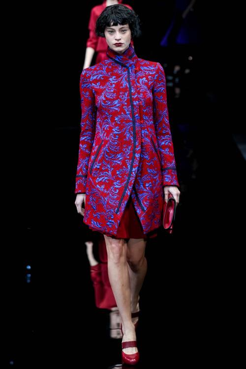
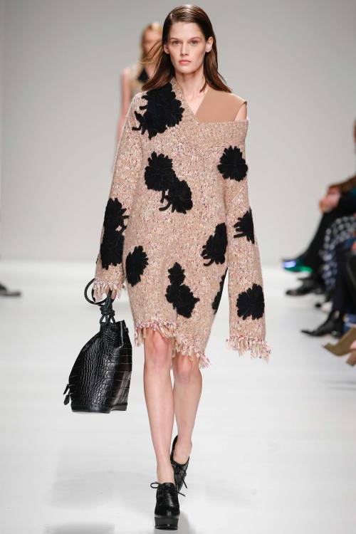
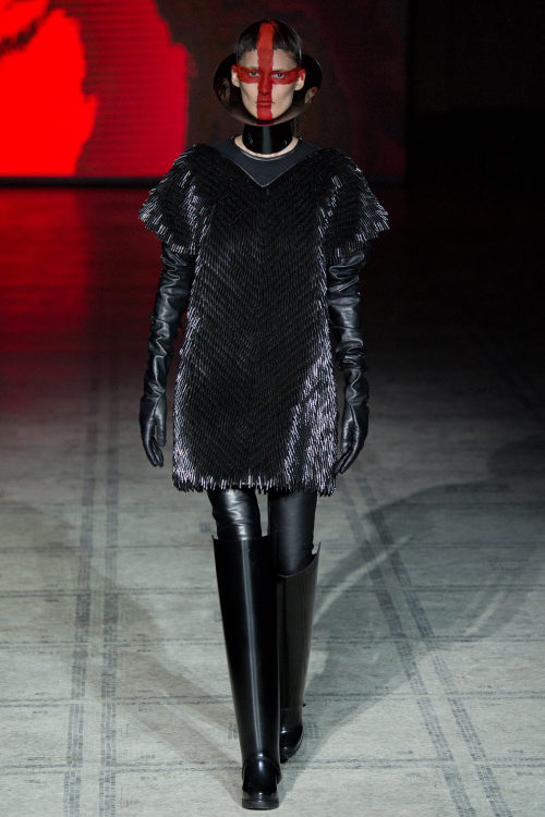
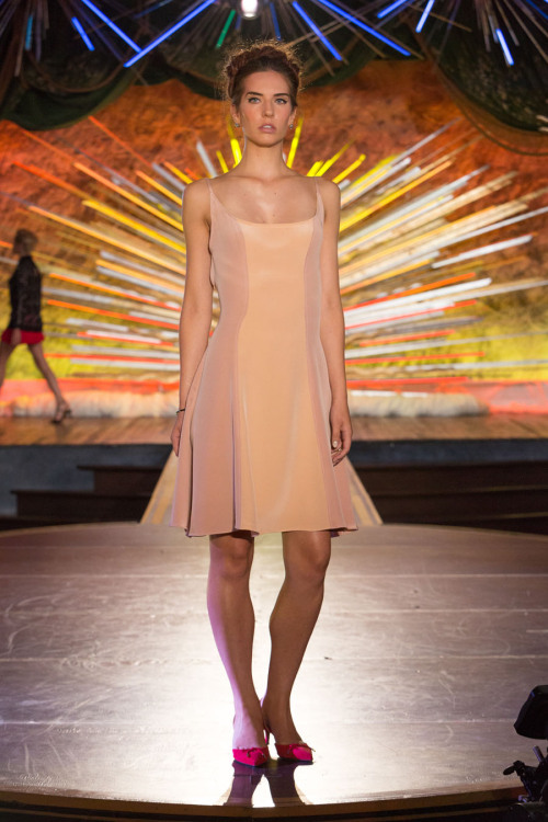
I start my review with Emporio Armani (photo 1), with a slight inspiration coming from Asia, with lines similar to the kimono translated into Armani language. Maxi-buttons were placed on the side, shiny silk brocades gave a little light to the looks, ruffles everywhere and just one very bright colour, red, together with grey and black. Sportmax (photo 2) always finds a good compromise between wearability and fashionability. It was great because the details that made the clothes simple made them also remarkable: the raw cuts of the little dresses, wool in neutral shades used for the beautiful coats closed by just one string, straight lines and basically no decorations at all.
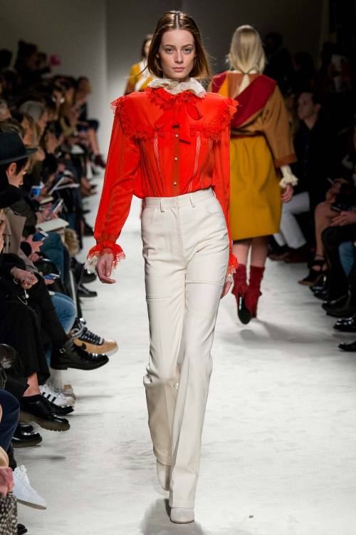
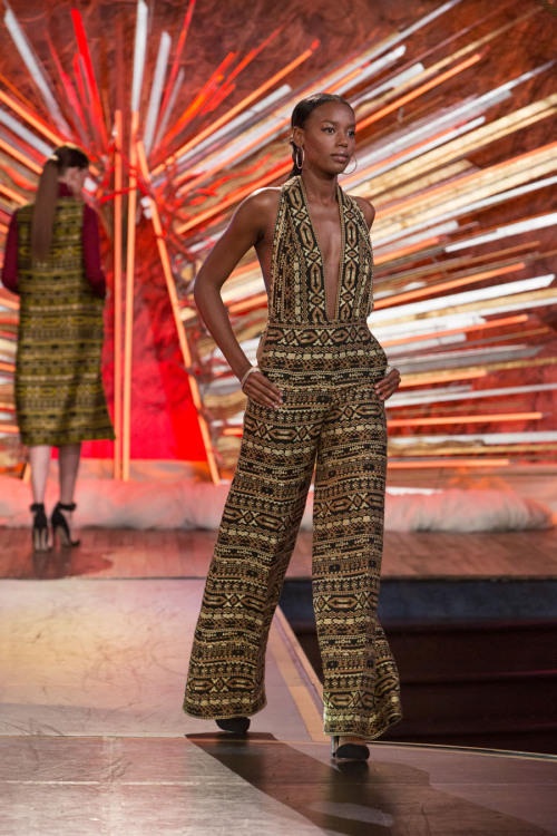
This time I didn’t like the prints in Etro collection - guess in some cases it reminded me of Desigual, which I hate - but I recognise this is a matter of taste. It wasn’t a bad collection, but overall that’s the problem: it was just nice. Too many dresses looked as the same, the only successful ones in my opinion being the ensemble top + trousers and the ones in the shiny tones of gold. Iceberg (photo 3) was instead a grower for me. It started looking like another ‘normal’ collection but it wasn’t: when you start noticing the three-dimensional quality of the few prints, or the focus on the extremely tight waist, with high-waisted sort of trousers which are maybe more leggings than pants, in neutral tones, or the wool multi-coloured skirts paired with immaculately made white blouses, well, it wins you over.
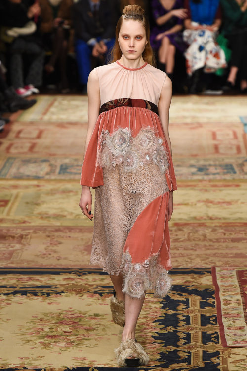
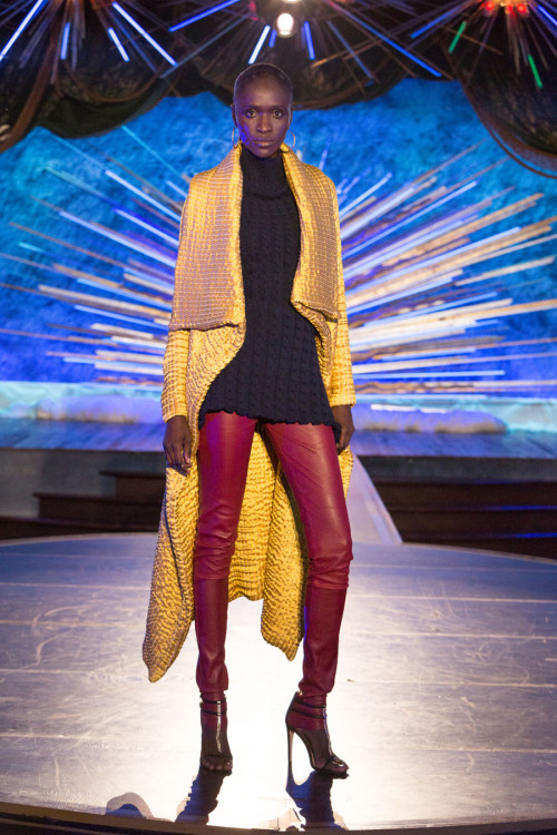
How I like experimentation with fabrics! The great strength of Marco De Vincenzo’s collection (photo 4) was, first of all, the extremely wide variety of materials: there was leather, sheepskin, denim, wool, velvet. And then the interesting manipulation of these materials: criss-crossing in contrasting shades, fringes, fur patchwork. It was a total collection. Philosophy di Lorenzo Serafini (photo 5) had period elements with 70s vibe: the ruffles, the bows, the white lace meets high-waisted slightly flared trousers, chiffon maxi-dresses, bright colours like blood orange, with some much more modern twists - shorts with printed sweaters and tiny jackets in flowery patterns.
There were definitely too many idea in Versace collection. The glam look is becoming old, and the only looks I really appreciated were the black ones with slits revealing slashes of amazingly bright colours: lemon yellow, fiery red. I also save the little dresses with the puzzle of greek prints - signature of the brand - declined in different colours. For the rest, it’s a no no. Bally chose instead classic shapes revisited with a touch of irony: colour blocking, oversize croco trousers, bright accessories.
Day 4
Ermanno Scervino (photo 6) presented a collection which was already successful after the first few white quilted dresses in which the quilt creatively formed a pattern. It then went on with a chain of sophisticated blue looks, with dreamy and romantic shapes. Beautiful the gowns closing the show, inspired by the 40s and still linking the brand to its signature elegant style.
Creativity takes over again at Antonio Marras (photo 7) and the result is always fabulous. Colours veered towards pastel shades, but shapes are much more rigorous and structured: square-shaped oversize coats with prints inspired by abstract and deco art, referencing the beautiful lace used throughout the collection, mixed with velvet or juxtaposed on the other colours to create beautiful graphic effects.
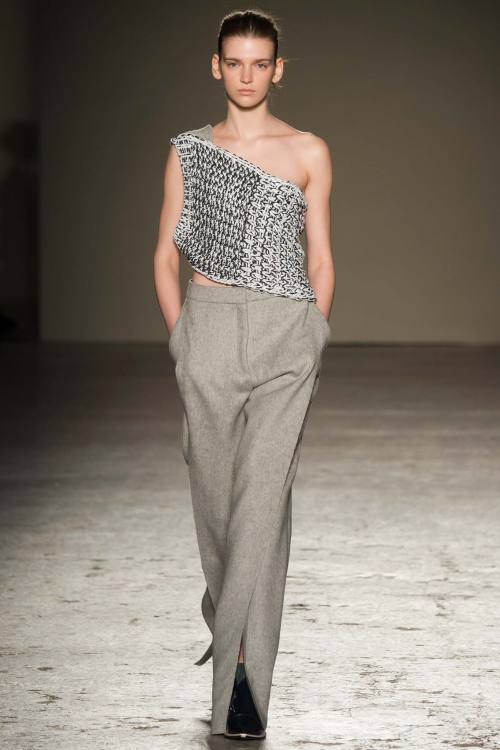
I chose that outfit in the photo for Gabriele Colangelo (photo 8) because it represents, in my opinion, the very core of this amazing collection: a pair of wool blend grey trousers and a simple woven panel as a top. The woven panel was the real fil rouge connecting the whole collection and was present over dresses, coats, trousers, skirts. Wonderful idea that of the insertion of colours in the final part, fuchsia being the main tone. Fur added that little bit of opulence giving character to an already perfect collection.
xxx
Post link
Milan Fashion Week - Days 1 & 2
Milan is currently hosting Fashion Week, and as I’m living there I can tell you: the city breathes and lives fashion! Let’s see together these first two days of fashion week.
Day 1
Genny went sexy this time, with total see-through crossed by lines forming geometrical shapes. Beautiful the white and gold pieces.
Himalaya is definitely Stella Jean’s latest inspiration (photo 1), as we’ve seen in her menswear collection - and she actually translated some of the prints she used for menswear here for this new exciting collection. Useless to talk about print when it’s Stella Jean: that’s her signatur, we know that, we love that. Last season I wished she would change something in her design which was becoming repetitive; now I can say I’m happy with this collection. I loved the puff skirts in plaid, the warm pullovers and the beading made of pearls, little jewels, fringes… I even saw a more sophisticated attitude in her tartan trench coats.
Luisa Beccaria’s collection was about modern Cinderellas, and you could actually feel that romantic atmosphere in these clothes inspired by lady-like shapes and the most classic of gowns and feminine desires: a pale golden long evening gown with no decoration but just its simplicity; cute little caps; chiffon blouses, blingy cocktail dresses.
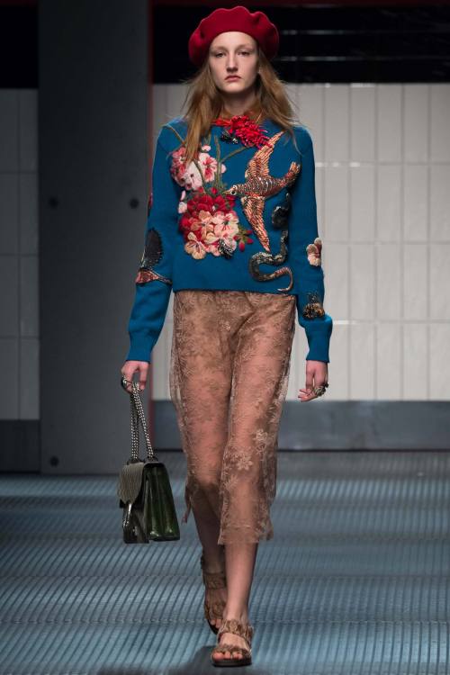
Gucci (photo 2) is still recognisable as Gucci, so we can breathe easy. I admit, after the beautiful menswear collection I saw in January I expected more from the new appointed creative director Alessandro Michele, but there were still many very valid elements. For example, it was slightly more daring than usual: some models were basically walking down the runway with completely sheer ensemble - without wearing bras, of course. It continued on the gender-crossing mission, and some looks could be definitely worn by either men or women. Yet, there was something missing, that je-ne-sais-quoi which still doesn’t convince me completely. But Gucci is on the right track.
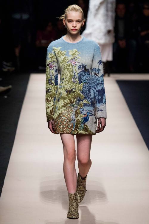
Every designer draws inspiration from the remote past from time to time - Alberta Ferretti (photo 3) did it now. Renaissance was visible in these total white lace looks, or in the brocade-like coats and trousers lightened by golden threads against the black background. I particularly appreciated the white blouses, being the pieces in which the detailing is at the same time the most subtle and the most intricate and sophisticated. I also liked No. 21 collection (photo 4), and the only negative thing I can say about it is that I still need to find that fil rouge connecting the different styles in it. Overall, though, I was completely blown away by the pixeled landscape print and the dozens of ruffles architecturally placed around the body covered by the white coats and jackets looking like white paper.
Fausto Puglisi’s style doesn’t suit me personally, but I recognise the strength in it, a sort of kitsch attitude combining very distant things together, gold and zebra print, elegant shapes and urban style. Francesco Scognamiglio’s show (photo 5) started with extremely simple black silk dresses, and I was already in love. It takes guts to give start to a runway show with extreme simplicity. It kept that way throughout the collection, with some highs of sexiness and sweetness some times, romantic shapes and ethereal fabrics gently and swiftly following the body lines.
The principle ‘sport, sport, sport’ is taking Brunello Cucinelli as well, so much that he decided to match activewear shapes with hyper soft furs for this new collection. And I’m sure this can make a trend.
Day 2
Max Mara proposed effortless looks with effortless shades in effortless shapes: coats lost all the decorations, even buttons were invisible; shades veered towards sand, beige, cream; beautiful the quilted sweater coordinated with the quilted silk coat. Even more basic was the direction taken by Les Copains, yet there was a sober atmosphere which gave space to the very small details: jewel brooches, the soft quality of materials, colours declined in different very similar shades building a tonal architecture which gave depth and structure to the clothes.
Fendi (photo 6) went slightly alternative. Younger and fresher than usual, it started with loud white ensembles in candid leather which lit up the runway completely. It went on with very innovative elements: the duvet of the coats used to create total duvet dresses, maxi-coats with strong shoulders, oversize furs wrapping the body.
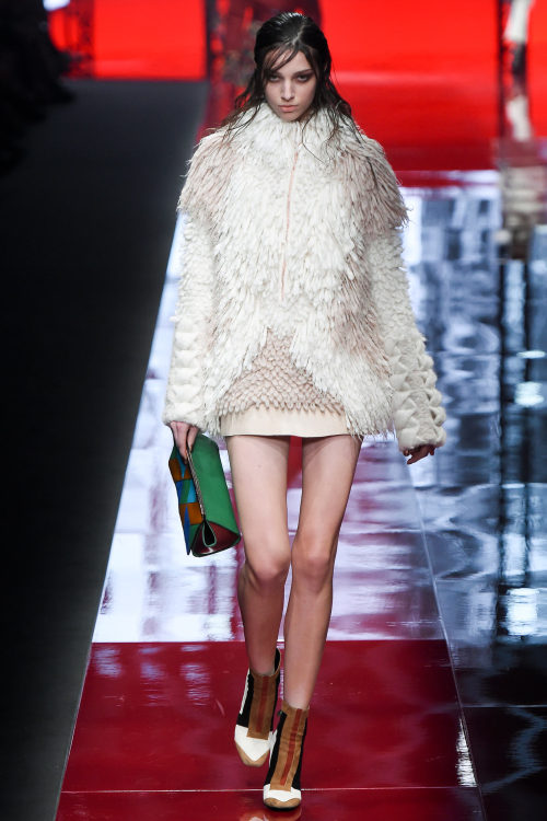
It’s official: I like Roberto Cavalli’s secondary line, Just Cavalli (photo 7). It’s becoming much more polished, elegant and animal prints are disappearing or are translated into something more graphic and less predictable. It was Cavalli anyway: the fur, the feathers, the edgy attitude of his woman, everything was there as proof that you can keep your style without necessarily going tacky. The one thing I loved about this collection was the extreme variety of the offer: there were little dresses in total black, maxi furs, studded jackets, mini skirts…
Miuccia abandoned the black she embraced during last season and for menswear, and she went back to her first love for this Prada (photo 8) collection: colour. And crazy prints as well. Everything looked like being made of neoprene, but then I read Tim Blanks’s review and saw that he missed the 'joke’ as well: it wasn’t neoprene, but double-faced jersey. Magician Miuccia pulled another rabbit from her magic hat. And so she went on, with irony, mimicking tartan and tweed prints, mixing colours, showing that something new in fashion can still be created.
Cristiano Burani presented a cool collection with an edgy and activewear twist: bomber jackets in fur, coloured stripes everywhere, black leather and glossy plastic for mini-skirts. Daniela Gregis knows how to be a conceptual designer without giving up on wearability. Research on cut and colour was central: peek-a-boo elements opening a window on brushes of colours looking like painted on a canvas. Black serving as the contrast against which opposing the whole rainbow.
Byblos Milan opened its show with shocking pink and colour blocking, which could trick you into thinking you were going to assist to an explosion of tones. That was not the case: colours were used to lit up the main shade, which was definitely black. Black made electric by blue, black made bright by the match with the most classic white, black being sexy as pattern on sheer fabric against the naked skin. And then Moschino came. The first looks really made me hope that Jeremy Scott was over the references to pop culture - which I like, but you know, you have to change if you want to stay hot in fashion. Then it started with another of his obsessions: cartoons. This time it was Looney Tunes, but the formula was the same: blingy accessories, shapes and types borrowed from football, basketball, sport in general. But it wasn’t even cartoons: it suddenly went to what we can easily call the new 'mascotte’ of Moschino, the teddy bear. And then graffiti. It was definitely too much - but is it a praise or a critique for a designer whose motto can easily be summed up by 'more is more’? Anyway, my favourite part was definitely this last one: I didn’t even think Scott could be able to conceive such elegant traditional shapes. Reinvented through the colourful graffiti though. Yes, I would have definitely loved to see some more of that, it would have made Moschino collection one of the best so far.
I was in love with Ports 1961 (photo 9) as soon as I saw the first photo of this new collection. After that, I couldn’t get over it anymore. Beautiful the grey ensemble with the maxi-knot in front, being the detail which turned around a whole look. And then it went on with ethereal fabrics, looking like made of nothing, the beautiful draping of some gowns - bravely paired with slippers - decoration to the minimum: even the simplest thing can look great.
Marcelo Burlon County of Milan closes my first review for MFW, and I can say alternative futuristic fashion lovers have found their guide in Milan. Everything was over-the-top without being bad taste: graphic prints, silver fabric looking like space suits, exaggerated proportions.
xxx
Post link
London Fashion Week - Day 5
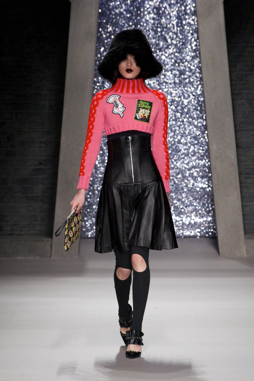
Few collections on this last day of London Fashion Week, but the overall level is not lower than the past few days. Rock'n'roll met feminine sweetness in Ashley Williams’s collection (photo 1): leather was topped by shocking pink pullovers or soft furs, and patches applied to total black dresses and jackets gave an ironic reading of the figure of the rockstar. Irony wasn’t missing in Anya Hindmarch’s collection (photo 2). The designer took street signs and introduced them into her clothes. Vibrant prints matched loose-fitting jumpsuits paired with high stiletto boots which elongated the figure.
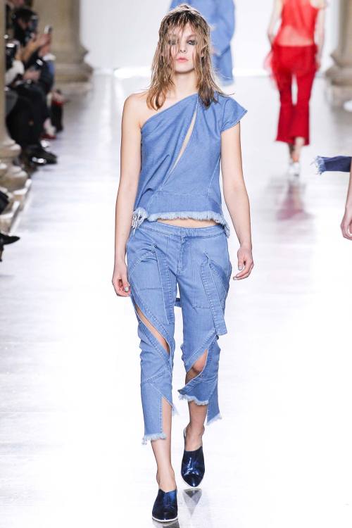
I’m realising I love denim manipulation. For this reason I couldn’t help loving the collection by Marques'Almeida (photo 3), where clothes really looked like they were ‘lived-in’. Fabric was the protagonist, but not only denim: there was jersey in grass green and orange, leather in metallic shades, chiffon, brocade. Everything was manipulated, torn, cut, patched, restitched in baggy slightly decadent shapes.
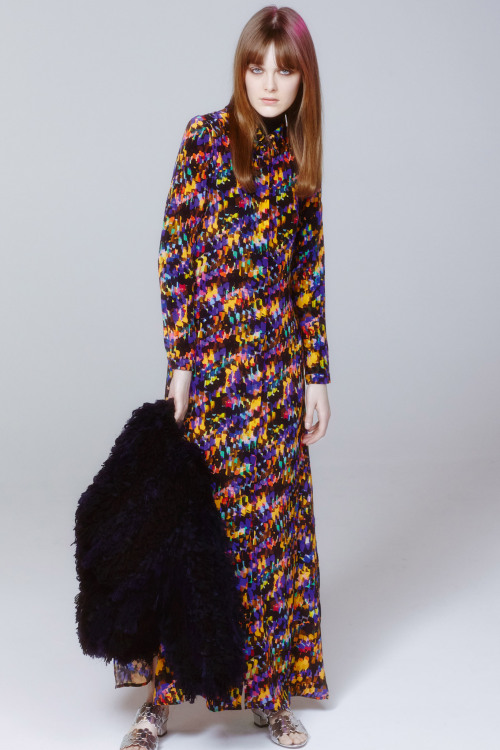
Outerwear is THE thing for Christopher Raeburn (photo 4), and the forms he chooses are definitely countless: capes with pockets and edges in contrasting colours, quilted orange windbreakers, jackets with colour blocking lapels. And these materials are also translated into other pieces of clothing as well - the quilted orange duvet for skirts as an example.
Ryan Lo (photo 5) proposed lady-like ensembles with round white lace skirts and warm brightly coloured pullovers, bows, little nice headpieces in a bon ton atmosphere. Let’s close this fashion week with a surprisingly interesting collection by Saloni (photo 6). Fabrics and prints were the most striking thing in a collection where shapes and proportions were pretty classic after all: there were many gowns in a bohemian mood, sleeveless little dresses, beautifully cut cropped trousers. The showstopper was the print giving the impression of blurred colours, which was one of the most graphic examples I’ve seen so far; as materials you have feathers giving a little edge to a black top, or coats made of furry fringes.
xxx
Post link
London Fashion Week - Days 3 & 4
Day 3
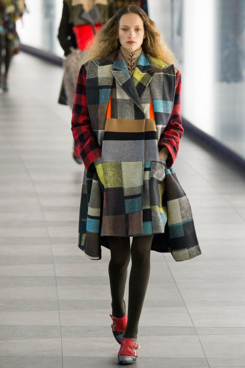
Patchwork is a nice technique which is becoming more and more fashionable, and Preen by Thornton Bregazzi (photo 1) put it at the centre of its collection, stitching different fabrics together, mostly tartan and checks, in a hurricane of colours and ruffles. The black part was more focused on the cut and on the subtle decorations of the pieces, and another take on the patchwork theme was proposed in a lace version.
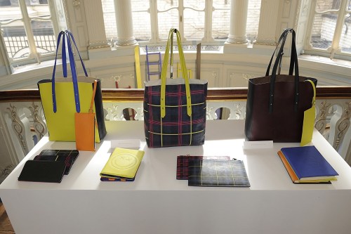
I would title Mulberry collection as ‘oversize elegance’. Loved the shearling checked coats and the giant jackets in cream and brown. But at London Fashion Week space is also given to great accessory makers. The collaboration Aspinal of London x être cécile (photo 2) had one of the best collections in this field, with shoppers, clutches, suitcases, basically every type of bag you can think of, in amazing prints and mix of contrasting colours. I need one! If you’re more about shoes then, don’t miss the shoe extraordinaire Sophia Webster (photo 3), especially if you’re not an ordinary person and you want shoes that fit your personality. A pop art collection made of everything you can think ok: animal prints, butterflies, feathers, Coca-Cola logos, messages on bags and shoes… Amazingly colourful, amazingly extravagant!
There’s still someone doing flowers, and I’m actually happy about it after all. Matthew Williamson proposed in this sense a 70s inspired collection which struck for its ability to pair the opposites: amazing chiffon gowns with loose silk pajamas, different flowery prints mixed together in a schizophrenia of patterns. The evolution of floral print continued with Temperley London (photo 4) - or is it better to talk about 'hybrid’ in this case? Hybrid between flowers and ethnic patterns, which was really visible in the collection with warmer tones and darker shades linked through the constant presence of the black. Boho silhouettes with a sexy twist.
Toga proposed its deconstructed kimonos, while Belstaff delivered its rigorously structured coats paired with more contemporary pieces of clothes. Beautiful the furry-fringed sweater.
Vivienne Westwood Red Label was fearless. I mean, don’t you feel it’s brave to choose very short shorts for a winter collection? It’s possible with Vivienne, especially if paired with a pair of red rain boots. And of course, the mixing of prints with the iconic tartan. Mary Katrantzou (photo 5) draw inspiration from wallpaper, which seems to be the newest trend on the runways. This time Katrantzou decided to give it a minimal restyling, and while she kept silhouettes very simple, she put all her fantasy into the prints and fabric manipulation. The classic wallpaper was then declined in several bright shades of yellow, orange, green - loved the fringed textile looking like grass - and appliqué of plastic and PVC ruffles went to adorn skirts, jackets and tops. Also loved how the collection was balanced on the runway: the darker shades were suddenly followed by pops of colour, so you could see a maroon and purple little dress and then, BANG! a neon yellow three-quarter sleeved top with a black mermaid skirt.
Jonathan Saunders’s collection (photo 6) definitely had a graphic quality - the three-dimensional prints of the beginning were just psychedelic - again like in Katrantzou, I appreciated keeping shapes simple to give space to experimentation on the field of prints. A wide palette of colours, which found its maximum in the degrading stripes of tones in some of the skirts and shirts.
Day 4
Antonio Berardi (photo 7) chose an unusual summery palette of lemon yellow and tangerine for a very elaborate structure of ruffles and layers of fabrics. In the simplest looks the sophistication came from jewel-like embroideries. London designers have understood that they don’t have to be afraid of colours during winter, and Roksanda (photo 8) proved that colourful furs and dresses can brighten up even the cloudiest day. Her clothes, then, do it in the coolest way possible. Loved the colour blocking as well as the variety of materials. Balance between flamboyant shades and more subtle ones.
I’ve learnt that in Erdem’s collections (photo 9) two things are sure: lace and chiffon. This time even leather was treated as lace, with intarsia-like shapes covering and embracing the body - sometimes in unusual shades like deep purple - and chiffon was there, ethereal as usual, in a wide variety of tones for little flowery dresses. But there was more to it: there was brocade blackened like coal, or even wool for coats in which the raw hems underlined the structure of the beautiful tailoring. Burberry Prorsum (photo 10), with long embroidered shawls, fringed leather skirts and capes, multicoloured maxi gowns in chiffon, definitely stated itself as a collection strongly inspired by boho culture.
Osman started very ethereal in the different tones of white, with feminine shapes and materials and ending darker, total black, with leather and feathers. But the real poet of this day was Christopher Kane (photo 11). The body is a primary problem for a fashion designer, and we know Christopher Kane is one of those artists who approach problems from the closest point of view possible - remember the biologically precise version of flowery print he proposed some seasons ago? So why not putting the body directly into his clothes? I was already amazed by the first black velvet pieces with women profiles in different colours on them; the middle part of the collection was all about the juxtaposition of layers of contrasting colours, without letting any of them prevale over the others though, a concept which took sense only in the last, amazingly emotional part, with the juxtaposition of human figures on the dress and on the models’ bodies themselves. I was completely speechless and this is definitely one of the best collections I’ve ever seen.
Peter Pilotto (photo 12) was inspired by board games and the paths in which you have to go forward through your moves. The collection itself was a sort of game and the cheerful colourful looks were the perfect match for such inspiration. Giles (photo 13) went instead for period costumes with an algid appeal. Loved the decorations of the silk dresses - are those mushrooms?
xxx
Post link
London Fashion Week - Days 1 & 2
Fashion experts have arrived to Europe to attend the fashion weeks opening with London, and I’m excited to see some old friends among the designers as well as some new talents. Let’s start the show.
Day 1
J.Js.Lee(photo 1) was a good start for London with a little bit of minimal directly from Asia. I loved all the shades of grey in this collection - cannot talk about it without referencing ‘50 shades of grey’, it’s becoming a joke - and the concept of the thread crossing the fabric and linking all the looks together was a nice, subtle feel rough putting together the whole collection.
LFW is always a great container of new talents, and Manuel Facchini (photo 2) debut on the catwalks was really one of the most promising I’ve seen recently. Facchini does very feminine silhouettes using bold and even aggressive patterns in a palette which is basically black and white, but the pops of colour weren’t missing: it’s only little touches, like the fine line bordering a jacket in red, or the yellow interior of a black and white dress skirt. Graphic and vibrant, I can’t wait to see more from this designer.
Paul Costelloe chose very bon ton shapes, with round skirt dresses inspired by the 50s. Chanel-like tweed jackets were mixed to brocade opulent fabrics and maxi shoulders to ironise. Very sleek and young silhouettes came from Fyodor Golan (photo 3), even if I still don’t understand what 'My Little Pony’ is doing there, but it added a touch of irony and thoughtlessness which is very in the mood with London Fashion Week. Towards the end the exaggerated proportions and the even more flamboyant colours made everything crazier but definitely more fun.
If there’s a place you’re sure you’ll find some great new artists, that’s Central Saint Martins. In this MA runway show fashion was art at its highest. It’s incredible to think that these designers were only fashion students until now. Among others, my favourites were Hayley Grundmann and Krystyna Kozhom, with their sculptures stating that basically every kind of material can be knitted, and also Beth Postle, with a very visible nod to the art of Keith Haring.
Day 2
Every time an African designer sends his creations down the runway I think that they all know how to deal with prints. Duro Olowu (photo 4) wasn’t different, and he definitely knows how to translate their traditions and aesthetic into beautiful feminine clothes which women from all over the world will definitely find as desirable items.
Mother of Pearl had a collection where innocence exuded from every single garment, inspired by a sort of children-like fashion - vichy checks, knee-high coats and jackets, styling to the minimum, everything looked really natural. Bon ton is the thing at London Fashion Week, and Orla Kiely went all the way about it. Little cute dresses for extremely feminine women in pastel tones, sometimes paired with a silk foulard tied around the model’s neck. Someway there was space for slightly more alternative options, like furry long-sleeved dresses in warmer tones.
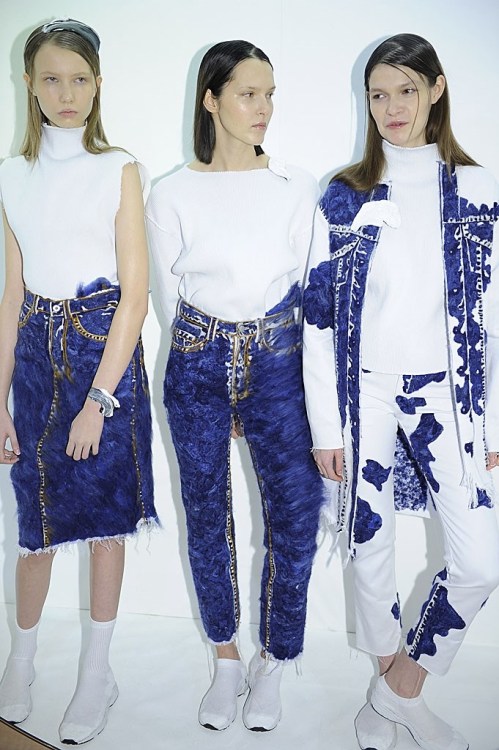
Faustine Steinmetz (photo 5) is a designer I put my eyes on last year for her debut at LFW, and now she’s one of those I wait for their collections to be shown, because I know there will be something amazing going on. Denim is her signature piece, and she manipulates it in ways still unknown to the fashion world. This time paired with hyper-white tops, the blue of the denim looked unusually bright and sparkly. It was minimal, yet had the impact of an avant-garde collection.
You can’t think of anything more minimal than Ports 1961. The clothes were cut to perfection, most of the collection was realised in black, white and nudes, but the touch of colour that every collection needs came toward the end, especially with a lovely very simple multi-coloured lace little dress which I adored. Softness everywhere was the first think I thought watching Emilia Wickstead’s collection (photo 6). Comfortable wool wrapping the body in soft coats and amazingly cozy sweaters in pale shades of pink, sky blue, nudes, were just lovely. Some concession to brighter shades in the last looks. Effortless atmosphere.
Sibling delivered a visionary collection, even if maybe more toned down than usual. Three-dimensionally graphic, loved the late embroidered with wool. Markus Lupfer (photo 7) was geometrical under every aspect: from the optical prints to the shape of the pieces, with perfectly tailored raglan sleeves, sharp edges and straight lines. Loved the variety of fabrics.
Contrasting feelings were featured in Danielle Romeril’s collection: every piece could be associated to the idea of strength as well of decay. Deconstruction, with clothes looking like they were falling apart, but never looking weak, everything looked stable somehow. The contrast was also given by the structured quality of quilted leather mixed to the fragility of lace.
The detail I liked the most from Lucas Nascimento’s collection was the extra thin straps in some of the dresses and tops, which made me think of 90s but in a cooler way, in contrasting colours, a little bit of bling and long silhouettes.
There was a lot going on in J.W.Anderson’s runway show, so you had to figure out what you were looking at. After all, Anderson has established himself as one of the greatest - and surest - promises of fashion. The thing I liked the most about this collection was that proportions were asymmetrical - sometimes the focal point was underlined with a belt, or with a simpler knot - and materials were really diverse, from leather to fringes.
I don’t usually like only gown collections, but Marchesa (photo 8) always knows how to sell it in the best way possible. This special line is really a jewel in Marchesa maison, with gowns made of the finest materials and sewn by the most expert hands. Loved the ethereal chiffon and organza which looked like made of nothing, as well as the golden lace. It exuded perfection.
Black velvet was one of the most luxurious materials you could get during the Italian Renaissance. If Simone Rocha wanted to start her runway show making people think about opulence and luxury, well, that was the right thing to do. To translate the message into modern language then, taking brocade was a great choice, a fabric which managed to go beyond time differences and kept its appeal nowadays. The last looks were the extreme consequences of such a passage, looking much more modern than the previous ones, but still nodding to the past from where they came from.
I didn’t expect such an exciting runway show from Henry Holland for his House of Holland (photo 9) - don’t know why, in my mind his designs were much less bright than these ones. I loved the puzzling effect of prints creating new patterns and I loved the happiness coming out of them. And Henry Holland, running down the runway with a big smile on his face after the show, was definitely happy as well.
Total black, as many designers chose to do for this season, was the perfect choice for Gareth Pugh (photo 10). This time he really let his fantasy run wild and free, and the result was amazing. His creations are definitely sculptural: you see it in the duvets covering the body in shapes that made me think about Japanese warriors; but also in the structural shapes of the leather or the fringes made of only god knows what material was that. Experimental.
xxx
Post link
Project Runway All Stars - FINALE
I finally get to talk to you about the last collections presented by the three finalists of Project Runway All Stars. Needless to say that Dmitry was the - deserving - winner, followed by Sonjia and, as second runner-up, Helen - we all knew she wasn’t going to win. I have to say I couldn’t decide between Dmitry and Sonjia as the winner, but after thinking about it Dmitry’s collection was much more mature and ‘ready’ for the fashion business, much more than Sonjia’s, that anyway had a really marketable and wearable collection, young, hip and fresh. Let’s see the three finalists one by one.
HelenAs she did on the episode before the finale of her Project Runway season, she spoiled it all. The collection was completely uninspired, not cohesive at all, not interesting. Some single dresses were nice - I really liked the champagne little dress with the thin straps - and some materials were top choice - loved the black and white print and the furry-plasticky fabric of the white separates - but in general it wasn’t all stars at all. She put some red just because Zanna was worried about her collection only being black and white, and anyway this pop of colour wasn’t relevant and, in my opinion, it was visible that she added after conceiving the whole collection - just like a patch you sew on your old jeans to cover the holes.
SonjiaShe did a great job during the whole season, and this time as well she proved she has a great eye for colours and exciting and new materials. I usually don’t like pencil skirts with ruffles tail, but the papaya yellow she sported with the navy blue bouclé top was just so cool I couldn’t help falling in love with it. The multicoloured print inspired by Ancient Egypt was perfect for her young, hip style and was enhanced by the silhouette of the jumpsuit. In general it was an exciting collection, where she also found space for a beautiful bikini - even if it was too similar to the swimsuit challenge they had during this season.
DmitryHe is a master, we all know this, and this collection stated this fact again very strongly. It was conceptual, it was all about form, very artistic, and yet it felt wearable anyway. His manipulation of print is just exquisite, and I loved the fact he experimented on very simple and basic pieces, like a sweater paired with a pencil skirt, making colours and print as the focus of the whole look, rather than concentrating on the clothes in themselves. Asymmetry was there to serve as a signature feature of his aesthetic and I could totally see the woman he wanted to depict: a strong art lover who likes collecting unique pieces of clothing. His clothes were absolutely unique, just like his point of view. In his clothes I see something which only great artists can achieve: self-confidence, he doesn’t feel the need to show he’s good, because he knows he is, and that’s all. His clothes speak for themselves.
I say bye to my readers for having been with me during this season of Project Runway All Stars, and I can’t wait to start again, maybe with the new upcoming season of PR :D Auf Wiedersehen!
xxx
Post link
New York Fashion Week - Day 6, 7 & 8
And we’re finally here, to the closing of one fashion week and saying hello to London - which actually kicked off with its fashion week two days ago. Let’s see the best looks, day by day.
Day 6
Tory Burch gave a great start to this day of runway shows with Moroccan-inspired prints reminding of the beautiful rugs woven in North Africa. The style was in between relaxed, chilled and cool, feminine. I would have liked more pieces in the ethnic prints of the beginning. Very polished instead was Jil Sander Navy (photo 1), extremely well-structured, with beautiful bright young colours. Loved the quilted total looks.
Would you ever say such a designer as Vera Wang, who creates the most beautiful wedding gowns, could be able of such amazing dark fashion? Nearly everything was black in her ready-to-wear collection, silhouettes were kept really plain, very far away from the ruffles and white organza of the bridal gowns. A sort of indie vibe kept together the whole collection.
One of the most commercial brands of NYFashion Week, J.Crew (photo 2) opted for simple wearable clothes where the exciting element was the pairing of subtle tones with bright shades of yellow, blue, red. Classic pieces from a woman’s closet reinvented - from the cream-coloured jumpsuit with a formal cut to the oversize grey tailored trousers. A little bit chaotic Rodarte collection (photo 3) was, but I liked it because it made me think of very inspiring references: the circus, with the blingy dresses worn by its performers; the street, with black leather and fur nodding to a dark urban style; at the same time, though, it was vulnerable, feminine, sweet, with chiffon and flowers made of sheer lace adorning the front of the mini-skirts paired with velvet deep cleavage tops.
There was nothing new in Jenny Packham’s collection, yet everything was pleasing to the view and extremely cool looking. The champagne gold, the pearl tones, the bows, the lace gowns, everything talked about opulence, but it was not an ostentatious kind of wealthiness, it was more of a contemporary chic lifestyle. Rachel Zoe knows how the market works, and she knows what people want. Her collection, then, can never do wrong: nothing is too much, nothing is superfluous, everything is essential.
All the lines coming out of the Jacobs maison - even this Marc by Marc Jacobs (photo 4), which is not designed by Marc Jacobs himself - seem linked by a common goal: dressing women for war. It’s an everyday battle, the one that all women have to face when waking up in the morning and preparing for a new day. So why not fighting while wearing cool stuff? Shoulders are always very strong and one of the focus of the garment, but they are never too exaggerated. Wallpaper-like prints are mixed to written panels and activewear insertions in a colourful but wearable extravaganza.
Lela Rose presented a collection where everything was extremely measured, even in the peacocky prints and fringed fabrics, which didn’t look too heave or showy. Impossible, then, not to talk about the debut of Peter Copping at Oscar de la Renta, after the death of the much beloved designer some months ago. However, I thought this collection lacked of self-confidence. Of course we have to recognise that substituting such an artist of fashion as De la Renta is a stressful and difficult task, but it seemed to me Peter Copping didn’t want to overshadow his master, and in this way he ended up with a mediocre collection. Nothing like the last one Oscar designed last season. He will be greatly missed, again.
Narciso Rodriguez (photo 5) understood the secret to make every woman look thinner and taller, and applied it to every look he sent down the runway for next season. So the rules are: never use colours that are too bright or flamboyant, but always go for nudes, black, white - especially cream; tighten the waist but go looser towards the top part and the feet - resulting in amazing slightly flared trousers; whatever you can elongate, just make it longer - what about the ankle-length waistcoats? Divine.
After the first two looks KTZ collection (photo 6) stated itself with the strength of a loud scream: IT WAS AMAZING! Definitely one of the best runway shows so far, maybe not as wearable as you would expect from New York Fashion Week - after all KTZ is based in London - I just thought as genius to take ethnic prints and decline them in flamboyant shades - my eyes were actually hurting with brightness @_@ - and put them everywhere, even translating them into fur. GLAMAZING!
Day 7
You can’t expect pure innovation from a designer all about business like Michael Kors, but in some way he always manages to transform the wearable things he create in something effective just as if he was dealing with art. He always chooses the best prints, the best colours, the best silhouettes for this prints and colours, the bust fur, the best length of dresses, trousers, skirts. And when it comes to accessories, well, his market success in this field is enough to tell everything about it.
Starting a runway show with a pop of colour is always a great way to grab everyone’s attention from the beginning, and I loved the fiery red Jason Wu for Boss decided to send down the runway for the first looks, especially because it was paired with grey coming from classic suit tailoring. Everything was immaculately constructed, as usual, but I would have preferred seeing more of that sparkle of colour of the beginning.
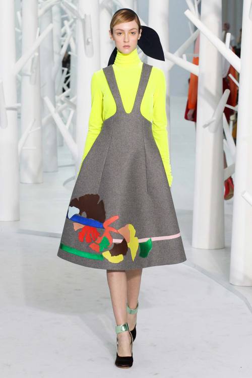
Psychedelic is the right word to describe the most hippy-like collection I’ve seen so far, despite having watched so many inspired by 70s. And Anna Sui’s ambition was probably to conceive a total collection, in the sense that this one really included everything you can think of about hippy style, just like a brain storming: strange headpieces, print mixing, chiffon, maxi dresses, fringes, leather. But it was Delpozo (photo 7) the collection that really made me crazy about it. I was waiting for it because I knew it was going to be epic, and yet I was shocked. The neon yellow was enough to make me swear I will love Delpozo for the rest of my life, but in general this was one of those collections which you can NEVER forget. Amazing knitted pink dresses, cut-out decorations of flowers and birds in thousands of beautiful colours. It was bold, it was elegant, young, fresh and with a touch of irony. Just the best.
Marchesa (photo 8) toned down the volumes for this runway show inspired by 30s and 40s, with feathers, pearls and fringes giving movement to the little dresses or to the long, sleek gowns where the focus was on the waist. Kinda reminded me of the dress Dmitry designed for the red carpet challenge at Project Runway All Stars - is Georgina Chapman copying?
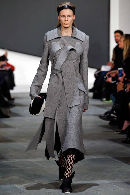
Wayne featured a collection where prints were banned, except for a tartan brown and grey coat. The aesthetic is really clean, I loved the fact they chose very feminine elements to complement the dull colours - black, grey - like bows and ruffles. Destructuring is instead the key-word for Proenza Schouler (photo 9), this time accompanied by sexy cuts of the dresses to show a little bit of skin, but always in an experimental way. Graphic juxtaposition of lines and layers gave a graphic quality to it.
Day 8
Tokyo Runway Meets New York is an event for Japanese fashion talents, and this time Han Ahn Soon (photo 10) really stood out among others with a futuristic look where cool hip clothing - fur coat, baggy trousers, street style accessories - met future - loved the insertion of metallic leather.
From Romania Dorin Negrau couldn’t help being heavily inspired by his land’s traditions, with long knitted pieces paired with chiffon gowns embroidered with colourful lace. It lacked of sophistication though. Sophisticated and simple, as usual, was instead Calvin Klein Collection, this time with a decorating twist set to the minimum. Dresses and jackets were made of rectangular pieces of fabric put together like a puzzle, or also the bouclé pieces of the end really fit the aesthetic of the brand; colours veered mostly to a dark palette.
Marc Jacobs with his eponymous line closed London Fashion Week, depicting a woman that you can define as a mistress: algid, dark, a lot intimidating. For this purpose, silhouettes were really long, colours were mostly dark - black, navy blue, bordeaux, maroon - and there was a strong sexiness going through the whole collection - the completely sheer gowns seemed like an invitation to touch and at the same time were frightening in their ostentatious transparency and sex appeal.
Stay tuned for London Fashion Week!
xxx
Post link
New York Fashion Week - Days 3,4 & 5
A little because I’m lazy, a little because I was really tired these days after my mother came to Milan to visit me - sightseeing with someone who doesn’t know the city where you live in can be a very stressful experience - I delayed my review for New York Fashion Week, and now I’m here to get you through day 3,4 & 5 - and hopefully tomorrow there will be the remaining three days and the first day of London Fashion Week!
Day 3
What better way to start a new day in New York, the most commercial of the four main fashion weeks, with a very commercially appealing brand? Lacoste (photo 1) sent some models down the runway wearing sweaters with ‘René did it first’ written on them. And it’s true, René Lacoste was the first one, in the 30s, to give sportswear a sporty look without losing the elegance of formalwear. I found it incredible how successfully for this collection they managed to merge tracksuits and trench coats together, or pinstripe suits and polo shirts. Flawless under every aspect.
A brand which I always like for its sophisticated vibe is Noon by Noor (photo 2). This time, though, it was not polished as usual, or extremely feminine as I’m used to, but I was glad for this collection because it was experimental - at least for such a brand. I was happy to see that there are brands which still know it’s important to question their aesthetic and to take a breath of fresh air. The last part of the collection reminded me of the good old signature style of the brand, made of jewel appliqués and flowing silk.
Dion Lee treated his clothes like puzzles given by stripes of fabric in which the constant peek-a-boo of naked skin was the super sexy element giving brightness to the general atmosphere. Max Azria with his line Hervé Leger opted again for a structured aesthetic translated into dozens of different - sexy - ways. I didn’t like the fact there was not any variety of length - all the dresses were higher than the knee, and this made it a little bit repetitive.
Alexander Wang went for total black, and no one knows how much I would have liked to see a nice total black collection, but I was highly disappointed. There was nothing of the activewear wave he surfed for the past collections. Of course it’s fine to evolve as a designer, but I would prefer some time to transition from one design aesthetic to the other, instead of making such rapid changes. That was a no no.
For Altuzarra collection there were all the predictable elements of sexiness: sheer lace, leather, form-fitting dresses. Yet, it wasn’t predictable, it was instead sophisticated and seductive. Every woman wants to be like the woman depicted by Altuzarra, that’s sure.
Another total black collection was shown on the third day, this time by Alexandre Plokhov. Very strong but still feminine, my favourite elements were the strapless dresses and the draping on many of the silhouettes. If you want an example of wearability and effortlessness at the same time, take a look at CG collection (photo 3). Menswear suits were a little bit shrunk down to give them a more feminine appeal, mini-skirts were decorated by ruffles, all the colours were very earth-toned, with brown, beige, a little bit of pale ochre - and yet, they looked so bright.
Isa Arfen was one of the few doing minimal who managed to catch my attention. Loved the wide range of fabrics - wool, lurex, faux fur - and I was amazed by the peek-a-boo pieces paired with simple plain shirts. So nothing and so everything.
I didn’t expect I would like Rosetta Getty’s collection (photo 4) so much. There was only a little number of pieces, all of them with a strong 70s vibe, in earth-toned colours and laid-back attitude. Yet I was struck with curiosity for the innovation I could see in shapes and cuts as well as in the modified proportions of many looks.
Day 4
Ranfan went for coat as the hottest choice for winter: furs, maxi silhouettes, trench. I wished I could see more of that juxtaposition of beautiful colours I so much loved in some of these looks: sky blue, white and tangerine, all together, all extremely bright and beautiful in their difference.
Donna Karan for her young collection DKNY used very graphic colours, with layers of clothes in contrasting tones building a harmony of style. But a real showstopper - surprisingly- was Custo Barcelona collection (photo 5). This time the brand totally nailed it. Even if the collection had a really big number of pieces walking down the runway, and so the risk of losing the main theme was really strong, the fil rouge that tied together all the looks was clear throughout the show. Structured pieces following and accentuating the lines of the body and at the same time manipulating the woman body’s shape, that was the strong point of the entire collection. I particularly likd the raglan sleeves giving the shoulders a sort of 80s attitude which I see as more and more fashionable. Amazing the flamboyant prints, signature of the brand.
Victoria Beckham sported her usual minimal style, but this time I found it too dark maybe, while Public School showed its urban style canceling all the differences between menswear and womenswear.
70s style will be strong for the next season as well, we understood that, and Derek Lam (photo 6) nailed the trend with an ultra-sophisticated attitude. All the pieces were perfectly structured, the trench coats were immaculate in their construction, the bell bottoms were never too large, colours were measured.
Simple is a word you would never associate with a brand such as Hood by Air (photo 7), but that’s it: it was much simpler than usual, cleaner, more polished. The brand is growing up, it’s becoming adult, so it’s changing, but it’s still strongly recognisable. Colours were reduced to minimum, white, nudes, black. Outfits were not too busy, and there was even space for smarter pieces of clothing.
Yigal Azrouël played with the juxtaposition of lines, both in the materials, with checks and criss-crossing tweed, and in the construction lines, in the shape of the pieces themselves. Porsche Design (photo 8) was strong as usual. The collection was developed in basically two colours: total black and total nudes, with the exception of some grey piece in the middle. Loved the silhouettes, accentuating the waist, and the knitted leather.
Thakoon unveiled a collection where the interesting elements were so many that I didn’t know where to start reviewing it. In general the attitude was easygoing, the pieces were simple, made interesting by knots, criss-crossing, juxtaposition of different types of materials.
A brand that is becoming bigger and bigger among fashion experts is definitely Opening Ceremony (photo 9). This time the two designers decided for a strong 70s attitude with a younger and fresher take on it. Flares were high-waisted, to the ankle, giving the impression of extremely long legs, an impression enhances by the use of oversize tops. The accessories were simply amazing, especially the shoes. To finish the day, Tracy Reese (photo 10) was part of that group of designers who went very graphic, offering an extremely wide range of pieces among which to choose - they know how to satisfy every taste.
Day 5
Tommy Hilfiger, after so many years, still has an appeal for cheerleaders - or better, he still is inspired by them. But this time they were definitely luxurious cheerleaders whose uniforms are made of fine leather and soft velvet, girls who follow fashion and know how to be cool in the streets wearing oversize baseball tracksuits and bombers. Another very American designer follows, and of course we are talking about Donna Karan, with her main line. It shone with New York lights: there was the black of the city at night, the gold of the blinding lights, the boldness of the New York typical career woman wearing clothes that fit her strong personality.
Vivienne Tam had a collection were many little elements were the really interesting part - I wished I could see more of that lace decorating many of the garments, or, especially, that beautiful fabric looking like a piece of silk Chinese tapestry adorning many of the first gowns. I appreciated, though, the fact the silhouettes were kept simple when using such heavy decorations.
Oudifu is a brand from China, and yet in this collection there were elements coming from everywhere but China: front panels and lace looking like inspired by Indian sacred icons; monogram digitally stylised symbols; optical multicoloured patterns; urban cool style, totally Western. Talking about prints, it’s obligatory to mention Alice+Olivia (photo 11) which completely won me over with the best prints of the season so far.
The Row by the Olsen twins was in some way more serious than usual, even if you can obviously see the signature aesthetic made of oversize shapes and soft comfy materials. This time the palette was less 'indie’ and more 'professional’ - not sure an oversize buttonless coat worn with slippers can be defined as professional - an attitude confirmed by the venue: the Seagram Building, designed by the architect Mies Van Der Rohe. The Olsen twins continue to create magic and are definitely among the celebrities who successfully brought something smart and unique into the fashion world.
I swear I have tears in my eyes while writing this, it feels stupid but this is what happens when fashion really touches you like art does. If you happen to read my blog from time to time, you know that Thom Browne (photo 12) is my favourite designer, so I can’t really be unbiased when looking at one of his collections. The fact is that his creativity goes so much beyond whatever you can imagine, that it’s impossible not to fall in love with what he does and not getting excited when looking at his new creations. I didn’t like this collection as much as I liked his past ones, yet I recognise the masterful quality of the details and the amazing concept behind it. It was mourning, again, which inspired Thom for this new season, and for this reason he went for a total black collection. Yet, the white figures standing up in the background gave the impression of watching a black and white movie. But apart from this, the clothes were anything but old: they mimicked old, maybe, but this was the most contemporary and accessible collection created by Thom Browne yet. There was a sort of Chanel vibe to many pieces - look at the raw edge of some of the jackets, or at the tweed used in some other pieces - and black was not used in a plain fashion: it was kind of three dimensional, with shades - 50 shades of black? - giving detail to every single element of the clothes - the buttons, the zippers, the seaming and the ruffles. Masterpiece, as usual.
Adeam showed how to go very dark and still keeping a feminine attitude, while Zoë Jordan borrowed clothes from the male wardrobe and reinvented them in an androgynous style. Loved the white biker jacket and the dégradé long blazer.
A very strong pop of colour in 70s style came from Karen Walker, who offered very different options keeping it cohesive. Rag & Bone displayed a strong collection where different style were put bravely together. Silk night gowns were paired with trousers and quilted windbreakers, black was mixed to acid colours and lurex and leather met in more than one look.
xxx
Post link
New York Fashion Week - Day 2
The second day of runway shows in New York City opened with the usual Concept Korea event, three designers from the Asian country showing their collections to an international audience. I was pretty stunned by the polished, sleek and minimal looks presented by the brand LEYII and especially from the menswear collection of Beyond Closet (photo 1). This joyful new wardrobe for the man of today was full of prints, which I was glad to see as it’s so difficult to find good ones for men. But there were also furry coats and pullovers - I’ve already said some weeks ago, I guess for the Menswear collections in London and Milan, that I want one.
Charlotte Ronson went very wearable, it was more of a spring collection than fall, but it was a pleasing view after all. Cream-coloured pieces paired with Tiffany blue complements were made of leather and chiffon, which made everything look extremely light. Knitwear was instead everywhere in Ryan Roche’s collection (photo 2): models were covered by it from head to toe, with scarves, pullovers, knitted dresses. Colours were neuter, cream, beige, grey, black. Loved the bohemian vibe of it all and I was completely in love with the back showing in the look which you can see in the photo.
Kate Spade New York showed us how to choose wearable clothes without giving up on cockiness. I usually love the collections where it seems young girls are playing being adults, and this was one of them. Perfectly balanced between playfulness and sophistication. Tanya Taylor (photo 3) likes playing with prints and from the revisitation of pied-de-poule in the first looks to the optical checks of the following dresses everything was a feast for the eye.
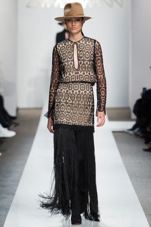
Zimmermann (photo 4) delivered a collection which was 70s without being too rock'n'roll; it was boho chic without being hippie; it was mature without looking old. Everything exuded luxury, the silhouettes gave the body an elongated shape and cool accessories - like the mounty hats - were the perfect companion for such high quality fashion.
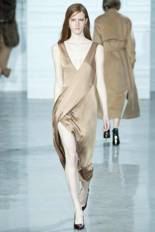
I wasn’t sure about Jason Wu’s collection (photo 5) but I think it’s right to give him a shot, at least for going so minimal. There were some looks - like the one I chose for this review - which really looked like there wasn’t anything about the design process; but after you see dozens of collections you realise that there’s always a great deal of thought behind what you’re seeing, and you also realise the simplest pieces are usually the hardest to conceive. Even more if they look beautiful like they did on Jason Wu’s catwalk. Even more if the materials used are definitely deluxe quality: shiny silk in bronze tones, croco leather and soft fur - even if, as usual, I would have done without it.
Sally LaPointe had a nice collection, and it was a pity that the second part went so boring after all, because the first half, with all those cuts and bits and pieces, had a nice movement and a interesting new point of view on fashion. Cynthia Rowley decided for this season to show her collection through a video, and I don’t think it was a particularly successful decision, even if her collection wasn’t bad at all. I always love her looks and I think what really distinguishes her is the graphic quality of her prints. Of course this aspect wasn’t missing in this collection either, but the video didn’t allow to capture the details through photos, and something went lost in the process. Colours were toned-down and a little bit darker than usual, but after all it’s a fall collection. Yet, the playfulness was there and I’m always amazed at how she manages to keep things down-to-earth without becoming boring.
There was a mix of everything is cool at the moment in Cushnie et Ochs collection: new geometrical necklines, deep cleavages, materials borrowed from activewear mixed to velvet or fur. A total collection wanting to satisfy every taste. M Missoni (photo 6) was the real showstopper for the day. I was surprised because I usually find Missoni very similar in every collection, but for their young line this was probably the best collection I’ve seen so far. It was definitely inspired by China - the Mandarin gown closure for one of the looks was enought to understand - but it was modern, kind of technologic, with straight lines, subtly fading colours and armour-like structures. Just divine.
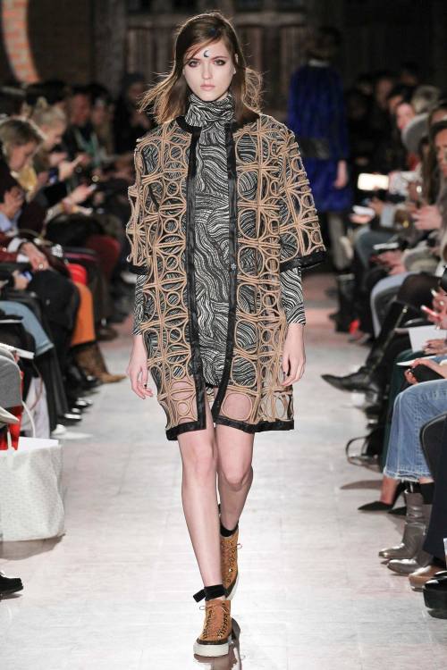
Rodebjer (photo 7) went very dark in some way - and the half moon on some of the models’ forehead was a sort of arcane symbol in this sense - which made it the more fascinating. Interesting fabric choice - especially the wrinkled black leather - but of course it seems obvious to me that the most exciting part was about the structured peek-a-boo coats - which were actually doing everything except what coats are for: covering the body. Pure beauty.
Adam Selman (photo 8) sent down the runway the models in that hairstyle which makes you immediately think of Amy Winehouse. Yet, the overall atmosphere of the collection clashed with the figure of the beloved singer: the ‘Spoiled’ writing on one of the tops said it all. In fact, Amy Winehouse was just in the hair, and even if you searched for her in the details, the only thing you could recognise was her badass attitude, this time translated into a feminine, cocky girl wearing bows and bon-ton coats.
Comfy and soft were the first words that came to my mind while watching Novis collection (photo 9). And it’s immediate when you have an entire collection made of plaid, soft wool and long head-to-toe coats. Colours were amazingly bright as well as amazingly subtle - nothing was too much in-your-face. One thing I didn’t like: stilettos in different colours. That was a no no.
Suno (photo 10) closed the day in a subtly psychedelic way: I know, it’s a contradiction, but I couldn’t find any other effective phrase to describe this brilliant collection, where black was the main colour but stripes and flowers in neon tones went to adorn long formless dresses, glossy overcoats and warm pullovers.
xxx
Post link
New York Fashion Week - Day 1
Here it begins, the tour de force of the fashion weeks. And now that New York has inaugurated the season with the first day, I can’t wait to tell you everything about my favourite collections.
It was a nice start with Coach (photo 1) which presented a style which I would define as indie: leather coats with furry edges, long plain silhouettes with different layers of - black, of course - garments, including long skirts and some oversize knitwear. Cool in the streets.
The urban style of Nicholas K was presented this time in a very feminine translation, with chiffon, pinstripe manly fabric used in delicate draping and shapes which enhanced the woman body. About Jonathan Simkhai’s collection there were some things I really liked and some which I really DIDN’T. For sure I loved the injection of modernity given by the straight lines over the first lacy outfits; I completely loved the juxtaposition of lines in some of the other looks, like for example in the sky blue, black and white sweater, as well as the crisscrossing of thin lines in the last gowns. I hated the champagne gold fabric though, I thought it completely destroyed the collection looking extremely cheap.
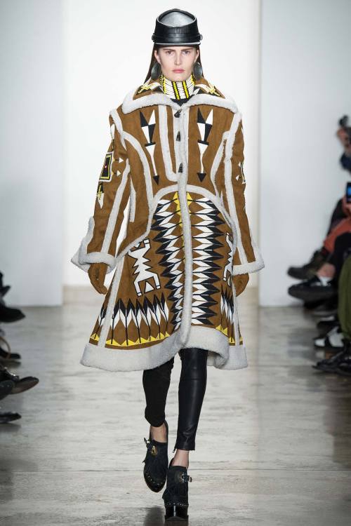
It was an unusual inspiration for BCBCMAXAZRIA (photo 2) but this tribal native American atmosphere really nailed it: fringes, ethnic prints, everything declined in the usual vocabulary used by Max Azria, where femininity is the first word to know. Loved the juxtaposition of colours which is not very usual with the designer, and it was a good step outside his comfort zone.
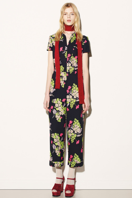
Red Valentino (photo 3) the young line of the Italian maison always gives great satisfaction with the minimum effort. Yes, effortless is maybe the best adjective to descrive this collection made of pastel colours - powdery pink and baby blue as first - simple silhouettes, mini dresses and checked shirts. Loved the bold prints and the jumpsuit which are definitely the coolest outfit for a woman-to-be.
I kinda loved the first half of Creatures of the Wind collection (photo 4), and it was a pity as it could be a great one if it wasn’t for the second part where a very toned-down atmosphere toned down my enthusiasm as well. Loved the jackets with the raw stitching in bold colours, loved the nude coats and I also appreciated the metallic print which made me think 60s in a sort of 80s revisitation.
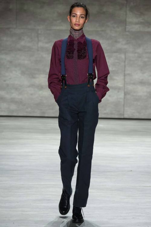
Costello Tagliapietra (photo 5) probably had the best collection of the day. It was menswear for women and it has never looked so sexy! There were braces, high-waist trousers, dungarees, overalls. It was kinda schoolboy too but there was always space for some extremely sweet and elegant dresses, and overall, despite the differences, everything worked well together. It was a great, polished, pleasing collection.
Sea proposed a collection of basic pieces with an edge and some prints here and there which are never a bad idea. But Honor (photo 6) was another one having a great collection. I always love Honor collections because they all take you to a world of fairytale. This time, though, the protagonist was not the princess, but the mistress, the evil witch. Yet, it was a pretty fashionable witch. I loved the fact the brand is always recognisable, especially in its prints looking like shades projected by a night lamp, with a sort of children-like irony attached to it - we are talking about fairytales after all - which definitely makes you smile - aren’t those little whales extremely cute? And I also loved how mature it can go without losing its freshness - look at the red chiffon gown, it looks like it’s made of flames. Exquisite collection, even if I preferred the first part and didn’t like the purple shade they used in some of the looks; it read old in my mind.
From Norma Kamali I particularly appreciated the first grey denim patchwork looks and I loved the sporty vibe of the overall collection; however, it went a little 80s disco-dance at the end. Creatures of Comfort (photo 7) instead opted for flowing dresses and skirts everywhere, but nothing was too ethereal - just look at the boldly coloured check fabrics. It was energetic, even the bows adorning dresses, trousers and tops were large and in-your-face, but still feminine and gentle. Great balance throughout the whole collection, even between pretty basic looks and more eccentric ones.
Marissa Webb was all about classic shapes, different layers in different materials - wool and chiffon for example - I loved the coordinates in grey, they had a very professional attitude and made me think of a strong career woman. The real miracle of the first day happened with Desigual: I don’t know what changed from the last time I told myself ‘Give another chance to the brand, take a look around’ when entering the store while I was on holiday in Vienna. After that time I promised myself I would have never put my nose inside another Desigual store EVER. But after this collection I might change my mind: I actually liked most of the pieces. Loved the aztec prints, I loved the fact they stopped using thousands of different -ugly - prints in the same outfit - and I usually love mixing prints, but that was just too much! - and I loved as well that they quitted writing awful messages on their t-shirts and dresses. That’s a good new start.
Tome (photo 8) chose the coat as the centrepiece of the whole collection, translated into different ideas: first the camel woolen trench coat in different lengths and proportions, then the leather jacket - in bright lemon yellow - over an elegant dress.
I would like to close my review and the first day of NY collections with a designer which I’ve never really thought about, Rachel Antonoff (photo 9). I didn’t remember her - but after all, Valentino was not successful at the very beginning of his career, so this doesn’t mean anything - but I loved her schoolgirl aesthetic. There were some very subtle references to school in these first collections, but Antonoff was the only one to take it to the extreme and make this reference clear - her model was definitely dressed in a school uniform - and it was cool. What I particularly appreciated was the subtle reference to biology - is the girl behind this collection a biology student? First, from the little dresses with the front printed with the stylisation of the reproductive system in one case and with some lungs in another instance; then the print for the last looks, depicting fruit and flowers with biological precision. School can be fashionable then. Interesting.
xxx
Post link
Project Runway All Stars Season 4 - Episode 12: Some Like it Hot Dog
Is it just me or the episode titles are getting worse? Jeeeez.
Anyway, I was really excited to see what this challenge was about as I didn’t understand anything from the preview the week before, and I was happy to see that they had to design a look for a Gala event such as the Oscars - the fact they were inspired from Marilyn Monroe was just an excuse to talk about the new film being released on Lifetime, wasn’t it?
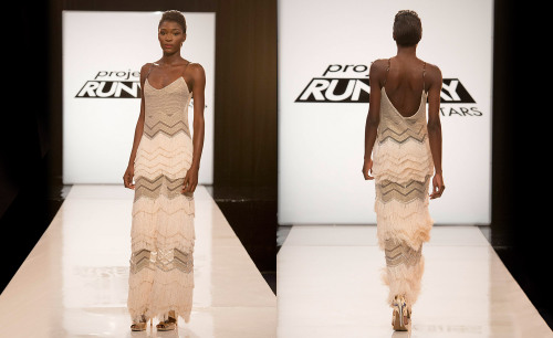
A pretty safe choice from the authors, as you usually take some shimmering lace, cover your model, leave her back naked and you have an amazing Elie Saab sort of gown - I just realised I perfectly described Michelle’s dress for this challenge.
But first, in the workroom they had a really stupid mini-challenge which didn’t have anything to do with the main one and which only served to give Michelle her only win before being eliminated. They had to make, in a very short time, some dresses for dogs getting their inspiration from film genres. Michelle won the chance of being artistic director for a dog clothing collection of I don’t know what. It was all pretty out-of-place, TBH.
Dmitry of course blew me away. It didn’t even surprise me as I’m so used to getting amazed by what he and Sonjia do. From the choice of tea dying the fringes to give that antique look, to the sheer lace he chose - very Dmitry style! - and, omg, the invisible straps - I agreed when one of the judges said she’s never thought about invisible straps as a sophisticated detail, and yet in this dress that was one of the most exciting aspects. Yes, it was perfect, and I can see tons of stars catfighting to have that on their next red carpet apparition!
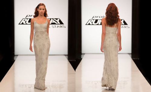
It was hard to choose between Helen and Michelle but I opted for the former, not because I can’t stand her - even if it’s true that I can’t - but because after all, Michelle’s dress had more thinking behind it. I appreciated Helen went for something really minimal, it looks a little bit 90s, which can be a good thing as the 90s are back in fashion - even though I’m seeing this trend disappearing more and more. I still don’t know if I liked the colour and the beading, I don’t understand if I find it very matronly or very fresh. One sure thing is that it was too long. Anyway, all these doubts about it are nothing good, and between her and Michelle I would have gone for Michelle all the way, I was curious to see if she could pull off an amazing collection - which I didn’t expect from her - just like in her PR season.
Michelle didn’t have a good dress, everything, from the silhouette to the sleeves, looked way too long, and I would have completely avoided that cheap chain behind it - Zanna told her during the critique, but she couldn’t just get over those f****** chains! I didn’t mind the fabric, in general it was a predictable evening gown which you can see in every red carpet, that’s why I wasn’t excited about but at the same time that’s why I wouldn’t have sent her home.
The judges had another mini challenge for the bottom two girls, where they had to pick at least three of the eliminated looks from this season to create a new garment. Of course you can’t do much in one hour, so they came out with some very shitty outfits - even if the judges were all saying how gorgeous what they made was. I mean, of course it was pretty amazing in one hour to pull off those things, but it was nothing special, come on. Helen did something very basic, maybe too basic, and even if Michelle’s look was possibly uglier, at least there was something in it - but you also have to consider she used only two from the past looks and she realised it only after they finished. Anyway it seemed pretty obvious to me that the judges wanted Helen to go to the finale, so she could even came up with a fig leave over the model’s patsy, they would have chosen her anyway.
One thing I couldn’t stand was her crying and saying for the 100th time how miserable it was to go home just before the final in her season and no, no, I don’t want this to happen again, oh my god, how can I do…. Really girl, SHUT UP.
She’s going to make some cape dresses, some total red look and screw everything with choices she thinks are outside the box and instead it’s only crap. I’m sure of this.
Sonjia or Dmitry, one of them is going to win.
xxx
Post link

