#graphic design portfolio
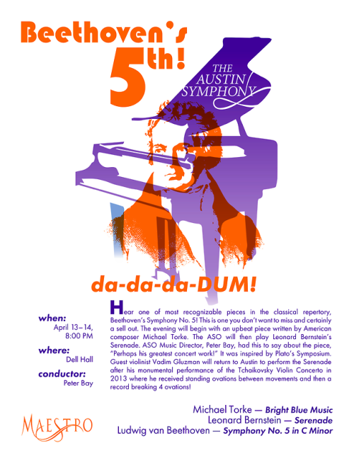
Poster design for Vector Graphics for Production (Spring 2018) using only two pantone colors. The text was given to us, and we had to use the Maestro and Austin Symphony Orchestra logos. I made a lot of guidelines and did a lot of rearranging trying to get everything to line up while still keeping the poster balanced and easy to read.
Post link
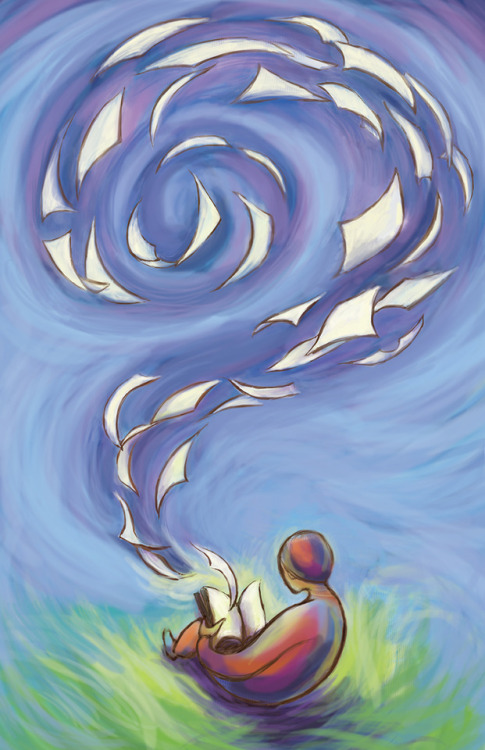
Here’s the final version of my project for Basic Graphic Design. I definitely could have done more with it, but overall I’m satisfied. The goal was to communicate a message without using words.
It was a rough week; I got my wisdom teeth out on Tuesday (yes, during finals. And on top of that I caught a cold) and then this project was due Thursday afternoon. So I was relieved to call it quits for the semester just to get some rest, but I’m also sad to be done. I learned a lot from all my classes. Here’s hoping I can go out and do something with all that I’ve learned!
Post link
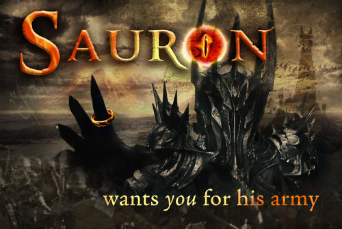
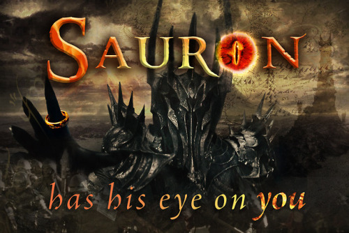
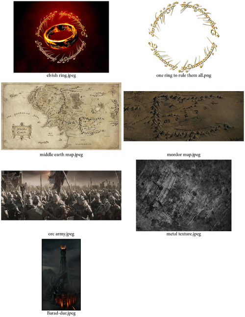
This was a postcard project for my Digital Imaging I class Fall 2017. We were supposed to use a single word and a caption, and do some editing with at least one of the letters (turning it into a shape, replacing it with an image, etc.) I had been watching the Lord of the Rings movies with my boyfriend, so the first thing that popped into my mind was the eye of Sauron. I did thumbnails of other ideas, but ultimately this was the one that won out.
Another requirement for the project was to use at least two layer comps (basically having two different versions or layouts of the same composition in the same file), hence the two versions here. I’m still torn about which one I like best.
Below that are the contact sheets for the project, which show you the original images I used to build the postcard. The entire project was done working non-destructively, so I used layer masks to hide parts of the images rather than deleting pixels.
This was probably my favorite project of the entire course to complete. I had such a blast working with all of the details and textures.
Post link
More projects from Digital Art I last semester, this time in Photoshop. The first two were about scale (taking something huge and making it tiny, and vice versa). Then there was a mythological composite creature which we made to look like one of those magazine photos of Loch Ness or Bigfoot with terrible quality pictures. (We had to come up with a name for the creature, too–I named it Bessie.) Then we did a disappearing act with an iconic image, taking something vital out of it.
Lastly was Arcimboldo, inspired by the Italian painter who painted portraits of people made out of objects such as vegetables or flowers. In this case we used found objects, simple everyday things that we brought to class and scanned in. This was such a fun way to get acquainted with Photoshop and stretch our creative muscles!
Post link
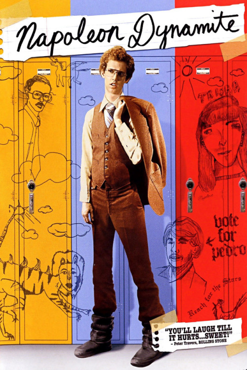
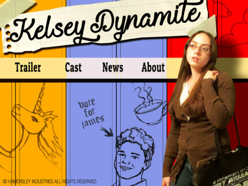
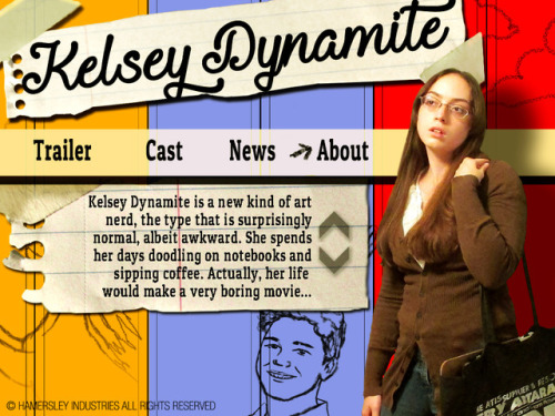
For my final project for Digital Imaging I, we created a mock movie poster based off of a real one and then made a web splash page to match. I chose Napoleon Dynamite. We had to use our own images, so I took the photo of myself and drew in the locker graffiti. All of this was put together in Photoshop.
It was a blast recreating the poster and seeing how creative everyone got with the project!
Post link
Hey, guys, I’m still alive! Just barely managed to survive the last semester, haha. I am never taking five classes at once again. @_@
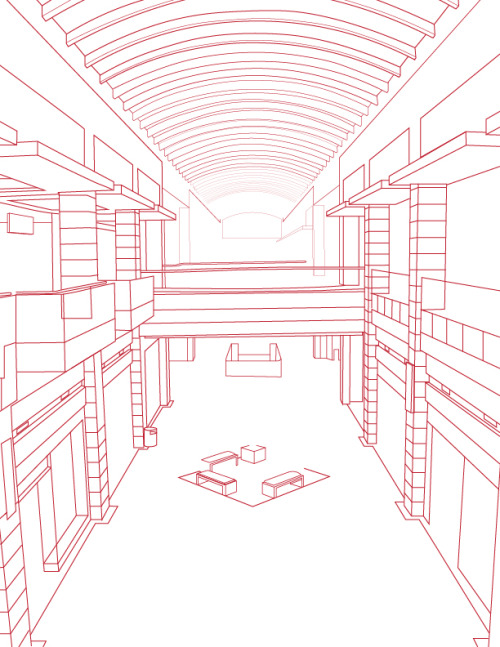
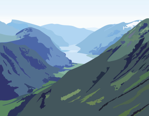
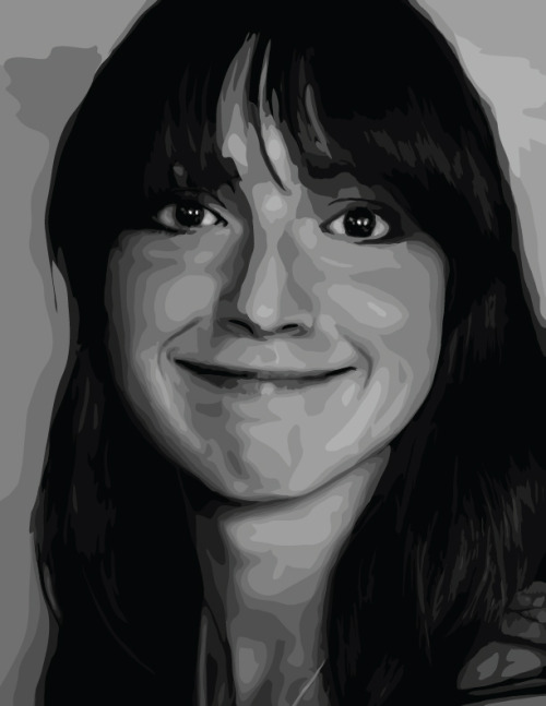
Anyway, here are a few projects I did in Adobe Illustrator for Digital Art I! Linear perspective, atmospheric perspective, and for the last one we took an image, turned it black and white in Photoshop, posterized it to somewhere between 5-16 levels of gray (I think I did 12 or 14), and then recreated it in Illustrator.
Post link
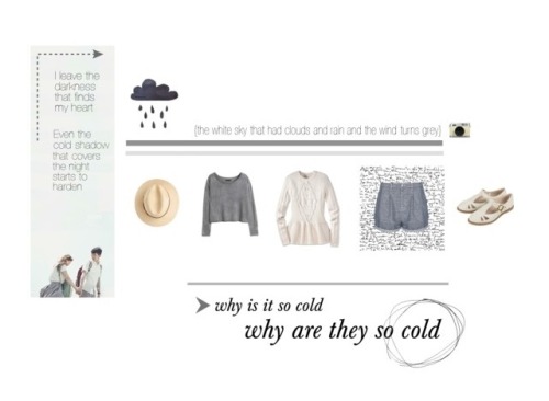
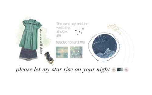
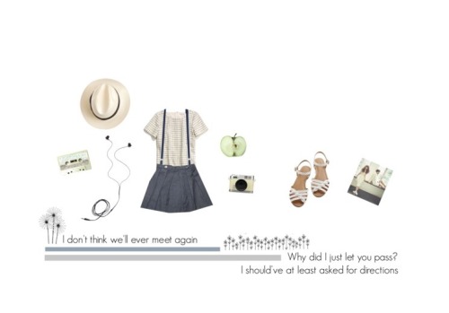
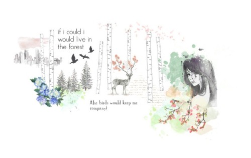
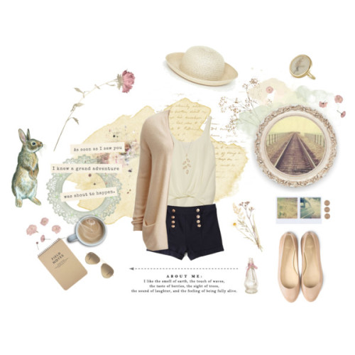
RIP Polyvore. These are a few designs I did before they got bought out. It’s unfortunate that I didn’t take higher quality screenshots…
The first three sets are inspired by the songs “Melted,” “Little Star,” and “Anyway” by Akdong Musician (AKMU), my favorite Korean group I’ve come across yet. The words within those sets are translated lyrics from the songs. I tried to make the items and their arrangement reflect the character of the songs…not sure how well it worked, but it was tons of fun and good graphic design practice me.
Post link
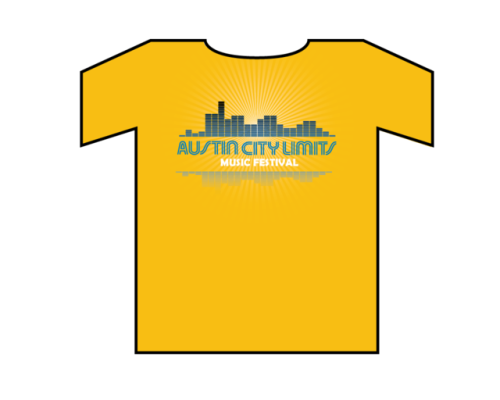
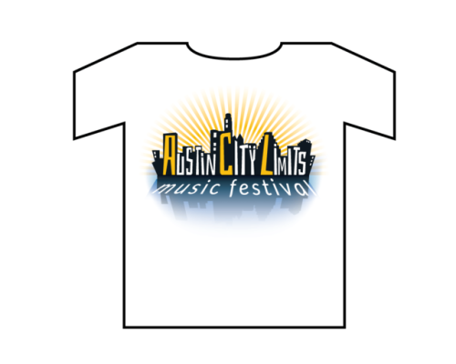
T-shirt designs I created for a Basic Graphic Design class. The assignment specs required that I create at least three different concepts using limited colors, one of the colors had to be Dell Blue, and the shirts had to contain the text “Austin City Limits Music Festival”. It was a blast looking at images of Austin for inspiration and trying to capture the personality of the city and create a graphic suitable for a music festival.
Post link
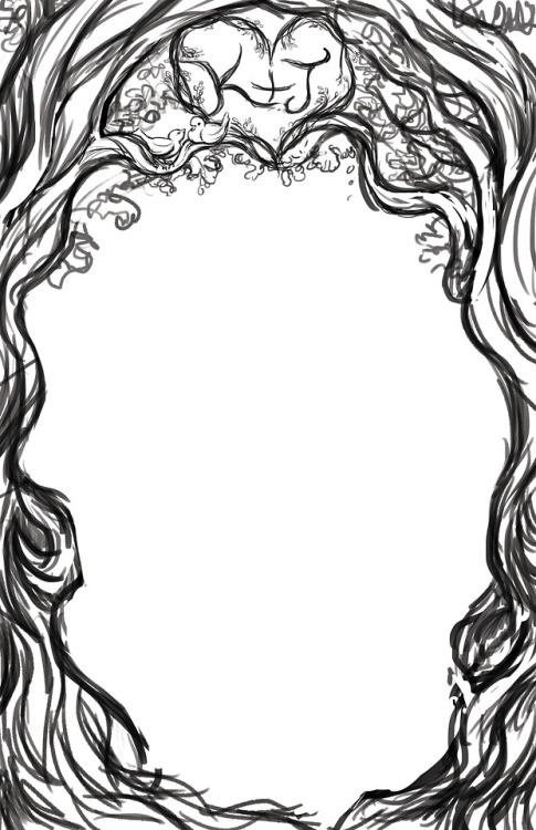
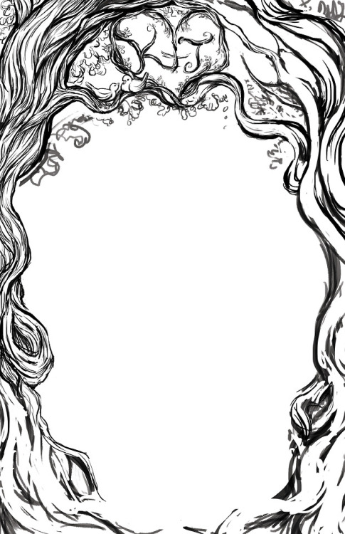
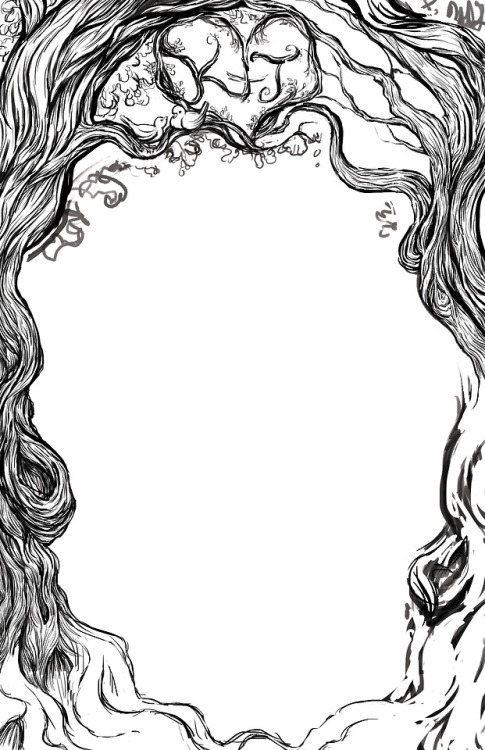
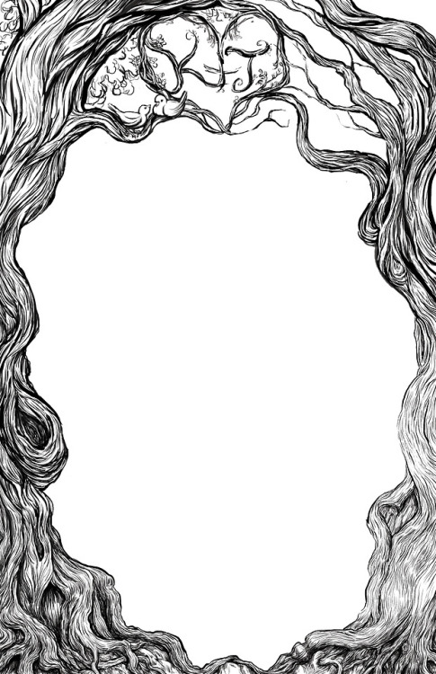
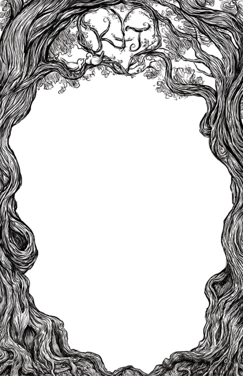
All done with my crazy-detailed tree drawing! I tried to make it look like ink, but this was all done in Photoshop. I’m using this illustration for my wedding invitations (only two months to go!!), hence the blank interior.
Post link

