#photo editing

Hello! Here is this month’s all-Tiers Digital Download (*^ᴗ^) I felt inspired by the Cottagecore Set and @lilacsblossom’s beautiful edits to make this Polaroid Graphics Bundle ~♡

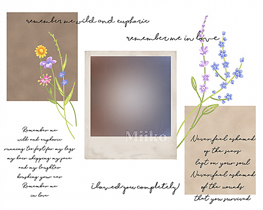
The bundle includes…
- Polaroid template PSD with included vintage photo-filter
- 2 garden flowers PNGs
- 2 paper textures
- 2 poetry PNGs
- 3 quotes PNGs
I hope you like it! ʕ•ᴥ•ʔ
Patreon-exclusive ($1 Tier and up)
Link on my blog, or
miikocc.tumblr. com /mycc


PSD SOLID COLOR REFERENCE, pt. 1
As you all know, I am very new at Photoshop. Many of you told me you are novices as well, so I decided if I learn something new I will share the wealth.
Here, I experimented with adding light settings using this method:
layer > new fill layer > fill solid color > mode
All of these are the original with a single lighting layer in the same color- a light blue- at 100% opacity.
In other words, every gif is identical except for the lighting method.
Post link

♡GLITCH EDIT FOR GIMP♡
This was requested after making the glitch tutorial for photoshop, so here it is for GIMP! This tutorial will teach you how to add a create a glitch effect. You can download GIMP for free here. Keep reading for the tutorial.
Post link


Stalin was a pro at retouching photos to make himself look better and erase his enemies. Click to read the full fact.
Post link


https://www.yourgirljess.com/p/preset.html
My Lightroom Mobile preset is now available for purchase on my website! This preset will give your photos that warm, neutral, and cohesive aesthetic. It’s easy to use and under $6! ✨
Post link

A lot more editing went into this than it actually shows, lol, you can’t really tell from the before & after but there were so many little specific alterations.
Post link


This was a postcard project for my Digital Imaging I class Fall 2017. We were supposed to use a single word and a caption, and do some editing with at least one of the letters (turning it into a shape, replacing it with an image, etc.) I had been watching the Lord of the Rings movies with my boyfriend, so the first thing that popped into my mind was the eye of Sauron. I did thumbnails of other ideas, but ultimately this was the one that won out.
Another requirement for the project was to use at least two layer comps (basically having two different versions or layouts of the same composition in the same file), hence the two versions here. I’m still torn about which one I like best.
Below that are the contact sheets for the project, which show you the original images I used to build the postcard. The entire project was done working non-destructively, so I used layer masks to hide parts of the images rather than deleting pixels.
This was probably my favorite project of the entire course to complete. I had such a blast working with all of the details and textures.
Post link


More projects from Digital Art I last semester, this time in Photoshop. The first two were about scale (taking something huge and making it tiny, and vice versa). Then there was a mythological composite creature which we made to look like one of those magazine photos of Loch Ness or Bigfoot with terrible quality pictures. (We had to come up with a name for the creature, too–I named it Bessie.) Then we did a disappearing act with an iconic image, taking something vital out of it.
Lastly was Arcimboldo, inspired by the Italian painter who painted portraits of people made out of objects such as vegetables or flowers. In this case we used found objects, simple everyday things that we brought to class and scanned in. This was such a fun way to get acquainted with Photoshop and stretch our creative muscles!
Post link


For my final project for Digital Imaging I, we created a mock movie poster based off of a real one and then made a web splash page to match. I chose Napoleon Dynamite. We had to use our own images, so I took the photo of myself and drew in the locker graffiti. All of this was put together in Photoshop.
It was a blast recreating the poster and seeing how creative everyone got with the project!
Post link


The process a National Geographic photographer uses to cull images from a shoot.
- Technical issues.
- Framing.
- Composition.
- Narrative.
- Behavior.
- Final decision: gut instinct.
Using the Bezier Curve function of Direct Draw in Clip Studio Paint to get better inked lines. It operates just like how you would manipulate control points in Illustrator and Affinity Designer when you are using the vector tools.
Some day, when I have time, money and energy, I shall expand my miniscule knowledge/provese with digital art and photo editing
…I would very much like to try my hand with a drawing pad like wacom or something

things I wish I had known when starting a studyblr - study-like-you-mean-it
It’s been a looong time since I made this studyblr; I started it in Easter 2016, which means it’s over 3 years old now (which doesn’t seem like a lot but going from GCSEs to having finished the first year of university is a long journey). I thought I’d share a couple of things I’ve learned along the way, through trial and error (mostly error), and hopefully this will help some of you out! :)
- Experiment with your look: It’s great if you settle into an aesthetic straight away and want to stick with it for the whole time you have your blog, and if that works for you, that’s great! If like me you want to keep trying out different styles, go with that (I still haven’t settled on an aesthetic and that’s chill)- most of the time, people will see your posts in isolation anyway so don’t put too much pressure on finding aesthetic cohesiveness
- Don’t think you have to buy all the stationery: You’ll see a bunch of brand names popping up over and over again in people’s posts, and whilst brands like MUJI and mildliners may work for some, you absolutely do not need to buy all of these things in order to keep up a certain ideal aesthetic. I, for one, have strayed from mildliners and use stabilo pastel highlighters now, as they are cheaper and last longer. My go-to writing pen when I work is a BIC biro, which I bought in bulk so it costs 24p per pen. I do have MUJI pens for working on my bullet journal and the B4 notebooks for taking to lectures, but it’s really not necessary to cash out on all the kit in order to be a “legit” studyblr. All you need is a phone camera, a pen, and a piece of paper.
- You don’t need the “studyblr” handwriting: Scrolling through the myriad of studyblr posts, it’s easy to become convinced that you need this stereotypical ultra-neat “studyblr” handwriting, and whilst it does look nice, it’s not the only handwriting that looks nice. I used to take ages to try and write my study notes out so that they conformed to this aesthetic, and it ended up slowing down my studying to the point that I never finished the notes or the material I wanted to cover in a given day. I also ended up making notes for the sake of studyblr posts that ended up not being an effective way for me to study (I learned this the hard way). I’m quite lucky in that my regular handwriting is quite consistent, but to be honest, the overall aesthetic of a post is more important, and sometimes this studyblr handwriting fits into the aesthetic, but I can guarantee it’s not a necessity and you don’t need to spend your time on it if your handwriting doesn’t look like that.
- Composition and lighting are most important: Long story short, you can’t take a good photo of your notes if the composition and lighting aren’t there. Take a look through the most popular photo posts and you’ll see what I mean: it doesn’t matter what the actual content of the photo is, just that it looks nice overall. Again, this is a case of what kind of a look you’re going for: some posts will have this super clean, neat look with no shadows, and other will tactfully play with the shadows for a different kind of image. However, if the shadows in the picture don’t match the aesthetic you’re going for, or you try and edit them out after taking the photos, I can guarantee this is a recipe for disaster.
- Edit, but don’t overedit: Everyone with a studyblr edits their photos. I personally use a combination of VCSO and Snapseed, and have been doing this for a while, but even then I often make errors in judgement about filter strength and editing, and sometimes my photos end up looking overprocessed and frankly unattractive. I have 11.5k followers, and even now I get posts with 0 reblogs because my photo editing has been so bad. It happens (and the posts get deleted once I realise), and that’s just something you just gotta keep trying at.
- Be inspired by others: See something that you like that someone else is doing? There’s no harm in trying to recreate something similar yourself, as long as you’re not plagiarising or downright stealing.
- Regularity is important, but you are more important: Obviously, uploading and/or reblogging content regularly is important to your blog. However, it’s a studyblr, and if you find that it’s getting in the way of doing actual work, there’s no harm in taking a break. I rarely upload during term time, or even in the holidays, because I’m so busy trying to get my actual life sorted and enjoying my university experience. For me, I worked the most on my studyblr last summer after I finished my A-Levels, and that’s when I experienced the most growth through very regular uploads (and since everyone else was also on their summer break, they had more time to spend on tumblr and see my content). From there, it’s just been growing by itself, and it’s almost 10x as big as it was in January of 2018. Don’t feel pressured to dedicate loads of time to producing content if you simply don’t have the time. If you’re a studyblr who reblogs rather than produces content, it’s always possible to just queue up stuff so it’s released regularly whilst you are working.
- Stick at it: It took me over two years to experience any real growth, and by that time I’d poured many hours of work into it. Growth doesn’t come overnight, and no matter how hard you work, you’ve gotta keep working. My first text posts got 10k notes and that did almost nothing to my follower count. Keep going and it will happen, and when this happens, you’ll be able to reach out to more people, directly and indirectly, and it becomes an even more rewarding experience.
I hope this helps some of you, and as always, you can access my Redbubble store here, and if you think what I’m doing is kind of cool (and want to request content that becomes top of my priority list/support what I do), you can find my ko-fi link here (it’s like patreon but they don’t take commission).
Post link