#deep dives with star

Hello everyone! It’s December 12th, and today just so happens to be a very special day… it’s my birthday!
One year ago today, I made what may just be my absolute shortest post announcing to the few followers that I had at the time that it was my birthday. It wasn’t anything special, and the only reason I had uploaded it at all was because I was proud to share that the twelfth of December is a date I look forward to all year.
This year, however, I wanted to try a little something different. Instead of settling for a three word post (I still can’t get over how short that post is.), a few months ago I had an idea of what I could talk about when 12/12 rolled around.
I’ve mentioned this briefly once before in the answer to an ask that had been sent in, but there’s a very good reason that my blog name is ‘StarDestroyer81'— it’s a combination of the subtitle and release year to one of my all-time favorite arcade games, Bosconian!
Unfortunately, Bosconian isn’t all that well-known of a title, especially when pitted against some of Namco’s other smash hits, such as Pac-Man and Dig Dug. So, for my birthday and just in time for Bosconian’s 40th anniversary..

Let’s talk about Bosconian: Star Destroyer!
Bosconian was released by Namco in… well, 1981! The game began to show up in arcades in Japan on November 7th of that year, whereas its was released worldwide (By Midway Games) the next month.
I’ve spent such a long time digging around to try and find an exact date as to when in December the worldwide release happened (How cool would it be if it was on my birthday?), though I did find the date of December 5th, though don’t take this as the definite date.
Whenever I talk to my friends about Bosconian, a majority of them have never heard of it (Appropriately so), and so I describe it to them 'The Star Way'— it’s like Galaga, but a million times cooler. Bosconian is a multi-directional space shooter type of arcade game, and unlike Galaga, not only can you move wherever you’d like instead of being limited to the x-axis, but you can move and shoot in eight different directions!

Bosconian puts you as the player in the esteemed Starfighter, a spacecraft which has but one goal: to seek and destroy the base stars (Also known as 'Orbitals’), which are large, green enemy bases. It’s no easy task, however, as the entire time you’re being chased by oncoming fleets of enemy ships on top of steering clear of asteroids and Cosmo Mines, which can be destroyed for additional points.
Each level of Bosconian gives you a set number of base stars to vanquish, whose destinations are conveniently identified on a map on the right side of the screen (A blinking red dot signifying where you’re at). Blast all the base stars and you’re off to the next parsec!
The base stars have six circular cannons which can open fire should you get too close, though its projectiles are relatively easy to avoid should they not be too clustered. To defeat the base stars, you have two options: the standard way, or the patented “Star Method”.
Regularly, you would shoot work your way around each base star and shoot out all of its cannons. Once all six are destroyed, the entire base star blows up. Conversely, if you go about the ever-cool “Star Method”, if you line up your shot just right, you can shoot between the bottom or top two cannons to shoot directly at the core of the base star, which blows it up immediately. It’s SO satisfying!
Sometimes, the game alerts you to go into 'battle stations’, which means a select base star has sent out a fleet of five enemy ships in a certain formation that will hone in on your location. By being reckless, it can be easy to not see where they’re coming from and run right into them, but with quick handiwork, they can all be blasted for a nifty point bonus provided none have left the screen.
You might also notice that on the right side of the screen, there’s a section reading your ship’s “condition”. Having a Condition Green means that everything is relatively lax, and there’s not much action afoot. A Condition Yellow means that things are looking a bit dangerous, and is the usual condition for a majority of the game.
And then there’s Condition Red…
Before I get into specifics about Condition Red, I should also mention the importance of one of Bosconian’s most vicious foes: the dreaded Spy Ship. Easily spotted by its bright yellow color, the Spy Ship appears from a random corner of the screen, and will glide around the player at a distance before vanishing off screen. If you see the Spy Ship, stop everything and destroy it before it leaves. If you don’t,or if you take too long in a level…
Condition Red happens. Heart-pounding music sets in as an enormous amount of enemy ships will fly in from all directions directly toward your ship. If you don’t act fast and blast the remaining base stars, you’re as good as space junk.
Something that sets Bosconian apart from a lot of other space shooters at its time was the fact that it— in a forty year old game, mind you— included voice acting. Throughout your cosmic escapades, various voice lines will play, and right here is a list I’ve made of all of them and when they occur!
“Blast off!” - Played when starting a stage.
“Alert! Alert!” - Played when an enemy ship draws near.
“Battle stations!” - Played when a fleet of five ships leaves a base star, in search of your ship.
“Spy Ship sighted!” - Played when a Spy Ship appears. This is an excellent audio clue to know when to start looking for it.
“Condition Red!” - Played when… uh, take a wild guess.
While it’s neat that Bosconian has these voice samples, I personally didn’t hear them in action until long after I played it for the first time on the first Jakks Pacific Namco Plug-and-Play, which lacked the samples. And, additionally… some of these voice samples don’t even sound like what is actually being said.
For example, for a while, these are what I heard instead:
“Lock/Loaf all!”
“Alive! Alive!”
“Battle station!”
’Spy Ship sighted!’ may just be the clearest sample of them all, but ’Condition Red!’, on the other hand… when I was little, I had no clue what was being said, and didn’t use contextual clues to look to the right of the screen.
Speaking of taking visual cues… what does all of this even look like? If you’d like to check out the original, 1981 arcade version, here’s a longplay of it where you can check out my long descriptions of in-game goings-on in action!
Alternatively, check out the Jakks Pacific port, which was the version of Bosconian that not only I grew up with, but also set my all-time personal best score of 505,750on!
I think that’s about everything that I’ve wanted to dive into regarding Bosconian, and I hope that with my explanations that anyone reading this has a better understanding of what Bosconian is. It’s such a cool game that deserves a whole lot of recognition! I hope you’ve enjoyed everything this post has had to offer, as I’ve waited quite a bit to write about this game!
Hi everyone! I’m back yet again with another lengthy design deep-dive post, this time having to do with Override! It’s been a short while since I’ve discussed anything Override related, and since I’ve been wanting to talk about it and its cast of characters again for quite some time, I settled on the perfect topic: how its main character designs have evolved over the course of two years!
Since I first unveiled Override as a concept to my tumblr (Which you can find linked in the paragraph above), a good few touch-ups have been made to all four protagonists— including a complete redesign of Casey! Check it out!

I find that the differences in design are most prevalent with Casey, though effectively, the remaining three have also had pixel-perfect alterations made to their sprites. I’m also just now realizing that this is the first time my followers are getting to see their default sprites, something I’m very much acquainted to by this point.
Below, you will find not only explanations as to what’s changed for each character’s design, but also their full design timelines (And developmental names!) which includes sprites I made for Casey and Lauren back in 2019! Without further adieu, let’s get into it, because we’re in for a long ride!
As I’ve mentioned in Override’s two year anniversary post, Override was once a completely different concept entirely compared to what it is today, and given this, each member of the chosen four have had quite a rollercoaster ride in just about every aspect of their design, be it their looks, name, or personality.
And who better to start with than Casey?

Casey was originally going to be named either ‘Weston’ or 'Colton’ early on in back when the project was called MOTHER: Into the Unknown, but 'Casey’ was settled to be his final name once I drew him for the first time.
As you can see above, the tried and true Earthbound 'striped shirt and shorts protagonist’ combo in Casey’s design was used to its fullest since day one. At first, I wanted him to have a red shirt with orange stripes, but after noticing this made him look too similar to Lucas, it was changed to a blue shirt with cyan stripes.
Fun fact: Casey’s dull brown hair color and the color scheme of his shirt for a while were in direct reference to one of Lucas’ Smash Bros. alternate palettes, which was where I got the inspiration from (Plus, blue is my favorite color)! He was going to have red shorts as well, but that was much too on the nose.
Casey’s scarf also went through a few color changes! I think the reason it was white in the first design was just for placeholder reasons, though I recall it being red for a little while before I switched into yellow for two reasons: one, the color yellow is associated with both optimism and cowardice (Both being big personality traits of Casey’s), and two… well… this guy.
Lastly, let’s touch on Casey’s most recent design. Because Override is now its own entity separate from the Earthbound continuity, I wanted to opt for a design that was… more of my own, if that makes sense. I ended up giving him a long sleeved light cyan shirt with blue sleeves, referencing his previous design, as well as completely redrawing his hair so that it wouldn’t be too spherical.
Now, how would you react if I told you that Casey’s design timeline has the least number of sprites?

Enter Lauren, who I’ve given the distinction of having the second most changed design since her first version! My original vision of Lauren was to have her be more of a 'girly girl’ type (Look where that ended up lol), and while she had several preliminary names, the only ones I distinctly remember are 'Madison’ and 'Hannah’.
Because I didn’t bring it up in Casey’s section, you might notice that Lauren’s sprite style changes drastically by the third design, opting for a bigger sprite with room for more detail. Early on in, this visual style lined up with Oddity’s quite a bit, and became its own thing soon enough (Plus, Override’s character sprites have four pixel tall eyes. Big difference.).
For like a very brief while, Lauren’s color of choice was a mint green, though that was swapped out for a shade of orange quite fast. I also wanted Lauren to have a bow, kind of like what Paula wears in Earthbound, and I also wanted her to wear a dress… before long, I realized I had just designed another Paula.
So, the dress aspect of the design had to be changed, but I first wanted to see if I could hammer out a good hairstyle for her, which doesn’t come into full effect until the third-to-last sprite. Lauren eventually began to sport her trademark ruby red color, and instantaneously after that change, she switched out the dress for something marginally less lady-like; a t-shirt and overall combo.
By now, Lauren’s 'nine-year-old tyrant’ personality was beginning to take shape, and while her overall design was her final design for a while, I then remembered that Override takes place early on in the year, so it might make a little more sense to have her dress in something warmer (Like how Casey gained a sweater)!
Thus, Lauren was given her standard jacket, as well as keeping the pink shirt aspect of the previous design! I find that Lauren had the smallest amount of changes between the Override reveal post and this one, as all I did were give her the little hood pullies and a hood for her jacket.
And that’s a wrap for Lauren! You know how I said that Lauren had the second most changes to her design since her initial concept? Well, do you want to know who couldn’t keep a consistent design for the live of him for the longest time?

Bradley.
With a whopping eleven different design sprites, it took me an extremely long time to settle on how I wanted Bradley to look, as well as who Bradley is as a character. Named 'Oliver’ originally, his design didn’t start making the rounds until I had started to round out the designs for Casey and Lauren.
Initially, I envisioned Bradley as more of a 'social outcast’ type (Much more so than his present version, funnily), though I also wanted him to be kind of a nerd type who plays video games a lot and does well in class, but I also wanted him to be a 'cool guy’ character who would skateboard everywhere… oh, boy, this wasn’t going to be easy.
Bradley, for a while, wore glasses, as a subtle nod to the glasses Jeff wears in Earthbound: the only difference being that you could actually see Bradley’s eyes. Jeff was a big inspiration for Bradley’s character, too, seeing as both were blonde (At one point), had glasses (At one point, again), wore green (At some point) and didn’t use magic.
It was when I did away with his glasses that his current design began to form. I briefly brought back the hoodie his first design has before giving him a red dress shirt with a black overshirt jacket (Though the hoodie was repurposed for his best friend’s design, who ended up looking a lot more like how I first wanted Bradley to).
I then tested out a different palette for his new outfit by making the overshirt jacket green and trying out a long-sleeved black shirt underneath, and since that design change, Bradley was pretty much finished, save for small changes from then on (Such as his military dog tag necklace).
His current design changes two things from his previous design: one, I finally got his hair how I wanted it to look— noticed best by his bangs and the addition of a cowlick— and two, he now sports an undershirt like this, which I find has a particular 'late 90s/early 2000s’ feel to it.
As for Bradley’s character, it was eventually decided he would be a mix of the personalities I wanted to give him: he’s mostly known as an unassuming and awkward teenager, but also likes skateboarding and playing video games. With perhaps the most design-intensive character out of the way, let’s move on to our last but certainly not least team member…

MacKenzie! Oddly enough, I’m pretty sure MacKenzie was like the second character I began to think of ideas for. In the Into the Unknown days, my basic idea was for her to be the standard 'early 2000s gothic girl’ without going too overboard in terms of the usual dark and complex clothing.
She was named 'Destiny’ at the start, but I then changed her name to 'Kenzie’, as it better fit the era Override takes place in… but then I felt like Kenzie was too feminine of a name for the type of character I was aiming for, so she was promptly renamed to MacKenzie thereafter.
MacKenzie is noteworthy for having her first design line up pretty closely to her current design, though plenty of changes were made in-between. She started out with an extremely basic, placeholder look: a jean jacket, deep red shirt, black pants… boom. MacKenzie. However, for a while, MacKenzie had two things the current MacKenzie does not: a hair bow, which has a crescent moon in the middle, and bright pink wrist sleeve braces.
Most of her early sprites were focused primarily of detailing her first sprite, while experimenting some with color choices. Somewhere down the line, though, a humorous idea came to mind— what if she carried an entire stop sign for a weapon? I had wanted MacKenzie to be more of a masculine type of girl, similar to MOTHER 3’s Kumatora, so it was a perfect addition to her design!
For a little while, the sprite where she first has the stop sign was her current design, before I tried out giving her the black jeans I had initially drawn her with. I liked the design, though I felt that it was a little lacking, like it was missing something… maybe if I gave her different headwear?
Her crescent moon bow was replaced with a black snapback with a purple brim (That’s why MacKenzie is always represented with a purple color, by the way!), and I saturated her jean jacket a bit so it wouldn’t be so flat. She also now wears a black wrist sleeve brace (Though it could also be a Psiometer… up to interpretation!) on one of her arms, as a nice callback to her starting design.
Thus, MacKenzie’s design was complete! … or, so I thought. It was when my good friend @minxxikuo took a huge liking to MacKenzie and began to draw her that I found that I really like how he portrayed her. Knives’ portrayal of MacKenzie featured a shorter hairstyle that juts out to the side a bit, as well as giving her all kind of earrings.
We ended up agreeing that this interpretation was now canon, and the only other addition I made that you can find in her latest sprite— which is an extremely easily missed detail, mind you— is the addition of two little pins to the front of her jean jacket. Oh, also, her stop sign has a dent in it now, implying… previous melee use.
Well, I think that’s about everything! This post ended up being much longer than I expected it to be, but knowing a good few of my followers do like when I get lengthier insights to whatever I make, I’m not sweating it too much! I hope that you’ve enjoyed this deep dive of the Override cast’s designs— these four have come a long way!


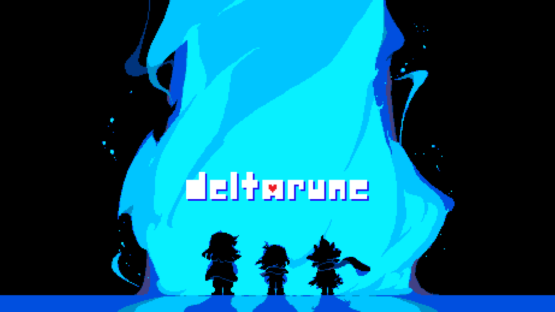
It was bound to happen sooner or later, though after extensive work and a close eye for attention to detail, I’ve created promo artwork for the Deltarune AU @itsactuallyreigh and I have been working on, DarkLight: Parallel Worlds, based off of the artwork Deltarune uses in its file select menu!
(And there’s quite a tale behind its creation, too, of which you can find a deep dive and additional insight for underneath the cut— concept art included!)
Since Reigh and I began talking about creating a Deltarune about a month or so back, we knew that at one point we wanted a version of the one piece of Deltarune art featuring Kris, Susie and Ralsei beholding a behemoth of a billowing, blue dark fountain (Unintentional alliteration + 100).
The only difference being, naturally, that in place of the usual three heroes of the Delta Rune legend, it would instead feature the DarkLight trio: Reigh,Micah, and— a character that a lot of the Deltarune fandom could argue deserves much more lore relevance— Rouxls Kaard.
I mean, how hard could it be, right? Said artwork is entirely sprited, and if you know me, I’ve quite a history in pushing my spriting expertise to the limit… though, let’s take a closer look at the original’s sprites.

Upon closer inspection, the silhouettes of Deltarune’s trio are not only shaded a very specific way, but also have parts of their outfits flowing valiantly in the wind. The more I began to look at it up close, the more I wasn’t sure if I had the skill to make something of this caliber for DarkLight— I even would have to sprite the trio from the back!
Though, I didn’t want to conclude that it couldn’t be done, not without at least giving it an attempt. Really, all I needed to do was sprite DarkLight’s trio of the legend, as I already had a good, pixel-perfect asset of the fountain itself. So, I took to MS Paint and hastily drew out what the end result would look like.

Key word: Hastily.
As it turns out, it was easier than I thought it would be whipping up silhouettes of the cast by mouse, though I knew for certain that I would have to add a lot more details and accurate shading if I were to attempt a final version.
It was at this point that I discovered a sneaky trick that would, effectively, give me silhouettes that would actually look good, and from then on, all I’d need to do is shade them. The trick in question? Just upscale their overworld sprites, redraw them as solid black silhouettes, and flip them horizontally!

It worked out a lot better than I thought it would, too, and all that was left to do was heavily reference the shading style of the original. I noticed that, in the original art piece, the upper halves of Susie and Ralsei are at a very slight angle— it’s easier to see with Susie, as you’ll notice her jacket is flowing mostly to the left, so I’d have to account for that for Micah and Rouxls.
So, I got to work in shading. It was during this process that I made the realization that I would have to draw in some details so that the silhouettes would look better, most notably, having Rouxls holding his hands behind his back (Which, as any artist who’s drawn said pose from the front, is nowhere near as easy from the back).

Here’s what the fruits of my labor yielded! Eagle-eyed observers may notice that Rouxls’ coat flaps are drawn differently than the original silhouettes so that they look a bit more flowy (Rouxls Kaard fanatics may also notice that his whole design looks a bit different, and the reason behind that is… well… Reigh fixed it!).
This was quite a fun little project to work on, and it won’t be the last time you’ll see this art in action, either, though more on that in due course… in the meantime, I hope you’ve found my sprite process for this piece to be fascinating because I’m REALLY proud of it!!
If you’ve been following my blog for a while, chances are that the name ‘Fated Acolyte’ might sound familiar to you! The Fated Acolyte was my first publicly shown Shovel Knight OC/Self-Insert that I designed in early 2020 and didn’t end up posting to tumblr until the end of that year. While he’s gotten a few touch-ups to his design, I’m still proud of his overall look and feel as he looks like he’d fit right at home in a campaign like Specter of Torment!
In the Fated Acolyte’s debut post, I mention that— at the time— it was a lot tougher for me to make a Shovel Knight OC than it was for me to make a robot master OC, merely because at that point I had only been familiar with the Shovel Knight franchise for a little under a year. Sure, I’d actually designed one or two knights during that time, but I’ll get around to showing them once I touch up their designs a bit.
However, a couple of days ago, I was struck with a genius idea for a Shovel Knight OC, and given that my familiarity with the Shovel Knight universe has expanded since 2020, I sprang to action to bring a skilled marksman to the Valley…

MeetBattle Knight - The Administrator!
(Check under the cut for a bio, a design deep dive on Battle Knight’s look and a special bonus!)
Name: Battle Knight
Height: 5'11" (6'5" counting helmet)
TrackNames: An Unmatched Artillery, The Administrator
Affiliations: The Order of No Quarter (Formerly)
Pros: Strategical mind, possesses great confidence, well presented
Cons: Refuses to accept defeat, easily intimidated when outnumbered
“Armed with a tactful mind and a fearsome onslaught of warriors, Battle Knight is notorious for being outstanding in his field— the field of battle! Battle Knight once worked closely with The Enchantress and the Order of No Quarter to diligently plan the takeover of the Valley, and was responsible for recruiting worthy warriors to defend each knight’s respective keeps.
He holds a strong appreciation and knowledge for all things weaponry, evident by his very own literal arm cannon. His artillery smarts are perhaps most evident on Propeller Knight’s Flying Machine, which he aided to equip with state-of-the-art cannonry, landing him a strong fellowship with the Spin Controller.
In spite of his prestigious position, Battle Knight is easily frustrated with anyone claiming to be a worthy opponent and not have an ideal weapon to match (Take, for instance, a spade), and has been known to drop his brave demeanor once faced with an army greater than his own. But a fighter wouldn’t stay true to their name if they couldn’t hold their own, and Battle Knight ensures any scuffle he finds himself in will see him victorious!”
/cdn.vox-cdn.com/uploads/chorus_asset/file/13289627/shovelKnight.png)
Unlike the Fated Acolyte, who’s design process at first took a few days and was improved upon over the course of 2020, Battle Knight’s design was so clear to me from the get-go that it took me a little over an evening to both design and sprite him! I chalk this up to the fact that I knew that I wanted him to be a war general type of character, and was quick to scour the lands of Google for good outfit references.

As is standard practice with my sprite posts, here is the process I went about when spriting (And by extension designing) Battle Knight! While a regimental coat was a given for the type of knight I was going for, I’m most proud of two aspects of his design: his cannon arm and his bullet shaped helmet!
The day after I had completed Battle Knight’s base sprite, it felt only right to also sprite a dialogue portrait to go along with it (And so I could write humorous dialogue between him and the other knights)! What’s interesting is that I’ll usually sketch out what I want a sprite portrait to look like before spriting it, but much like Stellar Man, I ended up freestyling the whole thing, making for a flashy final result!

And from having sprited a portrait for Battle Knight, I put it to good use by designing him his very own Joustus card! Having Battle Knight’s card in your deck ensures turning the tide should your opponent gain the upper hand; between possessing both a Bomb arrow (Referencing his cannon arm) and being a Slam card, this is certainly a card to chase after!
With that, that’s finally everything! I hope that you’ve enjoyed my deep dive pertaining to this steadfast sharpshooter, because I’m extremely proud of what all I was able to come up with for him!
The artstyle of the Classic Mega Man series, which only began to find its footing just after the third installment, is iconic. I have a majorsoft spot for Keiji Inafune’s artwork for the NES-era Mega Man titles, as well as Ryuji Higurashi’s illustrative work for Mega Man 9. I’ve even spent a good while trying my hand at the style, of which you can check out here!
Though, every artstyle has to start somewhere, and even though the later NES Mega Man titles had some excellent looking artwork, the illustrations for the first couple of games were… interesting. The characters of the original Mega Man and its sequel were drawn in a much more rounded artstyle, looking more chibi like than the anime-esque style it would evolve into, and after the first few Mega Man games, it was quickly improved upon.
When you really take some time to sample Mega Man 1 and 2’s artwork, however, you’ll find that it’s not thatbad of an artstyle. Sure, the infamous ‘Capcom hand’ looked odd from having the middle two fingers fused together, but outside of that, I find that it’s an artstyle that doesn’t get a lot of representation in Mega Man fanart and is one I’ve grown to appreciate in these past few weeks.
And from having drawn a near-identical Inafune-styled Mega Man a month ago, yet another challenge for my artstyle replicating smarts arose… could I do it again, but take more after the style of Mega Man 2’s artwork?

See for yourself!
I’ve been playing a whole lot of the first Mega Man Legacy Collection for the past few weeks, and in that time I’ve beaten all six games (Some even twice or thrice like Mega Man 5), read all of the database entries, and have been sampling the game’s enormous backlog of illustrations from Mega Man 1 through 6!
In doing so, I found myself developing a fondness for the artstyle of the first two titles in the series— while I do prefer the artstyle of the later NES games, the humble beginnings of Keiji Inafune’s illustrations for Mega Man appealed to me, and it was a style that I definitely wanted to see if I could come close to replicating.
And so, it was shortly decided that I would be drawing Mega Man in the Mega Man 2 artstyle! … but what pose would I draw him in? I thought it would be neat to have a MM2-styled version of Mega Man from his appearance on Mega Man 10’s box art, and the instant I thought of that pose, I got straight to work!

Compared to its modern counterpart, the style of the earlier Mega Man games has some pretty key differences: most glaring are the pupils of the eyes, which are much more wide than the slimmer pupil shapes seen in later titles. The eye shape itself is also a lot more circular, too, and certain aspects of robot master facial features (Such as their mouth or chin) are much larger.
The hands and boots of both Mega Man and robot masters are also greatly simplified, too. The 'feet’ section of the boot is much more round, and also lack the 'Z’ crease shape you would normally see on non-segmented boots. Instead, the boots (And often other parts of the body, such as the legs or buster) have minor crosshatch shading, though nothing too major.
These were design elements I made sure to account for in my initial sketch, and much like when I last drew Mega Man, the most important part was getting his head to look as 1:1 to the original that I could. You might notice the 'Capcom hand’ looks a bit wonky, and this is because I was using my Switch for references and it was tough to draw a good looking one pointed left instead of right— it wasn’t a huge deal. I could always fix it when I digitalized it!

After I got the sketch fully lined to my liking, it was time to figure out another crucial aspect to staying true to the look of Mega Man 2’s visual style: the colors. The colors I used here were directly picked from Mega Man himself on Mega Man 2’s box art, but when I wasn’t liking how dark the colors came out, I brightened and desaturated them a slight bit to give it that vintage feel.
The shading was particularly easy, as I referenced the shading from my main reference of Mega Man in 10’s main artwork, though I intentionally left some areas unshaded (Such as the buster meter and inner earpiece) seeing as Inafune tended to do the same every now and then.
An extremely small detail that I’m glad I acknowledged was how you can only see Mega Man’s right (Or hisleft) earpiece as opposed to both. In artwork from the first two games, whenever Mega Man is at a ¾ths angle, only one earpiece is present, whereas both can be seen at the same angle in later games.
I’ll be honest, it was actually a whole lot of fun drawing in 2’s artstyle, since it’s a lot more simplistic compared to the perfection 9 and 10’s style demands when replicating it— I may even attempt modern robot masters in the same style to see what they may have looked like in earlier Mega Man titles… or perhaps even draw faux official artwork for the obscure Bond Man!
That said, I hope you’ve enjoyed my dive into analyzing the artstyle of the earlier Mega Man games, and what my research yielded in perhaps one of my favorite drawings I’ve done this year!
Longtime followers of mine may have seen my faux Mega Man Ultimate screenshots, which range from exemplary stage designstofull-on boss battles! However, it’s been a little while since I’ve made another sprite piece of what certain in-game moments of Mega Man Ultimate would look like, and for my next screenshot, I knew just what I wanted to sprite!
My last faux screenshot detailed the electrifying battle against SLN-001, Zap Man, and seeing how easy it was to sprite full screens with the magic of tilesetting, I aimed to make a mockup of a battle against another one of the Synth Legion Numbers, Satellite Woman! And unlike Zap Man’s simpler NES-esque boss arena…

… the boss arena of SLN-003 has a lot more going on!
Who doesn’t love space? When it came time for me to decide which of the eight Synth Legion numbers to devote my next boss battle mockup to, Satellite Woman was my first choice, because that meant I got to sprite an out of this world background for her by way of tilesetting!
And there was a lot I could do with it, too. While I initially didn’t have a whole lot of ideas as to what Satellite Woman’s boss arena could look like, I did eventually come up with two goals: for it to have a Mega Man V feel to it as well as referencing her bio, which mentions her base of operations being exactly one hundred parsecs away from Earth.

This is what I came up with! One of the earliest design decisions I made was that I wanted to have Mega Man fall into the boss arena rather than walk into it— we haven’t had a lot of robot master boss arenas of a vertical caliber since the original Mega Man! Fortress bosses have entrances of this type, so why can’t more robot masters?
Secondly, the arena lacks walls, because I find that the quarters in which you do battle with Satellite Woman feel a lot more vast without them than they would with the usual boss-in-the-box formula. I first planned on having the satellite platform be shorter in width, where if you fell off, it’d be a one-hit KO, but I felt like that wouldn’t be too fair (Even if Cloud Man did it first).
Perhaps the most appealing part about the entire background are the drifting satellites and the gorgeous view of Earth— both of which took me quite some time to sprite! The Earth sprite in particular (Which I think was the asset that took me the longest to sprite) fits snugly into a 32x32 tile, whereas the satellites make up a 48x48 tile.
The last design choice I’d like to mention are the colors in this piece. For Satellite Woman’s boss arena, I wanted to stray away from the usual NES limitations and go for something a little more flashy— hence my decision to make the space background all kinds of blue hues instead of a solid black (Plus, if I went with the latter, you wouldn’t be able to make out Satellite’s complex sprites very well!).
I kept switching between purple and light green for the bottom platform, and when I couldn’t reach a consensus, I tried a turquoise color to see what that would look like, and it made for a stellar in-between! It was always a given for the space station up above to be colored after Satellite Woman, so I didn’t have a lot of trouble figuring out colors there.

And finally, as I’ve started to do for my art posts, this was the process I went about in designing the arena! Starting with a conceptual sketch of the room I drew in MS Paint, it follows up with a general layout made up of placeholder green and purple tiles, and from there you can see the final product start to form!
With design specifics out of the way, we can touch base on what it’s like to be pitted against the connoisseur of the cosmos, Satellite Woman! Her battle takes a lot of inspiration from Star Man’s battle from Mega Man 5, with the emphasis on the robot master constantly being shielded and zero-gravity jumping aplenty.
When she’s not putting her Reflect Satellite to good use, Mega Man may attempt to land a blow on her… if she doesn’t land a blow on him first! The only time you can do damage to Satellite Woman is when her shields are down or when she’s firing lasers from her Satellite Buster (Pictured above), so it’s very much easier said than done…
That is, of course, unless you arrive with her weakness weapon in tow!

Enter Glitch Strike, the weapon you acquire after defeating the bug-tastic Glitch Man! Glitch Strike allows Mega Man to speedily glitch a lengthy distance in any direction, passing through any projectiles without harm and— with precise aim— may ram into opponents. However, this ability comes with a hefty energy cost (Much like Tornado Blow in Mega Man 9), and you’ll only see four or five uses of it with a full meter. Better use them wisely!
Well, that’s about everything— this ended up being one of my biggest sprite pieces in a while, and it took a whole lot of thought and experimentation to look just right! I hope you’ve enjoyed reading through the design process, and more importantly the fruits of my labor!
Many a time on this blog, I’ve shown of my fascination in two particular things: logosandrecreations. I’ve always had a thing for logos specifically, and many of my favorite video games have very cool looking logos, such as Rivals of AetherandBosconian!
Though, stylistically, a triad of games from a franchise very close to me hold logos that are very high up on my favorites list, those being the three games that make up the Earthbound/Mother trilogy! In Japan, the logos for all three Mother games stay relatively the same, though Earthbound’s logo in particular is vastly different by comparison. It’s really neat stuff!
And if several of my previous posts are any indication, you can bet that I’ve attempted to not only find the fonts that the logos use, but also see if I can recreate them from the ground up to the best of my ability… and I’m very pleased with what I was able to come up with!
Below, you’ll find recreations of all three Mother games’ logos with a small deep dive on the process of each one and a bonus at the end! Let’s get right into it, shall we?
Typically, when I’m recreating a logo of any kind, I will sometimes default to recreating it to read something else in place of the original text. And what better word to swap out Earthbound/Mother than with my very own Override?
The logo for the first Mother game is perhaps the simplest one of them all— ‘Mother’, written in a dull gold color on a red background, with a drawing of planet Earth in place of the 'o’. For the longest time, I was under the assumption that the font used in the Mother logos was 'Bank Gothic BT Medium’, and all you had to do to make it look more accurate was by stretching the text vertically.
But that never sat right with me, seeing as every time I wanted to make a Mother-related logo for something, stretching the text would result in a distorted quality which just threw the whole thing off entirely, and I was so certain that there had to be a font out there that’s more accurate to the original without use of text manipulation.
As it turns out, there was! Thanks to some research, I found a font named 'Poster Gothic ATF’ that was exactly what I was looking for. It didn’t require vertical stretching like the previous font, and it was essentially a perfect match! And with how easy Mother 1’s logo was to recreate now that I had it…

I whipped this up in just a few minutes! I think the toughest aspect about recreating Mother 1’s logo in particular was finding a high-definition image of the Earth artwork used in the logo, but other than that, this proved that I now had the font that I needed for when I’d recreate Mother 3’s logo.
Mother 2’s logo is very similar to its predecessor, only much more grandiose. Considering how close it is to the game before it, and given that Override doesn’t have a number in its title, I decided to opt for seeing what Override would look like in the style of Earthbound’s logo!
Earthbound’s logo has always been my favorite of the three, and I think the reason behind that is because of the font choice and the astounding gradients it uses. This meant that making an EB-styled logo for Override would be a bit more challenging given its use of gradients…

… but it was quite a fun challenge! Another aspect I had to take into consideration was how the 'B’ in Earthbound is much larger than the rest of the text, and how there are an equal number of five letters on each side of the 'B’ so it centers quite nicely.
Override, however, has an even number of letters, and making one of the middle 'R’s bigger than the rest of the text just didn’t look natural, so I instead made the starting 'O’ and the ending 'E’ the letters to make big, which I find looks pretty great!
Up until this point, recreating the logos for Mother 1 and Earthbound have been ridiculously easy, especially given the fact that all I had to do to find Earthbound’s font was to look up 'earthbound font’. With the easier two out of the way, it’s time to focus on the final boss of this challenge…
Recreating Mother 3’s logo style.
… oh, boy. There were just so many factors in Mother 3’s logo style to account for when I got around to making a version of it that read 'Override'— the thickness of the text itself, the metallic gradient, the partial wood coverings… this was going to be a tough one.
I’d been trying my hand at mastering the art of recreating Mother 3’s logo style since mid-2019, back when I was still using the Bank Gothic BT Medium font, and while I did get extremely close in making one that read 'Override’ a few months ago, I decided to give it another shot now that I had the precise font that I needed.
But was it possible?

See for yourself!
It took about eighteen layers and a great deal of fine-tuning, but this is what I was able to come up with! I think this is the one that I’m the most proud of, in part of how close I was able to make it look and how pretty much all of the gradients were meticulously drawn in by hand.
The wood coverings and the metal 'o’ sphere I just grabbed straight from Mother 3’s actual logo, though a few of the wood coverings were resized and skewed a bit to fit the letters used in Override (Most notably, the one on the ’D’, which was grabbed from the '3’ in the original), and I still am in complete awe that I was able to get it to look this good!
And that’s a wrap on my recreations of the logos from the Mother trilogy! This was perhaps one of my more daunting challenges in terms of recreations, but I had a lot of fun with it and am hoping that the effort I put into each one is more than visible!
But before I wrap up this post entirely, here’s a question… what would Earthbound look like in Override’s logo style?

The answer is a little something like this! Making Override-styled logos is quite easy given I have everything I need to make them in one file, all I have to do is type out custom text, add the blue grid, gradient the text, and it’s done!
I hope that you’ve enjoyed this deep dive in logo recreations— this is definitely something I’d love to do more in the future!
Hi everyone! As most of my followers know (Especially if the post I made on my birthday is any indication), I’m an enormous nerd on all things arcade games. I grew up playing them by way of official compilationsorplug-and-plays, but it’s very rare I get to see any of my arcade favorites in person, as arcades are quite sparse in my town.
However, last night I found out about an arcade relatively close to where I live, and while I went into it with mild expectations, let me just say that the amount of fun I had and the discoveries I made were unlike anything I could have ever expected! Below, you’ll find a deep dive of my experience there, what games I found, and a superstar display of arcade mastery! Let’s insert a coin and jump right in!

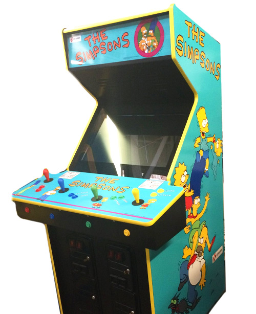
Once I arrived, the very first arcade cabinet that caught my interest (And, by extension, saw) was the Teenage Mutant Ninja Turtles beat-em-up by Konami! Cartoony beat-em-ups such as this one and The Simpsons (Which they also had!) are something I’ve always had a fascination for, and while it was very tempting to start a game, I decided to hold off on it for the time being so that I could check out what else the arcade had in store— plus, games like this are always more fun with friends!

Just around the corner, I found a genuine Mario Bros. cabinet! This one was the first one that really surprised me, as I’d never seen one physically. I’d played a great deal of Mario Bros. ports in my time, but never the real deal, so it was really cool to finally give it a go…
… before realizing how clumsy I am at it. I’m telling you, the traction on each stage feels like Mario’s going ice skating with skates he buttered beforehand— the sliding is real. While I did get pretty close in beating the high-score here, it for some reason decided not to save, but that was no big deal to me. At some point I’d love to practice and see if I can really master the art of Mario Bros.
And because this is probably the only instance I’ll ever get to mention this, if you haven’t seen the commercial for Mario Bros. Atari port, I’d suggest you do so, because it is nothing short of hilarious.MAAAAAA-RI-O, WHERE ARE YOU?!

I remember getting particularly hyped when I caught sight of the ‘Galaxian’ marquee shown here, as I’d not once ever seen a Galaxian cab, though upon closer inspection, the machine is actually an iCade 60-in-1 compilation, one I actually grew up playing at a laser tag place and have a fondness for (The menu music gives me SUCH a great deal of nostalgia)!
One such title in this compilation that I consider myself a pro player at is Super Pac-Man, and that ended up being the first game that I got REALLY into playing. I noticed upon starting the game that the high score was around forty thousand or so, but by the time I wrapped up…

I showed “YOU” who’s boss (Weird, now that I look at it, that the 41,470 looks to be a default score as the stage they made it to was… well, zero)! This ended up being my all-time personal best Super Pac-Man score by just four hundred points or so, and was DEFINITELY the most exciting one yet!
When I finished with that game, I noticed that just down the hall, there were even more games, which interested me fairly quickly. I made my way down the hall and turned to the right, and sure enough, there were a whole lot more games!
And then… I saw it.

A genuine Dig Dug cabinet.
It took every last square inch of my entire being to not just start fanboying right then and there. I’d been waiting for as long as I can remember to see a Dig Dug cabinet in person, and it was SO EXCITING finally being able to play one! You’ll notice in the image above that the high score was in the thirty thousand range, which I found was EASILY beatable given my expertise…

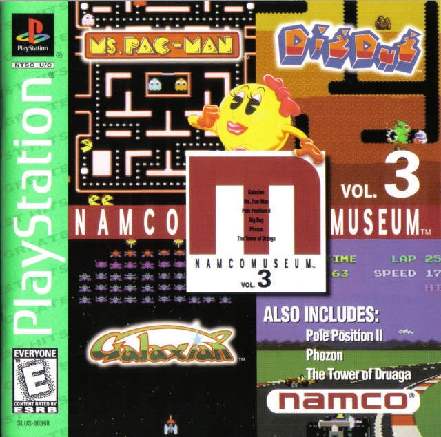
Turns out, all that practice playing Dig Dug on Jakks Pacific’s plug-and-play and in Namco Museum Vol. 3 payed off! Once I began Round One, I noticed one tiny detriment to the cabinet, however- it took some major effort to even go up, which is pretty much a requirement if you even want to beat the first stage.
As I played, though (Let me tell you, this was one of my more intense Dig Dug sessions, I was making some serious plays that hinged on exact timing and choosing which enemies to pump first), the joystick seemed to loosen up, and I found it much easier to move upward as the rounds went on.
This might just be my favorite picture I took last night, too. I’ve always wanted my initials to be in the top spot of any genuine arcade cabinet, and for it to be Dig Dug no less was just so satisfying! Now, we wait until I scout out a Bosconian cabinet…

They also had a Ms. Pac-Man cabinet in the same row that Dig Dug was in! The version they used was particular fun, too, as it was actually Turbo Ms. Pac-Man, which is exactly what it sounds like. Weirdly, this cabinet’s top score was relatively low (Around twenty-thousand, I think?) and I even remember hearing somebody my age remarking how difficult it is.
I don’t know if it’s just because of how well-versed I am at Ms. Pac-Man but— again— I set the high score for this, too, clocking in at 54,410! I’d played another Turbo Ms. Pac-Man a while back and remember my score being much higher, but the score I had set just proved I was on a roll!

Lastly, another cabinet I was surprised to find was Space Invaders! I recall having seen a Space Invaders cabinet many years ago at a Chuck E. Cheese north of my town, though I don’t remember it having a space backdrop like this one has, which blends in with the actual game really well.
I’d only ever played Space Invaders a handful of times, though to nobody’s surprise (But perhaps to everyone’s amazement) I set the high score HERE, too! In the image above, the score is 910, though by the time I finished, I had upped it to 1140. Games like this and Ms. Pac-Man don’t save initials for high scores, but I at least have proof on the matter that this is indeed my score!
I guess I’m a lot better at the classics that I was led to believe! The whole experience was just a blast, and I REALLY wanted to share it with you all! I definitely want to make posts like this for other arcades I visit, and you can bet that if I come across a Bosconian cabinet… THAT’S going to be one lengthy post!