#thedsgnblog
Interior Design for Work & Co’s Office by Aspekt
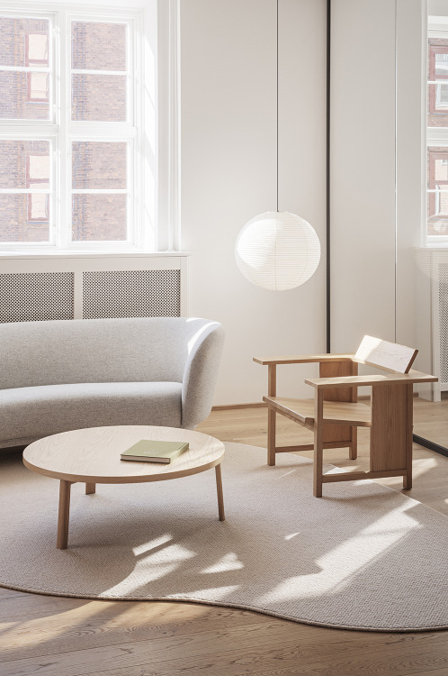
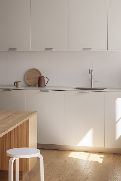
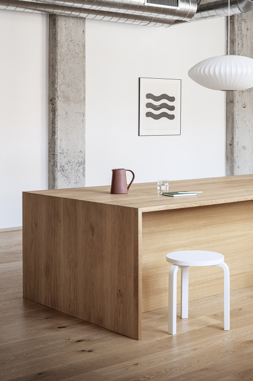
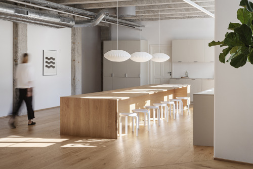
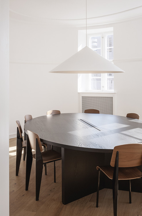
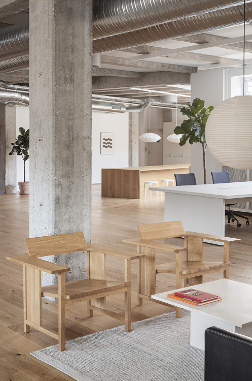
Aspekt Office has designed Work & Co’s new Copenhagen office as a place where employees can collaborate and where the local ambience shines through. A material palette that highlights oak wood, soothing neutrals and soft textiles produces a distinctly calm and understated ambience throughout the premises.
Transparent walls and an overall airy spatial design promote an open environment and sense of community, supporting Work & Co’s core values of being hands-on designers and developers. At the same time, in the current environment, the spaciousness allows for social distancing when needed.
TDB: instagram • twitter • facebook • newsletter • pinterest
Post link
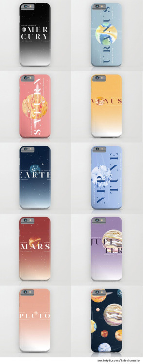
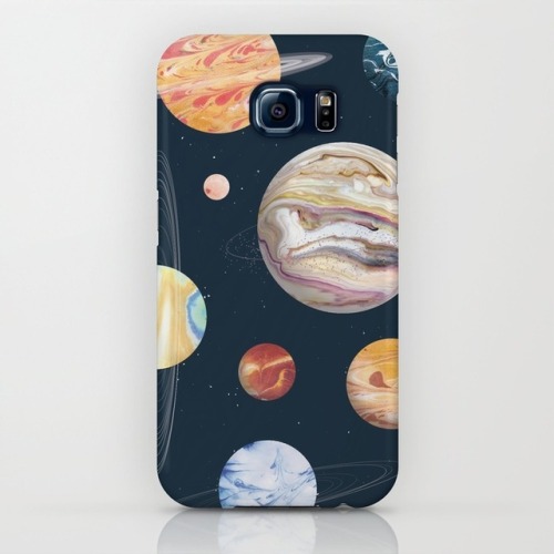
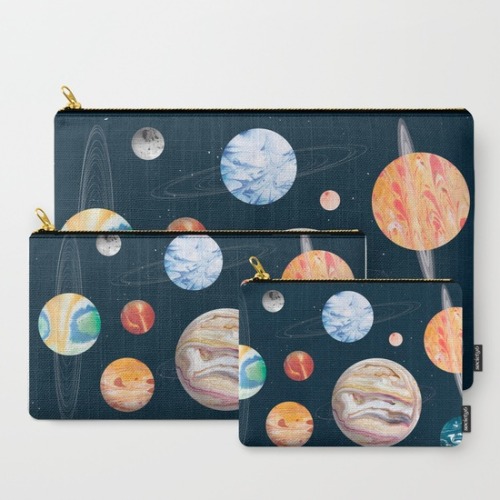
I just updated my Society6 page with new prints, and this is one of them! I uploaded all the individual planets as typographic posters too. iPhone/Samsung cases, laptop sleeves, pillow cases, bath mats, pouches, and totes are available for selected prints! Get them today while S6 is on sale and offering free shipping, until midnight PT only.
Post link
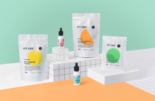
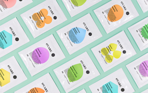
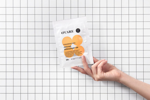
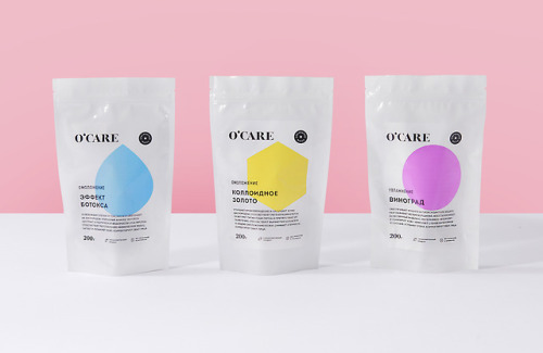
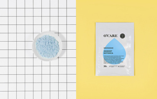
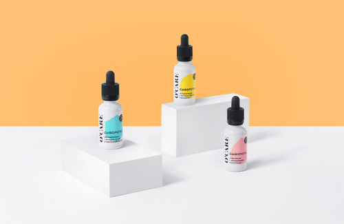
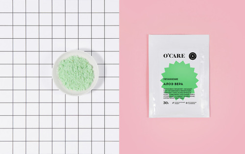
Identity & Packaging for O’Care by Nika Levitskaya
“Naming, logo and packaging for a new cosmetic brand that specializes in alginate facial masks. O'care makes 20 types of colorful masks based on different Ingredients with young women as prime target audience. We used a classic serif font for logo and mixed it with simple, modern identity with simplified geometric icons symbolizing masks ingredients. We were going for design that can be easily discerned and understood to an everyday audience in a retail setting.”
Nika Levitskaya is a designer based in Moscow, Russia. She specialises in identity and brand creation, print and web communications and art direction.
T D B: instagram • twitter • facebook • newsletter • pinterest
Post link
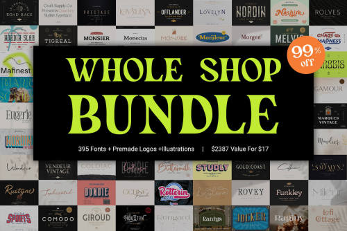
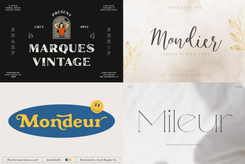
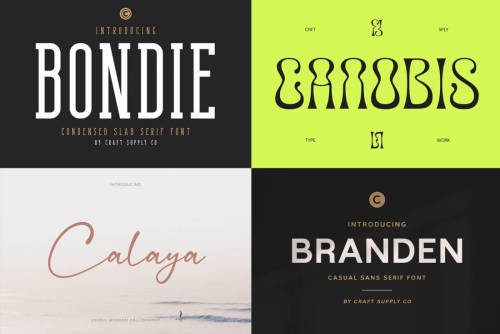
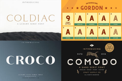
Whole Shop Bundle (Craft Supply Co) - only $17!
How would it feel to add 395 new fonts to your toolbox right now in just a few clicks for less than the cost of a bad movie? Oh, and what if each font was more beautiful and useful than the last?
The Whole Shop Bundle from Craft Supply Coincludes 395 fonts with bonus illustrations, labels, and premade logos and badges. This bundle is a terrific toolbox for display purposes. It would be a perfect choice for posters, headings, letterhead, merchandise, logos, T-shirts, magazines, banners, and more.
Highlights:
- 147 font families with 395 fonts in total + extras;
- Tons of illustrations, labels, premade logos, & badges;
- Upper & Lowercase;
- Stylistic Alternates;
- Standard Ligatures;
- Numerals & Punctuations (OpenType Standard);
- PUA encoded.
For more amazing design deals, visit Mighty Dealswebsite.
Post link
Sorry Sorry Hampers Design by Pitu Studio
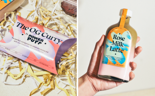
Ramadan is the most awaited event in this country, as the majority of the Indonesian are Muslims. Traditionally, in the spirit of Ramadan traveling back home is one of the must things to do as we will celebrate Hari Raya with our loved ones.
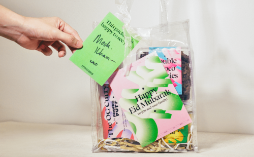
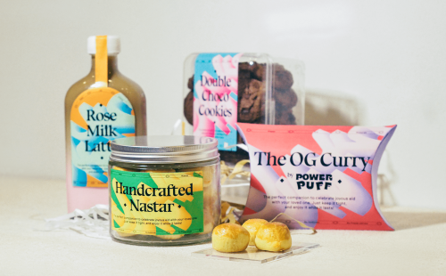
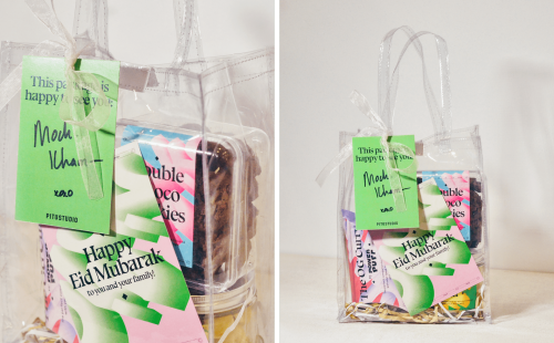
It is been 2 years since the pandemic. A lot of people were missing their chance to come back home to their loved ones during the Ramadan. Finally, we are here now, we can travel back and celebrate Hari Raya as it is supposed to be! We are designing a special Eid Mubarak hamper as a sweet compliment to commemorate this moment.
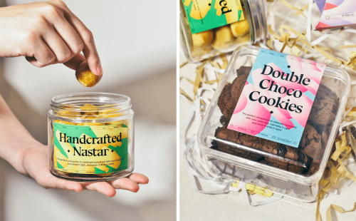
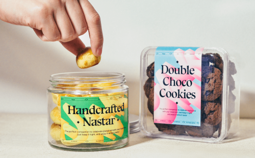
Inspired by the festivities of Eid Mubarak, bold, fun, and bright color combinations are used to celebrate these joyous moments. We hope that these special hampers can be the sweetest treats that can be shared with your family and loved ones during these special holidays.
TDB: instagram • twitter • facebook • newsletter • pinterest
Post link
Areaware: Objects & Gifts for Home, Work & Play
“We believe the best design evokes good feelings, and think everyday objects should be as fun as they are functional. We work with independent designers to create pieces that bring a touch of delight and charm into your home.”
Areaware creates objects and gifts for the home, work, and play in collaboration with independent designers. Based in Brooklyn, NY, and Columbus, OH, their small team is dedicated to creating functional and uplifting objects designed with integrity. Above all else, their designers are at the heart of their work.
If you’re looking for fun, unique, and design-forward gifts for your loved ones, or yourself, check out their catalog of products that will make any space feel more bright and homey.
Featured products:
- Everybody Grinders by DUSEN DUSEN
- Assembly Desk Set by Alex Proba
- Serving Friends by Selena Liu
- Good Day Mobile by Daniel + Emma
- Goober Candle by Talbot & Yoon
- Cubebot Toy Robot by David Weeks Studio
- Playing Cards by Poketo
- Stacking Planters by Chen Chen & Kai Williams
Special offers alert!
Sign up and get 15% OFF your first order.
GetFree Shipping when you spend $75 or more.
Post link
Houseplant Packaging Redesign by MA-MA
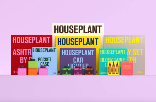
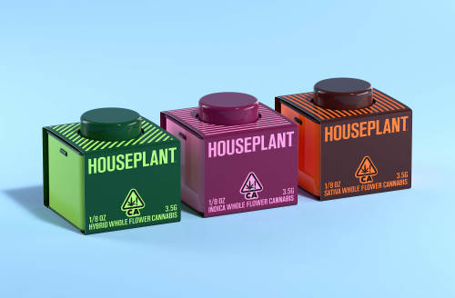
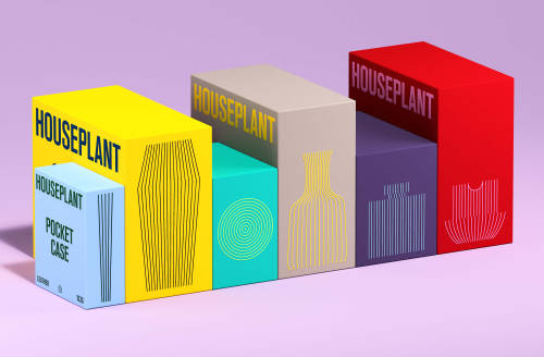
Packaging redesign for Houseplant; a cannabis brand founded by Seth Rogen for its launch into the U.S. market (originally from Canada). Taking Houseplant’s existing logotype and symbol as the starting point, we developed a typographic and illustration system that helped unify and revamp the brand’s new wide range of products and overall communications.
The redesign includes the introduction of a wider typographic system with a custom typeface that is based on the original logotype, a unifying illustration system that helps represent the forms of the products packaged within, and a fresher color palette with brighter hues to convey the vibrancy of the company.
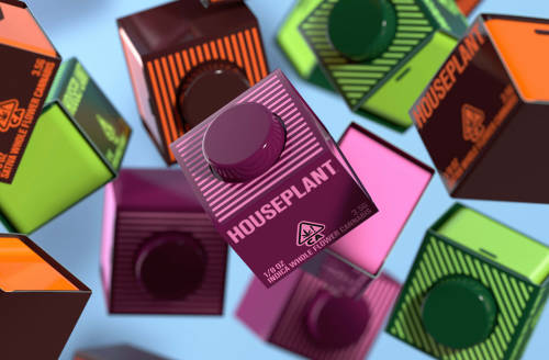
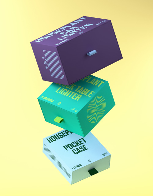
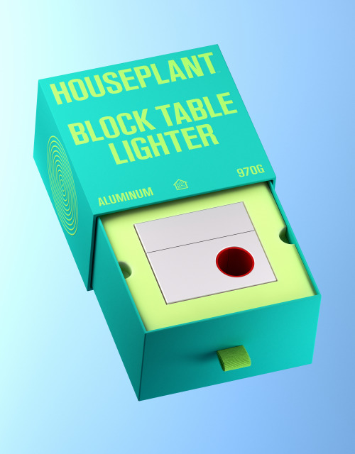
The structural packaging itself maintains a simple design; a solid colored drawer system, in which the complimenting color is featured within the typography, line illustration, pull tab, and eco-foam within. In line with the company’s goal to be more sustainable, we also designed a series of recyclable tin ‘jars’ to house the cannabis goods, as well as, tin cases for pre-roll joints.
The ‘jars’ have been designed such that they can stack like legos, acting as a collectible and reusable keepsake. In efforts to keep the packaging as sustainable and with as little waste as possible, we designed a simple label wrap for the tins made out of cardstock paper with printed graphics.
Project done in collaboration between MA-MA and Pràctica.
Structural Packaging Design: MA-MA
Identity and Packaging System Design: Pràctica
Product Design for Tin Jars and Pre-Roll: MA-MA
Typeface Creative Direction: Pràctica
Typeface Design and Production: Tipografies
Animations and 3D Renders: Dani Avila
TDB: instagram • twitter • facebook • newsletter • pinterest
Post link
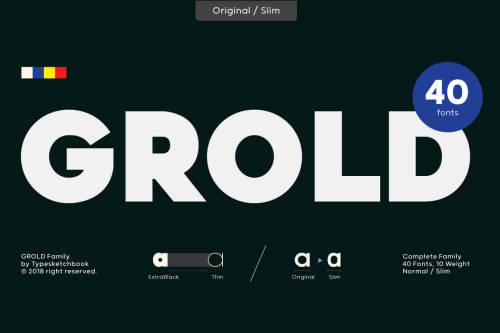
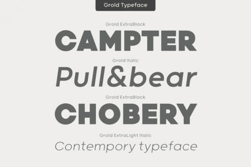
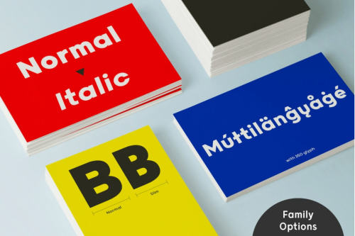
Grold Family (40 Post-Geometric Fonts) - $12
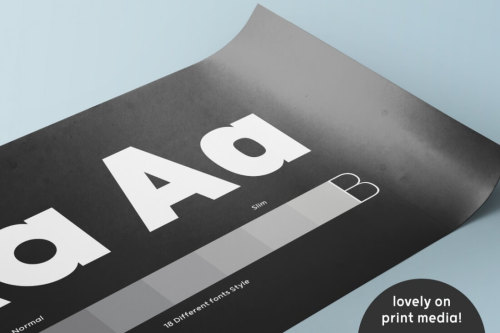
Grold is a post-geometric typeface consisting of 40 different fonts across 10 weights with both normal and slim options. This unique and modern sans typeface, is well suited for a variety of typographic applications such as headlines and small texts, and even supports multiple languages.
Highlights:
- Unique post-geometric sans typeface.
- 40 different fonts in 1 family.
- 10 different weights - from Thin to ExtraBold to ExtraBlack.
- Normal and Slim options for each font.
- Great for various typographic applications like headlines & small text.
For more amazing design deals, visit Mighty Dealswebsite.
Post link
Brand Identity for Limón by Goods & Heydays
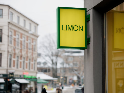
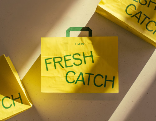
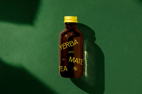
Limón is a fast-casual food chain in Oslo, Norway, serving fresh pokés, mouthwatering ceviches, and healthy bowls. Inspired by the oceans that connect Norwegian fish with exotic South American tastes, the concept has inspired everything from Limón’s website that’s literally floating to perforated metal interior details that resembles fishing nets.
All packaging is responsibly sourced and features bowls made from sugarcane pulp, lids from recycled PET bottles, and fiber cutlery instead of plastic.
Brand Strategy, Naming, Visual Identity, Packaging & Web: Goods&Heydays
Interior Design: Omhu Projects, Interior photography: Einar Aslaksen
TDB: instagram • twitter • facebook • newsletter • pinterest
Post link
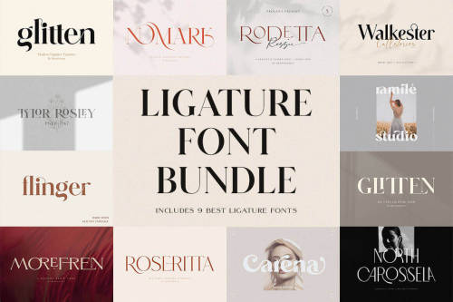
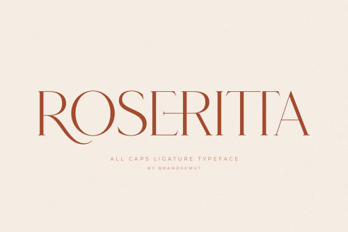
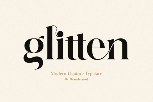
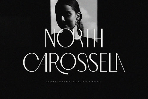
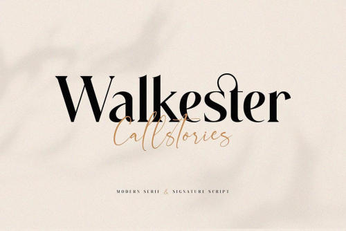
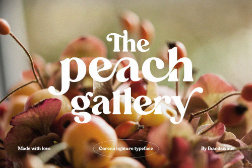
Huge Ligature Font Bundle + Bonus - only $9!
With the Ligature Font Bundle, you’ll add some elegance to your typeface library. You’ll get 9 gorgeous, modern ligature fonts and 7 signature fonts, 11 displays, and 3 script fonts as a bonus. With the extended license, you can whip up all sorts of personal and commercial products from invitations to T-shirts.
Highlights:
- 9 gorgeous ligature fonts;
- Bonus: 7 signature fonts, 11 displays, and 3 script fonts;
- Tons of OpenType features – ligatures, stylistic alternates, swashes, punctuation, and more;
- Multi-language support on the majority of the fonts;
- Perfect choice for tons of printed projects: invitations, envelopes, magazines, cards, posters, signs, T-shirts, mugs, pillows, and more;
- Extended license - personal and commercial use.
For more amazing design deals, visit Mighty Dealswebsite.
Post link
Interior Design for Work & Co’s Office by Aspekt
Aspekt Office has designed Work & Co’s new Copenhagen office as a place where employees can collaborate and where the local ambience shines through. A material palette that highlights oak wood, soothing neutrals and soft textiles produces a distinctly calm and understated ambience throughout the premises.
Transparent walls and an overall airy spatial design promote an open environment and sense of community, supporting Work & Co’s core values of being hands-on designers and developers. At the same time, in the current environment, the spaciousness allows for social distancing when needed.
TDB: instagram • twitter • facebook • newsletter • pinterest
Post link
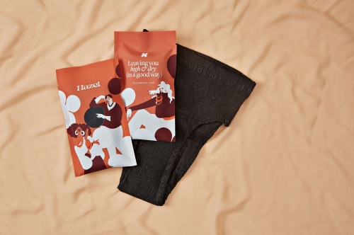
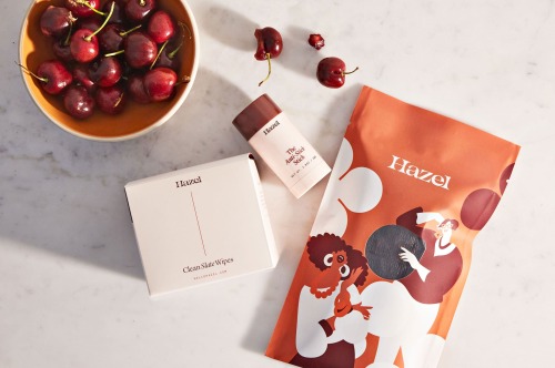
Branding for Hazel by Studio Mast
A startup working to redefine the meaning of aging through ground-breaking products.
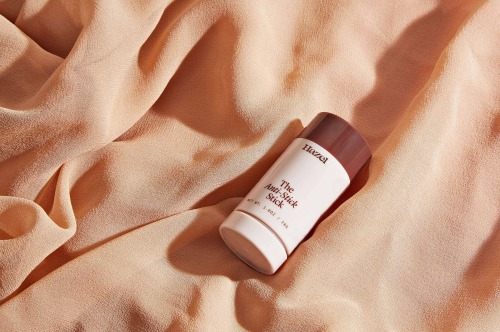
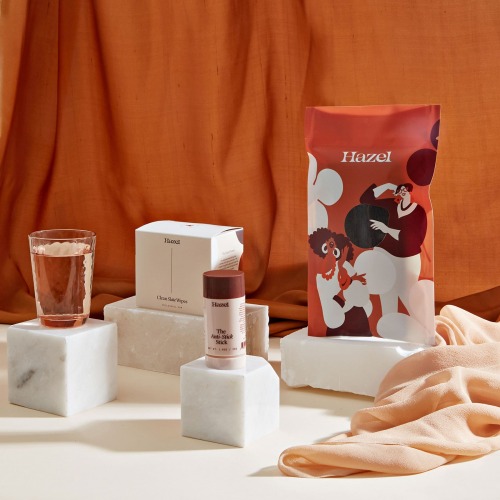
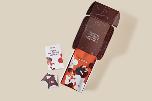
For far too long, the incontinence category has made women feel ashamed and alienated; Aubrey Hubbell and Steven Cruz saught to fight this head-on by starting Hazel; a personal care company working to redefine the meaning of aging. Believing that no two women are the same, they have developed a suite of thoughtful, ground-breaking products that make women feel less ashamed and alienated and more empowered as they age. Their products exist to boost confidence and make their customers feel excellent at every age.
Studio Mast worked with them ahead of their launch to help build a brand that possessed as much personality as their customers—resulting in an expressive, elegant, and flexible brand.
TDB: instagram • twitter • facebook • newsletter • pinterest
Post link
Trenda Font Family (8 Weights) - only $17
Trenda is a geometric sans-serif typeface that sports a wider character set and complete family of uppercase and lowercase letters available in different weights. This versatile and easy-to-use functional font is perfect for both display and text sizes.
Highlights:
- Geometric sans-serif font based on the uppercase of Trend.
- Offers a complete family of uppercase and lowercase in different weights.
- Especially designed for corporate projects, logotypes and publishing.
- 8 weights with matching italics - includes small caps and alternates.
- Supports 206 different languages.
For more amazing design deals, visit Mighty Dealswebsite.
Post link
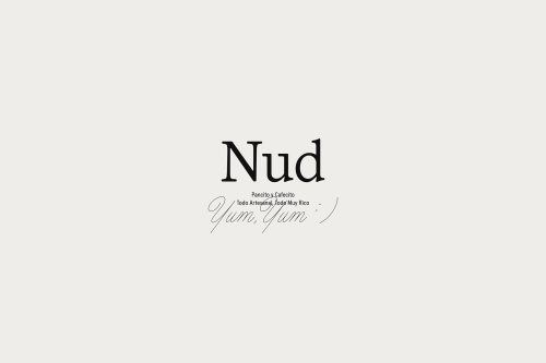
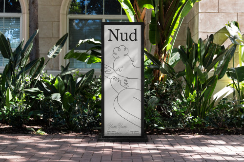
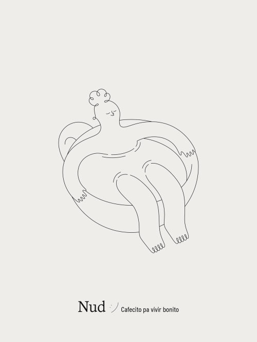
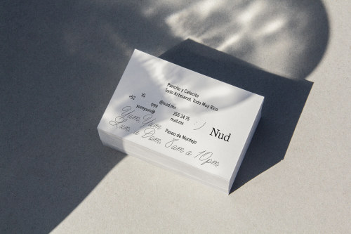
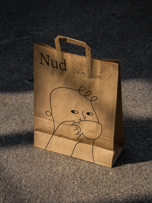
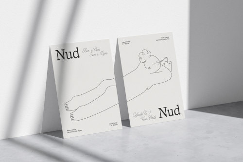
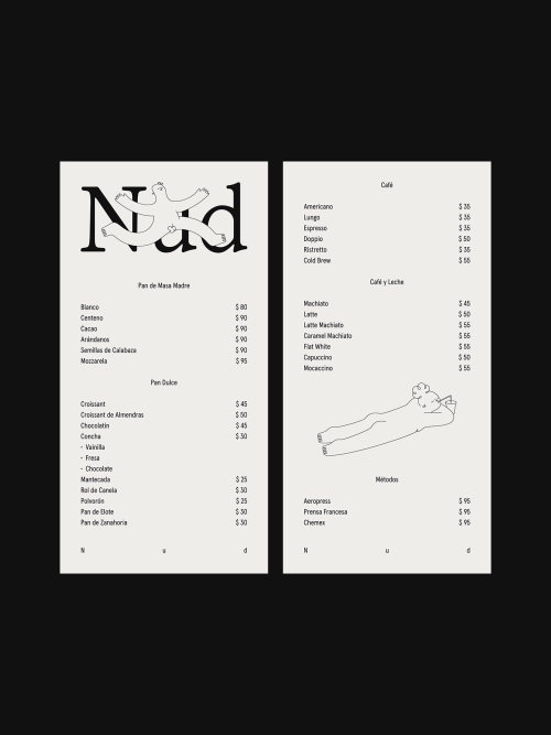
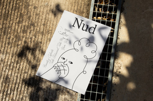
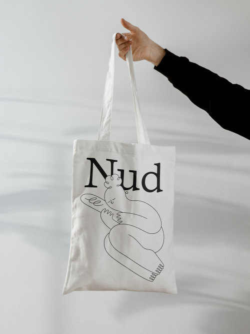
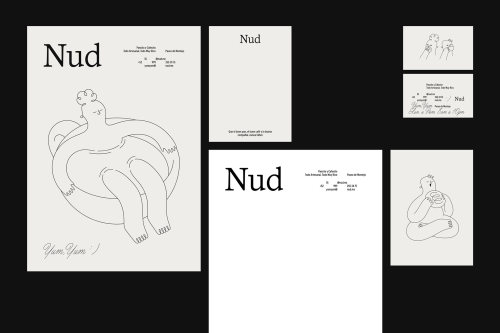
Brand Identity for Nud by Maniac Studio
Nud is an artisanal bakery and coffee shop specialized in sourdough bread and gourmet coffee. It was designed as a place where only good things happen and life stops for a moment.
“Bread and coffee” is possibly the best combination that exists, and some of the most enjoyable things in this world. Few things compare to the sensation of the first sip of a good cup of coffee or the first bite of a delicious bun; hence the concept of the brand is born. It all begins from that first sip or bite that makes you feel as if nothing existed, there is no rush, there are no troubles, neither people, it’s just you “nude” enjoying a brief moment of happiness.
For the visual identity we designed a series of lovely characters that portray the love for coffee and bread and those pleasant sensations we feel when tasting them. The feeling of the brand is soft, cute and casual, it is a brand that communicates in diminutive, a peculiar manner of speaking in Mexico with the things we care and enjoy the most.
TDB: instagram • twitter • facebook • newsletter • pinterest
Post link
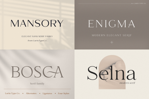
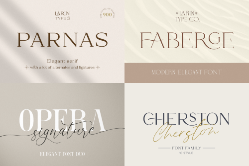
Modern Font Bundle of 200+ Fonts from Larin Type Co. - only $15!
It’s time to give your typeface toolbox a serious expansion! With this mighty deal from Larin Type Co, you’ll get 200 high-quality, professional fonts for 1 ridiculously low price. With styles ranging from Script to Art Deco, you’ll also get plenty of OpenType features and an extended license to ensure you’re set to design to your heart’s content!
Highlights:
- 200+ high-quality fonts in 65 typefaces;
- Diverse styles - Serif, Script, Stencil, Art Deco;
- Loads of OpenType Features - ligatures, alternates, swashes;
- Perfect for logos, product branding, wedding invitations, T-shirts, posters, book covers, and more;
- Extended license - use any of these fonts as often as you’d like in as many personal or commercial projects as you want.
For more amazing design deals, visit Mighty Dealswebsite.
Post link
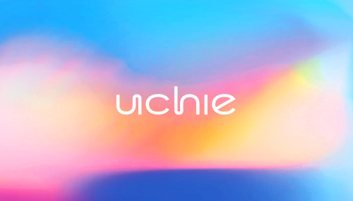
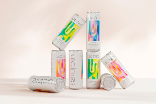
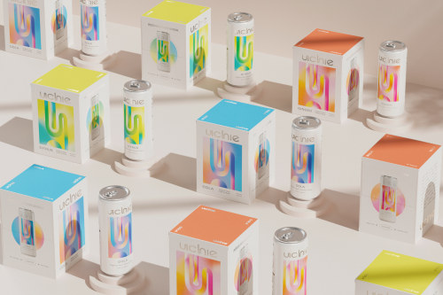
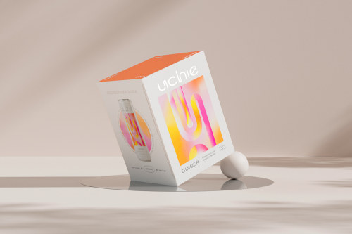
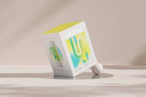
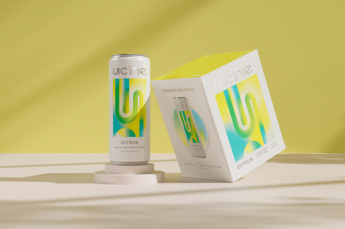
Uchie Packaging by Kati Forner
Uchie came to us to help former pop lovers rediscover the joys of soda in a healthier form—with zero calories, no sugar, all-organic ingredients, natural sweetness and no shame. We positioned Uchie as the soda for who you are now, so you can treat yourself, and still treat yourself right.
Leaving out trendy add-ons in favor of flavor focus, Uchie innovates in a tasteful, and tasty, way to simply bring us more of what we love and none of what we don’t. Which led us to the perfect tongue-and-cheek tagline “Very Tasteful.” Inspired by the art of the Light and Space Movement, we gave the brand a visionary graphic palette that spoke to innovation and artfulness.
The logomark feels clean, inviting and playful with an innovative twist. Contrasting type pairings bring bold personality and presence to the identity. An unexpected palette brings a dynamic, modern feel to timeless colors, elevated by future-forward silver. (KF for dieline.com)
TDB: instagram • twitter • facebook • newsletter • pinterest
Post link
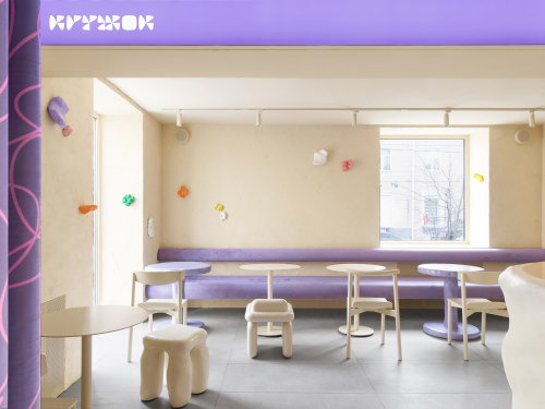
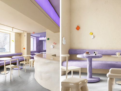
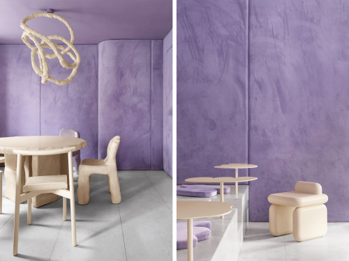
Krujok Cafe Interior Design by Eduard Eremchuk
Space was inspired by airy shapes of the donuts, melting glaze, and cream — the essence of a donuts. All space is divided into 2 halls. The first one, where you start your journey as if you are inside of a donut — as though crumpled glossy furniture, beige and sand-coloured walls and furniture refer to different forms of dough.
Glossy colorful popcorn sculptures on the walls created by Russian artist Elena Minaev, are there not by accident. Pastry cook decorates donuts with caramelized popcorn — this is an important element of the dessert. In the next space, Katy and Eduard reinterpreted a melting glaze. They played with tactility by mixing mystic purple shades with soft velvet fabric, on the walls and accessories.
TDB: instagram • twitter • facebook • newsletter • pinterest
Post link
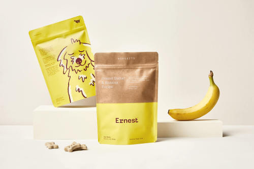
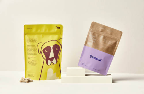
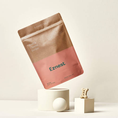
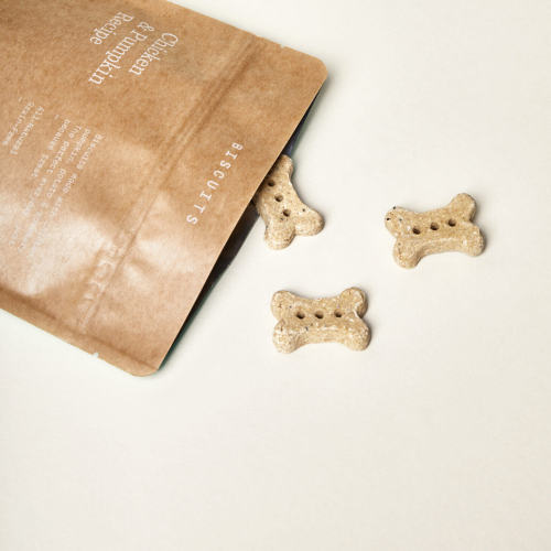
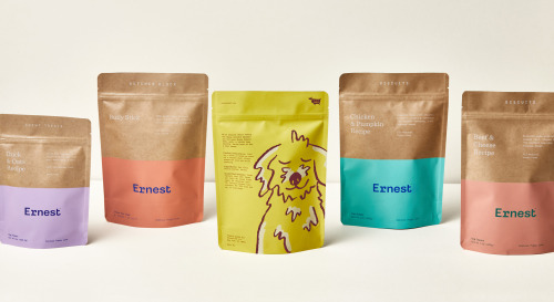
Branding & Packaging for Ernest by Perky Bros
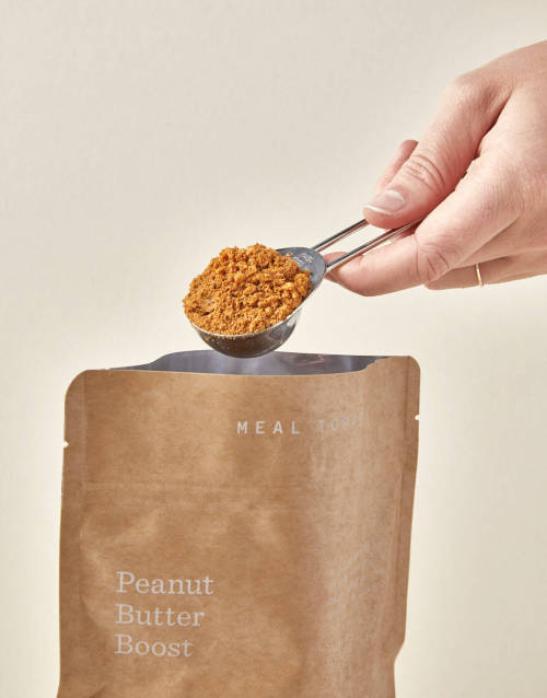
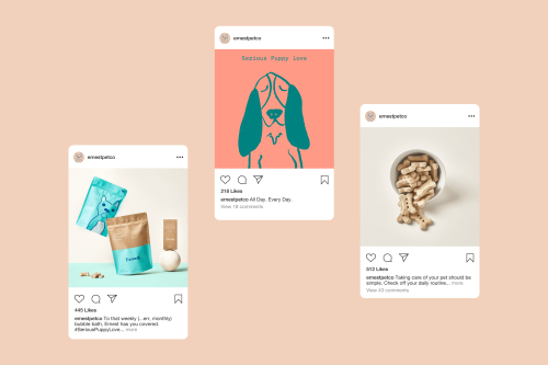
Ernest is serious about making pet care easy and fun. They provide pet essentials for your daily routine in a convenient monthly bundle so you can focus on what’s really important: your pup.
Guided by the tagline Serious Puppy Love, our goal with the visual identity was to create a system that feels warm and friendly, yet sophisticated enough to feature on your countertop.
The packaging is intentionally restrained to evoke a feeling of utility, but also feel bright and optimistic. Organized messaging on the front side gives way to a moment of expression on the reverse, which features large illustrations that bring character and exuberance to the identity. The expressive and colorful illustrations breathe (four-legged) life into the otherwise tidy identity.
TDB: instagram • twitter • facebook • newsletter • pinterest
Post link
Brand Identity for Fine Grazing by Both
Fine Grazing are known for their high quality, design-led grazing tablescapes featuring ingredients from Melbourne’s leading food artisans.
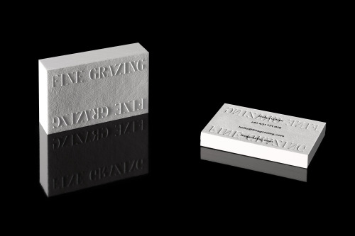
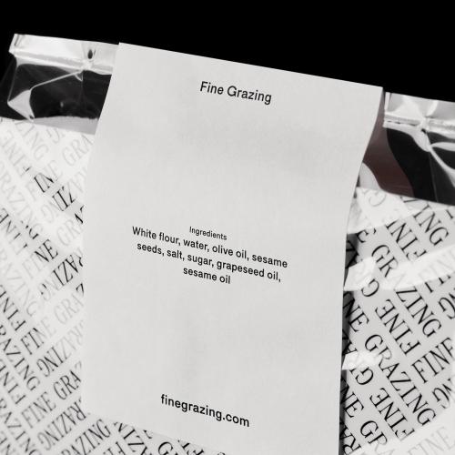
Working closely with the Fine Grazing team, Both implemented a new approach to their brand positioning and narrative, exploring the boundaries of food and design. The resulting visual identity is both formal and unconventional, and seeks to extend the same level of attention to detail seen in their event tablescapes to the Fine Grazing at-home offering. As a part of the brand positioning, Both worked on the art direction of a series of images celebrating the ingredients that form the core of Fine Grazing’s ethos.
The Fine Grazing stationery and packaging components utilize unconventional layouts to abstractly reflect the way in which grazing tables are often approached from many sides, and therefore viewed from different perspectives. Tactile finishes including delicate embossing and textured papers were selected to bring a sense of understated luxury to the at-home Fine Grazing experience.
T D B: instagram • twitter • facebook • newsletter • pinterest
Post link
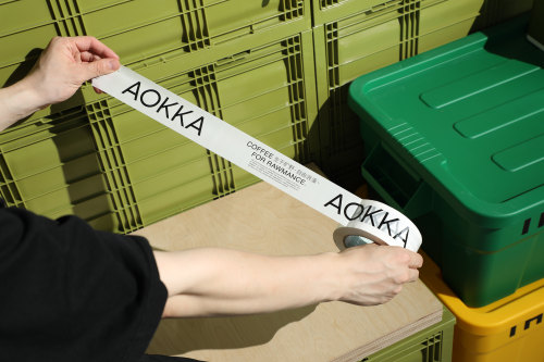
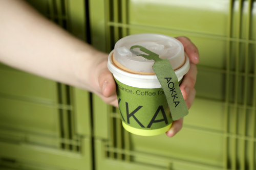
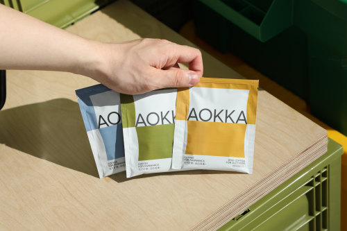
Brand Identity & Packaging for AOKKA by Low Key
The founder of AOKKA Robin is a doer who loves coffee, feels passionately about outdoors and record. Advocating freedom and romance, willing to share his coffee world. About 10 years ago, he was back to Melbourne, Australia to recording coffee tour with photographer, to let coffee lovers know more about specialty coffee story.
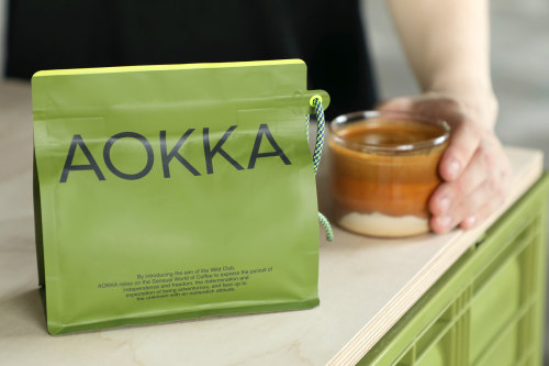
By introducing the aim of the wild club, Aokka relies on the sensual world of coffee to express the pursuit of independence and freedom, the determination and expectation of being adventurous, and face up to the unknown with an outlandish attitude.
COFFEE FOR RAWMANCE, this design concepts to support the entire brand’s visual language. Coffee crops grow up in the wilderness around the world, after cultivating, harvesting, processing into green coffee beans. Each sack of green coffee bean though transportation arrives at their destination, and has AOKKA shipping labels and unique sealing rope. We design and use them into exclusive AOKKA’s visual language, also for brand packaging system.
T D B: instagram • twitter • facebook • newsletter • pinterest
Post link
Grold Family (40 Post-Geometric Fonts) - $12
Grold is a post-geometric typeface consisting of 40 different fonts across 10 weights with both normal and slim options. This unique and modern sans typeface, is well suited for a variety of typographic applications such as headlines and small texts, and even supports multiple languages.
Highlights:
- Unique post-geometric sans typeface.
- 40 different fonts in 1 family.
- 10 different weights - from Thin to ExtraBold to ExtraBlack.
- Normal and Slim options for each font.
- Great for various typographic applications like headlines & small text.
Post link
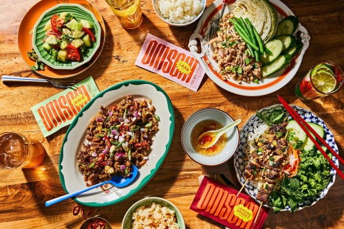
Brand Identity for Omsom by Outline
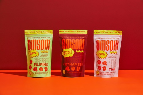
A fiery, feisty food brand with a lot to say and even more to serve. Asian starters launched by two sisters in partnership with acclaimed chefs.
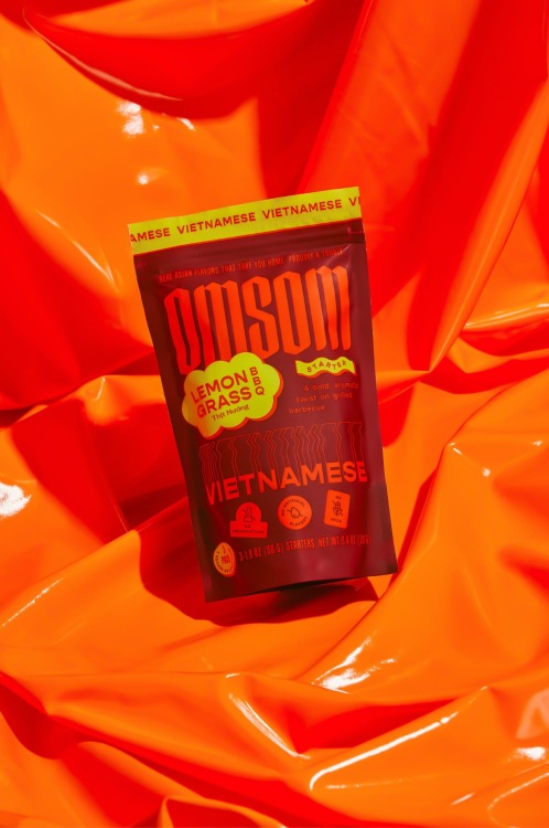
Outline’s work for Omsom was inspired by the change produced when forces collide, spark and create something new. Whether it’s an idea or your dinner – the whole becomes more (and different) than the sum of its parts. This cultural point of view, and the heat the founders put behind it, served as the concept for their bright brand identity.
The showpiece of the Omsom launch – the Sampler – featured Larb, Lemongrass BBQ and Sisig starters. The Sampler’s large format allowed us to keep telling the story of the visual brand’s fiery potential by letting the wordmark take over the space, replicating and distorting as it did so. The packaging is an oversized matchbox-style drawer with melting motifs framing the starters inside
T D B: instagram • twitter • facebook • newsletter • pinterest
Post link

