#type specimen books
Typography Tuesday
ANNA SIMONS
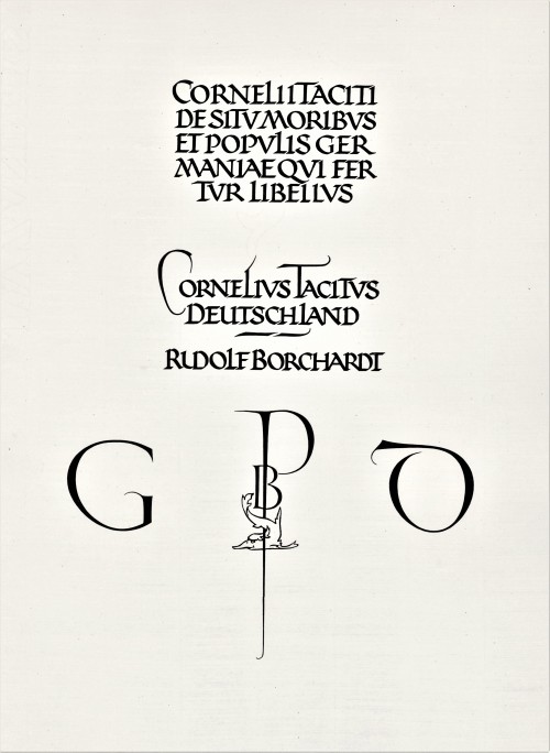
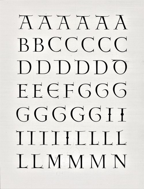
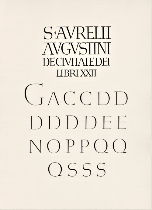
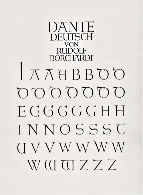
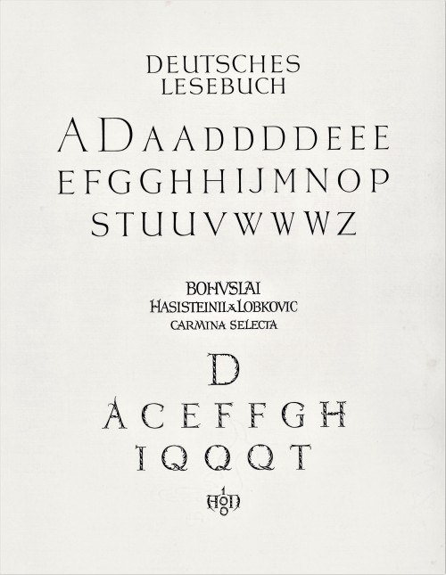
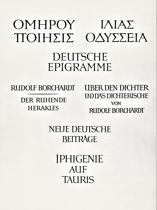
Today we present a few pages from a new acquisition, Titel und Initialen für die Bremer Presse, a specimen book of the titling and initials produced by the German calligrapher and type designer Anna Simons (1871–1951) for Willy Wiegand’sBremer Presse, printed letterpress in Munich at the Bremer Presse in an edition of 220 copies in 1926. A student of the renowned British calligrapher and type designer Edward Johnston, Simons taught Johnstonian design concepts at the Kunstgewerbeschule in Dusseldorf and later at Munich under the direction of German architect and type designer Peter Behrens. She began doing design work for the Bremer Presse beginning in 1918, and along with her assistant Franziska Kobell, Simons designed some 1400 titles and initials for the Presse. Simons continued to teach and work in Germany through the Nazi regime and died at 80 in Prien, Germany.
View more posts with designs by Anna Simons.
View posts on other Women Type Designers.
Viewmore Typography Tuesday posts.
Post link
Typography Tuesday
ANNA SIMONS, PART 2
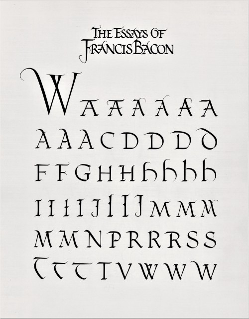
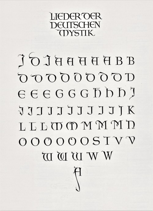
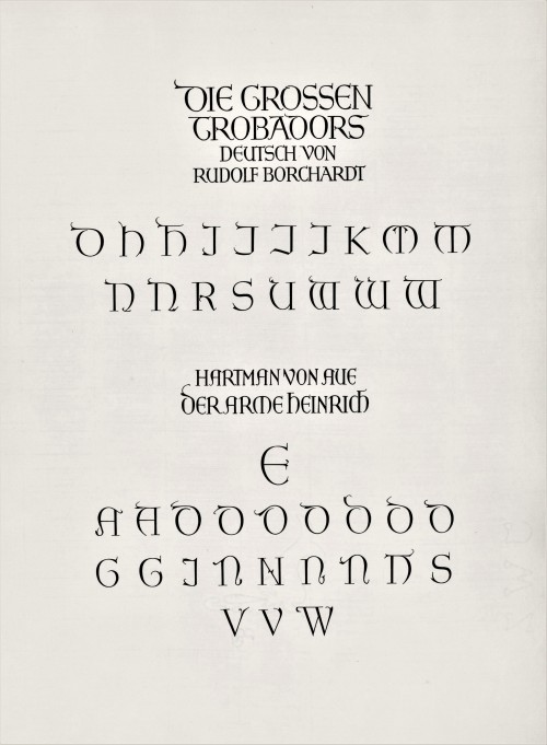
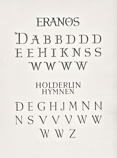
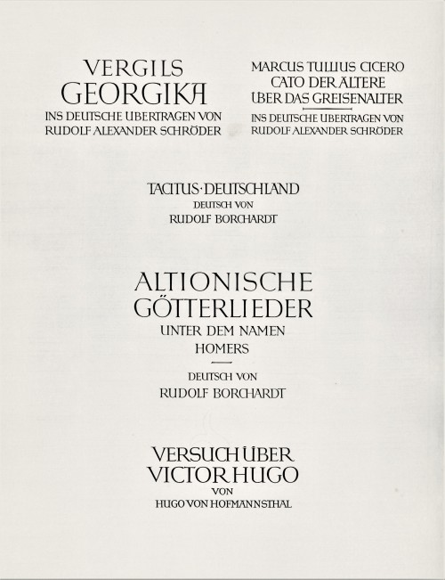
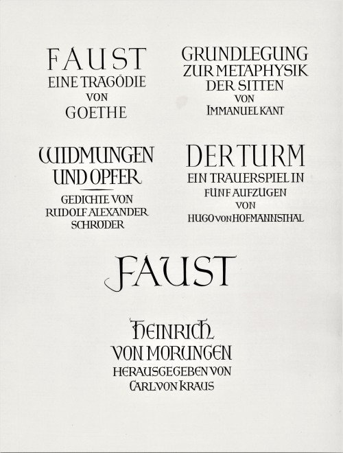
This week we present the next ten of the twenty numbered plates in Titel und Initialen für die Bremer Presse, a specimen book of the titling and initials by the German calligrapher and type designer Anna Simons (1871–1951) for Willy Wiegand’sBremer Presse, printed letterpress in Munich at the Bremer Presse in an edition of 220 copies in 1926. We highlighted the first ten plates a couple of weeks ago.
For 15 years, Simons’s Arts & Crafts-inspired designs were important elements in the aesthetics of the Bremer Presse, and Weigand celebrated her contributions in this portfolio set of specimens during the middle of their collaboration. The press closed in 1934 and its assets were liquidated the following year. The studio building was destroyed in bombings during WWII. Simons, however, continued to teach and work in Germany through the war before her death in 1951.
View more posts with designs by Anna Simons.
View posts on other Women Type Designers.
View more Typography Tuesday posts.
Post link
Dutch-FoundryFeathursday Roosters
ROOSTERS!!
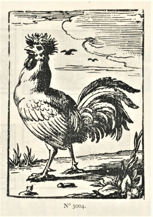
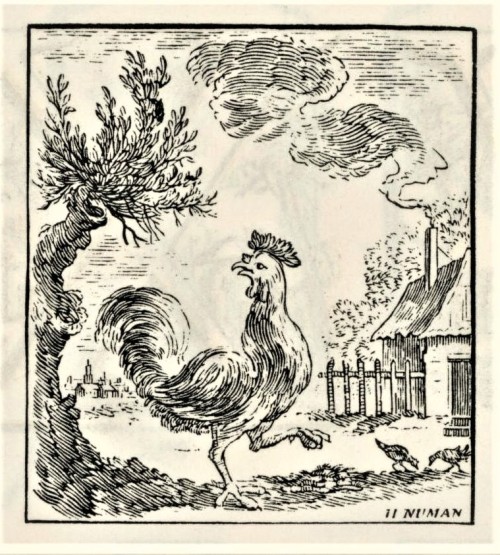
This past Typography Tuesday, we highlighted some fancy-pants wood-engraved initialsfrom Charles Enschedé‘s historical survey of Dutch types, Fonderies de caractères et leur matériel dans les Pays-Bas du XVe au XIXe siècle,published in Harlem by De Erven F. Bohn in 1908. Besides surveying metal and wood types used in Dutch printing, this weighty tome also includes many pages of historic cuts used by Dutch printers.
Because we are in somewhat of a fowl mood, today we present a sampling of ROOSTERS! from Mr. Enschedé‘s selection of cuts. We’re cock-sure you’ll just crow over these fine-feathered foundry fellows. Click on the images for the engraving credits.
View other posts related to the Enschedé type-founding firm.
Post link

