#fine press books
Wood Engraving Wednesday
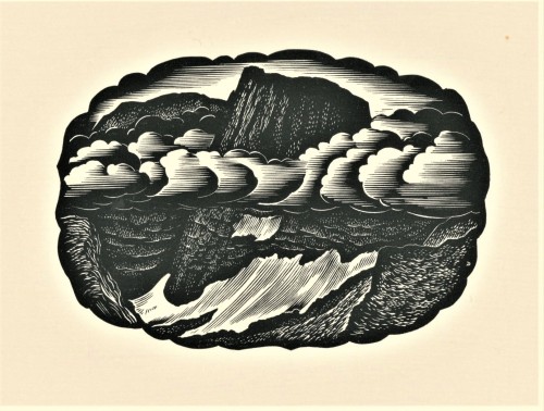
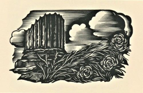
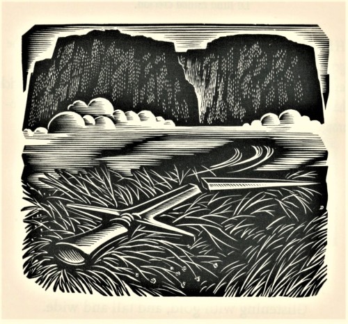
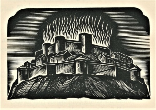
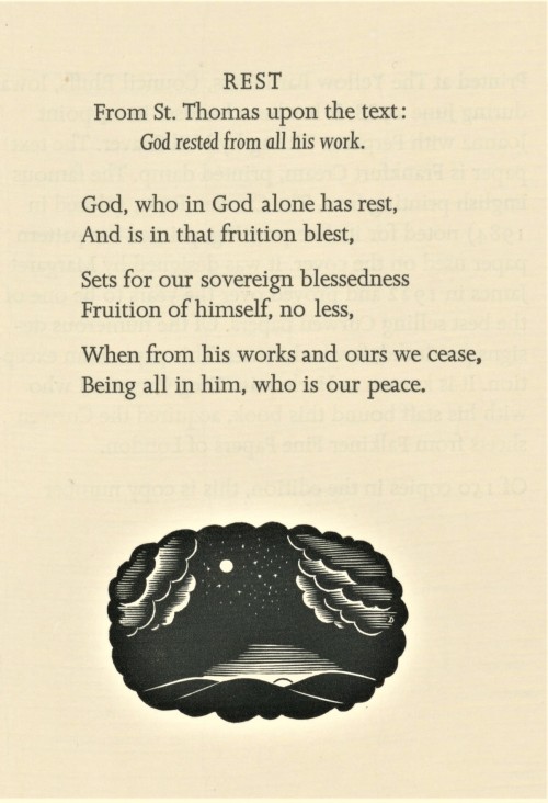
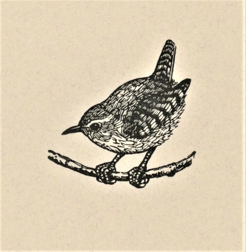
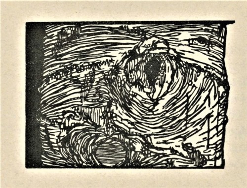
This week we present more prints by the legendary American wood engraver John DePol (1913-2004), this time as illustrations for a collection of poems by the English translator and poet Walter Shewring,Later Verses and Earlier, printed letterpress in 1988 in an edition of 150 copies at Neil Shaver’s Yellow Barn Press in Council Bluffs, Iowa. Shaver handset the 14 pt. Joanna type with Perpetua Titling, and printed the edition on dampened Frankfurt Cream paper. Of DePol, Shaver writes:
John DePol ranks today as one of America’s top wood engravers… . Since the 1930′s John DePol has been capturing little corners of our world with the engraver’s burin. Small churches in France, the back alleys of Ireland, the aging buildings of New York, all have been frozen in time with serene, sometimes dramatic, skill. He is sensitive to atmosphere and the romantic age of things, the mood of changing seasons and the images of history. His is the perfect talent for the Shewring verse.
Our copy of Later Verses and Earlier is a gift from our friend Jerry Buff.
View more posts with work by John DePol.
View more posts on books from Yellow Barn Press.
Viewmore posts with wood engravings!
Post link
Typography Tuesday
ANNA SIMONS
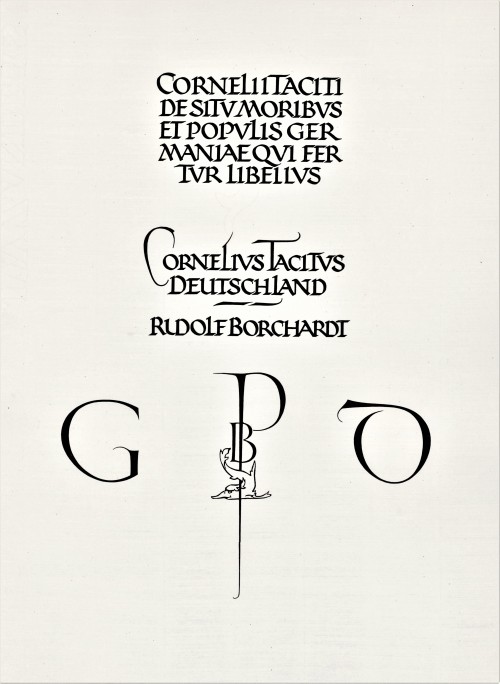
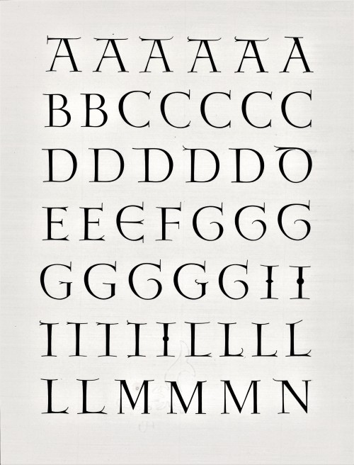
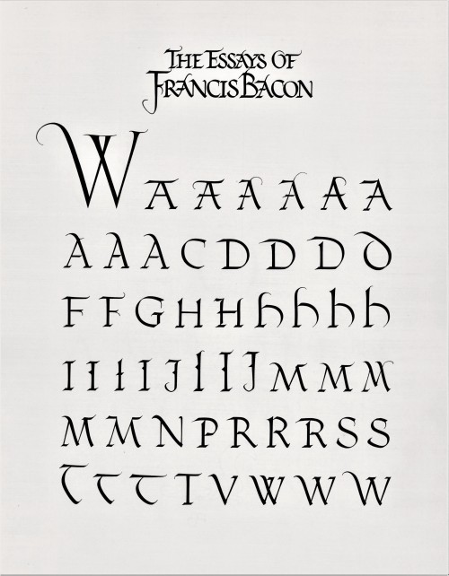
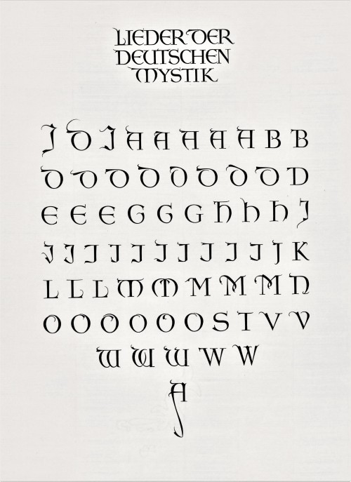
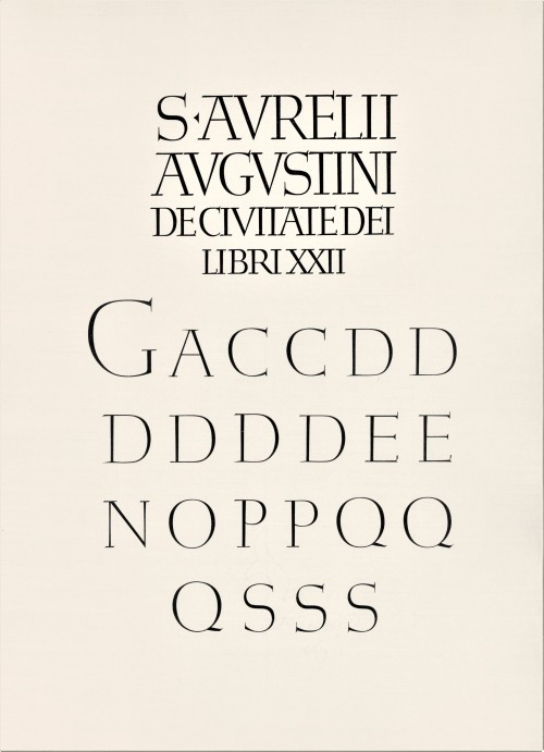
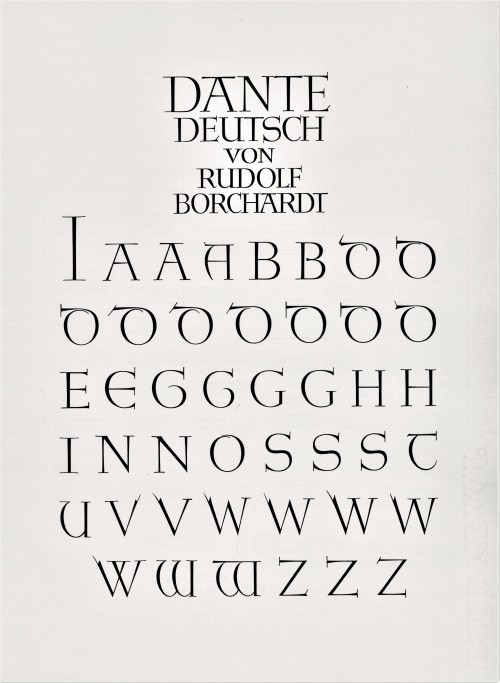
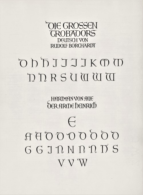
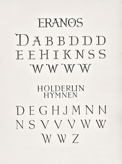
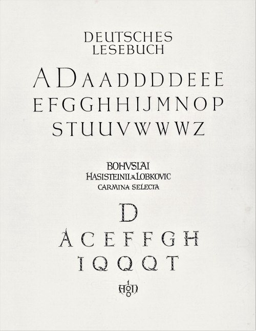
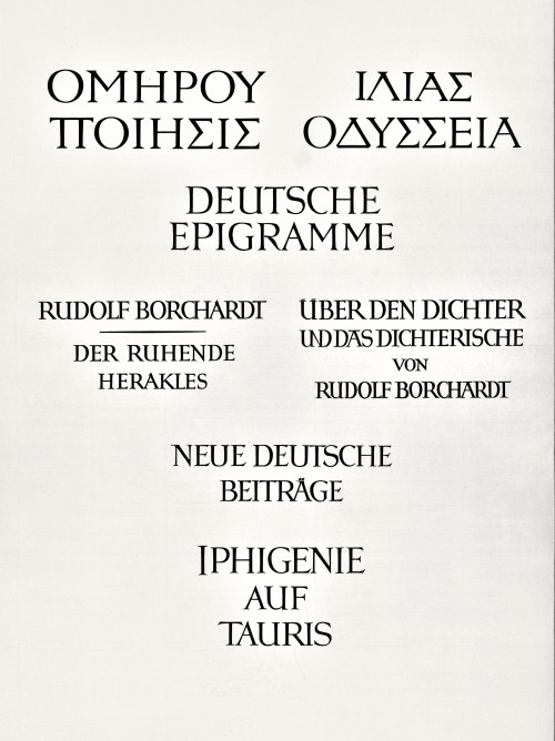
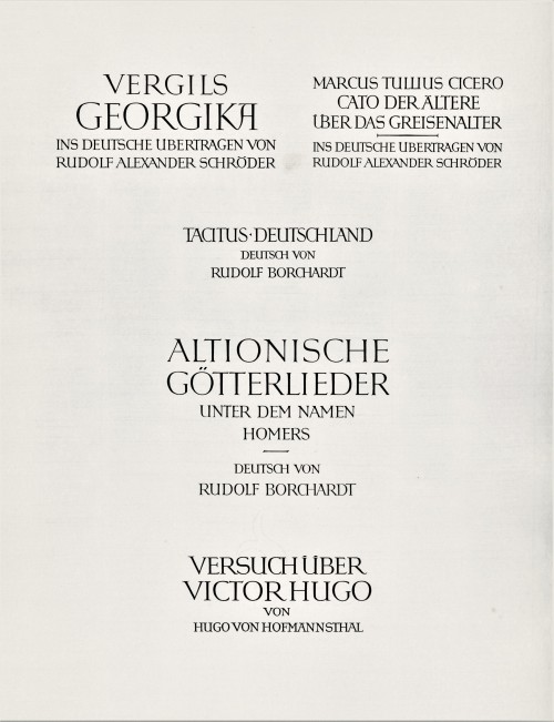
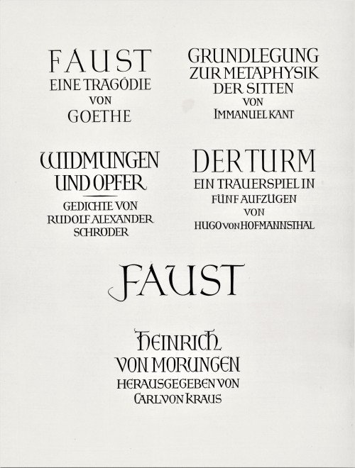
Today we present a few pages from a new acquisition, Titel und Initialen für die Bremer Presse, a specimen book of the titling and initials produced by the German calligrapher and type designer Anna Simons (1871–1951) for Willy Wiegand’sBremer Presse, printed letterpress in Munich at the Bremer Presse in an edition of 220 copies in 1926. A student of the renowned British calligrapher and type designer Edward Johnston, Simons taught Johnstonian design concepts at the Kunstgewerbeschule in Dusseldorf and later at Munich under the direction of German architect and type designer Peter Behrens. She began doing design work for the Bremer Presse beginning in 1918, and along with her assistant Franziska Kobell, Simons designed some 1400 titles and initials for the Presse. Simons continued to teach and work in Germany through the Nazi regime and died at 80 in Prien, Germany.
View more posts with designs by Anna Simons.
View posts on other Women Type Designers.
Viewmore Typography Tuesday posts.
Post link
A Minimalist Fine Press Friday
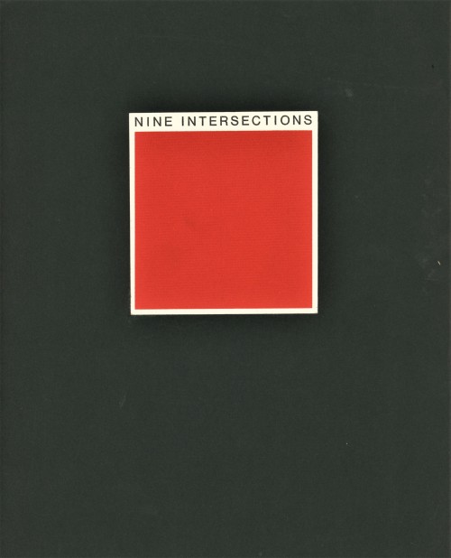
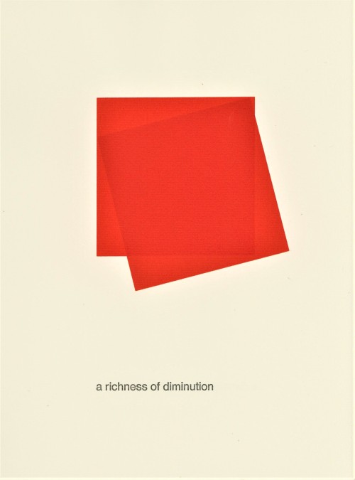
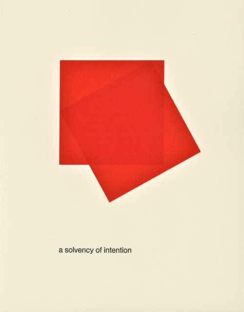
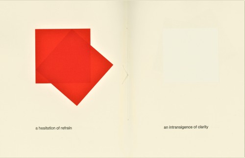
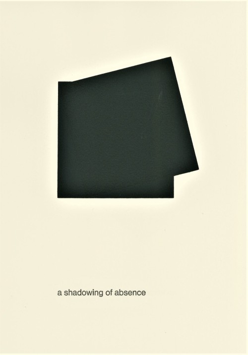
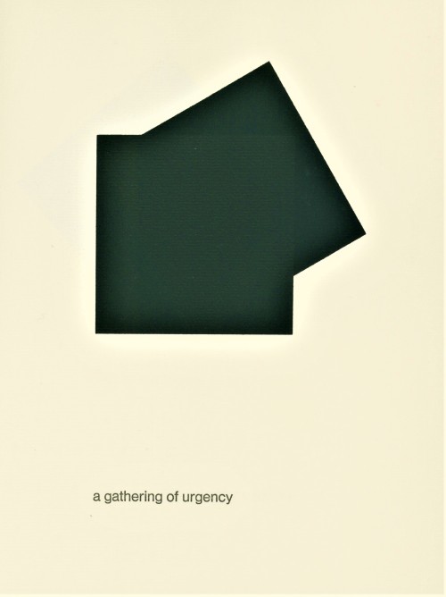
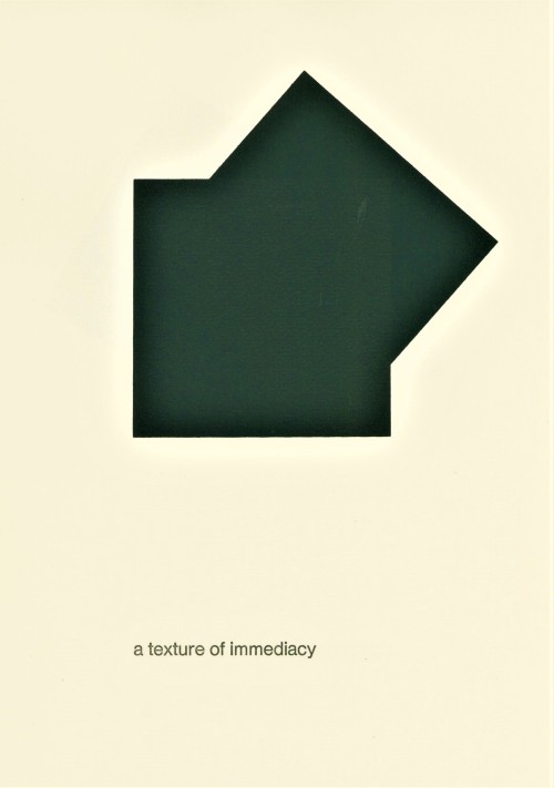
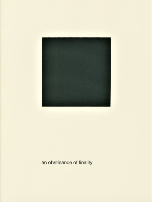
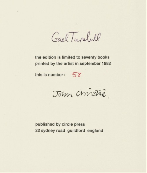
This week we present a fine-press pamphlet by a poet and an artist noted for their spare compositions. British artist and filmmaker John Christie uses minimalist silk-screened squares to illustrate Scottish poet and physician Gael Turnbull‘s equally sparse poem Nine Intersections, printed in 1982 by Christie at Ron King’s Circle Press in Guildford, England in an edition of 70 copies signed by the poet and artist. This is one of 14 publications Christie printed for Circle Press. Despite its minimalism, or perhaps because of it, the pacing, movement, and rhythm of this little book is wonderfully satisfying.
Viewmore Circle Press publications.
View moreFine Press Friday posts.
Post link
It’s Fine Press Friday!
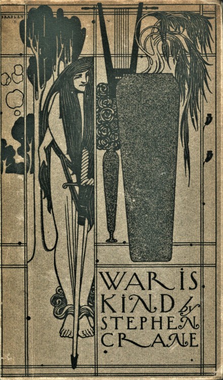
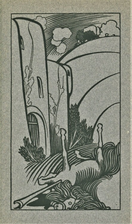
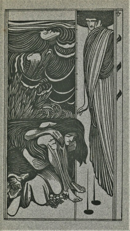
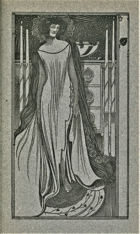
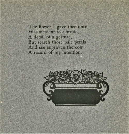
On this Fine Press Friday we present some pages from Will Bradley’s design and printing of Stephen Crane’sWar is Kind, published in New York by Frederick A. Stokes in 1899. Printed on dark grey paper, this is the only edition of Crane’s second collection of poems, published a year before his death.
An artist, illustrator, filmmaker, printer, and type designer, Will Bradley (1868-1962) was one of the foremost American graphic designers of the 20th century, and this work is one of the most visually-memorable American trade publications of the 1890s. Although Bradley’s style exhibits many of the hallmarks of Art Nouveau, his aesthetic was also strongly influenced by the Arts & Crafts movement. Often criticized as an American knock-off of Aubrey Beardsley, Bradley’s early style was already well-established before Beardsley’s popularity in the mid-1890s.
Our copy of War is Kind is yet another gift from our friend Jerry Buff.
View another post on Will Bradley’s type ornaments.
View moreFine Press Friday posts.
Post link
Wood Engraving Wednesday
PAUL NASH
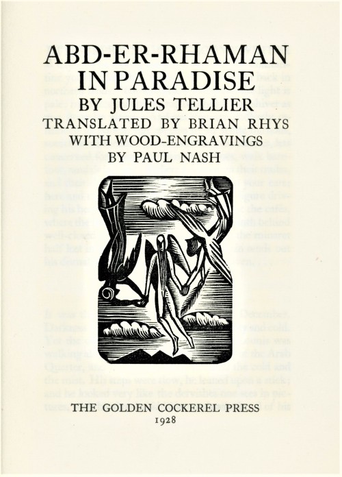
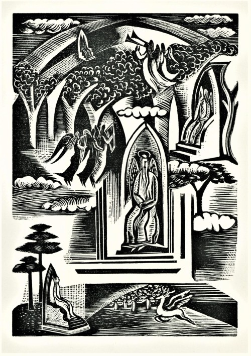
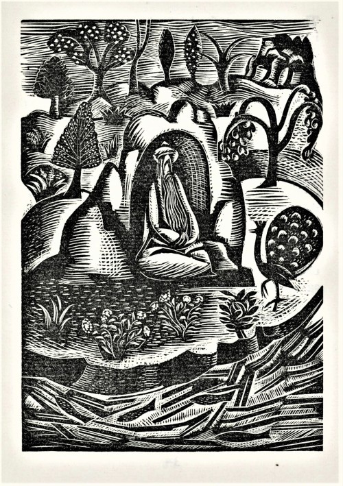
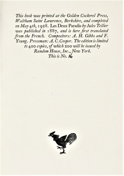
This week we present original wood engravings by English painter and wood engraver Paul Nash (1889-1946) from the 1928 Golden Cockerel Press edition of Jules Tellier’s 1887 story Abd-er-Rhaman in Paradise, printed in an edition of 400 copies. While he is remembered mainly as a painter, Nash was also an accomplished wood engraver and was an early and prominent of the Society of Wood Engravers, of which his younger brother John was one of the ten founding members.
Abd-er-Rhaman in Paradise was printed during the period when the Golden Cockerel Press was owned by another prominent English wood engraver, Robert Gibbings, another of the ten founding members of the Society of Wood Engravers. Gibbings could have easily illustrated this book himself, but as Roderick CaveandSarah Manson point out in their definitive A History of the Golden Cockerel Press 1920-1960,
… for him to commission Paul Nash to illustrate Tellier’s story was brilliant. Abd-er-Rhaman (1928) was splendidly successful. The reviewer in the Times Literary Supplement didn’t like the engravings, saying it would ‘probably appeal more to the devotees of the most “advanced” form of this art than to more old-fashioned persons,’ but now Nash’s illustrations seem just right.
Our copy is another gift from our friend Jerry Buff.
View more posts about Golden Cockerel Press productions.
Viewmore posts with wood engravings!
Post link
Wood Engraving Wednesday
GRETCHEN DAIBER
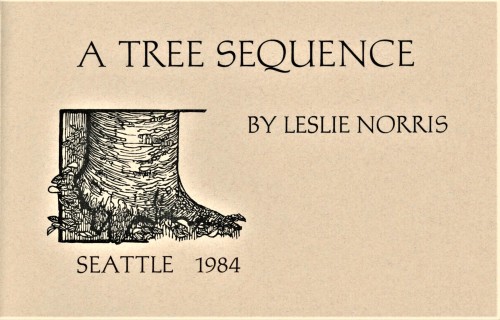
This week we highlight four delightful wood engravings by Washington artist, sculptor, and printmaker Gretchen Daiber that serve as illustrations for Welsh poet Leslie Norris’s 1984 chapbook of poems A Tree Sequence letterpress printed by Suzanne Ferris on handmade papers by Neal Bonham at their Sea Pen Press and Papermill in Seattle, Washington, in a limited edition of 20 copies signed by the poet and artist..
Daiber lives and works in Leavenworth, Washington, a Bavarian-styled village in the Cascade Mountains of central Washington State. She writes that “My work reflects the landscape and environment which I love– the mountains where I live… . my passion is to record and interpret my surroundings with sculpture, pastels, original prints, journal sketches and watercolors.“
We also include two watermark illustrations by Neal Bonham. At first, we couldn’t understand why there are two blank handmade sheets of paper in the middle of the book made of different fibers than the paper in the rest of the book. Then we tuned a page and the light caught the watermarked illustrations of trees and their shadows. Both Ferris and Bonham graduated from the book arts program at the University of Wisconsin-Madison where they were students of the great letterpress printer, book artist, and papermaker Walter Hamady.
Our copy of A Tree Sequence is another donation from our friend Jerry Buff.
View more posts with women wood engravers.
Viewmore posts with wood engravings!
Post link
Typography Tuesday
ANNA SIMONS, PART 2
This week we present the next ten of the twenty numbered plates in Titel und Initialen für die Bremer Presse, a specimen book of the titling and initials by the German calligrapher and type designer Anna Simons (1871–1951) for Willy Wiegand’sBremer Presse, printed letterpress in Munich at the Bremer Presse in an edition of 220 copies in 1926. We highlighted the first ten plates a couple of weeks ago.
For 15 years, Simons’s Arts & Crafts-inspired designs were important elements in the aesthetics of the Bremer Presse, and Weigand celebrated her contributions in this portfolio set of specimens during the middle of their collaboration. The press closed in 1934 and its assets were liquidated the following year. The studio building was destroyed in bombings during WWII. Simons, however, continued to teach and work in Germany through the war before her death in 1951.
View more posts with designs by Anna Simons.
View posts on other Women Type Designers.
View more Typography Tuesday posts.
Post link

