#initials
Typography Tuesday
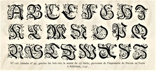
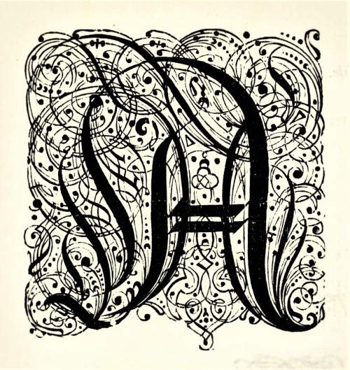
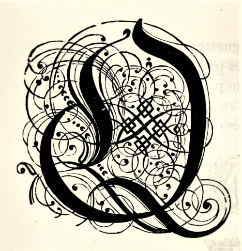
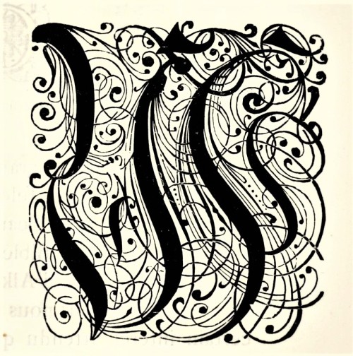
Here are some fancy, schmancy wood-engraved initials from our recent acquisition, Fonderies de caractères et leur matériel dans les Pays-Bas du XVe au XIXe siècle byCharles Enschedé (1855-1919), with specimens from the extensive typographic collection of the venerable 320-year-old printing and typefounding firm Joh. Enschedé en zonen, published in Harlem by De Erven F. Bohn in 1908.This title is one of type historian and designer Jerry Kelly’s recent One Hundred Books Famous in Typography (The Grolier Club, 2022).These highly calligraphic Gothic initials were engraved in wood in 1741 and were from the printing house of Pieter de Vries in Schiedam, Netherlands. Our copy of Fonderies de caractères is from the collection of New York artist Elijah Silverman and bears his signature.
View other posts related to the Enschedé firm.
Viewmore Typography Tuesday posts.
Post link
Typography Tuesday
ANNA SIMONS
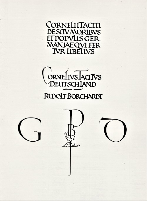
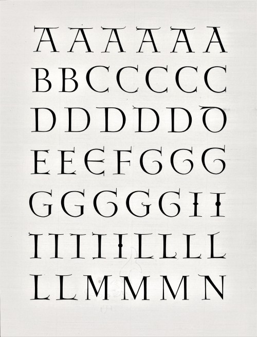
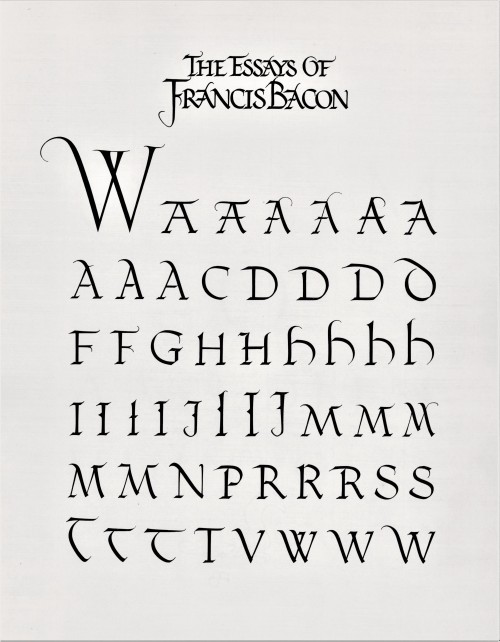
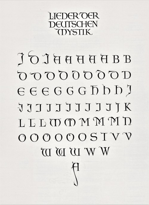
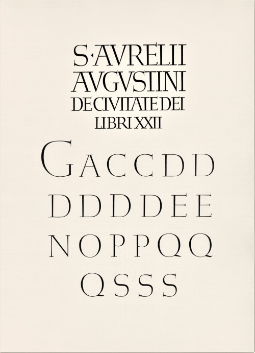
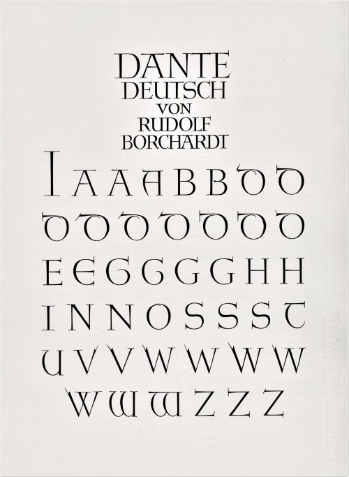
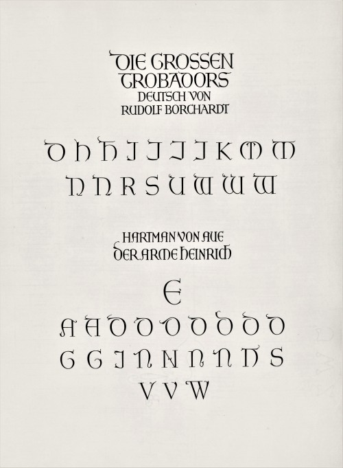
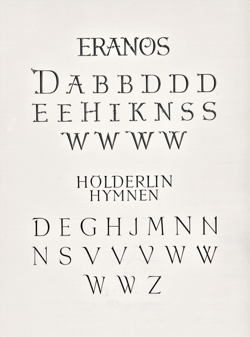
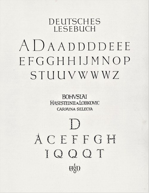
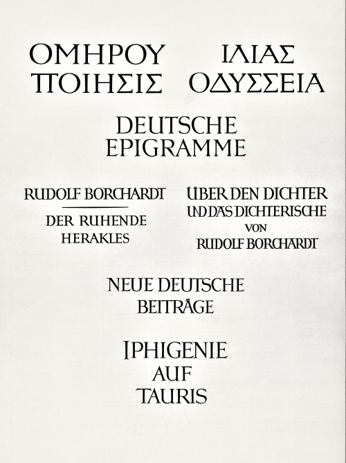
Today we present a few pages from a new acquisition, Titel und Initialen für die Bremer Presse, a specimen book of the titling and initials produced by the German calligrapher and type designer Anna Simons (1871–1951) for Willy Wiegand’sBremer Presse, printed letterpress in Munich at the Bremer Presse in an edition of 220 copies in 1926. A student of the renowned British calligrapher and type designer Edward Johnston, Simons taught Johnstonian design concepts at the Kunstgewerbeschule in Dusseldorf and later at Munich under the direction of German architect and type designer Peter Behrens. She began doing design work for the Bremer Presse beginning in 1918, and along with her assistant Franziska Kobell, Simons designed some 1400 titles and initials for the Presse. Simons continued to teach and work in Germany through the Nazi regime and died at 80 in Prien, Germany.
View more posts with designs by Anna Simons.
View posts on other Women Type Designers.
Viewmore Typography Tuesday posts.
Post link
Typography Tuesday
ANNA SIMONS, PART 2
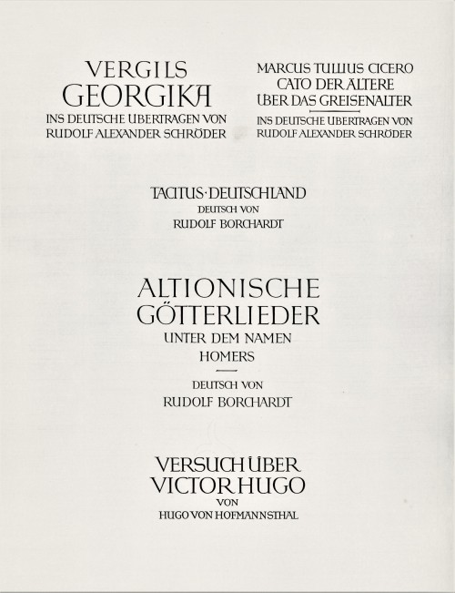
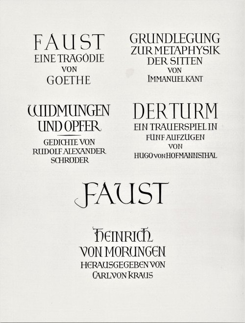
This week we present the next ten of the twenty numbered plates in Titel und Initialen für die Bremer Presse, a specimen book of the titling and initials by the German calligrapher and type designer Anna Simons (1871–1951) for Willy Wiegand’sBremer Presse, printed letterpress in Munich at the Bremer Presse in an edition of 220 copies in 1926. We highlighted the first ten plates a couple of weeks ago.
For 15 years, Simons’s Arts & Crafts-inspired designs were important elements in the aesthetics of the Bremer Presse, and Weigand celebrated her contributions in this portfolio set of specimens during the middle of their collaboration. The press closed in 1934 and its assets were liquidated the following year. The studio building was destroyed in bombings during WWII. Simons, however, continued to teach and work in Germany through the war before her death in 1951.
View more posts with designs by Anna Simons.
View posts on other Women Type Designers.
View more Typography Tuesday posts.
Post link
Woodcut Wednesday: Watch it with that!
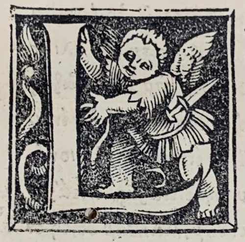
What would this winged fellow need with a knife? We must assume he used it in the construction of the big letter L.
Woodcut initial in the 1516 Greek New Testament by Erasmus.
Erasmus, Desiderius (ed.). Novum instrumentu[m] omne. [Basileae, in aedibus Ioannis Frobenii, 1516]
Post link
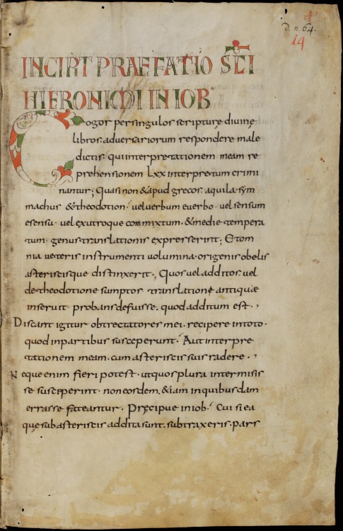
On my continuing trip through the St Gall archives, I come next to MS 14.
The manuscript contains five books from the Old Testament (Job, Tobit, Judith and 1 and 2 Ezra). It contains notations in the hand of Notker the Stammerer, the biographer of Charlemagne. It dates to the 2nd half of the 9th century.
As an illuminated manuscript, it’s about as minor as it gets; it makes the list because of exactly an interesting initial on page 1, and it’s a pretty minor initial at that.
It’s a zoomorphic initial, a fish shaped into a letter “C” with vegetal ends. “Fish letters” were a pretty common Merovingian motif, and lasted well into the Carolingian period. This is a pretty typical example. The titles are hollow capitals, filled with green and red. There are a few other hollow capital initials, filled with red through the manuscript, and that’s about it for this manuscript. Perhaps useful, in a minor way as a model.
Post link
Walter Art Museum, MS W.2, Collection of works by Augustine, Didymus the Blind, and Quodvultdeus, fol. 1bisr.
Post link
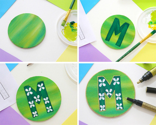
How to make Personalised Letter Magnets
We did something cute :) Right? We made these magnets for my cousins, because we like magnets and they’re fun to paint. Here’s the link for the tutorial on the blog.
Have a great weekend!
Post link
Celaena Sardothien
Initials: C.S.
Sam Cortland
Initials: S.C.
Their initials are flip-flopped. Coincidence? I think not.
The letter K. #mezart32 #calligraphy #lefty #lettering #penmanship #flourishing #frame #california #southpasadena #selftaught #progressnotperfection #2017 #nametag #initials #family #friends (at South Pasadena, California)
Post link
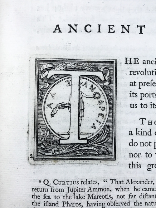
These unique initials are among the finest found in our collection. Rather than being printed from woodblocks, these specimens were engraved on a metal plate. While this process is more laborious, the results are far superior, with crisp, deep detail.
Images from: Norden, Frederik Ludvig. Travels in Egypt and Nubia. London: Printed by Lockyer Davis and Charles Reymers, 1757.
Call number: DT51 .N82 1757
Link to catalog record: https://bit.ly/3pBtdDn
Post link
©Glenn Carstenns-Peters
All The Things Left BehindWe saw their mail
Piling on the table by the door
Like if it didn’t
Make it into the living room
It wouldn’t have lifeWe knew he couldn’t manage
Living in empty rooms
Where memories floated
On dust particles caught
On sun rays
That never touched his skin againWe waited for that day
Like waiting for the elevator light to blink
And doors opening
T…


