#specimen books
Typography Tuesday
ANNA SIMONS
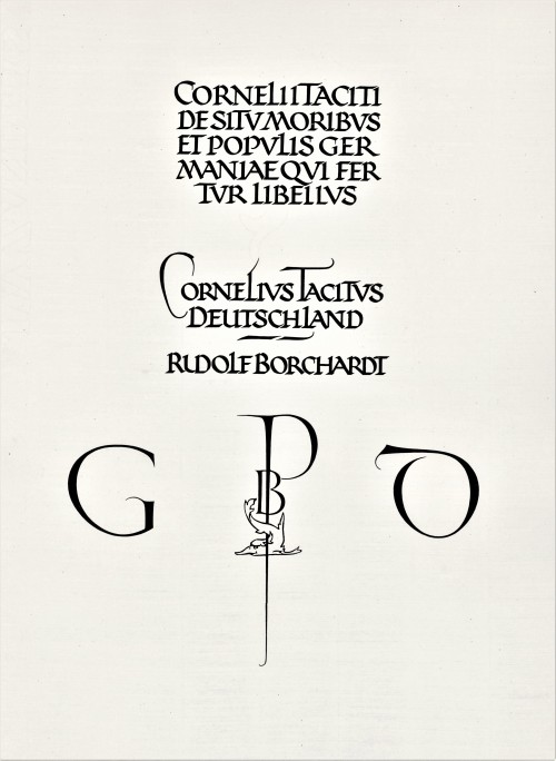
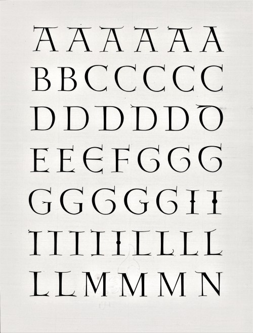
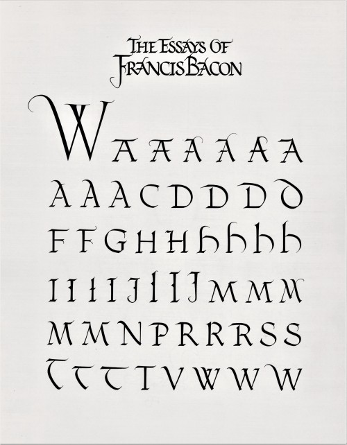
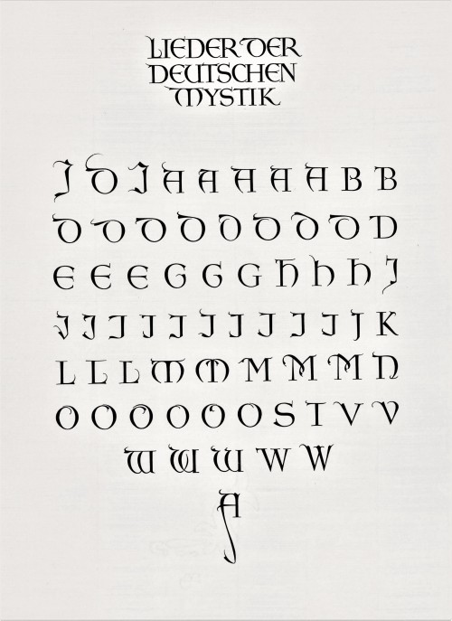
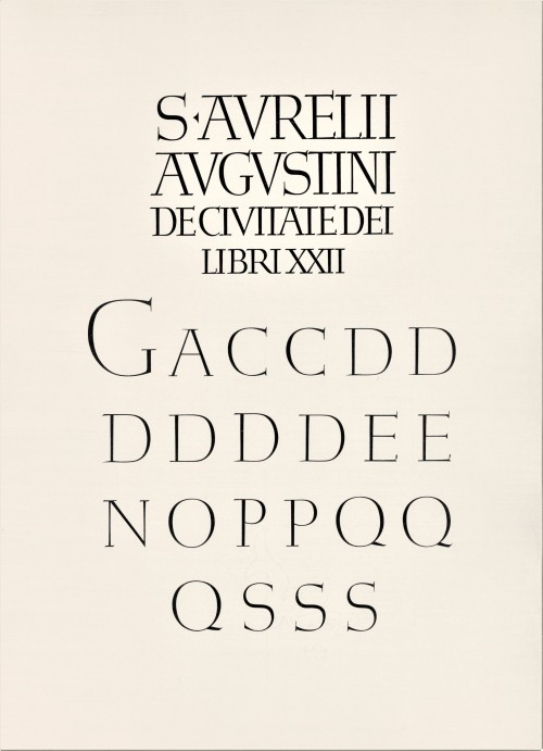
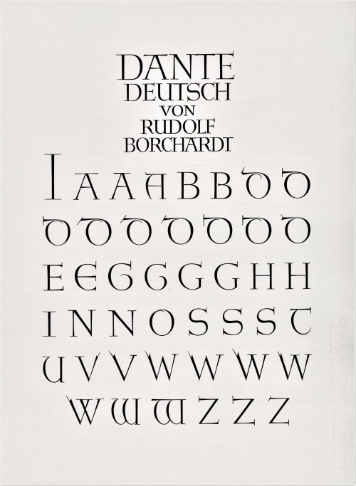
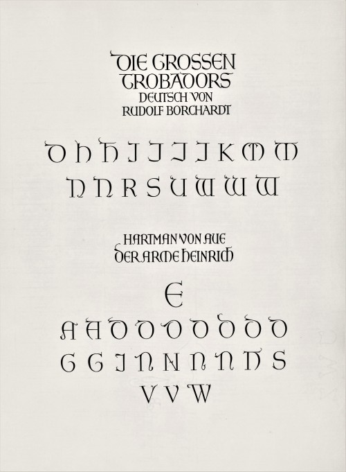
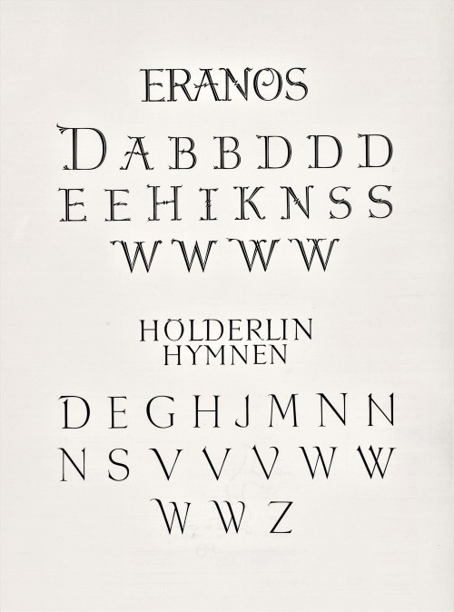
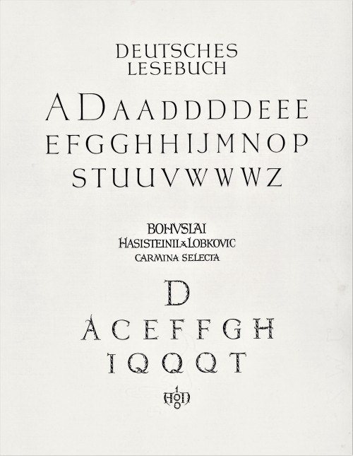
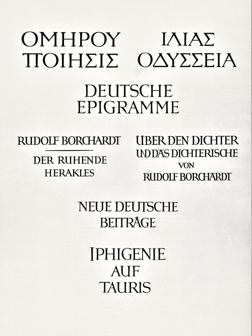
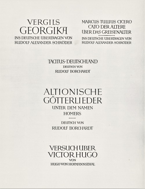
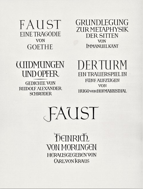
Today we present a few pages from a new acquisition, Titel und Initialen für die Bremer Presse, a specimen book of the titling and initials produced by the German calligrapher and type designer Anna Simons (1871–1951) for Willy Wiegand’sBremer Presse, printed letterpress in Munich at the Bremer Presse in an edition of 220 copies in 1926. A student of the renowned British calligrapher and type designer Edward Johnston, Simons taught Johnstonian design concepts at the Kunstgewerbeschule in Dusseldorf and later at Munich under the direction of German architect and type designer Peter Behrens. She began doing design work for the Bremer Presse beginning in 1918, and along with her assistant Franziska Kobell, Simons designed some 1400 titles and initials for the Presse. Simons continued to teach and work in Germany through the Nazi regime and died at 80 in Prien, Germany.
View more posts with designs by Anna Simons.
View posts on other Women Type Designers.
Viewmore Typography Tuesday posts.
Post link
Decorative Paper Sunday
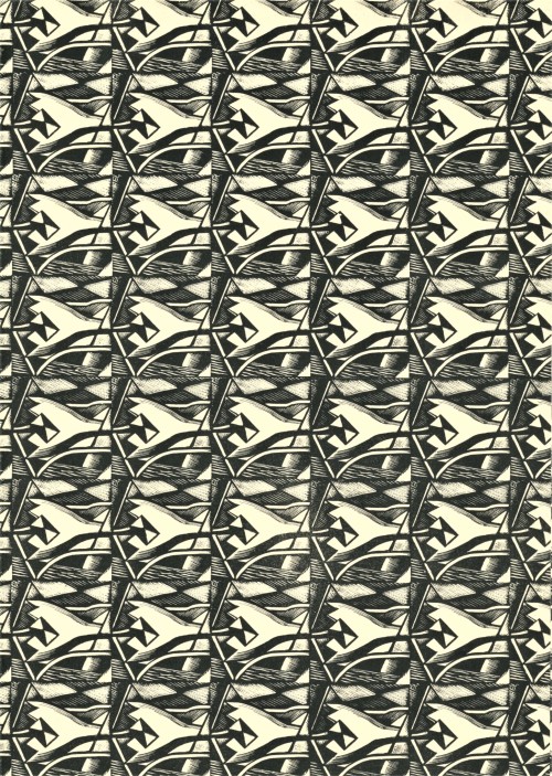
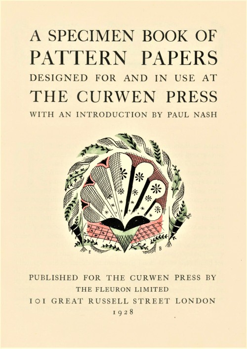
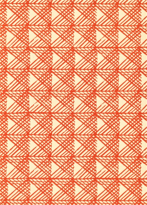
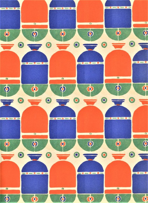
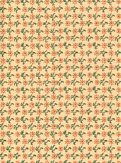
I’ve been excitedly waiting for this specimen book to make its way through processing and into our catalog so I can share these gorgeous decorative papers with you all. I hope some design nerds out there will share my enthusiasm. The book isA Specimen Book of Pattern Papers Designed For and in Use at the Curwen Press,published in London for the Curwen Press byThe Fleuron Ltd. in 1928 in a limited edition of 220, containing 31 samples of pattern paper, with an introductory essay by artist and Curwen collaborator Paul Nash.
From Nash’s introduction:
The papers in the following Collection are from designs reproduced by offset printing, the original key pattern being a line block from a drawing, or wood engraving … The latest designs are mostly from blocks engraved upon wood, sometimes with another colour applied either flat or grained. This notable output by an English printer is another sign of the steadily growing conviction that distinction of design is not only aesthetically, but commercially important. Every article, from the Shopman’s showcard to a motor-car, must have economy and beauty of form. It is a lesson we are learning very late, but if we can learn it intelligently, and not like parrots, we may yet recapture what has been so long lost with us, a pride in style.
The Reverend John Curwen established the Curwen Press in 1863 in order to produce hymn sheets for his congregation, where he was responsible for popularizing the tonic sol-fa method of sight singing. John’s grandson Harold Curwentook over management of the press in 1914. Inspired by William Morris and the Arts and Crafts movement and invigorated by fresh design ideas after a sojourn in Leipzig, Harold led the firm in a new direction, focusing on typography, design, and collaboration with artists in print projects. The Curwen Press, together with its associates in the Design and Industries Association,were highly influential in 21st century printing and publishing in the West.
The Curwen Press closed in 1984, but the Curwen name lives on in the Curwen Studio. The studio was established in 1958 and managed by esteemed printmaker Stanley Jones and specializes in fine art lithographic printing.
See image captions for design attributions. This book was acquired with support from the John S. Best Fund.
You can find moreDecorative Sunday posts here.
Moreposts about the Curwen Press can be found here.
-Olivia, Special Collections Graduate Intern
Post link
Typography Tuesday
ANNA SIMONS, PART 2
This week we present the next ten of the twenty numbered plates in Titel und Initialen für die Bremer Presse, a specimen book of the titling and initials by the German calligrapher and type designer Anna Simons (1871–1951) for Willy Wiegand’sBremer Presse, printed letterpress in Munich at the Bremer Presse in an edition of 220 copies in 1926. We highlighted the first ten plates a couple of weeks ago.
For 15 years, Simons’s Arts & Crafts-inspired designs were important elements in the aesthetics of the Bremer Presse, and Weigand celebrated her contributions in this portfolio set of specimens during the middle of their collaboration. The press closed in 1934 and its assets were liquidated the following year. The studio building was destroyed in bombings during WWII. Simons, however, continued to teach and work in Germany through the war before her death in 1951.
View more posts with designs by Anna Simons.
View posts on other Women Type Designers.
View more Typography Tuesday posts.
Post link


A little color to usher in the weekend on this rainy day…
These dyed ostrich feather samples are from the 1888 edition of The Practical Ostrich Feather Dyer by Alexander Paul, published by Mrs. Dr. M. Frank.
We’d love to see what the impractical ostrich feather dyer can do!

