#advertisements


In his most famous works of the 1960s, Warhol often lifted imagery from newspaper ads. In the 1980s, he returned to this source, drawing from spiritual advertisements but varying his approach by tracing the ads by hand.
The images include a Jesus Christ night-light, a reference to the book of Revelation’s apocalyptic mark of the beast, admonitions for good behavior in consideration of the afterlife, and a radiant star of psychic power. The question “ARE YOU DIFFERENT?” may indicate Warhol’s personal insecurities, or how his sexuality had marked him throughout his life.
Have you experienced #WarholRevelation yet? Bring a friend and grab a ticket: https://bit.ly/revelationbkm
Visitors at Andy Warhol: Revelation. Brooklyn Museum November 19, 2021–June 19, 2022. (Photo: Jonathan Dorado, Brooklyn Museum. Artworks by Andy Warhol © 2021 The Andy Warhol Foundation for the Visual Arts, Inc. / Licensed by Artists Rights Society (ARS), New York. Used with permission of @warholfoundation) #warholfoundation
Post link

Ad for the 1954 Ford Courier. America’s most distinctive Sedan Delivery.

1951 Life Magazine ad for Pepsi-Cola.

“Wind howling, logs crackling, popcorn popping, Budweiser sparkling - and you pouring! (1950).

Hidden dirt is a beauty thief! Ad for Palmolive soap in McCall’s Magazine, 1956.

1956 ad for Veedol “Flying A” ethyl gasoline and 10-30 motor oil.
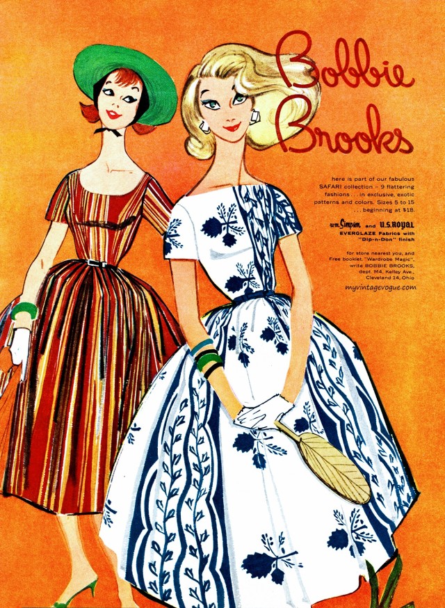
Bobbie Brooks fashion, 1958.

Souffle salads with JELL-O and Best Foods or Hellmann’s mayonnaise, 1953.


1956 advertisement for Artype transparent, self-adhering acetate sheets featuring hand-lettered alphabets (”actual type faces […] selected by master typographers and designers”), numbers, reference letters, arrows, symbols, borders, and more in a range of styles and sizes.
Burton Cherry Ephemera Collection (box 1, folder 9)
Newberry call number: Case Wing folio ZC 1 .183
Post link

1955 advertisement for Furst-McNess Company’s Beauty-Queen cosmetics. “Rich oils, feather-soft powders, wonderfully delicate fragrance … all the finest possible compounds” formulated and processed in their very own “sunlight laboratories” by “experienced chemists”. Sold only by personal consultants. The featured model seems very satisfied with her tub of “Hormone Cream”.
Burton Cherry Ephemera Collection (box 1, folder 10)
Newberry call number: Case Wing folio ZC 1 .183
Post link

This broadside from around 1868 advertises soda fountains available from James W. Chapman & Sons of Madison, Indiana. They promise these new models are easy to assemble, clean, and use. The advertisement ends with a series of glowing customer testimonials, like this one from Evans & Cromwell of Morganfield, Kentucky:
Messrs. Chapman & Sons: –Gents–Your fountain is one of the most completely arranged, simple, easy going thing we have ever seen in the shape of a soda fountain. Persons who have drank soda water from this fountain pronounced it the best ever drank. Yours, &c., Evans & Cromwell, Morganfield, Ky., Jan. 29, ‘68.
Newberry call number: Case Wing broadside TP635 .J36 1868
Post link
Question of the week.
Do you use an ad blocker yourself?

keep your friends close; keep your pubic enemies closer

Ad for a pair of Marvel UK miniseries starring Death-Wreck and Death Metal, both spin-off characters of ridiculous 90s ubermech and then-Marvel UK flagship character Death’s Head II. Given the era, the hyperbolic taglines were meant with utmost sincerity… although “our brains don’t fit into our heads” is a bizarre permutation of raditude.
Scan from a 1994 issue of Wizard magazine, which gives this some kinda peak crescendo of 90sness.
Post link
I am now getting advertisements in both English and Spanish. I feel like this is some sort of milestone in learning languages that I have reached


267.icons without psd: advertisements icons // ivy park: halls of ivy, 2021.


266.icons without psd: advertisements icons // ivy park: halls of ivy, 2021.


258.icons without psd: advertisements icons // tiffany & co., 2021.


257.icons without psd: advertisements icons // tiffany & co., 2021.

