#geotagged


Data Visualization at UBER
By Nicolas Garcia Belmonte
Map-based information is one of our biggest and richest assets at Uber. The billions of GPS points handled by our platform every day in real-time pose atypical challenges for real-time mapping visualizations and in-browser, data-dense visualizations. […]
Our tech stack for these applications consists on a few libraries that we developed and open sourced.react-map-gl provides a React-friendly layer on top of MapboxGL, a library from Mapbox that we use extensively at Uber. deck.gl provides an interface for creating WebGL-powered layers that can be put on top of a map or used standalone for creating abstract data visualizations. […]
We recently created a data visualization that explores how uberPOOL can have an impact in making cities’ transportation much more efficient. Behind Travis Kalanick in his TED Talk, you’ll see the data visualization we crafted to show traffic per street segment with and without uberPOOL, demonstrating POOL’s ability to make cities smarter by reducing traffic.
Source:UBER Engineering
Post link

Visual clutter remains a challenge in cartography, especially for web maps depicting voluminous, unfiltered collections of point type data. This issue is particularly prevalent in datasets generated in cities due to urban density. Professor Andrew Vande Moere and myself developed BinSq (abbreviated Bin2), a novel gridded dot density mapping technique to overcome this challenge. We demonstrate this technique on a large dataset of language referenced, geotagged tweets to reveal language communities in Brussels. The figure above compares our technique to the [a] standard dot map and six related solutions namely: [b] jittering, [c] refinement, [d] distortion with pixel map as well as [e] aggregation with categorical binning, [f] splatter plot and [g] dot density map. Our output is depicted in [h]. An implementation of BinSq in Java is avaliable on GitHub. Read our paper for a complete description of the technique.
Post link


Summer Pinwheels by Binita Shrestha
Via Flickr:
Size: 40 x 50 Fabric: Moda Sunkissed Photograph by Scott Allan Wallick.
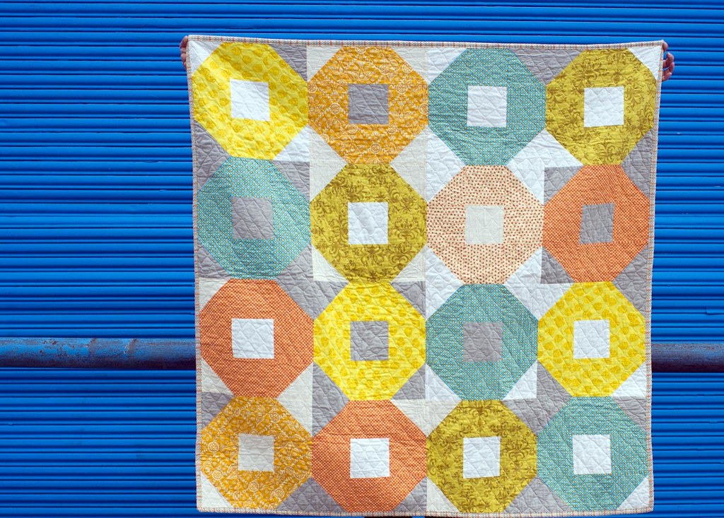
Shoofly Quilt by Binita Shrestha
Via Flickr:
Size: 45 X 45 Fabrics: Assorted Tutorial: quilting.about.com/od/blockofthemonth/ss/shoofly_quilt.htm Inspired by Malka Dubrawsky of stitchindye.blogspot.com/
 on Flickr.")
 on Flickr.")
 on Flickr.")
 on Flickr.")
 on Flickr.")
 on Flickr.")
 on Flickr.")
 on Flickr.")
 on Flickr.")
 on Flickr.")

