#branding design

LIVE
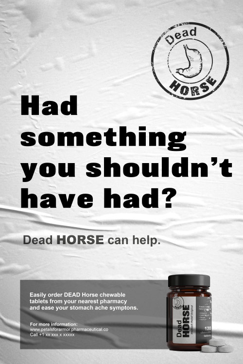
 Turned “Dead Horse” by Hayley Williams into stomach ache relief tablets. Dealing with p Turned “Dead Horse” by Hayley Williams into stomach ache relief tablets. Dealing with p Turned “Dead Horse” by Hayley Williams into stomach ache relief tablets. Dealing with p Turned “Dead Horse” by Hayley Williams into stomach ache relief tablets. Dealing with p Turned “Dead Horse” by Hayley Williams into stomach ache relief tablets. Dealing with p Turned “Dead Horse” by Hayley Williams into stomach ache relief tablets. Dealing with p

Turned “Dead Horse” by Hayley Williams into stomach ache relief tablets. Dealing with post trauma, anxiety crisis, depression and shitty husbands SUCK. Thank you for the wonderful work you gifted us with, Hayley.

The complete project is up on my behance: https://www.behance.net/gallery/96840255/Dead-Horse-Branding


Post link
Gestire le forme semplici e in un minuto progettare un monogramma netto ed efficace: K, ispirazione

Gestire le forme semplici e in un minuto progettare un monogramma netto ed efficace: K, ispirazione in logodesign.

https://bit.ly/2kKM25O


Post link
TBC brand logo design. A accessories in Australia.-Client: Andrew Saeid.Date: 4. 2015.——TBC brand logo design. A accessories in Australia.-Client: Andrew Saeid.Date: 4. 2015.——TBC brand logo design. A accessories in Australia.-Client: Andrew Saeid.Date: 4. 2015.——TBC brand logo design. A accessories in Australia.-Client: Andrew Saeid.Date: 4. 2015.——TBC brand logo design. A accessories in Australia.-Client: Andrew Saeid.Date: 4. 2015.——

TBC brand logo design. A accessories in Australia.

-

Client: Andrew Saeid.

Date: 4. 2015.

————————————————————————————-

Twitter  |  Instagram  |   Facebook   |  Shop  |  Oh Good Goods Mag  |  Pinterest  |  Medium  |  P.E.A.C   |    Linkedin 


Post link
Knowm Branding Logo Design.-Client: Alex Nugent.Date: 5. 2015.—————&mdKnowm Branding Logo Design.-Client: Alex Nugent.Date: 5. 2015.—————&mdKnowm Branding Logo Design.-Client: Alex Nugent.Date: 5. 2015.—————&mdKnowm Branding Logo Design.-Client: Alex Nugent.Date: 5. 2015.—————&mdKnowm Branding Logo Design.-Client: Alex Nugent.Date: 5. 2015.—————&mdKnowm Branding Logo Design.-Client: Alex Nugent.Date: 5. 2015.—————&md

Knowm Branding Logo Design.


-

Client: Alex Nugent.

Date: 5. 2015.

————————————————————————————-

Twitter  |  Instagram  |   Facebook   |  Shop  |  Oh Good Goods Mag  |  Pinterest  |  Medium  |  P.E.A.C   |    Linkedin 


Post link
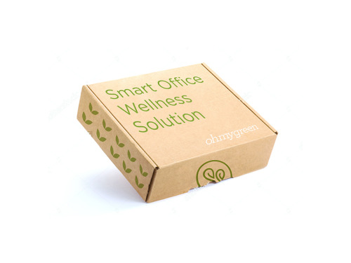
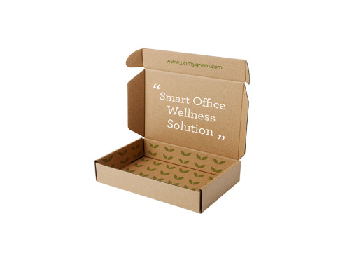
Product Package Box Design.Client: Oh My Green.Date: 12. 2015—————&mdaProduct Package Box Design.Client: Oh My Green.Date: 12. 2015—————&mdaProduct Package Box Design.Client: Oh My Green.Date: 12. 2015—————&mdaProduct Package Box Design.Client: Oh My Green.Date: 12. 2015—————&mda

Product Package Box Design.

Client: Oh My Green.

Date: 12. 2015


————————————————————————————-

Twitter  |  Instagram  |  Shop  |  Oh Good Goods Mag  |  Pinterest  |  Medium  |  P.E.A.C


Post link
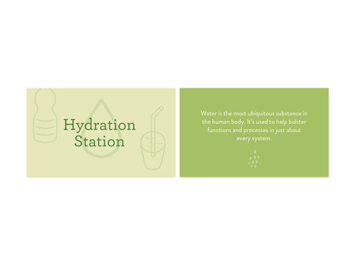
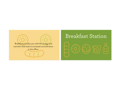
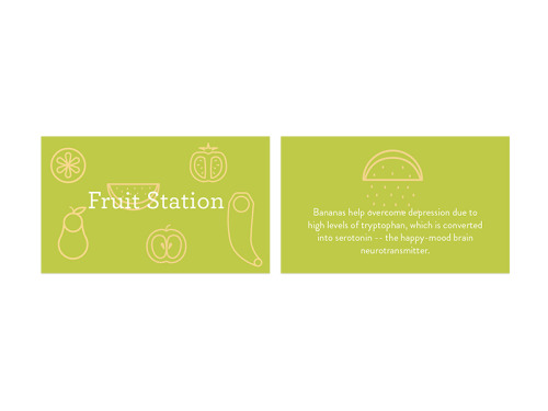
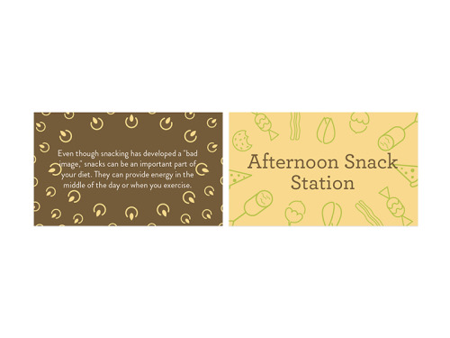
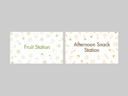
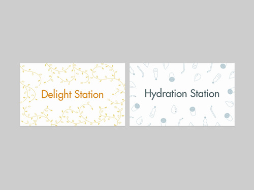
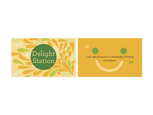
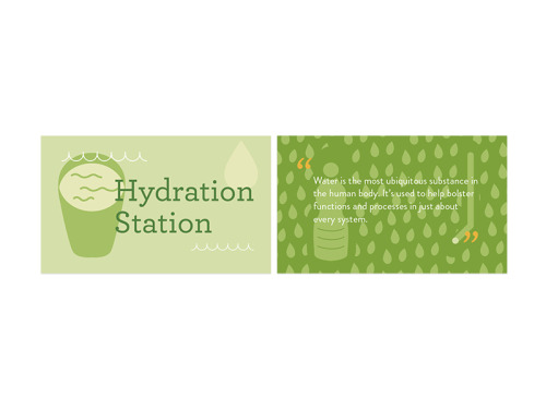
6 Station Signs Design ( concept 3 )Client: Oh My Green.Date: 12. 2015————&m6 Station Signs Design ( concept 3 )Client: Oh My Green.Date: 12. 2015————&m6 Station Signs Design ( concept 3 )Client: Oh My Green.Date: 12. 2015————&m6 Station Signs Design ( concept 3 )Client: Oh My Green.Date: 12. 2015————&m6 Station Signs Design ( concept 3 )Client: Oh My Green.Date: 12. 2015————&m6 Station Signs Design ( concept 3 )Client: Oh My Green.Date: 12. 2015————&m

6 Station Signs Design ( concept 3 )

Client: Oh My Green.

Date: 12. 2015


————————————————————————————-

Twitter  |  Instagram  |  Shop  |  Oh Good Goods Mag  |  Pinterest  |  Medium  |  P.E.A.C


Post link
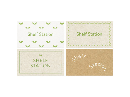
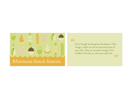
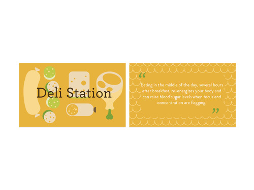
Shelf Station & 6 Station Signs Design ( concept 2-Final Version )Client: Oh My Green.Date: 12. Shelf Station & 6 Station Signs Design ( concept 2-Final Version )Client: Oh My Green.Date: 12. Shelf Station & 6 Station Signs Design ( concept 2-Final Version )Client: Oh My Green.Date: 12. Shelf Station & 6 Station Signs Design ( concept 2-Final Version )Client: Oh My Green.Date: 12. Shelf Station & 6 Station Signs Design ( concept 2-Final Version )Client: Oh My Green.Date: 12. Shelf Station & 6 Station Signs Design ( concept 2-Final Version )Client: Oh My Green.Date: 12.

Shelf Station & 

6 Station Signs Design ( concept 2-Final Version )


Client: Oh My Green.

Date: 12. 2015


————————————————————————————-

Twitter  |  Instagram  |  Shop  |  Oh Good Goods Mag  |  Pinterest  |  Medium  |  P.E.A.C


Post link
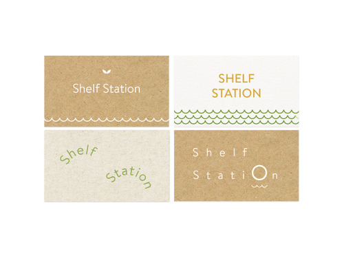
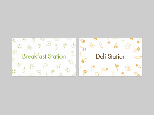
6 Station Signs Design ( concept 1 )Client: Oh My Green.Date: 12. 2015————&m6 Station Signs Design ( concept 1 )Client: Oh My Green.Date: 12. 2015————&m6 Station Signs Design ( concept 1 )Client: Oh My Green.Date: 12. 2015————&m6 Station Signs Design ( concept 1 )Client: Oh My Green.Date: 12. 2015————&m6 Station Signs Design ( concept 1 )Client: Oh My Green.Date: 12. 2015————&m6 Station Signs Design ( concept 1 )Client: Oh My Green.Date: 12. 2015————&m

6 Station Signs Design ( concept 1 )

Client: Oh My Green.

Date: 12. 2015


————————————————————————————-

Twitter  |  Instagram  |  Shop  |  Oh Good Goods Mag  |  Pinterest  |  Medium  |  P.E.A.C


Post link
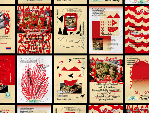
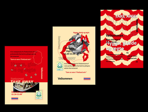
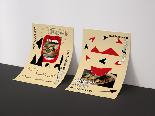
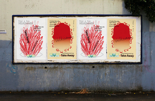
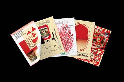
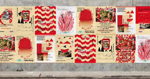
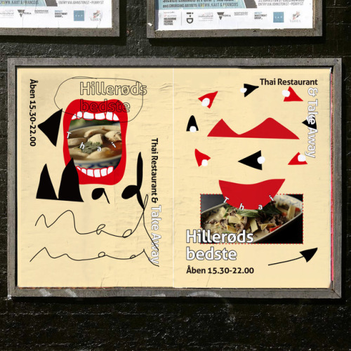
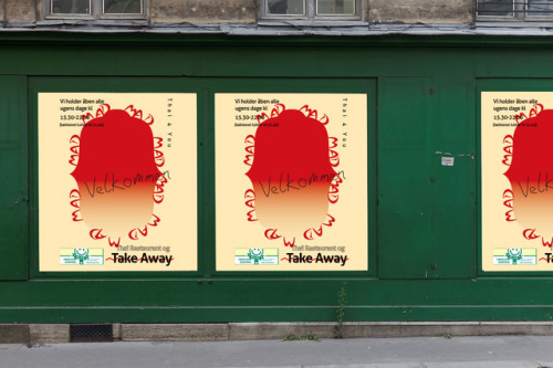
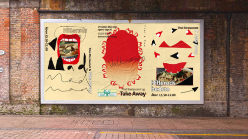
Thai restaurant series poster design No. 2. This series mainly used for signs, windows display, billThai restaurant series poster design No. 2. This series mainly used for signs, windows display, billThai restaurant series poster design No. 2. This series mainly used for signs, windows display, billThai restaurant series poster design No. 2. This series mainly used for signs, windows display, billThai restaurant series poster design No. 2. This series mainly used for signs, windows display, billThai restaurant series poster design No. 2. This series mainly used for signs, windows display, billThai restaurant series poster design No. 2. This series mainly used for signs, windows display, billThai restaurant series poster design No. 2. This series mainly used for signs, windows display, billThai restaurant series poster design No. 2. This series mainly used for signs, windows display, bill

Thai restaurant series poster design No. 2. This series mainly used for signs, windows display, billboard etc. for “Thai 4 You” restaurant.


-

Client: Tue Kalmo.

Date: 8. 2017.

Art Direction : Jun-Yao Yu
Visual Design : Jun-Yao Yu
Illustration : Jun-Yao Yu

-

Twitter  |  Instagram  |   Facebook   |  Shop  |   Pinterest 


Post link
“The strategy was simple, we can’t design another ‘me too’ product, Legend was sick of seeing “The strategy was simple, we can’t design another ‘me too’ product, Legend was sick of seeing “The strategy was simple, we can’t design another ‘me too’ product, Legend was sick of seeing

“The strategy was simple, we can’t design another ‘me too’ product, Legend was sick of seeing the same looking things on the shelves, they wanted something that offered the market something new and unexpected. With ‘Stories worth sharing’ as our central strategy, we developed product names, brands and packaging that leveraged local BC legends and created custom illustrations to bring the stories to life on the bottles. We wanted every detail to be considered, from container selection, non-traditional colour selections and print finishings to create something that stands out from the crowd.”

Also Known As


Post link
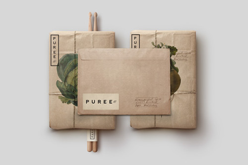
“In February of 2014 Marie & Claude LaPonte Launched Puree, an organic medicinal vegetable“In February of 2014 Marie & Claude LaPonte Launched Puree, an organic medicinal vegetable“In February of 2014 Marie & Claude LaPonte Launched Puree, an organic medicinal vegetable“In February of 2014 Marie & Claude LaPonte Launched Puree, an organic medicinal vegetable“In February of 2014 Marie & Claude LaPonte Launched Puree, an organic medicinal vegetable

“In February of 2014 Marie & Claude LaPonte Launched Puree, an organic medicinal vegetable garden where consumers can have access to naturally farmed food located in there very neighborhoods. 

Specific produce has been known to help with health problems such as joint and arthritic issues as well as a variety of cronic illnesses. Although Puree is known for its attention to growth and detail in supplying locals with fresh and specialized produce owners Marie & Claude wanted to steer away from looking like a typical health pharamcy and focus more on the product they produce.
 
It was important right from the start to showcase Puree as a specialty produce company that is quite different than your typical organic mom and pop store. In order to accomplish this it was important to create a timeless Identity that held up to Puree’s standards of simplicity and aesthetic value. Inviting people to make the most of the food they eat.”

Post link
“The client is a grown up couple who has a family business in Saltillo Coahuila. They harvest “The client is a grown up couple who has a family business in Saltillo Coahuila. They harvest “The client is a grown up couple who has a family business in Saltillo Coahuila. They harvest “The client is a grown up couple who has a family business in Saltillo Coahuila. They harvest “The client is a grown up couple who has a family business in Saltillo Coahuila. They harvest

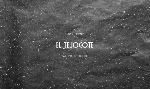
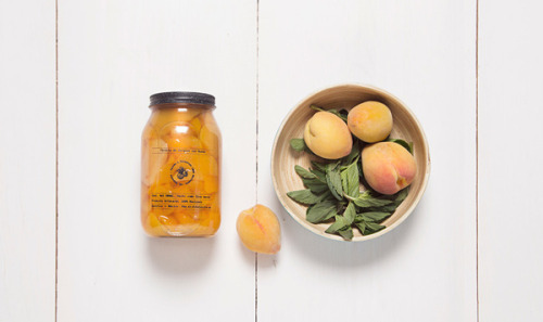
“The client is a grown up couple who has a family business in Saltillo Coahuila. They harvest the fruits themselves and transform them into traditional candy and preserves.

 
They opened the doors of their business and their own home to us, treating us like family. Due to that we were able to get inspiration directly from their kitchen, where they had a lot of crocks made of pewter, a very traditional material used in Mexico for many years. That’s the reason why we used pewter texture as the main element of the branding. The client surprised us with very accurate references of design, places and food around the world, that motivated us to propose a different solution for their project.
 
“El Tejocote” was a small task, but the persistence and determination turned it into a “great” project.”

Post link
“The brand focuses on the sensorial experience of furniture. With all materials more so in woo“The brand focuses on the sensorial experience of furniture. With all materials more so in woo“The brand focuses on the sensorial experience of furniture. With all materials more so in woo“The brand focuses on the sensorial experience of furniture. With all materials more so in woo

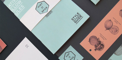
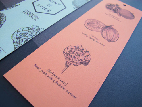
“The brand focuses on the sensorial experience of furniture. With all materials more so in wood, it is alive, it is a vehicle for fragrances. Have you ever gone to a show room or a fancy high-end house, stepped in and knew by the smell, that this place was indulgent and expensive. Chances are its because of the complex and harmonious smells that bring us to this conclusion.”

Sherman J.W


Post link
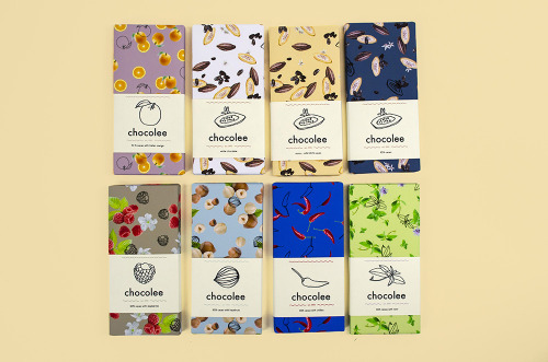
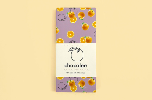
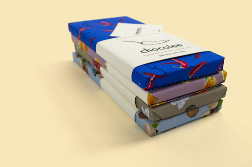
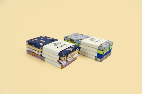
“An imaginary brand of chocolate inspired by origami paper and Japanese multi-purpose wrapping“An imaginary brand of chocolate inspired by origami paper and Japanese multi-purpose wrapping“An imaginary brand of chocolate inspired by origami paper and Japanese multi-purpose wrapping“An imaginary brand of chocolate inspired by origami paper and Japanese multi-purpose wrapping“An imaginary brand of chocolate inspired by origami paper and Japanese multi-purpose wrapping“An imaginary brand of chocolate inspired by origami paper and Japanese multi-purpose wrapping

“An imaginary brand of chocolate inspired by origami paper and Japanese multi-purpose wrapping cloth called furoshiki.”

Kathy Wu


Post link
“Hudson Made is an online retailer selling highly curated artisanal products from the Hudson V“Hudson Made is an online retailer selling highly curated artisanal products from the Hudson V“Hudson Made is an online retailer selling highly curated artisanal products from the Hudson V“Hudson Made is an online retailer selling highly curated artisanal products from the Hudson V“Hudson Made is an online retailer selling highly curated artisanal products from the Hudson V

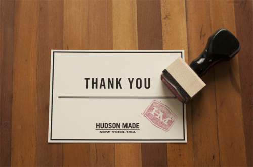
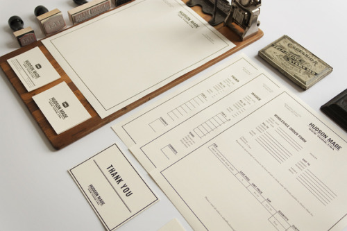
“Hudson Made is an online retailer selling highly curated artisanal products from the Hudson Valley, North Country and Brooklyn. Small batches. Limited quantities. 100% American made.

Late-19th century influences of the Bates stamp and the classic practice of letterpress printing hark back to an earlier time, while maintaining the refinement and clean lines of modernity for this brand identity.

The branding also reflects Hudson Made’s emphasis on what is handmade, invoking nostalgia for a time past and a return to the simplicity of production limited to the human touch. Handmade crafts also guarantee each product’s utter uniqueness, and the impossibility of two ever being alike.”

Hovard Design


Post link
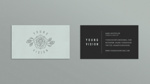
Young Vision is a group of creative individuals focused on making visual content that is unique, aesYoung Vision is a group of creative individuals focused on making visual content that is unique, aesYoung Vision is a group of creative individuals focused on making visual content that is unique, aesYoung Vision is a group of creative individuals focused on making visual content that is unique, aesYoung Vision is a group of creative individuals focused on making visual content that is unique, aesYoung Vision is a group of creative individuals focused on making visual content that is unique, aesYoung Vision is a group of creative individuals focused on making visual content that is unique, aesYoung Vision is a group of creative individuals focused on making visual content that is unique, aes

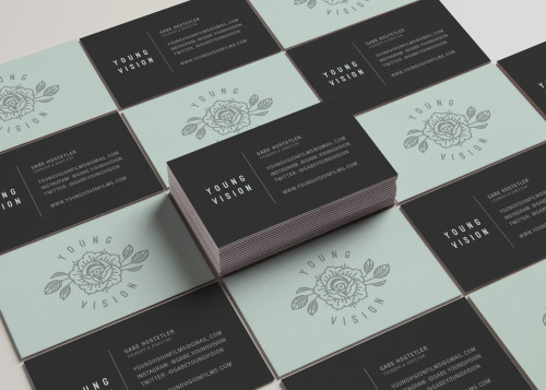
Young Vision is a group of creative individuals focused on making visual content that is unique, aesthetically pleasing, and impactful. From music videos to commercials to artwork, their passion is bringing a vision to life. I had the pleasure of developing the new visual identity for the collective in 2017.

Animation by: Adam Dargan


Post link
loading