2 tablespoons unsalted butter, at room temperature
2 egg yolks
Filling
1 ¾ cup strawberry jam
¼ cup cornstarch
3 tablespoons water
Decoration
Red royal icing in a decorating bag fitted with a #3 tip
Yellow royal icing in a decorating bag fitted with a #3 tip
Equipment
Large cast iron pot attached with a candy thermometer
Baking sheet lined with parchment
Baking sheet lined with paper towel
3-inch round cookie cutter
Wooden spoon
Small mixing bowl
Large mixing bowl
Rolling pin
Small saucepan
Rubber spatula
Whisk
Decorating bag fitted with a #802 tip
Let’s get started!
In a small bowl, mix the warm milk, yeast and sugar and allow to sit for 10 minutes to activate.
Add the mixture to a large bowl, and mix in the yolks, butter, vanilla bean and almond extract.
Add the flour slowly while mixing, and the salt half way through adding the flour.
Once all the flour is mixed in, knead for a few minutes.
Place dough into a greased bowl and allow to sit until the dough has doubled in size.
Punch down dough and roll out to 1/ 2-inch thick.
Cut out donuts with a 3-inch circle cookie cutter and place onto a parchment lined cookie sheet and cover with a towel to rest for 20 to 30 minutes.
Heat oil to 350ºF. Once the donuts have rested, place them into the hot oil.
Fry for 1 minute on one side, then flip the donuts and fry another minute until both sides are golden brown, remove from oil and place onto a paper towel lined baking sheet to drain.
To make the jelly filling: whisk the jam in a small saucepan over medium heat until it comes to a boil. Mix the cornstarch and water to make a slurry, and then whisk into the boiling jam. Whisk constantly until it thickens, then cool completely and scoop into a decorating bag fitted with a #802 tip.
Allow the donuts to cool and fill with jelly mixture by piping it into the side of the donut.
Using the red icing, pipe and fill a circle on top of the donut. Allow to dry for 15 minutes.
Using the yellow icing, pipe and fill a yellow star on top of the red circle.
TaDa! “Do or Do Nut” finish all these Steven Universe donuts!
Pink frosting in a decorating bag fitted with a #12 tip
Fondant: grey, light blue, light purple, white, and black
Food coloring gel: pink, blue, and white
Large fondant rolling pin
Small fondant veining tool
1 1/8-inch round cookie cutter
#12 decorating tip
Edible disco dust
Decoration
White buttercream frosting
Grey fondant (shell)
Light purple fondant (horn)
Purple fondant (eyes)
Light blue fondant (beak)
White fondant (whites of eyes)
Black fondant (center of eyes)
Pink gel color (speckle)
Blue gel color (speckle)
White gel color (speckle to mix with colors)
Pink buttercream frosting (head)
Edible Disco dust (shell)
Let’s get started!
Preheat oven to 325ºF. Grease egg mold and grease and line 6-inch cake pan.
In a medium bowl, whisk together the cake flour, baking powder and salt and set aside.
In a large bowl, beat together the butter and sugar until light and fluffy.
On low speed, alternate adding the flour mixture and milk to the butter mixture, beginning and ending with the flour mixture.
In a large clean bowl, beat the egg whites to a soft peak.
Fold the egg whites into the batter, 1/3 at a time until all the egg whites are added.
Pour the batter into the prepared egg mold and the remaining batter into a 6 inch pan.
Bake egg halves for 1 hour and 35 minutes. Bake the 6-inch cake for 30 minutes.
Remove cake from the oven and cool to room temperature.
Time to decorate!
Trim each egg half so the halves fit together. Pipe some white frosting in between each half and place together to make a round egg. Freeze for 15 minutes.
Remove the bottom 1/6 of the cake to make a flat surface for the egg to sit upright. Cut the top of the cake to resemble a cracked egg. Remove a small amount of the cake from inside to create a place for the head to sit. Save all cake pieces.
Crumb coat the cake and chill in the refrigerator for an additional 30 minutes.
To make the egg shell: On a lightly powdered sugar surface, roll out grey fondant to a ¼-inch thick. Cut fondant into a large rectangle and wrap then smooth around cake.
To speckle the egg shell: Mix in white food coloring into separate bowls of the pink and blue food coloring. Using a dry brush, splatter the pink and blue paint onto the grey fondant egg.
To make the Hatchimal head: crumble the 6-inch cake and reserved cake pieces into a bowl and mix in 1 tablespoon of frosting. Work the frosting into the cake then shape into a large smooth cake ball. Place the cake ball onto the top opening of the egg shell.
Shape a small unicorn horn with light purple fondant and a small beak with light blue fondant.
To make the eyes: Use a small round cutter to make purple fondant irises. Use the smaller round cutter to make black pupils.
Attach the eyes, horn and beak to the head. Pipe the entire head with pink frosting to look like fur.
Brush the shell of the cake with edible disco dust to make it sparkle.
TaDa! Our Hatchimals’ purple eyes means it’s hungry so it’s time to eat cake!
Here’s one of my newest tutorials for patreon.com/tycarter, “Man and Dog”! I’ll be releasing this and two more at the beginning of Nov. Sign up before Oct 31. I’m covering a bunch of fun topics like adjustment layers, getting traditional feeling paint/color using digital image filters, and I’m sure there will be some terrible jokes in there which you don;t have to laugh at :) Thanks for your support!
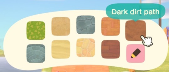
I don’t know if this is obvious to everyone but me but I just found out this cool “hack” for round custom paths. In Animal Crossing New Horizons when you finally unlock your terraforming app (also known as island designer app) there are 10 different paths you can create including custom paths.
All paths except for the custom paths have a very natural look to them around the edges + they can’t be destroyed just by pressing y + they can be rounded around the corners unlike custom paths that can look unnatural and blocky.
BUT!! There is a way to fix this problem to get the best of both worlds~
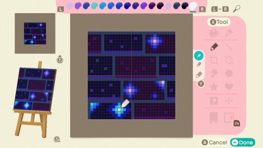
it is important to note that your custom path must have at least 1 transparent pixel to make this hack work; making all animal crossing new leaf qr code paths unusable for this hack.
The transparent paint tool is always the far right paint option for any of the color palettes. For this design I made the middle pixel of my star transparent and you can hardly tell.
So now that’s out of the way, the hack is really easy.
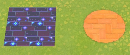
Lay down any of the 9 pre-made paths however you want. I chose the brick path since my custom design is brick and I wanted the sound effects to be the same. Make sure that you have it exactly how you want (with rounded corners and all) before doing step 2.
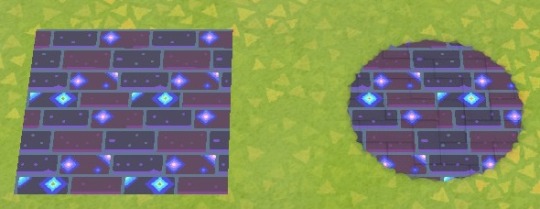
Switch to your custom design and put it on top of the pre-made path. It will act like a overlay and conform to the shape of the path beneath it.
You’re done! Step back and enjoy your finish product.
Disclaimer: Unfortunately these custom designs will still be easily destroyed if you press y while near them but the pre-made path underneath it will be left untouched.
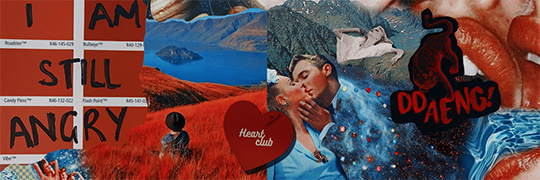
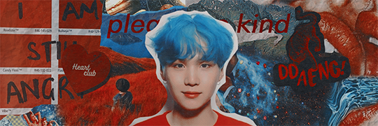
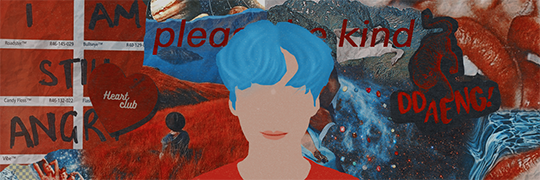
It’s quite simple finding “random” pictures to create the “background” of the header. I call it background because it’s too simple just dragging a lot of random pictures, the famous person picture and a psd. We have to make it beautiful and very, very “filled” of things. So, the part where is just a lot of pictures together we’re gonna call it background. The famous’ picture we’re gonna use is the LAST thing we search for, alright?
There are some sites that you can find pictures for free use, and they are:
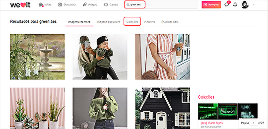
Those two blogs have really beautiful random pictures. But to help you, when you open you have to search for what you’re looking for. Please, everytime you’ll start doing this type of header, put in your mind the color you want. I’m gonna give you and example on we heart it.
Try doing it with me. Let’s choose the color green. Search for “green aes;” After you search, click on “collections”
So, here are the keywords: (color) aes; (color) aesthetic; (theme - like, idk, griffyndor?) aes; girls/ulzzangs (to find random pictures of ig models).
2.0 - THE “BACKGROUND”
Now that you click in collections, a lot of collections with a lot of pictures with the color you want will appear. The only thing you have to do is click in one of them (ofc you can open as much as you can) and selecting the pictures you want.
When I’m doing it, I don’t like to save a lot of pictures in my computer, so I just copy them and paste on photoshop, in the document of the header.
Now, let’s start with the background (finally). I don’t like a “pattern” with the pictures (like, three on the top and three on the bottom, and they are simetrically resized). You can use any of the selection tools to cut them in v e r y s t r a n g e w a y s. That’s how mine is looking (ugh I hate green so a changed the color of the header I hope you guys don’t mind hehehehehehehe)
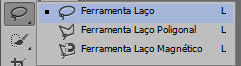
The tool I usually use.
The “ v e r y s t r a n g e w a y s”
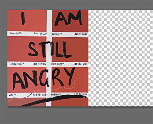
The result of the strange way:
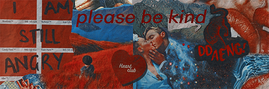
Now, keep doing that till you’re satisfied. Use png (pictures without background) on the header, this helps it getting even more beauty. Put a drop shadow on it by clicking twice in the png’s layer. That’s my result by now (I already applied the psd because why not).
The next step is putting a texture in each one of the pictures. You can find it easy on google. I “googled” newspaper texture and tchadannnn:
Choose one of them, or two, or one for each picture you used on your “background”. In this case, if you use just one, be sure to resize it in different ways in each picture (like, diagonally). And ofc, those textures for old pictures (like vhs etc) are kinda cool to put!
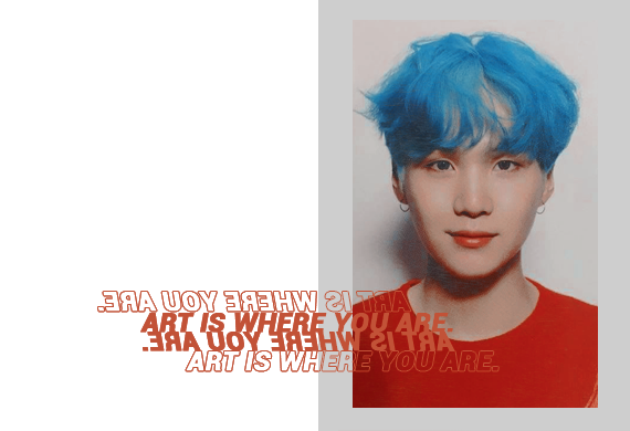
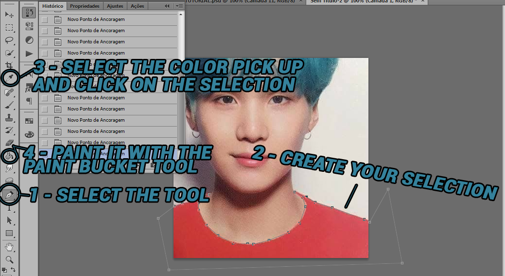
Everything you have to do is paste the picture in a solid color background, and then write what you need. For the transparency I just use that one style of photoshop that the preview is just a transparent square with stroke.
This one is quite simple. All you have to do is use the eraser!
Sample 03.
Here I use te vector technique. Basically, follow this steps for every content (hair, mouth, clothes, skin) and remember to separate them by layer. I won’t explain it because I said: basic knowledge about using photoshop - including selection tools.
Now, we finished! If there’s any doubt, pls, ask me! And if you made a header with this tutorial pls let me see by sending the post’s link in my ask, I would love it!
Using this headers and reposting are not allowed. *******
The type of pictures I used on background are surrealism*****
Tutorial made byciaracoloring. Difficulty level:easy You need to know how to use brushes.
Tutorial in english and portuguese. To find english version just Ctrl+F and write “english version”. Remember: english is not my first language, sorry for anything.
If you have doubts go to my askbox.
If it’s usefull give me like or reblog to show it for more people. Thanks ^^
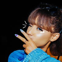
Primeiro: baixe os brushes. Nesse post tem os links. Eu vou ensinar voce mesmo a fazer os desenhos, mas esses brushes são lindinhos e essenciais em dias de preguiça ou bloqueio de imaginação, hahaha. Pegueessaimagem e faça comigo, vamos lá.
Passo um: Crie um documento em 200px pra voce poder visualizar melhor. Cole a imagem e redimensione. É sempre muito importante que na escolha da foto voce ja tenha uma noção de onde vai desenhar e tal. A minha vai estar assim:
Passo dois: Agora voce tira o bg com esse tutorial. Crie uma camada para a cor solida em baixo e mais uma camada em cima da camada do icon pra voce desenhar nela, apertando aqui:
Selecione a pencil tool/ferramenta lápis. Se ali estiver outro desenho clique com o botão direito do mouse clique no lápis:
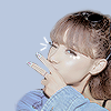
Agora, deixe a camada criada selecionada e comece a desenhar. Eu tinha em mente fazer risquinhos do lado do olho fechado e bolinhas no olho aberto.
Os riscos serão sempre com a pencil tool, mas as bolinhas é melhor fazer com a brush tool/ferramenta pincel. A pencil tool tem de estar com o hardness/dureza em 100% e o tamanho em 1px. Já a brush tool, pra fazer as bolinhas eu recomendo o 4px pra bolinha maior e ir diminuindo 1px pras bolinhas menores, tipo 4 > 3 > 2….
Passo três: Aplique o psd. Depois vá em Alt+Ctrl+i e coloque 100px e de ok. Agora aplique a atn e pronto, seu icon está feito ^^. Lembre-se que o grupo do psd deve estar em cima da camada do icon mas embaixo da camada do desenho.
Voce pode fazer varias coisas com a técnica “doodle”, como:
circular em torno da pessoa…
… seja em linhas retas ou com bolinhas
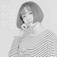
Voce também pode destacar detalhes como: os fios de cabelo mais escuros, alguns detalhes do fundo como flores e plantas e também a roupa :]
E o mais importante: não esqueça de usar os brushes a seu favor :]
English version:
First, download the brushes. This post has the links. I’ll teach you how to make the drawings, but these brushes are beautiful and essential for lazy days or when you’re not so inspired, hahaha. Takethis picture and make with me, so let’s go.
First step: Create a document with 200px size to see it better. Paste the image and resize. It’s always important have an idea of what drawing you’ll do on the pic. Mine is like this:
Step Two: Now you make your png. Create a layer for the solid color below and another layer on top of the icon layer. Make it by pressing here:
Select the pencil tool. If it is another draw click the right mouse button then click the pencil:
The lines will always be with the pencil tool, but the balls are better to do with the brush tool. The pencil tool has to be with the hardness in 100% and the size 1px. Already the brush tool, to make the balls I recommend 4px to larger ball and go decreasing 1px for smaller balls, like 4 > 3 > 2 ….
Step three: Apply psd then go to Alt + Ctrl + i and put 100px on the size. Now apply the atn and your icon is done ^^ Remember that the group of the psd have to be above the icon layer and under the draw layer.
You can do a lot of with with doodle:
You can work around the person with lines or dots
You can also highlight details like the wire darker of hair, some background details like flowers and plants, and also clothes…
And please, don’t forget to use the brushes, they’re adorable :]


 for patreon.com/tycarter")