The stripes on the original rainbow Pride flag stood for traits and values, like “healing”, “serenity”, and “art”. I think it’s ultimately a bad idea to try to create pride flags with stripes that each represent specific identities within a community - concepts about group identity change over time, and in-group bickering about who does or does not belong can eclipse unity and solidarity.
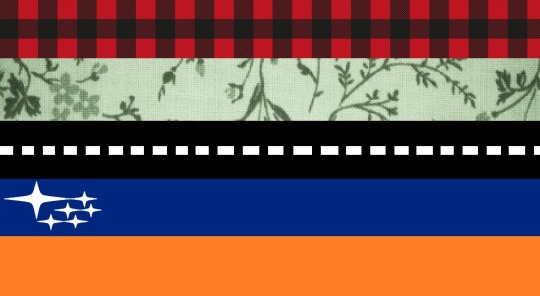
for example here is my design for a lesbian pride flag
the plaid represents the value of using an axe, the generic botanical print represents liking the idea of having houseplants, the road represents having mostly long-distance relationships, the stars represent going to space and being successfully advertised to, and the orange represents having anxiety and Rebel fighter pilots
Constructive criticism: the white lines on the road should probably be narrower and further apart, it doesn’t quite read as a road at first glance to me.
Also, the mixture of textures and solid colors feels a bit off, probably because the textures are right next to each other. The textured lines might work better if they were the second and fourth lines because then they would be evenly distributed between the lines that seem to be graphical elements.
My final recommendation would be to try the lines in this order: 1-blue, 2-botanical, 3-road, 4-plaid, 5-orange. I feel they may fit together better as a unit that way.
While I appreciate your input and you make great points, it’s more authentic if it’s a tacky aesthetic disaster.
To everyone suggesting adding a stripe for cat-owners: just lay it on a chair and it’ll be covered in cat hair in no time. DIY.
I’m pretty sure that, if you showed this to a vexillologist, you’d turn them into a homophobe.
Prior to 1861, the state of Louisiana had no official flag. In January 1861, after seceding from the United States but before the formation of the Confederate States of America, Louisiana unofficially used a flag based on the flag of France.
In February 1861, Louisiana officially adopted a flag with a single yellow star in a red canton, reminding of the colours of the Spanish flag, and with thirteen red, white and blue stripes, the colours of the French flag.
This was used through the end of the American Civil War, though the Pelican flag and Flag of January 1861 remained in use unofficially. In 1912 this flag was eventually replaced by a new version of the Pelican flag.
According to the mythology, the 12th-century King Eric IX saw a golden cross in the sky as he landed in Finland during the First Swedish Crusade in 1157. Seeing this as a sign from God he adopted the golden cross against a blue background as his banner.
According to non mythological theory, the Swedish flag was created during the reign of King Charles VIII, who also introduced the coat of arms of Sweden in 1442. The oldest recorded pictures date from the early 16th century. This flag was swallow-tailed, and the first legal description of the it was made in a Royal warrant of April 19, 1562.
By the mid of the 17th century, the double-tailed flag was changed into a triple-tailed. In 1905 the triple-tailed flag became the Swedish naval jack and the Swedish state flag became identical to the square-cut civil ensign.
With over 93,000,000 inhabitants, Ethiopia is the most populous landlocked country in the world. Tracing its roots to the 2nd millennium BC, Ethiopia was a monarchy for most of its history. Ethiopia derived prestige for its uniquely successful military resistance during the late 19th-century Scramble for Africa.
The colours green, yellow, and red have carried special importance since at least the early 17th century. Before the tricolour scheme has existed, Ethiopia flew three coloured pennants. Unlike today, the red was then at the top.
A year after Ethiopia decisively defended itself from Italian colonization at the Battle of Adwa, the pennants were replaced by the rectangular flag we still know today and that inspired the flags of many African countries.
The United Tribes of New Zealand was a loose confederation of Māori tribes based in the north of the North Island. British James Busby was sent to New Zealand in 1833 to serve as the official British Resident, and set up a framework for trade between Māori and Europeans.
British laws ruled that every ship must carry an official certification, so the United Tribes needed a flag to trade. Three designs were put to 25 northern Maori chiefs. The design chosen was based on the flag used by the Church Missionary Society.
When officially gazetted in Australia in 1835, the flag was altered, to fit with more standard heraldic patterns (the black fimbriation was made white, and the stars were changed to be five-pointed). Today it is widely used today as a flag by Māori groups throughout New Zealand, who also refer to it as the He Whakaputanga flag.
Sierra Leone is a country in West Africa. In 1808, the capital Freetown became a British Crown colony, and in 1896, the interior of the country became a British protectorate. In 1961 it became an independent country within the Commonwealth with Queen Elizabeth II as head of state.
There are personal flags for monarchs in many countries of the British Commonwealth. They are usually derived from the nation’s coat of arms and display the queen’s royal cypher in the centre. The zigzag border represents the Lion Mountains after which the country was named, the three torches symbolize peace and dignity.
After three military coups between 1967 and 1968, Sierra Leone became a one-party-state. In April 1971, a new republican constitution was adopted, making the royal standard obsolete.
The Kingdom of the Two Sicilies was the largest of the states of modern Italy. It was formed as a union of the Kingdom of Sicily and the Kingdom of Naples, which collectively had long been called the “Two Sicilies” and lasted from 1816 until 1860.
Like the flags of other Bourbon states it was white, and to distinguish from France’sandSpain’s white flags it showed the coat of arms. You can find an explanation of it here.
The Kingdom of Two Sicilies was annexed by the Kingdom of Sardinia in 1860, which eventually became the Kingdom of Italy in 1861. The integration into the Kingdom of Italy changed the status of Naples forever: “Abject poverty meant that, throughout Naples and Southern Italy, thousands decided to leave in search of a better future.”
Oldenburg was a Grand Duchy within the German Confederation, North German Confederation, and German Empire, which consisted of three widely separated territories. The largest of these territories and the namegiving capital was in north-west Germany.
The flag shows a St. George’s cross on a blue field. The design is rather unusual for a German flag of that time because most countries used a two-striped flag. The colours are the Landesfarben (colours of the state) and are derived from the coat of arms.
Oldenburg became part of the German Empire and the flag lost its status as national flag, but it is used as flag of the subnational entity until today.
The Ukrainian Insurgent Army was a Ukrainian nationalist paramilitary and later partisan army that engaged in a series of guerrilla conflicts during WWII against Nazi Germany, the Soviet Union, Czechoslovakia, and both Underground and Communist Poland.
Even resorting to collaborating with the German army as a tactical strategy to achieve nationalist goals during WWII, some accuse them of murdering Jews and Poles, so in Russia this flag is regarded as fascist. Nevertheless the flag is used by Ukrainian nationalists until today.
The Duchy or Republic of Amalfi was a de facto independent state centred on the Southern Italian city of Amalfi. It extracted itself from Byzantine vassalage and first elected a duke in 958. It rose to become an economic powerhouse, a commercial centre whose merchants dominated Mediterranean and Italian trade for a century.
Amalfi, perhaps the first of the maritime republics to play a major role, lost its independence and fell to the Normans, from whose yoke it failed in two separate attempts to free itself.
Today the flag, among with those of Venice, Pisa and Genoa, is part of the Italian CivilandNaval Ensign.
Karafuto Prefecture, commonly called South Sakhalin, was the Japanese administrative division corresponding to Japanese territory on Sakhalin from 1905 to 1945. Through the Treaty of Portsmouth, the portion of Sakhalin south of 50°N became colony of Japan in 1905, and in 1907 the prefecture of Karafuto was established.
The flag shows the mon of Karafuto, but I have no further information about it. I think it shows birch leaves, but I can’t interpret the three things between them.
In 1945, with the defeat of Japan in World War II, Karafuto was occupied by Soviet troops and its Japanese administration ceased to function. Karafuto Prefecture was formally abolished as a legal entity on June 1, 1949. Since 1951, the southern part of Sakhalin has been a part of Russia.
Northern Epirus was a short-lived, self-governing entity founded in the aftermath of the Balkan Wars on February 28, 1914 by Greeks living in southern Albania (Northern Epirotes). After being taken by the Greek Army during the First Balkan War the area was assigned to the newly established Albanian state, what was rejected by the local Greeks.
The flag is based on that of Greece at that time, but also shows a double-headed eagle like the flag of Albania. “A” and “E” stand for autonomous Epirus.
The Greek Army reoccupied the area in October 1914 following the outbreak of WWI, and it was supposed to be ceded to Greece following the war. But Italian interests and the lack of military victories prevented this.
Zamora is a Spanish province of western Spain, in the western part of the autonomous community of Castile and León at the Portuguese border.
The eight red stripes stand for the victories of Viriato, a local Iberian leader who resisted to Roman annexation some 2000 years ago. The Catholic Kings, in reward for the heroic acts of the people of Zamora at the battle of Peleangonzalo or Toro in 1476, decorated the flag with the green stripe.
Viriato is seen as a remote ancestor and national hero in Portugal, and some say his legendary hometown and its colours are the origin of nowadays Portuguese republican colours.
Lethbridge is a city in the province of Alberta, Canada. After the US Army stopped alcohol trading with the Blackfeet Nation in Montana in 1869, traders John J. Healy and Alfred B. Hamilton started a whiskey trading post at Fort Hamilton, near the future site of Lethbridge.
Artist Alex Johnston used a photograph of the flag that flew at Fort Whoop-Up (the nickname of Fort Hamilton) in the late 19th century as the basis for his rendition of the modern flag. He also used some contemporary written descriptions.
Souaida, later called Jabal Druze, was one of the five autonomous states in the French Mandate of Syria from 1921 to 1936, designed to function as a government for the local Druze population under French oversight. It was the first, and remains the only, autonomous entity to be populated and governed by Druze.
The colours of the flag had been established during the constitution of the government of the Emir. The 13 stars represented the 13 French administrative divisions of the state.
The stars were removed in 1924 and a small French flag was added as canton. Protests against the division of Syrian territory into statelets led to the foundation of Syria in 1936.
Crimean Tatars, Native Crimeans or simply Crimeans are a Turkic ethnic group, native to the Crimea. They emerged as a nation at the time of the Crimean Khanate, a Turkic-speaking Muslim state which was among the strongest powers in Eastern Europe until the beginning of the 18th century.
After Crimea was conquered by the Russian Empire in 1783, the Tsarist deliberate policy of annihilating Crimean Tatar existence in Crimea and the Russo-Turkish War (1877–78) caused an exodus of the Crimean Tatars. All Crimean Tatars were deported en masse, in a form of collective punishment, on 18 May 1944 as “special settlers” to distant parts of the Soviet Union. 46.3% of the resettled population died of diseases and malnutrition.
The flag features the traditional Turkic colour of light blue and a golden coloured tamğa, an abstract seal or stamp used by Eurasian nomadic peoples as cattle brand and clan identifier.