Progress on another of my war goddesses, Inanna. Working on Bast, Alala, and Astarte as well when I’m not posting on Tumblr. The whole series will be at the Hive Gallery in Los Angeles on June 7th, 2014.
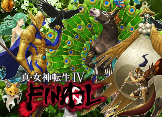
The release of a new Shin Megami Tensei game means it’s worth deviating from the blog’s main focus for another volume (at least). Join Kaneko’s Crib Notes editors SorenandEirikr once again as they discuss in detail all of Shin Megami Tensei IV Final’s new demon designs by Masayuki Doi! The major spoilers are corralled into their own section at the end, but it’s advisable to err on the side of caution if you’ve not yet familiarized yourself with them. All other intrepid souls, click onward!
I. DOI’S REFINED PALATE
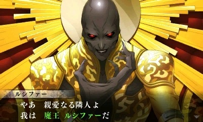
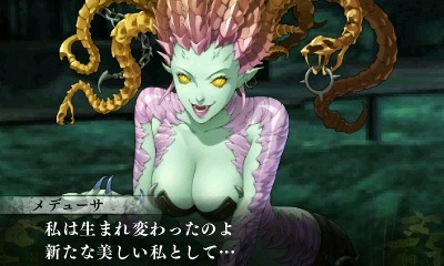
Eirikr: We might as well start with the more familiar faces. Though there’s not really too much to say about the refined designs that wasn’t already said 3 years ago. I think the winners this time around were Medusa and Lucifer.
Soren: Yeah, Lucifer in particular benefits greatly from the ol’ Doi touch.
Eirikr: His darker skin tone and an honest-to-goodness facial expression polish him about as far as he’ll go.
Soren: Not to mention the snazzy throne, which does soften the blow a bit.
Eirikr: A throne which he never leaves, hilariously. “We’re a package deal, honey.”
Soren: (Laughs) Yes, that makes up one of the game’s more commendable efforts at comic relief, intentional or not.
Eirikr: Medusa’s facelift fixes the glaring problem with her SMTIV artwork.
Soren: Yeah, having a face that isn’t completely jarring makes for quite a turnaround.
Eirikr: She REALLY wants you to look at her boobs now, but on the whole she’s a much better fit with the rest of the compendium. The refined demons I feel weren’t (or couldn’t be) improved are Merkabah, Napaea, and Centaur. Merk’s just a mess, no need to get into that again. But it’s a slightly better looking mess now.
Soren: Those are pretty much broken from the ground up, unfortunately, Not that Doi didn’t give it his best shot, of course.
Eirikr: Like adding a thin layer of icing to a burnt cake. But yeah, he did as much as he could, you gotta give him that.
Soren: Centaur benefits the most from a more dynamic pose, but otherwise there isn’t much you could do to make that design less silly. As for Napaea… well, the man isn’t a miracle worker, I’m afraid.
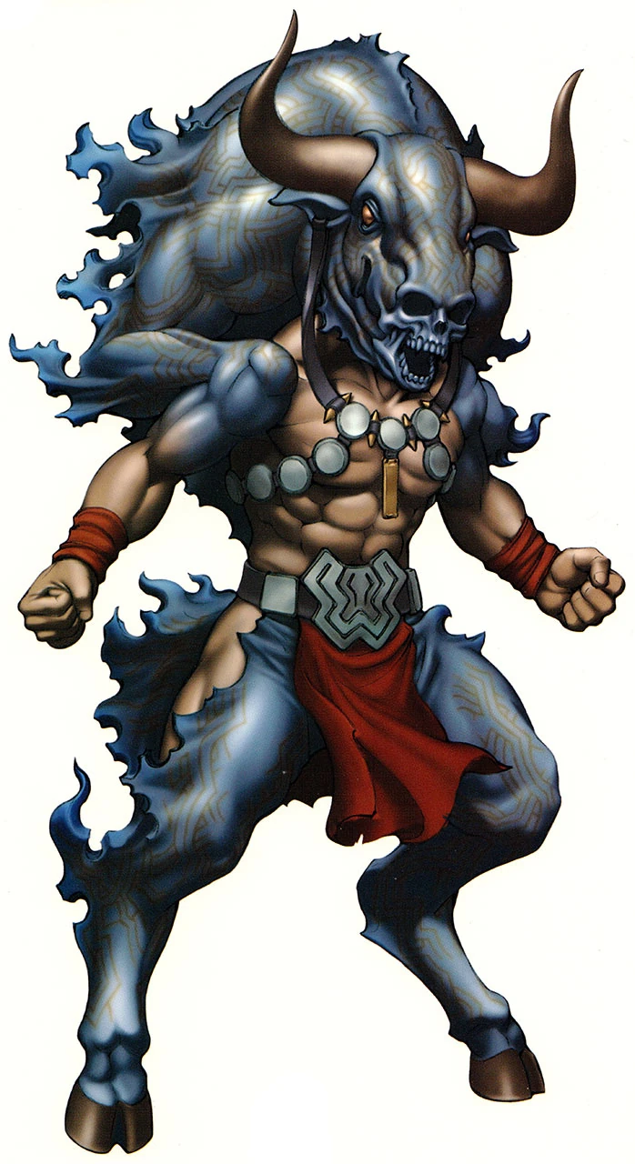
Eirikr: That she’s in but Minotaur isn’t was a shocker.
Soren: Yeah, Krishna and his goons really dropped the ball when it came time to resurrect old deities, apparently. Tenkai, on the other hand, certainly deserved a second shot at life. Of course, he didn’t require much of a touch-up in the first place, so the result is maybe a bit redundant.
Eirikr: Yeah, Tenkai’s is one I feel fared a little worse. I commented before that he now looks like he put his hand in something stinky and is retching from the smell. I can’t unsee it.
Soren: (Laughs) Yeah, I can’t blame Doi for going with a more… monkly pose, but the execution leaves something to be desired. But that about wraps it up for the oldies. They certainly are, uh, there.
Eirikr: It’s kinda funny though how many aren’t. The archangels appear in silhouette with the Gabby sprite, though she is called Gabriel. Was it a reaction to negative feedback?
Soren: I’d say either that, or those licenses belong to their respective artists and their agents; but seeing as any of them appeared at all, the former seems more likely.
Eirikr: Speaking of the guest artists, Nirasawa died recently, didn’t he? Yep, on February 2nd. Kidney failure. Only 52.
Soren: Yeah, that’s a real shame. His body of work beyond those guest designs is nothing to sneeze at, and he seems to have been quite influential in his field.
Eirikr: Yeah, he wasn’t a fit for SMT, but he designed some crazy cool creatures and costumes for tokusatsu stuff. I urge anyone to check them out.
II. ROSTER UPDATE 2K16 (NON-SPOILER)
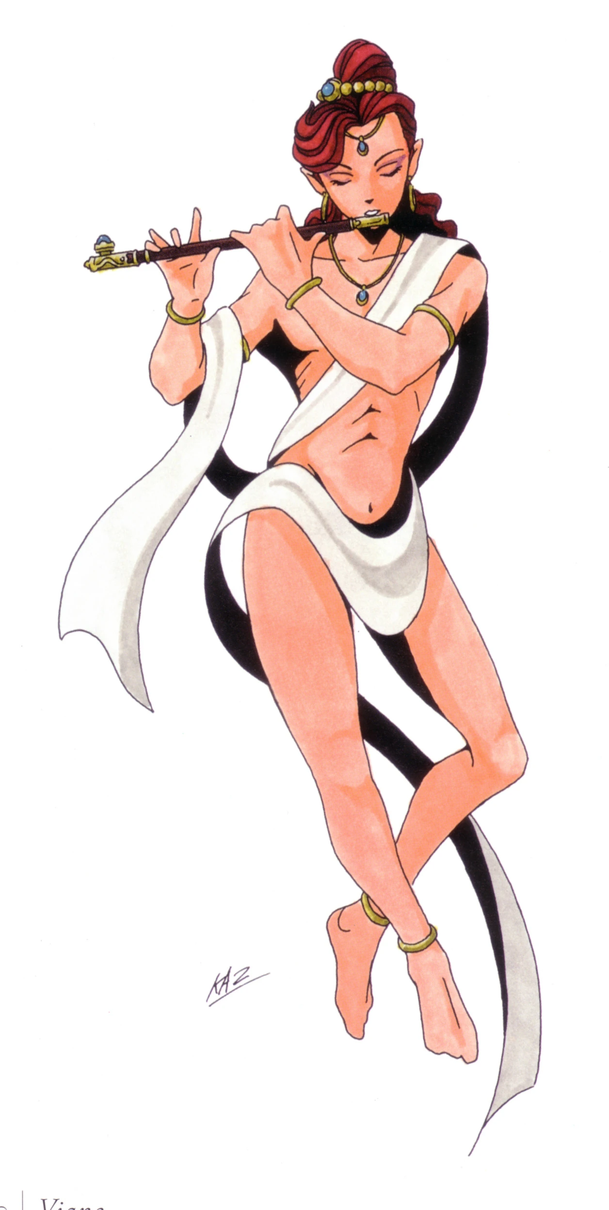
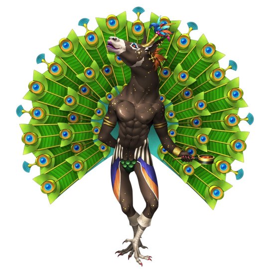
~Krishna~
Eirikr: Anyway, the new stuff. Let’s go with Krishna first. I remember you liked him right out of the gate, but I didn’t.
Soren: Yeah, Krishna is a real odd case. As a character design or as a “human” guise for, say, Vishnu, I really dig it; very snazzy. He even forgoes the digital shading employed for the rest of the roster. But it doesn’t seem to have panned out that way.
Eirikr: I grew to like it a lot as I played through the game. But, yeah, he didn’t scream “demon” moreso than he did NPC to me at first. Even though Krishna ends up being too one-note in personality, I was all too happy to finally fuse him. His name means “the black one,” right?
Soren: That’s right, and to be sure, he has his fair share of dark-skinned depictions throughout traditional art.
Eirikr: It’s not too surprising that the design goes for something more natural, though.
Soren: For sure. And the flute, the peacock motif, the pose recalling the traditional cross-legged stance: there’s a lot to like here beyond his impeccable fashion sense.
Soren: It’s certainly nice to see them taking a crack at some of the duller oldies for once.
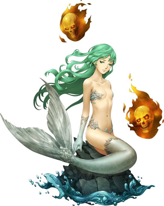
~Mermaid~
Eirikr: How about Mermaid?
Soren: There’s one that’s soured on me since the initial reveal, unfortunately.
Eirikr: Yeah, me too. It looks like a mermaid, but…
Soren: A real mess from the neck down. Calls to mind some unfortunate fetishes.
Eirikr: Her bifurcated human thighs and nearly bare chest edge too close to squicky. There’s a purpose to this design and it’s not entirely about accurately representing a mermaid.
Soren: Something of a running theme when it comes to the ladies of the roster, unfortunately. The flaming skulls almost save it, but I still wouldn’t want anyone catching me playing the game with her on screen. And the vapid, uncomfortable expression somehow makes it all the worse.
Eirikr: Yes, she looks a little pained. But despite my misgivings about it I’d still have to classify it as “good.” Or “fine.” “Acceptable.”
Soren: Let’s say… 2.5 out of 5 flaming skulls.
Eirikr: (Laughs) Yeah, sure.
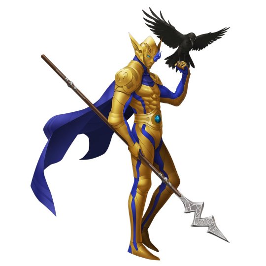
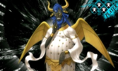
~Odin~
Soren: Odin fares quite a bit better, though he still occupies a weird space for me.
Eirikr: Odin is also…fine. I’d want my all-time favorite father god to look a bit more sophisticated than a superhero as he does here, but it’s not terrible. I’m always going to be bitter about the constant neglect of the perfect Soul Hackers Odin design, but that’s neither here nor there anymore.
Soren: Yeah, once again, the focus is more on “caped spear guy” than anything suggesting boundless wisdom, but Doi did his homework here. And he at least claims the honor of “Best Gungnir”, if nothing else.
Eirikr: Yeah, it’s a quality Gungnir, etched with its name in runes on the blade in case Odin forgets or something.
Soren: The winged helm and perched crow score some points as well, firmly placing him above any of his non-SH incarnations, which I suppose is about as good as we’ll get at this point.
Soren: Now then, Miroku. He’s not bad, but it begs the question: is it worth all these goddamn Matsuko Deluxejokes?
Eirikr: Oh my god. Every time he appeared in a piece of Japanese media, you’d see a reference to Matsuko Deluxe. Which in turn reminded me of Japanese donut chain Mister Donut, since she was a spokesperson for them while I was in Japan. So no, it’s not really worth it for the donut association.
Soren: Then it’s settled: Miroku, not even once. But I guess we should also talk about the actual design.
Eirikr: It’s…fine? (Laughs) I fear this discussion might be a little repetitive.
Soren: Buckle in, everybody. Still, brings some much needed Buddhist representation to the fore, that much is certain.
Soren.: Appears so. Maitreya/Miroku occasionally comes across as a bit rounded in traditional art, but not to this extent.
Eirikr: He’s a healthy guy. Bodes well for the future. 500 billion years in the future or whatever it is.
Soren: Yeah, I’m sure he won’t let us down, though perhaps he’ll be a bit slow going. Anyway, the general aspect is there. You know, the mudra and everything. He’s a Buddha, there’s no denying that much.
Eirikr: Yes, the mudra is solid. He’s a real dick in the game, though. Besides donuts, I can’t help but associate him being a real heel.
Soren: Him and Krishna, who knew, right? And… that’s Miroku. If only it ended there, but more on that later.
Eirikr: Yeah, I still think another Buddhist deity would have served better here, but it wouldn’t have gelled with the AMAZING surprise to come.
~Dagda~
Eirikr: I’m still not sure if I like Dagda or not. But this is entirely from the angle of a compendium demon, which he never becomes.
Soren: I’ve never been quite sure what to make of him, either.
Eirikr: I think it’s a highly polished design, and one Doi probably drafted and modified innumerable times, since he’s a key figure.
Soren: Seems to be playing on his connections with death and rebirth (with emphasis on the former), which stands to reason, given his role in the game. But if any design reminds me more of a persona than a demon proper, it’s this one. Granted, perhaps more in line with Kaneko’s work on the original game, which is fitting.
Eirikr: Yes, it also reminds me of a persona. What’s up with that question mark on his forehead?
Soren: Oh, I meant to ask you about that, now that you’ve finished the game. But no dice, huh? I guess the Dagda is sort of an enigmatic figure within Celtic myth, not playing much of an active role but still occupying a sphere of great importance. But that is… not how you should go about depicting that.
Eirikr: Yeah, I’ve beaten the game twice, once on each path, and it’s still not clear. As you say, it might just be about his mysterious character. When I think of Dagda, I think fat guy with a cauldron. Mostly due to possible depictions on the Gundestrup Cauldron.
Soren: Yeah, same here. And there’s certainly nothing fatherly about his design here, either. Nailed the triskele, though. Still, I dig it from an aesthetic angle. The helmet and all, pretty neat. The tattered cape, on the other hand… maybe a bit much.
Eirikr: Yeah, it looks neat. He probably felt it had to look cool. That’s usually a demon design sin if it’s the primary reason, but given Dagda’s prominence it’s understandable. If a rotund guy with a cauldron and club tells you he’ll revive you for a price, most people would rather stay dead, probably.
Soren: Yup, probably not too many people who would be jazzed about lugging that guy around. And I can see how that would pan out when designing the “face” of the game. Well, that’s about all I can think to say here. So, Dagda: Not Bad™.
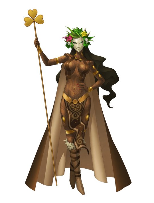
~Danu~
Eirikr: Yeah, Dagda’s fin…ah, I won’t say it. But Danu, let’s move on to her. She’s 90% pretty good. But I still don’t understand the mask.
Soren: Yup, good from the neck down, and then from the head up again, I suppose. But yes, the mask… just completely conspicuous and jarring. Maybe if you threw a nose in there? But I’m not convinced even that would solve the problem entirely.
Eirikr: Nah, she needs more expression than “blank.”
Soren: True enough. I suppose he was going for a stern, matronly expression, but it really doesn’t play.
Eirikr: I think part of it might be practical. Since she and Dagda appear fairly frequently in cutscenes, Dagda’s skull-helmet head and Danu’s mask mean there’s no need to draw alternate facial expressions as needed.
Soren: That would certainly gel with Burroughs’s cropped face in the original.
Eirikr: And they appear during scenes that may require a little more subtlety than “we’re going to kill you,” a la the Polytheists. Should Danu ever become summonable, hopefully she loses the mask and gains a smile or something.
Soren: Yeah, Celtic myth has never featured so prominently until now, so there’s reason enough for some cheer. Regardless, the rest of the design is very nice. Strong nature associations, from the floral headdress to the wood-like skin, not to mention some much appreciated motif sharing with Dagda, which I’d say enhances both their designs.
Eirikr: I agree. It’s better than “fine,” even! (Laughs)
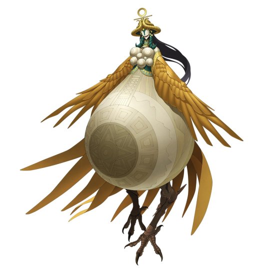
~Inanna~
Eirikr: Inanna is an example of Doi doing his homework. Just maybe he didn’t read the assignment carefully enough.
Soren: Yup, there’s plenty to like here, but it’s not all scenic pastures. The distended belly is a valid fertility symbol, but it places sort of an uneven stress on that aspect of the goddess, not to mention it doesn’t exactly gel with the traditional depictions that the design is otherwise thoroughly aping. And then there’s the “mask”, which only serves to make her appear more monstrous than divine.
Eirikr: Yeah. So those “masks” just ended up being Doi’s take rather than having any plot significance. It’s a bit too inhuman for a goddess who is among one of the oldest depicted with human proportions and features. It’s exaggerated to a persona-like effect.
Soren: It’s a similar situation to Kuebiko, where the design doesn’t quite hit the mark, but the intentions are there. Otherwise you’ve got the standard features you’d see on any piece of ancient art, tastefully and carefully interpreted, and with the iconic star thrown in for good measure.
Eirikr: Perhaps Ninhursag would have been a better choice for a mother goddess? Such is Final’s cohesion that her role could have been filled by just about anyone.
Soren: Hmm, I’m not too clear on her role in the story, but yeah, that’s unfortunate. Still, closer to good than bad for my money, and I’m personally pretty fond of it, despite the misgivings.
Eirikr: Yeah. I had no qualms about using her in the game, and she’s pretty awesome. Powerful unique skills for the four magic elements came plenty in handy.
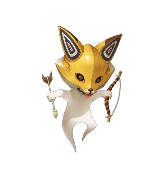
~Chironup~
Eirikr: Chironup I think is pretty ideal.
Soren: Yeah, this one is simple enough that you’d be hard pressed to pick at it.
Eirikr: He gets the point across that he’s a minor Ainu fox spirit.
Soren: A totally solid design that fits the purpose, and we could always use more Ainu representation in there. Sorry to any big Chironup fans out there, but that’s about all there is to say.
Eirikr: (Laughs) Yeah. I don’t understand why Hallelujah is attached to him, considering Hallelujah ends up being a [spoiler]. Where’s the connective tissue between esoteric Hebrew ideas and Ainu animism?
Soren: Yeah, I’d have taken a demon that actually hinted towards his true nature over a very silly sport jacket any day, but you certainly can’t pin the blame on Chironup’s design there. This might sound like a bit much, but: 5 out of 5, uh, fox heads.
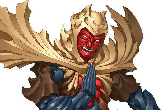
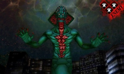
~Adramelech~
Soren: And that leads us to another, more exciting highlight: Adramelech.
Eirikr: Well, we can kind of skip over him a bit, since we already praised him on last month’s Crib. But Adramelech is worth getting excited about.
Soren: Yeah, no need to get into specifics, but boy, what a trooper.
Eirikr: Does he talk like a gay stereotype, as feared? Absolutely. But the design is a real winner.
Soren: And that’s something that can hopefully be expunged via localization, at least. But man, more demons like this, eh?
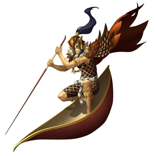
~Sukuna Hikona~
Eirikr: Speaking of one, how about Sukuna Hikona, eh?
Soren: No kidding. Going for a hat trick here. And Okuninushi finally has a solid rendition for his partner, beating out the painfully dull Kaneko original.
Eirikr: The only novel thing about the original was the tiny size of the sprite. This is a nice update. Sukuna Hikona does indeed ride on a leaf, but damned if I could figure out what kind of leaf Doi has him on here.
Soren: Yeah, “he’s riding a leaf” was certainly not the first thing to come to mind after the initial reveal. But regardless, along with his garb of wild fowl skins, it’s nice when demons are depicted with their accouterments to this extent.
~Shesha~
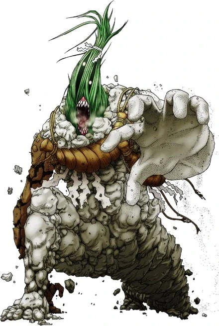
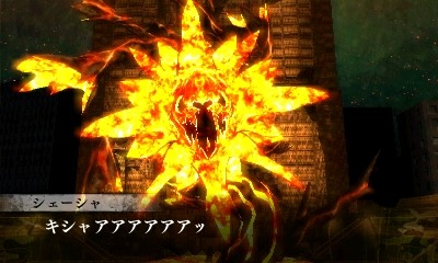
Eirikr: Totally. So we should talk about Shesha too, right? First form.
Soren: Right, and he certainly is a… snake, I guess.
Eirikr: The first form is pretty dumb looking. It resembles something out of Devil Children.
Soren: Certainly looks more like something Vic Viper should be having a go at.
Eirikr: (Laughs) Spot on. But a demon with seven or more heads wouldn’t have worked here, since he’s a rendered model.
Soren: Yeah, some leeway should be afforded given the set-piece-y nature of the whole thing.
Eirikr: This is not a design meant for the ages. But in the game, it works.
SPOILERS FOLLOW FROM HERE!
III. THE SURPRISES
~Shesha V2~
Eirikr: So, we’ve reached full-on spoiler territory. Reader beware, though if you’ve read this far you probably are aware of everything anyway.
Soren: Yeah, lot’s of… let’s say, hummdingers in this section. Proceed with caution.
Eirikr: Let’s start easy, continuing with the previous subject, Shesha. Who, gasp, has a second form.
Soren: Shesha V2. Or maybe his “true” body, or something? Anyway, he’s there, and he’s… a snake guy, for certain. A little bit better than the last, at least.
Eirikr: I was actually pleasantly surprised by this one. I mean, after “Burning Flower Dog” anything might be a pleasant sight.
Soren: Yeah, he’s still got that generic boss monster vibe going on, but it’s certainly closer to the mark. Green, and got that hood and everything. Not really sure what’s happening with his face, though, as it’s not terribly clear from the screen.
Eirikr: He’s got a monster maw and lots of eyes, apparently.
Soren: Bizarre. But it’s a nice detail that Krishna is employing him in the first place, even though it looks like Lakshmi wanted no part of it. Bonus points for that horror-show Flynn money shot, and, you know, just straight fucking eating Asahi.
Eirikr: Yeah, I gotta say, I was most bullish on the game when that shot of Shesha-Flynn was revealed. I was literally shocked. It flashes on the screen really fast and I just wasn’t expecting it. Great moment.
Soren: Really cool stuff, and a rare instance of those cutscenes being used to good effect. You’re a loose cannon, Shesha!
Eirikr: Unfortunately, it’s pretty much all downhill from here. Reaches the guest artist quality nadir, sad to say.
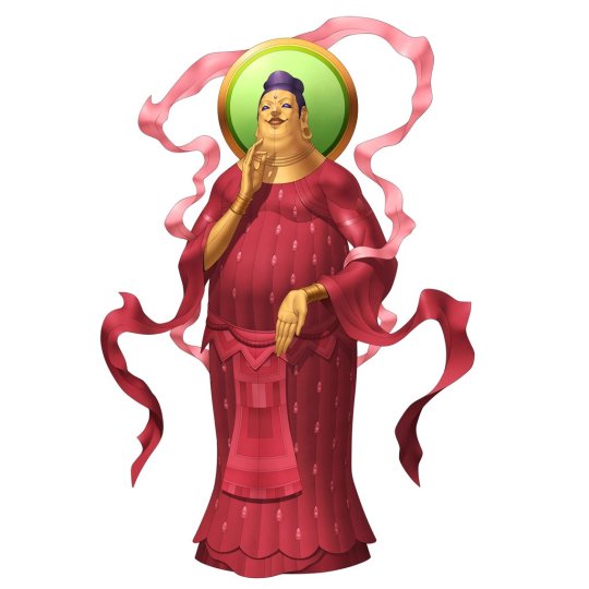
~Mitra Bosatsu~
Soren: Which brings us to Mitra Bosatsu. Lord, where to begin with this one.
Eirikr: (Laughs) Yeah….you go first.
Soren: Well, it looks like Miroku’s artificial veneer did in fact belie something further, unfortunately: perhaps the mother of all stretches. Makes some of the connections within the Fornax crew seem piercing in insight.
Eirikr: I don’t understand Japan’s seeming obsession with connecting Buddhist deities to Persian stuff simply through tenuous etymological connections. And that the design is called “Bosatsu/Bodhisattva” makes no sense at all.
Soren: Yeah, that’s the cherry on top, I suppose. As for the actual design… what is even happening here? Depicting Mitra as literally bovine is certainly the first misstep, calling to mind Michael’s serpentine aspect in IV.
Eirikr: Yeah, is there any basis for that at all?
Soren: Not that I’m aware of: traditional depictions tend to be pretty uniform across the board, either in mid-tauroctony or emerging from the stone.
Eirikr: Oh, right, the Mithras stuff. I was thinking purely Indo-Iranian Mitra here. That’s an even bigger stretch then considering most of the imagery for the Roman Mithras is exclusive.
Soren: I’m not aware of any bovine associations with the Indo-Iranian Mitra proper, so I assumed they were tilling the Roman Mithras, yeah.
Eirikr: Yeah, I don’t know what to say, then. (Laughs)
Soren: But then the flowing white dress and wings suggest the angelic yazata, so… yeah.
Eirikr: Broad side of the barn, missed completely.
Eirikr: For real. It’s not really THAT messy, guys.
Soren: I’d be curious to read the compendium entry there, but I can’t imagine anything that would rectify the whole situation. Ah, well, what’re you gonna do.
Eirikr: Right away I can read it says he’s the ancient Persian deity. So who in the hell knows.
Soren: Well, that’s Mitra Bosatsu in a nutshell.
~Vishnuflynn~
Soren: Let’s move on to something that isn’t quite as stupefying: Vishnuflynn.
Eirikr: The first form, anyway. Though I admit I was stupefied at first when Vishnu avatar Krishna merged with Flynn to become…Vishnuflynn.
Soren: Yeah, it is an equally dumb name, that’s for sure. And apparently the deities in this world can’t do much without dramatically fusing with teenagers. But the first form is fine for what it is, even if what it is is pretty silly to begin with.
Eirikr: I’ve heard people mention that it may at least partially represent Kalki. Would make some sense, considering the fusion with “Messiah” Flynn.
Soren: They certainly could have put that across, uh, much more clearly, if that’s the case.
Eirikr: That’s true. It was otherwise one of the more reasonable explanations I read.
Soren: Otherwise you’ve got the headdress and the lotus, and the black color scheme perhaps recalling the name Krishna. But things take a bit of a dive once the contractually obligated second form emerges, and the lotus is exchanged for, well, a host of… laser swords.
Eirikr: Less a fusion of Krishna and Flynn and more that of Darth Maul and General Grievous. GrievousMaul!
Soren: (Laughs) So sneaky. The four arms would otherwise be a fine addition, but when Vishnu is so consistently depicted holding an accruement of more interesting and meaningful objects than a slew of goofy sabers, I can’t help wonder why it would pan out as such.
Eirikr: Yeah, I agree. He needed just a little more item variety. Comes off as pretty generic otherwise.
Soren: The aforementioned “cool” factor undoubtedly played a role. But all said, it’s still not that bad.
Eirikr: Yeah. It’s still better than some others.
Soren: Definitely one of the better designs to come out of this section, that much is certain.
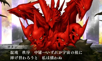
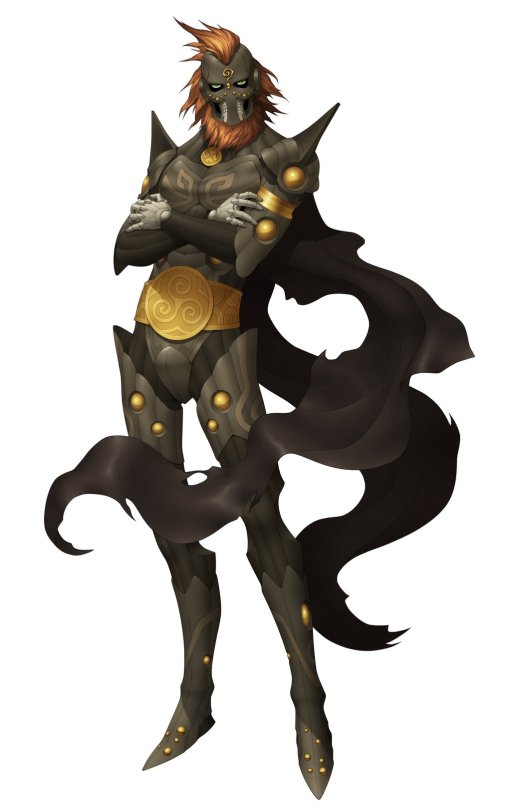
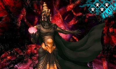
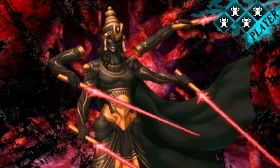
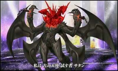
~Satan~
Soren: Which brings us toooo… Satan. God, this won’t be a fun couple of entries. Where to begin…
Eirikr: Do we have to? (Laughs, but then cries)
Soren: Yeah, might as well take our shots and move on. Alright, so right away we’ve got something that would look more at home in, say, Lord of Vermilion or some such. Very “cool”, so to speak. Then there are the seven heads and ten horns recalling the beast of revelation, which, besides being utterly redundant besides the likes of Mother Harlot, clashes a bit with his explicit role as the angel of Judgement.
Eirikr: The end result is an unfortunate big, beefy generic demon, but yes, the iconography at play here shows Doi at least stuck to a valid theme, but it just wasn’t the right one for Satan’s own role in the game. And the redundancy with Mother Harlot’s Beast is a head-scratcher.
Soren: Yeah, some sort of decent intent was in play here, however misplaced.
Eirikr: When I first saw the design, aside from cringing, I right away counted the heads and horns (though they look more like spikes, given that some are positioned on the back of the main head), as I figured the Revelation Beast is what Doi was going for.
Eirikr: Yeah. Granted, it’s sometimes hard to distinguish which Satan is being represented in SMT, though aligning with YHVH suggests pre-fall Satan: The Satan of the book of Job, et cetera. Chains make no sense, as he’s part of YHVH’s gang. As Job details, Satan kind of has free rein. When the rumors were heavily suggesting Satan’s return in Final, if he was redesigned I was really dreading a generic “The Devil” look. But that’s unfortunately pretty much what we ended up getting. I do like the black/red contrast it has going on between body and heads, and that Doi at least tried to adhere to source material.
Soren: Yes, the color scheme is no doubt an inspired choice, and Doi can’t be criticized for entirely skimping on his homework. It’s nonetheless a shame that one of the most striking and iconic designs in the series didn’t merit something, well, better, when it came time for another crack at it.
Eirikr: That’s the biggest disappointment, that it replaced something far more original. Change isn’t bad, but this was a regression.
Soren: True enough.
Eirikr: Satan is also just oneof the low notes the game ends on.
Soren: Yeah, he has the misfortune of being part of a real one-two punch near the end there.
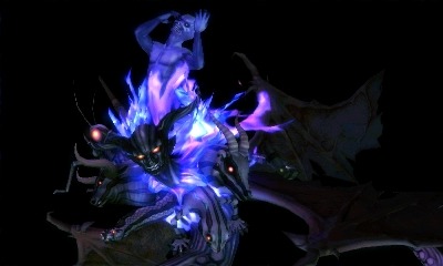
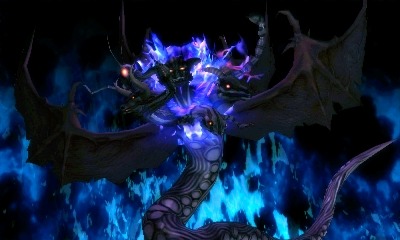
~YHVH~
Soren: Which leads us to the host with the most himself, YHVH. Specifically his second form.
Eirikr: The…uh, music for that second fight is cool. Okay, so let’s move on to Mephisto.
Soren: (Laughs) Not so fast, I’m afraid. Let’s at least stop to commend his first form, which represents a very inspired take on the old stand-by.
Eirikr: Yeah, a universe of YHVHs.
Soren: Granted, we’re not looking at much of facelift here, but that’s really all that was called for. Something that suggests his infinite nature at the end of a sprawling, cosmic mess.
Eirikr: Shiny balds heads illuminating the cosmos. Aside from the loss of his red eyes, keeping it largely the same showed a lot of restraint.
Soren: Those expressions are something else as well. Very animated. But that’s unfortunately where the fun ends for YHVH, I’m afraid.
Eirikr: YHVH’s awesome smirk animation was actually a portent of my day being ruined upon his transformation. But if I were to be perfectly honest, his second form is one of the best Final Fantasy final boss designs I’ve ever seen in a Shin Megami Tensei game. That’s the secret. This is Shin Megami Tensei IV FINAL…FANTASY. And people thought the main series would never cross over with anything.
Soren: Truly, we live in exciting and daring times. But yes, YHVH V2… well, “Final Fantasy final boss” sums it up about as well as you could hope to. You almost couldn’t ask for a less evocative design, frankly.
Eirikr: It’s pretty nonsensical.
Soren: At first I thought the various heads might represent the different facets of creation, but then, any avian rep is conspicuously missing, and it wouldn’t exactly explain the demonic head at the center… and honestly, even that’s being too generous with regards to the level of thought that must have gone into this.
Eirikr: I would love to read the design doc for this. There is the locust near the rear flank, so I thought it represented YHVH’s plagues and curses and whatnot. But what the hell is that lizard doing there?
Soren: Just hanging out, I suppose. Wondering why over half the planet would worship this mess.
Eirikr: But even if you can make sense of what all of the heads mean, their arrangement bears little resemblance to any descriptions of YHVH. The aesthetic is, purely and simply, “JRPG Final Boss.”
Soren: Yeah, it’s unmistakable. This design is practically the lorem ipsum of that variety.
Eirikr: No better than the likes of SMTIV’s archangels or whatever. I feel no guilt in calling this one flat-out bad.
Soren: Yeah, I feel no compulsion to try and smooth the edges on this one either. But that’s YHVH now, like it or not. Poor guy might have been better off in hibernation. Always end on the lowest note possible, I suppose.
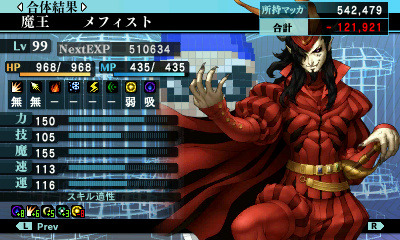
~Mephisto~
Soren: But thankfully this train isn’t ready to pull into station quite yet, and next up is Mephisto. For real this time. Now, this guy is great, A real breath of fresh air coming out of that mess, and if you’re reading this blog you can probably imagine why. In fact, keep your eyes peeled in the future for more on that. But for now, let’s simply say Mephisto: pretty sweet.
Eirikr: Atlus may be in a tizzy that almost the entire contents of their secret DLC plans were leaked, but Mephisto is certainly the diamond in that rough. Thankfully we are only talking about demon designs here.
~Cleopatra~
Soren: Yes, thank god for that. So, might as well cap things off with the other recently dropped ball: Cleopatra.
Eirikr: She’s got those curves. 12-year-old boys and Duke Nukem are gonna love her.
Soren: Yeah, if you thought Mermaid was a bummer, here’s something doubly flagrant.
Eirikr: Sex, other than the uncomfortable symbolic kind, is finally for sale in Shin Megami Tensei. She has an amazing…MP pool. It’s huge.
Soren: (Laughs) Indeed, such assets. Truly engrossing. But otherwise, you’ve got a bevy of snakes in her hair, I suppose because the historical Cleopatra met her end via Asp. So, you know, kind of a bit much. Maybe one snake would have done to get the message across, but even then.
Eirikr: Are they in her hair or emerging from her right arm?
Soren: Oh, yes, I suppose they are; you can see where her arm is all. uh, snakey and shit. So, even more bizarre.
Eirikr: If she were wearing a mask, this would be a good persona design.
Soren: Maybe so. But, as it stands, just another grossly sexualized portrait of the legendary female pharaoh. And a weird choice for inclusion, especially within the Megami race.
Eirikr: Yeah, there’s like, top to bottom issues with this design and its utilization.
Soren: A real fizzle, unfortunately. But hey, guess that’s a wrap!
Eirikr: Man, what a weak way to end things.
Soren: Yup, I guess that’s Final for you. But despite this largely unfortunate last section, all in all it’s not half bad. A marked improvement over the last smattering of designs, if nothing else.
Eirikr: Yeah, it’s better than last time. An improved ratio of good to bad, though there’s a lot of mediocrity between them.
Soren: And for a final thought to close out on, how about our respective favorite design of the bunch?
Eirikr: Adramelech, no contest. I’ll always have a weakness for the Infernal lot. Chironup and Sukuna Hikona come close, though. Mephisto surely as well, but he barely exists as more than a screenshot for now.
Soren: Yeah, I’ve been waffling between Adramalech and Sukuna Hikona myself, but I’d have to give the edge to the former as well. God, that wasn’t surprising (Laughs).
Eirikr: (Laughs) Well, the two of us like Shin Megami Tensei for its design sensibilities, which are perfectly represented by Adramelech.
Soren: Yeah, we’ve said it before, but he’s a really fantastic example of style and traditional design coming together exquisitely. Good stuff.
Eirikr: So your least favorite?
Soren: YHVH V2 by a mile, I’m afraid. Pretty much represents the exact opposite, if I had to wager.
Eirikr: Satan broke me so I’d already been (mostly) desensitized by the time I saw Neo YHVH. I was so disappointed.
Soren: At the end of the day, they certainly represent the bottom of the barrel.
Eirikr: I’ve written a lot about SMT’s depictions of YHVH and Satan, but I’ll never waste a minute of my time defending Final’s take on them.
Soren: Yeah, this was perhaps not an area they could afford to drop the ball, but alas. Still, there’s always next time, and the prospect of another game untied to it’s predecessor’s baggage or relentless tilling of the SFC era is spiriting.
Eirikr: Indeed, I haven’t lost all my faith quite yet. Hopefully something creatively stellar is in the works. Besides beachwear content, of course. Welcome SMT, welcome to the fanservice machine.
Soren: God willing. Aaaaand that’s all, folks! Look out for more cribs and discussion in the future, possibly on a less polarizing topic.


