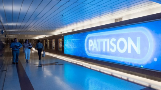
I know I’ve talked about it before but it never ceases to amaze me that the city of Toronto created this labyrinthine series of underground walkways that stretch for kilometres under the heart of downtown and they called it the fucking PATH. like how much more ominous could that even be. It doesn’t even stand for anything it’s just the PATH, all caps. What fucking fae named this artisanal bakery maze.
“PATH is downtown Toronto’s enclosed pedestrian walkway linking 29 kilometres of shopping, services and entertainment connecting Toronto Coach Terminal to Maple Leaf Square/Air Canada Centre. The Acronym (PATH)doesnotstand for anything - just signals that there is a pathway.”
Like I always lose my mind at this. If it doesn’t stand for anything it’s not an acronym Toronto!!Toronto!!!!!!!!!
Copying my tags:
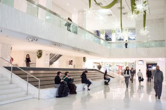
I’m not exaggerating about the part without a ceiling:
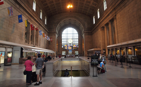
This is, by the way, right under Bay & Bloor, dead centre of the city and some of the most expensive real estate in Canada. It radiates an incredible aura of menace.
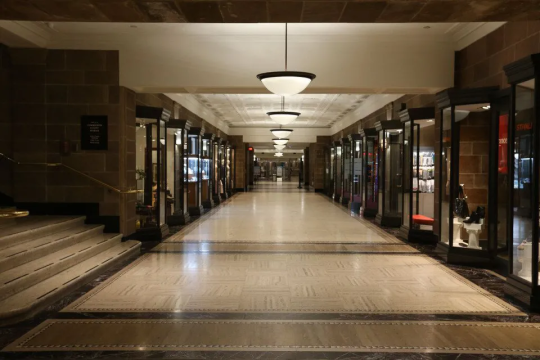
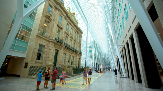
Okay far more poeple have reblogged this than I thought and I just wanted to clarify- the horror of the PATH is not that it all looks like a spooky basement where you’re about to get murdered. There ARE spots like that, but to understand the ~vibe~ of the PATH, you have to understand that it is essentially one very large mall co-designed by like, 70+ different corperations who all have different aesthetics. SO, the PATH looks like that, but it alsolooks like this
and like this
and like this
and like this
Here’s an entrance to the PATH at Union
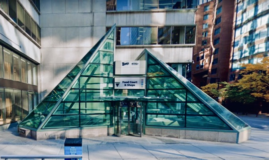
And here’s another- alsoat Union
And here’s another a few blocks away, though tbh I have never been able to enter here because it always seems to be locked, no matter how much I want Wendy’s that day.
And you’d thinkthese mixed aesthetics would make it easier to navigate, or at least figure out whereyou are, but again, there are over 70 different entities designing this shit and not one original thought between them. So while you may well know when you step from one property to the next, whatever the look of your current section it’s more than likely they’re a nigh identical section somewhere further just to confound your mortal sense.
Basically, everyone tagging this with the Magnus Archives is very correct- If any place on earth could be the true domain of the Spiral it’s the PATH, and it’s just a shame Jonny didn’t know about it before the show wrapped up.
It stands for Puzzling, Aesthetically Terrible Hallway.
Now in its 11th year and recognized by USA Today as one of the 10 Best Film Festivals in the World, the ICFF 2022 Lavazza IncluCity Festival has become a 10-day, nine-city festival of over 130 feature films, documentaries, and short films, showcasing the best in cinema from around the world.
Attracting an Affluent Audience
The festival, being held at the Historic Distillery District (new for…
Traditionally I come from a country where coffee is a staple moment of everybody’s routine at home or outside. In Italy you start the day heating your moka and waiting for that unique sound ready to serve two small cups; if you’re on the go, your espresso and a Nutella croissant with the newspaper under your arm depict the average bar goer in the morning. Plenty of cafes placed here and there that offer this important drink at any time of the day.
In Italy there isn’t that status-quo of tallorgrande paper cups to carry around while going to work or while driving to get the kids from school. However, the market for coffee in North America is a well established business that in the last twenty years managed to go beyond the beans, entering a whole new dimension of corporate branding and personal status.
Today sporting a cup in your hands is not about taste anymore, but about who you are. That cup is a beacon sending a subtle message to others about your life style and preferences. Corporate identities acquired a more powerful aspect when designers begun working with the experience element to be used in the equation. Advertisers could only go so far in convincing people to buy this or that product, that’s why understanding the user was essential to the business.
Famous brands like StarbucksandTim Hortons are the two essential names in coffee consumption in Canada. The former constitute a different brand loyalty from customers than the latter which attracts a different crowd. Starbucksis not just coffee but a way of life. Those who hold that large white paper cup with the green logo on it are not just drinking their beverage, they are telling others around they belong to another plain of society, usually a middle class and above, and they enjoying being seen with something in their hands that is a totem of status-quo: I can afford an expensive coffee and I belong to a circle of people similar to mine (usually the white collars).
On the other hand the Canadian chain Tim Hortons is a business which belongs to a broader percentage of the population; it encompasses the average Jane and Joe which rise early in the morning to go to work, who hold a trade which involves labor and specific manual/technical skills; I’m thinking about your neighbor carpenter, your middle school teacher, the plumber who just repaired your sink, the road worker with the yellow vest. It’s essentially a blue collar coffee for it’s accessible price and quality.
Two distinct cups for two distinct brands. Starbucks focuses more on the logo to visually engage those around the cup in suggesting status; Tims sports a different interaction with the user to engage a larger crowd through cost and quality accessibility.
The behavior of these two brands is visible everyday at any moment, whether at the mall, outside offices, while doing groceries, at the bank. Those who spend twice as much for coffee at Starbucks want to be seen, and that’s why the cup is designed to stand out: white with the bright and visible logo that is unique and easy to identify. It never changes. Whereas Tim’s has its cups shifting throughout the year in style with different seasonal themes and prize winning months (Roll Up The Rim contest).
So, in this quick analysis of coffee, the choice of cups goes beyond the beans; it’s not just the quality but a way of expressing one’s personal status and kinship to a specific mindset or group of people. There are other brands that might have worked too making the comparison; however, in Canada this polarization of brand choice offers an outstanding window of user behavior just by looking at a cup of coffee.
Sunday afternoon I decided to walk uptown Toronto on Yonge St. to reach the Kinkos shop so I could mass print a few documents. The weather was stable enough and it felt just right a stroll after lunch.
The whole corridor between Finch Ave. and Sheppard Ave. on Yonge has been a constant crescendo of high rise activities since 2000, between the realization of the purple subway line and the many Asian restaurants that replaced the old pubs and burger joints.
The apartment complexes running along the street are coasted by two large low-density residential areas to the west and to the east side, virtually shielding them from sight. Plenty of food from sushi to Korean bbq, from pharmacies to bubble tea shops, it’s a vibrant and young portion of town that will keep you busy if you are a foodie.
Mel Lastman’s Square is great for public events, but its positioning doesn’t attract people.
However, if you slow down and pay attention you will notice the lack of public spaces with the exception of Mel Lastman’s Square; the rest is sidewalks and a series of missed opportunities that would have given a better look and functionality to this part of town.
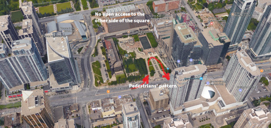
The square especially has a problem in terms of accessibility since it doesn’t generate pedestrian flow. People have their major entrance and exit point only from the Yonge St. side, leaving the back unattended for lack of opening. The place feels rushed in terms of design development, and the facts it has limited entry and sight doesn’t help.
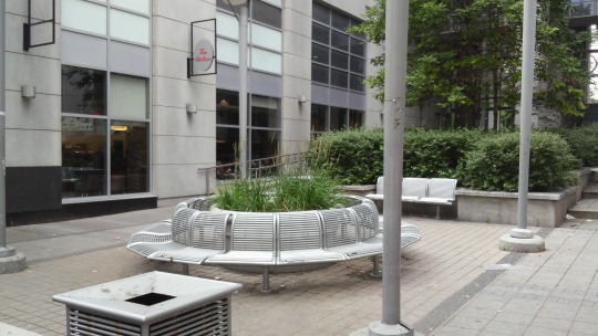
Squeezed between two towers, an attempt at public space suddenly appears.
I took a picture of a portion of space between two buildings that allegedly should work as public dominion, unfortunately it’s always empty and leads to nowhere but private property access. Indented areas don’t really work if there’s no accessibility from either side when built this way, pedestrian activity doesn’t happen because there’s no source of foot traffic transiting through.
This spot would have worked better if it featured a more welcoming sitting configuration and some flowers too, unfortunately it wasn’t well kept and weeds grew out of the large green container. The overwhelming use of metal elements to create this space make it feel cold and unwelcoming.
The Bauhaus nostalgia is strong with this one.
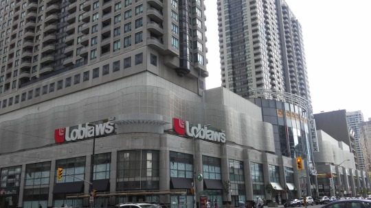
Close to the sitting area the North York Centre functions as shopping area for thousands of residents and visitors. Inside it hosts a cinema, a large grocery store, restaurants, health clinics, electronic shops, subway stop, and formerly a two-story Staples point which is now no more leaving a huge retail vacancy that removed the only bit of colour from its facade.
From outside the industrial look minimizes its appeal removing any human element form it. The lack of distinctive patterns and vegetation alienates the pedestrian from having a pleasant interaction with the place, also the absence of alternative space arrangement emphasizes the frenetic flow of people along the sidewalk: nowhere to stop, nowhere to sit, it’s not meant to have anyone gazing around or stopping to contemplate.
What punishes this urban setting is the verticality of Yong St. which left no options for an alternative design to happen; intersections are at right angles and leave no room for the public realm to properly exists. This pushes these areas to become sad enclaves of private spaces that oust the public from enjoying their towns.
Diagonal, a missing term in the urban design manual of North America.
Alternatively, the design would have improved if roads took a different angle than crossing at 90 degrees with each other. The Spanish city of Barcelona is characterized by the Avinguda Diagonal, a large and important street which goes through the whole city without running parallel with other roads. Paris is another example of alternatives to the repetitive pattern of road grids that characterizes Canada and the US.
Diagonal street design has the ability to make cities feel more organic and less artificial, they allow for more sidewalk space to exist and therefore to grant access to more pedestrian traffic and business activity which can expand outdoor.
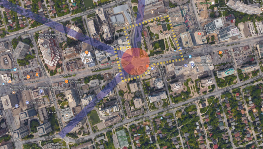
Above the aerial view of the portion of Yong St. and Mel Lastman’s square with an alternative design: purple lines represent additional roads that help relieving traffic directions, red is the focal point that connects all the streets, the dashed yellow line represents a much bigger possible public space pedestrians can enjoy and business to thrive.
The current setting of designing roads doesn’t allow for a natural flow of pedestrians, but rather a parallel dynamic dictated by the car traffic directions. This is one of the reasons these areas don’t collect as much people as they should. At random times through the day you can see the lack of people, the only instant they have activity is during lunch hour when office workers eat their meals in the square.
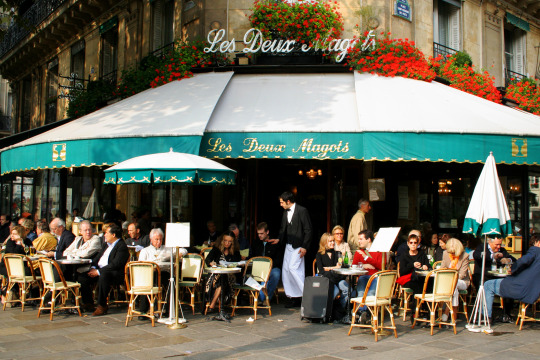
A cafe in Paris where outdoor seating is a must, even in the winter.
Intersections that meet at different angles have the ability to generate more sidewalk space for people to experience. Cafes in Paris flourished because of this road design which allows commercial activities to extend their seating capacities just outside their doors, becoming a staple reference point for citizens and for cities to become alive.
Bars and outdoor seating areas are greatly cherished and respected in Europe as they represent the quintessential experience of claiming the public space which rightfully belongs to the people. On the contrary, in North America, the systematic absence of the public realm has favored the car-culture to bloom uninterrupted, creating more harm than anything else to cities, pedestrians, and the environment.
The pleasant sight of people filling the streets and enjoying the public realm, a rarity in North America.
Why does this happen less frequently in Canada and the US?- It’s understandable how the weather of certain portions these two country experience has its own impact; however, the good season allows for metropolitan areas to have their share of pedestrians activity to fill the streets.
The current design of cities in these two countries developed around the Industrial Revolution period, where the need for mechanized transportation was already in place, so roads had to be able to host a large flow of private transportation which later transformed society with the advent of the car and the birth of the suburbs, thus more road lanes and less space for pedestrians.
All in all, cities never stop to change especially when we talk about Toronto, now the 4th largest metropolis in North America; so there are big shoes to fill from this perspective. Tourism can greatly benefit from extended pedestrian areas that concentrate people granting more time to be spent around business activity.
In the end we should rethink the way we perceive the public realm. Public as for pedestrian to use, not for cars to generate more traffic that already exists, so it’s essential for citizens to demand from their local and national political representatives to broaden their views in terms of environmental issues. It’s not just a matter of how many trees you plant, but how much space families and tourists can benefit from a better developed city.


 Gonna get faded and watch anime.")
")