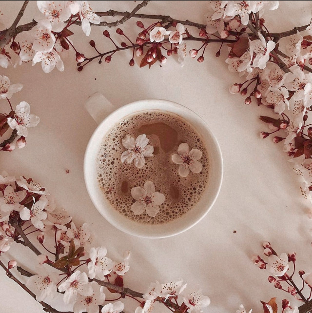
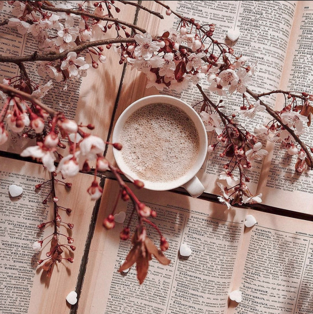
#coffee cup


Traditionally I come from a country where coffee is a staple moment of everybody’s routine at home or outside. In Italy you start the day heating your moka and waiting for that unique sound ready to serve two small cups; if you’re on the go, your espresso and a Nutella croissant with the newspaper under your arm depict the average bar goer in the morning. Plenty of cafes placed here and there that offer this important drink at any time of the day.
In Italy there isn’t that status-quo of tallorgrande paper cups to carry around while going to work or while driving to get the kids from school. However, the market for coffee in North America is a well established business that in the last twenty years managed to go beyond the beans, entering a whole new dimension of corporate branding and personal status.

Today sporting a cup in your hands is not about taste anymore, but about who you are. That cup is a beacon sending a subtle message to others about your life style and preferences. Corporate identities acquired a more powerful aspect when designers begun working with the experience element to be used in the equation. Advertisers could only go so far in convincing people to buy this or that product, that’s why understanding the user was essential to the business.
Famous brands like StarbucksandTim Hortons are the two essential names in coffee consumption in Canada. The former constitute a different brand loyalty from customers than the latter which attracts a different crowd. Starbucksis not just coffee but a way of life. Those who hold that large white paper cup with the green logo on it are not just drinking their beverage, they are telling others around they belong to another plain of society, usually a middle class and above, and they enjoying being seen with something in their hands that is a totem of status-quo: I can afford an expensive coffee and I belong to a circle of people similar to mine (usually the white collars).
On the other hand the Canadian chain Tim Hortons is a business which belongs to a broader percentage of the population; it encompasses the average Jane and Joe which rise early in the morning to go to work, who hold a trade which involves labor and specific manual/technical skills; I’m thinking about your neighbor carpenter, your middle school teacher, the plumber who just repaired your sink, the road worker with the yellow vest. It’s essentially a blue collar coffee for it’s accessible price and quality.

Two distinct cups for two distinct brands. Starbucks focuses more on the logo to visually engage those around the cup in suggesting status; Tims sports a different interaction with the user to engage a larger crowd through cost and quality accessibility.
The behavior of these two brands is visible everyday at any moment, whether at the mall, outside offices, while doing groceries, at the bank. Those who spend twice as much for coffee at Starbucks want to be seen, and that’s why the cup is designed to stand out: white with the bright and visible logo that is unique and easy to identify. It never changes. Whereas Tim’s has its cups shifting throughout the year in style with different seasonal themes and prize winning months (Roll Up The Rim contest).
So, in this quick analysis of coffee, the choice of cups goes beyond the beans; it’s not just the quality but a way of expressing one’s personal status and kinship to a specific mindset or group of people. There are other brands that might have worked too making the comparison; however, in Canada this polarization of brand choice offers an outstanding window of user behavior just by looking at a cup of coffee.


10/365 - I’ve always wanted to make espresso cups! I think next time I’ll add a minimal handle to it
https://www.instagram.com/p/CHW2hl2jiOX/
Post link

11 o’clock allready… Espresso doppio will charge my batteries… Classes at University are coming to an end so tons of papers must be corrected…
Double ristrettobycreativebastard on Flickr.
Post link


Justine Nicolas
by Antoine and Charlie
News
=============================================================
If you like to see uncensored pictures visit my new blog at In search of beauty and please let me know what you think about
=============================================================
Post link


“The books we love, they love us back. And just as we mark our places in the pages, those pages leave their marks on us. I can see it in you, sure as I see it in me. You’re a daughter of the words. A girl with a story to tell.”
― Jay Kristoff, Nevernight
Post link


Receptionist Safehouse, Auckland CBD
Drink pictured: Flat white ($4.5)
I have been to Receptionist Coffee’s little takeaway window on Lorne Street but this was my first time visiting their space on Little High Street. They serve Eighthirty Coffee and I really liked the “receptionist” stickers on their paper cups and their fake stacks of money!


Rumours Coffee, Auckland CBD
Drink pictured: Flat white ($5.7) and esor.
Visited the newly opened Rumours Coffee, near Chancery Square. They serve coffee from Society Coffee, and their espresso is a single origin, which is pretty rare, as most cafes use blends for their espresso! This gave it a much lighter flavour than a blend would have. The space is minimal and quite relaxing. They also do filter coffee, which I’d love to go back and try!


Atomic Coffee Roasters, Kingsland
Drinks pictured: Flat white ($5.7) and soy flat white ($6.4)
Some photos from Atomic Kingsland with their all-black decor and good coffee!


Mibo Bakery, Mount Eden
Drink pictured: Flat white ($5)
Finally got to visit Mibo, which is a sister to Benedict’s in Eden Terrace, which is another favourite of mine! They serve BeSpecialty Coffee which was delicious and I really liked the leafy exterior. They don’t have a lot of seating, a few inside and some more outside, but luckily when we were there, it was not raining and the outside seats were free. Would definitely go back for the delicious coffee and to try more pastries!


Semicolon Coffee, Auckland CBD
Drink pictured: Flat white ($5)
Visited the newly opened Semicolon Coffee on Fanshawe Street. They serve their own blend of coffee which was pretty good and I really liked the interior as well!


Chur Bae, Auckland CBD
Drink pictured: Flat white ($5)
Visited Chur Bae which opened about a month ago in City Works Depot. They serve Ozone Coffee, and are a pretty spacious cafe with indoor and outdoor seating.


Winona Forever, Parnell
Drinks pictured: Flat white ($4.7) and oat latte.
Some photos from Winona Forever in Parnell, which was packed when we arrived. They serve Coffee Supreme and their cabinet food always looks amazing!