#user interface


The famous porn video-hosting website Pornhub has once again made headlines for its peculiar content, but not what you think. This time it has nothing to do with XXX titles or soft-core, but the website is hosting some of the forbidden topic YouTube has taken action against; this time is about guns since the incremental weapon assault against civilians happening in the US from Las Vegas to Florida.
Here’s the link to one of the gun video from the channel In Range TV Show(WARNING: NSFW link video!!!). If you cannot watch the video I’ll explain it briefly to you. Two guys in camouflage uniform are at a shooting range discussing about pistols, in this case the famous Glock manufacturer, with all the pros and cons of the weapon. Each of the guys pitches in what’s their opinion their view and the video continues with them in action at the range (not THAT action).
It’s interesting how change has affected the online platforms after real life events unfolded in tragic occasions, defining discussion policies that are influencing what video channels can host and what content creators can discuss. In light of this shift of wind, several Youtubers have been posting for the past months essays and v-logs arguing that free speech is important, that forbidding certain topics like guns, Islam, terrorism, shootings, violence attacks, is censorship and there ought to be a transparent conversation in order to address these problems to resolve them.

Sex, guns, violence, are being marginalized once again into a specific platform just like it happened 60 years ago with pulp magazines.
What is interesting here is how a platform like Pornhub has begun changing its behavior. Forbidden topics unable to be hosted on YouTube and other hosting sites had to converge onto pornography hosting portals to survive. The taboo effect has created a new behavior that might reshape the way we see adult-themed websites; they will diversify their capability and portfolio offering content creator the chance to upload what other platforms forbid.
This is a whole new economy for places like Pornhub that can offer a new type of service and monetize it, without the effort of advertising or actively stealing the user-base from YouTube. The need for content creators to expand their video channel has been met by an unlikely platform originally born to host hardcore material.
I wouldn’t be surprised if YouTube looses the opportunity to fix their topic policies, or to open a whole new branch dedicated to content that cannot exist on their original brand anymore. What In Range TV Show has done was to adapt to their need to supply their viewers with uncensored material -something that has been disrupted- and they did so the smartest way that has already prompted others to do the same. This is the first and clear signal YouTube has to think about in terms of user behavior if they don’t want to loose millions of followers, views, and monetization.

For those who are seasoned sailors of the web, especially if you come from the 90s, you have probably browsed thousands of web pages form around the world and managed to find all kinds of content across several languages.
Ever since the beginning of the Internet 2.0 web design started to become more conformed around certain standards, especially since globalization widened communication channels, with users preferring certain standards than others. Shapes, colours, formats, images, sounds, and much more, evolved in various entities becoming common praxis or iconic styling.
While browsing logo brands across countries I found a very interesting layout in the Japanese web design that immediately struck me. Intercontinental names like KFC,McDonald’s,Uniqlo, presented distinct layouts in their web pages.

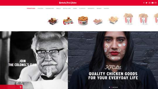
Layout necessity or Japanese simplicity? [kfc.co.jp]
KFC came across with their Japanese homepage that relied less on images and more on information compared to its US counterpart. Large pictures and minimalism are the convey method to present products in North America; it’s a faster way to appeal to visitors and customers with an engagement relying on pixels rather than text.
Stories and ethnicity have become a big part of corporate strategies. [kfc.com]
In the case of KFC I immediately noticed the vertical Japanese layout versus the horizontal American one. Different scrolling directions for websites that might change the user experience and information output; however, there are questions we can ask:
- Is this about Japan being famous for maximizing their physical space by ‘verticalyzing’ everything?
- Is this layout a much better solution because the Japanese user base heavily relies on mobile and tablet technology and their vertical displays?
- Do Japanese value information through text more than pictures?
Upon asking myself these questions I searched a bit more on the topic and found a very interesting article from Moravia.com about Japanese web design. There are elements the Asian user does not share with the Western one, and surprisingly text is and remains an essential portion of the information on websites and publicly displayed data, including billboards and flyers.
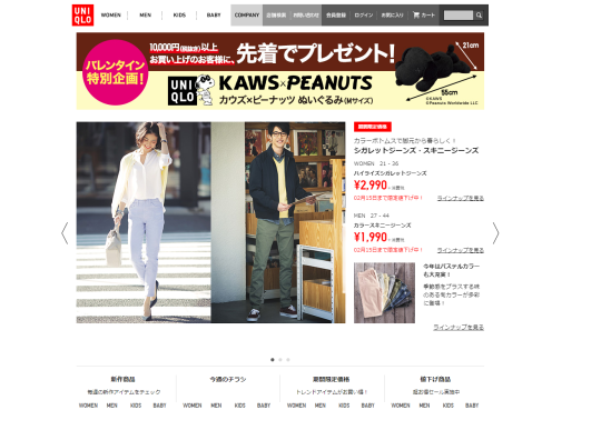
A preference for written information is what Japan likes. [uniqlo.co.jp]
Uniqlo shows on its homepage a different ratio of images/text compared to the US website. Somehow the Japanese choice of web structure seems outdated compared to the West, nonetheless its function if what the users in that country want. Product details appears to be the most relevant information for Japan customers; they value technical data more than product pictures.
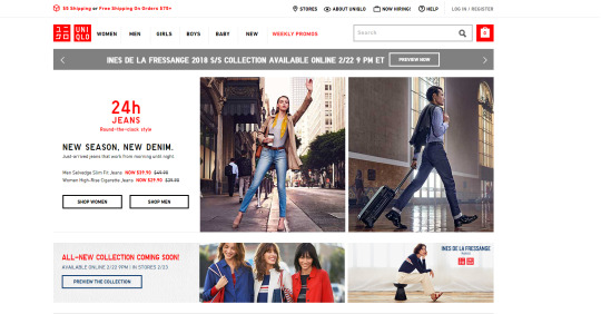
Western web design aims to increase the image percentage in order to become a catalog for users to check from any device. Pictures convey more data to customers since they are easier and faster to browse. The attention span people carry shortens as time goes by and companies don’t want customers to become bored reading too much of just one product. It can hurt sales. The User Interface design changes to fit the task the user wishes.

MdDonald’s Japan has a striking visual design proposing original alternatives. [mcdonalds.co.jp]
Beside serving different items, McDonald’s website in Japan shows the different approach on the graphic appeal to the point the logo fades in the background. Odd products are renown to be featured among the Japanese marketing machine for their ability to strike the user. However, American customers are spoiled by the perfect symmetry and repetitive look of the goods they buy, often relying on the same old reference picture as guidance to their spending habits.
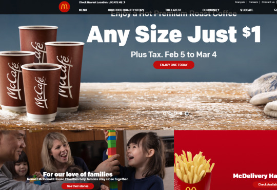
The US websites works more as a central information hub [mcdonalds.com]
McDonald’s US websites proposes a seasonal engagement to promote their offers in the form of coffee, along with their information on how their relationship with customers evolves in terms of new services or outreaches to the community. North American markets have to account for the diversity in ethnicity and cultural elements Japan does not have; this translates into a different set of rules web design and user experience will undergo.
Beside the cultural difference between Japan the North America, Japanese have a genuine curiosity on details we often miss. Their ability to collect information via text is superior to other countries; this gives them the edge to craft exhaustive experiences often dwelling into perfectionism. It’s more about quality than anything else.
It took some time, but the final update for Clean UI is now live! Check out the changes:
- Compatibility with TS3 style mood backgrounds
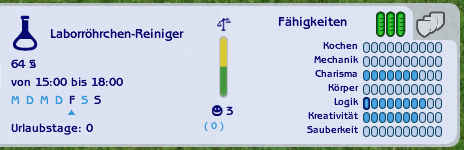
- Made earned skill/hobby/personality points more visible
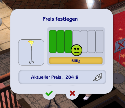
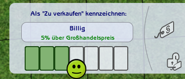
-Price options in business panel are now easily clickable thanks to a new layout
- Removed pink background from the ‘learned couples counseling life skill’ memory
- Fixed misaligned bar in the reputation hover
- Removed blue background row color in the ‘Sims available as roommates’ window
Additionally, there’s one fix that was already included in a previous version, but I didn’t mention it in the changelist as I couldn’t verify if it works until now:
-Fixed blank buy outfit window if you’re using the widescreen buy/plan outfit package
If you use a widescreen CAS option and it has no effect, it’s probably not related to Clean UI. With the help of friendly simmers, it seems that it’s rather due to your graphics card, because CAS always resets to the two column mode that was created for low resolutions. Please try to use Graphic Rules Maker so your game can detect your graphics card or increase the resolution if possible.
► DOWNLOAD v1.4
Thank you for reported feedback in the past! Due to the amount of anonymous messages which are hard to reply to, I had to close my ask inbox. But that made it much easier to interact with you via DM! If you have any problems that are not listed in any of my posts, feel free to contact me. But please keep that I won’t add any new features and only fix bugs.
—
I also want to remind you of the changes of past versions. Always be sure to have the newest version installed! You can also find it in the original download post.
- Graphical issues in the hobby/business milestones are gone
- Fixed missing Sim portrait in date panel
- Included optional horizontal & vertical cursor for the neighborhood camera (if you use a camera mod that also lets you move the camera vertically)
- True compatibility with the widescreen family tree
- No more crash when selecting a custom skin with the cas-min-width-1524-additional-200px.package
- ‘Try on’ clothing window no longer has the old blue background
- Picture in picture is clickable again
- Optional hidden delete family button
- Summer icon in change seasons panel has a thicker outline
- Fixed a small graphical issue in the senior age panel
- ‘Where would you like to go’ is now in Clean UI style, eg. the taxi cursor
- Included background image for the main menu if you don’t use a Clean UI loading screen (resolves black background issue)


Do’s and Don'ts of Designing for Accessibility
- Anxiety
- Autistic Spectrum
- Dyslexia
- Physical or Motor Disabilities
- Low Vision
- Screen Readers
- Deaf or Hard of Hearing
Find the PDFs for Do’s and Don’ts of Designing for Accessibility here.
Post link