Hey, guise. So today multiplytime asked me what settings did I use to sharpen this Common gifset. So I decided to make this text post so I can explain it because a) tumblr didn’t let me put all my prints in my answer to her and b) I’m super glad to share this with you. As I said, I couldn’t find the video in 720p or better quality, so I used these settings. But they work in great qualities as well.
First, Filter > Sharpen > Smart Sharpen and I used these settings:
3. Create a new guide halfway through your new document.
To do so,
3a. Go to View>New Guide
3b. Select “Vertical” under the Orientation options
3c. Enter the position, which would be half the size of the width of your new document.
For example, if the width was 540px, you would enter 270 px. If the width was 500px, you would enter 250 px.
Since I used 800px width, I would put in 400 px.
Just figure out half of the size width you put. (Width/2=Position)
3d. Click OK when you’re done.
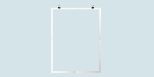
It should now have a line that goes through half-way, like so:
4. Select the image layer, click the rectangular select tool, click and drag the select tool until half of the document is selected. You would do it to the smart guide you previously created.
5.Once half of the image is selected, go to Edit>Cut. It should remove that half. Don’t worry, that is what it is supposed to do.
6. Now go to Edit>Paste Special>Paste into Place. The half should now be put back into place, in a new layer separate from the other.
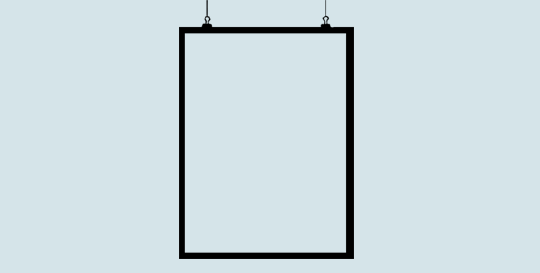
Now you can remove the smart guide if you want. If you do, simply go to View>Clear Guides.
I’ll be doing it, too. It’ll look back to normal, like so:
7. Hide the half layer for now and click the text tool.
8. Choose the font, text size, color, etc., then click on the document and enter the text you want on the side where the half would be.
9. Unhide the half-image layer, and place that half layer above the text layer.
For example, it’ll go from this:
To this:
10. Right-click on the half layer, and click “Create Clipping Mask."
The layers should look like this:
And the image should now be inside the text, like this:
That’s basically all there is to it. You can customize as much as you want.
You can enter a quote, like so:
You can make a birthday edit, like so:
Add a psd, like so:
Change the background color, and add a text style, like so:
Or, instead of having the text on one side, you can center it all together and it’ll look like this:
Just change the text color and background color, and it should match.
Anyways, I hope this tutorial/guide was helpful. If you need any help or have any questions, feel free to ask!
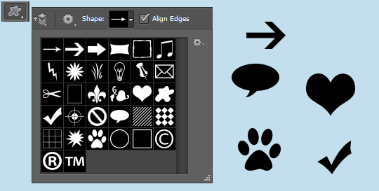
-`. Hello everyone! In this tutorial, I’ll teach you what shapes are, what the default shapes are, how to use them, how to style them, and how to make your own custom shapes. .’-
Here’s the navigation:(find the portion you want and the corresponding letter, then scroll down till you see the letter.)
a - explaining the shapes
b - showing the default shapes
c - explaining how to use the shapes
d - explaining how to style the shapes
e - making custom shapes tutorial
f - explaining how to get more shapes
A. What are the shapes?
Photoshop shapes are pretty self-explanatory. Much like the shape tools in Microsoft Word, you can use them to create edits/graphs/etc.
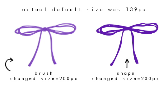
They are similar to brushes, but unlike brushes, they don’t have the textures as some do. Shapes are solid.
Another notable difference is that if you make your brush size bigger than what it was, it will be blurry. If you make your shape size bigger than what it was, it will not be blurry.
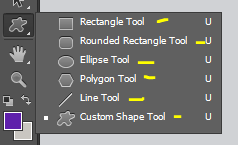
B. Default Shapes
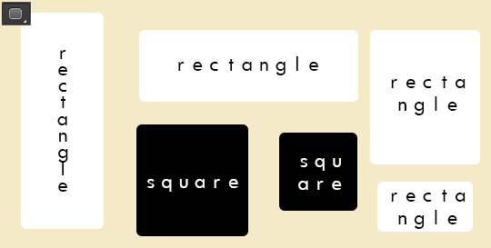
The default shapes are the rectangle, rounded rectangle, ellipse, polygon, line, and custom shape.
With the rectangle shape, you can make rectangles. You can also make squares if you hold shift while you drag and create the shape.
With the rounded rectangle, you can make rectangles with rounded corners. You can also make squares if you hold shift while you drag and create the shape.
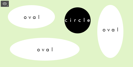
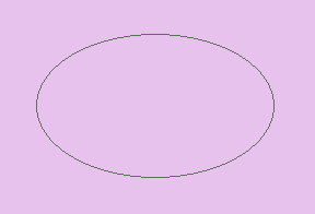
With the ellipse shape, you can make ovals and you can make circles if you hold shift, as well.
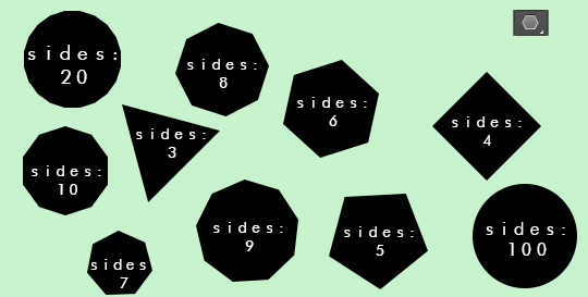
With the polygon shape, you can create shapes with more than 2 sides. You have to enter the number of sides you want, from 3-100. You can make a triangle shape with 3 sides, a square with 4 sides, a pentagon with 5 sides, a hexagon with 6 sides, a heptagon with 7 sides, an octagon with 8 sides, a nonagon with 9 sides, a decagon with 10 sides, and so on until you reach 100 sides, which will then be a circle.
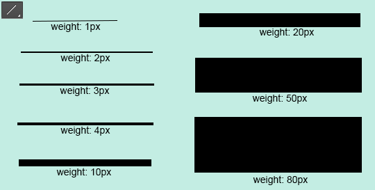
With the line shape, you can create lines/dividers. You can change the weight to be bigger or thinner, too.
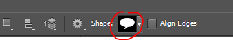
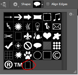
And then there are the custom shapes. That is where the other shapes are and if you download shapes from online, they will appear here. The preset custom shapes are random things like a heart, arrow, frame, etc.
C. How do you use shapes?
1. Select the shape you want.
2. Go to the document.
3. Click and drag until the shape is the size you want.
4. If you want your shape to keep its proportions, hold the SHIFT key while you click and drag.
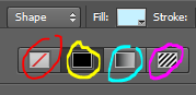
D. How do you edit the shapes?
You can change the color of your shape by going to the “Fill:” section and change the color.
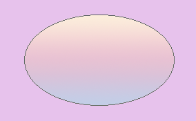
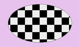
You can also change the fill to a pattern, gradient, or no fill at all.
The setting circled in red is the option to have no fill. If you click that, the shape will be invisible, like this:
The setting circled in yellow is the color fill.
The setting circled in aqua is the gradient fill. If you choose that, you can select a gradient. It’ll look somewhat like this:
The setting circled in pink is the pattern fill. If you choose that, you can select a pattern. It’ll look somewhat like this, depending on what patterns you have:
You can resize your shape by using the select tool, right-click on the shape, click “free transform path,” and resize it.
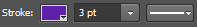
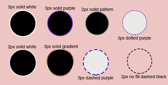
You can have a border by enabling the “Stroke:” portion. You can have the stoke to be a color, pattern, or gradient. Then you can change the size of the border next to it. And you can change the style of the border to be solid, dashed, or dotted.
E. How do you make your own custom shapes?
1. Open the image you want. 2. If it’s not already a png, you have to make it to a png. Otherwise, the shape will not turn out.
3. This step is optional, but I like to set the color overlay to black to see what the shape will look like. (ctrl+u, lightness: -100)
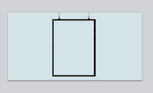
4. Use the select tool to select the entire document.
5. Click the move tool. (Make sure the document is still selected)
6. Move the shape a little. For example, click the backward key once and put it back by clicking the forward key once. 7. The png should now be the only part selected.
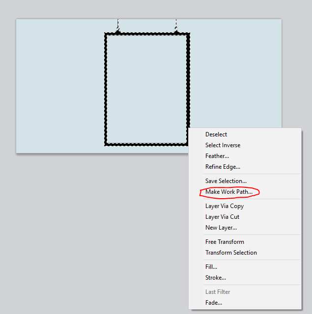
8. Go back to the select tool. (Make sure the png is still selected) 9. Right-click on the png and select “Make Work Path”.
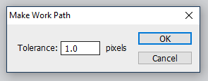
10. Enter a tolerance level. I recommend 0.5-2.0. It depends on the png, really. It might look better with lower tolerance, or it might look better with higher tolerance.
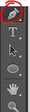
11. Click the pen tool and right-click on the png.
12. Click “Define Custom Shape.”
13. Name the shape and click OK.
14. Click the delete key and delete the png layer. 15. Create a new layer. 16. Click the custom shape tool.
17. In the custom shapes navigation, scroll down until you see the shape you created. Click it.
18. Click and drag the shape until it’s the size/portions you want.
19. Change any details you want (fill, stroke, etc.), and you’re done!
What to keep in mind:
The shape is not going to be perfect. The work path tries to detect as close as it can, but it will not get every detail.
F. How do I get more shapes?
Shapes4Free has a wide selection of shapes to choose from. Just choose the one you like, scroll down until you see the green “download” button, and click it. Then open it in photoshop. The shapes will appear in the custom shapes section.
Deviantart has tons of shapes available, too. Just search “photoshop shapes”, “custom shapes”, etc.
I hope this tutorial/guide was helpful. If you need any help or have any questions, feel free to ask!
-`. Hello everyone! In this tutorial, I’ll teach you how to center objects/text in photoshop, as well as explain how the Smart Guides and custom Guides work. .’-
A. How to Center Text
1. Type the text you want.
2. Select the center text-align option from the text toolbar settings.
3. Use the rectangular select tool to select the entire document.
4. Click the move tool and select the “Align verticals centers” and “Align horizontal centers” icons.
The text should now be centered perfectly.
Before moving on, let’s go over the other alignment options just so you know what they are.
“Top Edges” (the first icon) aligns the text to the top. “Bottom Edges” (the third icon) aligns the text to the bottom. “Left Edges” (the fourth icon) aligns the text to the left. “Right Edges” (the sixth icon) aligns the text to the right.
B. How to Center an Object
It’s the same steps as before:
1. Open/create the object and place it on the editing workspace.
2. Use the rectangular select tool to select the entire document.
3. Click the move tool and select the “Align verticals centers” and “Align horizontal centers” icons.
It should now be centered perfectly.
A few things to keep in mind:
It centers according to the image. If you have a png but there are some portions on the outside that are not fully erased, it still detects it as part of the image you want to be centered and will place the png in an odd place.
To get the best result, make sure there are no “crumbs” around the image/png you want to use.
If you can, select the portion of the image/png you want and click CTRL+J. That will create a new layer and remove any outer edges.
C. Smart Guides
Attempting to center multiple objects will send all objects in the same position and will override each other.
Thus, I recommend turning on your Smart Guides. (To do so, go to View > Show > Smart Guides)
The smart guides are bright, pink lines that appear when you place something over or near another object. It helps with aligning objects, specifically objects with the same dimensions to make them parallel.
For example, here is a gif showing you how the pink smart guides help you align an object (in this case the “&”) with another object:
It tries to help you align an object with the ends/center of another.
As another example, here is a white, centered square. The smart guides help align two black boxes to be even to the white box.
Using smart guides is a good advantage I recommend using.
D. Custom Guides
Adding custom guidelines in certain areas also makes it easier to align objects.
To add guides, 1. Go to View > New Guide. 2. Select the orientation you want: horizontal or vertical. 3. Enter the position you want the guide to be.
For example, if your document is 540px wide and you want to enter a guide in the middle, you would put “270 px”.
As you can see, it adds a cyan line in the center. That will help you see where the center is to put an object there.
You can follow the steps again to put more guidelines.
For example, say you want the 540px wide document to be cut into fourths, you would put one guide with 135 px, one with 270 px, and one with 405 px. (540/4=135. 135+135=270. 270+135=405. 405+135=540.)
The guidelines you enter help you see where to put things perfectly.
And don’t worry. When you save your image, the lines will not save with it. But if you want, you can remove them by going to View > Clear Guides.
That is it for this tutorial. I hope you found this helpful and your editing process. If you have any further questions, don’t hesitate to send a message!
I’m having a Mermay challenge all week on my patreon! I’ll give a few prompts to choose and will give feedback every step of the way. Video process on selective illustrations will be available as well! It will be a lot of fun, so please consider joining us for the challenge.
I have many fun activities planned for the future on my Patreon, make sure to check it out! Link is on my bio
Hi! in this time, I am up to make another art-tutorial thing.So, here the points how I color a black and white stuff
particularly, I copy black and white stuff, use “gradient map” and put it as “difference“ layer 15~30% opacity. Secondary, copy the black and white stuff, “image”→”adjustments”→” threshold ” and then,“gradient map“ again, put it as “soft light“ layer 30~40% opacity.
However you will put color on them, I think you can have a better outcome. I hope it will be some help of you. Thanks!
Okay so i got a few notes on how i go about Environments/Landscapes…so i’ll share a method thats easy to work with….bare with me its been a little while since ive drawn them Lol
First thing you want to start of with in your gradient background…use what ever is your preference. Depends on the setting, ima do some type of desert/dusty place.
You’ll learn that the Lasso tool is gonna be your bae when it comes to environments…that and its pretty useful. Now your going to be working in three tones, 1.Dark 2.Mid 3.Light and it will always be the darkest at the front fading to light towards the back…make sense? So you will have three layers for each one to make your life easier and Lock those layers so you will only color within that area. Make sure the dark layer is on top.
Here is where the fun kicks in…we add our dets, try to stay with each tone and dont end up making it all muddy so you cant distinguish each one. Now you can go about this any way you please, you can paint it all in with one brush ( for some reason people get anal about shit like that, thinking there great for using one brush…i think if you got tools use em if you know how to do it right.) Or you can use custom brushes…since this is a tut ill mostly use custom brushes to slap stuff around. Its up to you really, also use the lasso tool like i said its your bae.
The lasso can help define things better for you, so i wanted to add a structure type on the third layer. If you want to give an effect that the selection ive made is in front of the background right click your selection and invert it, add some lighting around the edges…only a little though you dont want to over do it.
Also if you’ve done something on a layer you dont want to mess up or paint on what you can do is create a clipping mask on that layer. Its kinda like locking the layer to that one so you dont go outside of the layer or ruin what you worked on. Make a new layer above the one you wish to attach it to and right click the newlayer, a menu will pop up, your looking for clipping mask. Once you clicked it the layer should look like what ive circled.
Once your done working on each layer we are gonna put in some mist effect, this is something that helps separate each section. So make a new layer between each of your three as shown in the image. Like i said you can use what ever method you like, i just use a soft brush or cloud/mist brush to get what i want.
Now we are going to add some definition to the image a good one to use is Curves. You can find this where your layer menu is, at the bottom you’ll find it, ive circled what your looking for. On the third image is what will appear when you click curves, all you need to do is drag the little square and you’ll see some magic happen. So adjust it to your preference. If you want you can also mess with brightness/contrast too. ALSO i would recommend adding a person in the image, it gives you an idea of the scale your environment is.
I was going to end it there but hey, ill show one last thing…its pretty simple. and that is some water reflection, we are going to turn the middle into water instead cause its a little boring right now. I merged all layers but the first one, you then want to make a selection and copy/paste. Free transform in the shortcut is ctrl T and do a vertical flip on it then adjust so its mirroring the top.
Now make a clipping mask like i explained earlier on the reflected surface and use the radiant tool…i think its called that lol it gives it more of a water surface like you see. For the image below it i used a custom brush which creates a water effect, aaaaaaaaaand bam you got you water now covering the area…easy huh.
And so this concludes the Tutorial and you have the end result. Hopefully that gave some tips on how to approach landscapes…they can be confusing sometimes on where to start. Enjoy and let me know if it was useful or not :P
A couple years ago, I wrote a post on harmonious color and Dan posted a link to it here on Muddy Colors. Shortly after Dan invited me to start contributing regularly. It occurred to me that it might be good to have the post etched in the granite block of Muddy Color’s blog so that in a thousand years when Google robots have taken over the earth, turned us into batteries and assimilated all knowledge they can choose a decent color palette for the inevitable future.
Also, from looks of my social network feeds, just about all of you are at IMC and will be working through the wee hours of the night having a wonderful time. I am jealous of the inspiration and fun all the IMC'ers are having, but it brings back great memories too!
Harmonious Color
“One more step, Mr. Hands,” said I, “and I’ll blow your brains out!” by N.C. Wyeth
I struggled early in my career with the application of color. That is no surprise because color can be tough, but I really struggled! In fact when I was just out of high school, my pride reared it’s ugly head and I even told one teacher that “color was overrated” and that “black and white was enough for me.” That makes me smile now, but I was serious then!
The reality was that I had no clue how to put a palette together for a painting. I knew that a complimentary palette could be good. Maybe red and green, or orange and blue… but what orange, and what blue? You only have to spend 2 minutes in an art store (or in Photoshop!) to realize that there are a LOT of different hues of blue and orange or any of the basic colors of the spectrum. It can be a bit overwhelming at first.
I do feel I have come a long way in my understanding of color, but I also know that it is something that will provide a deep and satisfying challenge for the rest of my life. Having said that, I will share my approach. I think when people ask me how I choose the colors in my paintings, what they are really asking is, “How do you create a harmonious palette?”
Cymon and Iphigenia by Lord Frederick Leighton
Creating Harmony
Let’s start with a color wheel. It can be any color wheel, as long as it contains the spectrum of colors in their full saturation. For this lesson, I have created a fairly large color wheel that has not only a broad selection of colors fully saturated, but also a couple different levels of saturation. In the center of the wheel is a white circle. This represents the color or temperature of the color of light that the color wheel exists in. – see fig. 1
The color of the light in your scene limits the colors in the spectrum available for you to paint with.
Only under white light will all the colors of the spectrum be available. If you have a red light in your scene, you will not be able to paint with the full spectrum of colors and have your painting feel natural. Let’s see what happens to the colors if we cast them in a different temperature light. – see fig. 2
The image above is simulating a scene as if you placed a 50% red filter over your eyes, or as if your scene were lit with light the color of the circle in the middle of the color wheel.
Look at how the red light has limited the colors. The greens have lost their kick, the yellows are pushed towards orange and the blues towards grey and purple. You could no longer paint with a bright ultramarine blue in this scene and have it feel natural. The color would not feel as if it belonged in the scene. In other words it would no longer be harmonious.
Below is a more extreme version, with the red light at 90%. – see fig. 2a
Now we are really dropping colors. You could imagine you are doing a sci-fi painting set on a planet that has a red sun. Your blue jumpsuit would be a nice grey purple and the whites of your eyes a strong carmine pink. Look at the change in the greens and yellows as well. The overall palette still represents the full spectrum, but cast under strong red light. Any of the colors within this palette will work with each other to convince the viewer that the scene you are painting has consistent color temperature in the light. It is harmonious.
Now for closer comparison, here is the color wheel with white light next to the palette with red light at 90%. – see fig. 3
The changes in the colors are very apparent, but it is also a rather nice limited selection of colors to work with. Of course if this were your palette, you would most likely use a variety of values and different saturations. I would also simplify the palette to the most important colors I want to dominate the painting. What color would your skin be under this kind of light? What about water, or a tree? Try to imagine the colors you use in your own illustration.
Experimenting with temperature
Next, let’s take a look at a painting and see how the painting changes with the temperature of the light.
The painting above, Pierrot’s Embrace by Guillaume Seignac - fig. 4 - has what is essentially white light illuminating the painting. Now let’s take a look at the same painting cast under a 25% red light – fig 4a.
A couple obvious things stand out. The whites are pink and the whole palette has shifted a little. The skin still looks like skin and we still read the dress as yellow. What would happen if we applied other colors? - see fig 4 – 4e
Look how the painting still works under all the different colors. The green skin in fig. 4c still reads, as does the purple skin in fig. 4e. The white fabric, while tinted in fig 4a – 4e still reads as white. Not technically, but perceptually. Our brain can tell that the light in the scene has changed and adjusts to accept the tinted cloth as white. If you were to take the shirt from 4c and put it in the original, it would no longer be perceived as white, but pale green.
It is the same in the natural world. If we are wearing a white shirt and we step outside into a beautiful Arizona sunset, we don’t wonder why our shirt just turned peach, we know that the temperature of the light changed and so the whole spectrum shifted with it. If we had a shirt that could somehow retain it’s brilliant white under different colors of light, it would stand out as unnatural. It is the same with our skin. Throughout the average day outside, our skin changes color significantly, as the color of light changes from dawn, noon and dusk. What does this tell us? Perceived color is highly relative.
I had a teacher once tell me that color doesn’t matter. It is a bit dramatic, but the point was this, there isn’t a specific flesh tone or color for spring grass that we can mix once and be done with it. Additionally, you can paint grass just about any color you want as long as it is consistent with the light and environment in your scene and it will be believable. All colors will change with the temperature of the light they are in. This is exciting to understand because even though the palette narrows, it frees us as artists to use the temperature of the light as a powerful brush. Let’s push Seignac’s painting a little further and see what happens.
The painting has a distinctly different feel to it. Besides changing the apparent time of day, it has shifted the entire palette, yet the skin is still believable as skin and the textures and surfaces still read effectively. Back to the statement that “color doesn’t matter.” Of course it matters, but what you don’t get stuck on is thinking that skin or any material has a set mixture or hue.
Look at the skin sampled from the painting – see fig. 6a. The skin has turned from a soft tan to a strong lavender color. That tube of “flesh” colored paint won’t help much at this point.
Winged Figure by Abbott Handerson Thayer
Choosing a palette
So how does all this help you choose a palette? The very first decision that I make when determining the color in a painting is to determine the temperature of the light in the scene. Warm or cool light? Will there be a strong color to the light? Now you need to shift the entire palette based on the light in your scene. This will simplify your palette. I find this to be rather beneficial. Every painting isn’t meant to have every single color. Part of the art and craft of painting is choosing which colors to use and manipulate to create your vision. By culling your palette at the beginning this way you are simplifying the range of colors available, sometimes by a significant factor. This is a good thing!
Knowing the mood you want to convey, or maybe there are natural factors like an overcast sky or sunset, will help you determine the temperature of your light in your painting. At first, it might be useful to take a color wheel into Photoshop and shift the color wheel based on the temperature of light you have chosen. The “Photo Filter” tool found under Image>Adjustments is an easy way to experiment.
Let me shift gears for a moment. Pixar does a wonderful job of painting with color. One of my favorite things about their art books is they typically include images of the entire movie in what is called a “color script”. These are like storyboards, but their purpose is to define the color through the entire movie.
Take a moment to look at the great color at work in the images above – see fig- 7. Look at how the mood changes. Note how Nemo changes color as the lighting changes in the various scenes along with the entire palette. Also note how when two different temperature light sources are used, like in the panels in the middle right of the image, that Nemo’s coloring reflects the two palettes. This is all fairly common sense stuff, but it bears repeating, especially if you aren’t used to thinking about the temperature of the light in your painting before you choose your palette.
It may be helpful at this point to see a range of colors applied to a selection of color spectrums. I am switching from the color wheel to a grid so that we can easily see how the colors change under different light. Fig. 8
The top row represents the color of light over the swatches below. Look at the orange color and how much it changes under different light. I point that color out because it is closely related to the base for typical skin. Some colors will also appreciably darken under different temperatures of light.
This has to do with the physics of light and how atoms are able to absorb or reflect incoming wavelengths of light. Electrons will either absorb incoming energy causing them to vibrate and heat up (which is why black stays black and gets hotter) or they will absorb a the energy temporarily, jumping to a different orbit with the new energy, a quantum leap, and then jump back to their original position. When this happens the remainder of the energy absorbed is reflected as a new wavelength of light, or color. A pure red object under white light is absorbing most of the spectrum and turning it into heat, while casting off the remainder of the energy in a red wavelength. Enough of that!
Back to the color grid. I also find it useful to see the colors less saturated. See fig. 8a
It is helpful because you don’t typically paint an image with all the colors at full saturation, so this chart shows colors in a more practical range.
Let’s also take a look at another painting, this time Le Dejeuner Du Matin by William Bougereau. – see fig. 9
This image shows what happens if the rules are broken. The image on the left is the original scan. The image on the right has been shifted with a 50% blue light. While I prefer the original, the image on the right is still successful with its color relationships and the skin is still beautiful and full of subtleties. The image in the middle takes the head from the original and superimposes it on the image from the right. We get what might be called the
“Snookie Effect”
. It is clear, not just because the head doesn’t match the feet and arms, but the color of the skin is much too warm, and it contains colors that aren’t believable, or possible in the natural world with such a strong blue light illuminating the scene.
As with most rules in art, you can break this rule, and to good effect. Movies will do this all the time to make a character stand out, or draw focus to a part of the screen. Color contrast, specifically color temperature contrast is powerful stuff. Having cool blue light illuminate a magic object in a room lit by warm candles, or a figure glow with warm light in a cool winter scene instantly tells the viewer that something other worldly or unnatural is taking place.
In The Young Martyr,by Paul Delaroche, – see fig 10 – temperature contrast is used to great effect. The other worldly light of the halo stand out as such because of the surrounding cooler colors and palette. The same is true of the setting sun in the background. Were she lit with a cool blue light it would not have the same pronounced effect.
Summation
Really all of the above is a long-winded way of stating something fairly simple; so let me try to do so as I conclude.
Determine the temperature of the light before choosing your palette
Choose your color palette from the new limited color wheel
Don’t go outside of the range of colors except for an intended effect
I hope that helps to clarify the creation of color. Happy painting


