I’ve put together a 2+ hour mixed-media tutorial that walks you through the painting process I developed over my 15 year career. This video includes voice over throughout the working process and explains design decisions made while drawing, basic color theory principles applied to this piece, as well as a specific methodology for applying materials to make acrylic, ink and gouache react with each other to present welcome surprises.
Preorder until June 3rd: $7
After June 3rd: $11
*This tutorial will be included free as part of the Ideation Lab LIVE course starting June 3rd. Enroll today:
For the next few days, I’ll be giving away this 3 hour tutorial for free. Illustration mixed media.
Just follow the link in my bio to sign up for my newsletter.
This is the process I created that lets you keep your drawing and mix paint color on your canvas, instead of on your palette. I employed it for clients from New Yorker, Rolling Stone, Bungie to Marvel.
Follow me here on Instagram for a second free demo very soon. #illustration #art #artsanity #painting #drawing #create #free #tutorial #daler-rowney #ink #instagram #artistsoninstagram #sketchbook #instaart #sterlinghundley
my screenrecord isn’t letting me record pop up windows so screenshots only until i can figure that out, but here’s how to add noise / static to your gifs !
we’ll start with our base gif, if you don’t know how to make gifs, there are a bunch of really helpful tutorials already out there (like this one ! )
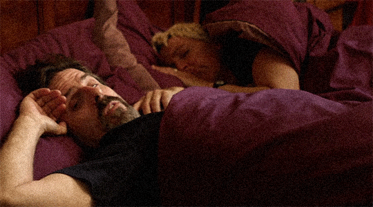
i’m gonna start with a gif i made of con o’niel, bc i am currently obsessed. here’s what we’re starting with !
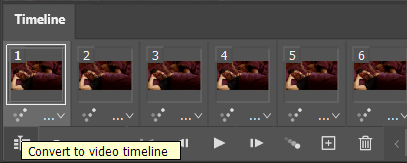
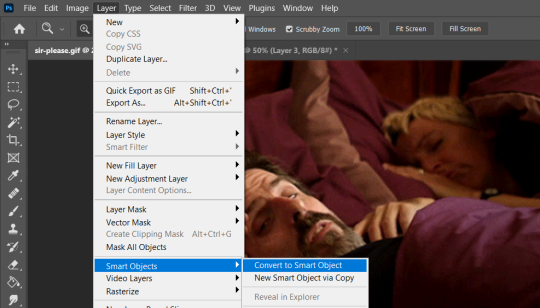
when i open my gifs, they open in photoshop they open as frame animations, we’re gonna convert them to a video timeline with the little button in the corner.
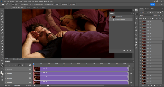
when we’ve got that done, we are going to select the bottom layer, and hold down shift, scrolling up to the top, this should selectallof the layers,
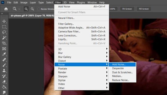
from here we are going to go to layers > smart objects > convert to smart object, this will merge all of your layers into one, and allow you to sharpen / adjust them as one layer.
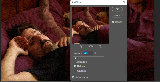
after we have our gif as a smart object, we can go to filter > noise > add noise.
it should give you a slider to adjust how much static, i like to have uniform selected, you can adjust it to taste !
and just save as normal !
pro tip : if you have a psd you’d like to use, i would recommend saving it on the gif before adding the static / noise filter, as some heavy psds will wash the noise off !
Not just about any old filters but about the filters you all need.
At least, if you take photos.
Also, this is my first “content collaboration video”. It seems, one of my old videos on “vintage lenses” - sort of - exploded and caught the attention of “some people who know people”… so… there is that.
I didn’t get paid to make this video but I got to keep the filters sent to me by K&F Concept (who, btw did in no way influence this video). Thank you! :)
I should probably make more videos again. Maybe on vintage lenses… I mean… you knooow… milking the cow ;P
Nah… joking aside. Making videos is fun. And I like to explain things. Is there anything you want me to explain to you?
Okay… I’ll stop. Here is my video about the “3 essential filters for outdoor photographers” (and also vloggers)
Without thinking about it, when drawing a brown tabby cat, most people will automatically start with the first example, but in actuality their fur is a LOT more like the second drawing.
Instead of brown with markings, the fur is actually various shades of gray and orange creating the FEELING of brown. It’s hard to paint! Of course this doesn’t mean you’re WRONG for drawing a cat like the first drawing, instead this is just something to realize if you’re struggling on accurately depicting a brown tabby. I have to think about this in pet portraits quite frequently. It makes them one of the more difficult colors I’m asked to paint!
Most of the individual strands of fur are actually multi-colored adding to the complexity of the fur color. I added in an example of the fur pushed back and what individual strands might look like. I jokingly call these porcupine quills when Pandora sheds them, because they visually resemble much smaller versions of a stripey quill!
Hope this is helpful! I really love what VARIETY brown tabbys have! Some lean much more orange, while others lean much more gray. It’s only in the complete absence of orange that they are thought of as gray tabby cats.
。・ tutorial five, graphic tutorial three by graphictutorials ゜+.*
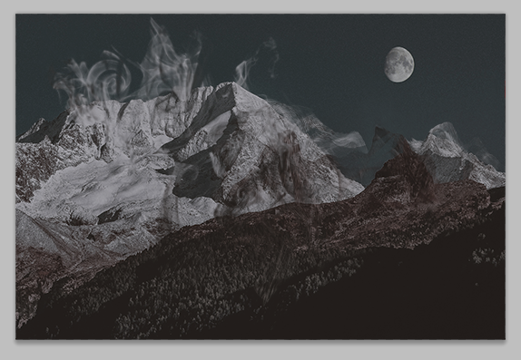
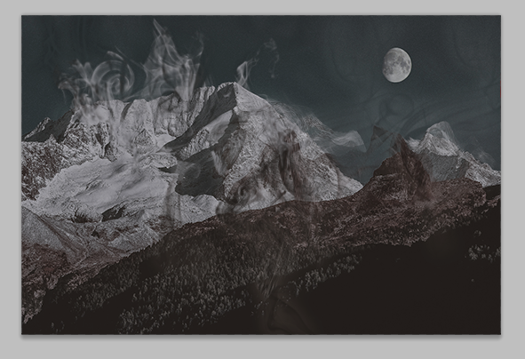
-`. Hello everyone! In this tutorial, I’ll teach you how do make an edit/graphic with smoke distortion, like this: .’-
Important note: You will need smoke brushes.
If you don’t already have brushes, here are some recommendations: 1 (I think this is the one I have), 2, or 3.
Download some smoke brushes and open them in Photoshop to install them.
Once you’ve done that, we can begin.
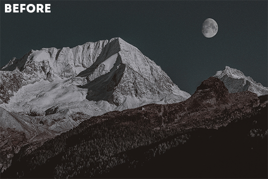
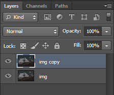
1. Open your image in Photoshop and duplicate the layer.
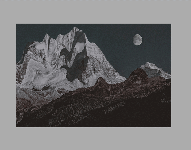
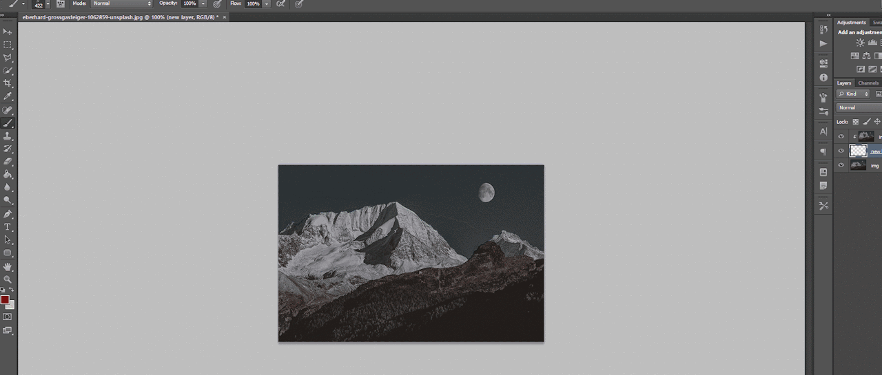
For example, this is my image:
And here you can see I made a copy:
2. On the duplicate layer, go to Filter>Liquify (or hold shift+ctrl+x).
3. Change the tool options to what you feel is best.
If the brush is too big, make it smaller. You don’t want it to be too big, you want it to be small so you can liquify only a few parts of the image. If the brush is too big, it will liquify the entire image, and you do not want that.
You can change the density and pressure, as well, depending on how you want your brush to be.
Here are my settings:
(Keep in mind, my image is 540x360, you might want to make your settings bigger if your image is bigger.)
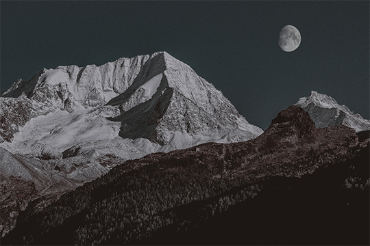
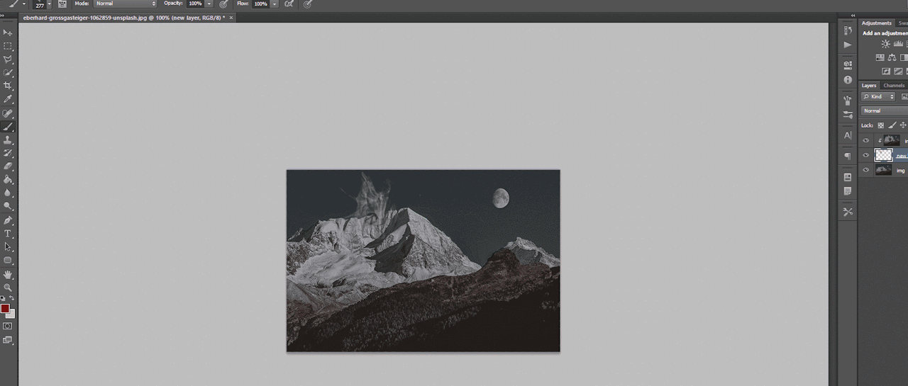
4. In the liquify section, you’re going to click and drag portions of your image in a certain direction.
For example, for my mountains, I’m going to drag the mountains upwards.
You can make swirls, zigzags, or just straight strokes.
You can switch between brush sizes to create smaller or bigger strokes, too.
Click OK when you’re done.
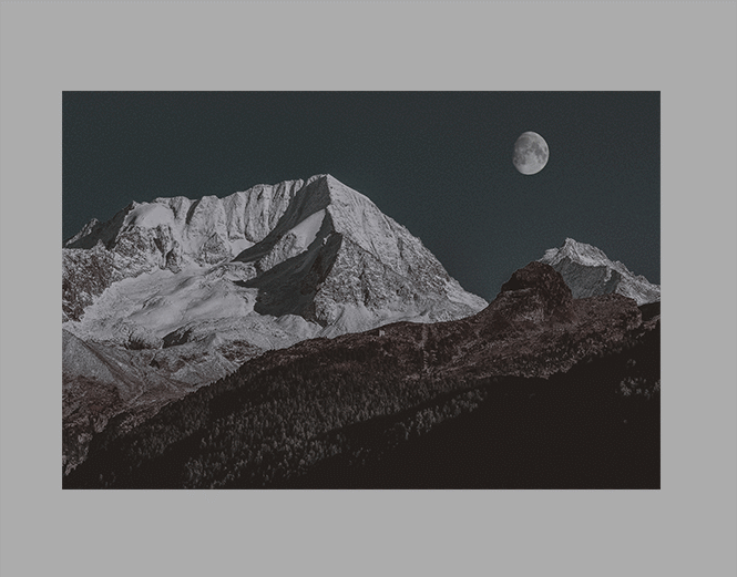
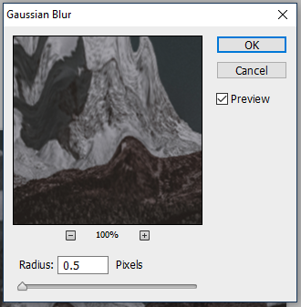
5. Go to Filter>Blur>Gaussian Blur and apply a small blur.
For example, I put 0.5 radius.
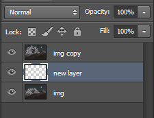
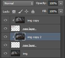
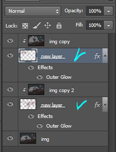
6. Create a new layer (ctrl+j) and place it under the liquified duplicate image.
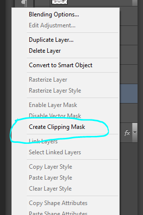
7. Select the duplicated image layer again, right-click, and select “Create clipping mask.”
The duplicate/liquified image will disappear from the workspace but don’t worry, it’s supposed to do that.
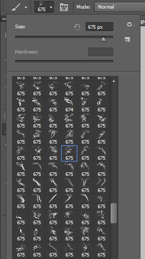
8. Select the new layer again, and go to the brushes. Choose a smoke brush you want. I recommend choosing one that goes in the direction of your strokes.
For example, if your strokes go upward, choose a smoke brush that goes upward.
9. Adjust the brush size if you need to, and go back to the workspace, choose where you want the brush to be, and click once.
That portion will now be filled with your liquified image.
10. Apply some more smoke brushes for more of the liquified image to appear.
11. You can go back to the original, unedited image, and duplicate it, liquify again, and repeat the steps for more distortion and smoke.
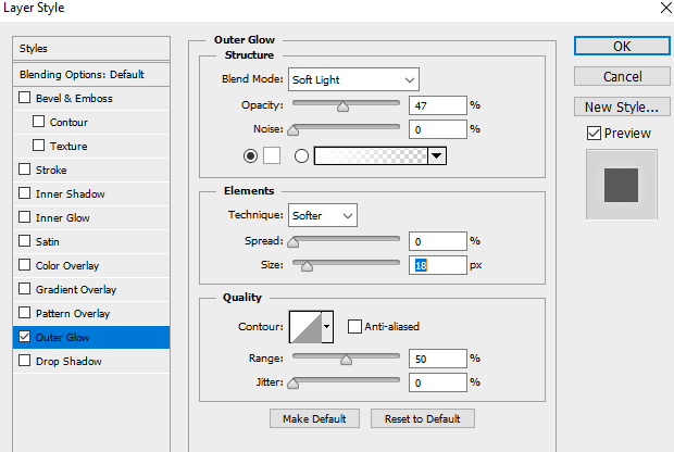
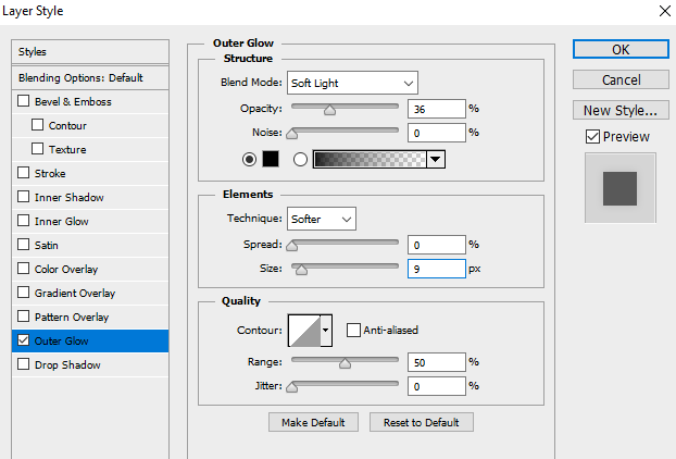
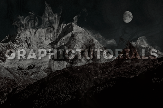
12. Once you’re done with the smoke, go to each brush layer, double-click, and apply an outer glow of either white or black, depending on the image, in Overlay mode and lower the opacity a bit.
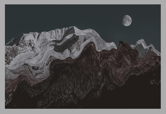
For example, here are mine:
Make sure you only do it to the brush layers, not the liquefied layers!
This will make each smoke layer stand out from the original image and from the other smoke layers.
If you plan on making more portions of your image smoked (?), then repeat the steps until you’re done.
That’s all there is to it!
I hope you found this helpful and plan on using it. If you need any further help, just send me a message!
。・ tutorial four, graphic tutorial two by graphictutorials ゜+.*
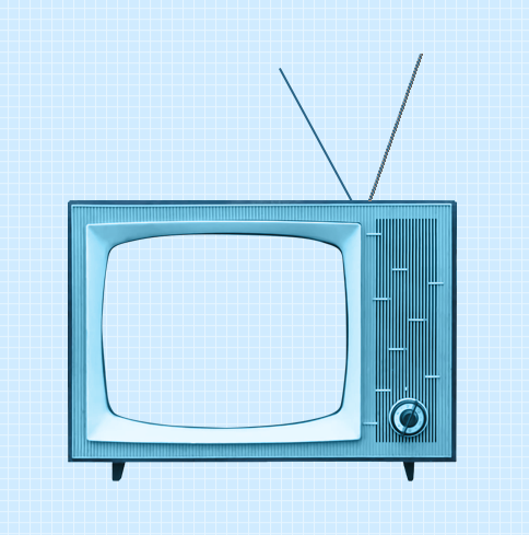
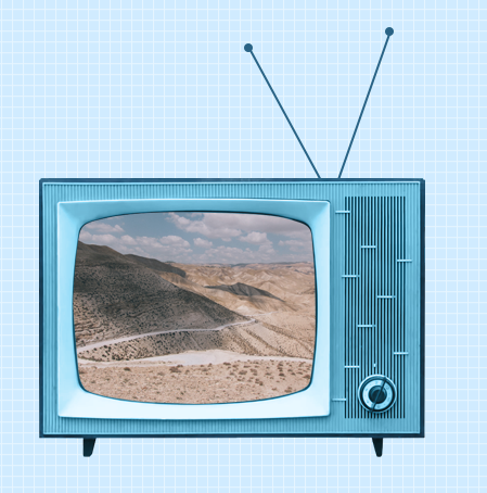
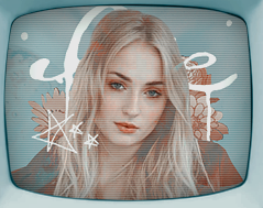
-`. Hello everyone! In this tutorial, I’ll teach you how do make an edit/graphic with a TV and electricity doodles, like this: .’-
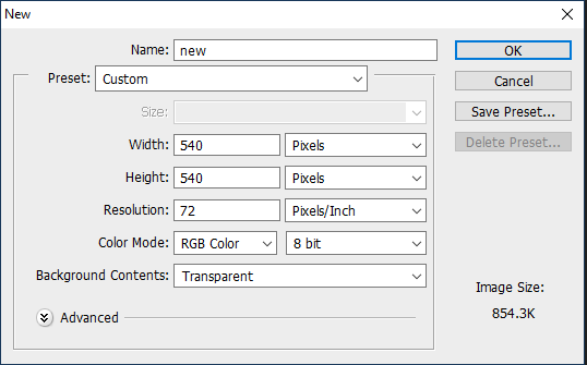
1. Open photoshop and create a new document with the size you want.
For this tutorial, I’ll be doing 540x540px.
2. Add your background. You can make it a solid color, use a pattern, gradient, texture, etc.
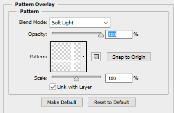
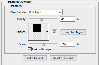
For example, I used the paint bucket tool to fill the background with a solid color (#d1ecff, to be exact), and I applied a pattern overlay (using the last one here) in soft light mode.
So my background looks like this:
A/N: I’m making the example pastel-ish, but you don’t have to!
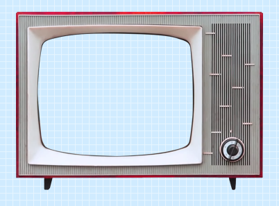
3. Now make a png of a vintage-esque TV, or you can use one of these: 1,2,3,4.
I’ll be using the 2nd png in the 1st pack.
A/N: You’re going to want the screen portion erased if it isn’t already, because that is where you’re going to put an image.
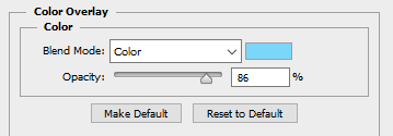
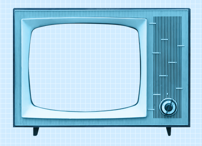
4. This is optional, but if you don’t like the color of the TV, you can change it by:
Double-clicking on the TV layer, and go to the “Color Overlay” tab, clicked the colored rectangle, choose the color you want, click OK, and change the mode to one of the following: Overlay, Soft Light, Color, Hue, or Multiply. Choose which one looks best with your color and you can adjust the opacity if you want.
For example, here’s what I did:
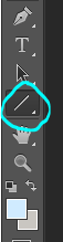
5. If you chose a TV that already has antennae, skip this step. If your TV does not have antennae, like mine, I will show you how to quickly make some.
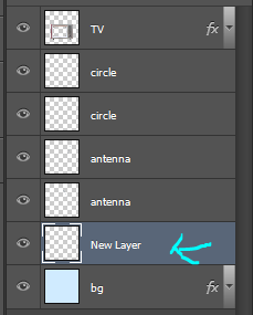
Create a new layer, choose a foreground color to a color that matches your TV color, select the line shape tool, make the line 2px weight with no stroke, and click and drag a couple lines from the top of the TV to make antennae.
A/N: You might want to rasterize those shapes (to do so, right-click on each layer and click “rasterize layer”) or put those shape layers under the TV layer.
Now create another new layer, use the ellipse shape tool, click and drag a small circle to fit on top of one of the antennae (hold shift as you do so to get an even circle). Duplicate that and drag it over to the other antenna.
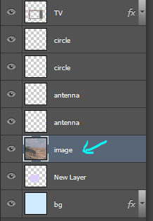
6. Now for the screen image.
Create a new layer and drag it under all of the TV/antennae layers.
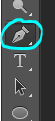
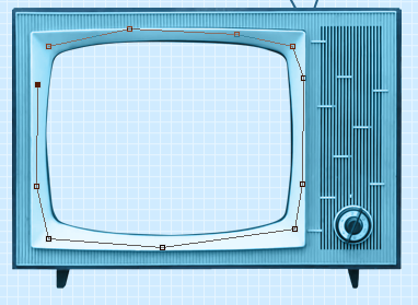
Select the pen tool. You’re going to make some points around the screen portion and connect them.
Once you connect them, It’ll make a line like this:
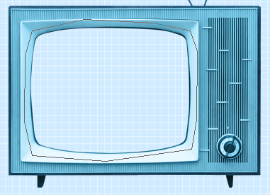
Go to the top bar and click the “Selection…” button. It will make the outline into a selection and that’s what you want.
A/N: There will be a dialogue box pop up, but just click OK.
Now it is a selection.
Click the fill bucket tool and click inside the selection to fill it. It doesn’t matter what color it is.
Click CTRL+D to deselect it.
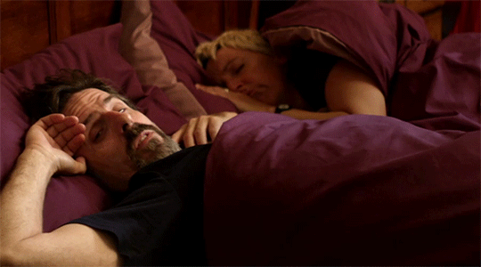
7. Now we will put an image/edit inside.
If you just want to put an image, open the image, drag it to the TV edit document, make sure it’s right above the screen fill layer, right-click on the image layer, and select “Create Clipping Mask.” It will be inside the screen portion and you can resize.
If you want to put an edit inside, I’d suggest making the edit in a new document, merge all of the layers of the edit document when you’re done, drag it over to the TV edit document, make sure it’s right above the screen fill layer, right-click on the image layer, and select “Create Clipping Mask.” It will be inside the screen portion and you can resize.
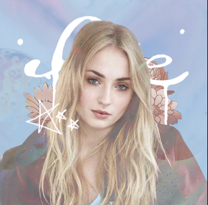
For example, I quickly made this edit in a new document and merged all the layers:
Then I followed the steps above and put it inside the screen.
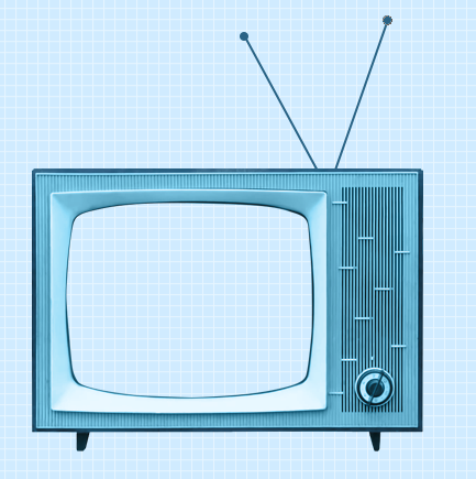
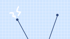
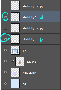
8. Creating the “electricity”.
Create a new layer and use the brush tool with a simple hard round brush in a small size and draw a couple little zig-zags coming from one of the antennae.
Create another new layer and make a couple more for the other antenna.
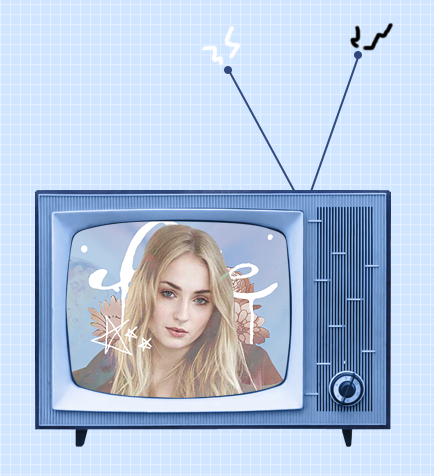
Now you could stop here, or if you want, you can make them into a little gif with the next step:
9.Duplicate one of the electricity layers, choose the select tool, right click on the document, and click “Free Transform”. Go to the top bar, and in the rotation box, enter -10. Hit the Enter key when you’re done.
It rotated the duplicate slightly to the left.
A/N: If it’s blurry around the edges, apply a Surface Blur with 5 Radius and 10 Threshold.
Duplicate the other electricity layer, Free Transform it, and apply a Rotation of 10. (Do the same number but polarize it. i.e., if you previously put -10, put +10 for this one. If you previously put +10, now put -10.)
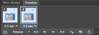
10.Open the frame animation timeline.
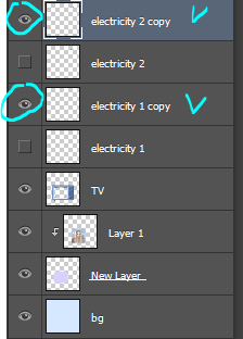
For the first frame, hide the duplicated electricity layers. Only the original ones should be visible.
Create a new frame and in this one, hide the original electricity layers and un-hide the duplicates.
Set the speed of the gif to 0.5, or something around there. You don’t want it too fast because it’ll hurt people’s eyes!
Make sure the loop is on “Forever” as well!
11.Go to File>Save for Web.., and save the gif.
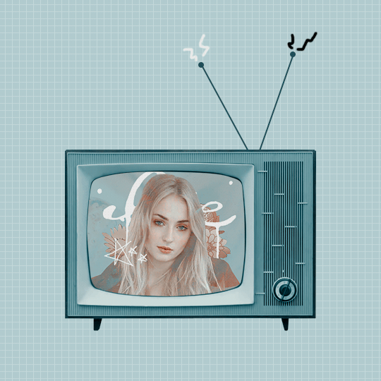
And you’re done!
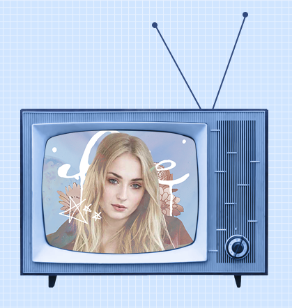
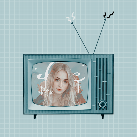
Here is my edit, image version:
And here it is as a gif:
Other Suggestions:
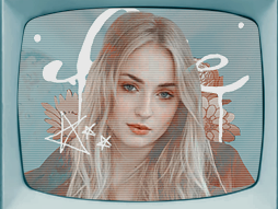
> For the full effect, you can go to the screen fill layer (not the image/edit inside of it) and select it, double-click, and apply a pattern overlay with a horizontal stripe and put the mode on Soft Light and lower the opacity to create that line effect.
Result:
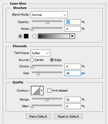
> You can also apply an Inner Glow to the screen layer and create a shadow.
Result:
Anyways, I hope this tutorial/guide was helpful. If you need any help or have any questions, feel free to ask!
⇨ How to Add Color to a Black and White Image: A Tutorial, Recoloring Tips and Other Random Sh*T by ME! If you’ve been following me for any amount of time or have looked at my original posts, you probably already know that I absolute love to colorize black and white photos and recoloring. I needed to do a tutorial so here you go, have fun!
I’ll be using an already colorful image of Red Velvet’s Joy from the Summer Magic teasers. I personally prefer to use a Gradient Map to turn images to black and white instead of Black & White adjustment because Gradient Maps leave more of a dramatic contrast but it’s up to personal taste.
After removing the color from the image, create a new Solid Color layer. I always start with the skin, do everything in between, then end with the background. Once the layer for the base skin appears, select the Layer Mask and invert it by pressing Ctrl-I or Image > Adjustments > Invert. Set the layer blending mode to Color. Making sure to still be on the Layer Mask, start drawing over the skin with White as your foreground color. Do not draw the eyes.
TIP: Lower the hardness of the brush when going around the hairline and around the ears, if hair strands are near it. If there’s skin showing through hair or if the person has bangs, lower the opacity to 20-30% and draw over it.
Now to add more warmth and detail to the skin. I start with a blush, then I add shadows and highlights. Set the brush hardness to 0%. Create a new Solid Color layer with the same color used for the skin but nudge it towards a warmer tone. Once the layer appears, select the Layer Mask and invert it by pressing Ctrl-I or Image > Adjustments > Invert. Set the layer blending mode to Color Burn. To make it easier and avoid drawing outside the skin, holding command, click on the Layer Mask from the base skin layer. With the selection, go to the Blush layer and paint.
HIGHLIGHT:I only add a highlight to the forehead, nose bridge, top of the lip, and under the eyebrows. I take the same color as the skin and move it closer to white, set the layer mode to Soft Light. Feather the layer mask to blend it better.
EYEBROWS: I use the Polygonal Lasso tool to select the eyebrows. With a Solid Color layer set on Soft Light, I use a rich brown color (5b2b22) and fill it, fading a bit to fit Korean beauty I guess and feather the layer mask.
LIPS: Repeat the same steps used to do the eyebrows but this time for the lips.
EYES: Solid Color Layer > Whatever color you want the eyes > Invert Layer Mask > Draw the Eyes > Set Blending Mode to whatever looks best. I used Soft Light.
⇨ LAYERS SO FAR Before you think something like “Wow, Nicolle! Joy isn’t that pale, stop whitewashing!” Adjustments exist for a reason, but I’ll show those later or in part two, if it gets too long.
NOW FOR THE HAIR! A lot of you fools like to edit idols with different hair colors and I support. Now I will teach you a nice, cleaner way to make it look like your idol’s hair is as natural looking as possible with an unnatural, fake color.
Solid Color Layer > Multiply or Color (Or whatever looks best with the color you pick > Select the hair. Use Select and Mask to try to make it as accurate as possible but we’re going to be drawing with the Layer Mask layer, so don’t worry to much. With the hair selection, Invert the mask to reveal the color. Ugly, right?
Don’t worry, the Soft Round brush is your friend. Make the brush very large near the hairline and hide the rough edges. Make the brush smaller and go around the edges and blend them away. Once you hide all the ugly, harsh parts, lower the opacity of the brush to 20% and paint over the baby hairs, the sideburns, and big chunks of hairs that show the background through the strands.
If the person in your image is wearing hair accessories, use the Polygonal Lasso to select the accessories and hide them with 100% Hardness. Try to not be sloppy. Take your time. The great thing about Solid Color layer is that you can always change the color at any time!
BACKGROUND:Same as everything above. Solid Color layer > Color Mode > Draw to show, draw to hide. Boom, DONE. A lot different than the B&W, right? Still UGLY! Add adjustments. Add WARMTH TO IDOLS! Bump up Vibrance and Saturation, Photo Filters, Color Lookups, Color Balance, all those.
If you’re like me and feel ugly without textures, add them. I always use a small “3D” effect and white specks on my edits because that’s how I like my stuff. Do whatever you like with your work to make it yours.

 h")
 h")
 h")
 h")
 h")
 h")
 h")
 h")
 h")
 h")


 Tabard Design in high qualityFree pattern Made in Adobe Illustra")
Credits to www.facebook.com/wegenaer.deBuy it here www.wegenaer")
Credits to www.facebook.com/wegenaer.deBuy it here www.wegenaer")
Credits to www.facebook.com/wegenaer.deBuy it here www.wegenaer")
Credits to www.facebook.com/wegenaer.deBuy it here www.wegenaer")
Credits to www.facebook.com/wegenaer.deBuy it here www.wegenaer")
Credits to www.facebook.com/wegenaer.deBuy it here www.wegenaer")
Credits to www.facebook.com/wegenaer.deBuy it here www.wegenaer")
Credits to www.facebook.com/wegenaer.deBuy it here www.wegenaer")
Credits to www.facebook.com/wegenaer.deBuy it here www.wegenaer")